Looks overhyped
A box with loud colors, many stars and big type; careful buyers grow suspicious at once.
Less type, fewer colors, and room for origins and ingredients presented plainly and truthfully.
Start from this problem
Hundreds of vitamin bottles look alike, and buyers choose the one they trust most.
Dietary supplements face fierce competition and tightly regulated advertising claims. Sinh Vũ helps a product earn trust through origins people can see, not through promises.

Three things first: a name and packaging frame that are easy to recognize, ingredient origins shown clearly, and a way of speaking that stays within what is permitted. Those three decide whether a buyer trusts your bottle or scrolls past.
Each product has its own color, but all share one frame, so placed side by side they read as one maker.
Where the ingredients come from, where it is made, which certifications: placed where buyers can see them.
Leave room in advance for the required phrase and warning, so advertising copy doesn't crowd them out.
All are dietary supplements, but buyers and places of purchase differ, so the brand has to speak differently.
Their customersBuyers repurchase regularly and compare many labels on marketplaces and at pharmacies.
Brand challengeStand apart from dozens of identical bottles without having to promise anything big.
Their customersBuyers are mostly women, who often look at photos and online recommendations before buying.
Brand challengeEvoke beauty without making any promise about skin, and keep photos and wording within scope.
Their customersBuyers purchase for the whole family, especially older adults and young children.
Brand challengeCreate the sense of safety and trust of something for the whole household, without scaring buyers with fear of illness.
These are the places where dietary supplements often lose even when their ingredients are as good as anyone's.
A box with loud colors, many stars and big type; careful buyers grow suspicious at once.
Less type, fewer colors, and room for origins and ingredients presented plainly and truthfully.
Start from this problemThe design is finished before anyone remembers the required phrase and warning, which get squeezed in as tiny type.
Reserve the position and type size for the required line from the first sketch, at every box and bottle size.
Start from this problemBuyers scroll past because the first photo, name and description look like dozens of similar products.
A set of photos and a layout frame consistent with the packaging, so every page of your own is recognizable.
Start from this problemEach new product means a new identity, and buyers don't see the products as one maker's.
A shared frame with room for each product's own color, written into guidelines so new products launch quickly.
Start from this problemAt the checking stage. Before clicking buy, buyers compare many pages and look for what makes this product more trustworthy. If they can't see clear origins, they choose another bottle.
Touchpoints are the places where a buyer sees, touches or reads about the product. You don't need to do everything at once. These five touchpoints decide most of the impression.
What buyers pick up, turn over and read closely before a first purchase.
Most purchases begin here, so the first photo and the name have to say something trustworthy.
Helps buyers compare quickly and see what is real about the product.
Shows where it is made and how to use it, so there is less need for promises.
A fixed, readable place on every flyer, box and post, avoiding omissions in large print runs.
Listed in the order to do them. A single product can stop at step two or three; a whole range goes all the way.
Settle who the buyer is and what makes the product more trustworthy than similar ones.
Name, mark, color and type: the foundation for every bottle and box.
Box, bottle and label, with room already set aside for the required line.
A set of lines within scope, shared across the box, the marketplace and social media.
Imagery for marketplace pages and campaigns, in the same frame as the packaging.
Sinh Vũ has not published a dietary supplement project. The two projects below solve the two nearest problems: packaging and imagery for care from within, and a way of talking about health that doesn't frighten the listener.
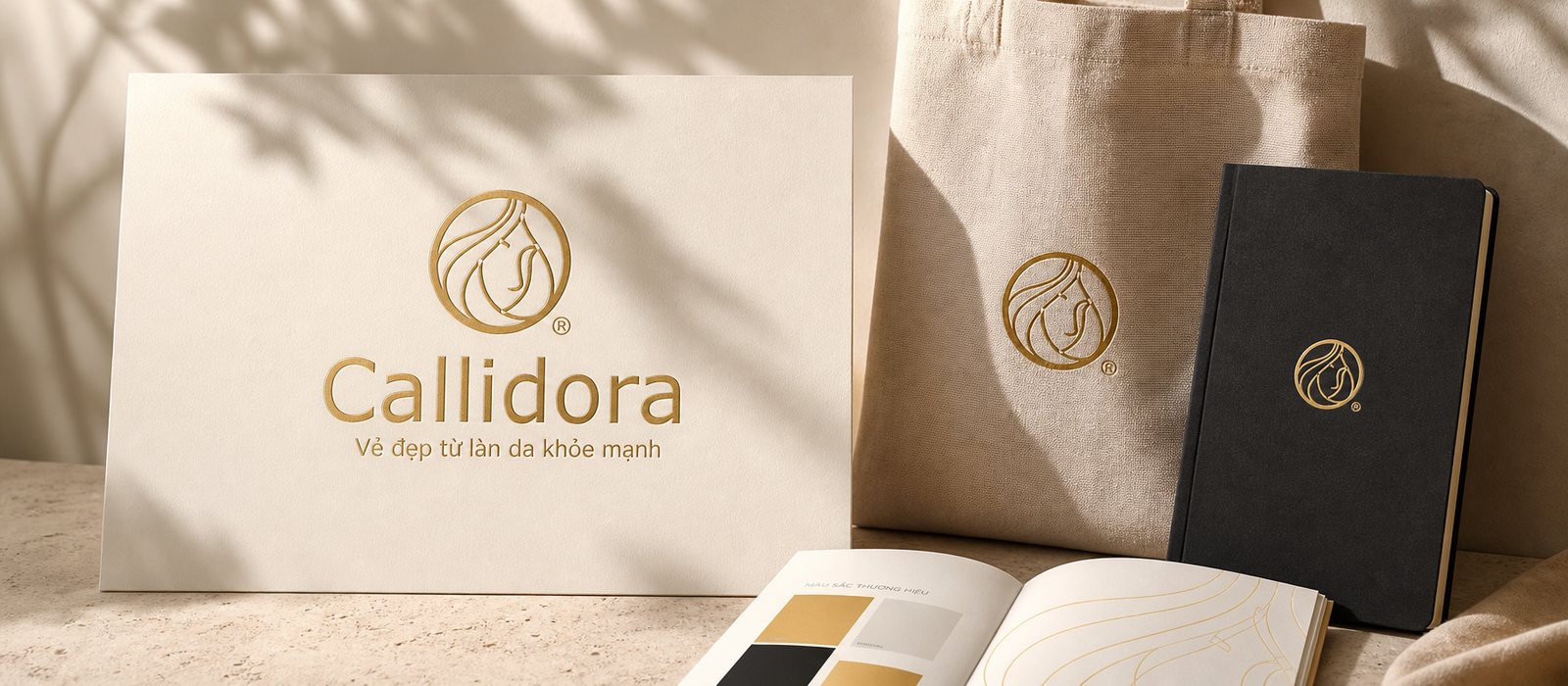
Callidora, a skincare cosmetics brand, had Sinh Vũ build a feminine, premium identity system that keeps its promise of beauty from healthy skin from the very first glance.
Packaging, campaign imagery and materials built around a philosophy of healthy skin, without overpromising.
 2011
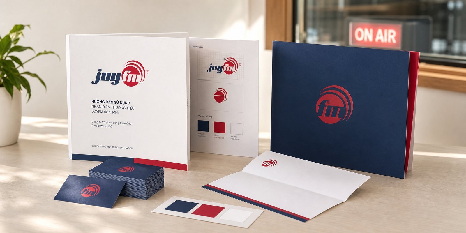
JoyFM is the specialised health radio channel of Hanoi Radio and Television Station, broadcasting on FM 98.9 MHz. Sinh Vũ built the mark, the guideline system and the corporate profile…
A voice kept warm and clear when talking about health, without frightening the listener: a way of speaking that suits dietary supplements.
The principles behind it
Advertising must carry the phrase "Thực phẩm bảo vệ sức khỏe" (dietary supplement) and the warning "This food is not a medicine and does not replace medicine for treating disease" (Article 5 of Decree 342/2025/ND-CP). The design has to leave room for that line from the start.
Don't compete on loud colors. Find something real about the product, such as ingredient sources or how it is made, then give it a clear place on the bottle and in the first photo of the marketplace page.
Evoke beauty through imagery and a light voice, without promising results on the skin. Put the ingredients and directions clearly, because collagen buyers read labels closely.
Be very careful, because before-and-after photos are easily read as a commitment to results. Before using them, have your legally knowledgeable person review every post.
Not if there is a shared frame from the start. A new product changes only its own color and content, while the frame, type and layout stay the same, so side by side they still read as one maker.
A few lines about the product, the buyers and what is holding you back is enough. Sinh Vũ will read it and reply within one working day.