
MEDI Plus, care built into a system
MEDI Plus is a new kind of medical complex, where patients are cared for gently from the very first moment. Sinh Vũ built the face and the digital nervous system for the clinic, so that care becomes an experience patients can feel, not just a promise.
The problem
MEDI Plus was not born to be one more clinic. Its ambition was to become a new kind of medical complex, where leading specialists, technology and comfort stand under one roof. But that ambition, without a form, was still just a line in a document.
A medical facility touches people at many points: the sign on the street, the reception desk, the ticket screen, the invoice, the uniform. When each point speaks a different language, patients feel disorder, not care. MEDI Plus's problem was to make every one of those touchpoints say the same thing, and to say it gently.
The approach
Before drawing anything, we settled where MEDI Plus stands. In a healthcare market that is often cold and rushed, the open space was care: a place to be examined without feeling small. The words Always caring were born from that, and became the measure for every decision that followed.
Positioning a new kind of medical complex does not stop at a slogan. It requires everything that follows, from the letterforms to the way a screen greets a patient, to be both modern and warm. A clear position is what keeps the whole system from drifting each time someone new picks up the pen.
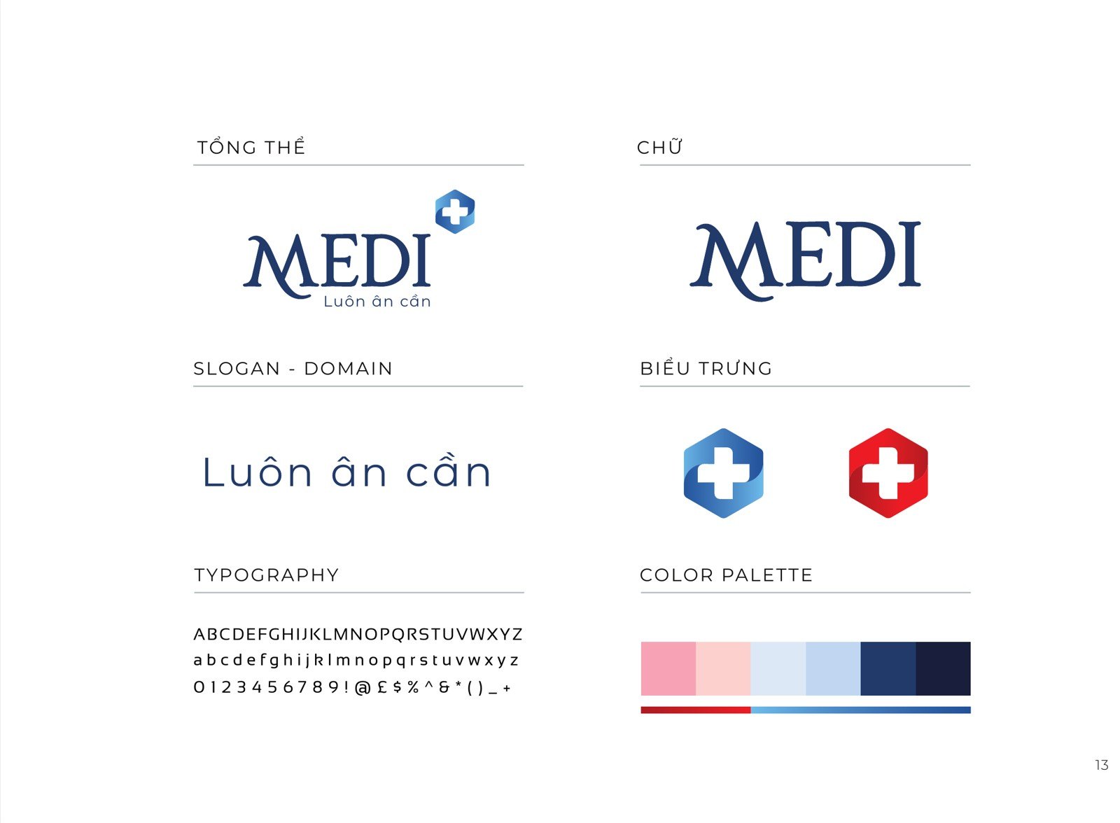
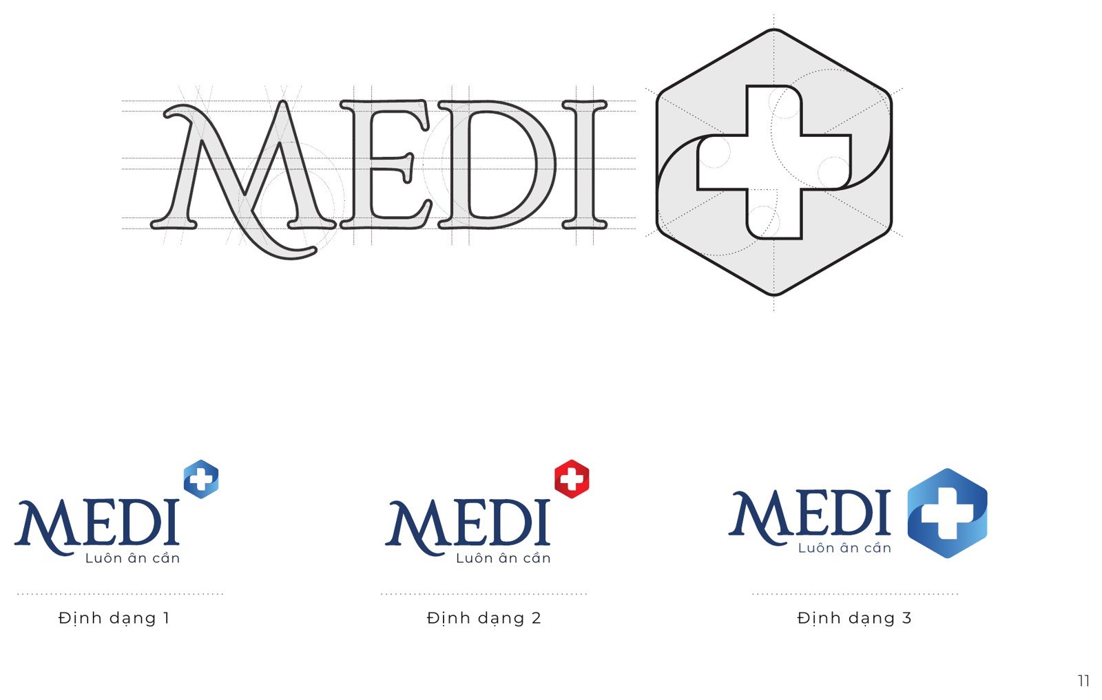
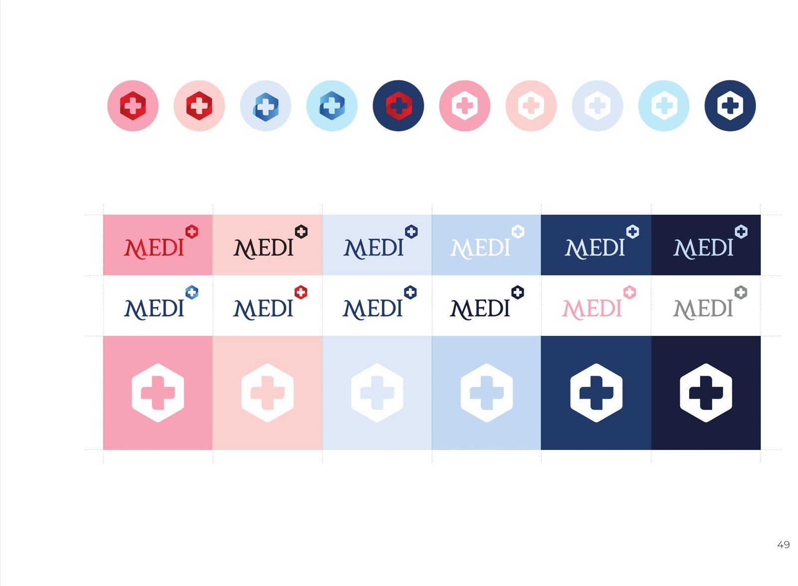
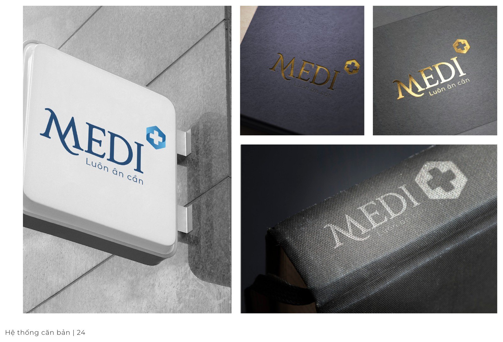
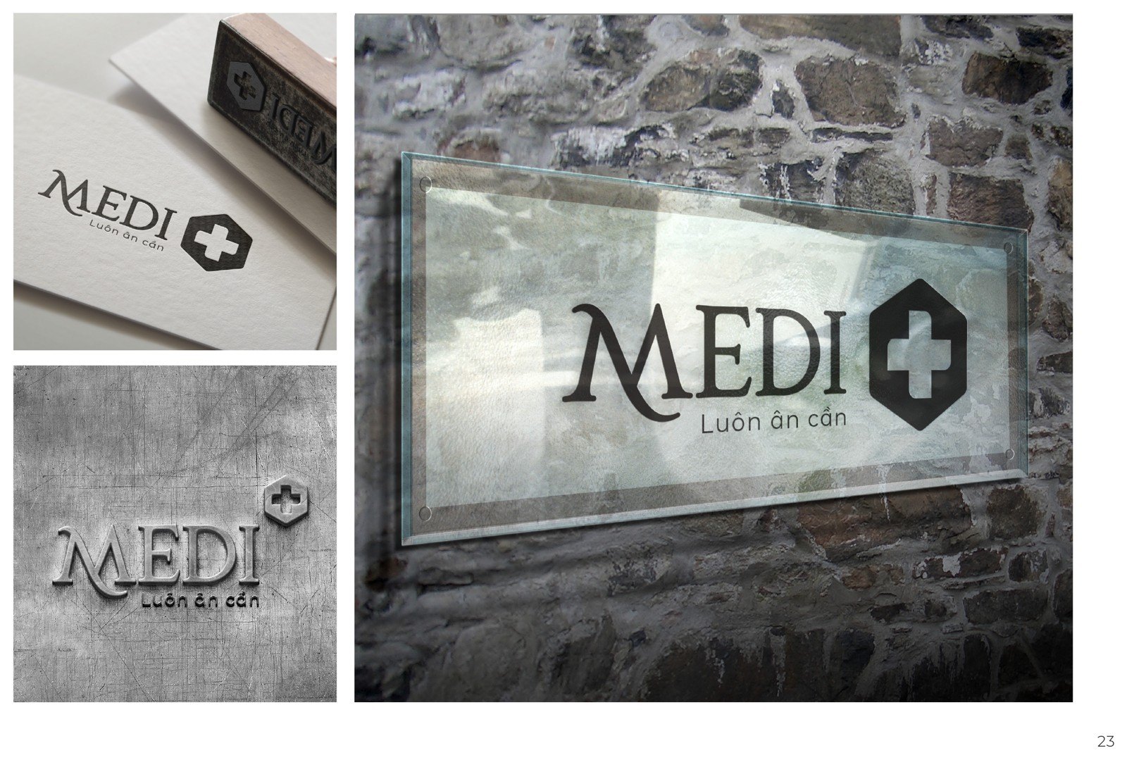
The MEDI Plus symbol is a hexagon, with a medical cross hollowed out inside it so that ground and light pass through. The cross is not rigid, it carries a small rhythm of movement, like a breath. The word MEDI sits beside it in a slender serif, balancing the rigor of medicine with the softness of care.
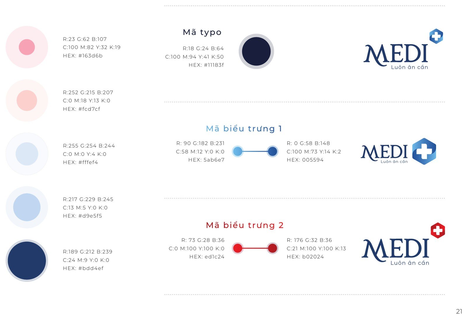
Around the symbol sits a system: deep navy for trust, cyan for freshness and cleanliness, a honeycomb pattern that runs lightly like cell tissue. All of it is held inside a standards guideline, so that logo, color, typography and breathing room always land in the right place. Because of it, a sign built by a contractor and a newsletter made by staff are still the same MEDI Plus.
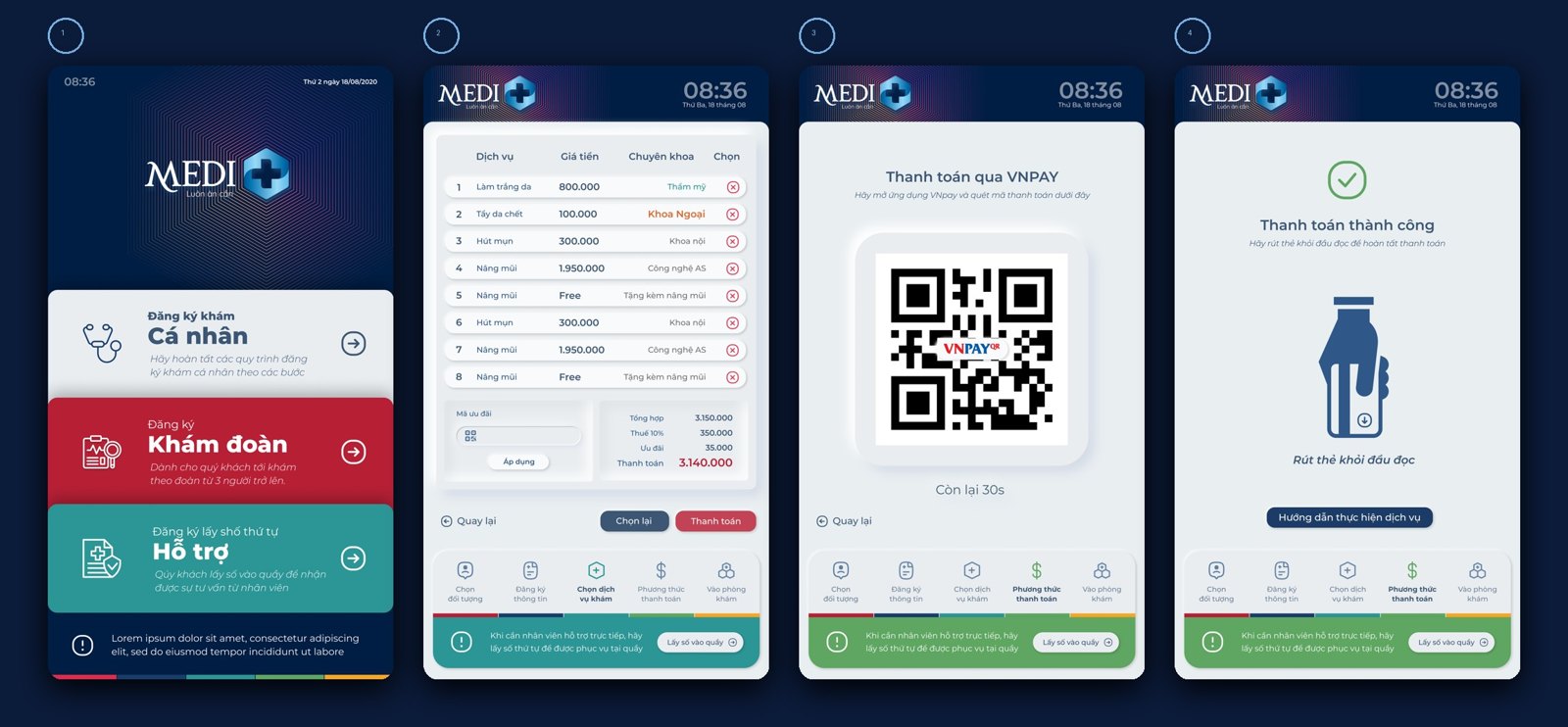
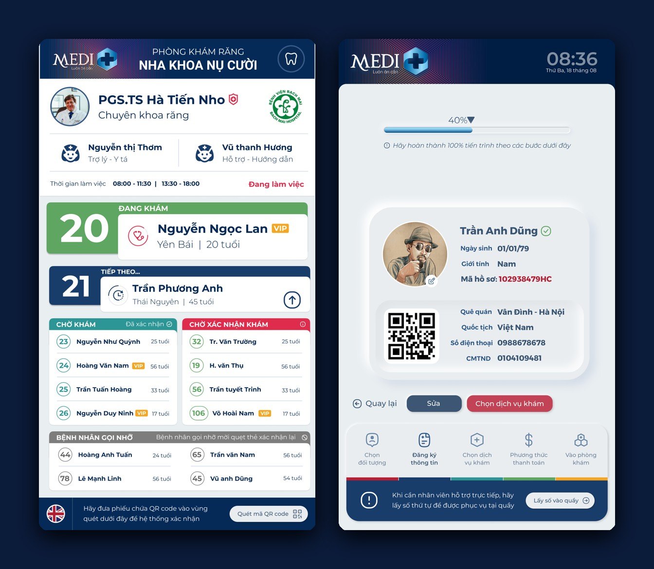
What sets MEDI Plus apart is not the sign, it is the moment a patient walks in. Instead of crowding at the counter, they stand before a kiosk and move gently through each step: choose who they are, enter their record with a QR code, choose a service, pay, then receive a number for the room. A process that used to be tangled is now arranged into a straight line anyone can follow.
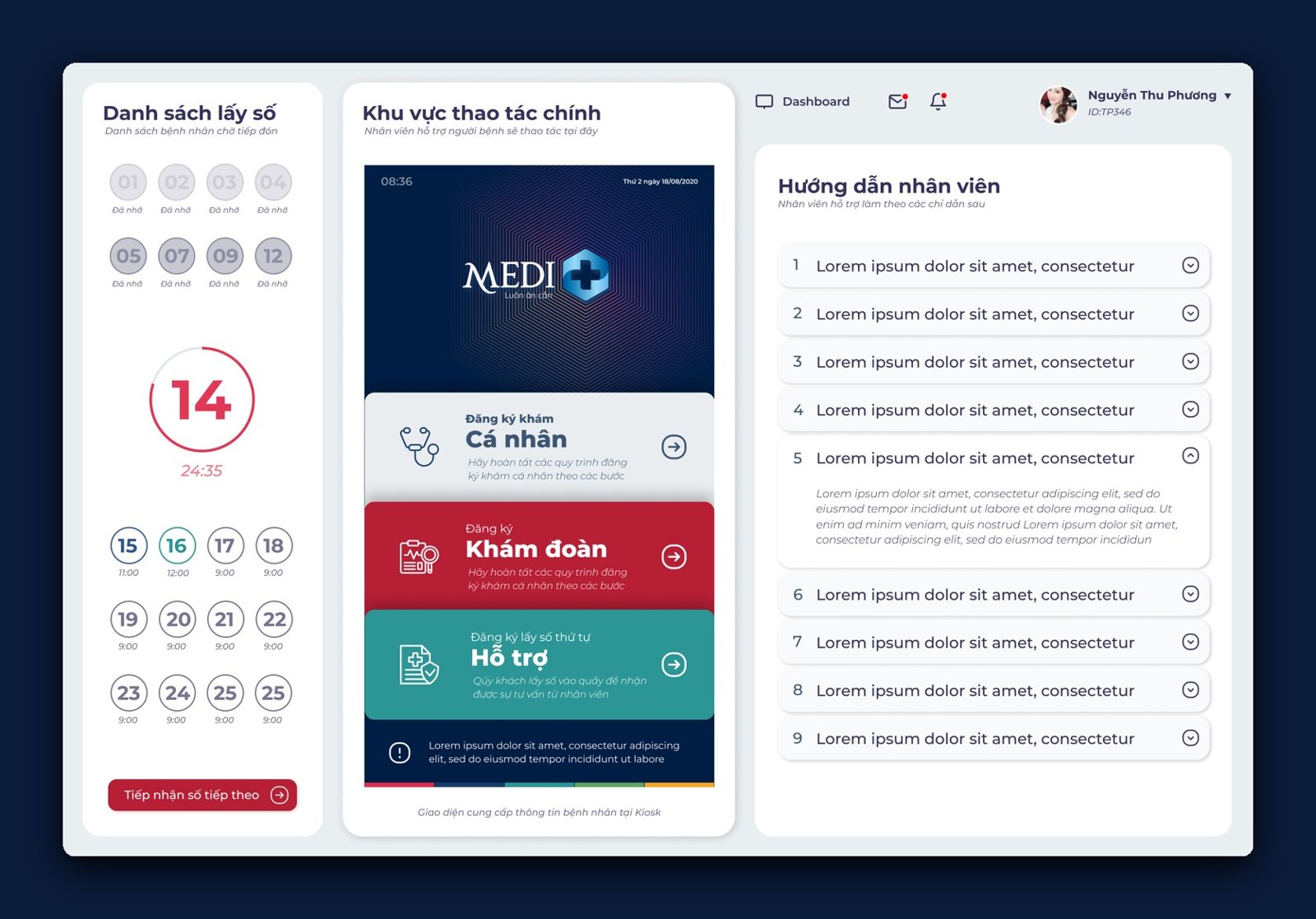
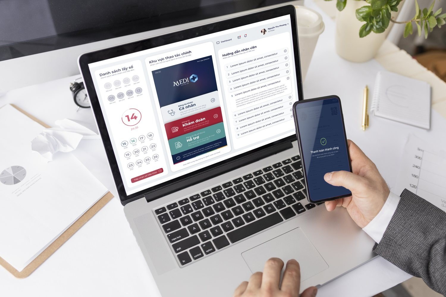
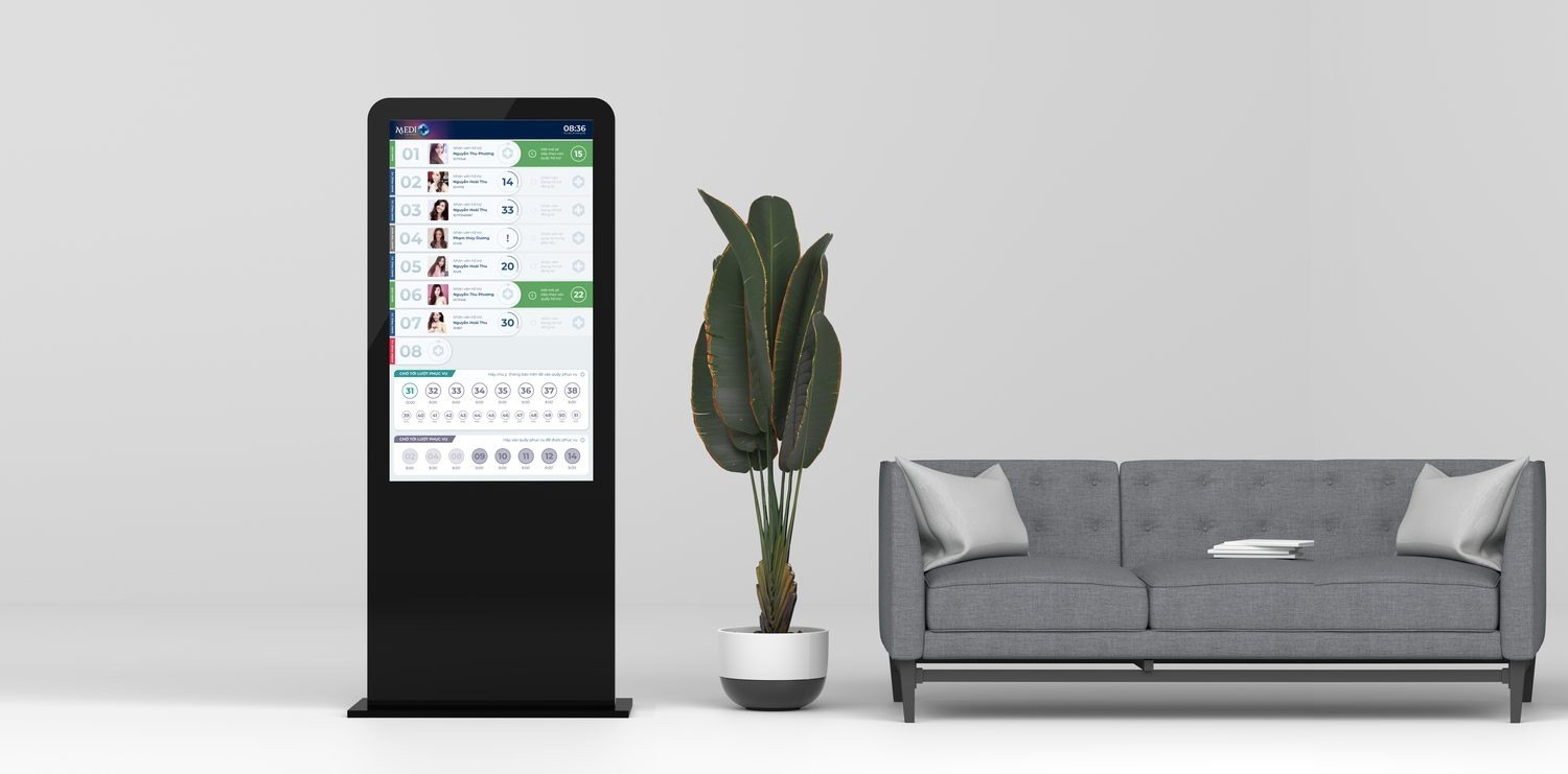
Behind that screen sits a whole interface system: an operating screen for reception, a queue display outside the clinic, an electronic record that follows the patient. We designed every screen to speak the same language as the sign in the lobby, the same navy, the same cross, the same clarity. Technology here does not show off, it steps back so doctors and patients can be closer to each other.
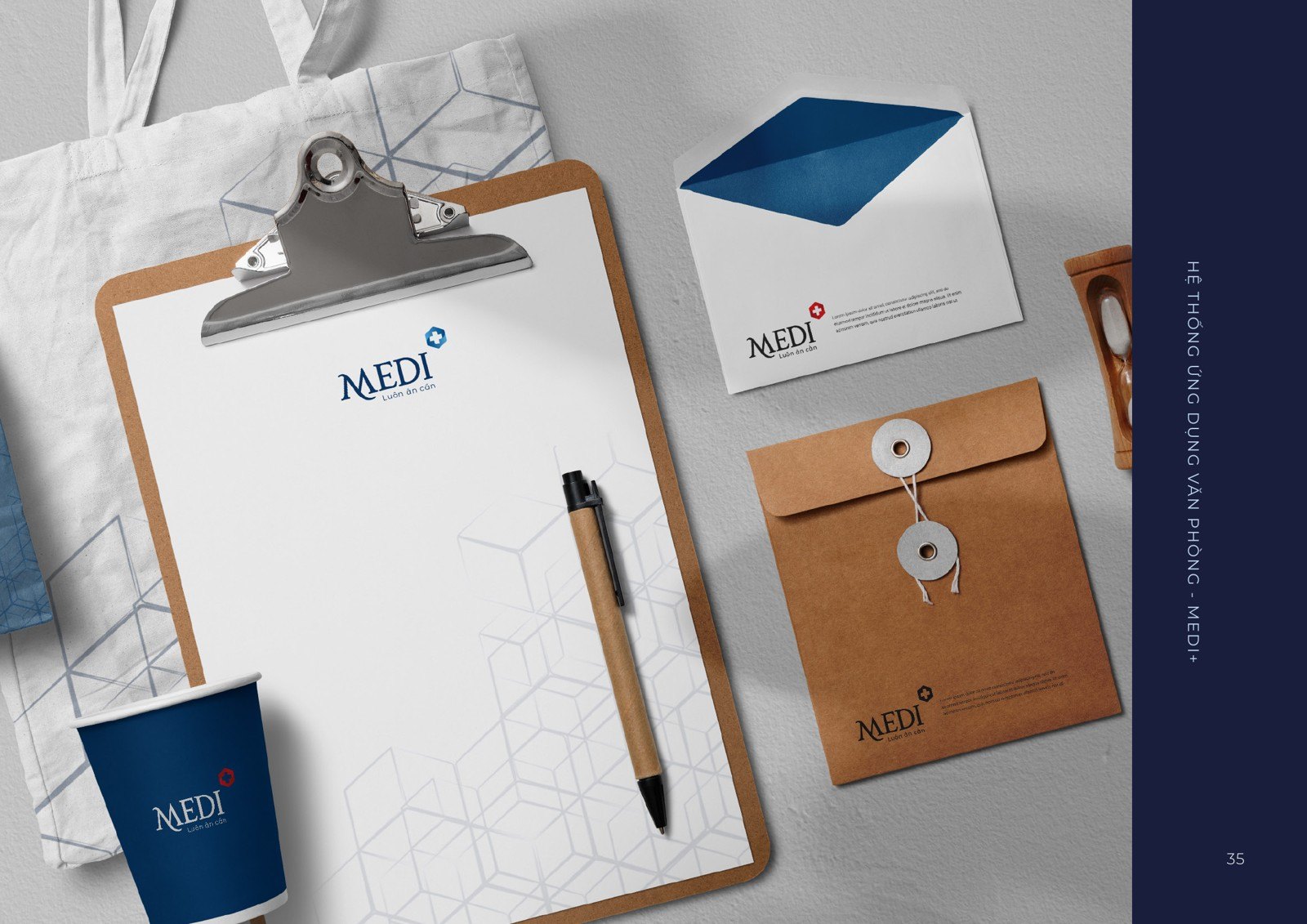
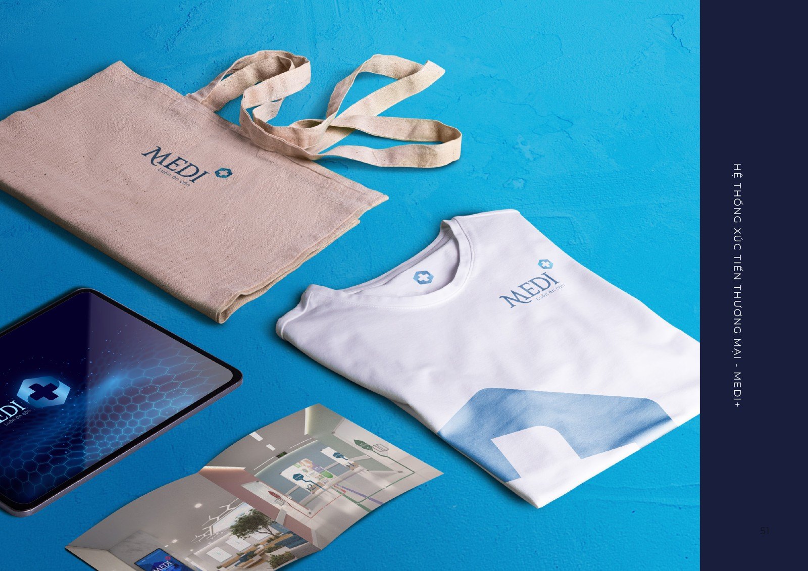
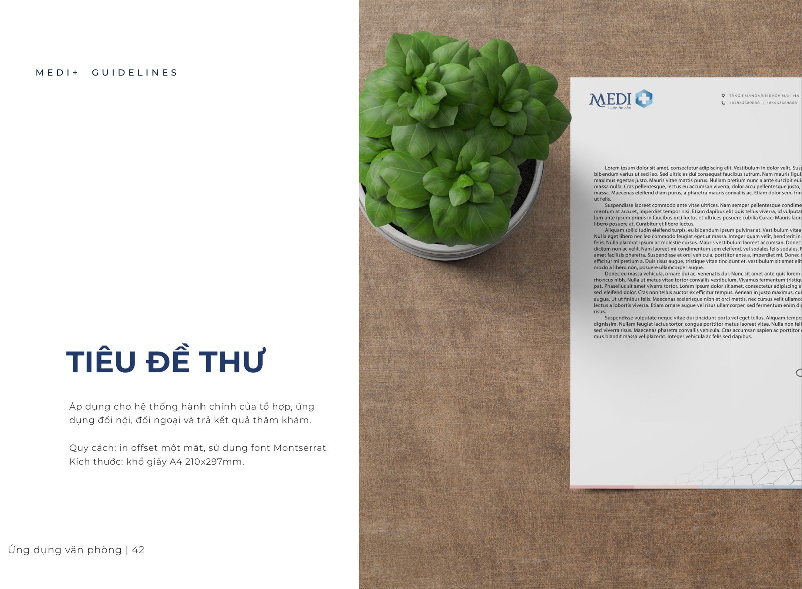
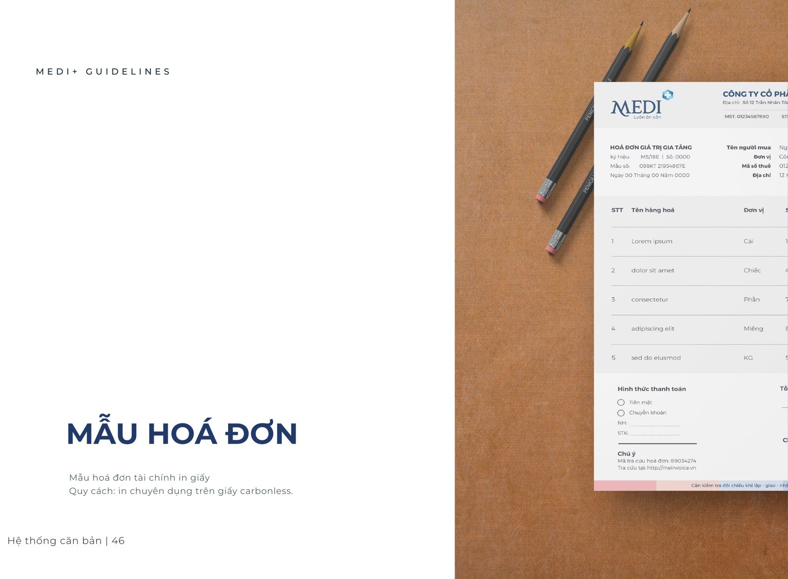
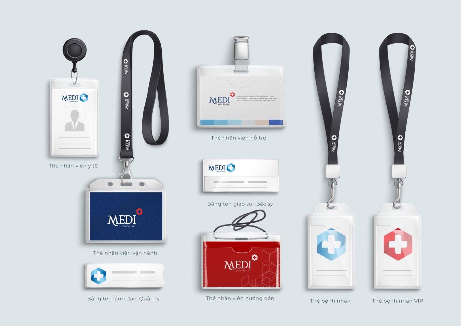
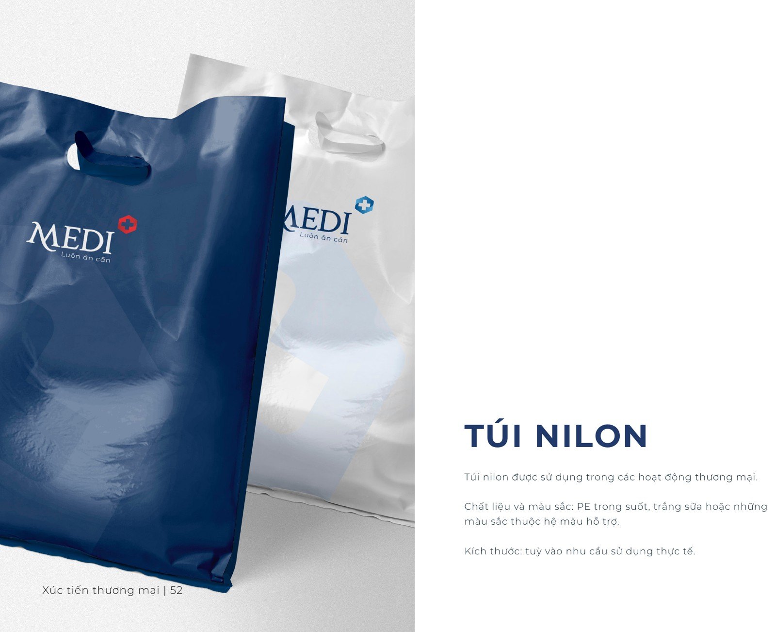
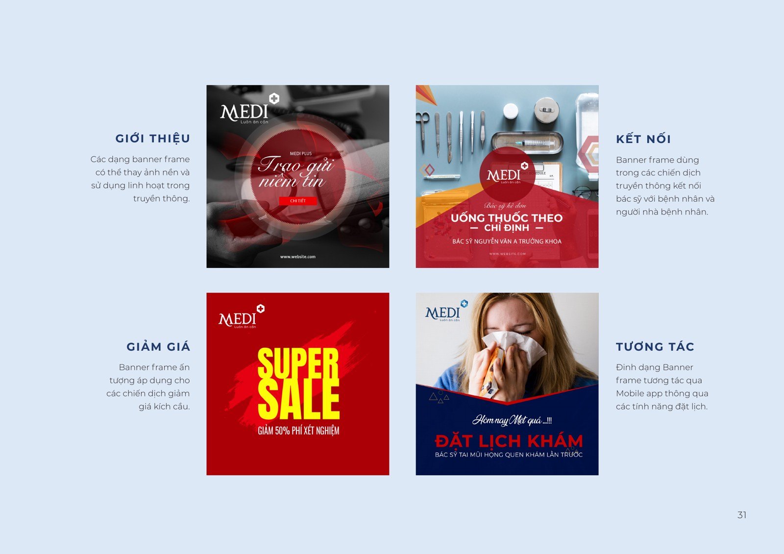
A medical complex produces hundreds of things every day: capability profiles sent to partners, invoices handed to patients, membership cards, envelopes, cups, bags, uniforms, signage for every department. We built all of it as one set, so that whatever someone holds in their hand, they recognize MEDI Plus.
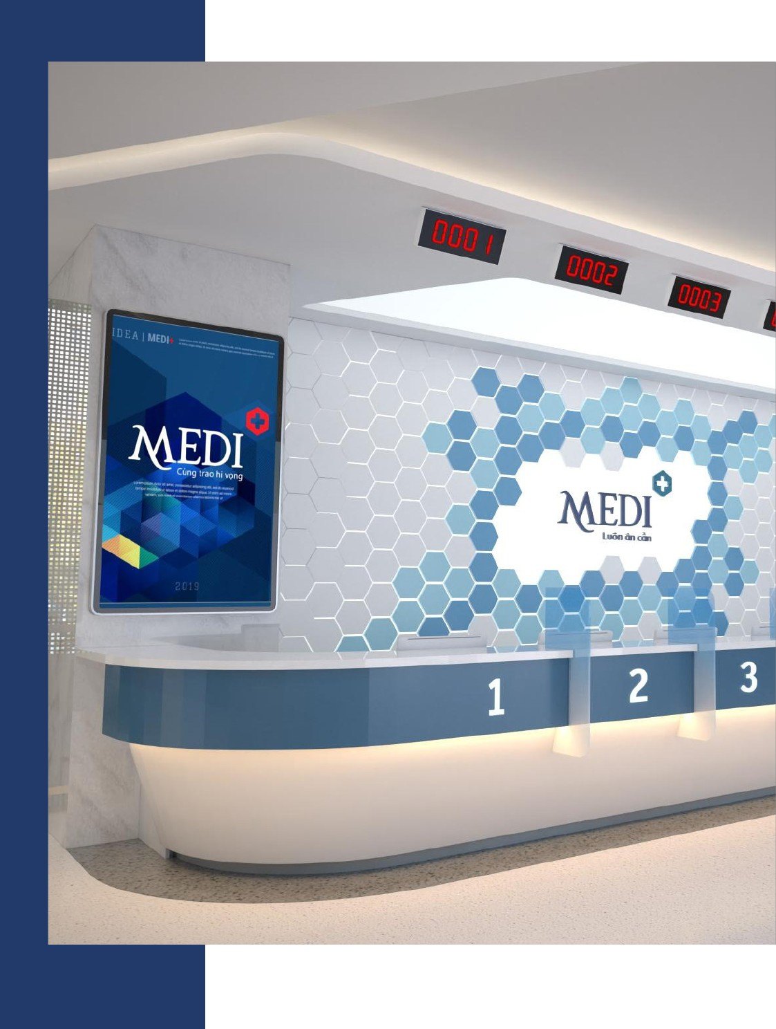
In the space, the cross is embossed on stone, printed faintly on glass, lit on the facade at closing time. Out in the world, the communication imagery keeps the same mold, so that every time MEDI Plus appears, the brand is recalled intact. That consistency, accumulated across every touchpoint, is what builds trust.
The process
Positioning
Settling the position of a new kind of medical complex and the spirit of care as the measure for every choice.
Identity and standards
Building the symbol, color system, typography and the guideline that keeps it all consistent.
Digital system
Designing the self-service kiosk, the operating interface, the queue display and the electronic record.
Rollout and handover
Bringing the identity to signage, print, space and every touchpoint.
The result
What MEDI Plus received was not a logo, it was a complex that knows how to speak in one voice. From the sign on the street, to the reception desk, to the ticket screen, to the invoice, everything conveys one thing: here, the patient is looked after.
The ambition of a new kind of medical complex has now taken shape, with a digital system that places the patient at the center. What Sinh Vũ built is the framework that lets that ambition grow without losing its voice: one more facility, one more service, one more screen, and the care stays intact wherever it touches.
One MEDI Plus, consistent at every touchpoint
Is your problem similar to MEDI Plus?
Tell Sinh Vũ what is on your mind about your brand or customer experience. Sinh Vũ will point you to the right direction right away.