
Callidora, beauty from the root
Callidora, a skincare cosmetics brand, had Sinh Vũ build a feminine, premium identity system that keeps its promise of beauty from healthy skin from the very first glance.
The problem
In cosmetics, what a customer applies to her skin is invisible, but what she sees first is the box, the label, the name. However good a serum is, if it wears a cheap face, it struggles to clear the first doubt: is it safe, is it trustworthy enough to put on my skin. For cosmetics, the brand is not decoration, it is a promise seen before it is verified.
Callidora chose a position that is difficult yet beautiful: beauty that comes from healthy skin, not from a layer of cover. A promise like that demands a face that is both feminine and trustworthy, clean yet refined, one that can stand on the shelf beside the big brands without losing ground, and one that lets a woman look at it and feel cared for.
The approach
Before drawing anything, we sat with the Callidora team to answer one root question: what does Callidora actually sell. Not a jar of cream, but the belief that healthy skin is the foundation of all beauty. Through that work, both sides agreed on one spirit: premium yet sincere, beautiful without showing off, caring for skin at its root rather than promising magic.
That position governs every choice that follows, from the letterforms to the shade of gold, so that wherever Callidora appears, it speaks in the same gentle, trustworthy voice.
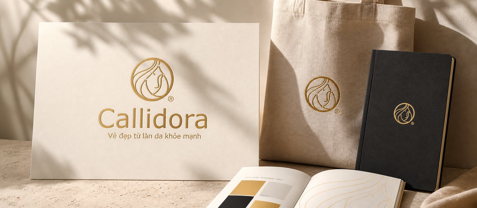
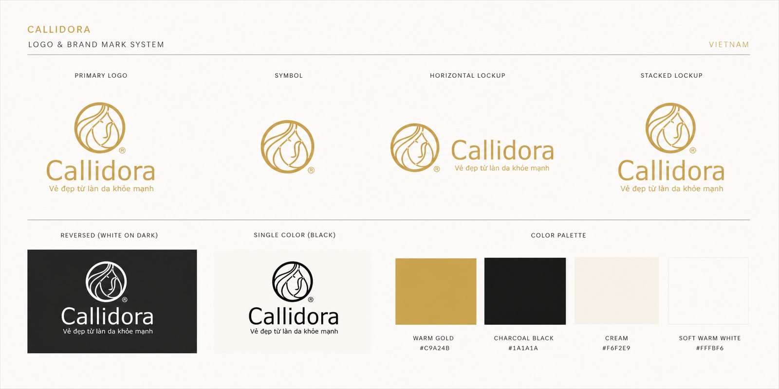
The Callidora mark is a woman's face with soft flowing hair curled into a circle, an image that is feminine yet refined, suggesting care and confidence. The letterforms are rounded and modern, soft enough for a beauty brand yet still clear and clean. A foil gold on cream and graphite grounds signals premium quality, a shine that appears at the touch, quietly speaking for the promise of quality without needing to boast.
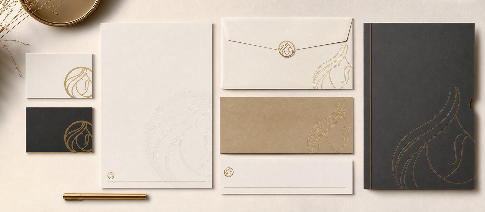
Beauty is not enough if every place uses a different version. We built an identity system with the logo, its variants, the color palette, and clear usage rules, so a business card, a bottle label, and a storefront sign remain the same Callidora. That is where an identity system differs from a logo: it keeps the brand's face equally beautiful at every touchpoint.
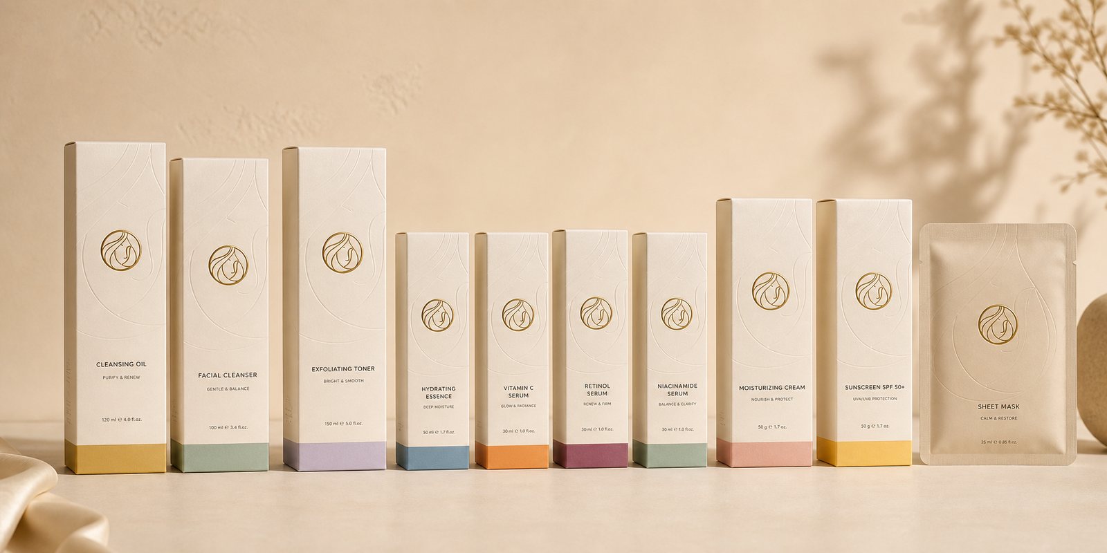
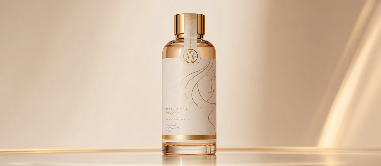
In cosmetics, the box is the first proof of quality. We designed the packaging system for Callidora's products, from the bottle shape and label to the foil stamping and embossing, so that every time it is picked up, the promise is confirmed again by touch. Clean, feminine, premium, confident enough to stand on the shelf.
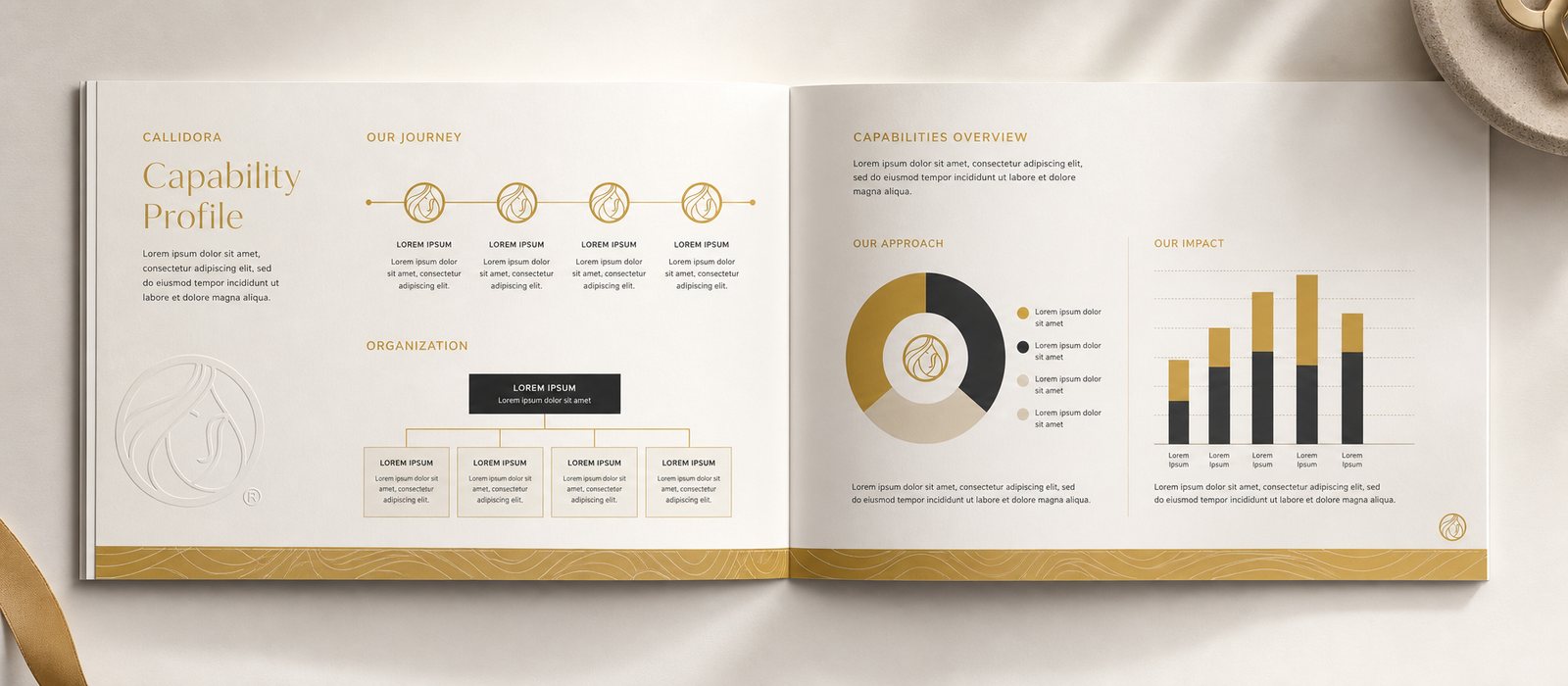
Alongside that came a set of corporate documents, what Callidora needs when sitting across from a distributor, an agent, or a partner. A polished dossier shows that behind the jar of cream stands a brand with a method and a vision, one worth trusting and worth ordering from.
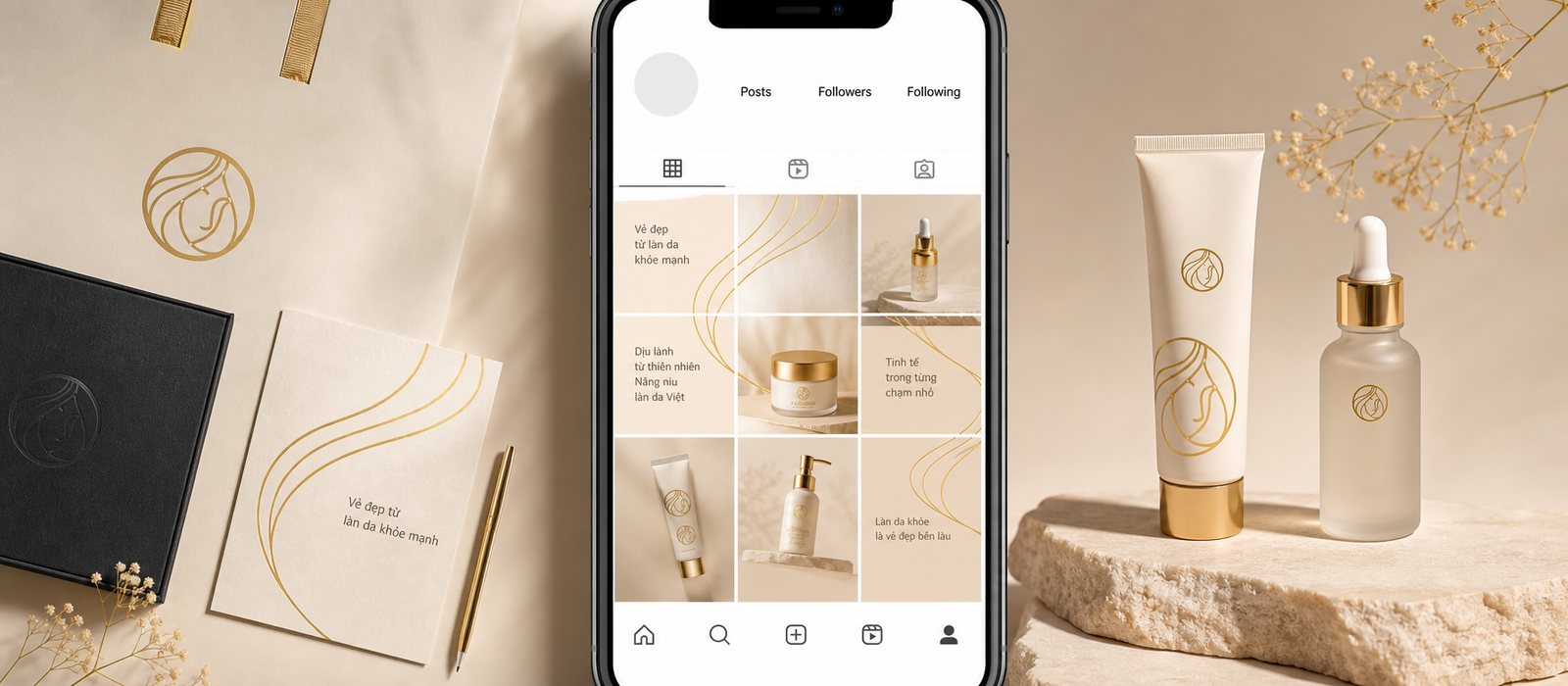
Cosmetics live on imagery. We built a campaign visual library with its own character, soft and luminous, so that Callidora's advertising and social media are recognizable at a glance, beautiful enough for customers to want to save and share.
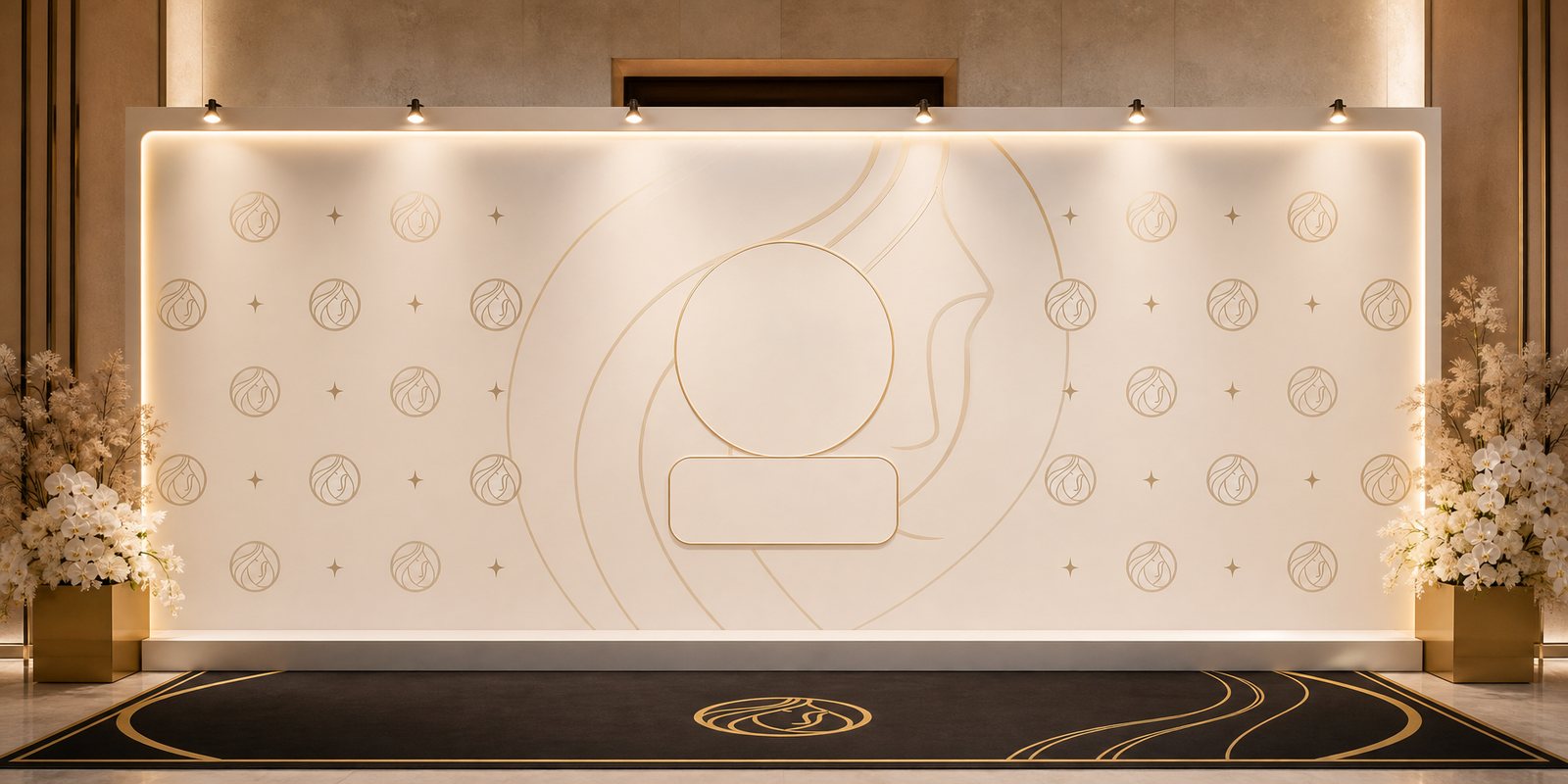
The story continues where customers meet the brand in person: event booths, signage, backdrops, standees. All carry the same Callidora face, so the experience flows seamlessly from a photo on a phone to a real-life counter. For a beauty brand, that consistency is itself the beauty of professionalism.
The result
What Callidora gained was not a logo, but a unified, trustworthy face running from the product bottle and box through to documents and event booths. Whether a customer meets it on a shelf, on a phone, or at an event, it is always the same Callidora, carrying the same promise of beauty that comes from healthy skin.
For a cosmetics brand, that consistency and sense of premium quality are exactly what shorten the trust gap between a new name and the decision to put it on one's skin. A beautiful, sincere face, held steady at every touchpoint, is the foundation on which Callidora is chosen and remembered.
Beautiful, evenly, at every touchpoint
Bottle and product packaging
Stationery suite
Campaign visuals
Corporate documents
Is your challenge similar to Callidora?
Tell Sinh Vũ what is on your mind about your brand. Sinh Vũ will point you to the right direction right away.