
JoyFM, a wave that cares for its listeners
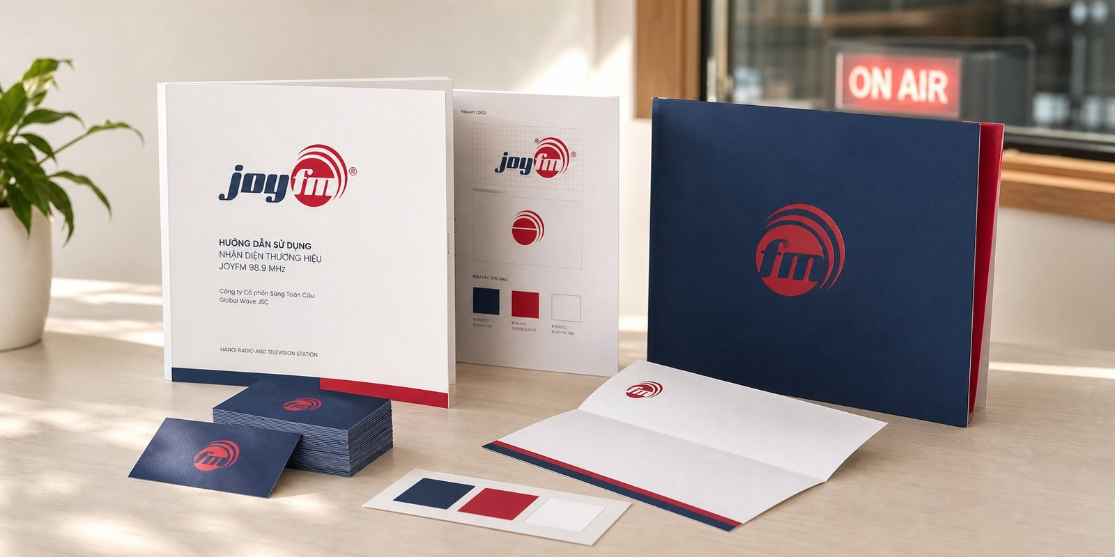
JoyFM is the specialised health radio channel of Hanoi Radio and Television Station, broadcasting on FM 98.9 MHz. Sinh Vũ built the mark, the guideline system and the corporate profile, so a channel that talks about health sounds as warm as a friend, not as cold as a clinic.
The problem
By the early 2010s, health information in Vietnam was scattered and often unreliable, and on the airwaves there was no dedicated, legitimate voice for it. Hanoi Radio and Television Station, with the health sector alongside, founded JoyFM as its third radio channel on 98.9 MHz: a channel devoted to health, broadcasting all day across many programmes for listeners of every age.
The task set for Sinh Vũ was not to draw a handsome logo. Health on the radio slips easily into the voice of a clinic, correct but cold, the kind people tune away from. Yet the channel's name was Joy. JoyFM needed a face that could say health and trust in a single glance on the dial, warm enough to keep people listening, and a system solid enough to live from the studio to the operator's corporate documents.
How we did it
Before drawing a single line, we asked where the channel should stand in a listener's ear. On the dial, health programmes risk the voice of a clinic: right, but cold, the kind you turn off. The name JoyFM deliberately puts joy before health, and we took that as its position: a health channel that sounds like a warm friend, for the whole family, knowledge told in a way that is easy to keep listening to.
That position became the measure for every decision. The red had to feel alive, not alarming; the letters friendly and leaning forward, not rigid; the whole voice warm rather than clinical. Each time we hesitated, we asked which choice kept both the trust and the warmth.
The mark had to earn trust and warmth in the same glance. So fm sits nested inside a red disc, from which broadcast waves rise like a pulse spreading outward. Beside it, joy stands in navy italic, rounded and leaning forward, friendly and in motion. Navy holds the composure of a broadcaster; red holds the pulse of life and energy, not an alarm. Read together, they are a wave carrying good news about health.
We tested the mark against the circle logos already familiar to Vietnamese eyes, to be sure its pulse read as broadcast rather than banking. It is the rising waves and the leaning wordmark that push the mark firmly into one place: radio, and friendly.
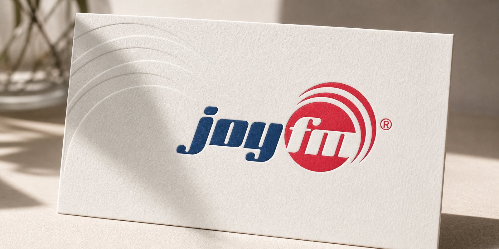
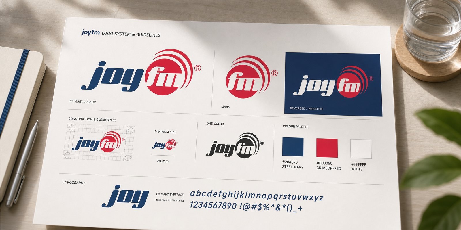
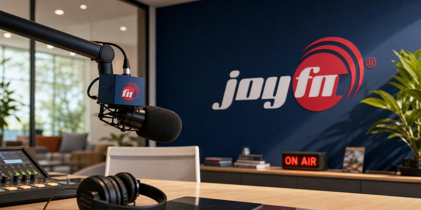
A radio brand lives in places that pull against each other: a dark studio backdrop, a white printed page, a small graphic on screen, a paper bag. So the mark was built into a positive and a negative version, with rules for clear space and minimum size, and variants tested to stay recognisable black on white, white on black, large or shrunk small.
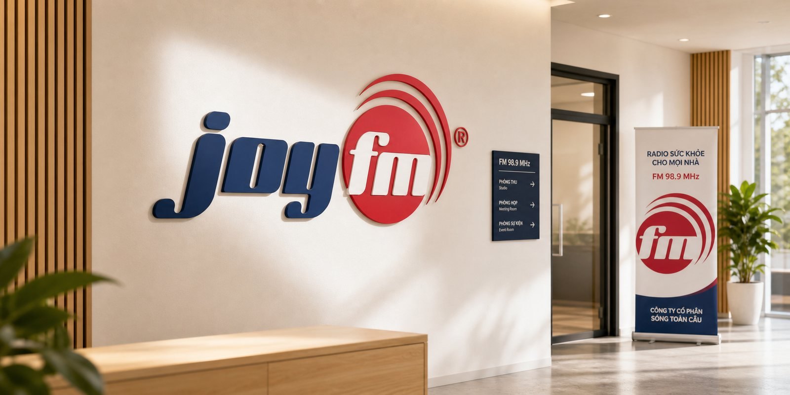
The value shows right here: whether on a studio wall or the cover of a profile, it stays one JoyFM, one voice across every surface.
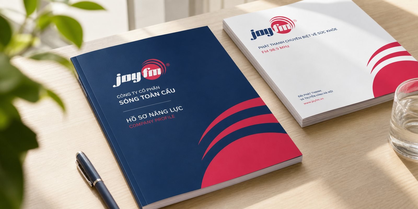
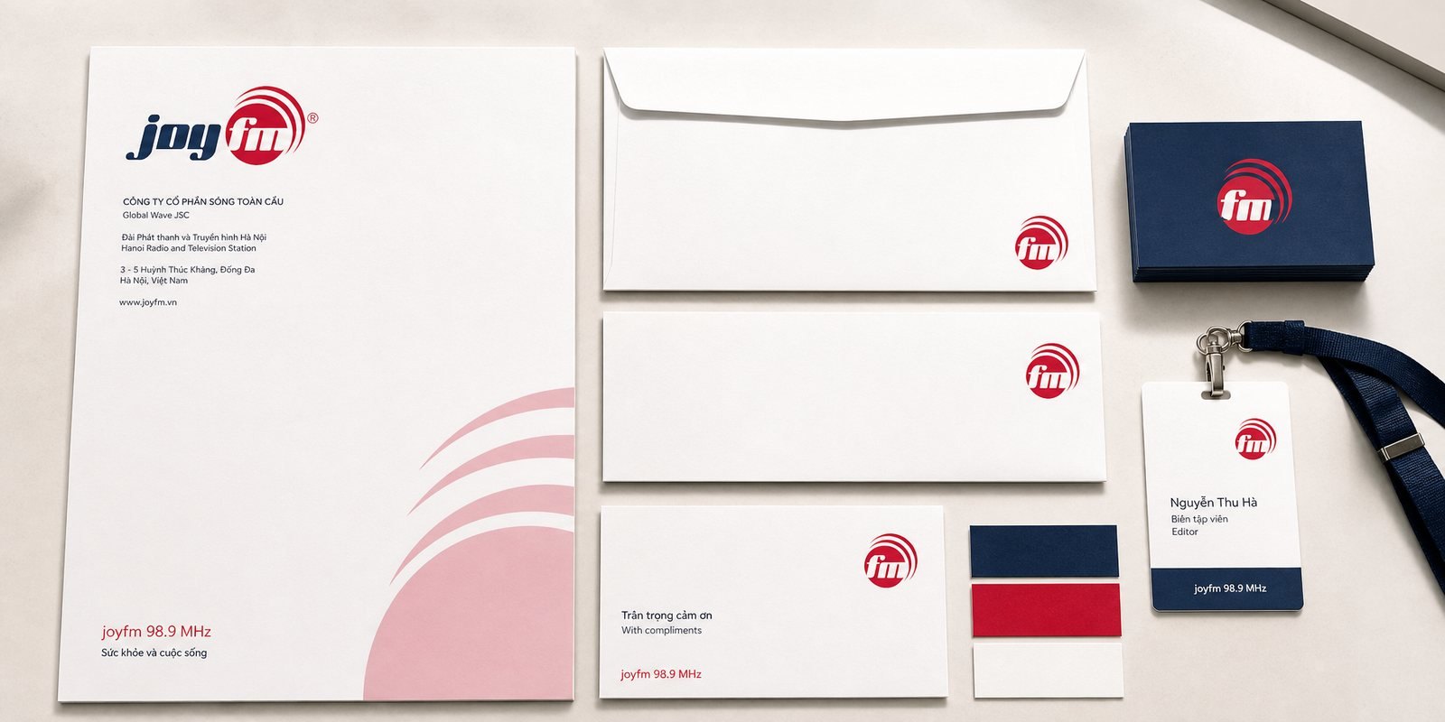
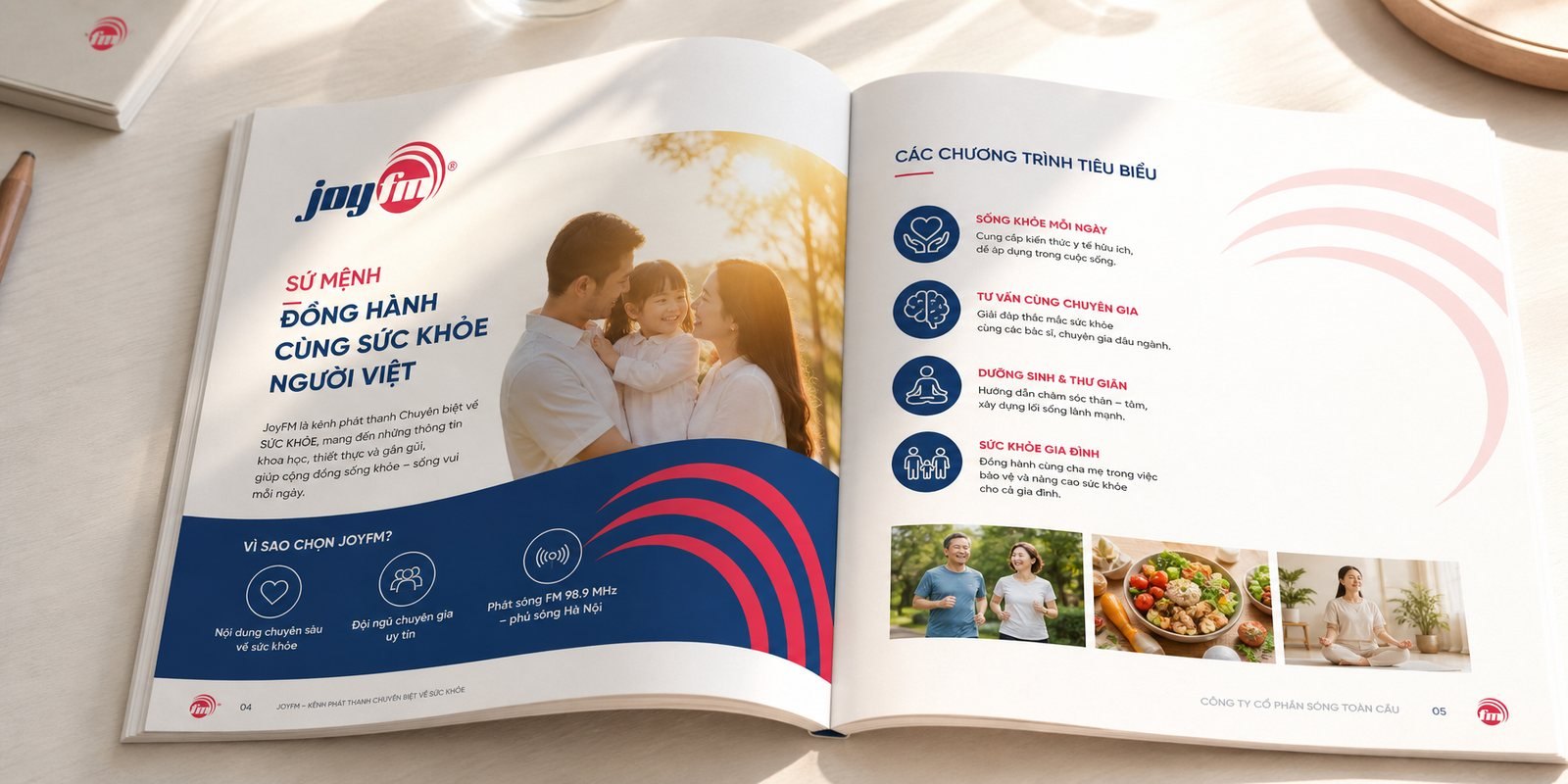
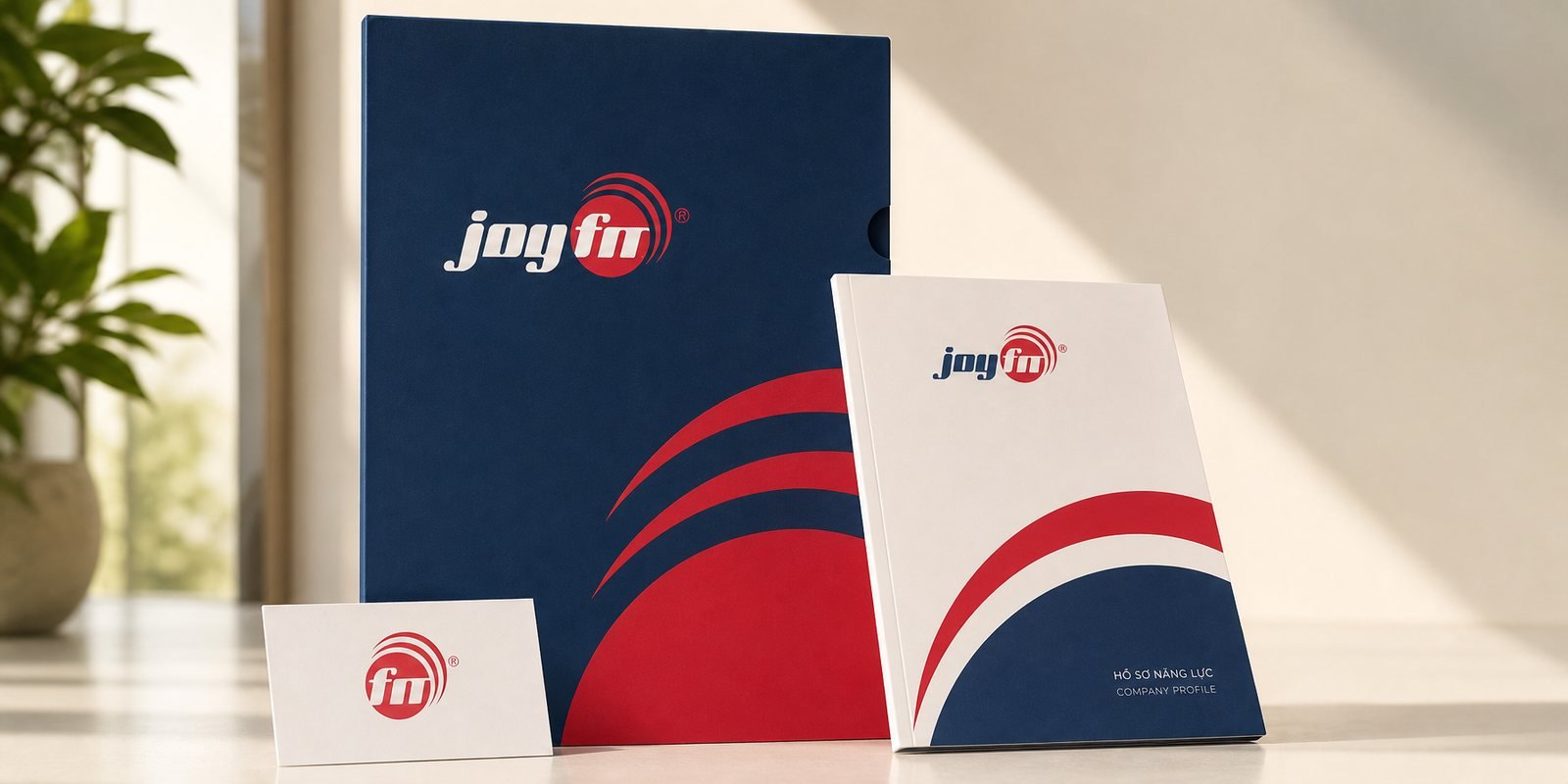
Behind the channel stands its operator, Sóng Toàn Cầu Joint Stock Company, and that company has to introduce itself to partners, advertisers and health institutions. We built the corporate profile and catalogue: the brand's warm yet composed voice carried onto paper a partner can hold. Wave motifs from the mark run across the covers and inside spreads, and the palette travels straight from the airwave to the page.
So the brand that welcomes a listener on air is the same brand that welcomes a partner in a meeting room, one voice, consistent, prepared and worthy of trust.
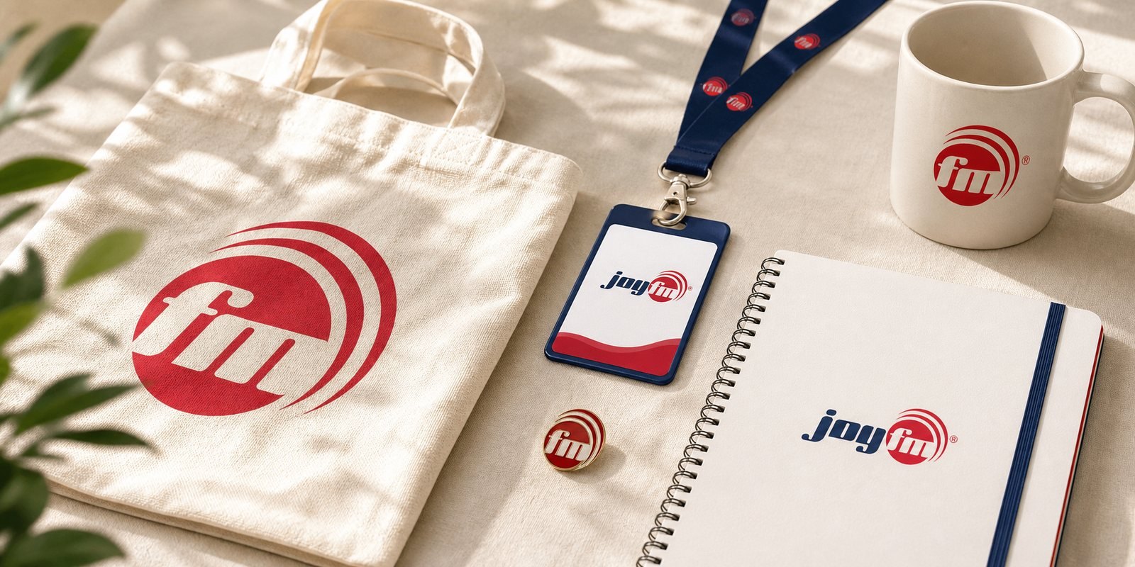
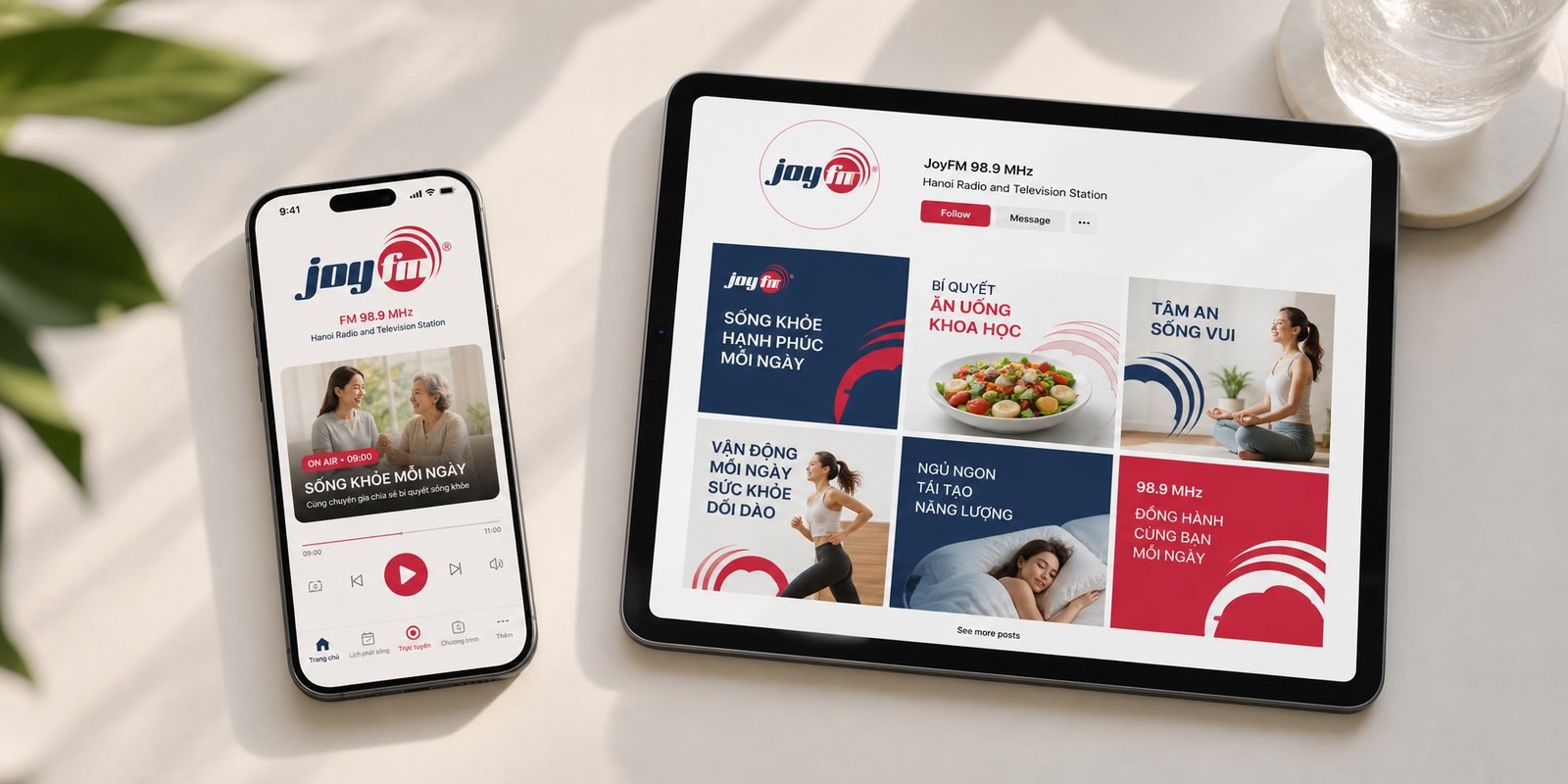
A radio brand is invisible by nature, it is sound. We gave JoyFM a life you can see beyond the airwave: on screen, in print, on a paper bag carried out of an event. Every surface applies the same mark and palette by the same rules, so the channel is recognised before it says a word.
JoyFM stops being only a frequency you tune to, and becomes a face you recognise.
The process
Joy first, then health
We settled JoyFM on the position of a health channel that sounds as warm as a friend, and made that the measure for every line.
A red wave
The broadcast-wave mark in its red disc and the navy joy wordmark were born together, with a full set of variants.
Positive and negative
A guideline so the mark stays itself on any background and at any size, from a studio wall to a tiny icon.
Off the airwave
Profile, catalogue, print and bag carried the mark out of the studio and into real life.
The result
JoyFM went on air at 98.9 with a face you read as health, but warm, in a single glance, and a system that held it together from the studio to the printed page. It grew into a recognised, dedicated health radio voice for Hanoi and the northern provinces.
The deepest value lies not in the logo or the handsome covers, but in the fact that a message about health could be welcomed instead of switched off. Warmth and trust were built into the mark itself, so the channel was free to focus on the thing that matters most: caring for its listeners.
JoyFM on show
The JoyFM identity stepping into the real world: from corporate stationery, the Sóng Toàn Cầu profile and catalogue, to the digital identity, the studio backdrop and event signage. One red broadcast-wave mark and one navy palette, consistent across every surface.
Does your brand look like JoyFM on day one?
Tell Sinh Vũ what is on your mind about your brand's face. Sinh Vũ will point you to the right direction straight away.