Every spa looks the same
The same lotus, river stones and brown-gold palette as a hundred other spas.
Find a feeling of your own that is real (origin, method, atmosphere), then hold it at every touchpoint.
Start from this problem
Clients remember a spa by how it feels to walk in, not by the name of a treatment.
Every spa promises relaxation. Sinh Vũ gives your spa a feeling of its own, consistent from the sign to the towel, so clients remember the name and come back.

Three things: a feeling of its own that stays consistent at every touchpoint, a treatment menu that is easy to understand, and visible signals of cleanliness and privacy. Without them, a spa is easily compared on price.
Scent, light, material, voice: all telling one story.
Clients know what each treatment does, how long it takes and who it suits.
Towels, rooms and process cared for where clients can see them.
All sell relaxation, but clients of each kind are looking for something different.
Their customersWorking women who come for a treatment series or a special occasion.
Brand challengeStand out when competitors also have nice beds, warm lighting and essential oils.
Their customersClients who come in groups or alone, often, to unwind.
Brand challengeLook reputable and skilled, so clients feel safe recommending the shop to family.
Their customersGuests who book a short slot and rarely return.
Brand challengeCarry the character of the property, distinct enough that guests book during the trip.
These are the places spas tend to lose clients that skill can't save.
The same lotus, river stones and brown-gold palette as a hundred other spas.
Find a feeling of your own that is real (origin, method, atmosphere), then hold it at every touchpoint.
Start from this problemTreatment names sound alike, clients can't see the difference and choose on price.
Name and present treatments by what clients need, stating what is done, how long it takes and who it suits.
Start from this problemWomen hesitate to walk in and regulars hesitate to invite family, because massage shops are often wrongly judged.
Real photos of the staff and the treatment rooms, neat uniforms, and treatment names that say plainly what they do for the body.
Start from this problemClients fear paying in advance and then the spa changes hands or closes, so they only come with a discount voucher.
A consistent brand, clear information on card terms and real photos of the team: so clients trust the spa will still be there.
Start from this problemA regular praises one location, then at the other finds the greeting, the scent and the way towels are laid out different.
Write a short guide: greeting, welcome routine, scent, towel setup, so the manager and therapists at any location can follow it.
Start from this problemAt the Experiencing stage. The photos online are lovely, but if the waiting room is noisy, the towels are worn and the greeting is rushed, clients feel let down and don't return.
Touchpoints are the places where clients see, touch or hear about the spa. You don't need to do everything at once. These five touchpoints create most of the feeling clients take home.
Clients decide whether to walk in.
Helps clients choose right and choose less on price.
What clients touch and remember longest.
Clients search on the map and message on Zalo before they come; the name, photos and greeting there are brand too.
A reason to return that doesn't need a discount voucher.
Listed in the order to do them. A newly opened spa can stop at step three; a spa chain goes all the way.
Name, mark, color and type that carry a feeling of their own.
Treatment menu, membership card, gifts.
A photo set of the space and treatments.
Design of the sign and branded items at the spa, with production-ready files for the workshop.
When you open a branch: guidelines so every location has one feeling.
Spa clients decide at the entrance and remember the towel long after, so the colors must be easy on the eye, look clean and keep one consistent voice across the sign, the treatment menu, the towels and the Zalo page. The type needs room to breathe and be easy to read on the treatment menu, so clients choose by need rather than by price.
 Common in this industry
 Common in this industry
 Unusual for this industry
 Unusual for this industry
The colors the industry often uses, as shown here, are estimates from working experience, not yet checked against many real brands. Use them as a reference, not a rule. Photos: Aditya Sethia, Tuccera LLC, Soheil Kmp, iKshana Productions / Unsplash.
Sinh Vũ has not published a spa project. The two below sit closest in feeling: refined hospitality, and premium beauty that isn't clichéd.
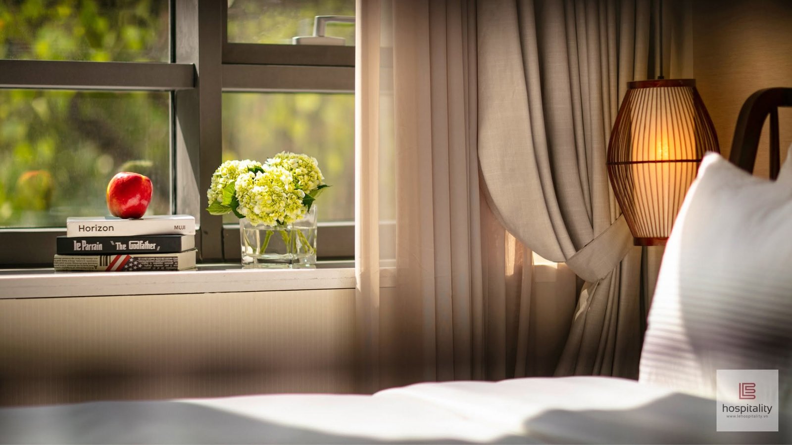 2020
LE Hospitality is a serviced apartment for Japanese guests living in Hanoi, a place where hospitality is measured by the things a guest has not yet asked for. Sinh Vũ built the positioning…
The spirit of welcome in a place to stay, built into a system of imagery and printed pieces.
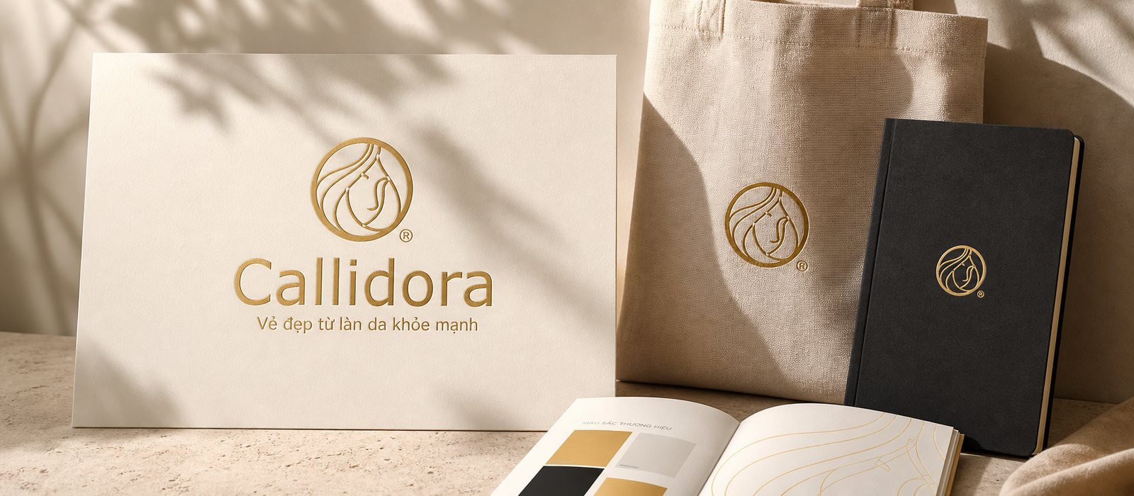
Callidora, a skincare cosmetics brand, had Sinh Vũ build a feminine, premium identity system that keeps its promise of beauty from healthy skin from the very first glance.
Feminine, premium beauty without being clichéd, in a skin care brand.
Free, no sign-up, right in your browser in a few minutes. Each tool points to one concrete thing to fix first.
 Start hereTouchpoint map for this business modelFor spas and massage, customers most often drop off at the Experiencing stage. The map opens with this business model so you can rate the five touchpoints to fix first.
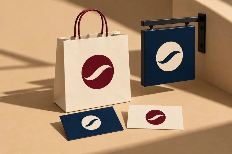 Touchpoint: Sign and entranceSee your logo on bags, signs and moreDrop in your logo. The tool picks colors from it and places your brand on 49 items: business cards, signs, uniforms, vans, packaging, screens. Download an A4 brand book.Open the tool
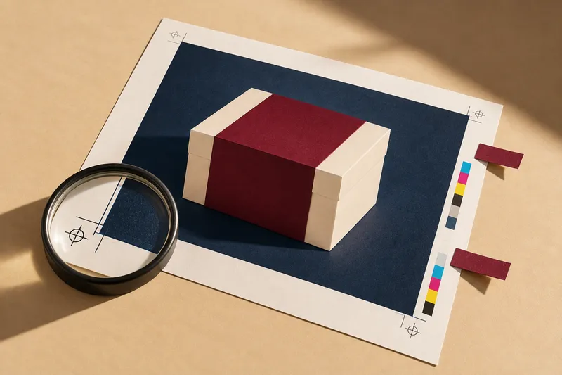 Touchpoint: Treatment menu · Membership card and giftsCheck a file before printingUpload a PDF and see its color mode, image resolution at print size, bleed and embedded fonts, before it goes to the printer.Open the tool See all the toolsMore tools for logos, packaging, print files and websites.Open the set
The principles behind it
At a minimum: positioning, logo, color, type and the things clients see first: sign, treatment menu, post template. If you plan to open a chain, you also need brand guidelines.
Name them for what the treatment does for the client (relaxing the neck and shoulders, restoring skin moisture) instead of generic names. A clear name helps clients choose faster and trust more.
Arrange it by client need, with each treatment stating what is done, how long it takes and who it suits. When clients understand it, they choose less on price.
Real photos of the rooms and the staff, neat uniforms, treatment names that say plainly what they do, and consistency from the sign to the posts. The service names on the sign and in posts should match the registered line of business; you should ask the local regulator which paperwork is needed before printing the sign.
It should have a name and feeling of its own, but within the hotel's system. Guests book quickly, so the service menu and imagery must speak clearly right in the room and at the front desk.
A few lines about the spa, your regulars and what is holding you back is enough. Sinh Vũ reads and replies within one working day.