
LE Hospitality, the serviced apartment that learned to bow
LE Hospitality is a serviced apartment for Japanese guests living in Hanoi, a place where hospitality is measured by the things a guest has not yet asked for. Sinh Vũ built the positioning, identity, application system and collateral so a Vietnamese name could learn to bow in the manner of omotenashi.
The problem
A Japanese family comes to Hanoi to live for a few months. They are not looking for a hotel room, they are looking for a place warm enough to call home, yet precise enough to feel understood. LE Hospitality was born to fill exactly that gap. But a place can be gracious in how it runs and still need a face that speaks of that grace before a guest walks in.
The problem was not comfort but language. A Japanese guest reads respect in detail: in neatness, restraint and consistency. The Vietnamese name, Lê, had to do two things at once, be international enough to feel professional and warm enough to feel like home. Sinh Vũ took on the part of turning the spirit of omotenashi into something visible, from the sign on the street to the signature at the foot of an email.
How we did it
Before drawing a first line, LE began with the question that comes before all others: where to stand in the heart of a Japanese guest far from home. Hanoi's lodging market split into two shores, standardised hotels, convenient but anonymous, and rented apartments, cheap but temporary. LE chose a third place to stand: omotenashi, a hospitality that treats a guest as if they had long been known.
The original positioning line the brand wrote for itself, in Japanese, holds all of it: ワンランク上, a notch above. Not louder luxury, only a little more where a guest can feel it, a pot of tea already warm, a pair of slippers turned to face the door. It became the measure: every later design choice asked again whether this detail lets a guest feel cared for.
The name sealed that stance. Lê is a Vietnamese family name, close and familiar. Written as LE and paired with hospitality, it steps onto an international stage without disowning its roots. A two-layer name for two readers: a Vietnamese sees warmth, a Japanese sees trust.
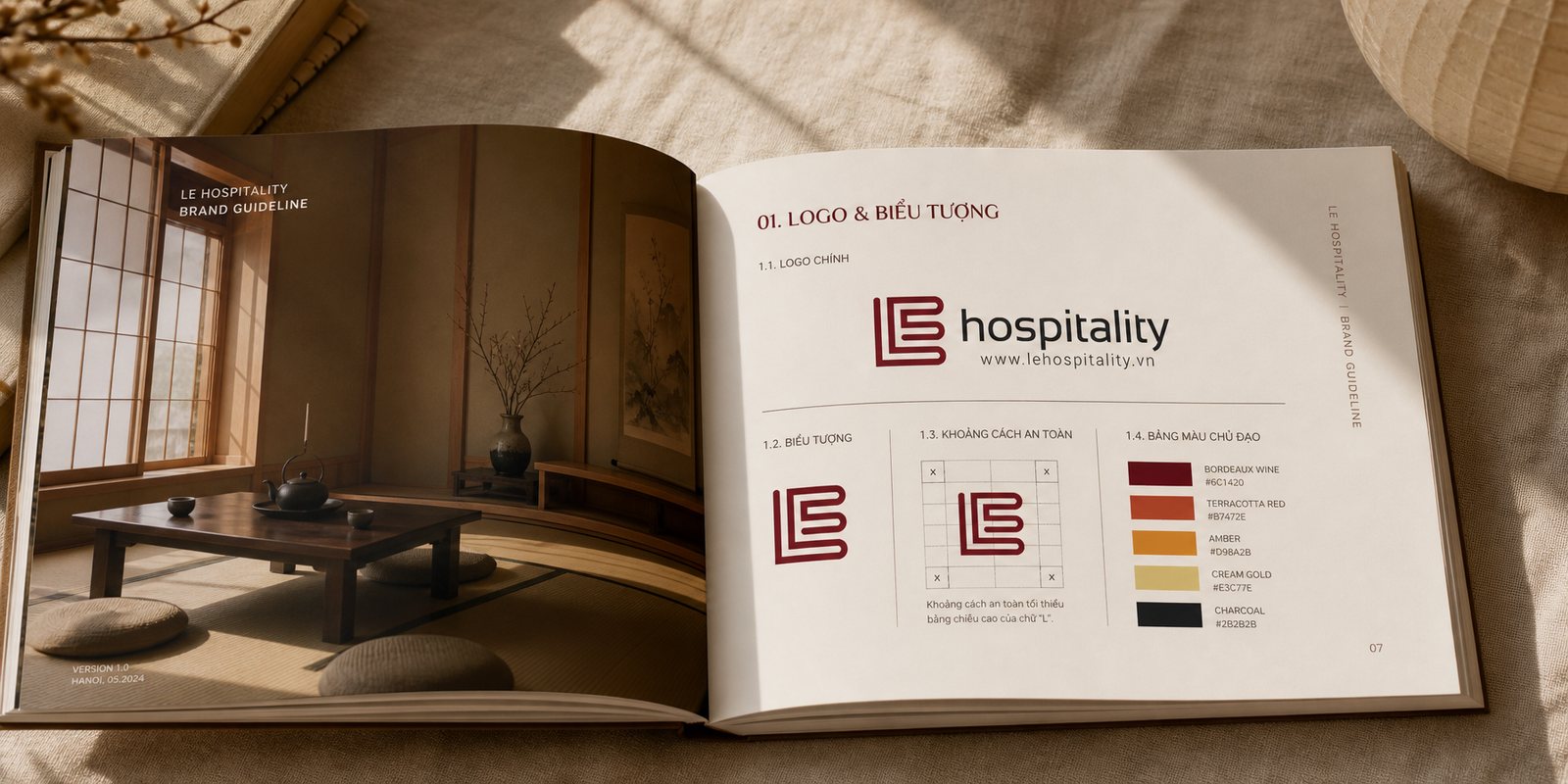
The first point of contact is a mark you must read in one beat. Sinh Vũ distilled the name Lê into a linked LE monogram: the E nested inside the L, its horizontal strokes drawn out into even bands. At a glance it is a stack of floors, or a book folding shut, orderly, still and neat, exactly what a Japanese eye is used to trusting.
That neatness is deliberate. Instead of flourish, the monogram takes thin even strokes, softly squared corners and perfect balance. It does not try to impress by being strange, but by being right, like a bow at the correct depth. The word hospitality sits beside it in a light lowercase, so the monogram keeps the lead.
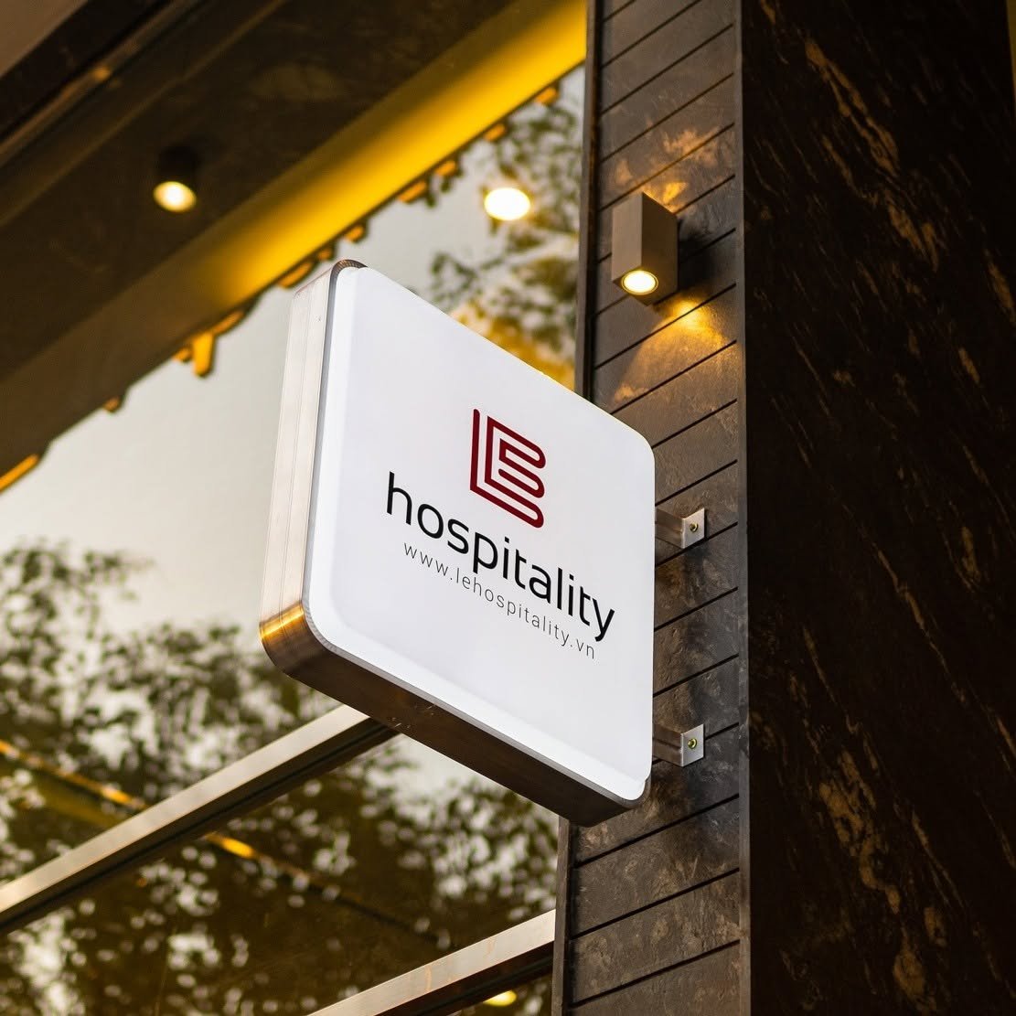
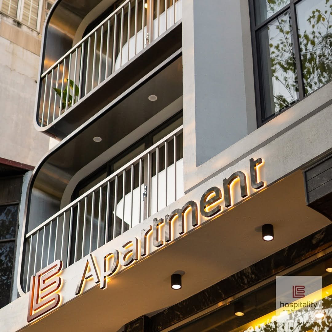
The value of such a mark shows on the street sign before a guest steps inside. A passer-by who knows nothing of the apartment already reads its care. The identity does the hardest part of its job at first glance: making a place for rent look like a place that keeps its word.
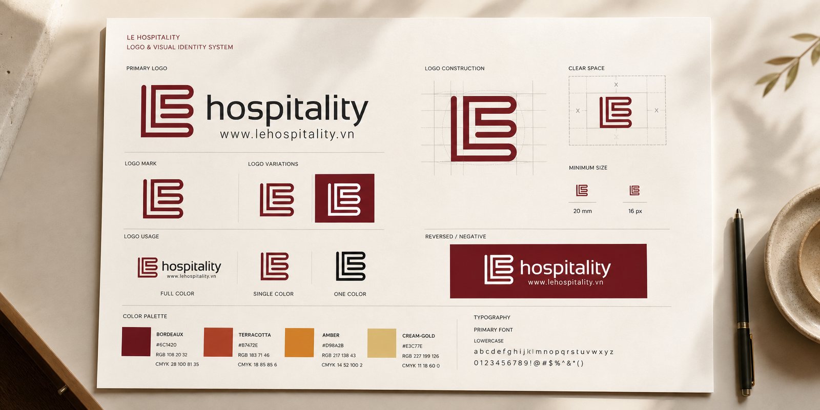
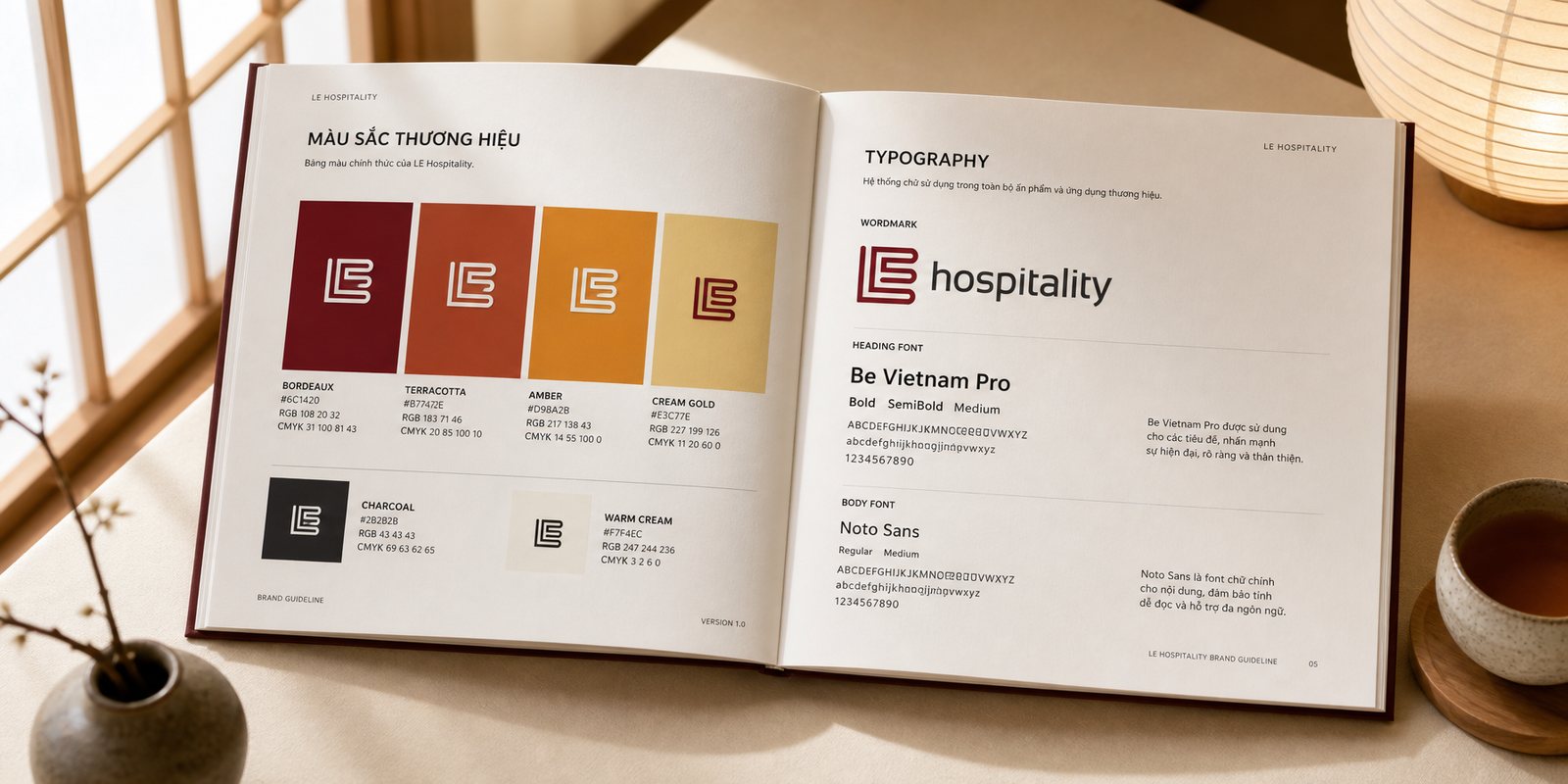
A brand this orderly risks turning cold, so the colour pulls it back toward warmth. Instead of industrial navy or hotel grey, LE takes a band of four earth tones: terracotta red-brown, amber, cream-yellow and a deep bordeaux as the lead.
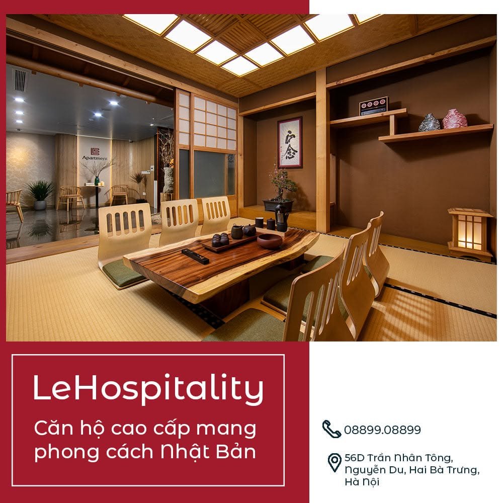
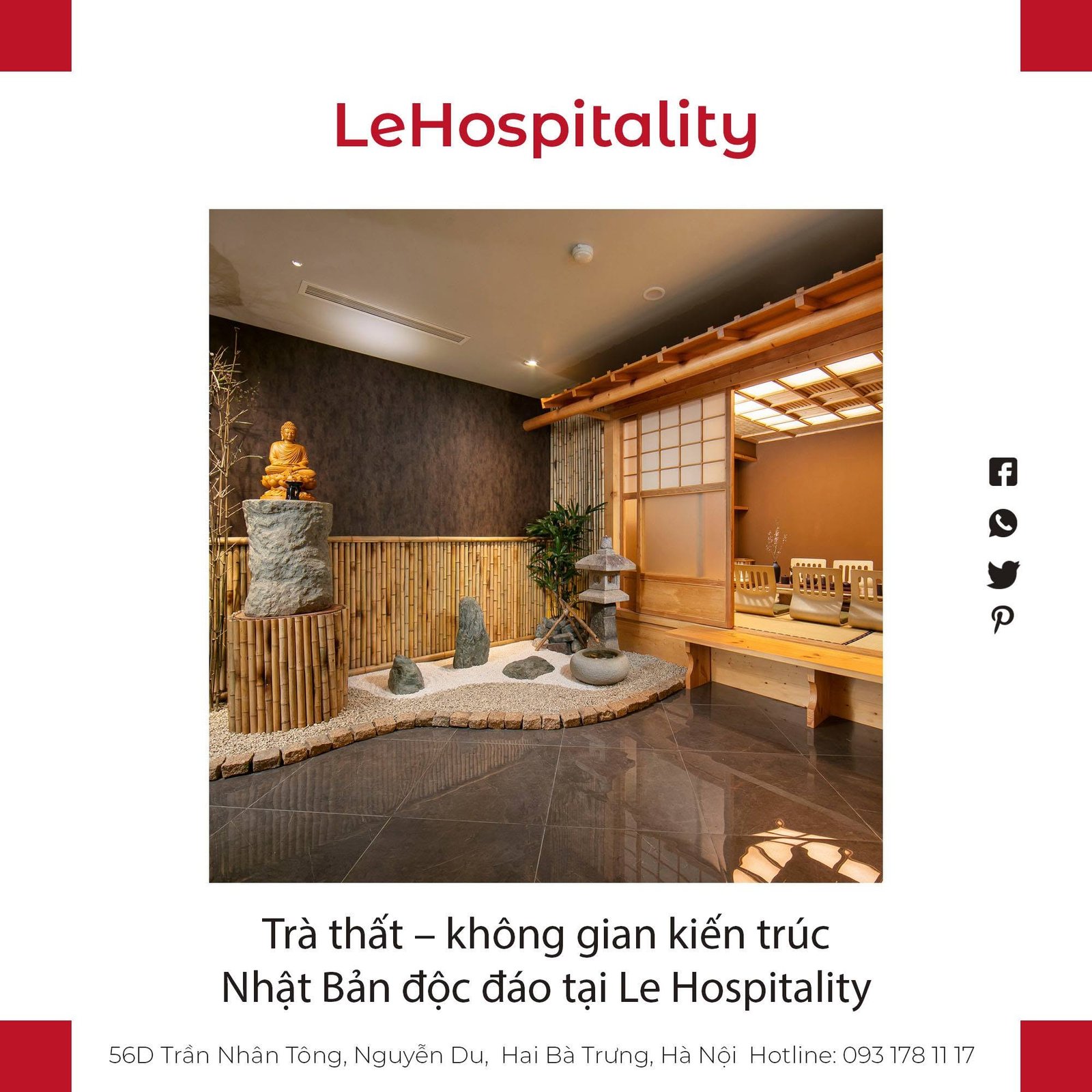
That band was not chosen at random, it is the colour of the space itself: wooden floors, straw-toned tatami, earthen walls, lantern light. Step into an apartment, then look at a business card, and a guest meets the same warmth. Bordeaux holds the formal part, the other three hold the closeness, enough for the brand to be serious without being dry.
Colour is what a guest remembers before the name. For LE, choosing earth over metal is a quiet promise: this is a place to live, not a place to lodge.
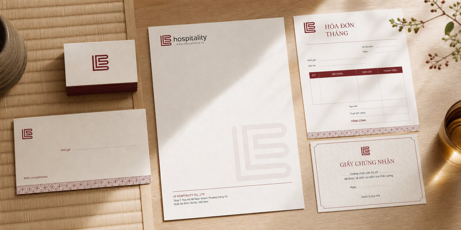
A long-stay guest touches the brand dozens of times a week, mostly in small places: the end-of-month invoice, the card at reception, the signature under a booking confirmation. That is where omotenashi is either kept or dropped.
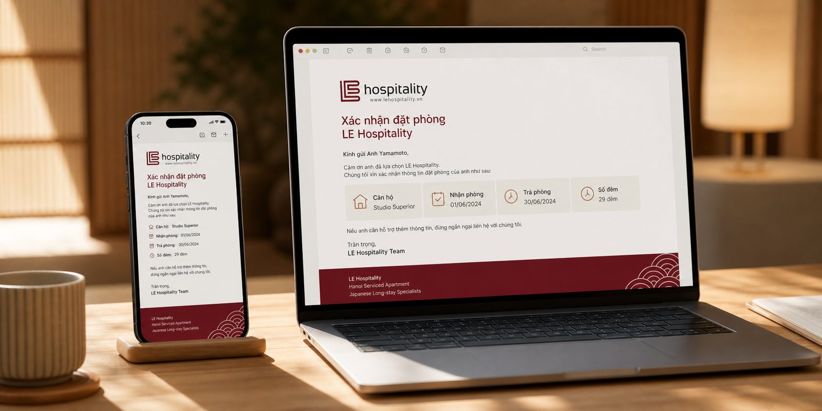
So Sinh Vũ built an office application system consistent from end to end: name cards, letterhead, invoices, certificates, email templates for phone and desktop. The same monogram, the same earth palette, the same neat setting of type. Not a single sheet slips out of the shared voice.
Consistency in the small details is how a brand says it pays attention. A Japanese guest reads exactly that: a place tidy down to its signature line is surely tidy in the places a guest never sees.
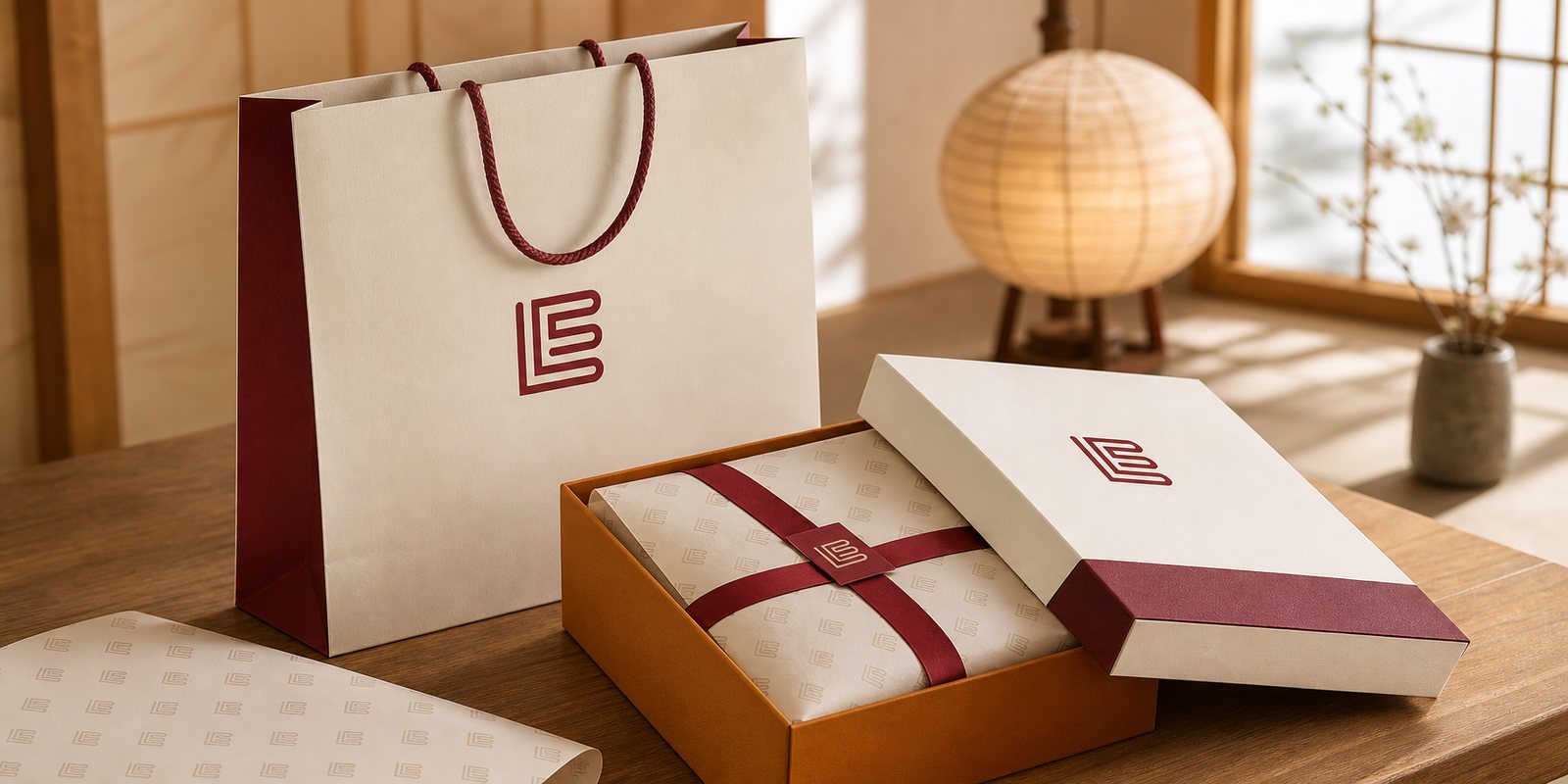
Omotenashi does not stop at check-in, it shows most clearly at the farewell. LE gives guests small things to carry home: a bag, a gift box, a layer of wrapping. This is the last touch, and often the one remembered longest.
Sinh Vũ designed that gift set as an extension of the identity: paper bag, box and wrapping share the same monogram and earth tones, handsome enough that a guest keeps them rather than throws them away. A well-wrapped gift is a thank-you that needs no words, and an invitation to return.
Gift packaging is where a brand is held long after a guest has left. For LE, each bag carried home is a piece of gracious Hanoi following a Japanese guest back to their country, and a reason to recommend this place to the next.
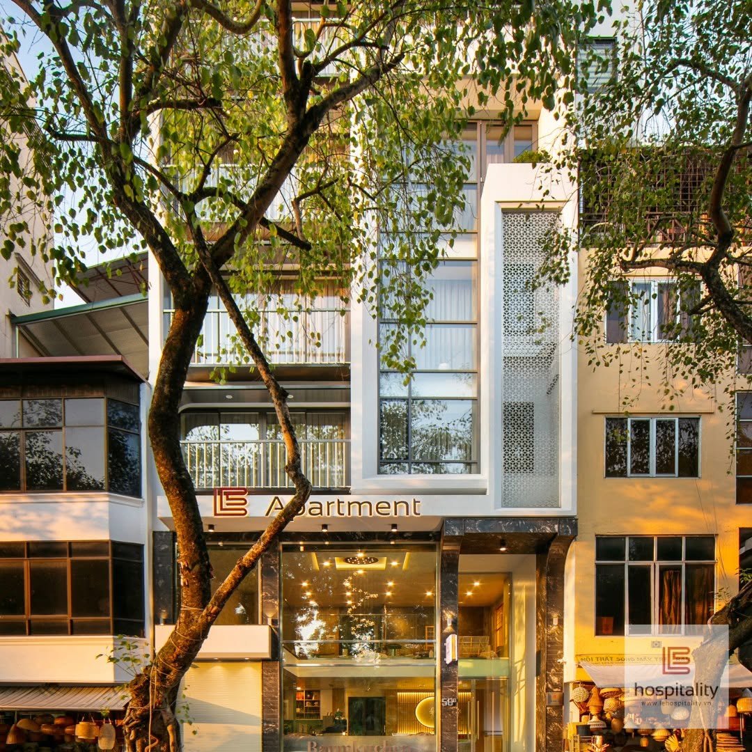
On Trần Nhân Tông street, the first thing a guest meets is not a person but a sign. Sinh Vũ set the monogram on a wall-mounted lightbox and raised the letters LE Apartment across the facade, so amid a crowded row of shophouses, LE appears trim and lit, inviting rather than selling.
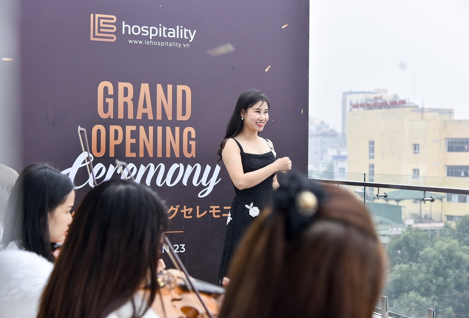
On opening day, the same identity spread across the stage: a bilingual Vietnamese and Japanese backdrop, so the first Japanese guest to walk in saw their mother tongue treated with respect. From the sign on the street to the event backdrop, all of it speaks in one voice.
Signage and event collateral are where a brand steps off the page into real life. Done right, they make a converted shophouse look like a trustworthy address before a guest even asks the price.
The process
Choosing omotenashi
Together with LE, we turned ワンランク上, a notch above, into the measure for every decision that followed: each detail asked whether it lets a guest feel cared for.
The name Lê becomes a mark
From that stance came the linked LE monogram and the band of four earth tones, giving the brand a face that is orderly yet warm.
Holding the voice at every touch
The office system and the gift set carried one consistent voice all the way through, from the invoice to the parting bag.
A lit sign, an opening
Signage and a bilingual opening ceremony brought the identity off the page and onto the street.
The result
What LE gained was not a handsome logo, but a face that speaks a guest's mind before they open their mouth. Japanese guests far from home, used to reading respect in detail, meet a familiar care at LE: a trim sign, a warm palette, a tidy invoice, a parting gift. A Hanoi shophouse, because of it, speaks the language of hospitality a guest thought they would only find back home.
The deeper value lies in consistency. When every touchpoint bows the same way, a guest no longer sees loose pieces but one place worth trusting. That is what an identity system can do and a single sign never can: turn hospitality, a thing by nature invisible, into something a guest can see, hold and carry home.
One voice, across the whole home
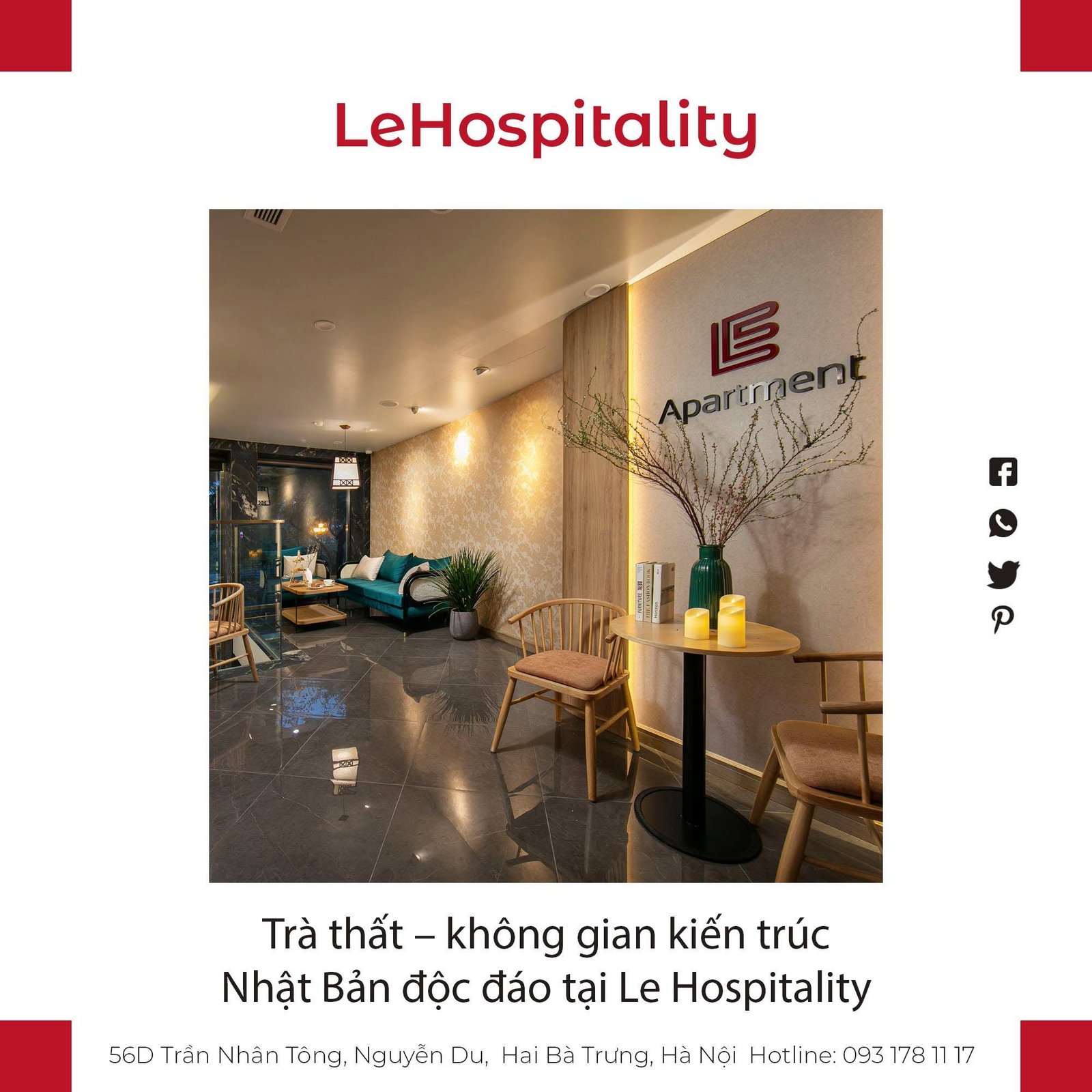
An identity system does not stop at the logo. This is the system of signals LE lives by across every touchpoint, from the street sign, the lounge and the tea room to the opening collateral and the email template.
Does your challenge look like LE Hospitality?
Tell Sinh Vũ what is on your mind about your brand. Sinh Vũ will point you to the right direction straight away.