
MASTER DOOR, rolling shutter technology standing guard at the door
From a blank page in 2009, Sinh Vũ built MASTER DOOR into a rolling shutter technology brand that homeowners trust before they even ask the price.
The problem
A rolling shutter is usually bought like a piece of hardware: how many millimetres thick, how much it costs, how many years of warranty. On a street where every shop sells steel sheets that look almost identical, customers have no way to tell them apart, and the decision comes down entirely to price. MASTER DOOR wanted out of that race.
Because what MASTER DOOR actually sells is not a steel sheet, but the safety and peace of mind of a modern home: a sensor that stops the shutter the moment it meets an obstacle, control from a phone, a slim body that saves space. In 2009, they came to Sinh Vũ with a blank page: no logo, no face, no system, just a conviction that a door could be a technology brand. The job was to build a premium door brand from scratch, one recognised on any storefront and trusted even before a customer asks the price.
The approach
Before drawing anything, we looked again at how a door gets chosen, and where MASTER DOOR could stand apart. Through a brand audit of the rolling shutter market and a workshop with leadership, both sides settled on what MASTER DOOR actually sells: not steel thickness, but modern safety, a door that watches, stops, and takes commands from a phone.
From there, the positioning tightened around three brand words that still hold today: convenience, safety, style, under one promise, building a safer, more modern life. That promise became the axis every category afterward had to serve, so that a piece of hardware could speak the language of technology and trust.
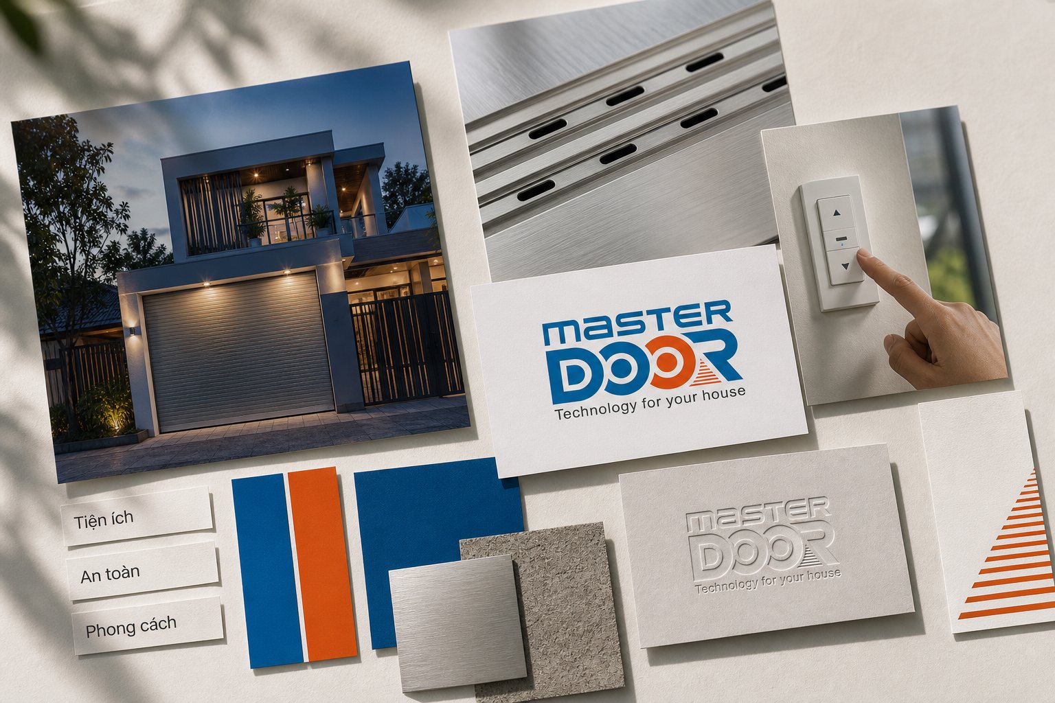
A name for a door has to do two things at once: sound like mastery and sound like technology. We built the verbal identity around MASTER DOOR and the English line Technology for your house, a deliberate signal that this is an engineered, modern product, not a welding shop down an alley.
We set how the name is written, how it is read, how it pairs with the promise, so that from the shop sign to the warranty card, the brand speaks in one voice: confident, technical, reassuring. Verbal identity is where a commodity item starts to feel like a brand you would trust with the entrance to your own home.
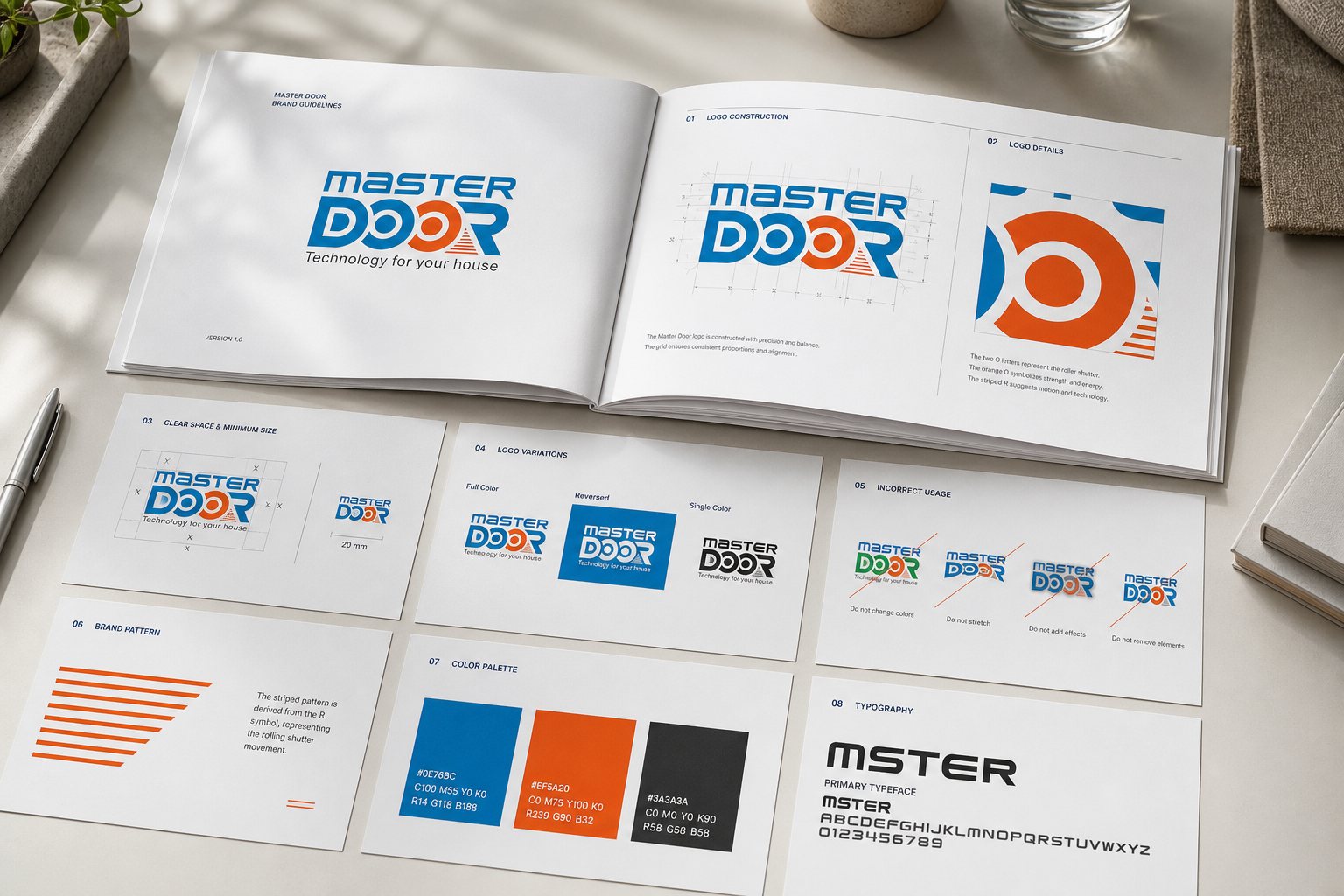
The logo turns the product into a signal. Inside the word DOOR sits a rolled shutter: one O is an open blue ring, the other is a solid orange disc, like a shutter already rolled or a button waiting to be pressed, while the R hides the horizontal slats of a shutter rolling up. Steel blue for engineering and trust, orange for the spark of technology and the warmth of home. One look and you see the door, the rolled steel, the press of a button.
Because MASTER DOOR would live on thousands of storefronts and control panels, we wrote a full brand guideline: where the mark sits, how far the orange can go, how the slat pattern is used, reversed and single-colour versions. Not just a logo, but a system, the rule that keeps the dealer sign in one province and the control panel sticker in another reading as the same MASTER DOOR.
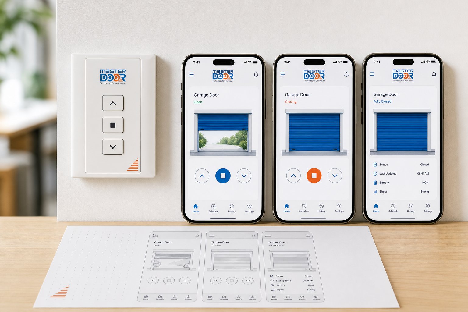
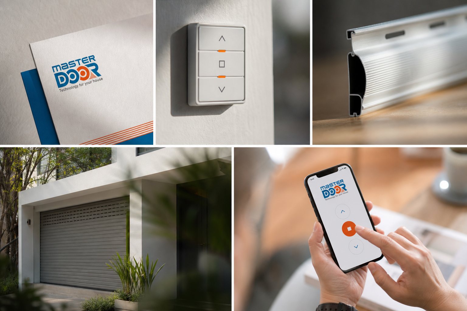
A door is trusted when it is easy to command. We designed the interface where hand meets technology: a wall-mounted control panel with three buttons, up, stop, down, and a phone control app, so operating a heavy steel sheet feels as calm and legible as flicking a light switch.
Every button, every icon, every state was drawn to the same identity, so that the moment of control, the product's most repeated touchpoint, looks and feels unmistakably MASTER DOOR. Interface design here is safety made tangible: clear, immediate, unambiguous exactly when it matters most.
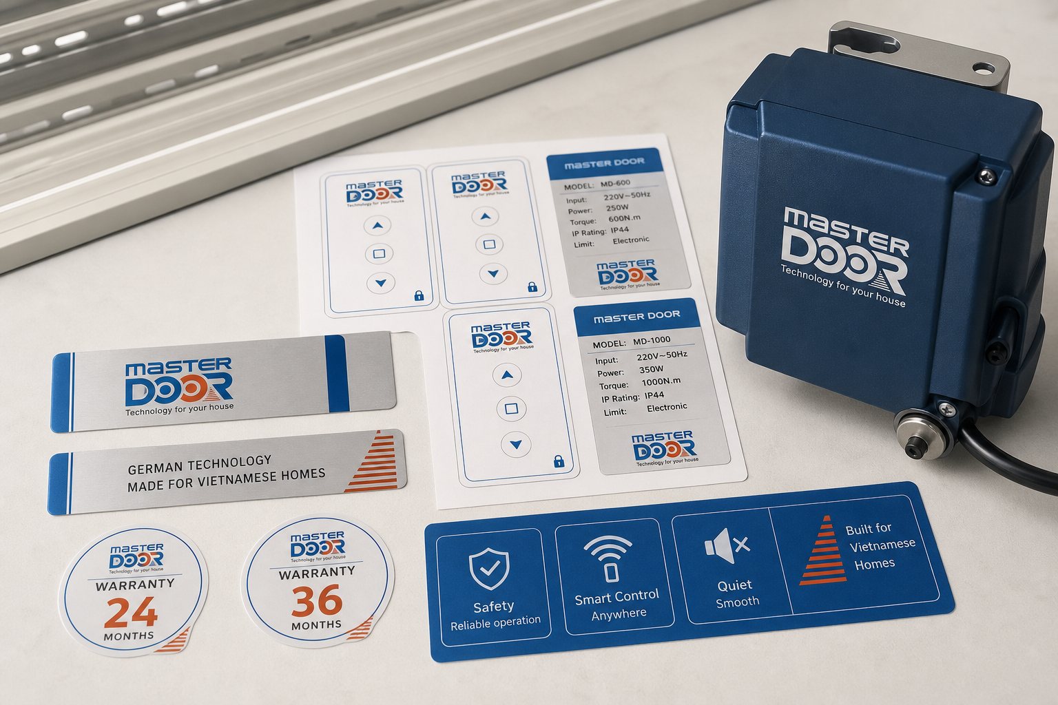
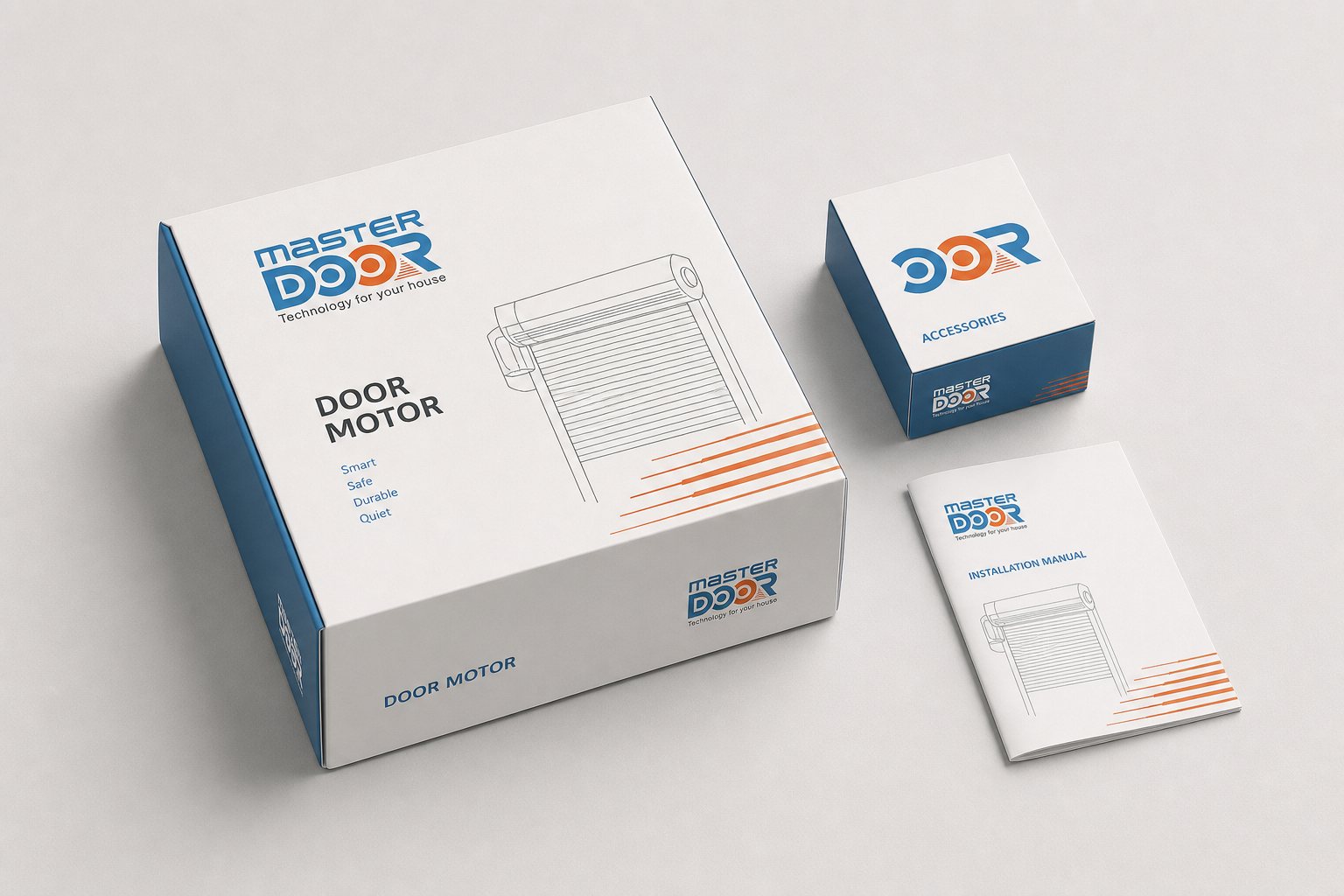
Then the identity had to survive contact with metal and pavement. We applied it directly to the product: control panel stickers, a nameplate reading MASTER DOOR on the motor housing, and packaging design for the door and its components, so that goods arrive looking engineered, not assembled from spare parts.
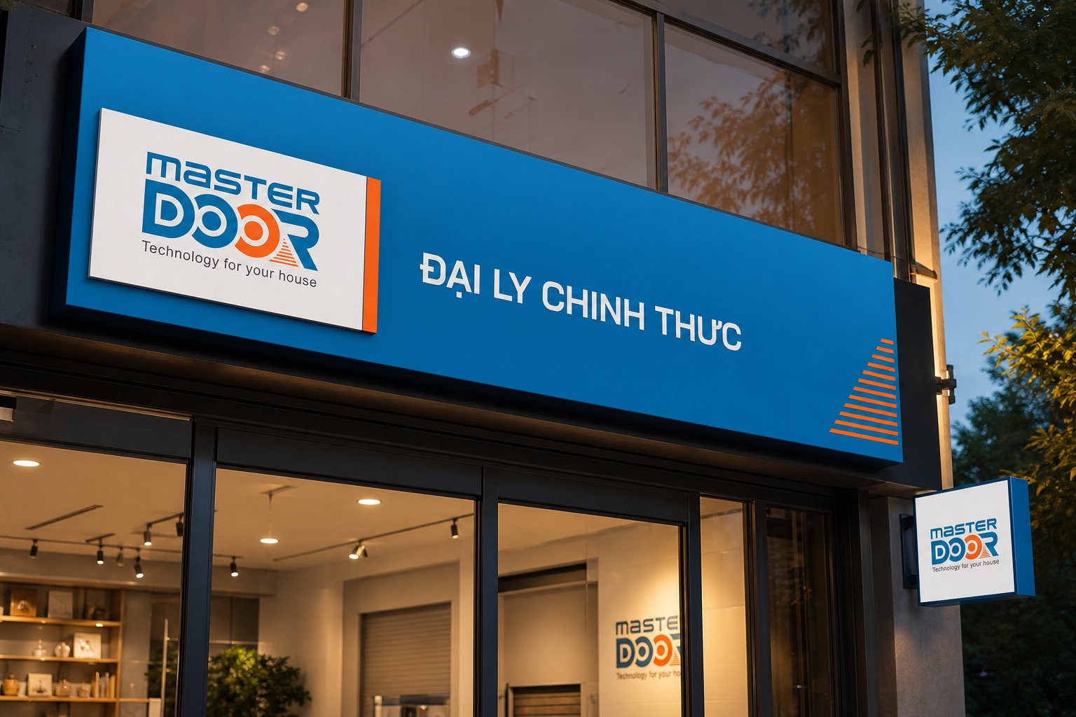
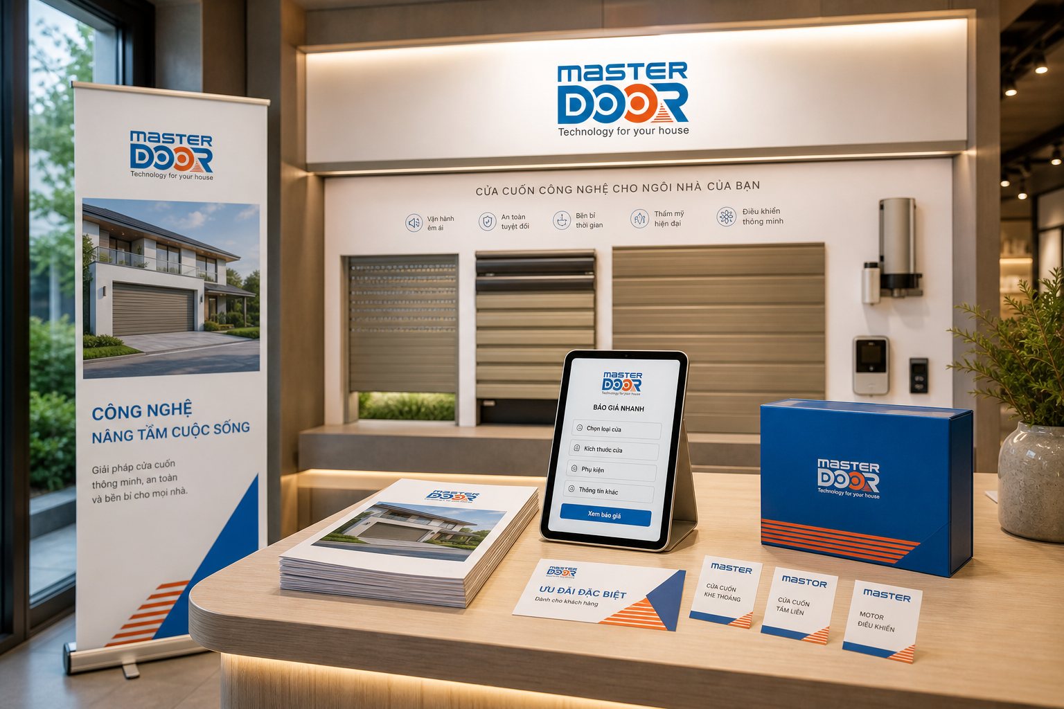
Out in the world, we built dealer signage, company signage and a POSM (point-of-sale materials) system: dealer light boxes, storefront signs, in-store presence, so that on any street, the same blue-and-orange mark tells a homeowner this is a MASTER DOOR point. This is where the brand stops living in a file and becomes something people see on their way home.
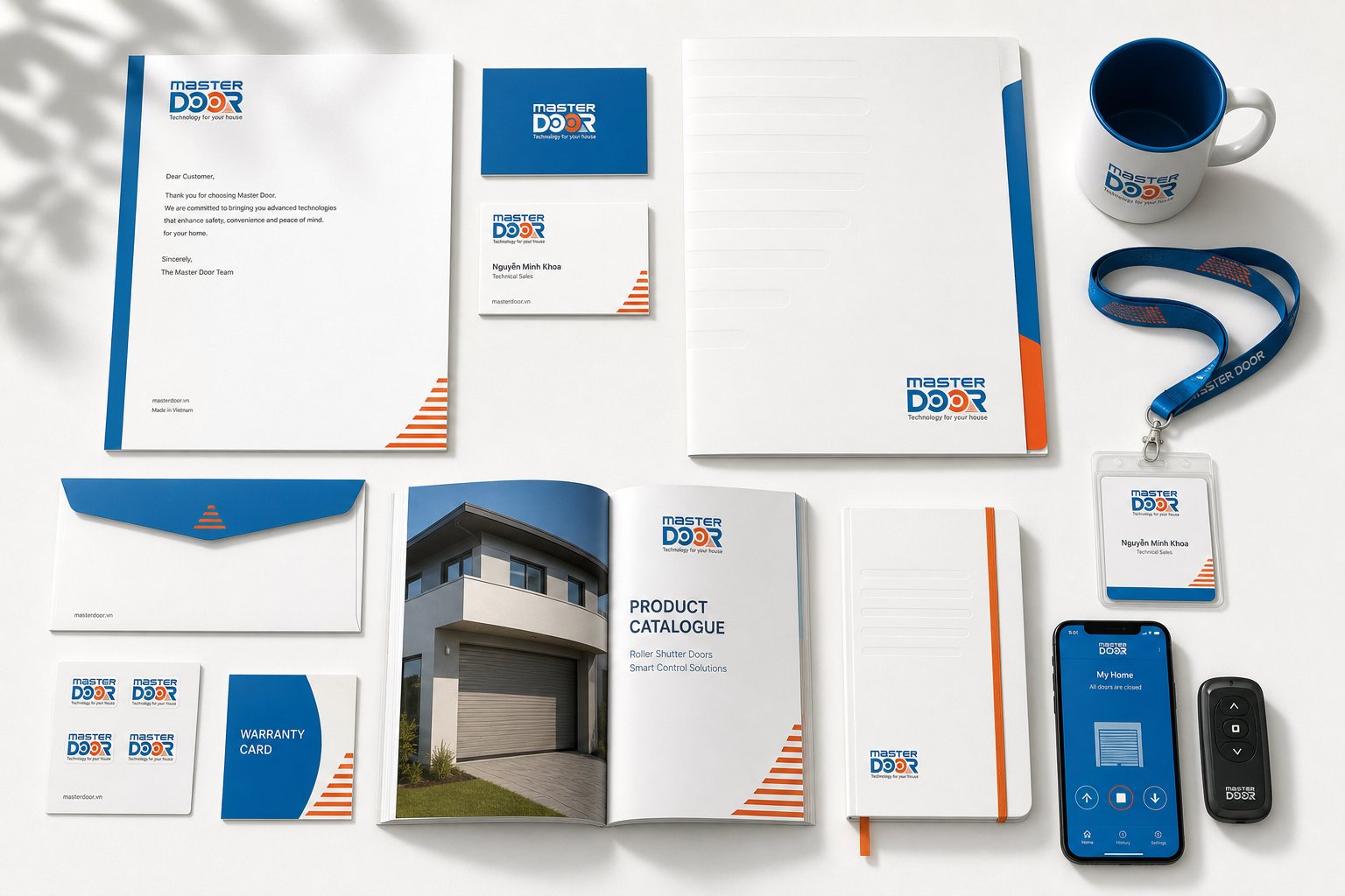
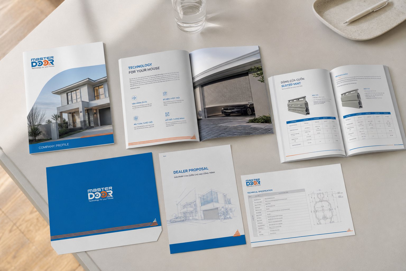
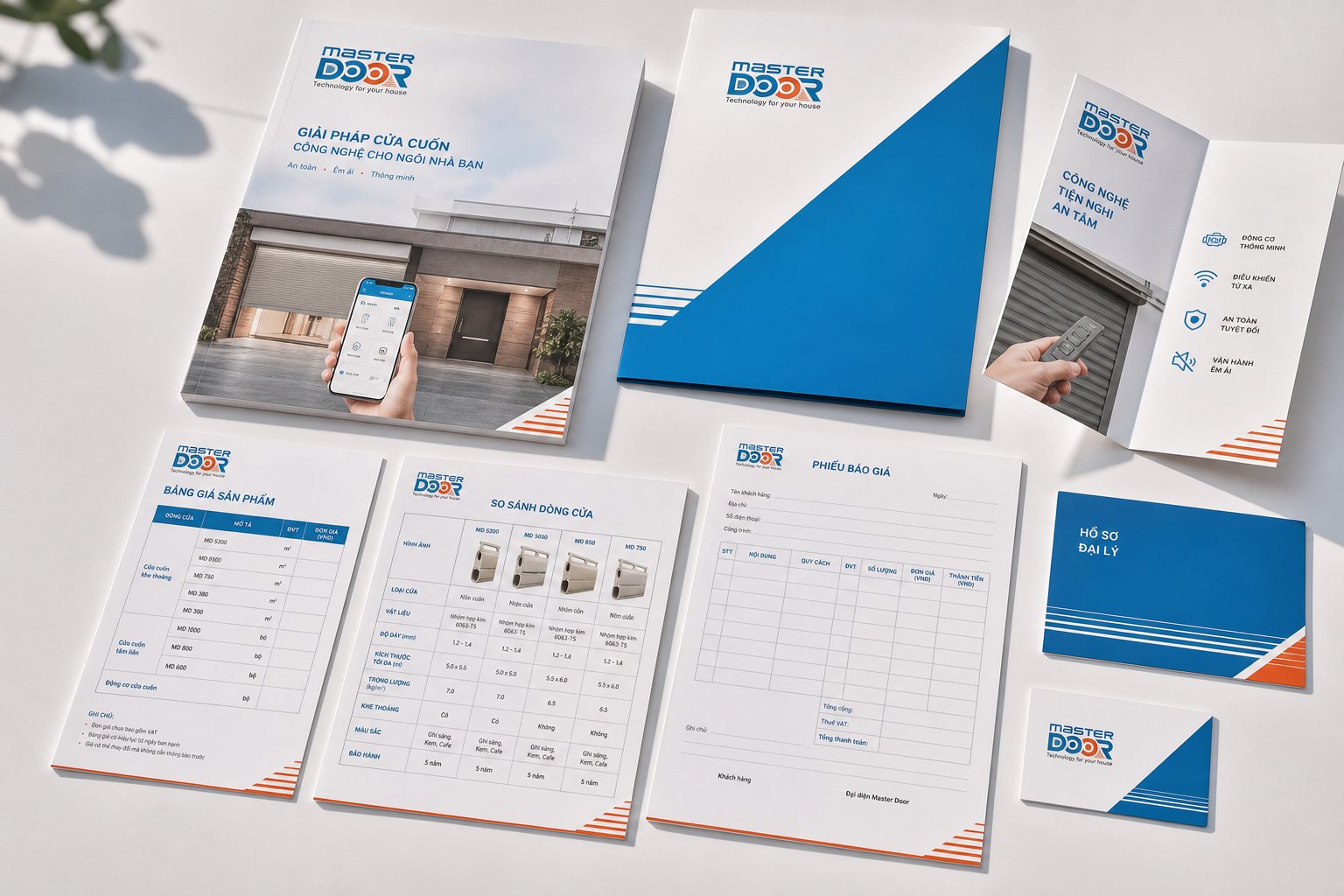
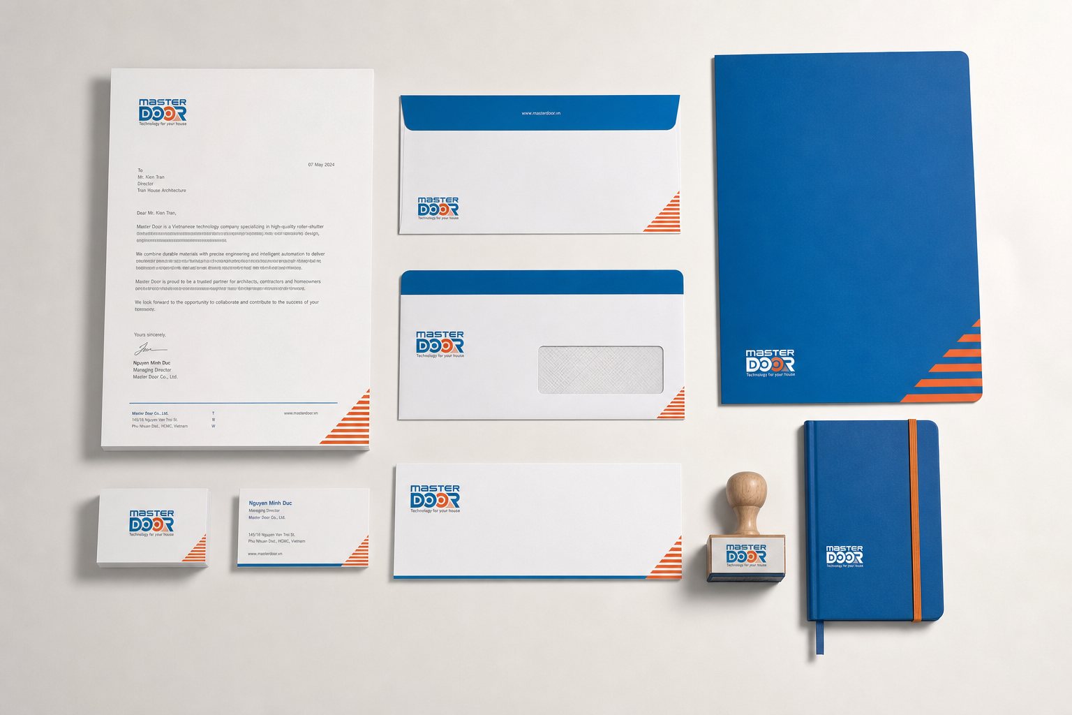
Finally, the brand had to help sell. We produced the corporate documents and capability profile MASTER DOOR needs when sitting across from a distributor or contractor, along with a sales and marketing kit: catalogue, spec sheets, quotation templates, so the sales team carries proof instead of promises.
Backing all of it was brand photography: the product and its details shot to one consistent, premium look, so every catalogue, dealer post or spec sheet draws from the same image library. When a homeowner or dealer meets MASTER DOOR on paper, on a wall, or on a phone, they meet a brand that has thought about safety as carefully as it has thought about steel.
Process
Audit and positioning
Reviewed the rolling shutter market, ran a workshop with leadership, settled on the modern safety promise as the throughline.
Naming and identity
Built the verbal identity, the logo with its rolling mark, and the guideline that keeps the whole system consistent.
Interface and application
Designed the control panel and app, then carried the identity onto the product, packaging, signage and POSM.
Documents and handover
Capability profile, sales kit and photography, handed over as a complete system for MASTER DOOR to run on its own.
The result
What MASTER DOOR received in 2009 was not a logo, but a complete brand system, built from a blank page, running from the rolled steel in the mark to the button on the wall, the sticker on the motor housing, the sign outside the dealer, and the catalogue in the salesperson's bag. The rolling shutter, about as commoditised a piece of hardware as they come, was given a face that homeowners recognise and trust before they ask the price.
For a hardware manufacturer competing on a street full of near-identical goods, that consistency is the line between being one more welder and being a technology brand for the home. With a hardware product, the first thing a customer sees is not steel thickness but the brand's face, identity is what turns a rolled sheet of steel into a promise of safety. Under one promise, building a safer, more modern life, MASTER DOOR can grow, add product lines and dealers, and still be recognised as the same MASTER DOOR, the door that knows how to stand guard.
One mark running through the whole system
From the rolled mark on the logo, to the button on the wall, to the dealer sign on the street, it is all still the same MASTER DOOR.
Is your challenge like MASTER DOOR?
Tell Sinh Vũ what is on your mind about your brand. Sinh Vũ will point you to the right direction right away.