
kythuat.work, trusted enough to open the door
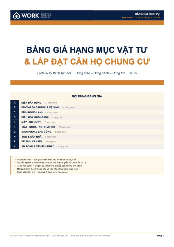
kythuat.work handles repairs, installation, cleaning and refresh work for apartment residents. Sinh Vu built its identity, website, paperwork and field operating system, so a stranger can knock and the homeowner still feels safe letting them in.

The problem
In an apartment block, small technical faults are constant and nobody puts their name to them. Residents post in the building group, pick up an unknown number, agree a time, then open their home to someone they have never met. The price is quoted by word of mouth, only settled once the work is done, and there is nowhere to go back to if it breaks again a few days later.
kythuat.work exists to fill exactly that gap: a single technical contact for residents of an urban area, covering everything from electrical and plumbing repairs to smart locks, air conditioner cleaning and refreshing an apartment before handover. What Sinh Vu was asked to do was not to draw a logo for a repair crew, but to build both the face and the frame that turn apartment repair work into a service with an identity, a paper trail and somewhere accountability can land.
The approach
Before drawing a single line, we asked residents what they fear most about calling a technician. Not the cost, but the not knowing: who will turn up, what they will actually do, what the final bill will be. That is a fear of vagueness, and better advertising copy does not cure it.
We settled kythuat.work on three promises: the right job, the right method, the right time. None of them was allowed to sit quietly on the logo, so each one was tied to something verifiable. The right job became a named catalogue of work items. The right method became a four-step process published in the open. The right time became a promise to respond within thirty minutes. Any promise we could not measure, we dropped.
The brand voice was tuned to the exact distance of someone about to step into your home: not the aloofness of a contractor, not over-familiar either. "We will take a look first and send you a price range" is how a skilled person speaks to a homeowner, and that voice runs from the website through to every Zalo message.

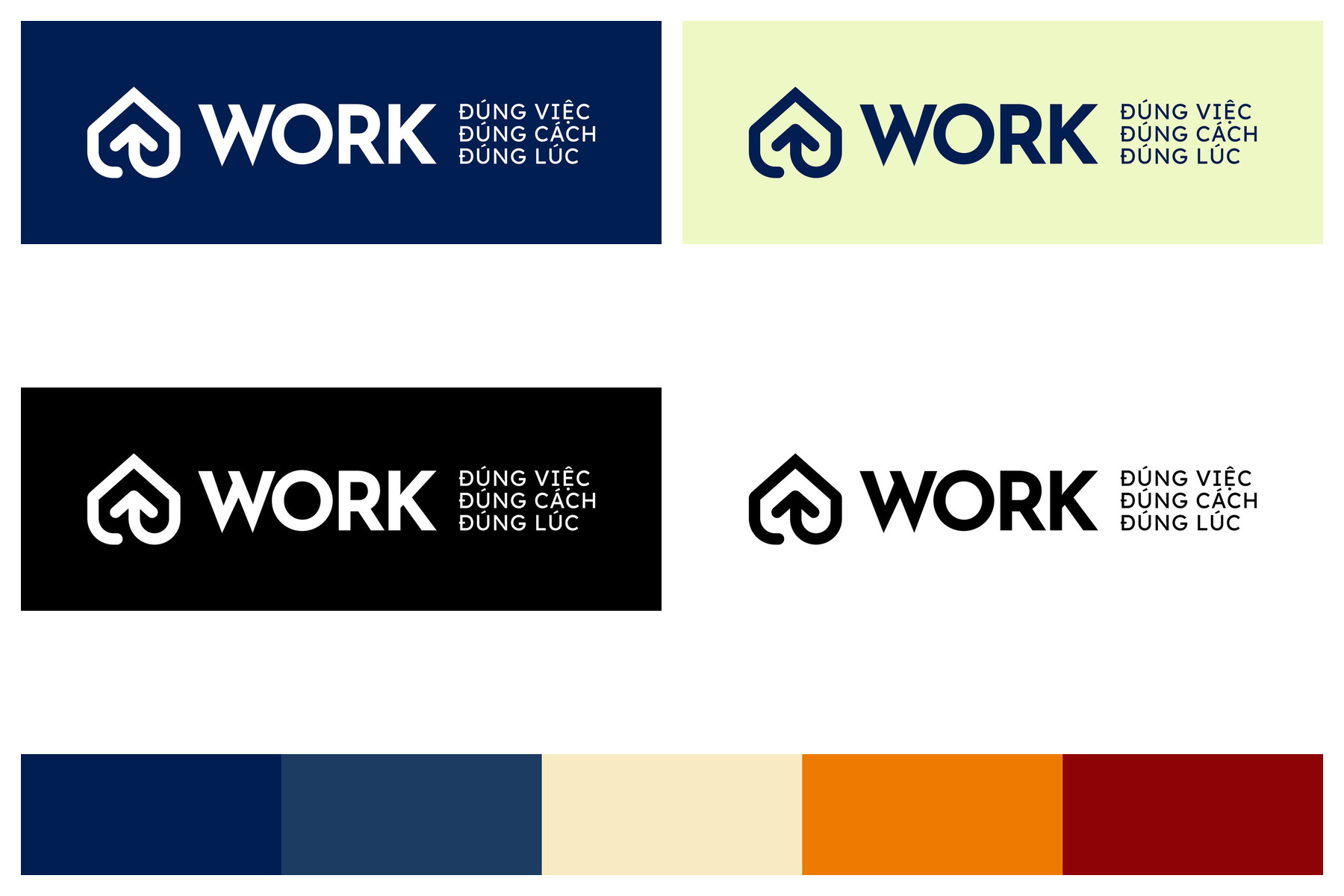
The first job of a mark in this trade is to reassure. So the kythuat.work symbol is a roof held inside a shield, two shapes anyone reads instantly: shelter and protection. The WORK wordmark is blocky and plain, without flourish, because what has to travel is not dexterity but dependability.
The colours follow how the trade actually works rather than taste. Deep navy carries the system, the colour of technical uniforms and of composure. Orange is site-warning colour, dosed carefully where the eye needs leading: buttons, price lines, accents. Cream grounds the paperwork so tables stay readable over long stretches.
The mark was built with enough variants to survive every ground it would meet: the navy of a standee, the cream of a price list, the black of a tool case, the white of a contract. A technician can put the logo anywhere and get it right without messaging back to ask.
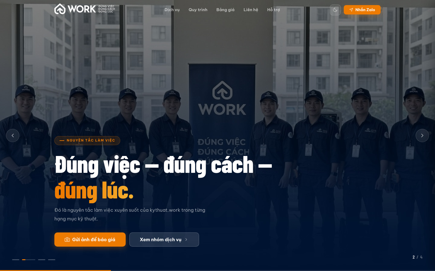
Residents with a fault rarely call straight away. They dread describing it properly, dread a price quoted over the phone, dread committing before they know what they will pay. So the way in to kythuat.work was designed to lower every one of those barriers: photograph the fault, send it over Zalo, receive a plan and a price range before anyone sets foot in the flat.
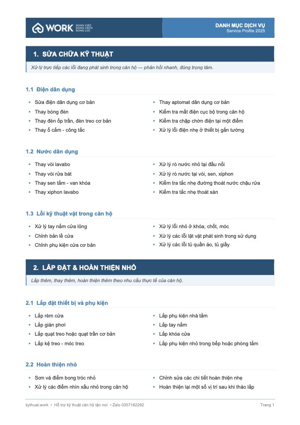
The website is built around exactly that behaviour. The homepage opens with a send-a-photo button rather than a paragraph of self-introduction. Four service groups are laid out as a menu of named work items so readers can spot their own problem. The reference price range sits openly in the middle of the page, alongside a plain sentence explaining why it is a range at all.
Underneath runs a digital design system shared by every block: service cards, the four-step process rail, price tables, the questions panel. Adding a new service group means slotting into existing parts rather than rebuilding the page, so the site can grow without losing its rhythm.
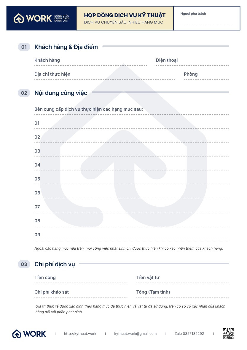
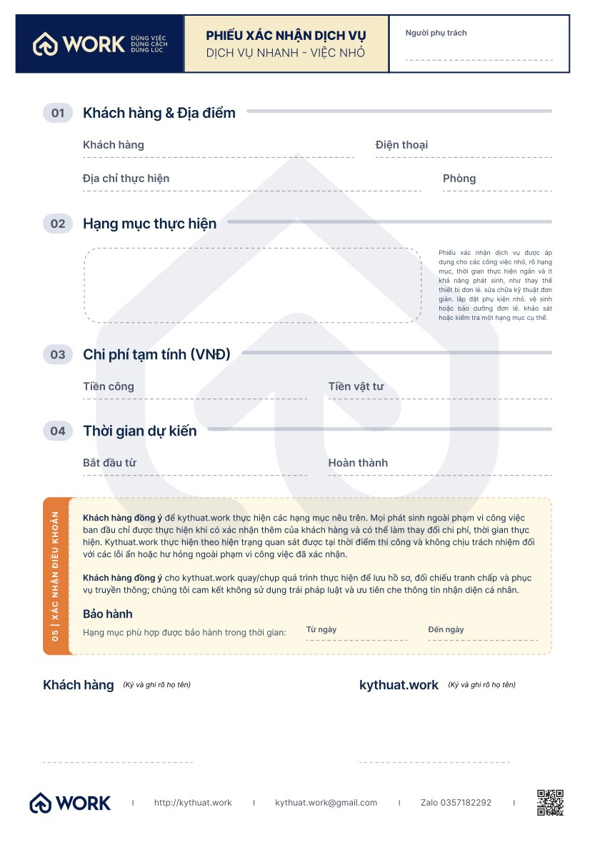
What separates a repair crew from a service provider is often just a few sheets of paper. So we designed the full set of field documents: a technical service contract and a service confirmation slip recording the work items carried out, the provisional cost, the expected duration and the warranty terms.
The set was built to be filled in with a ballpoint pen, on a kitchen counter, while the technician still has their hands full. Wide fields, type large enough to read, and a signature space for both sides wherever one is needed. The warranty line sits on a pale orange ground so nobody can skim past it.
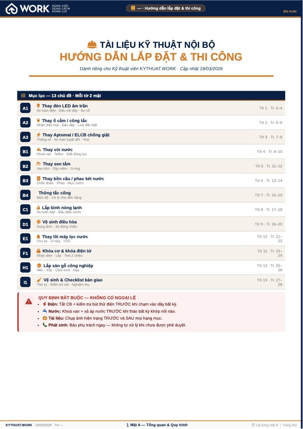
Alongside sits the sales kit: an A4 service catalogue and a price list for materials and installation, ready to hand to a building management office or pin on a notice board. And an internal technical manual covering installation and workmanship, so a new technician works to the same standard as an experienced one.
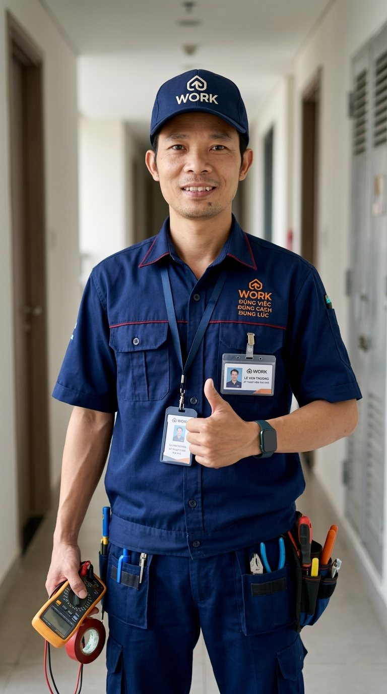
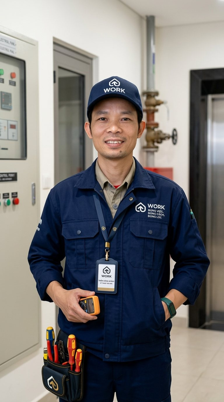
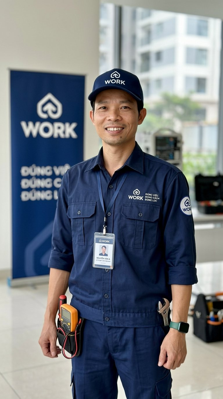
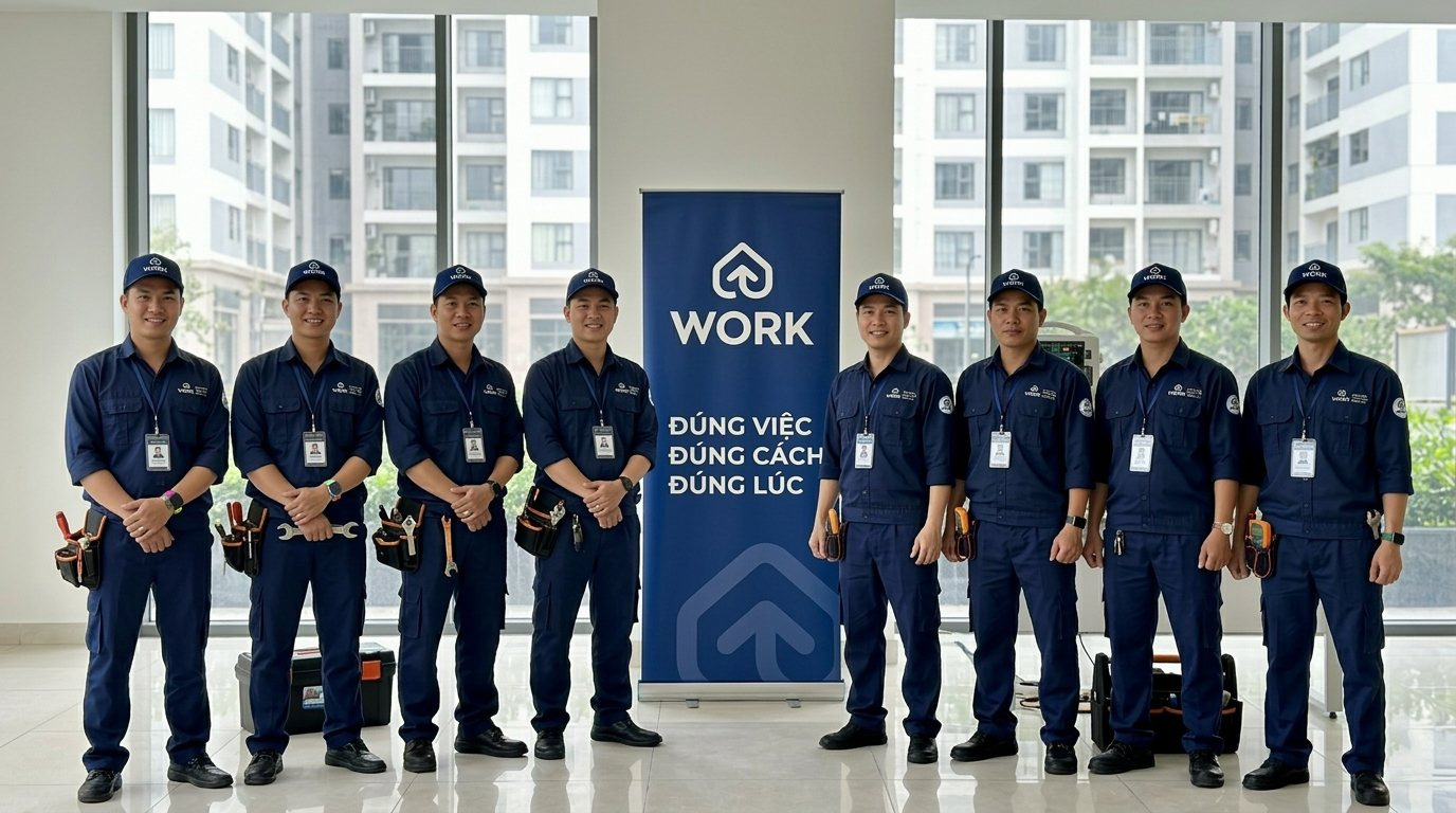
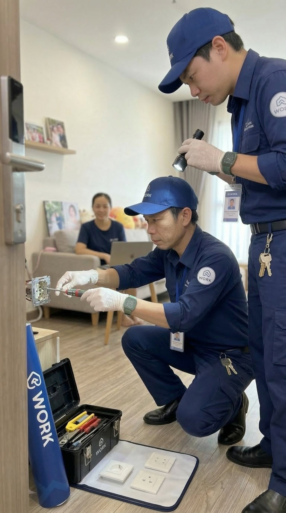
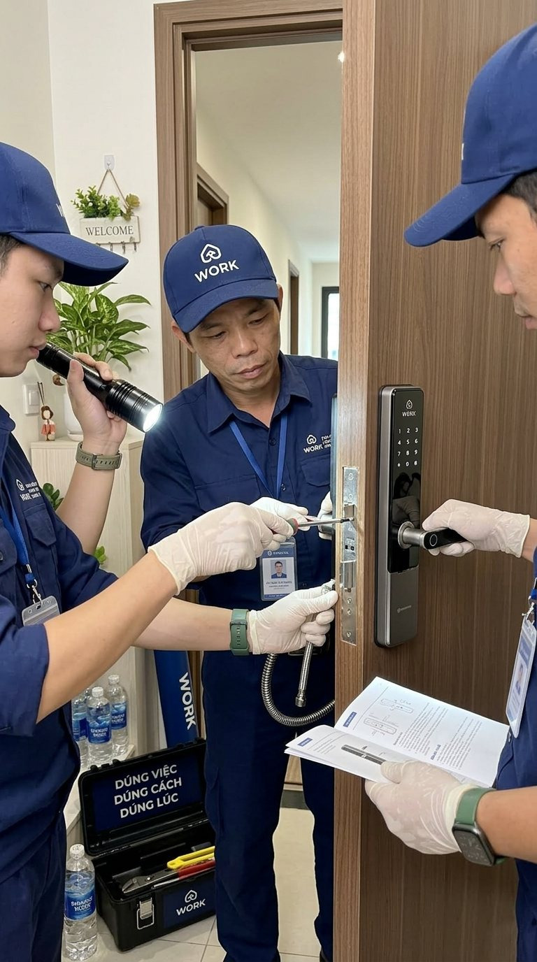
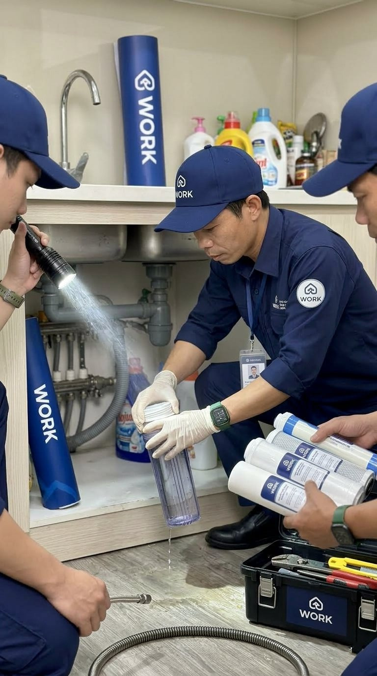
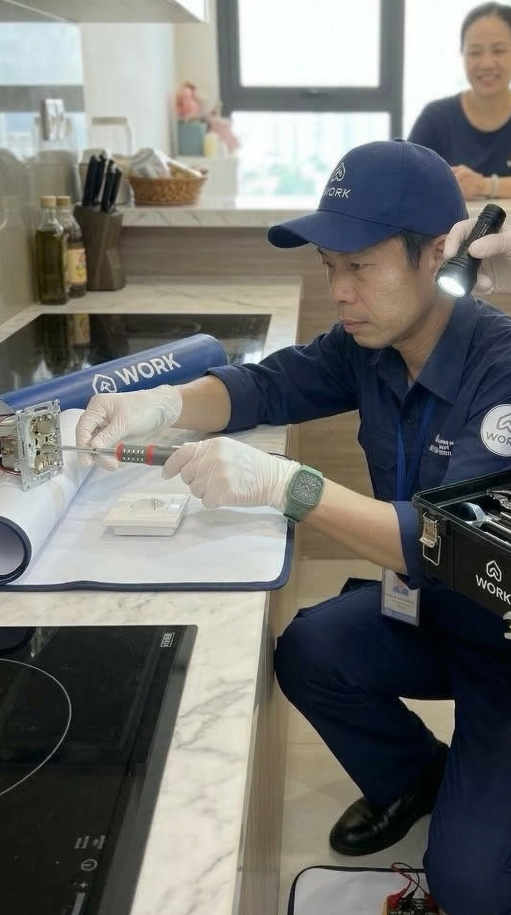
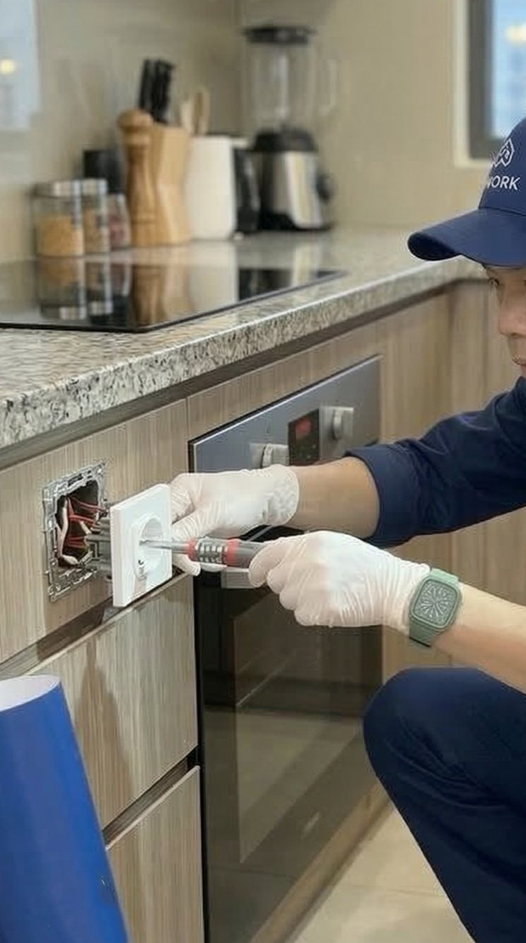
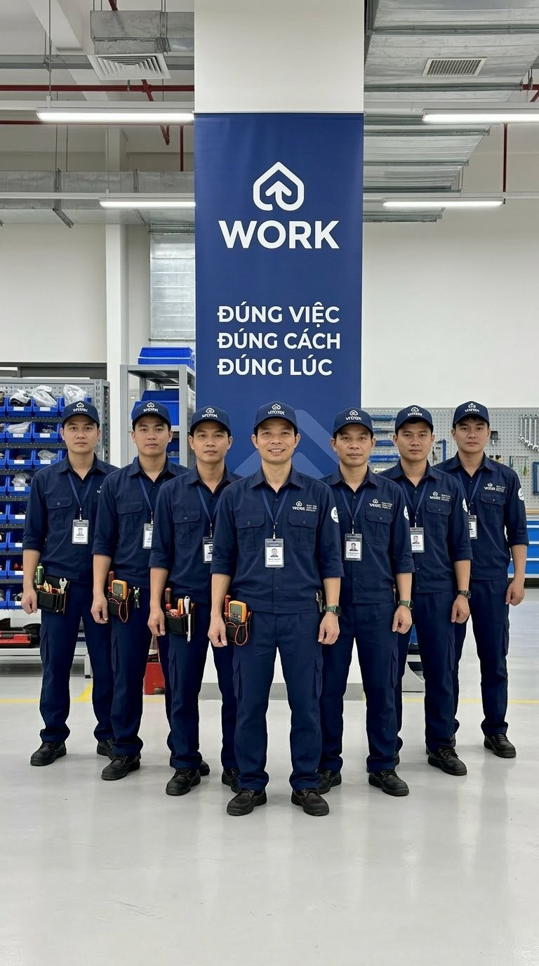
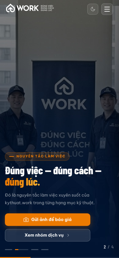
Every promise made on paper is tested again the moment the doorbell rings. So the hardest working part of this identity sits on the technician: a navy work shirt with the logo embroidered at the chest, a matching cap, a lanyard badge carrying a photograph and a name, and a tool case bearing the mark.
Through the peephole the homeowner sees three things before opening: a uniform they recognise, a badge with a name on it, a tool case from the same outfit. Together those answer the question "who are you" that nobody wants to have to ask out loud.
The campaign imagery follows the same rule: the technician is always in frame, the uniform and badge always legible, the work always real rather than posed. Photographs for the website, for Zalo and for the building notice board all come from this one set, so the team reads consistently everywhere residents meet it.
A technical service grows by adding people, and adding people is how standards get diluted. So the closing stretch of the project added nothing decorative, only what holds the standard: rules for using the mark, document templates, a shared catalogue of work items, and internal material a new technician can read and act on.
The physical presence joined the same system: navy standees and backdrops in building lobbies on deployment days, a materials store arranged by the same work groups listed on the website. A resident walks through the lobby, opens the site, then opens their door to a technician, and meets the same face all three times.
The process
Three promises you can check
We settled on the right job, the right method, the right time, then tied each one to a verifiable commitment instead of leaving it on the logo.
A roof inside a shield
The mark, the navy, orange and cream palette and the full variant set were built solid enough to live on uniforms, paperwork and screens alike.
Send a photo, get a price
kythuat.work opens with a send-a-photo button, built on a reusable digital design system, so residents know the price range before anyone arrives.
Uniforms, paperwork, operating system
Uniforms, badges, contracts, confirmation slips and usage rules were handed over as one system, so standards hold as the team grows.
The outcome
kythuat.work is now the technical contact with a face across Smart City and the areas around it. Residents send a photo, receive a plan, open the door to someone in uniform with a badge, sign a confirmation slip and keep the warranty terms in hand. That chain runs smoothly because every link has design behind it.
What the client gained is not a handsome identity but the right to state the price first. Once the work items, the cost and the warranty are all on paper before work begins, the transaction stops resting on the luck of trusting a stranger. That is also what lets a small technical team win work across a large urban area and have residents willingly open the door.
A brand that knocks every day
From the badge on the chest to the warranty line on the slip, everything a resident sees was built to answer the question they ask themselves before opening: is this the person I called, and what will it cost when the work is done.

Does your service look like kythuat.work on day one?
Tell Sinh Vu what is making your customers hesitate. We will point you straight to the right next step.