
Edupia, one identity system for a million English classrooms
Edupia, an online English platform for millions of Vietnamese students, needed a steady identity across every screen. Sinh Vũ built the identity and digital product to hold it together.
The problem
Edupia carries no small mission: bringing high quality English classes to every Vietnamese student, in every region and every economic condition. But an education platform for children has to win over two very different people at once: the parent, who pays and needs to trust, and the student, who learns every day and needs to like it. A face too serious makes children hesitant, one too childish makes parents doubt.
Edupia is also a large system, spread across app, website, multiple product lines for different age groups, plus countless materials and campaigns. If each place looked different, the brand would fracture and trust would thin out. The task set for Sinh Vũ: build an identity system both trustworthy and warm, tight enough to hold together as it scaled to millions of users.
Approach
Before any drawing, we worked with the Edupia team to clarify what the brand actually sells. Not lessons, but opportunity: a child anywhere can learn English as if in an international classroom. Through working sessions, both sides settled on a positioning: high quality yet approachable, serious about results but warm in how it reaches children.
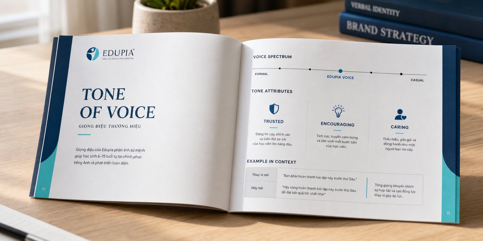
From that positioning, we shaped the brand voice: confident and clear when speaking to parents, playful and encouraging when speaking to students. That voice stays consistent so that whether read on the app or heard in a video, Edupia remains a familiar, trustworthy character.
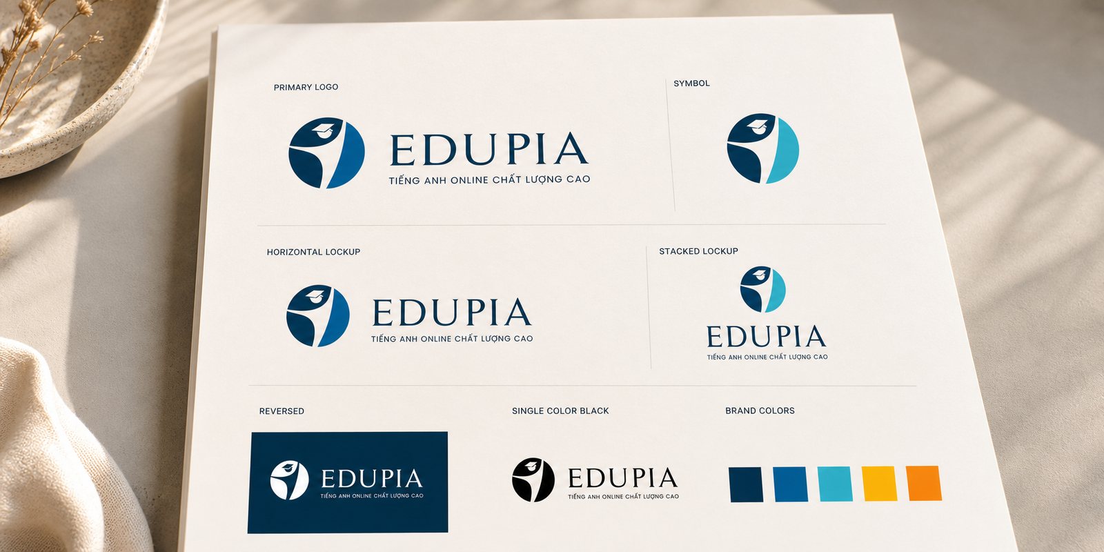
The Edupia mark is an eagle rising within a circle, evoking the aspiration to fly higher and a journey of knowledge without limits. Set within the circle, it is compact enough to read well as a small app icon, yet strong enough to hold up on a large sign. A simple mark carrying that much meaning stays recognizable even at small size.
Around the mark, we built the full identity system: typography, usage rules, variants for light and dark backgrounds. So that whether it appears as an app icon or an event backdrop, Edupia remains one face. That is where an identity system differs from a logo: it is a set of signals that lets people recognize the brand instantly, even before the name has registered.
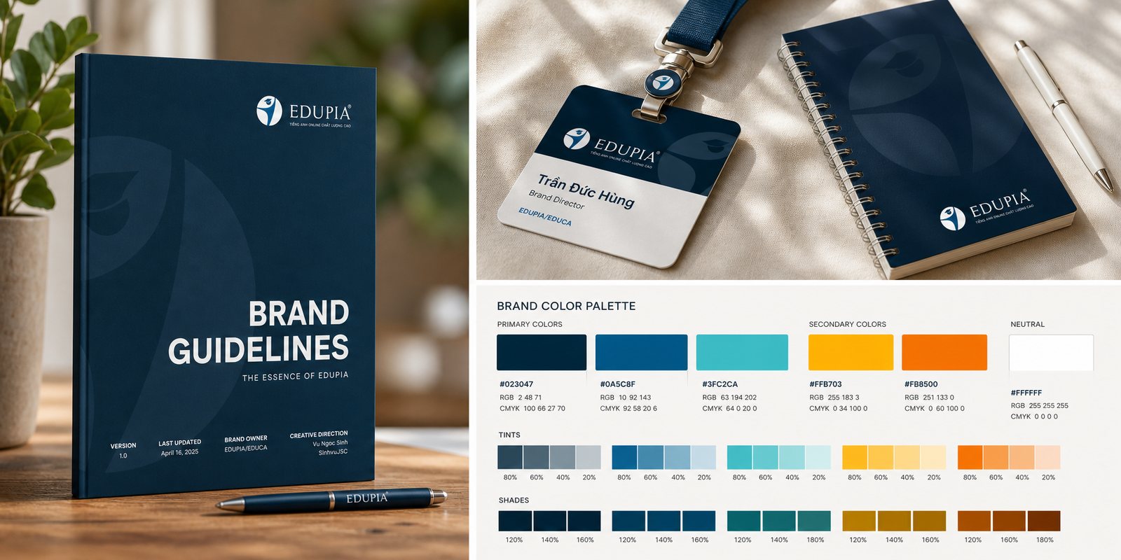
Color is where Edupia solves the puzzle of trust and warmth together. We chose a deep navy as the color of trust and knowledge, set against a bright cyan for energy and youth, with orange and yellow as accents for moments that call for cheer. That core palette runs across both the parent brand system and the individual product lines.
To keep a large system from drifting, we wrote a full set of brand guidelines: how the logo is used, how color is applied, where type sits, how much breathing room, down to the exact color codes. Because of it, an app screen built by one team and a flyer built by another are still the same Edupia. The guidelines are what keeps the brand's face consistent as it scales.
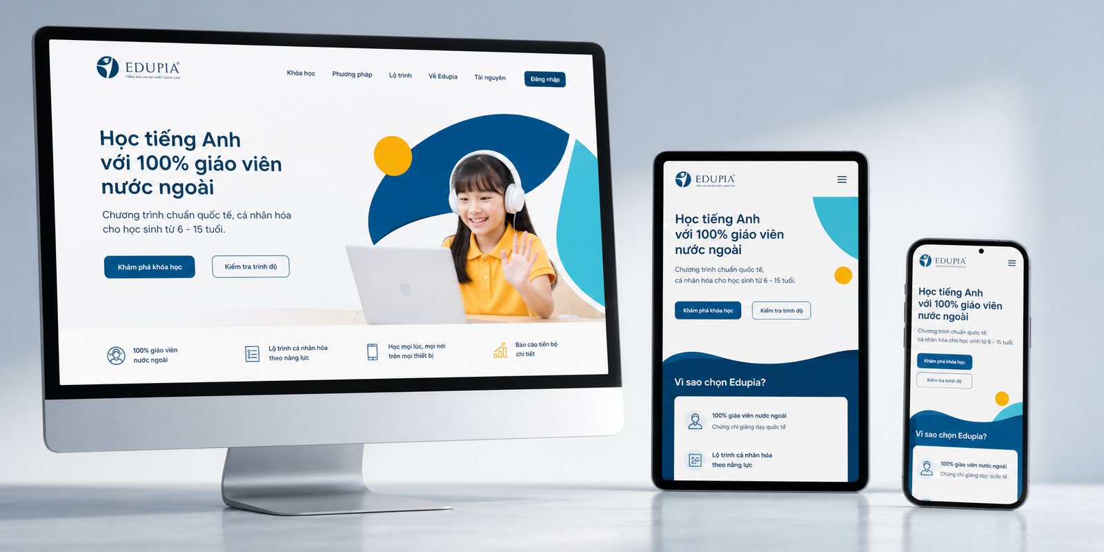
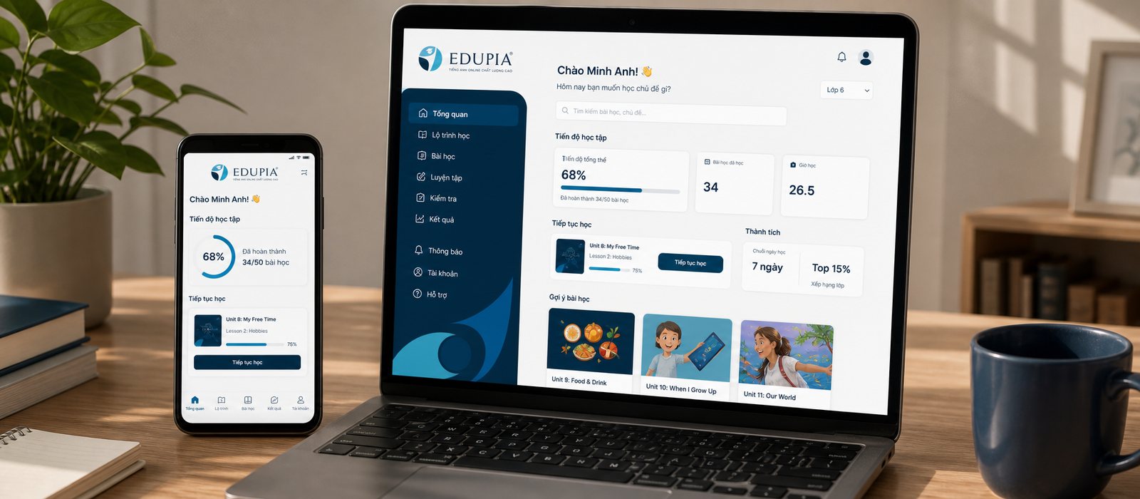
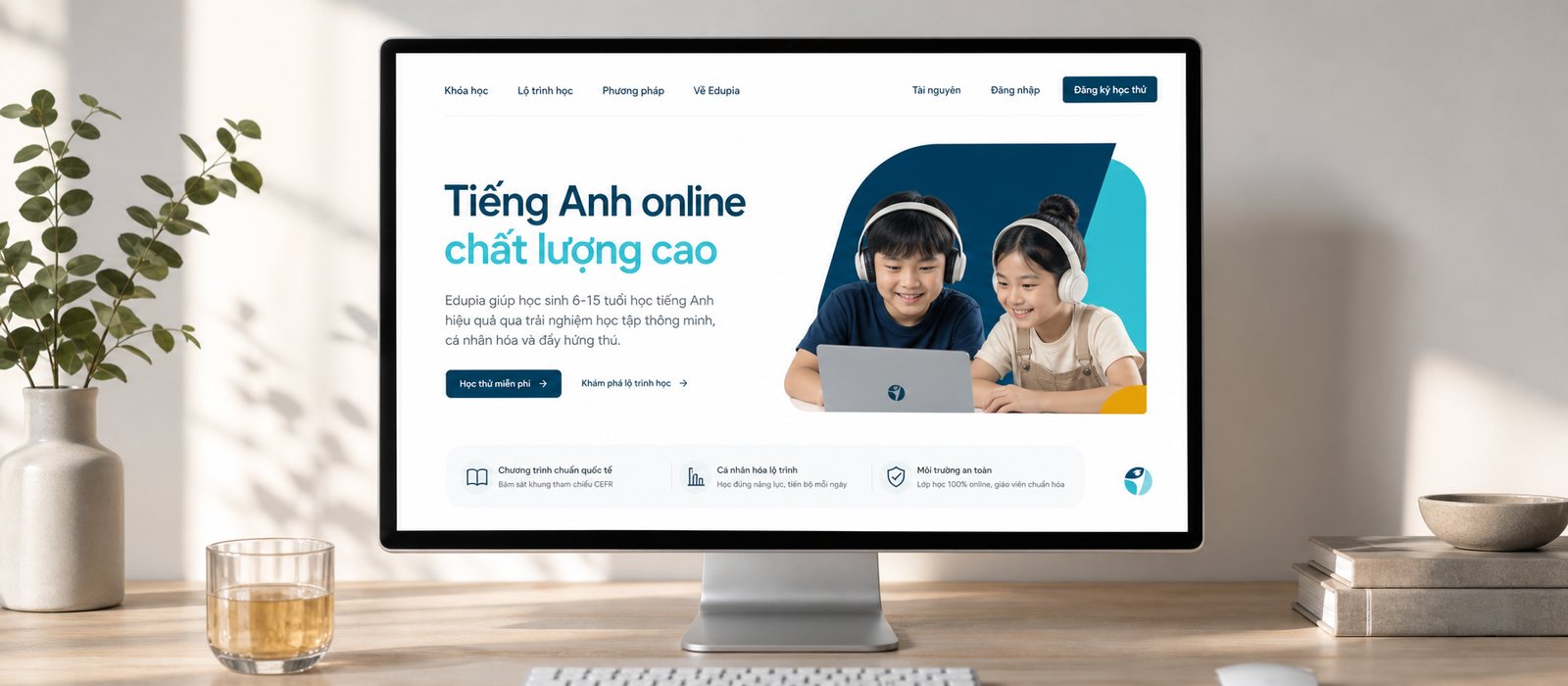
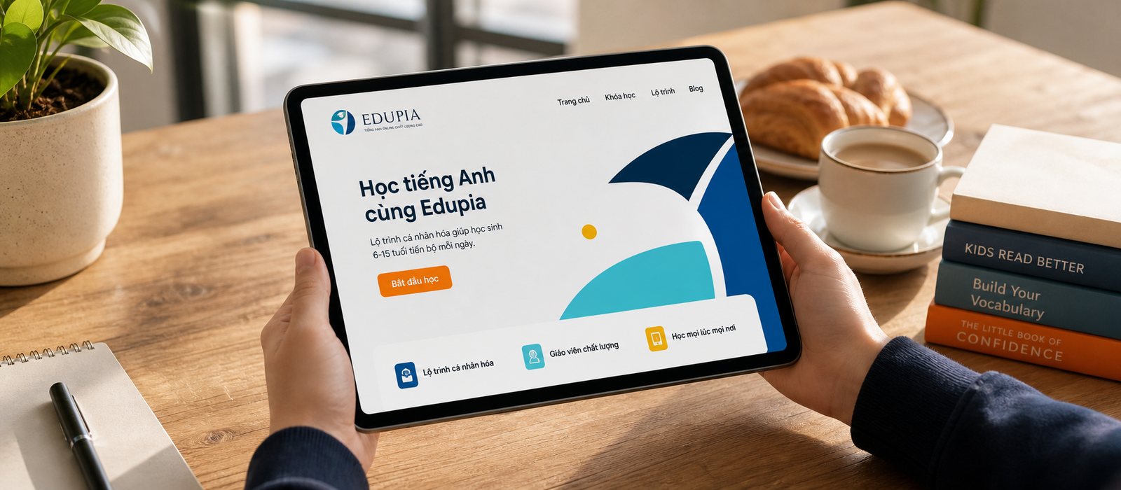
For Edupia, the product is software, so the identity has to live on screen. We designed the interface for the app and website, from the user flow and screen framework to a reusable component system, so that every time Edupia adds a feature, it appears consistent and familiar. That classroom folded into a pocket stays bright, clear, and easy to use, even for young children not yet used to technology.
That digital design system exists not only to look good, but to move fast: a growing platform can assemble new screens from existing pieces instead of redrawing from scratch each time. Consistency across app and web means a child moving from phone to computer still meets one Edupia, without having to relearn how to use it.
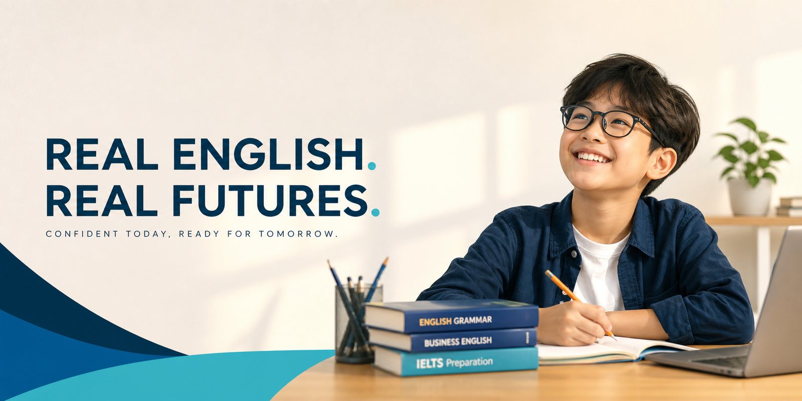
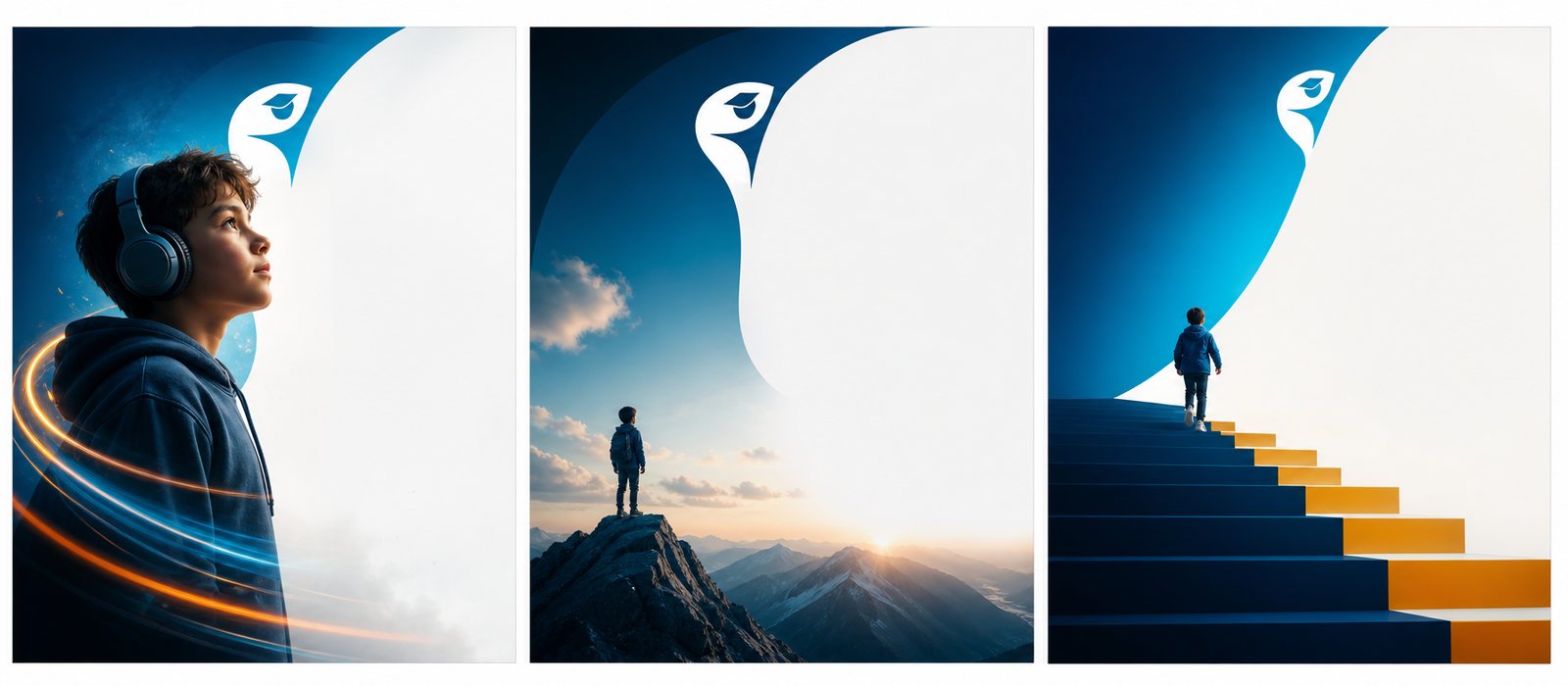
Education for children runs on emotion. We built a campaign imagery, photography and animated video library with its own distinct character: bright, warm, full of the excitement of learning. So that every advertisement, every frame on Edupia's social media is instantly recognizable, and more importantly, gives parents confidence and makes children want to learn.
From the photo of a child beaming after saying their first English sentence, to the short film showing how Edupia teaches, everything tells the same story: learning can be serious and joyful at once. That is the moment the brand stops being a logo and becomes a feeling.
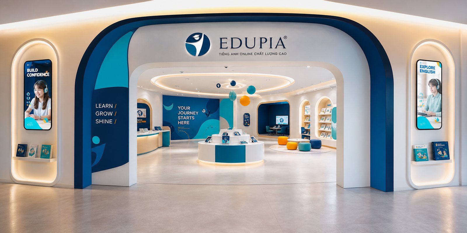
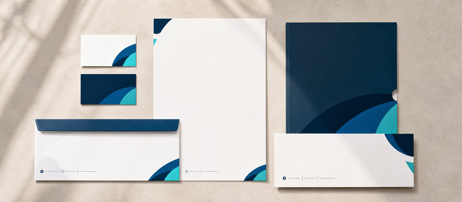
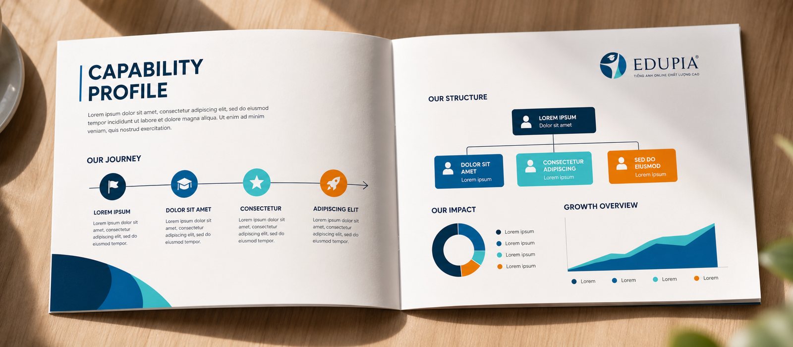
A digital platform still needs to meet people offline. We built a set of corporate documents for Edupia to use with schools, partners and investors, a polished profile showing that behind the app is a company with vision and method.
Alongside it came a set of POSM and event environments: booths, backdrops, signage for experience days and English learning festivals. So that from a phone screen to a lively school courtyard, Edupia remains one familiar, trustworthy face.
Process
Listening and positioning
Worked with Edupia to clarify mission, audience and standing, settling on a positioning that is high quality yet approachable.
Building the brand face
From the eagle mark to the color palette and guidelines, building the full identity system for the parent brand.
Designing the digital product
Carrying the identity onto the app and website through a digital design system, a consistent and reusable interface.
Handing over a living system
Closing with the Brand Guideline 2025, standardizing strategy, imagery and voice for every touchpoint.
The result
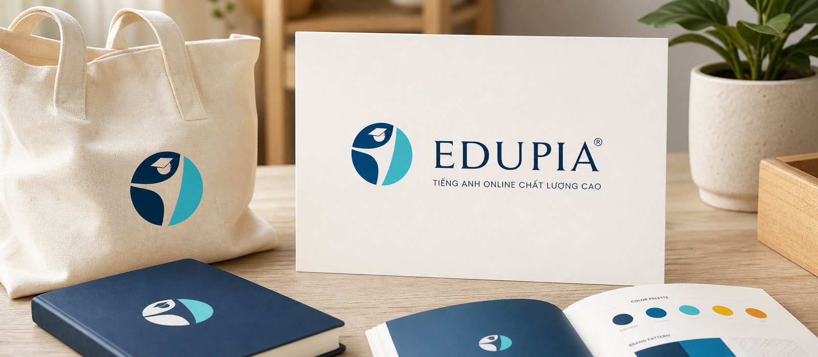
What Edupia received was not a logo, but a brand system running from the app icon, learning interface, website, through to printed materials and school event grounds. Whether a child meets Edupia on a phone, a parent sees it on a document, or the whole family encounters it at a festival, it is still one Edupia, both trustworthy and warm.
For a platform now serving millions of students, that consistency is what keeps trust from thinning as it grows fast. That clear, warm face, held steady across every screen, is the foundation that lets a large education mission be seen as serious, and be loved.
One Edupia across every screen
From app and website to printed materials, imagery and events, a single identity system runs consistently across every touchpoint.
App interface
Website
Office stationery
Brand photography
Video and animation
Corporate documents
Is your challenge like Edupia's?
Tell Sinh Vũ what is on your mind about your brand. Sinh Vũ will point you to the right direction right away.