Media and creativity

Identity design for online newspapers, broadcasters and publishers

Readers trust a familiar face, so a refresh has to keep what is familiar.

Newspapers, broadcasters and publishers live on trust built up over many years. Sinh Vũ helps the identity keep that standing while staying lean and clear for phone screens and sub-channels.

A sample identity set for a news organization: channel logo, online newspaper interface, show ident and a book cover
Quick answer01

What does an identity for the press, broadcasters and publishers need?

Three things come first: a mark that still reads at a very small size, a set of standards for every sub-channel and show, and a digital interface that works every day. Those three keep readers' trust as the content moves across many screens.

  1. A mark that reads at small sizes

    It is still recognizable when shrunk to a profile picture or an app icon, not just on the front page.

  2. Standards for sub-channels and shows

    Each section, show and sub-channel has a place in the system, rather than becoming a brand of its own.

  3. A daily interface and idents

    The news site, idents, transitions and book covers are built from one set of components.

Business types02

Three kinds of organization, three problems

All of them keep the public's trust, but readers meet each kind of organization in a different way, so what the identity must hold onto differs too.

Press organizations

Their customersReaders skim the news every day on their phones, on social media and on the home page.

Brand challengeA mark and an interface clear enough to recognize the paper at a glance, and steady enough to be trusted.

Radio and television stations

Their customersListeners and viewers meet the station through the dial, the channel list and show idents.

Brand challengeGive the station a face of its own among many similar channels, and a system for its sub-programs.

Publishers

Their customersBook buyers, authors and distribution partners.

Brand challengeA publisher's look that is recognized on the spine and the cover, while each title keeps its own character.

Pain points03

Four pain points specific to the press, broadcasters and publishers

These are the places where news and publishing organizations lose their audience's attachment, and where old credibility alone can't hold it.

Customer journey04

At which stage do news organizations lose the most readers?

At the See stage. Readers meet the content through a small news card on social media or a show tile in a list. If a glance doesn't tell them it comes from an organization they trust, they don't tap.

Where customers are most often lostSee
Do this now
  1. Test the mark and the news card at the smallest size on a phone.
  2. Use one news card template for every sub-channel and show.
  3. Keep the placement of the organization's name fixed in social media post images.
Touchpoints05

Five touchpoints to do first

Touchpoints are the places where the public meets the organization every day. You don't need to do everything at once. These five decide most of whether the public recognizes and trusts you.

  1. Mark and app icon

    It appears at the smallest size and appears the most often.

  2. News site or home page interface

    It is where readers stay the longest.

  3. News cards and post images on social media

    Most younger people meet the organization here first.

  4. Idents and transitions

    They tell viewers they are in the right place, in every show.

  5. Book covers and spines

    For a publisher, this is the first touchpoint in the bookstore and on e-commerce platforms.

Roadmap06

Where Sinh Vũ suggests you start

Listed in the order to do them. A large organization doesn't change everything at once: it does the mark and the standards first, then rolls them out channel by channel.

  1. Logo and Brand Identity Design

    Refresh the mark, color and type while keeping what readers are used to.

  2. Brand guidelines handbook

    A set of standards for every sub-channel, show and publication.

  3. Designing a digital design system

    A digital design system for the news site, the app and the newsletter.

  4. Brand video and animation production

    Idents, transitions and subtitles that share one rhythm.

  5. Brand operating system for corporations

    When many desks work together: an operating system so the standards last.

Projects07

The projects closest to the press, broadcasters and publishers

Sinh Vũ has published three projects squarely in this segment: an online newspaper, a radio channel and a television station. Sinh Vũ has not published a publisher project.

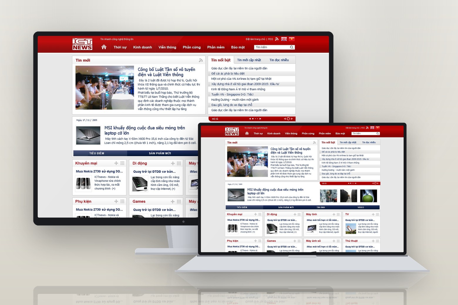
ICTnews, fast yet solid
Digital news
2007

ICTnews, fast yet solid

ICTnews is the technology news site of Vietnam Post Newspaper, under the Ministry of Information and Communications. Sinh Vũ built the logo and the whole interface…

View case

A paper has to be both steady and fast, so the mark uses a solid block of letters that holds up even shrunk to favicon size. The page system and the ad frame system were also built in from the start, so a small newsroom can still publish steadily.

JoyFM, a wave that cares
Specialised health radio
2011

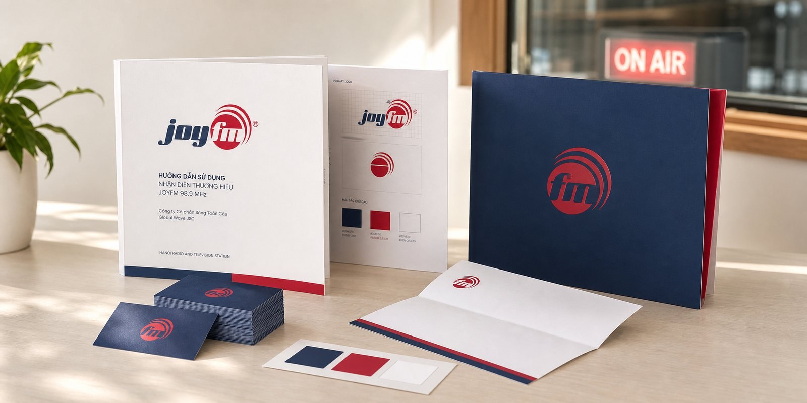
JoyFM, a wave that cares

JoyFM is the specialised health radio channel of Hanoi Radio and Television Station, broadcasting on FM 98.9 MHz. Sinh Vũ built the mark, the guideline system and the corporate profile…

View case

A health channel easily slips into a clinic voice, so JoyFM settled on a position as warm as a friend before drawing anything. The mark has positive and negative versions, a minimum-size rule, and carries over to the operating company's documents.

HiTV, a name that says hello
Television

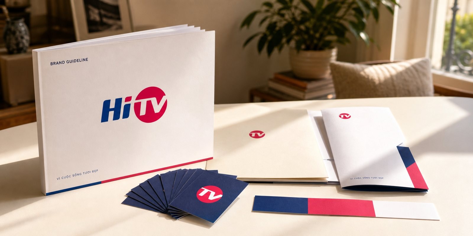
HiTV, a name that says hello

Among hundreds of channels crowding onto one remote, this Hanoi television brand wanted to be remembered for warmth…

View case

On the same remote control, a channel is mostly remembered by its number. HiTV took the greeting inside its own name as its anchor, so the station enters the home like an acquaintance.

Further reading08

More on press, radio, television and publishing

Free toolTouchpoint map for this business modelSee the five stages customers pass through, where they drop off most, then rate the five touchpoints to fix first.Open the tool Free toolCrop images for every placementFrom one image, get the right format for Facebook, Zalo, TikTok, Shopee and YouTube, with the important part kept in frame and light compression for fast loading.Open the tool
FAQ09

Frequently asked questions

Keep what readers are used to, such as the name, the main color or the shape of the letters, and refresh the rest step by step. Announce it on the site in advance and test on small screens before switching over fully.

It needs to read at a very small size on a dial or an app, have positive and negative versions, and stand next to other channels' logos. A radio mark should suggest listening, not only looking.

Yes, but within the station's framework. A program can have its own name, accent color and title, while the layout, the type and the rhythm of motion follow the shared standards.

Fix the position of the publisher's name on the cover and the spine, use one typeface for series names, and keep a zone where each title's cover is free to be designed. That free zone is where each book gets its own character.

It does when the news site, the app, the newsletter and social media are made by several teams. A digital design system lets you add a section or a page without redrawing each place.

Tell Sinh Vũ about your organization

A few lines about your organization, your audience and what is holding you back is enough. Sinh Vũ reads and replies within one working day.