
ICTnews, technology news that stays solid
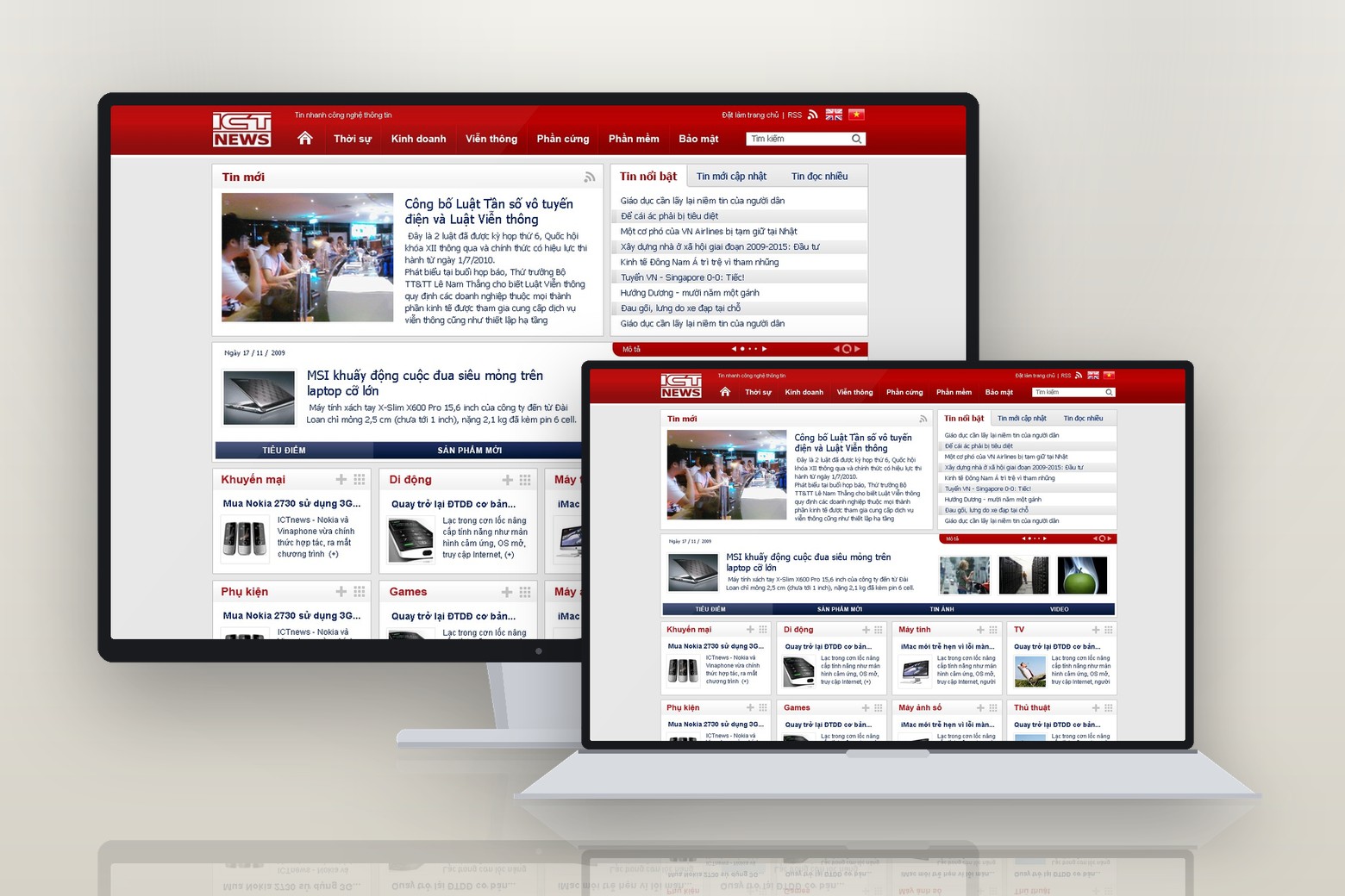
ICTnews is the technology news site of Vietnam Post Newspaper, under the Ministry of Information and Communications. Sinh Vũ built the logo and the whole interface, so a newborn digital newsroom could publish every day, fast and trustworthy at once.
The problem
In 2007, Vietnam's internet was expanding very fast, and the information technology sector needed an official news channel that could keep up. Vietnam Post Newspaper, the press arm of the Ministry of Information and Communications, founded ICTnews to play that part: an online paper devoted to technology, quick to publish, able to speak both for the regulator and for the market.
But the paper began from almost nothing, just a few people and a blank page. The task set for Sinh Vũ was not to draw a handsome logo, but to build both a face and a frame for a newborn digital newsroom: a mark that earns a reader's trust at first contact, and a page system orderly enough to publish every day without chaos, carrying the composure of a body under the Ministry while staying as nimble as technology news.
How we did it
Before drawing a single line, we asked where the paper wanted to stand in the reader's mind. ICTnews carried two opposing pressures: as the voice of a body under the Ministry it had to be composed and trustworthy; but as technology news it had to be quick and alert, never as dry as an official gazette. Lean too far either way and it fails, too solemn and it loses readers, too flippant and it loses authority.
We chose for ICTnews a place to stand in between: official, yet fast. That position later became the measuring stick for every design decision, from the weight of the logo and the red of the signal to the way a page is laid out. Each time we hesitated, we came back and asked which choice kept both the trust and the speed.
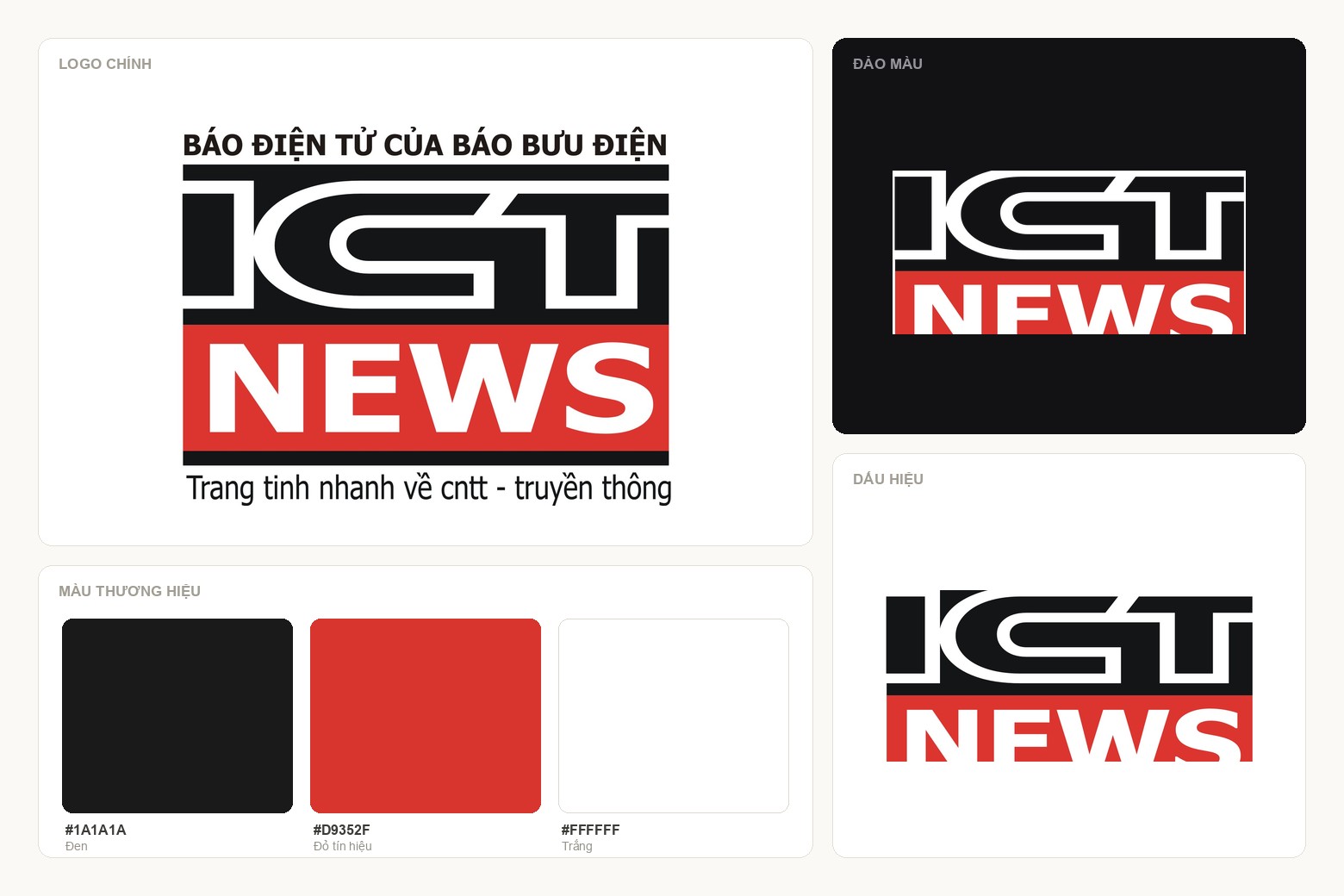
The first point of contact for a news outlet must do one thing before all else: make people trust it. So the ICTnews logo was distilled to the most solid form possible, two blocks of type side by side. ICT is built in squared, dense strokes, solid as a foundation; NEWS sits on a field of red, the colour of a hot signal, of a story just in. Reading that block, people see at once the two things the paper promises: trustworthy, and fast.
We built around that mark just enough to let it live everywhere: a band above stating plainly that this is the online paper of Vietnam Post, anchoring the authority of its parent; a line beneath about fast news on information technology and communications, saying outright what the paper does. The block letters were kept thick enough not to break when shrunk to favicon size, because on a digital surface a logo spends most of its life very small.
The value of such a face shows in real life. Readers scroll past dozens of news pages each morning, and that red and black block is distinct enough to be recognised, composed enough to be trusted, before they read the first headline.
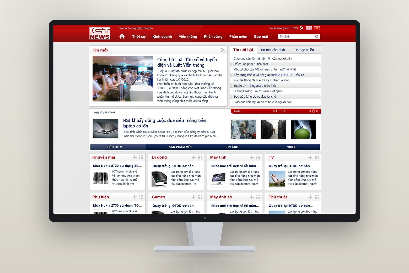
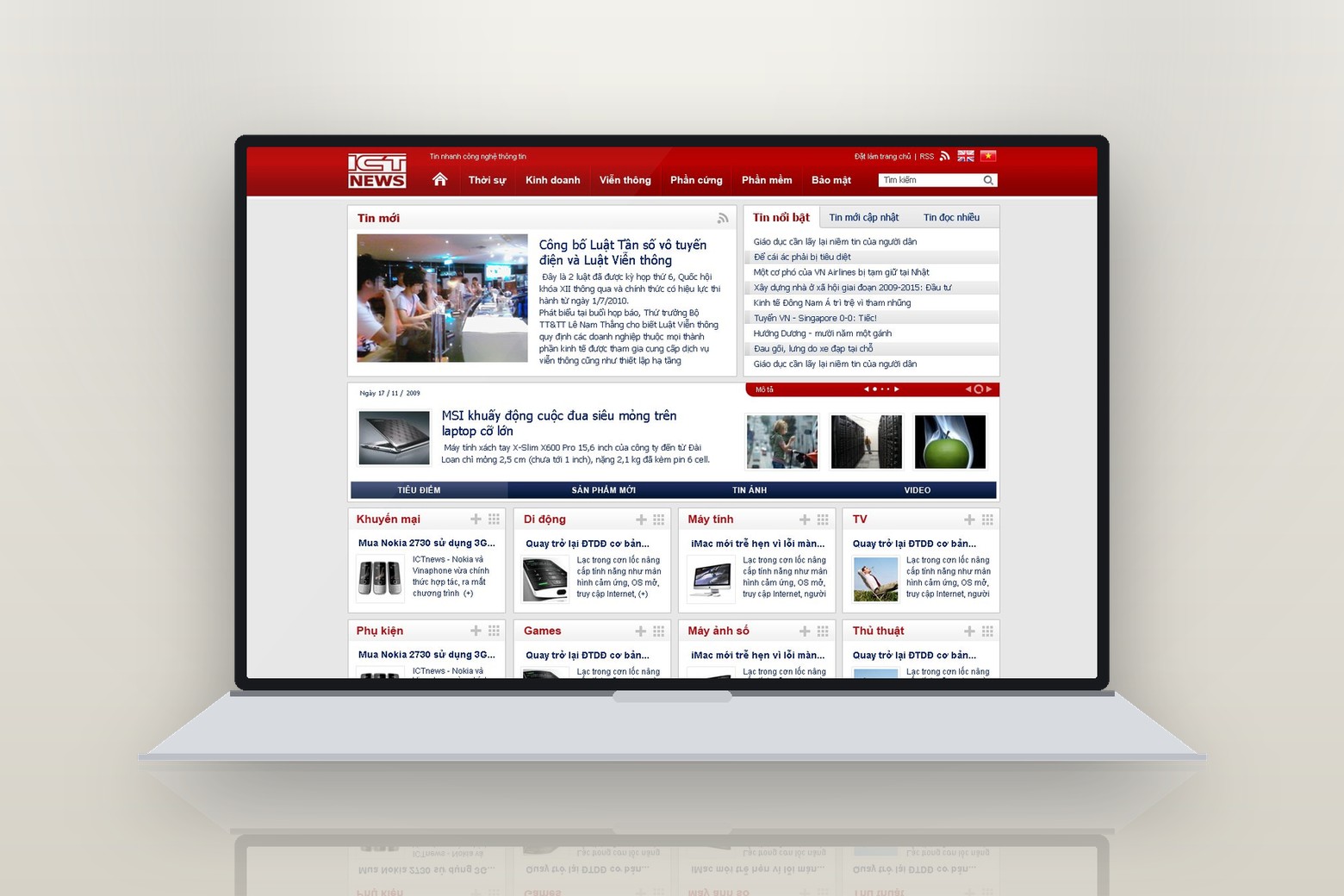
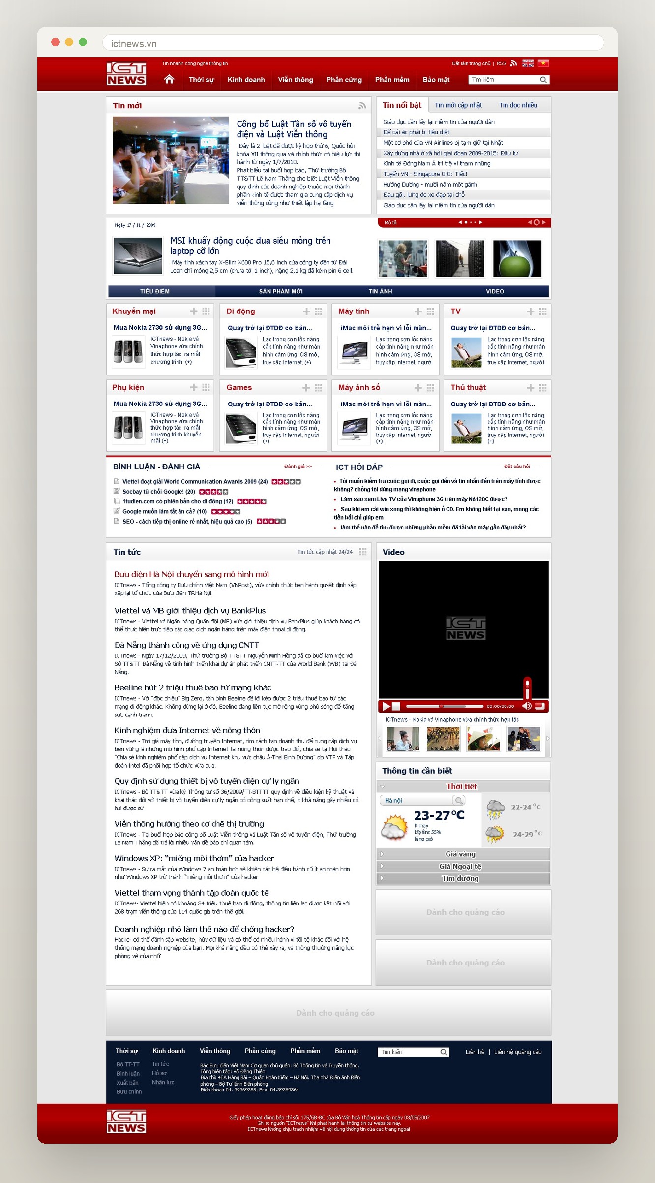
With a face in place, the paper needed somewhere to live each day. We designed the ICTnews home page the way a reader of that era scanned an online paper: latest and featured stories first, then highlights, technology products, video, with familiar strips woven between such as weather, gold prices and the stock market. Down the side ran clear sections, mobile, computers, electronics, so anyone could find their way.
The article page was built to be easy to read and easy to scan: a large headline, a lead image, an airy body, a right column suggesting related stories to keep the reader longer. Everything aimed at a smooth reading rhythm, because with fast news, every second a reader spends wondering where to click is a second they might be lost.
A newspaper does not only need to look good, it needs to pay for itself. So while building the interface, we prepared an advertising frame to the industry's standard sizes: a horizontal strip across the top, a tall column down the side, rectangles woven between the news. Those spaces were planned into the layout in advance, so the newsroom could sell advertising without the page breaking, without patching things up each time a client arrived.
More importantly, the home page, the section pages and the article pages all grew from the same frame and a set of reusable components. For a newsroom of only a few people publishing without pause, this consistency at the frame level is what keeps the paper running fast without chaos: add a section, open a new page, and everything still fits into one system.
As the paper grew, its face had to grow with it. Once ICTnews had found its footing, we refined the identity and interface to suit a maturing newsroom: a tidier logo, better aligned for the header bar; a masthead carrying the parent body, the editor-in-chief and the licence, to the standard of a properly established paper. The sections were reordered by the content areas that had by then become clear, from current affairs and telecoms to hardware, software and security.
That is how a good system grows up: not torn down and rebuilt, but tightened over time. The red and black block from the early days remained, only more composed, so returning readers still recognised the paper they trusted, while the paper had grown into a genuine press organisation.
The process
Official, yet fast
We settled ICTnews on a place to stand between the composure of a body under the Ministry and the speed of technology news, taking that as the measure for every line.
The ICT NEWS block
The two-block red and black logo was born alongside a set of variants and rules, solid enough to be recognised at any size, from the header bar to the favicon.
Home, sections, articles
We built the page system for the whole newsroom, with a standard advertising frame so the paper was both easy to read and able to pay for itself.
The refined version
As the paper grew, the identity and interface were tightened, neater and more composed, keeping the familiar block of news intact.
The result
From a few people and a blank page, ICTnews gained a face you read as news and a frame to publish by every day without chaos. Across a ten-year journey it became a technology news channel trusted by the regulator, by businesses and by readers, until it merged into Infonet in 2011 to begin a new chapter.
The deepest value lies not in the logo or the handsome screens, but in the fact that a young press organisation could run fast because its foundation was already solid. The identity and the page frame were built firm enough that the newsroom did not have to rethink them each time it added a section or sold a slot of advertising, free to focus on the one thing that matters most for a paper: being on time with the news.
ICTnews on screen
The whole ICTnews home page, from the top down to the masthead naming the Ministry of Information and Communications. A clearly tiered layout, familiar section rails, utility blocks and a built-in advertising frame, so the newsroom could publish every day without chaos.
Does your product look like ICTnews on day one?
Tell Sinh Vũ what is on your mind about your product's face. Sinh Vũ will point you to the right direction straight away.