
HiTV, a name that says hello
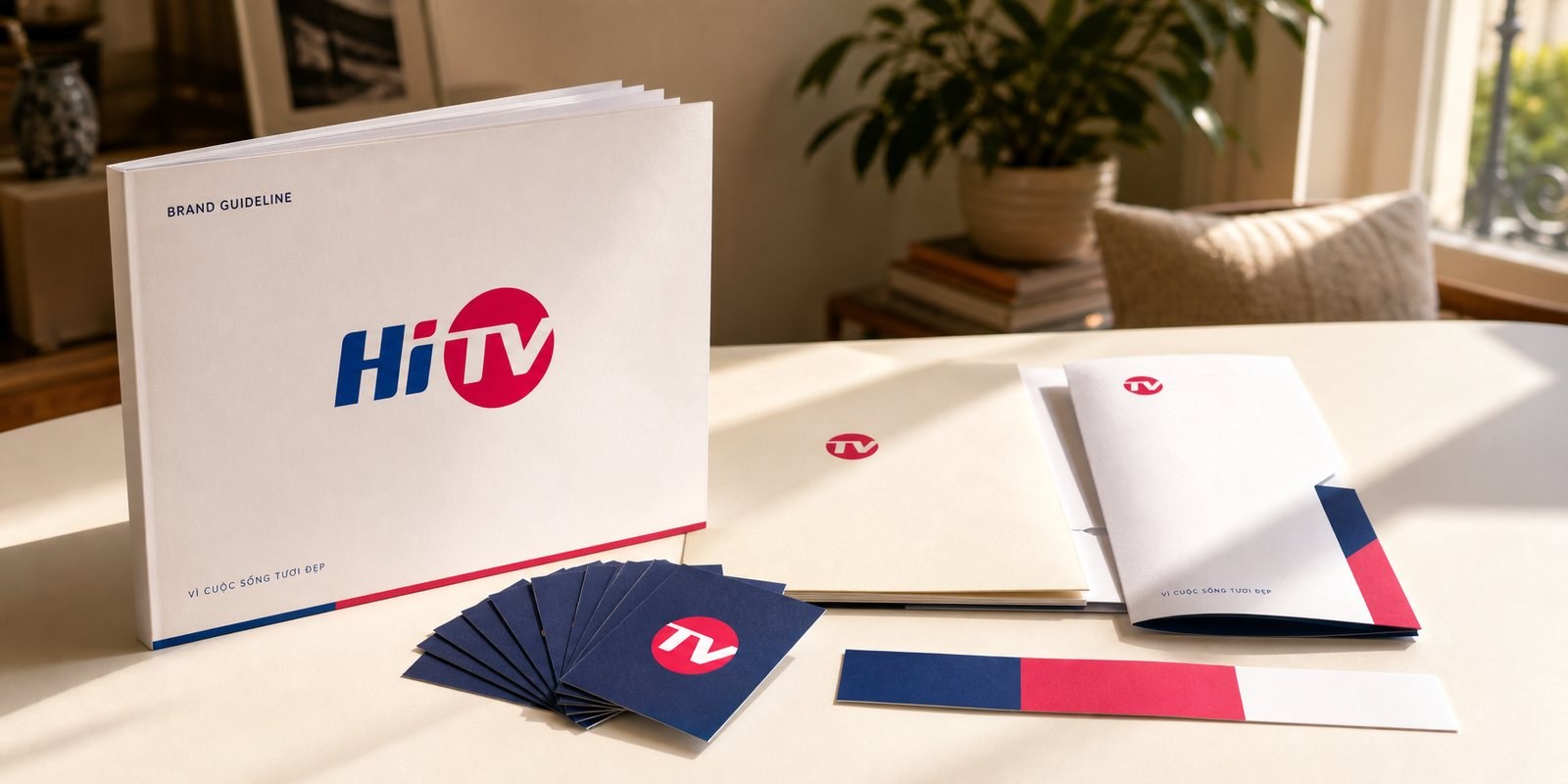
Among hundreds of channels crowding onto one remote, this Hanoi television brand wanted to be remembered for warmth. Sinh Vũ built the HiTV identity around the name itself: 'Hi' is a greeting, the pink dot beside it a warm point of everyday life, so that switching on the television means being welcomed into a beautiful life.
The problem
HiTV entered a crowded market. On one remote, hundreds of channels slide past in a few taps, most of them remembered by a number and a technical signal, cold and alike. A station is easy to appear on air and hard to stay in the heart of a Hanoi viewer.
HiTV chose a warmer promise for itself: for a beautiful life. What Sinh Vũ was asked for was not an eye-catching logo, but an identity that carries that warmth, so the station enters the home like someone familiar rather than standing outside like a service. Luckily, the name already held a rare gift: 'Hi', a greeting few channels have.
The approach
Before touching the form, we asked the root question: what should viewers remember about the station? Not the coverage area or the transmission technology, but the feeling of being welcomed home each evening. The anchor of the whole system sits in the first two letters, Hi, the warmest thing one person says to another: hello.
Alongside the name runs the line 'for a beautiful life'. We did not treat it as a slogan to display, but as a guiding promise: the station exists to make ordinary days a little easier. The positioning pulled HiTV out of the role of a technical channel and into the role of the one who brings joy to each living room, and everything built afterwards holds to that greeting as its axis.
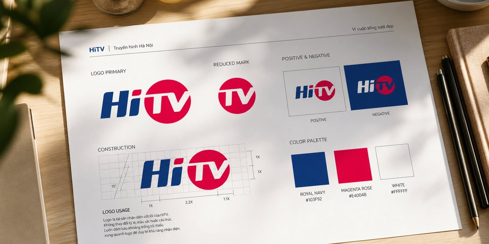
'Hi' is drawn with a forward-leaning stroke, navy letters that are solid without being stiff, like a person stepping in to shake hands. The lean carries the eye to the right, exactly where the story continues.
There, 'TV' sits inside a rose-pink circle, white letters reversed out of a warm ground. The dot is the bright point of the whole identity: it suggests a small sun, a power button just switched on, the warmth of a living room at night. Navy holds the credibility of an established station, pink-red holds everyday life and feeling, the two colours set against each other just enough to make the name both steady and fresh. By now HiTV is no longer three initials; it has become a greeting with colour.
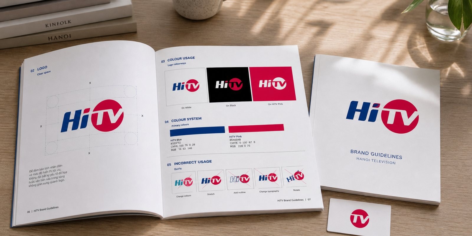
Television lives on all kinds of grounds: the corner of dark footage, a caption bar over bright news, a stage backdrop full of colour. Without rules, the pink dot and the navy letters would sink here and glare there, each hand building it a different way.
We wrote the guidelines so HiTV is always the same face: a positive version on white, a negative white version on navy, and how to place it right on the brand's own pink ground. With them come the minimum clear space around the mark, the smallest size at which the 'TV' dot still reads, the palette printed in true colour. Because of the guidelines, across countless broadcast hours and many hands, the greeting stays whole. The identity stops depending on the person making it.
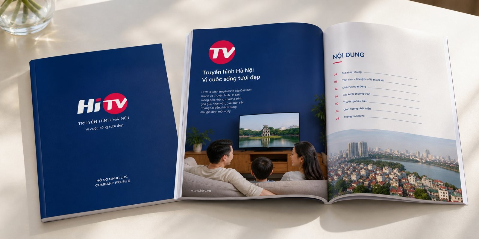
A station does not only live on air. It meets partners, invites advertisers, sends official letters, introduces its capabilities. In those meetings, what speaks for the station is its profile and corporate materials.
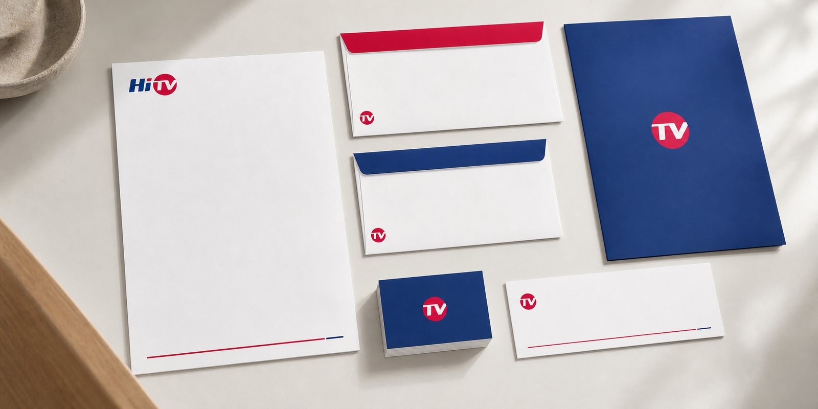
We carried the HiTV identity into the capability profile and the stationery: a navy cover led by the pink dot, warm images of family life inside, business cards and letterhead in the same polished voice. So that before a partner switches on the television, they already see the spirit of the station: trustworthy, bright, for a beautiful life.
The result
What HiTV gained was not a new logo stuck onto the screen, but a way of being present: among a forest of cold technical channels, the station has a face that greets, warm and easy to remember. The name is no longer three initials; it has become an invitation into everyday life.
For a television station, being remembered by feeling is worth more than being recognised by a number. When the pink dot lights up in the corner of the screen each evening, viewers not only know which channel they are watching, they feel welcomed. That is how HiTV keeps its place in Hanoi homes, exactly as its promise of a beautiful life says.
Warm on air, polished off screen
HiTV stationery
Does your challenge look like HiTV?
Tell Sinh Vũ what is on your mind about your brand. Sinh Vũ will point you to the right direction right away.