
AVG uses a plus sign to connect every screen
AVG steps into the on-demand television era (OTT) with a new brand identity: a plus sign that appears consistently across phone, television and website.
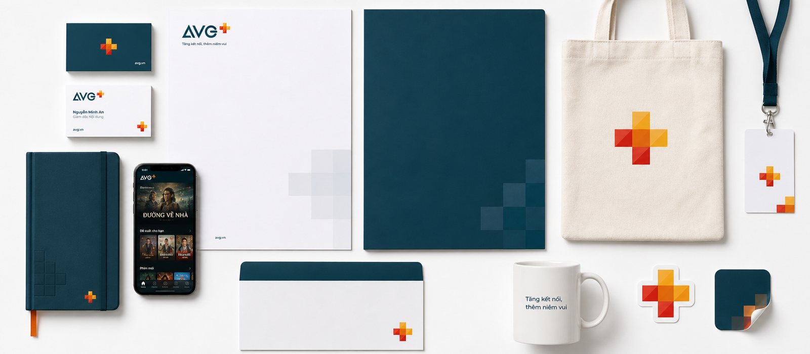
The problem
AVG is a name long familiar in Vietnam's television industry. But what had changed was not the name, it was how people watched: on a phone while waiting for a ride, on a computer during a lunch break, on the living room television on a weekend evening. A brand born in the era of fixed broadcast schedules now had to live in the OTT era, that is, television watched over the internet, where viewers choose their own time and their own film. The task was not to refresh a logo, it was to learn a different voice, one for modern entertainment, warm and playful, without dropping the trust the name had spent years building.
Harder still, that voice had to speak evenly across many places at once: a phone app held close to the face, a television interface viewed from a distance through a remote, a website in a browser, and physical touchpoints such as a set-top box on a shelf, a poster, a launch stage. When every team and every partner built it their own way, the brand broke into pieces, and viewers were no longer sure they were in the same place. Together with AVG, we went looking for an anchor small enough to fit an icon, and large enough to carry an entire broadcaster. That anchor was a plus sign.
The approach
Before we touched a pen, we forbade ourselves from drawing. A television brand in transition is rarely short of visual ideas, what it lacks is an answer to the root question: among countless platforms competing for a few free minutes of a Vietnamese viewer's day, where does AVG stand, and for what purpose. We audited the brand, reassessed the full set of assets and how AVG was showing up, and read back how viewers named it and remembered it, so as to look squarely at what already existed before discussing what should exist.
We then sat down with AVG through workshops, guided joint sessions where both sides settled on a direction together. Rather than impose a slogan, we distilled a compass line the whole broadcaster could agree on: AVG does not sell channels, does not sell a number of films, AVG adds joy to the moments people spend together. That short line went on to govern every choice that followed, from the warmth of a colour to the roundness of a corner to how a single line of text greets a viewer.
We hold to one principle: an identity system only stands firm when it grows out of a positioning statement, not out of a beautiful shape found first and given meaning afterward. This chapter produced not a single pixel, but it decided that every pixel to follow would share one reason for existing. Once a whole team knows why it is doing something, what it makes naturally stops drifting apart.
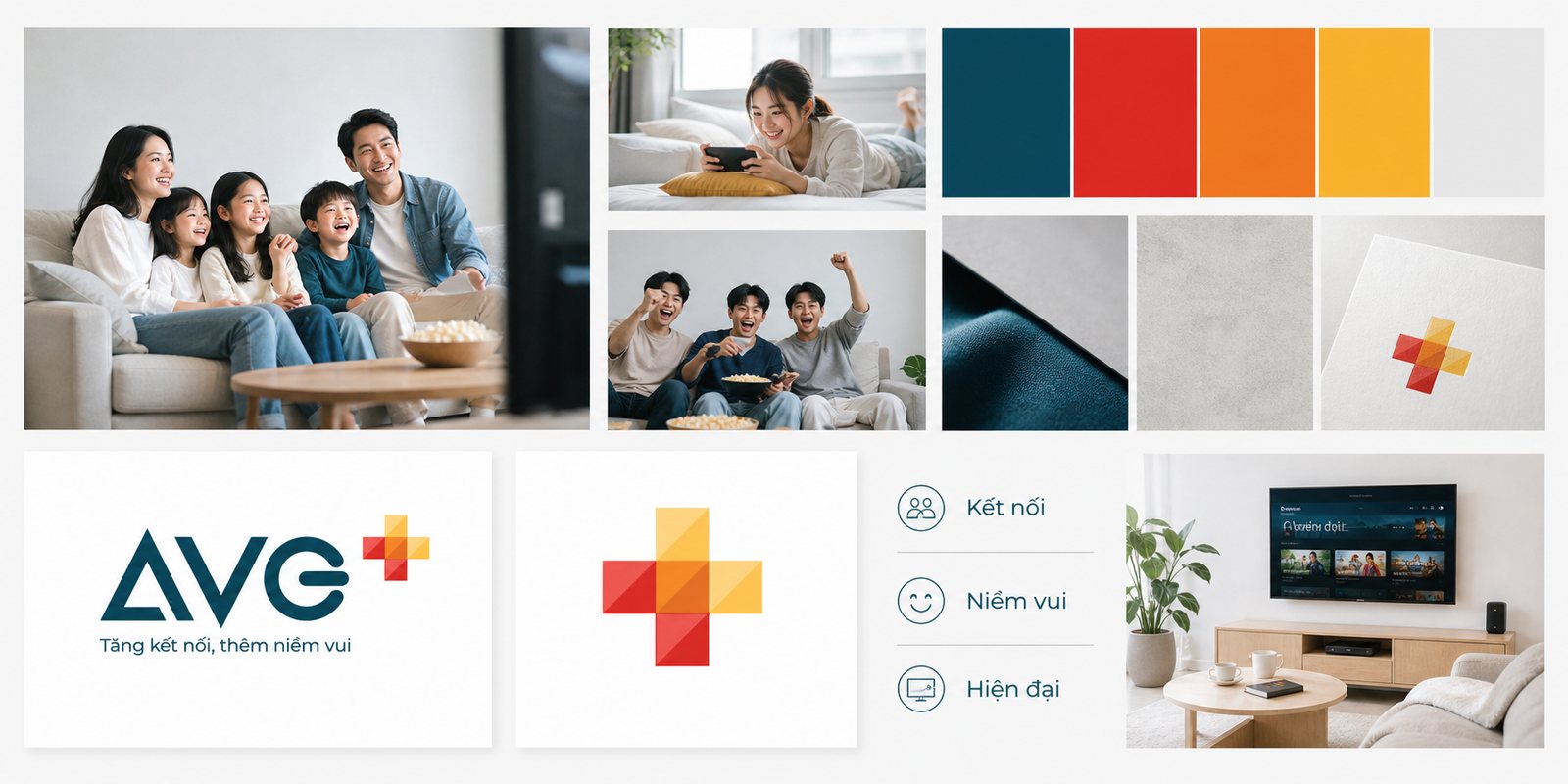
The anchor for the whole system is a plus sign, read like an arithmetic statement of the brand's actual promise: more connection, more joy, added on top of, not replacing, what viewers already loved. It is built from warm squares stacked over one another, red, orange, amber, like light spilling out of a living room in the evening, set beside the AVG wordmark in a deep, steady teal. Blue for trust, warm tones for joy: the long-standing broadcaster's credibility and the warmth of an evening spent together, bound into a single mark.
The difficulty is that the mark had to live at two extremes of size at once: shrunk to a speck of an icon on a phone and still recognised instantly, blown up across an entire stage backdrop and still composed. So we built the plus sign in a modular way, meaning the squares are bricks that can be taken apart and reassembled: they combine into the primary plus sign, and they also separate into a background pattern, a frame for arranging films, a rhythm of motion when an interface opens. The mark has many lives, always from the same root.
Internally we call this a plus sign that smiles: it does not stand at attention like a badge, it bounces, brightens gradually, and settles into a smile made of colour blocks when the app launches. A good mark for the digital era is not only for looking at, it has to move: brand identity today does not live in one static shape, it lives in how that shape moves consistently across every screen.
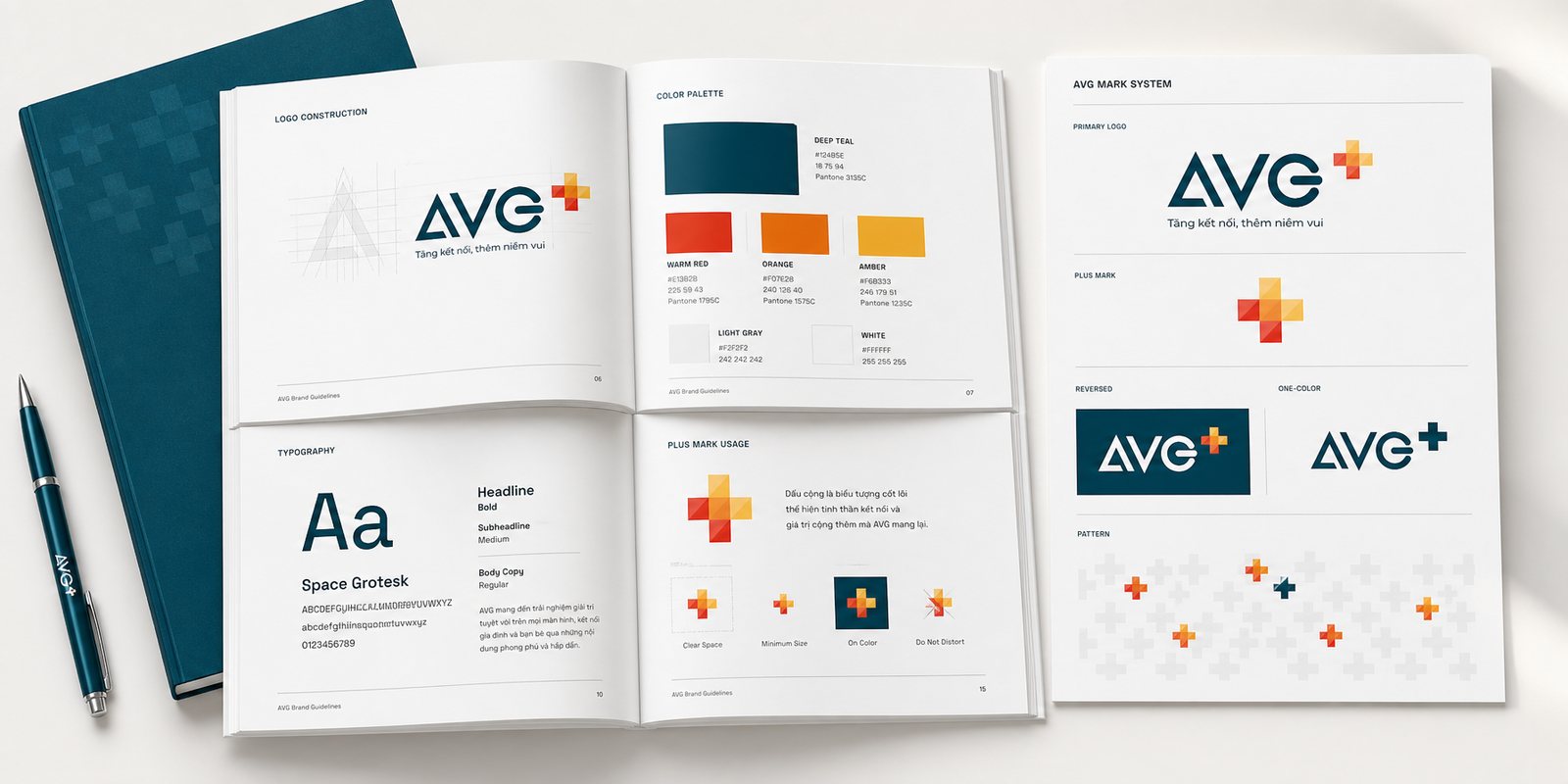
A beautiful mark is the easy part. The hard part is keeping it from warping when dozens of people, across many teams and partners, touch it every day. A large broadcaster builds content constantly: a programme today, a campaign tomorrow, a co-branded partner the day after. If every touch means reinterpreting where the plus sign sits or which red is the correct red, then within a few months AVG on television and AVG on a poster would already be two different people.
So we wrote a set of brand guidelines, a rulebook for using the brand, meant for reference rather than for display: how much clear space the plus sign needs, at what size threshold it switches to a different version, which colour codes are correct, which typeface for headings and which for long blocks of text, how the pattern is built from the squares themselves. Every rule comes with a correct example and an incorrect one, so the reader does not just know the rule but understands why it exists.
The value of the guidelines shows up in a place no one sees: a partner's designer, someone we have never met, opens the document and builds a banner correctly on the first try, with no need to call and ask. We believe that brand guidelines are exactly what turns a brand from something that must be supervised piece by piece into something that runs correctly on its own as it grows. It is a one-time investment that saves thousands of interpretations later.
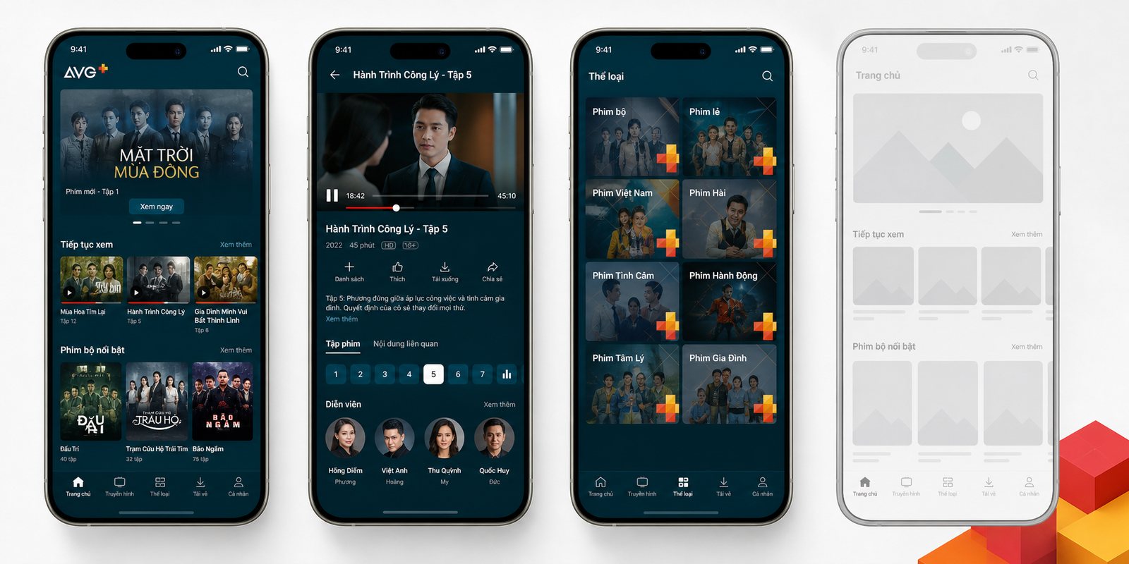
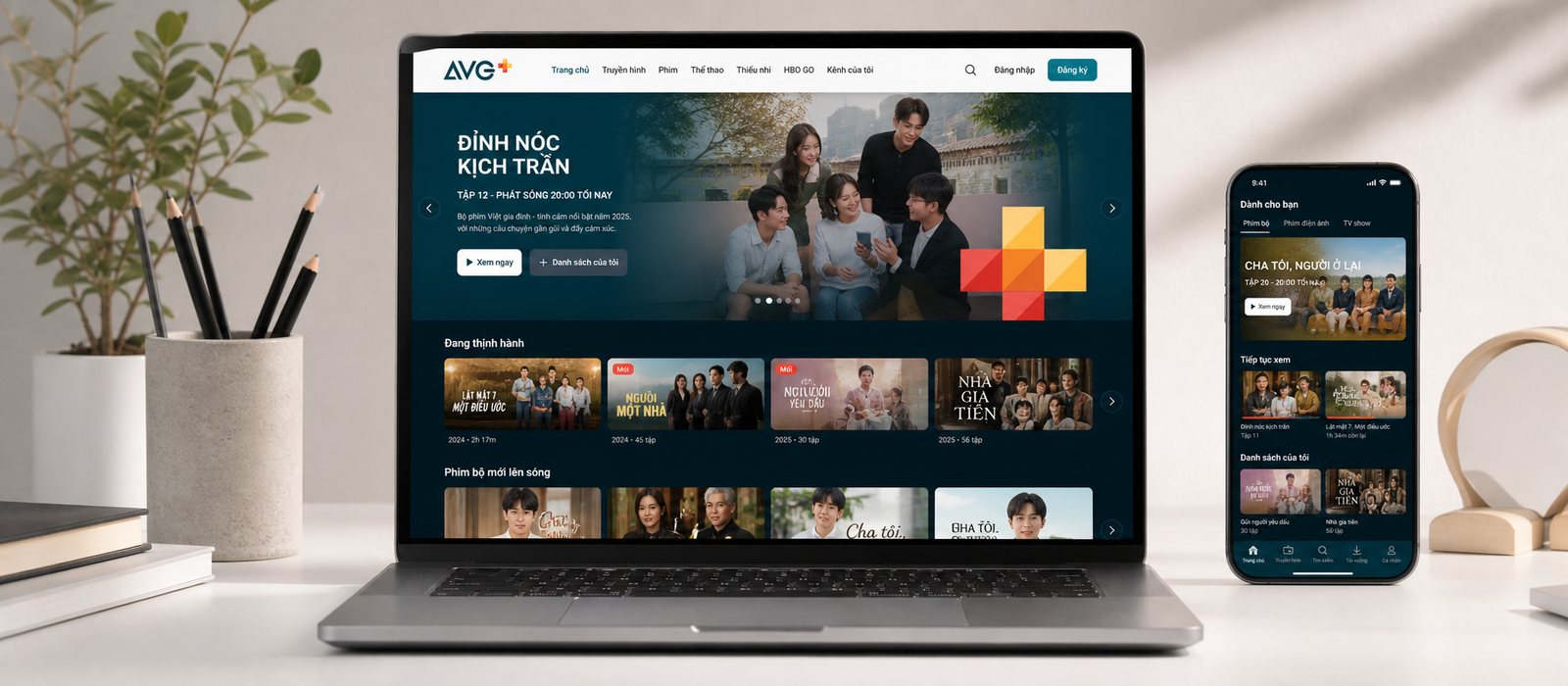
On-demand viewing does not live on one screen, it spreads across many: a phone in the hand, a tablet propped up in bed, a website in a browser. The easy way is to hand each screen to a separate team, and end up with three similar-looking apps where every detail is slightly off: a search button in a different place each time, a row of films a different size each time. We refused that route, and built AVG a shared design system, a standardised library of interface components so that every product assembles from the same set of parts.
We defined the interface building blocks once: film cards, horizontally scrolling rows of films, the navigation bar, the icon set, how posters are arranged, spacing and type-size rules, all drawn from the language of the plus sign. Every screen after that is not redesigned, it is reassembled from the same parts. Because of this, a viewer moving from a phone to a tablet does not have to relearn anything: the same logic for finding a film, the same places to tap, the same familiar feel.
The real value of a shared system shows over the long run. Every time AVG adds a content section or a feature, they build it once in the system, and it appears consistently across every screen at once. What used to be built three times, drift three times, and get fixed three times, is now one. We believe that for a product spanning many screens, design's greatest value is not a beautiful interface, it is a foundation that allows work to move fast without breaking its rhythm, so the product team can keep pace with content.
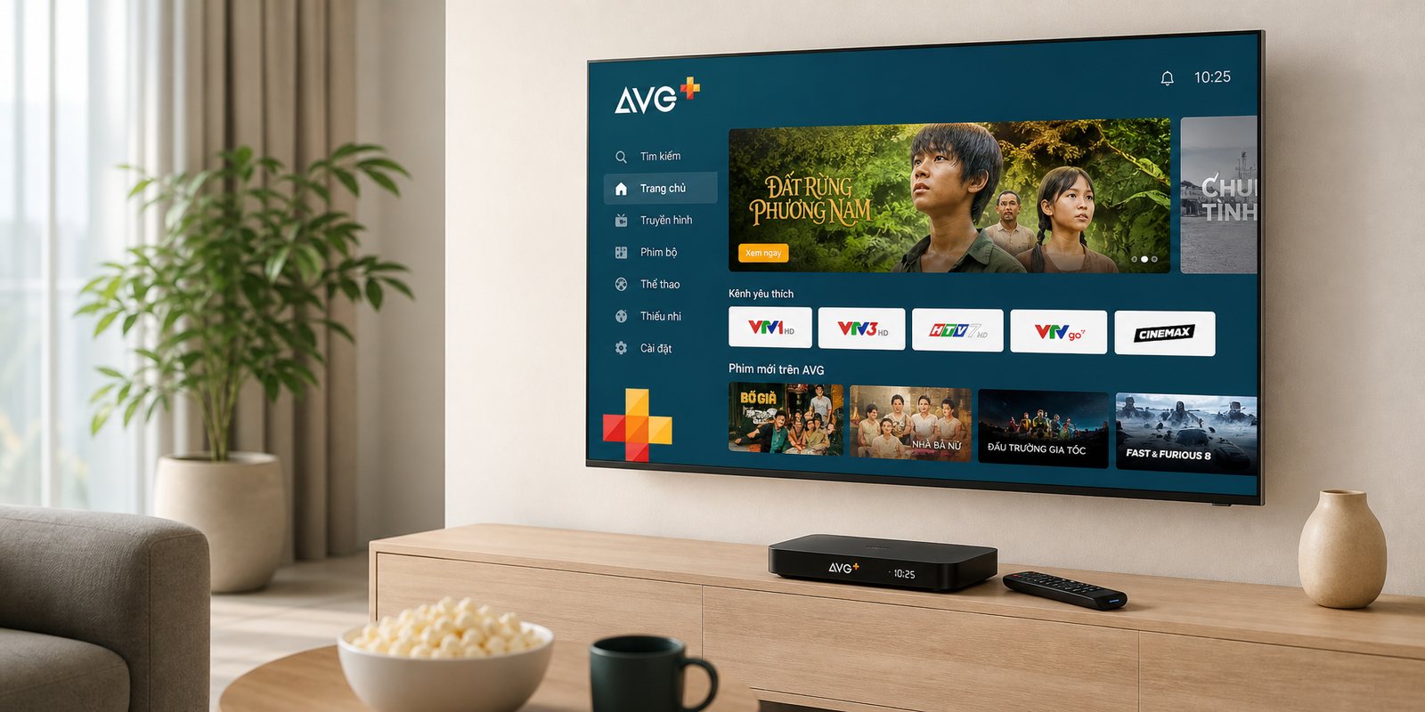
Among all the screens, one carries a symbolism of its own for a broadcaster: the television in the middle of the living room. But television is a design problem quite different from the phone, one where many digital platforms stumble. People do not touch a television, they sit a few metres away and control it with a remote that has only a handful of buttons. A phone interface carried over unchanged becomes text too small to read from a sofa, and paths that need a swipe become impossible with a single arrow button.
So we designed the television experience for viewing distance, meaning for a viewer sitting roughly three metres from the screen: text large enough to read from a chair, films wide enough to see clearly, contrast strong enough for a dark room, and above all a path shortened to few enough steps that reaching what you want to watch takes only a few presses of the arrow. The plus sign and the warm palette stay the same, but the layout closes in around one thumb on a remote, not ten fingers on a touchscreen.
What ties everything together is continuity. From the set-top box under the television, to the app in a shirt pocket, to the website open at work, viewers meet the same AVG, the same way films are laid out, the same plus sign greeting them on the opening screen. We believe a well-made digital brand is one where a user steps from one screen to another almost without noticing a boundary, because an experience only breaks when a design forgets that behind every screen is the same person.
An entertainment brand cannot live behind glass alone. People decide to buy an AVG set-top box while holding the box in a shop, remember AVG while passing a poster on the street, trust AVG while sitting in front of a well-built launch stage. If the plus sign is beautiful only inside the app and feels out of place in the physical world, the brand has only travelled half the distance. So we carried the plus sign out of the screen, keeping the same spirit but changing the material.
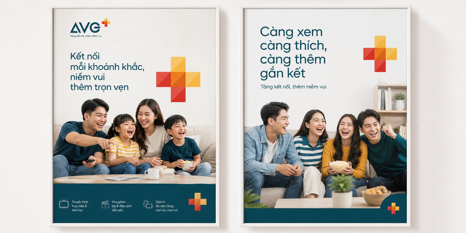
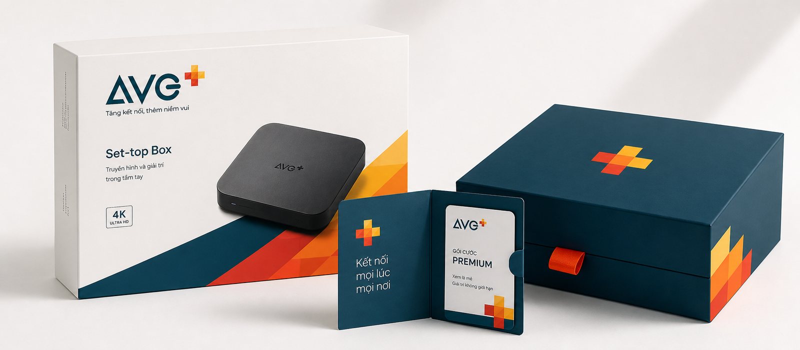
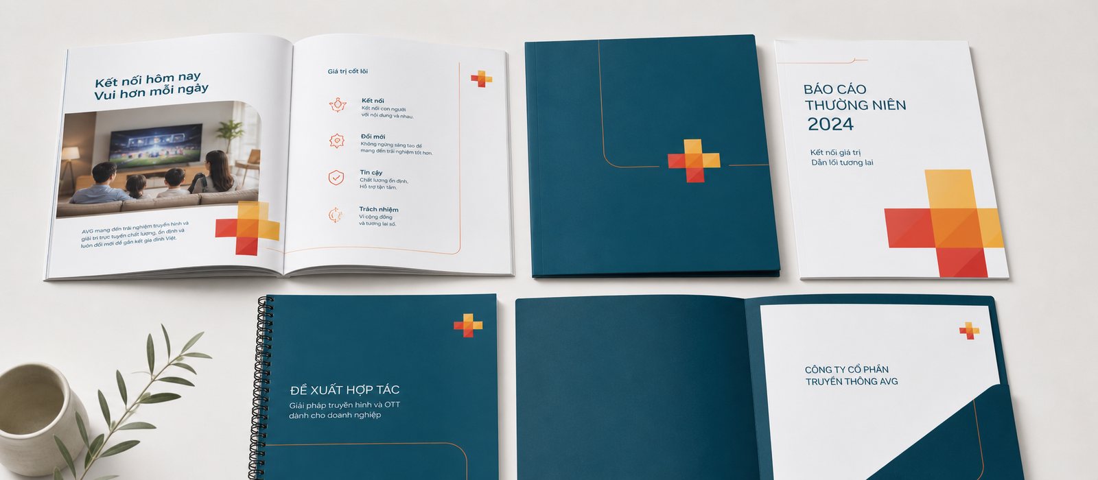
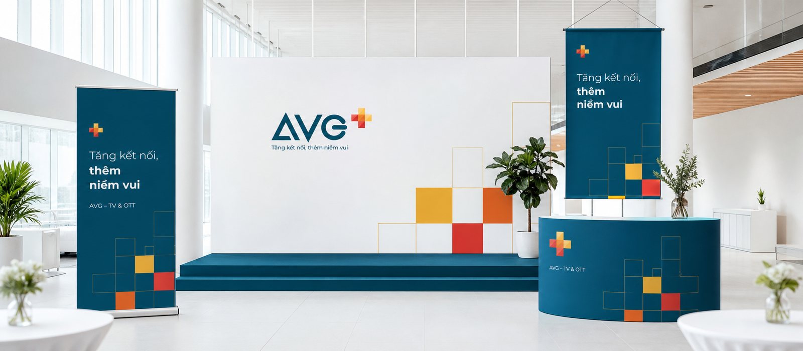
On the set-top box packaging, the warm squares become a visual system for the box, so that an otherwise dry piece of hardware carries the warmth of the joy promise. In campaign imagery, we built a consistent visual system around moments of people laughing together, watching together, so that every poster, though shot in a different scene, is instantly recognisable as AVG through its light, its colour, its rhythm of composition. On corporate documents and the launch stage, the same plus sign appears again, this time to tell partners and investors that this is an organisation with method, with a clear face.
The thread running through all of it is a single signal and a single promise: more connection, more joy. We believe a strong campaign visual system is one where viewers recognise the brand before they even read its name, and that only happens when every touchpoint, on screen and off it, gives off the same unchanging signal. AVG's plus sign travels from an icon a few dozen pixels wide to an entire stage, and remains itself all the way.
Process
Audit and direction
We audited the full set of existing brand assets and, through workshops with the AVG team, settled on a compass line: AVG adds joy to moments spent together. Everything that followed held to it.
The plus sign and the guidelines
From that direction, we built a modular plus sign from warm squares set against a teal background, then framed it into a set of brand guidelines so the whole broadcaster and its partners could use it correctly from the first try.
One system, every screen
We built a shared digital design system for the app, television and web, designing the remote-control experience for the living room separately, so every screen assembles from the same set of parts.
The brand beyond the screen
Finally, the plus sign stepped onto set-top box packaging, campaign imagery, corporate documents and the launch stage, closing a system that runs unbroken from strategy to every physical touchpoint.
Results
What AVG gained was not a new logo, it was a unified face for a major name stepping into a different era. Whether viewers meet AVG on a phone while waiting for a ride, on television on a weekend evening, on a website during a lunch break, on a set-top box or on a ticket to a launch event, they see the same brand and hear the same promise. The plus sign is not only a shape, it is a system: a method of construction, a rulebook, a shared language so that every team and partner at the broadcaster can keep building without drifting apart.
For a television platform stepping into the on-demand era, the deepest value lies not in how beautiful a screen looks, but in the ability to grow without having to rethink the brand every time a screen, a feature or a campaign is added. AVG can open more content, reach more points of sale, step onto more stages, and every step is still the same plus sign continuing the same story, only deeper. That is the reassurance a genuine identity system leaves behind: the brand stops being something that must be watched over case by case, and becomes a foundation to keep building on.
The brand steps beyond the screen
A plus sign that does not stop at the app. It lives on the website, on the set-top box, in corporate documents and on the launch stage.
Website
Set-top box packaging
Corporate documents
POSM and launch event
Is your challenge like AVG's?
Tell Sinh Vũ what is troubling you about your brand. Sinh Vũ will point you to the right direction right away.