A small carton blends in among big brands
Standing next to the familiar brands, your carton has nothing to make the eye stop.
Pick one real difference and put it on the front, then build the whole packaging around it.
Start from this problem
With milk, shoppers buy what they trust first, then what they like.
Milk is for the whole family, so shoppers demand a clear source and clear nutrition, and they react to the smallest doubt. Sinh Vũ makes your cartons, bottles and jars say what is true: fresh, wholesome and clear on origin.
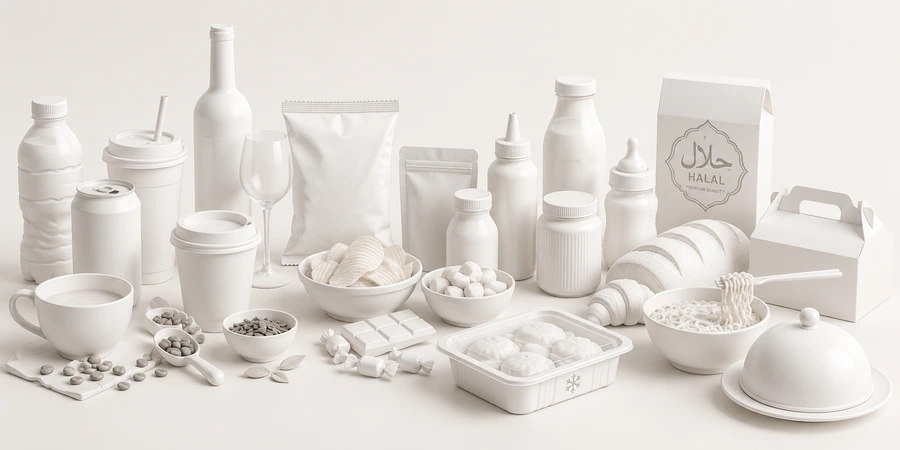
Three things: a sign you can recognize among the big brands, a clearly shown farm origin, and nutrition information that is easy to read. With milk, trust comes before taste.
Even a small carton has one distinctive thing you can read from a distance.
Where the animals are raised and where the milk is processed, told briefly in words and real photos.
Shoppers find what they need to know while the front stays clean.
Fresh milk, yogurt and cheese sit in different parts of the fridge and of the meal.
Their customersFamily shoppers who buy regularly and read labels closely because it is for the whole household.
Brand challengeGive a clear reason to choose this carton over a big brand: the source, the freshness, the method.
Their customersShoppers buying out of habit and by flavor, many of them buying for children.
Brand challengeA mark for each flavor you understand at a glance, with every jar clearly yours.
Their customersShoppers buying for the home kitchen, as gifts or for more ambitious dishes, who read the label to judge how refined it is.
Brand challengeShow the craftsmanship and how to use it, so the product is chosen as something worth noting.
These are the places dairy brands lose customers that quality can't rescue.
Standing next to the familiar brands, your carton has nothing to make the eye stop.
Pick one real difference and put it on the front, then build the whole packaging around it.
Start from this problemThe farm does things properly, but shoppers don't know because the packaging doesn't tell them.
Make where the animals are raised, the method and real photos part of the packaging and the sales page.
Start from this problemA table of tiny text crowds the front, and shoppers can't find what they need.
Divide the space: the front for recognition, with an ordered information panel on the side or the back.
Start from this problemFresh milk, yogurt and cheese look like they come from three houses.
One shared framework for the whole range, with each type changing its own color and mark.
Start from this problemAt the Check stage. Shoppers look at the origin and information on the carton, then look further on marketplaces and maps before they trust it.
Touchpoints are the places where customers see, touch or hear about the product. These five decide trust in milk.
It is what shoppers pick up and read.
Shoppers are buying for the whole family, so they read it closely.
Where a small carton has to stand out among the big brands.
Visible proof of the origin.
New shoppers often check here before buying.
In the order Sinh Vũ suggests doing them. A new brand can stop at step three and be ready for the shelf.
Choose a real difference from the big brands before drawing anything.
Name, mark, colors and type: the foundation for all packaging.
Cartons, bottles, jars and a shared frame for many types.
Farm and product photos for packaging and sales pages.
Once you have many types: guidelines so every type follows the frame.
Sinh Vũ has not published a milk or dairy project. The two below are the closest: instant fresh porridge that looks fresh, and a clean-produce chain.
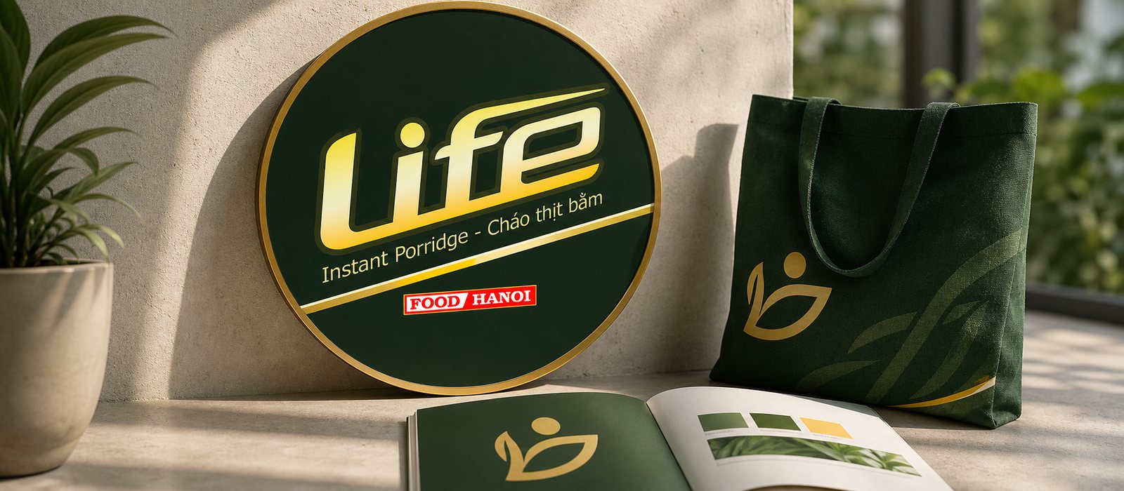
Instant porridge is easily seen as a makeshift food, so Sinh Vũ built the identity and packaging for Cháo Life to keep the fresh, clean, wholesome feel even in a pack that cooks in minutes.
A pack of fresh porridge that still looks fresh: a way to make freshness visible on packaging.
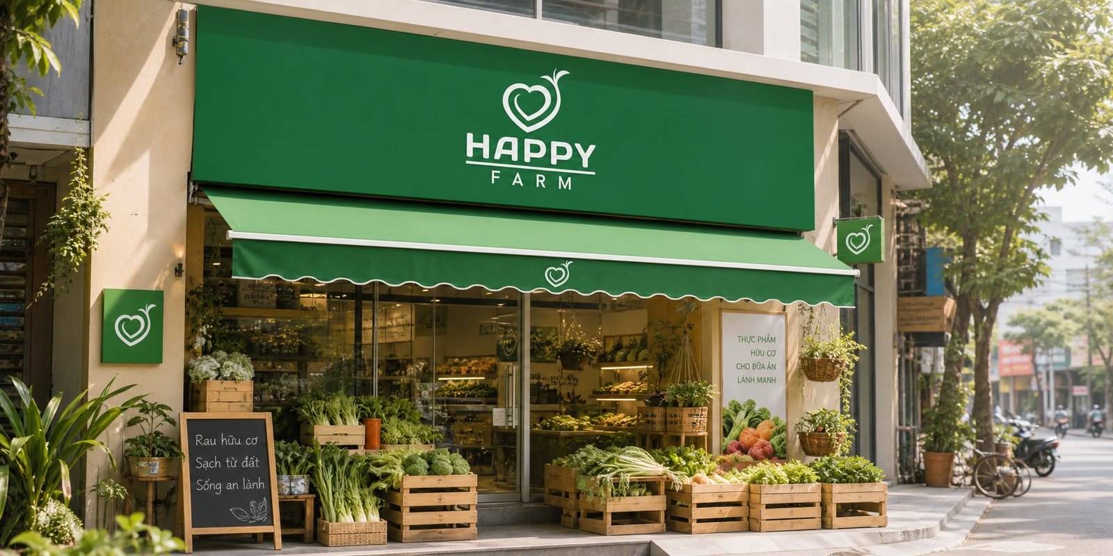
Happy Farm is a clean organic produce chain in major cities. Sinh Vũ built a logo and identity that is fresh and approachable…
Identity for clean produce, so its natural quality shows at every touchpoint: the same problem of origin.
The principles behind it
Goods sold on the domestic market must carry, in Vietnamese, the product name, the name and address of the responsible organization and the origin, plus mandatory content specific to each product group (Article 10 of Decree 43/2017/ND-CP, as amended by Decree 111/2021/ND-CP). The design should leave room for this from the start.
Don't compete the same way the big brands do. Pick something only you have, such as the source or the method, and make it the packaging's point of recognition.
One shared jar frame, with each flavor changing color and mark. Shoppers see the flavor at a glance and the range is still one house.
Only state what the product's documentation can prove. Tell the rest through origin and method.
Use real photos of where the animals are raised and where the milk is processed, shot in one consistent style. Real photos give shoppers evidence, not just a story.
A few lines about the product, where you sell it and what is holding you back is enough. Sinh Vũ reads it and replies within one working day.