Packaging goes dull in the freezer
Frost and cold lights wash the colors out, and shoppers can't read the dish name.
Use light colors and strong contrast, and test the packaging in a real freezer before printing.
Start from this problem
In the freezer, shoppers only notice the pack that is clear and looks fresh.
Freezer cases are frosted, the lights are cold and shoppers are in a hurry, so packaging has to read even when it is dim. Sinh Vũ makes your pack clear in the freezer and suggests the right dish once it is cooked.
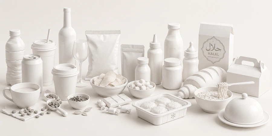
Three things: a front that reads clearly through the frost, a photo of the cooked dish that tells the truth, and cooking instructions that are easy to follow. Looking fresh and tasty even through a layer of ice is what shoppers need to see.
The dish name and food type stand out, in light colors with strong contrast.
The dish on the pack looks like the dish shoppers will cook.
Short, clear steps with pictures, readable even with busy hands.
Seafood, ready-made meals and canned food are chosen for different reasons.
Their customersShoppers buying for a family meal, whose biggest worry is freshness and origin.
Brand challengeShow the source, how it was frozen and how fresh it is, through clear photos and words.
Their customersBusy shoppers who buy to cook fast but still want a meal with substance.
Brand challengeSuggest a tasty dish once cooked, with instructions easy enough that shoppers dare to buy the first time.
Their customersShoppers stocking up, restaurants and gift buyers, who care about the expiry date and where it is made.
Brand challengeA clear, trustworthy label that is attractive enough for the whole range of cans to read as one house.
These are the places frozen food loses customers that quality can't rescue.
Frost and cold lights wash the colors out, and shoppers can't read the dish name.
Use light colors and strong contrast, and test the packaging in a real freezer before printing.
Start from this problemThe pack shows a dish as pretty as a restaurant's, the cooked result is different, and shoppers lose trust on the first purchase.
Photograph the dish really cooked to the instructions, matching what is in the pack.
Start from this problemShoppers shy away from frozen food for fear it is no longer fresh or contains preservatives.
State the ingredient source and how freshness is kept in plain words, in line with the product's documentation.
Start from this problemTiny text and mixed-up steps, so shoppers cook it wrong and blame the product.
Present the instructions as a few short steps with pictures, somewhere easy to see.
Start from this problemAt the Choose stage. Shoppers stand in front of the freezer with cold hands and skim quickly past the packs.
Touchpoints are the places where customers see, touch or hear about the product. These five decide whether a pack gets taken out of the freezer.
Where the decision is made in a few seconds, through the frost.
Where shoppers believe or doubt.
They decide whether shoppers cook it successfully and buy again.
The first thing distributors and stores see.
New shoppers check here before ordering.
In the order Sinh Vũ suggests doing them. A new line can stop at step two and be ready for the freezer.
Name, mark, light colors and clear type, the foundation for every pack.
Pouches, trays, cartons and cooking instructions.
Photos of the dish really cooked, for the pack and the sales pages.
A document set for distributors and stores.
Once you have many dishes: guidelines so every dish follows the frame.
Sinh Vũ has not published a frozen food project. The two below are the closest: a central kitchen cooking family meals, and instant fresh porridge.
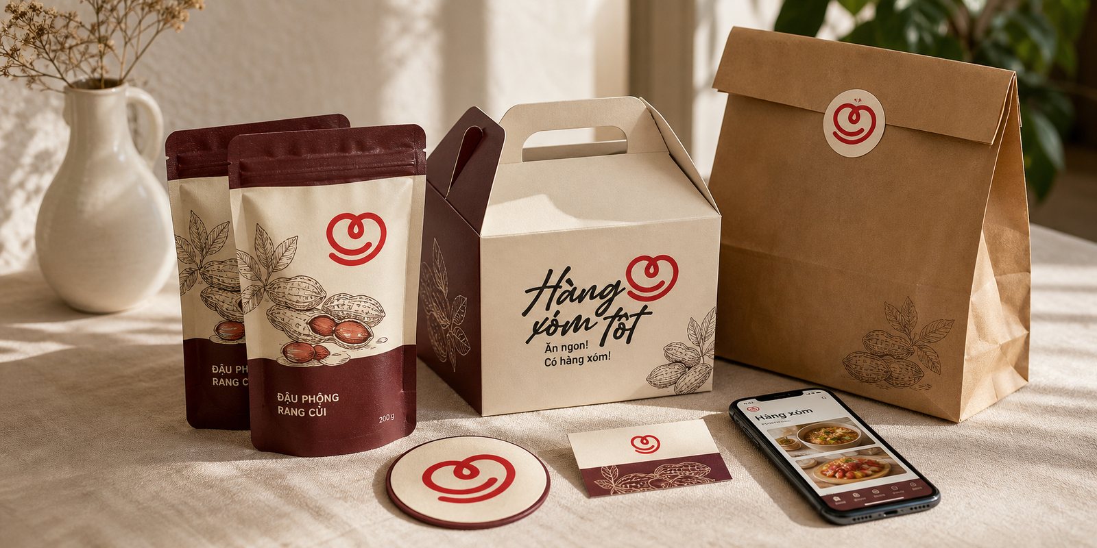
Hàng Xóm Tốt is a central kitchen cooking family meals for residents of premium apartment complexes, in the spirit of a good neighbour who cooks well and brings a plate over…
Identity, an ordering app and packaging for a central kitchen: the same problem of ready-made food for families.
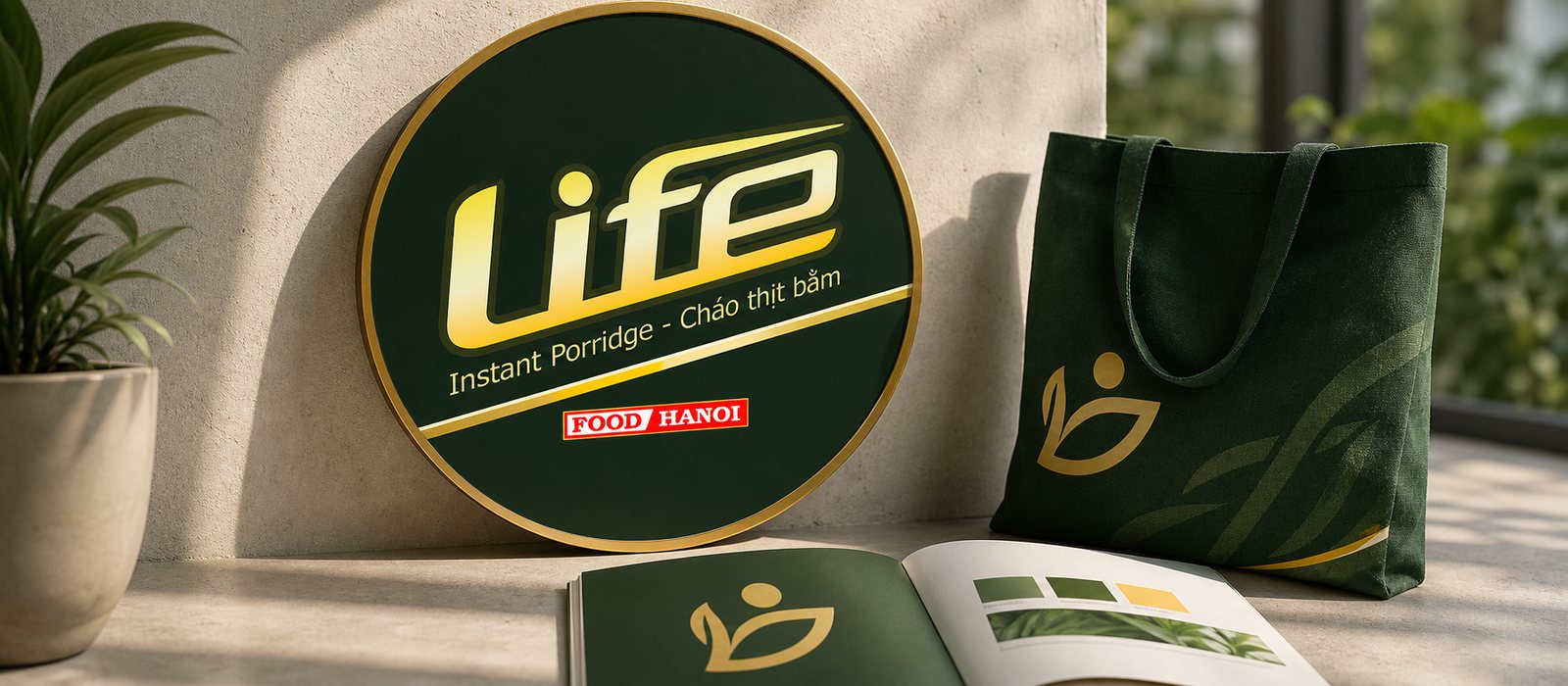
Instant porridge is easily seen as a makeshift food, so Sinh Vũ built the identity and packaging for Cháo Life to keep the fresh, clean, wholesome feel even in a pack that cooks in minutes.
Instant fresh porridge that looks fresh: a way to make freshness visible on packaging.
The principles behind it
It has to read clearly through the frost in the freezer: light colors, strong contrast, a big dish name. Test the packaging in a real freezer before printing.
Goods sold on the domestic market must carry, in Vietnamese, the product name, the name and address of the responsible organization and the origin, plus mandatory content specific to each product group (Article 10 of Decree 43/2017/ND-CP, as amended by Decree 111/2021/ND-CP). The design should leave room for this from the start.
Shoot the dish really cooked to the instructions on the pack. A photo that matches the real dish helps shoppers trust the pack and buy again.
State the ingredient source and how freshness is kept in plain words, in line with the product's documentation. Don't state anything without a basis.
A few short steps, each with a picture or one sentence. Put them somewhere easy to see so shoppers can read them while their hands are busy.
A few lines about the product, where you sell it and what is holding you back is enough. Sinh Vũ reads it and replies within one working day.