
Cháo Life, fast yet still wholesome
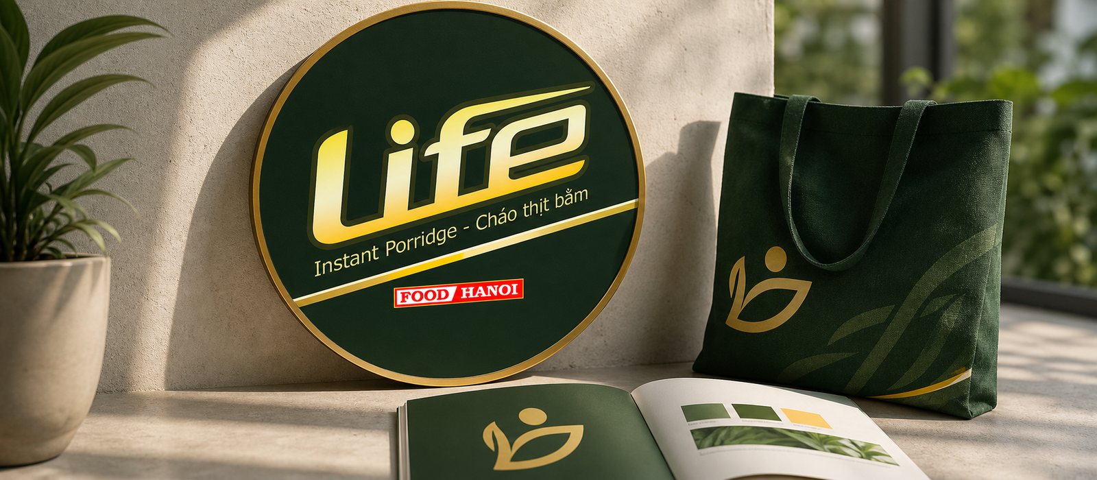
Instant porridge is easily seen as a makeshift food, so Sinh Vũ built the identity and packaging for Cháo Life to keep the fresh, clean, wholesome feel even in a pack that cooks in minutes.
The problem
Porridge is a dish of care. People cook it for the sick, for babies, for a morning that needs warmth without weight. It carries the idea of wholesome and clean. But instant porridge has to overcome a stubborn bias: instant food is often seen as makeshift, heavy on seasoning, light on nutrition.
Life carries a promise that runs against that bias: fast yet still wholesome, convenient yet still fresh. The challenge for Sinh Vũ was to make an 80g pack that cooks in three minutes convince the buyer, from the pack alone, that this is a proper meal, not just something to fend off hunger.
The approach
Before drawing anything, we fixed one idea: Life does not sell fullness, it sells wholesomeness. Every visual choice after that served this, so the pack could say fresh before the shopper even registered it as instant food.
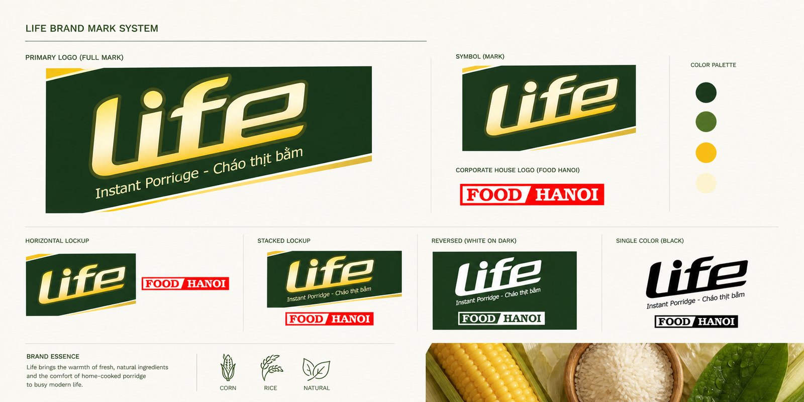
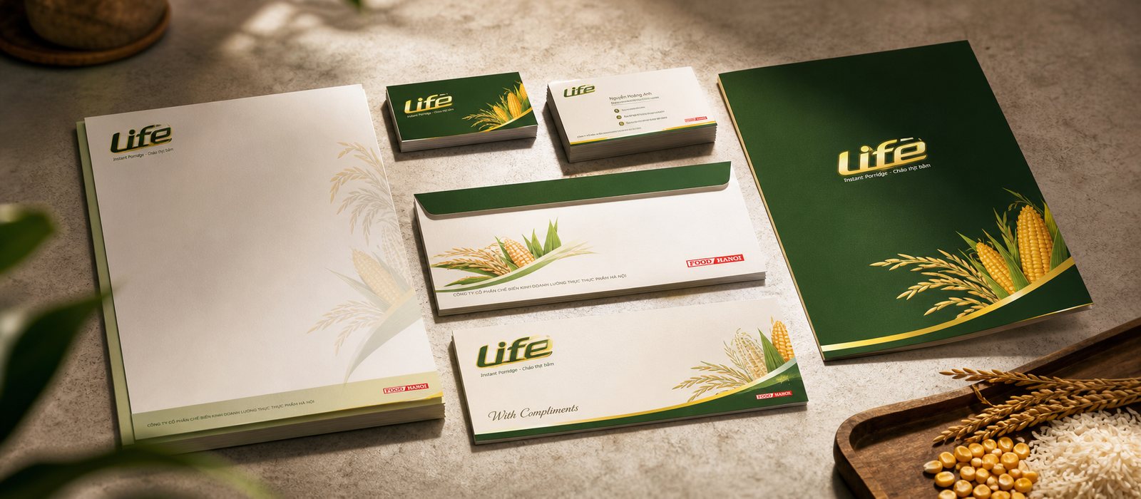
From there came an identity system with a Life logo in soft lettering, a golden hue like ripened rice, set on a leaf green ground. A face that is both modern and close to nature, so whether printed on a small pack or standing on a shelf, Life is recognised at once and speaks in the same voice: light, clean, wholesome.
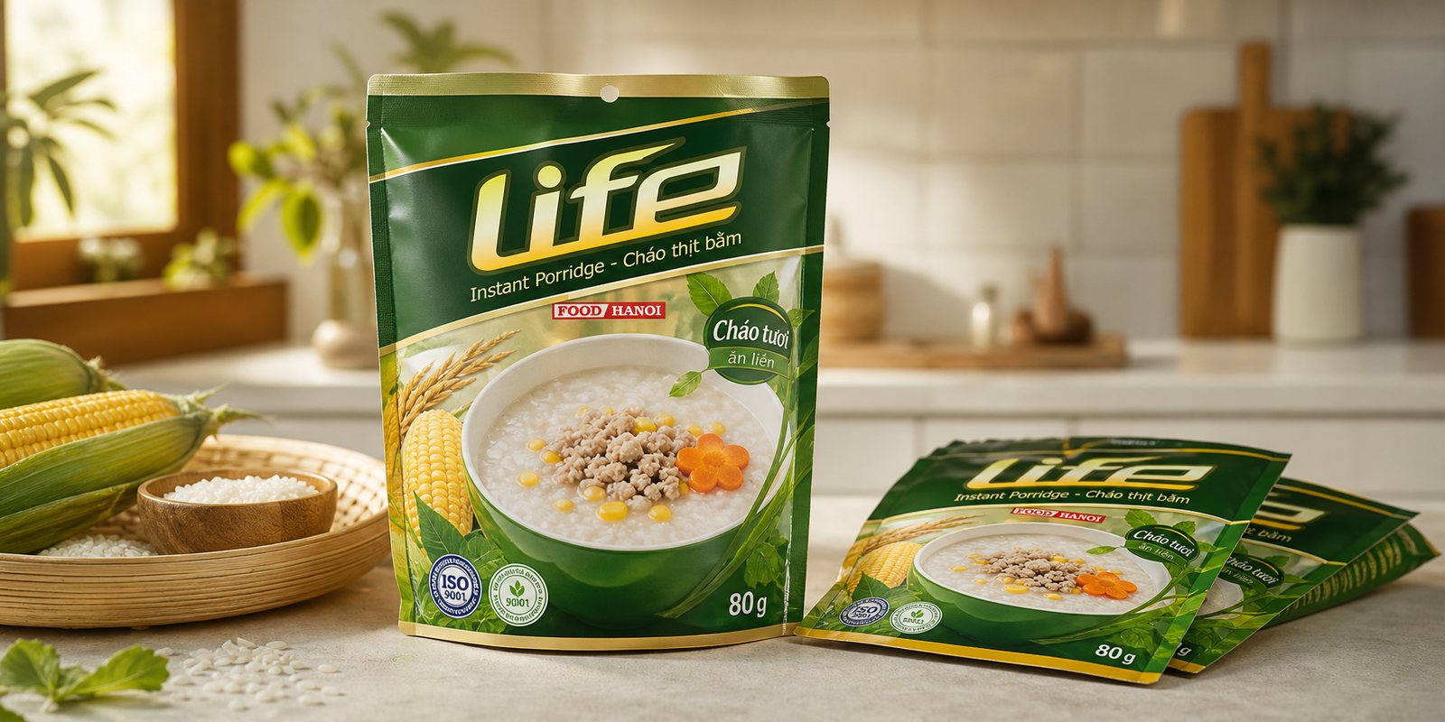
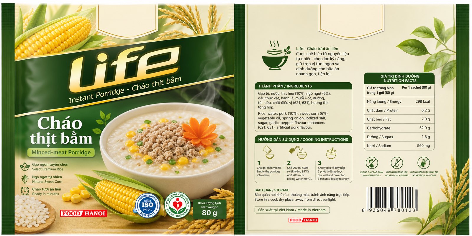
We told the story of freshness through the ingredients themselves. On the pack are golden corn kernels, rice stalks, green leaves, and a steaming bowl of porridge with minced meat and carrot cut into flowers. Not decoration, but evidence: what goes into the pack is laid out for the buyer to see with their own eyes.
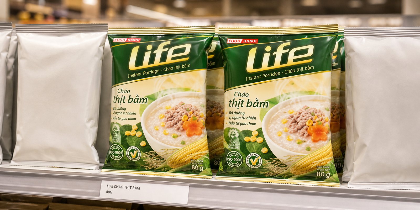
Leaf green and ripe-rice gold became the two lead colours, evoking the paddy field and a wholesome meal. In a shelf mostly dressed in red and sharp orange, the cool green pack sets itself apart, telling the buyer through colour alone that it belongs to the fresh and natural group.
We designed the packaging system for the Life porridge flavours on one shared frame. The small 80g pack has to do a great deal in the palm of a hand: show off the bowl of porridge, state the flavour clearly, carry the full nutrition information and cooking steps, while still feeling airy and fresh.
The front is reserved for the bowl of porridge and the Life lettering, to catch the eye and stir appetite; the back carries the weight of trust: ingredients, nutrition, the three-minute steps. Splitting the roles this clearly lets the pack sell on its own: the front pulls the hand in, the back seals the decision to put it in the basket.
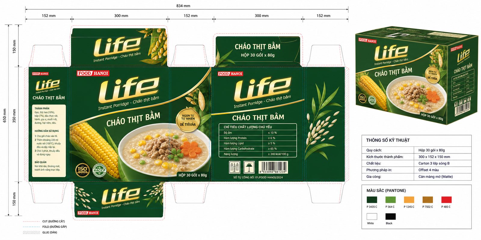
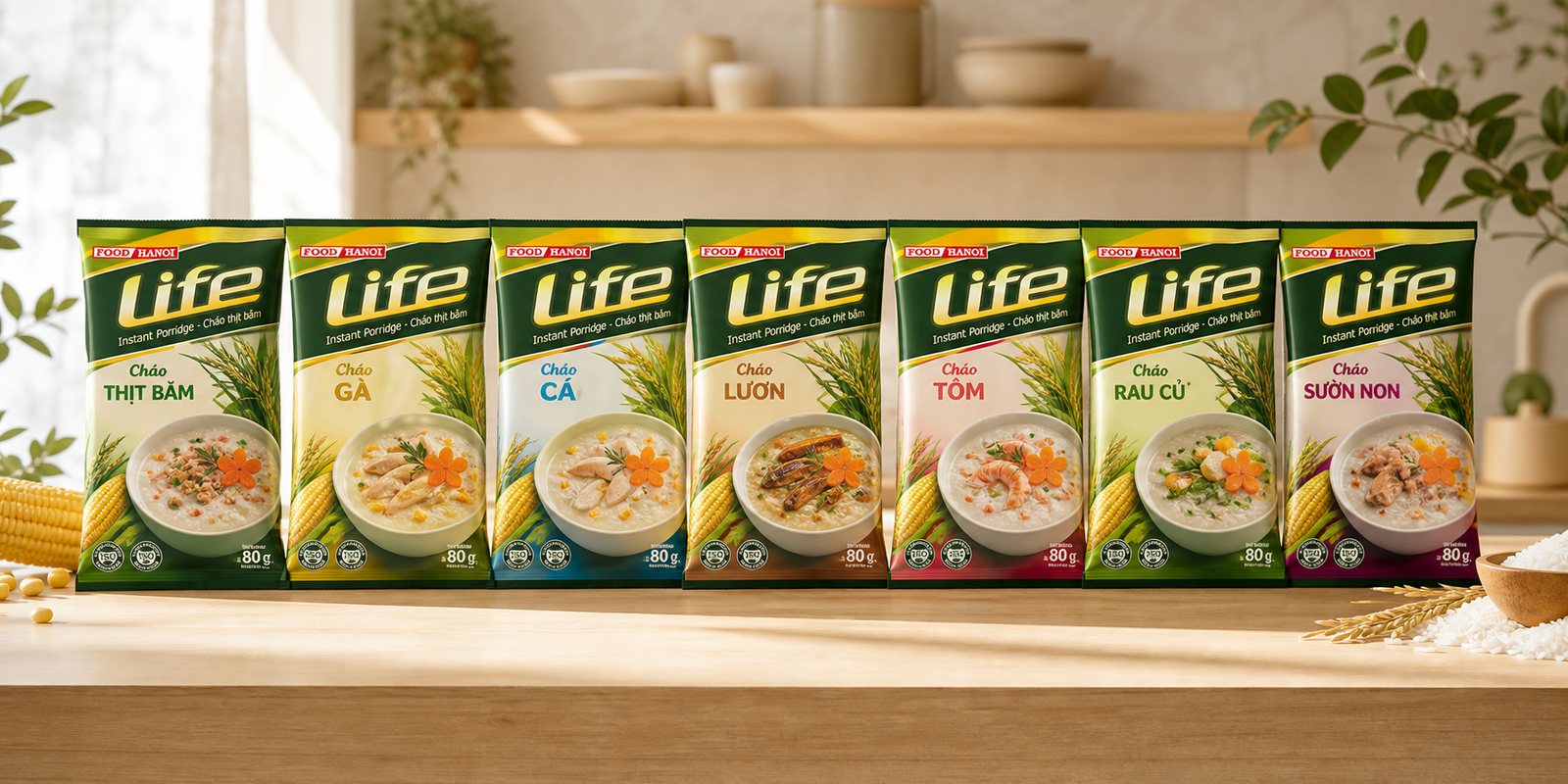
A porridge line does not stop at one flavour, nor one size. We standardised the framework: cutting dielines for both the single pack and the 30-pack box, colour specifications, and the placement zones for the Life logo and the FOOD HANOI maker's mark. So each time a new flavour is added, Life only needs to swap the bowl and the name, the rest already follows the standard.
The pack also carries the signals of trust: the Hanoi food maker's mark, quality certification, and easy-to-follow cooking instructions. For a food meant for the sick and for young children, this care is not decoration, it is the condition for being let into the kitchen.
The result
What Life gained was not a pretty label, but a fresh, wholesome face carried all the way from the pack to the shelf, along with a framework to add flavours without drifting off course. Whether the buyer meets it on the shelf or holds it in hand, Life says the same thing: fast, but still a proper meal.
For an instant food, beating the bias of being makeshift is already half the battle won. An identity that packs the words fresh and wholesome into the pack is the foundation for Life being chosen not for being cheap or convenient, but for looking worth eating.
One small pack, one wholesome meal
Cháo Life pack
Flavour lineup
On the shelf
Office stationery
Is your challenge similar to Cháo Life?
Tell Sinh Vũ what is on your mind about your brand. Sinh Vũ will point you to the right direction right away.