Happy Farm, fresh and approachable
Happy Farm is a clean organic produce chain in major cities. Sinh Vũ built a logo and identity that is fresh and approachable, so the organic promise shows clearly from the street sign to the weekend market booth.
Clean has to look clean
Clean food is sold on trust. Buyers cannot check whether the vegetables are truly organic; they trust with their eyes, by whether the store feels tidy, decent and believable. For a clean-produce chain, the brand is not decoration, it is the first piece of evidence.
Happy Farm had good products and a clear promise: clean produce, good for your health. But that promise needed a face that appears consistently everywhere a customer meets it: the sign on the street, the shelves inside, the fair booth, the bag carried home. Our job was to give that promise a form that is fresh and approachable.
A heart that sprouts
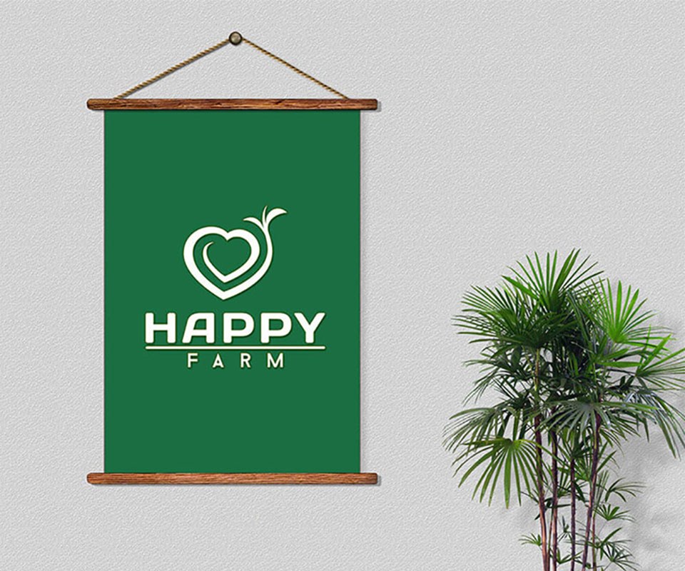
We distilled the brand into one shape: a heart that sprouts. The heart for care and goodness, the leaf sprout for freshness and nature. Together they say exactly what Happy Farm sells: clean food made with kindness. The shape is simple enough for a child to redraw, warm enough for an adult to trust.
This is also where we separated logo from identity system: the logo is for looking at, while the sprouting heart is the signal to repeat. It stands alone on the bag, on the sticker, on the apron, and every repetition is one more time the customer remembers.
The color of vegetables, not of advertising
The color is a fresh leaf green, the green of just-picked vegetables, avoiding a cold industrial blue-green. Green pairs with clean white and raw kraft brown, so the quality of clean food stays close and warm, not distant. The visual language is simple, friendly to nature and easy to approach, exactly what Happy Farm wanted.
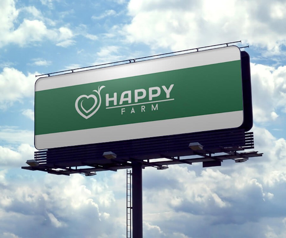
Simple is a calculated decision, not a lack of ideas. The logo has to live across every material: printed on a paper bag, pressed onto a badge, blown up on a billboard, shrunk onto a vegetable sticker. The more compact a shape, the farther it travels; we built it to move across every promotion material without losing itself.
The brand stands where customers meet the produce
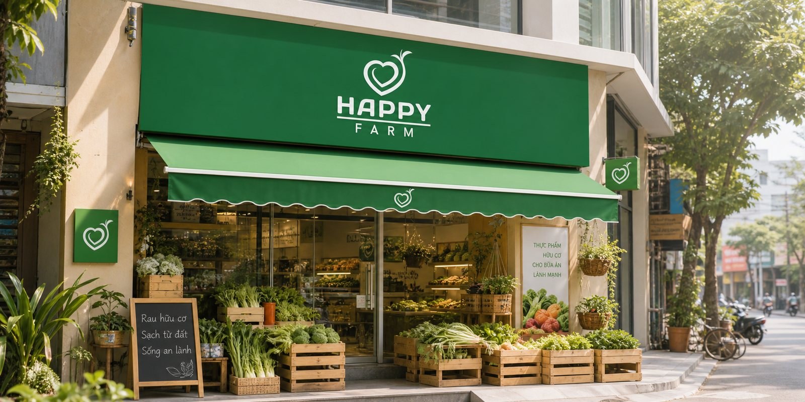
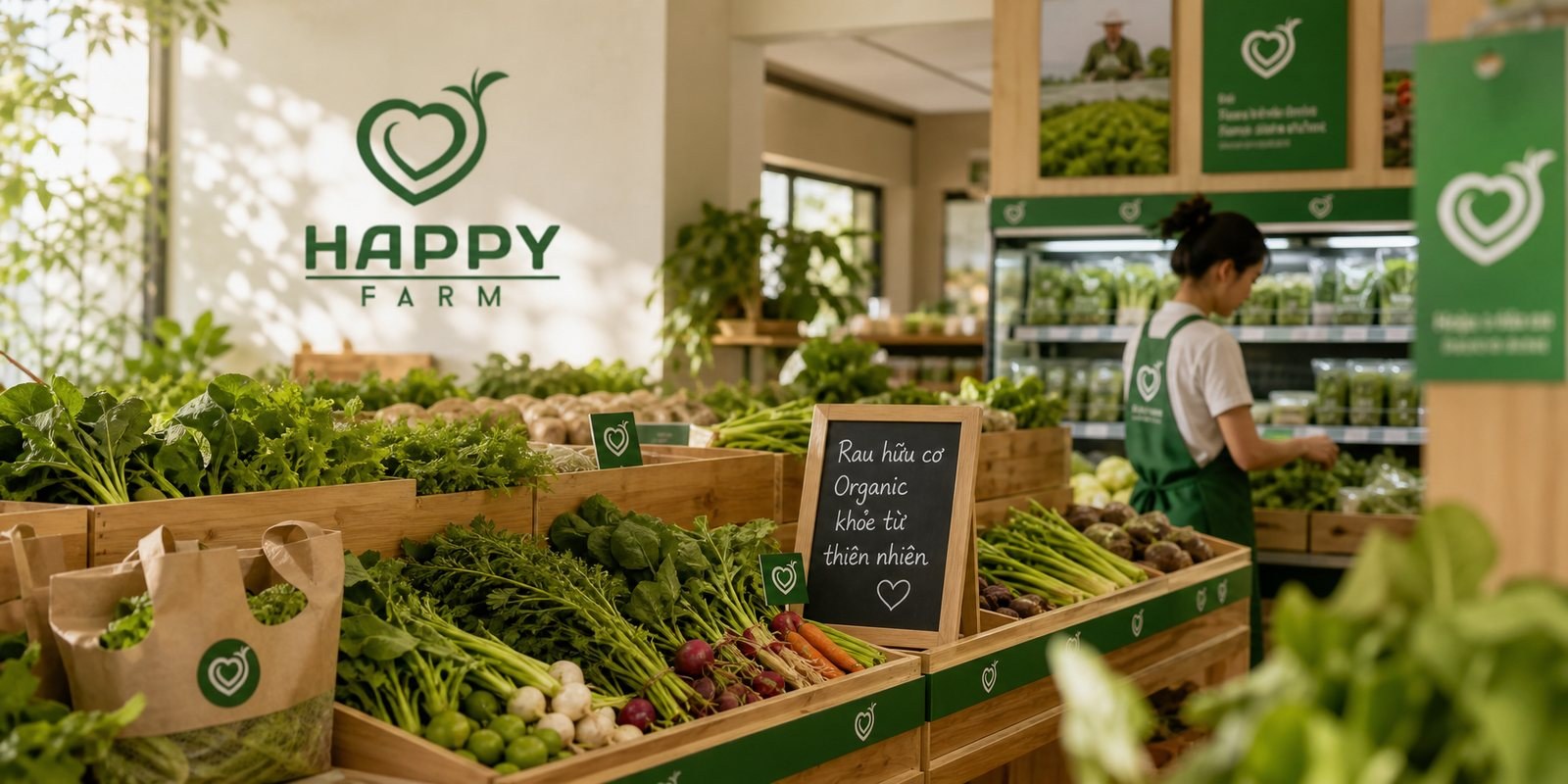
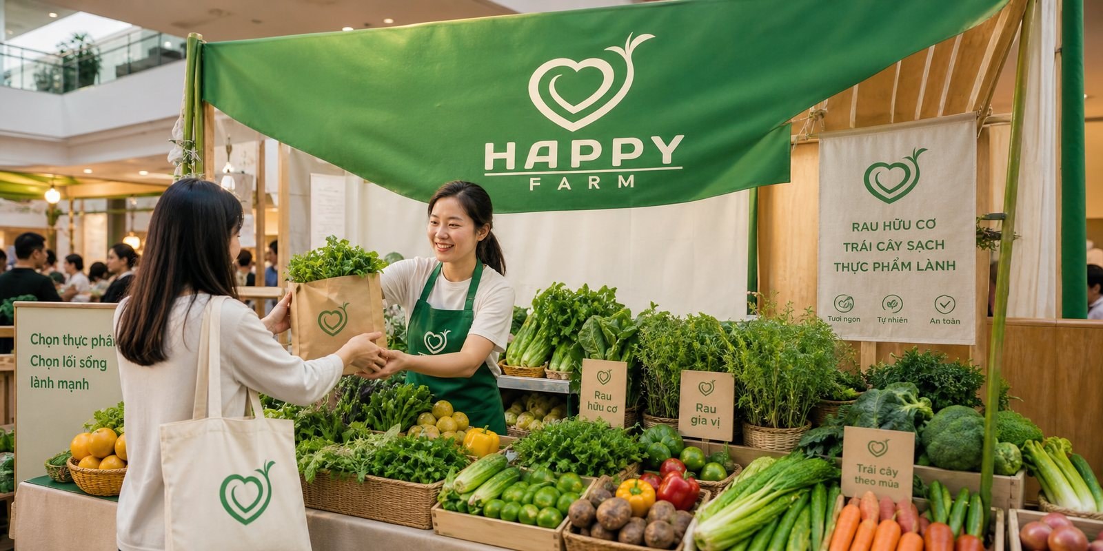
Clean produce is bought in very real places: the shop at the end of the alley, the weekend booth, the supermarket counter. We carried the Happy Farm identity into exactly those places: the storefront signage and facade, the shelving and price boards inside, the fair booth, so that wherever a customer meets the brand, the sense of freshness is the same.
At each point, the sprouting heart does the work of an introduction. On the sign it invites you in, inside the store it leads the eye, at the booth it draws customers closer. Trade promotion for clean food is not shouting discounts, it is making fresh and clean visible from far away.
Packing food, packing trust
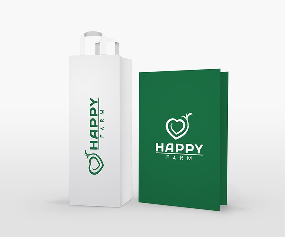
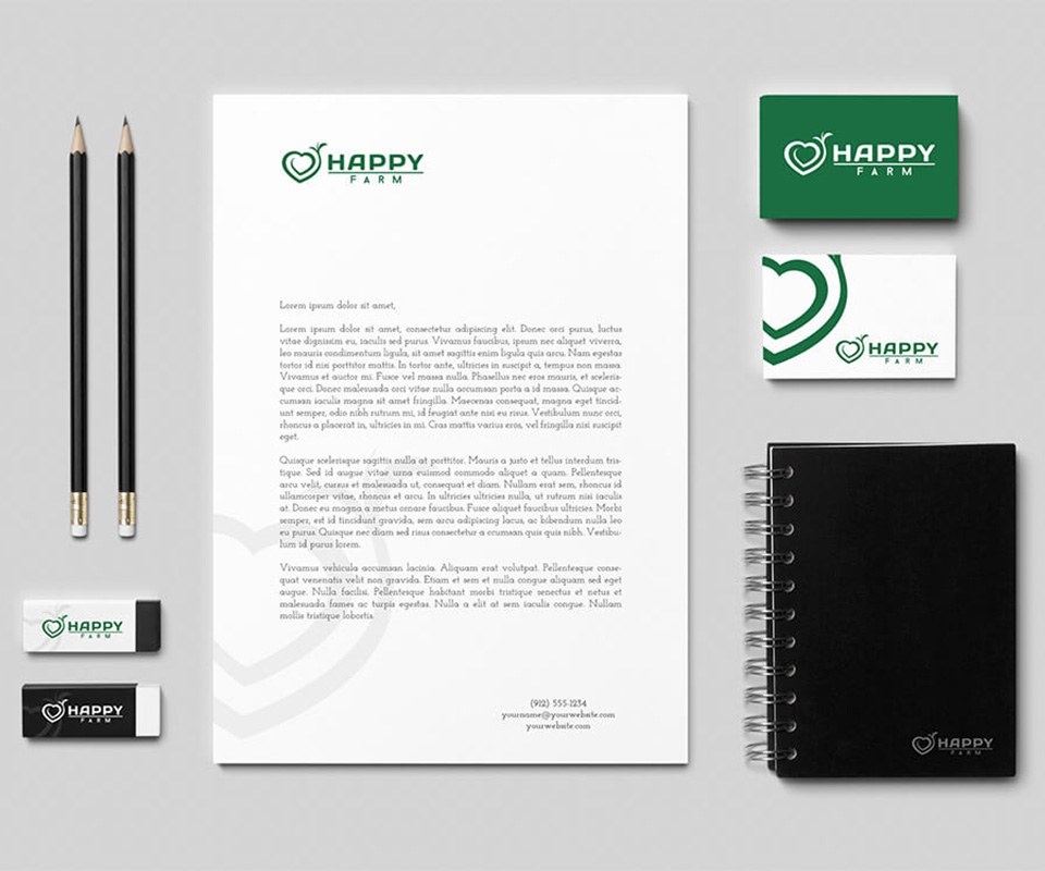
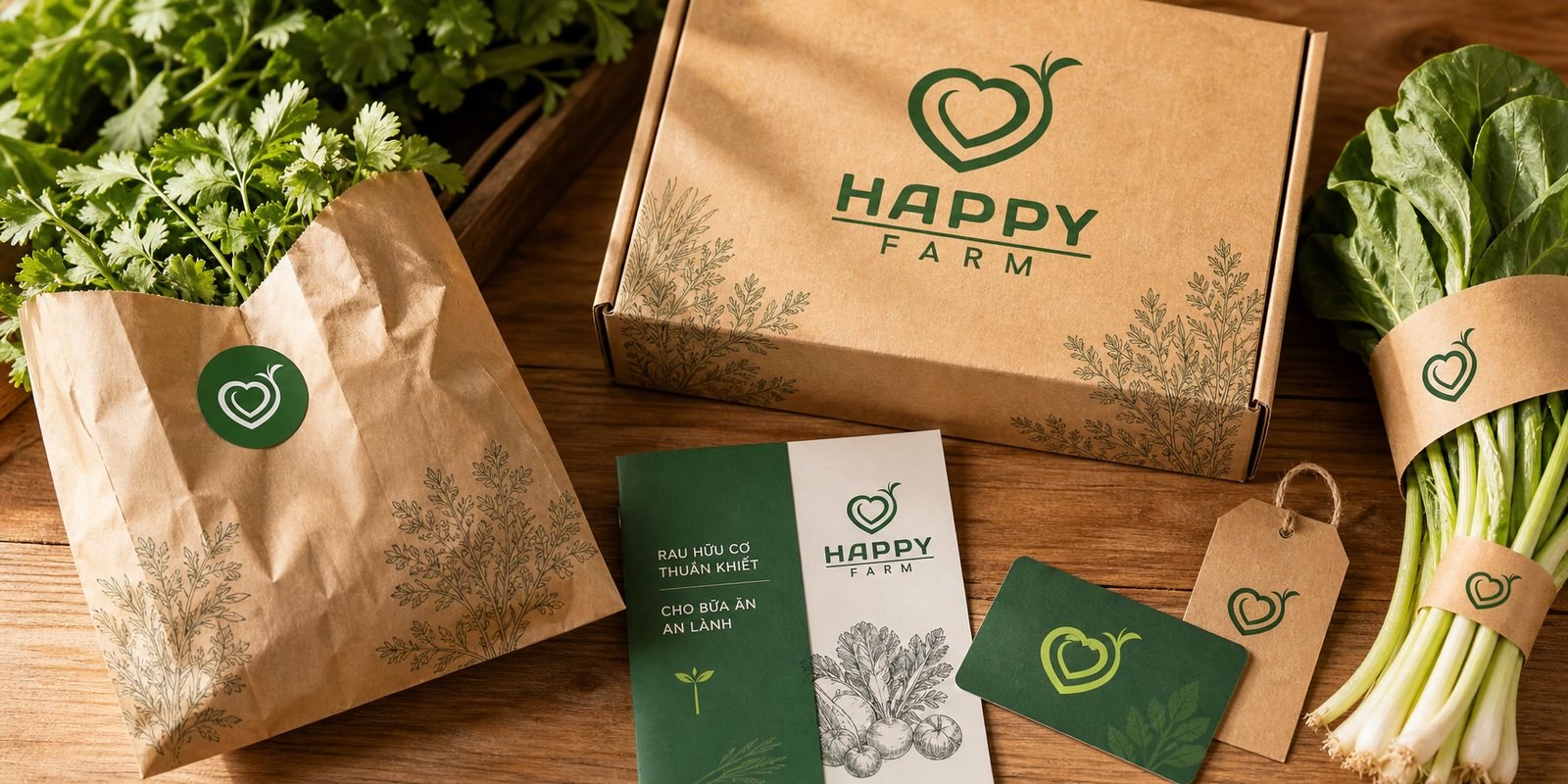
What the customer carries home has to speak in the same voice. Kraft paper bags, vegetable boxes, stickers, membership cards, leaflets all carry the sprouting heart, so a bundle of greens leaving the store is still Happy Farm on the dinner table. The raw paper material points back to its produce roots, and reminds us that clean also means unpretentious.
That way of packing turns one purchase into one memory. The customer opens the bag at home, sees the green heart again, and next time their feet turn back toward Happy Farm. Decent packaging is the cheapest and most durable advertising a clean-food chain has.
Value
What Happy Farm gained was not a good-looking logo, but a face customers recognize and trust before they even walk in. Among stores that all look alike, the green sprouting heart is what makes people turn in. Every time it opens a new store or a new booth, Happy Farm does not have to rebuild the brand, it only has to place that familiar signal one step further. That is the difference between a single design job and a brand asset that grows along with the whole chain.
A brand in the customer's hands
From the street sign to the bag carried home, Happy Farm keeps the same fresh face at every touchpoint.