F&B, food and beverages

Brand design for soft drinks and non-alcoholic beverages

In the cold case, the bottle picked up first is the bottle that gets paid for.

Soft drinks change their look fast and everyone chases the trend. Sinh Vũ gives your bottle, can and takeaway cup a face of its own, still recognizable after the whole market's packaging has changed.

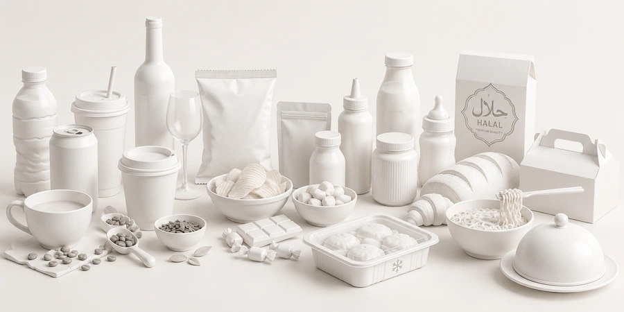
A sample print set for soft drinks: bottle labels, a takeaway cup, short-video frames and a cold-case shelf
Quick answer01

What does a soft drink brand need?

Three things: a sign you recognize at once in the cold case, an easy way to name flavors, and a shared set of visuals for bottle, cup and video. Those three keep your bottle from blending in with the one next to it.

  1. A sign you recognize from a distance

    From two steps away from the cold case, you can still read what it is and whose it is.

  2. A way to name flavors

    Each flavor gets a name and a mark you understand at a glance, so shoppers don't have to read small print.

  3. A shared set of visuals

    Bottle, cup, shelf and short video share one face.

Business types02

Three kinds of drink, three ways to get chosen

They are all soft drinks, but customers buy for different reasons, so the brand has to speak differently.

Milk tea and fruit tea

Their customersYounger customers who buy out of habit and for the pretty pictures online.

Brand challengeMake the cup in the hand a small sign for the brand, still recognizable next to other shops.

Bottled coffee

Their customersOffice workers who buy fast at a convenience store or from a cold case.

Brand challengeShow at once that this is real coffee, not mistaken for the soda next to it.

Juice and soft drinks

Their customersFamilies who often read the label before buying.

Brand challengeMake flavor and freshness visible on the label, with clear information and a front that stays clean.

Pain points03

Four pain points specific to soft drinks

These are the places drinks lose customers that great flavor can't rescue.

02

The flavors all look alike

Orange, lemon and peach differ by one patch of color, so shoppers have to read small print to find the flavor.

A mark for each flavor you understand at a glance, on one shared frame so the whole range is still one house.

Start from this problem
Customer journey04

At which stage do soft drinks lose the most customers?

At the See stage. Shoppers only glance at the cold case for a few seconds, and a bottle that doesn't stand out in those seconds doesn't get picked up.

Where customers are most often lostSee
Do this now
  1. Test the bottle from two steps away, in a real cold case, before printing.
  2. Make the flavor name and the type of drink readable first, then the picture.
  3. Line up the whole range of flavors side by side to check they can be told apart.
Touchpoints05

Five touchpoints to do first

Touchpoints are the places where customers see, touch or hear about the brand. These five decide most of the first impression.

  1. Bottle and can labels

    The first thing customers look at, and the thing they look at longest.

  2. Cold case and counter

    Where a bottle has to stand out among dozens of similar ones.

  3. Takeaway cups

    They travel the streets, get photographed and posted online.

  4. Short videos

    A good share of customers meet the brand here first.

  5. Product pages on e-commerce platforms

    Customers check the photos and the description before ordering.

Roadmap06

Where Sinh Vũ suggests you start

In the order Sinh Vũ suggests doing them. A new brand can stop at step two and be ready to launch; if you already have several flavors, keep going.

  1. Logo and Brand Identity Design

    Name, mark, colors and type: the foundation for bottle, cup and video.

  2. Product packaging design

    Labels for bottles, cans and takeaway cups, with a shared frame for many flavors.

  3. Advertising campaign image design

    Visuals for new-flavor launches and the peak season.

  4. Brand video and animation production

    Short videos built on one shared set of frames.

  5. Brand guidelines handbook

    Once you have many flavors: guidelines so every flavor follows the frame.

Projects07

Related work for soft drinks

Sinh Vũ has not published a bottled soft drink project. The two below are the closest: a café's takeaway cup, and a premium tea.

Further reading08

More on soft drinks

Free toolTouchpoint map for this business modelSee the five stages customers pass through, where they drop off most, then rate the five touchpoints to fix first.Open the tool Free toolMandatory label check (Vietnam)Choose a product type, paste the label text or drop a photo of the label, and see which mandatory items under Vietnamese law are not found.Open the tool
FAQ09

Frequently asked questions

It should read at very small sizes, on a profile picture and on a cup lid. Sinh Vũ looks for a distinct detail in the brand's own story and tests it small before settling.

Goods sold on the domestic market must carry, in Vietnamese, the product name, the name and address of the responsible organization and the origin, plus mandatory content specific to each product group (Article 10 of Decree 43/2017/ND-CP, as amended by Decree 111/2021/ND-CP). The design should leave room for this from the start.

Keep one shared frame and give each flavor its own mark and color. That way a new flavor launches fast and your shelf is still one house.

Yes. The cup is what customers carry down the street, so the name, the mark and the color have to read from a distance.

Follow them in the parts that can change, such as patterns and flavor illustrations. Keep the name, the mark and the core colors so customers remember you.

Tell Sinh Vũ about your drink line

A few lines about the product, where you sell it and what is holding you back is enough. Sinh Vũ reads it and replies within one working day.