
Hasmony, bringing 500-year-old ancient tea to the young
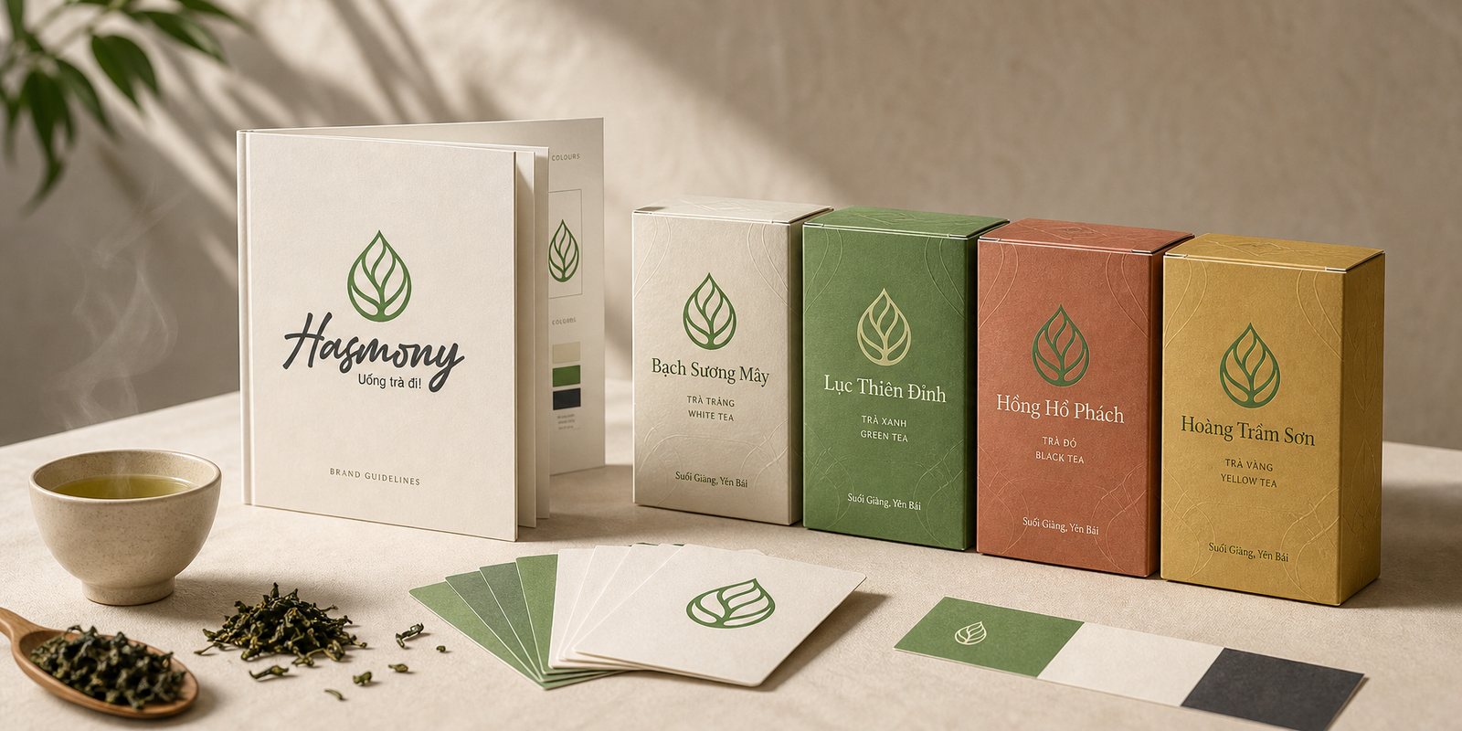
Hasmony is heritage tea from ancient tea trees hundreds of years old on the slopes of Suối Giàng, Yên Bái. As co-founder and creative director, Sinh Vũ built the positioning, identity, voice and packaging so that heritage could extend a warm invitation to a younger generation.
The problem
On the stony slopes of Suối Giàng, thirteen hundred metres up, stand ancient tea trees older than anyone living at the foot of the mountain. Six hundred Mông households pick the buds by hand, on clear days once the dew has lifted. This is a real heritage, precious and rare. Yet in the city, a thirsty young person reaches straight past it for a sugary cup in plastic, because ancient tea, in their mind, is a thing of grandparents, of the altar and of solemn receptions.
That distance is not a matter of quality, but of language. The more tea is told in a reverent, distant voice, the longer it stays on the shelf of the old. Hasmony's three founders set themselves a harder task than lowering the price or watering it down: keep the full depth of the heritage, but teach it how to extend an invitation. As creative director and co-founder, Sinh Vũ took on the part of turning that philosophy into something you can see, hold and want to touch.
How we did it
Before drawing a single line, Hasmony began from the question that comes before all others: where to stand in the mind of a young person. The tea market then split into two shores. One was ceremonial tea, refined but solemn, speaking in the voice of an earlier generation. The other was bottled and sugared tea, cheap and convenient, but turning its back on any depth at all. Placing Hasmony on either shore would lose half of who it was.
We chose a third place to stand, and named it through the philosophy of the Five Elements: harmony between people, heritage, nature, organisation and spirit. For the buyer, all of it folds into a simple promise: this is real heritage, but it knows how to invite. Strategy is not a slogan on the wall, it is a measuring stick. Later, each time we hesitated between two designs or two ways to name a tea, we came back and asked: which one keeps both the depth and the invitation.
A position clear at the root keeps everything that grows after it in line. The name Hasmony, drawn from Harmony, is not a label stuck on late but the conclusion of that stance: a brand born to reconcile two things that seem opposed, a heritage centuries old and the rhythm of a young life.
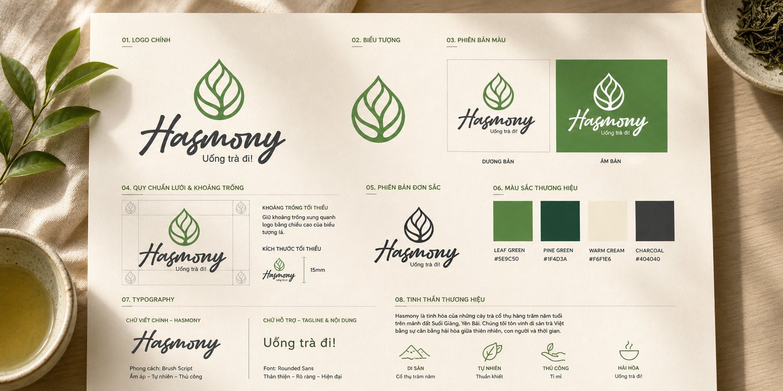
The first point of contact with someone still hesitant must do one thing first: invite, not intimidate. So when building the identity, we avoided the grandeur usually worn by premium tea, the gold and the red seals that push young people away. Hasmony was distilled into a shape anyone reads at once: a tea leaf, its veins woven together and rising in the form of a droplet. The leaf speaks of origin and life, the droplet speaks of distillation, and together they hold Hasmony in a single mark.
The colour, too, is a refusal. Instead of a noble gold, we took the green of a living tea hill, a young leaf-green edged with moss, so the brand would feel like nature rather than a museum. The word Hasmony is hand-drawn, its strokes soft and warm like someone pouring tea while they talk, deliberately leaning toward intimacy rather than ceremony. Both the leaf mark and the lettering are drawn by hand, so the craft in the hands that pick the tea does not vanish when it becomes a brand.
The value of such a face shows before anyone reads a word. A young person passing the shelf, knowing nothing yet of Suối Giàng, already sees that Hasmony is not their grandparents' tea: it is green, it is alive, it is close. The identity does the hardest part of its job at first glance, making a heritage centuries old look like an invitation.
A warm brand that speaks in a cold voice is one thing in image and another in words. So once it had a face, we found Hasmony a voice, and chose its most casual line as the greeting: come, have some tea. Those few words do what a whole solemn brochure cannot: they pull ancient tea down from the altar to the level of the coffee table, trade reverence for warmth, and turn heritage into a friend's easy invitation.
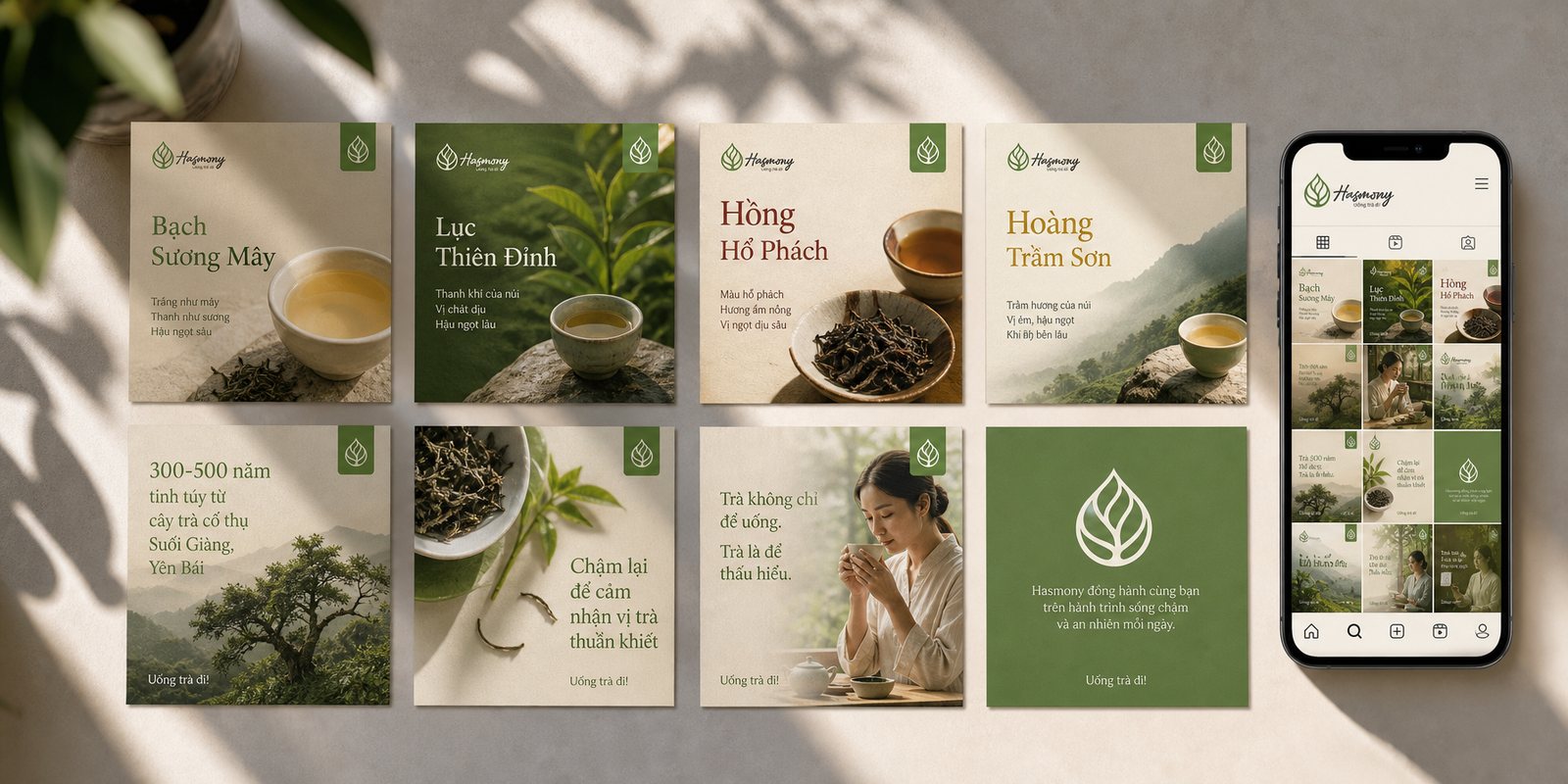
That voice carries on into how the teas are named. Thirteen teas bear thirteen names like small poems: White Cloud-of-Dew, Green Peak-of-Heaven, Red Amber, Yellow Mountain-Aloes. Each name is an image that opens up before the first sip, lovely enough to spark curiosity without needing any tea jargon. A young person who knows nothing of white tea or black tea still wants to try a Cloud-of-Dew, an Amber, because the name has already invited them.
Voice is the most invisible part of a brand, and also the most durable. Even when today's writer is not next year's, Hasmony still speaks the same way: close, warm, inviting. It is the steady repetition of that kind voice, not one clever line of advertising, that builds the familiarity which brings people back to pour another cup.

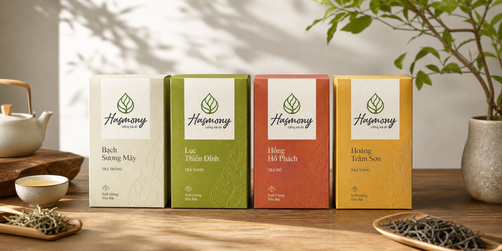
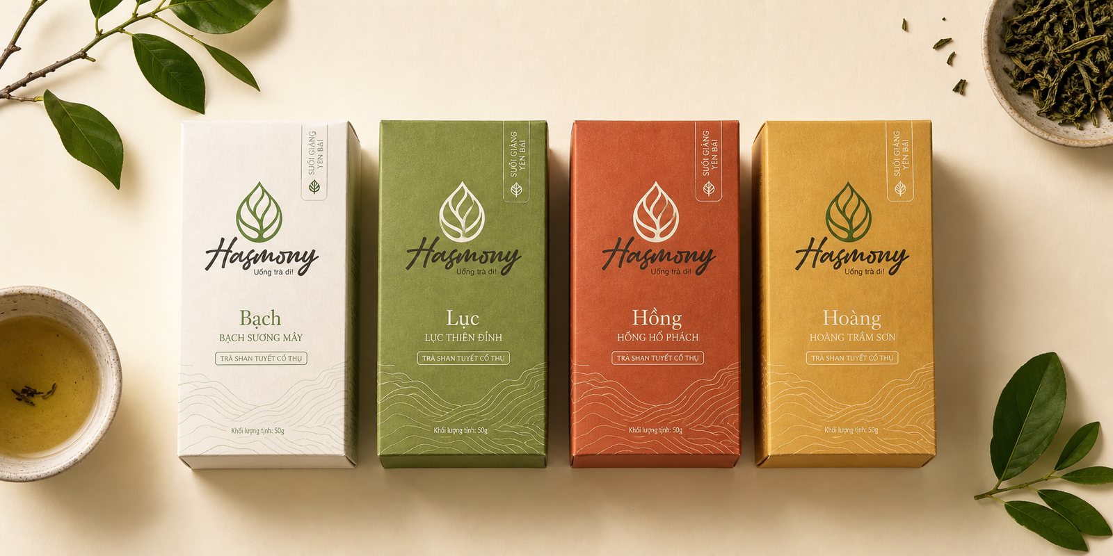
White, Green, Red, Yellow: four lines of tea for four ways of processing. The challenge for the packaging was to give each line its own character while all four still breathed to the same Hasmony rhythm, so that side by side on the shelf they stand like one family rather than four strangers.
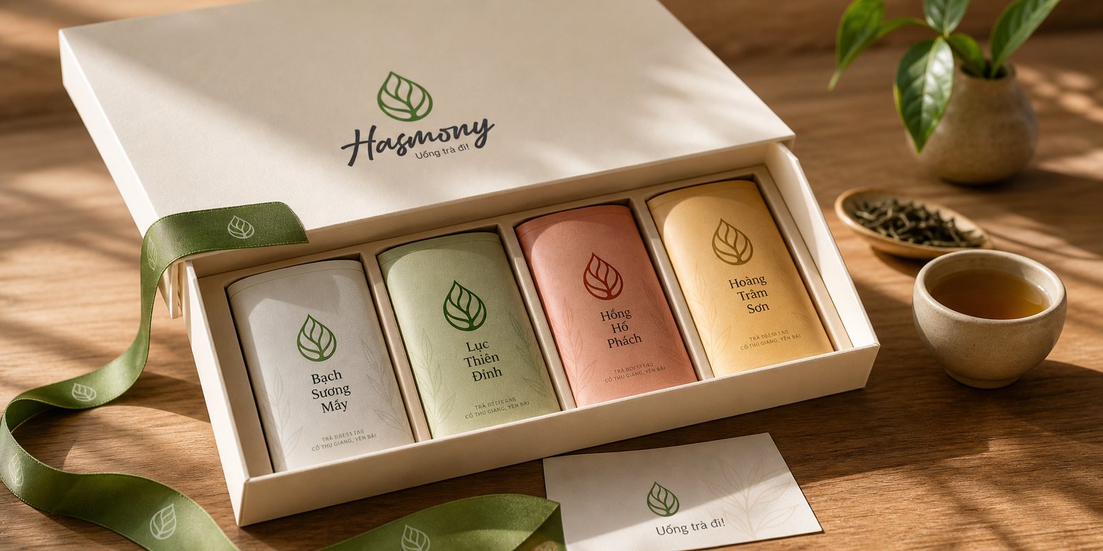
We built a shared frame: the same layout, the same leaf mark, the same way of naming, then let colour do the work of telling them apart. Each line takes a hue that hints at the tea inside, so a buyer recognises their favourite from a distance without reading a label. The box is designed for a young person to set proudly on a desk or give as a gift, clean and contemporary, rather than hide in a cupboard for looking too old.
Packaging is where a brand is held in the hand the longest, so it must carry both the promise and the beauty. For Hasmony, each box is an invitation in miniature: refined enough to honour ancient tea, close enough that a young person wants to touch it. A good packaging system is also an engine for growth: when Hasmony adds a new tea, it simply steps into the frame already there, and the whole house of tea stays one piece.
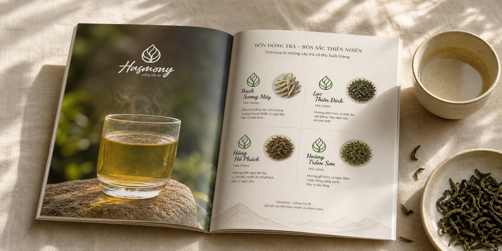
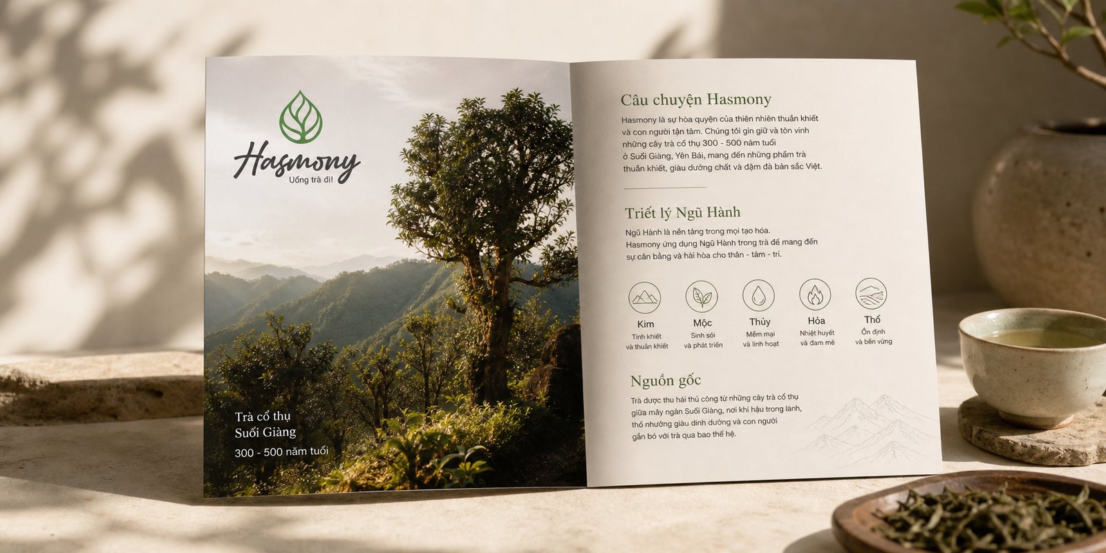
Young people often meet tea for the first time not in a teahouse but on a phone screen. A single photograph has to finish the work of inviting in one scroll. So we built Hasmony its own visual language, and carried it into the catalogue and the product photography.
The light we chose is soft and warm, enough to show the clarity of the brewed tea and the whole, unbroken shape of the bud, suggesting purity without the coldness of a lab shot. We photographed the ritual too: the pouring water, the rising steam, the hand lifting the cup, so the viewer feels the stillness of tea before tasting a drop. The catalogue arranges the teas by the four lines, each page holding the same visual rhythm set in the packaging, so picking up the catalogue is meeting the very same Hasmony.
Photography here is not decoration but a selling tool and the final bridge. It translates the invisible, the aroma, the aftertaste, the stillness, into something the eye can see and the heart wants to try. For a brand that sells an experience more than leaves, letting people see before they can drink is already half the way to the cup.
The process
Choosing a third place to stand
Together with Hasmony, we turned the Five Elements philosophy into a clear place to stand: real heritage that still invites, as the measure for every later decision.
Face and voice
From that stance, the leaf mark and the line come, have some tea were born, giving Hasmony a face that is green, alive and close, and a warm, intimate voice.
Four lines into one system
We brought the four lines of tea into one packaging frame, then built the photography language and catalogue so the whole system tells one story, on the shelf and on the screen.
So the harmony keeps itself
The whole identity, voice and set of rules were folded into a brand guideline, so that however many teas Hasmony adds, it keeps the same soul.
The result
What Hasmony gained was not a handsome logo, but a way of speaking that finally lets a centuries-old heritage reach a younger generation. Young people pick up a box of Hasmony not out of duty to tradition, but out of curiosity and liking: the name invites, the face feels close, the cup looks worth trying. Ancient tea from Suối Giàng steps off the shelf of the old and onto the desk, into the gift box, into a photo shared on a phone.
The deeper value lies in what cannot be seen: six hundred Mông households and tea trees older than any of them now have a brand strong enough to carry their heritage forward without letting it fade. As a co-founder, Sinh Vũ built Hasmony not to keep needing him, but to stand, grow and invite on its own. That is what a brand system can do and a single logo never can: turn a heritage into an invitation that still carries after the one who built it has stepped back.
One identity, every touchpoint
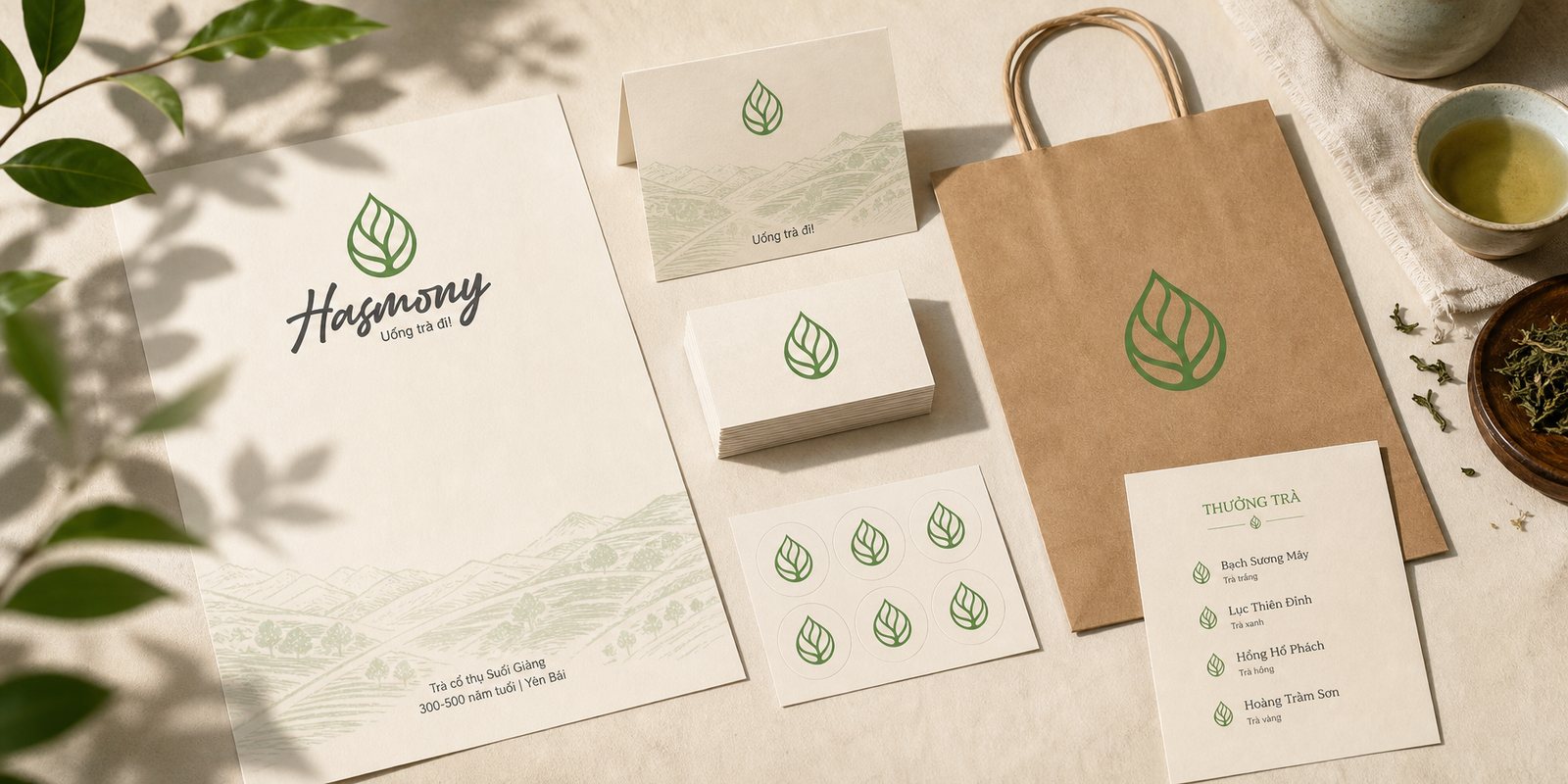
An identity system does not stop at the logo. This is the system of signals Hasmony lives by across every touchpoint, from packaging and gift boxes to catalogue, print and social media.
Four tea lines
Gift box
Product catalogue
Brand print
Social media
Does your challenge look like Hasmony?
Tell Sinh Vũ what is on your mind about your brand. Sinh Vũ will point you to the right direction straight away.