
Cosmetics and personal care

Brand design for skincare, Vietnamese style

Customers read the ingredients before they put anything on their face.

Skincare sells trust. Sinh Vũ makes the box, bottle and product page state the ingredients and the directions clearly, and never promise more than the formula has notified.

A sample print set for a skincare brand: a serum box, a toner bottle, a cream tube and an ingredient card
Quick answer01

What does a skincare brand need?

Three things first: a back of the box where the ingredients can be read, claims kept within the notified scope, and a packaging shape of your own that doesn't look like a Korean brand. Together they decide whether customers trust you enough to try it the first time.

  1. A readable ingredient card

    Type large enough, a clear order, and room for directions right on the box.

  2. Claims within scope

    Speak through ingredients and how it feels to use, and don't promise what the product hasn't notified.

  3. A shape of your own on the shelf

    Recognize your own box in one second among dozens of boxes of the same color.

Business types02

Three skincare groups, three problems

All are skincare, but customers buy for different reasons, so what the packaging has to say differs too.

Cleansers, toners

Their customersUsed daily and rebought steadily, and easily switched to another brand if it looks better.

Brand challengeGive customers a reason to remember the name from the bottle itself, because the product is quick to use and hard to impress by benefit.

Serums, moisturizers

Their customersCustomers read the ingredients closely and compare with other brands before buying.

Brand challengeMake the ingredients and directions easy to read, so customers see the maker's care.

Sunscreen

Their customersBought by season, chosen by how it feels on the skin and how trustworthy the tube feels.

Brand challengeA tube you understand at a glance, and one that differs from the orange and blue tubes on the shelf.

Pain points03

Four pain points specific to skincare

These are the places where skincare brands tend to lose customers even when the formula has no fault.

01

Ingredients printed small, too hard to read

Small type packed on the back of the box; customers photograph it, send it to someone they know, then walk away.

Design an ingredient card with hierarchy: what customers ask about most comes first, the rest is set compactly, with room for mandatory content from the start.

Start from this problem
04

Texture photos in a different color on every channel

Photos of a serum drop or cream on skin differ in tone across marketplace, social media and shelf, and customers doubt the real product color.

One texture photo standard: the same background, the same lighting, so every channel shows exactly one product.

Start from this problem
Customer journey04

At which stage do skincare brands lose the most customers?

At Researching. Customers read the ingredients, read the reviews and compare with other brands before adding to cart. Hard-to-read information sends them to a brand that is easier to read.

Where customers are most often lostResearching
Do this now
  1. Put the ingredient card and directions on the product page in the same layout as the back of the box.
  2. Write a one-line plain-words explanation for each main ingredient.
  3. Use the same set of texture photos on marketplaces, the website and social media.
Touchpoints05

Five touchpoints to do first

Touchpoints are where customers look, touch or read about the product. You don't need to do everything at once. These five decide most of a skincare customer's trust.

  1. Box and bottle

    What customers see first on the shelf and in the delivery photo.

  2. Ingredient card

    Skincare customers read this part most closely before deciding.

  3. Marketplace product page

    Where customers compare with other brands within a single screen.

  4. Texture photography

    Customers want to know whether the cream is thick or thin, absorbs fast or stays tacky, before they can hold the box.

  5. Directions card

    Use it in the right order and amount and customers see results and come back to buy.

Roadmap06

Where Sinh Vũ suggests starting

Listed in the order to do them. A newly launched brand can stop at step three; a line already on sale goes on to the rest.

  1. Brand strategy and positioning consulting

    Find the real point of difference in the formula and the user, so you don't borrow the look of Korean brands.

  2. Logo and Brand Identity Design

    Name, mark, color and type: the base for every box and bottle afterward.

  3. Product packaging design

    Boxes, bottles, tubes and ingredient cards for the first product line.

  4. Building brand voice

    A voice and plain explanations of ingredients, kept within the notified scope.

  5. Product and brand photography

    A set of texture and product photos usable on every channel.

Projects07

Projects closest to skincare

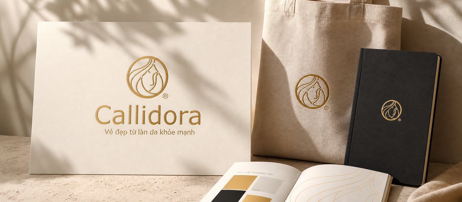
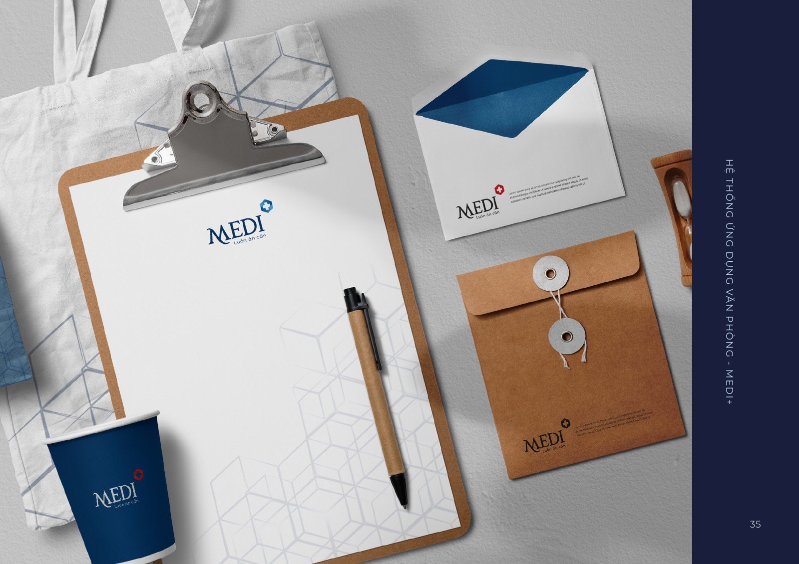
Callidora is the skincare project Sinh Vũ has published. The other two solve a close problem: professional trust and one packaging template used across a whole system.

Further reading08

More on skincare

Free toolTouchpoint map for this business modelSee the five stages customers pass through, where they drop off most, then rate the five touchpoints to fix first.Open the tool Free toolMandatory label check (Vietnam)Choose a product type, paste the label text or drop a photo of the label, and see which mandatory items under Vietnamese law are not found.Open the tool
FAQ09

Frequently asked questions

Choose the bottle and cap by how customers use it, leave room for the mandatory label content, and only then make it beautiful. Make a real sample and try holding it before ordering in bulk.

Set it in hierarchy: the ingredients customers care about most first, the rest compact and readable at the smallest type size allowed. Check the current labeling regulations before printing.

No. Cosmetics advertising may not suggest the product is a medicine (Article 4, clause 2 of Decree 342/2025/ND-CP). Speak through ingredients and how it feels to use, and have your company's lawyer review the final version.

Don't follow the tube colors and shapes that are selling well. Find the product's own point of difference, like the core user or the feel on the skin, then build color and type around it.

Not many sets, just one shared standard. The same background, the same lighting, the same way of photographing texture; each marketplace only recrops to its own aspect ratio.

Tell Sinh Vũ about your skincare product

A few lines about the formula, the user and what is holding you back is enough. Sinh Vũ will read it and reply within one working day.