
One die-cut, a whole identity system
A packaged consumer goods portfolio with many lines, all going to shelf from one shared die-cut: Sinh Vũ built the logo system, identity and packaging, so each line could speak in its own voice.

The problem
On a crowded shelf, products in the same category look almost identical in shape and size. What sets them apart, and what makes a portfolio look considered or scattered, sits almost entirely in the logo and the packaging. This brand needed multiple lines for multiple tastes, launched over time, without each line ending up looking like it belonged to a different family.
The problem, then, had two layers. The first was identity: each line needed a name, a logo, a story distinct enough to remember. The second was production: everything had to run on one shared structural die-cut, to keep production fast, consistent and to save on tooling cost. Sinh Vũ was asked to build both layers into a single system.
The approach
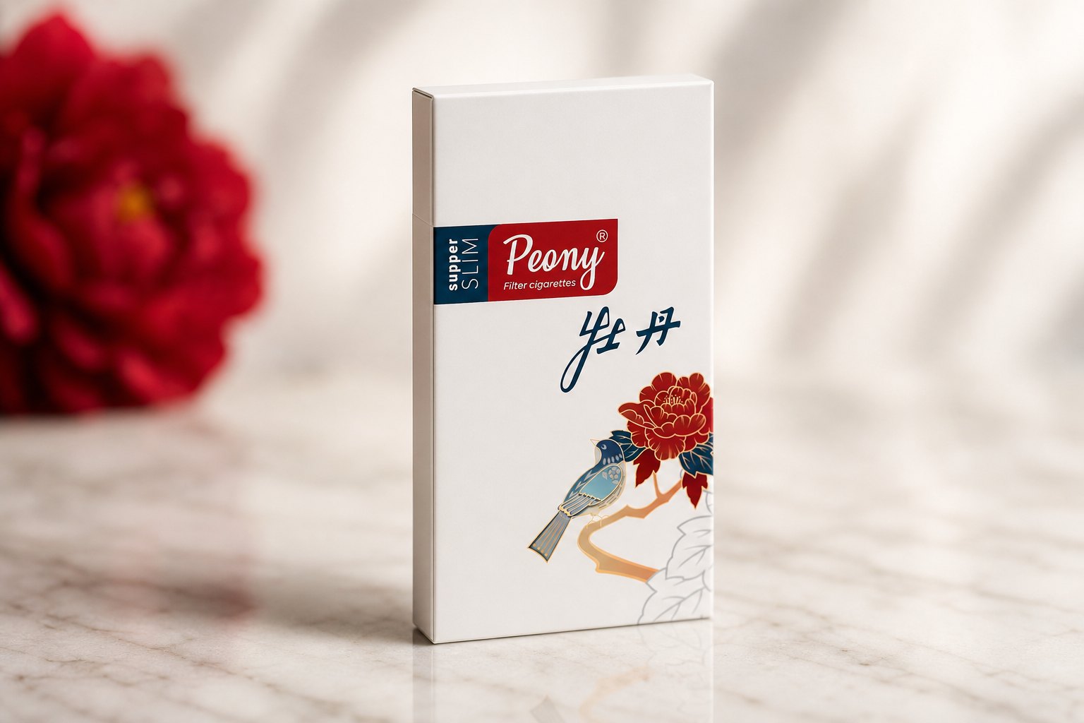
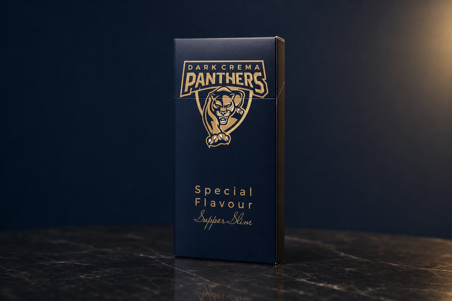
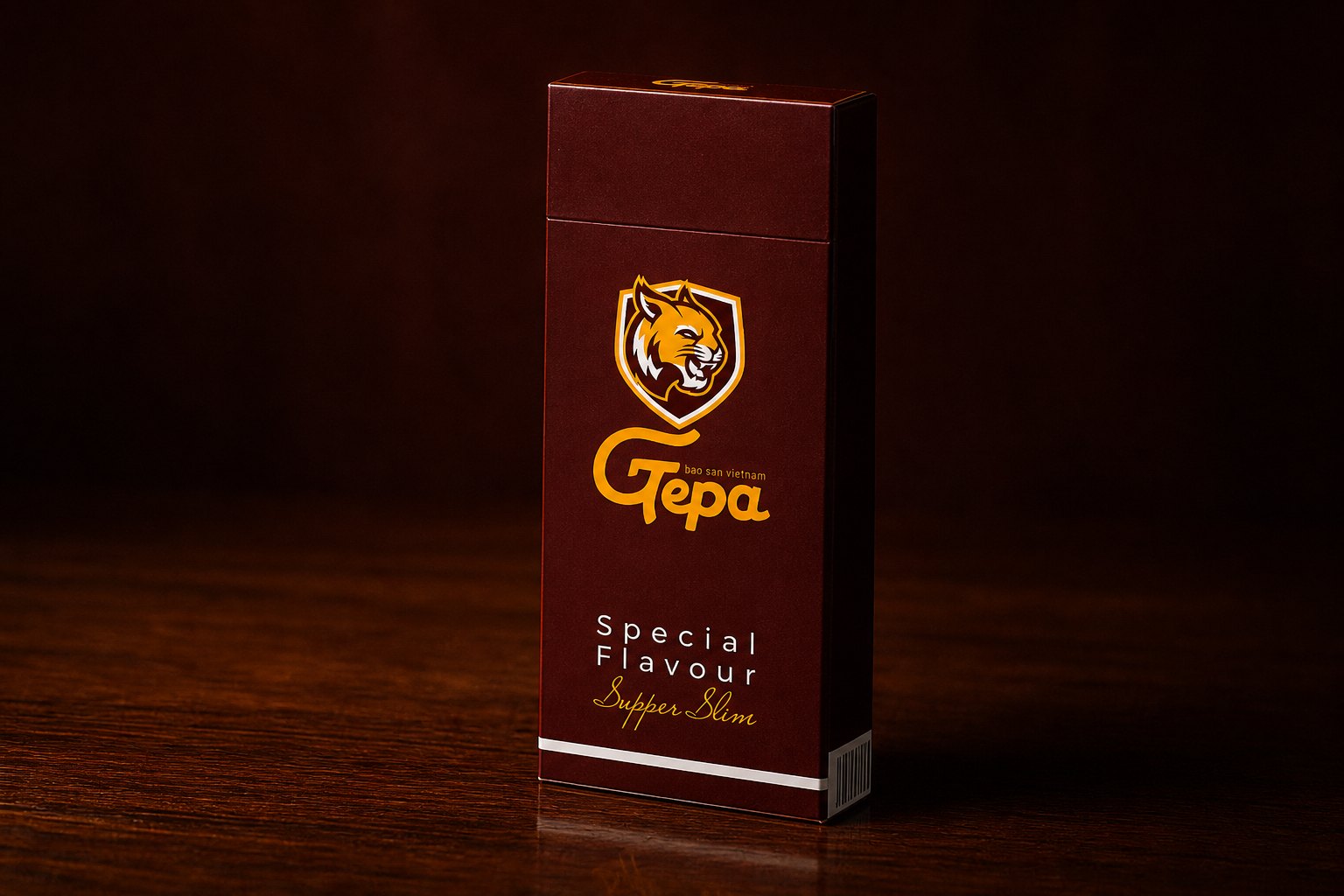
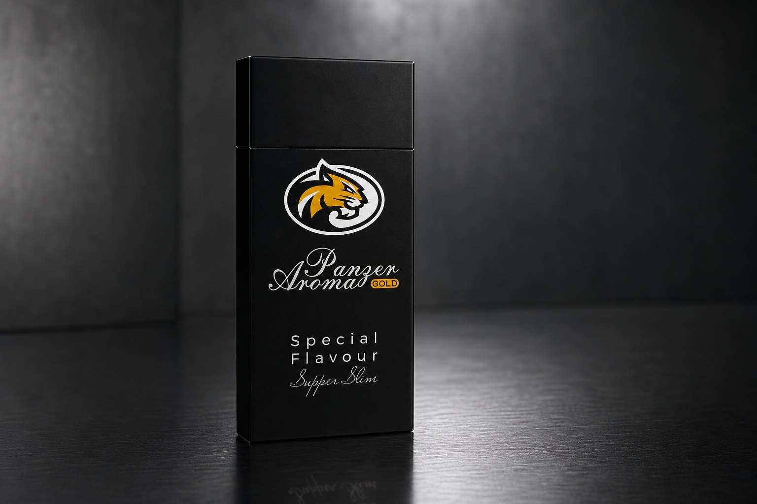
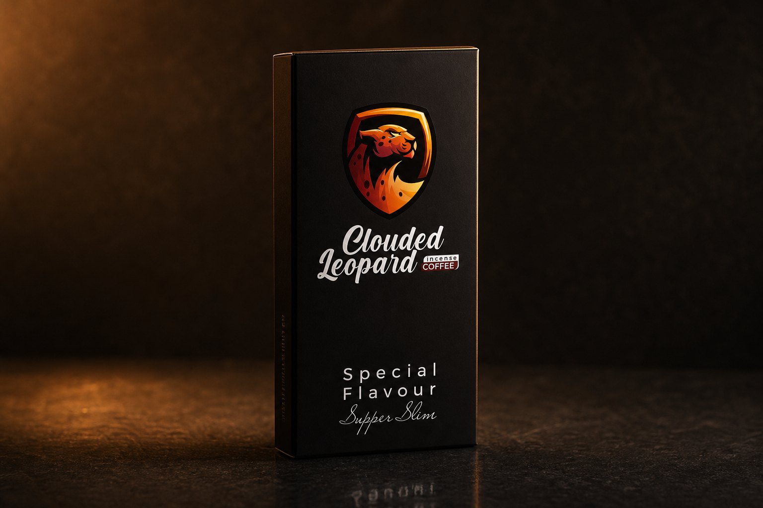
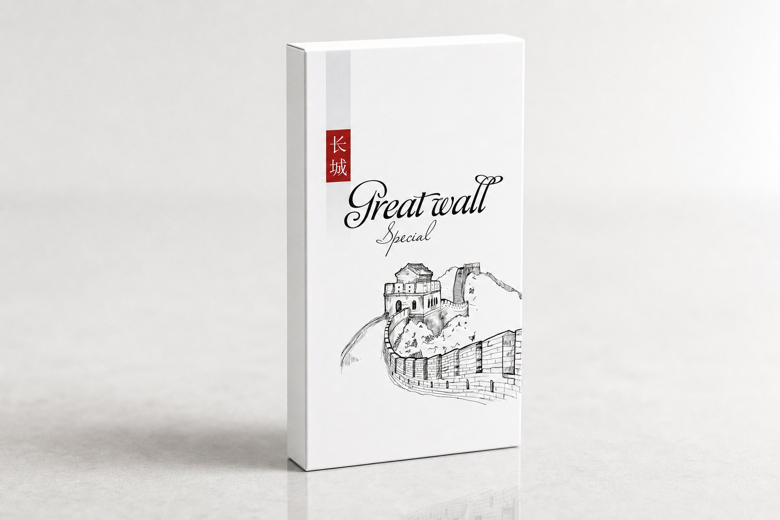
The portfolio needed a consistent naming logic, not names picked at random. For the premium tier we chose one unified world of imagery, big cats, one species per line, each with its own character, then opened further lines drawing on Eastern landmark imagery and on the peony for a classical feel.
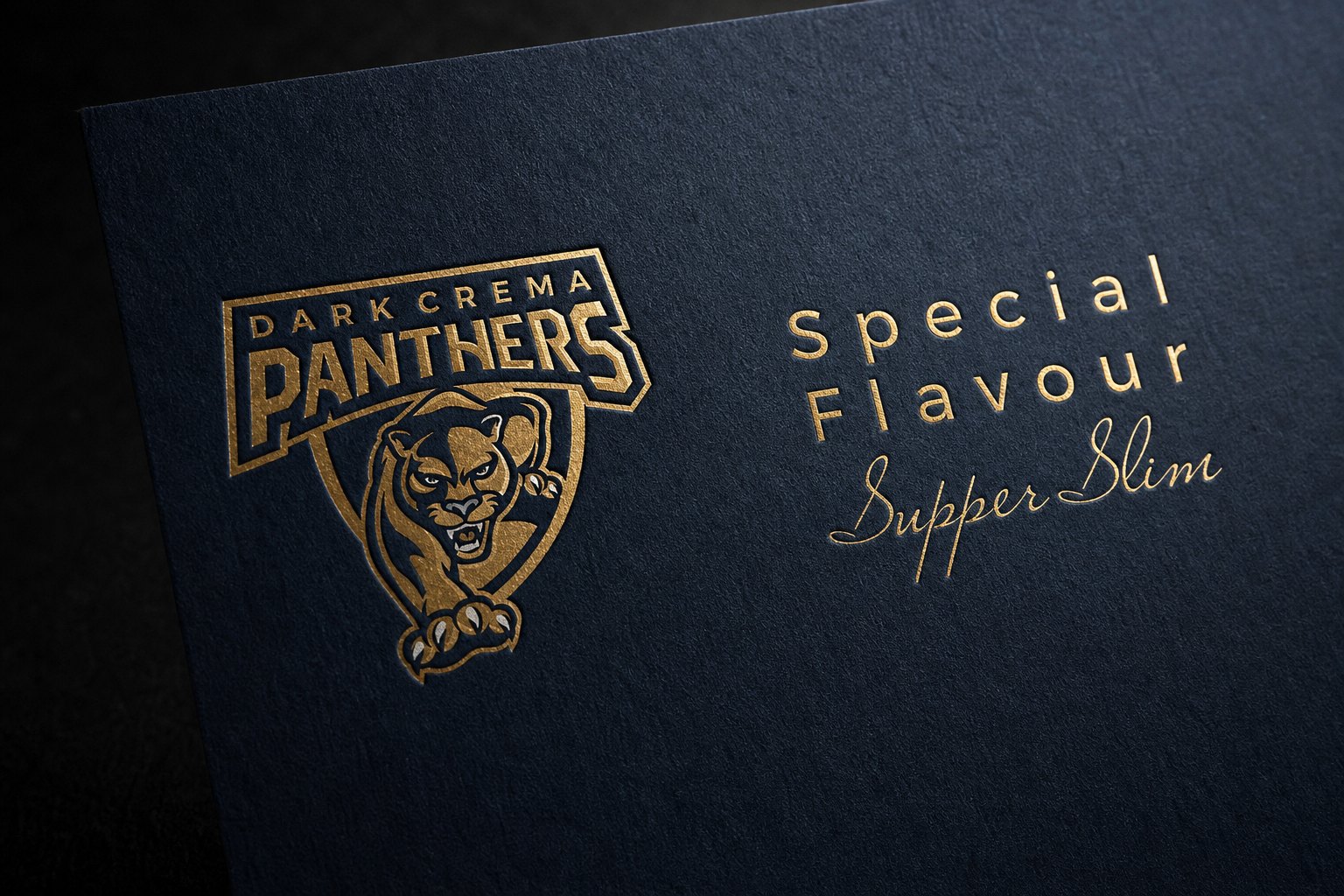
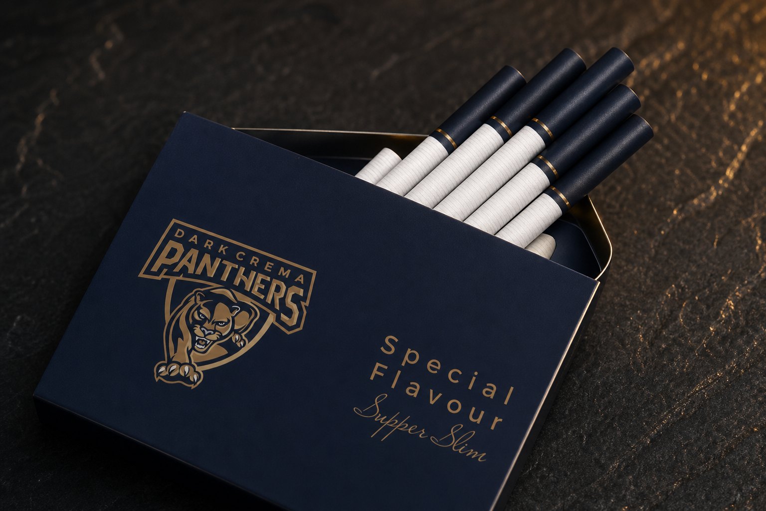
For each line, we drew its own badge in a crest-like manner: the figure set inside a shield, metallic linework on a dark ground, strong enough to stand alone yet still legible at small size. The lettering for each line's name was also drawn to suit its character, but all of it kept to one visual rhythm, so that at a glance you'd know they belonged to the same family.
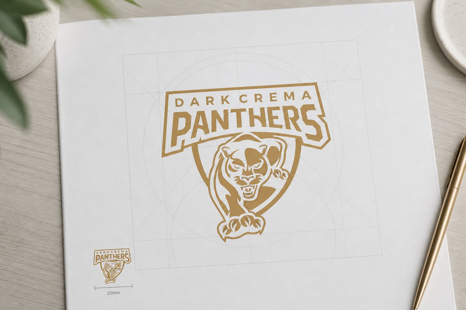
A logo only earns its keep when it holds up at every size and on every material. We built a guideline set for each badge: the construction grid, the clear space around the mark, the smallest size it still reads at, and how it should be aligned. This is the least visible part of the craft, but it's what keeps a mark from warping as it passes through many printers' hands.
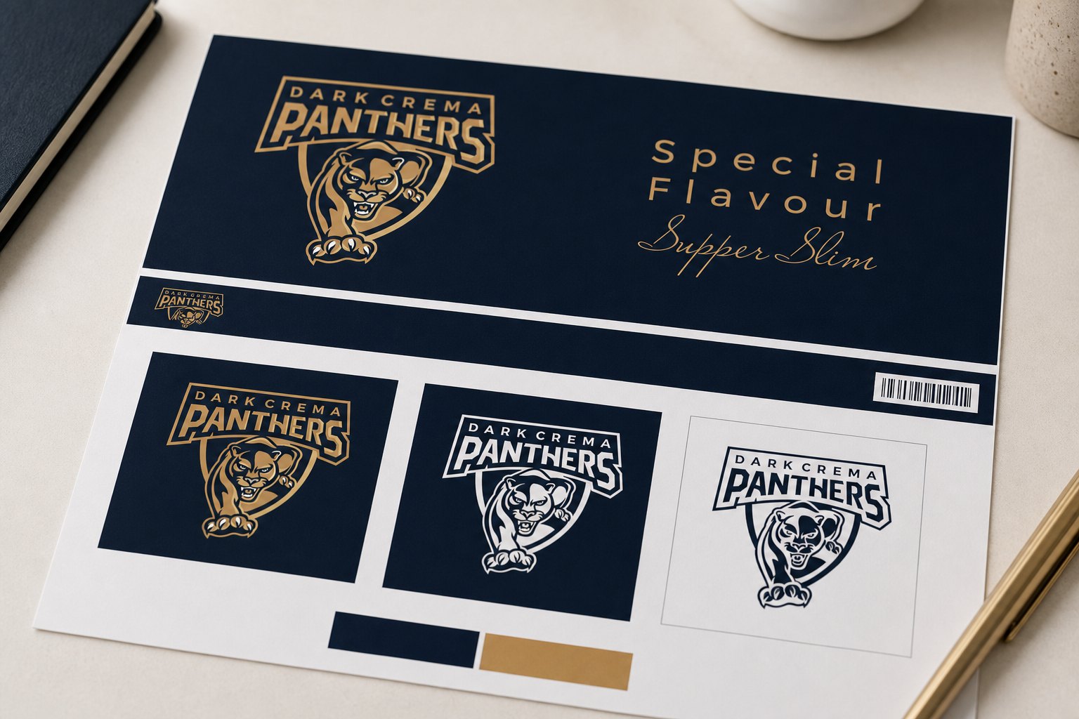
Alongside it came the required variants: a full-colour primary version, a reversed version for dark backgrounds, and a single-colour version for places that can only print one ink. A system, not a single drawing, is what separates a logo that looks good on screen from one that survives across thousands of products.
Once each line had its own badge and guideline, what remained was tying them into one system. We set the shared colour system and usage rules for the whole portfolio: where the mark sits, how far the accent colour goes, how the background pattern is used, so the lines could differ from each other and still recognise one another.
As a result, the big cat line with its dark, metallic ground and the peony line with its light, refined ground, though they sit at opposite ends of the emotional spectrum, still show that they belong to the same family. That is what an identity system can do that a single logo never can.
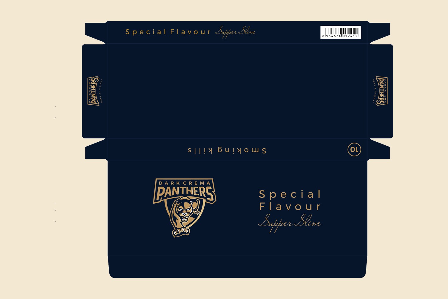
The secret of the whole portfolio lies in one master die-cut. We built a standard layout template for the slim pouch and the ten-pack carton, fixing the functional zones: where the badge sits, where information goes, where the barcode and mandatory content belong. When a new line launches, we don't redraw the structure, we only swap the outer layer: background colour, badge and pattern.
The hard part is technical: calculating every crease line, every glue flap, every locking tab, so that the pouch and carton fold correctly off the press, stand firm and open smoothly. This is where aesthetics meets print engineering; a design is only finished when it looks right on screen and runs on the production line.
From the master die-cut, we completed the full packaging set for each line: the pouch, the ten-pack carton, and the interior details, all carrying the same identity. For each line, the identity is placed consistently on the front, the side, the opening flap and the carton shell, so that from any angle you meet the same face.
Each option was then built into a three-dimensional mockup to finalise before print: placing the lines side by side, weighing the portfolio as a whole, seeing how the badge's metallic finish catches the light and how heavy or light the background colour feels in hand. When the full set appeared in one frame, the owner could see what they were about to have: a product range that looked like a brand, not a handful of loose files.
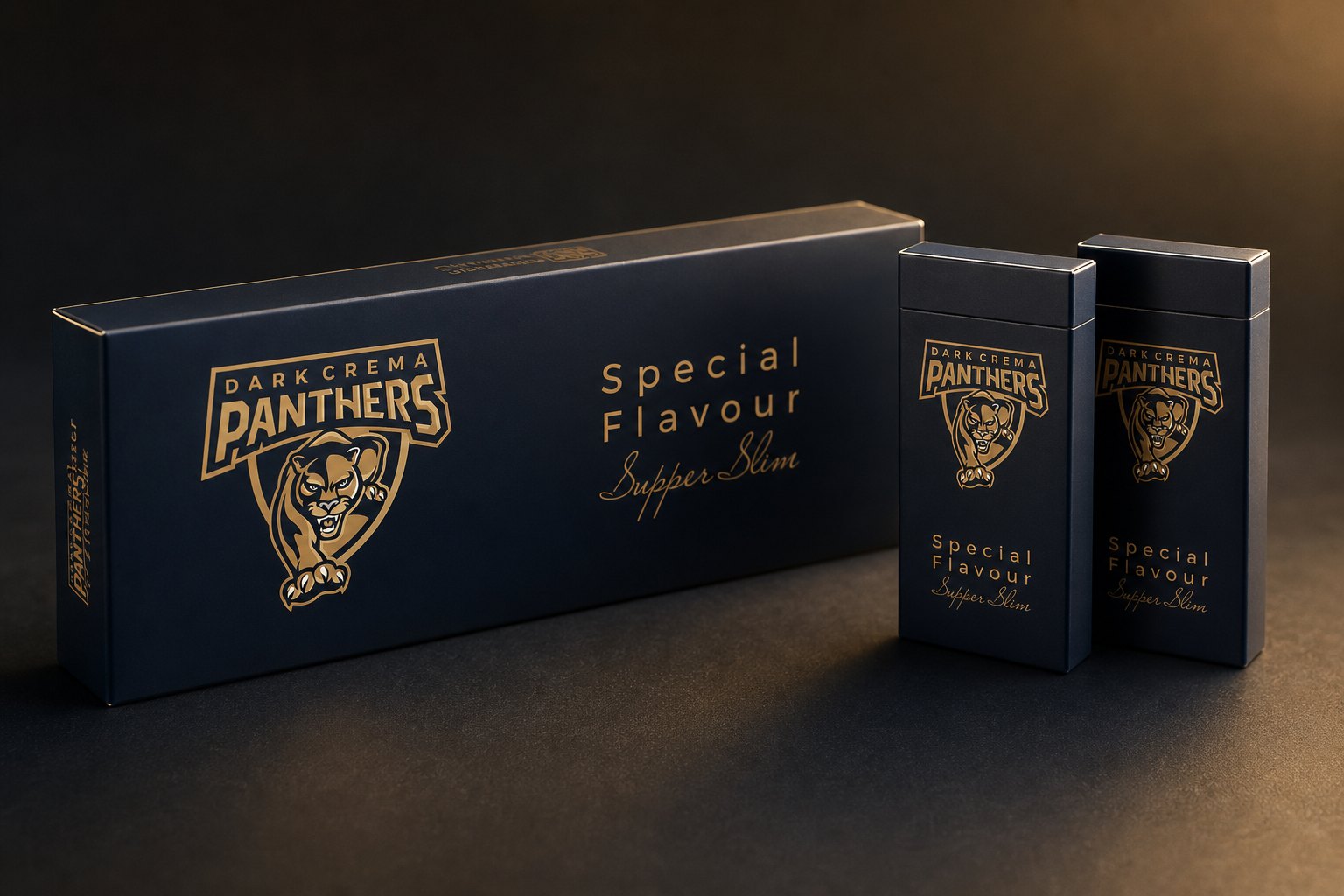
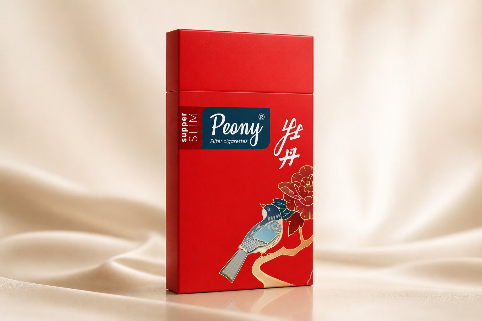
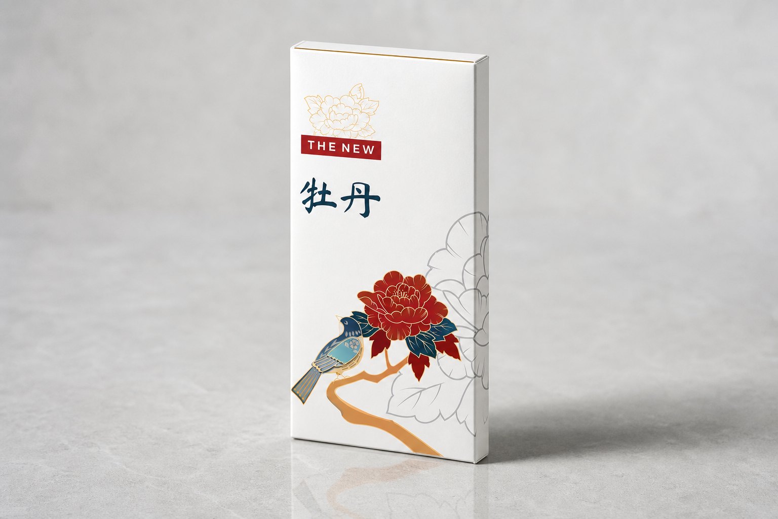
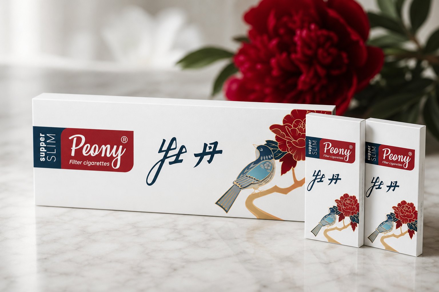
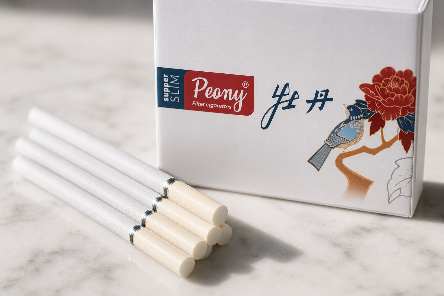
Not every taste suits big cat imagery. Alongside it, we built a line that moved fully into refined Eastern character, taking the peony as its motif, with a flowering branch and a bird drawn in the manner of classical painting, calligraphy set beside the Latin name, on an ivory white or vermilion red ground depending on the edition.
Same technical framework, same discipline of placement, but the emotion sits at the opposite end from the big cat line. That shows the real value of an identity and packaging system: it doesn't force everything to look the same, it lets a brand speak in several different voices while staying tidy and consistent underneath.
The process
Positioning and naming
Settling how a multi-line portfolio would coexist, and building a naming logic around distinct worlds of imagery.
Logo and guidelines
Drawing each line's own badge and lettering, and building the construction guidelines, variants and shared colour system.
Die-cut and packaging
Building the master die-cut for pouch and carton, applying each line's identity, and arranging mandatory information to regulation.
Mockup and handover
Building three-dimensional models to finalise the options, standardising files and handing over for production.
The result
What the brand received wasn't a logo or a package, but an identity and packaging engine: a logo system with its guidelines and a master die-cut, from which many lines could unfold, each with its own name, its own badge, its own face, and still recognisable as one family.
The value sits in the least visible place. A system like this lets a brand grow without rethinking everything from zero each time a new line launches: the shelf looks tidier, tooling cost is shared, and every launch stands together with the rest of the lineup. That is the difference between commissioning one nice-looking package and owning an identity architecture that knows how to grow on its own.
One family, many faces
Each line has its own world, but all of them were born from one identity system and one die-cut. Side by side, they look distinct, and just as clearly like siblings from the same family.
Is your portfolio currently scattered?
Tell Sinh Vũ what's on your mind about your logo, identity and packaging. Sinh Vũ will point you to the right direction right away.