Learners drop off after a few sessions
They download, study once or twice and vanish; the content is not the only reason.
Design the experience of the first days: small goals, small rewards and reminders at the right rhythm.
Start from this problem
Learners stay because they see themselves improving and have someone alongside them.
Every learning app has lessons and features. Sinh Vũ gives a platform a voice, a character and an interface clear enough that learners come back every day.
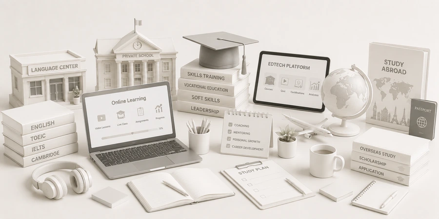
Three things first: a companion with personality, an interface that is easy to learn from rather than sprawling with features, and study reminders that feel pleasant. Those three decide whether learners stay past the first sessions or drop off.
A character or a voice with personality that praises and nudges at the right moment.
One main task per screen, with a single design system shared across every feature.
Warm study reminder notifications that add no pressure and never feel like spam.
Learning apps have very different users and usage patterns, so the brand has to speak differently too.
Their customersLearners who want to speak with more confidence, usually studying a little each day and afraid of being judged.
Brand challengeCreate a sense of safety in making mistakes, and show clearly that they have moved forward.
Their customersStudents study alongside their class, while parents follow along and pay; the two users have different concerns.
Brand challengeMake it fun for students and show parents that their child is really learning.
Their customersWorking adults who study in the evening, decide for themselves and easily quit halfway.
Brand challengeHold the rhythm with a clear path, well-timed reminders and a small community.
These are the places where learning platforms lose users even when the content is good.
They download, study once or twice and vanish; the content is not the only reason.
Design the experience of the first days: small goals, small rewards and reminders at the right rhythm.
Start from this problemEach new feature adds another button style and another screen style; after a few versions the app looks like several apps stitched together.
Build a shared design system for the product team, and plug every new feature into it.
Start from this problemA child uses the app but parents have no way to see the results, so they easily stop renewing.
Make a summary screen for parents, easy to read and in a parent's language rather than raw numbers.
Start from this problemThe first page lists features, and newcomers cannot see how they will be different after a few weeks.
Rewrite around what learners achieve week by week, with real screenshots and a few short motion clips.
Start from this problemAt the Learn stage, right in the first sessions. Learners have downloaded and signed up, but if they do not yet feel progress or have no habit, they do not return. Good content cannot hold someone who has forgotten to open the app.
Touchpoints are where learners see and hear about the platform. These five create most of the feeling of wanting to come back.
Decides whether learners continue after the first session.
What learners remember, and what gives the app its personality.
The daily bridge between the platform and the learner while the app is closed.
Where the person paying sees the value without opening each lesson.
Where newcomers decide whether to download.
Listed in the order to do them. A platform that already has a product can start at step two or three.
Name, mark, character, colors and voice.
A design system for the interface, so every feature plugs into the same template.
Motion for the character, rewards and small moments.
A landing page that says what learners achieve.
Materials for parents, schools and distribution partners.
This is the segment with the most Sinh Vũ projects in education. The three projects below are exactly the learning app and online classroom type.
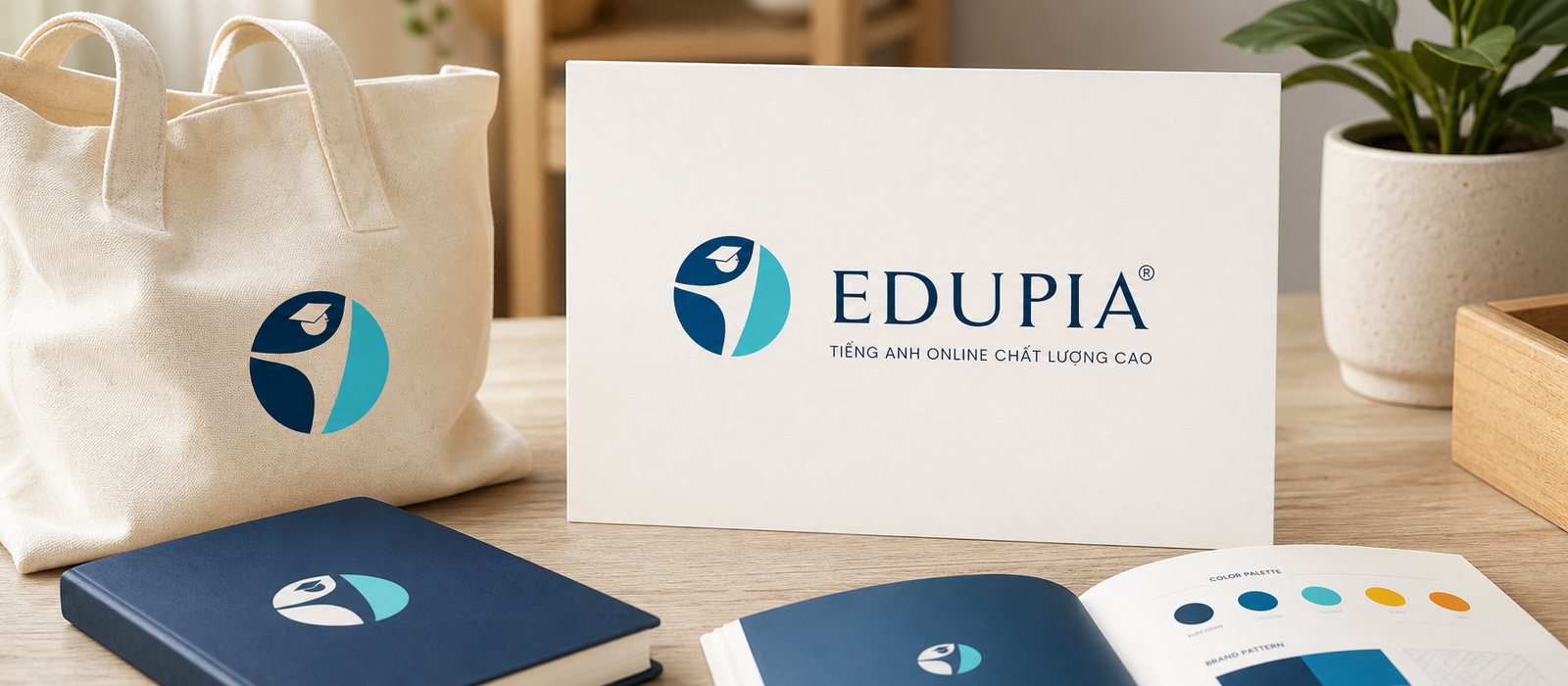
Edupia, an online English platform for millions of Vietnamese students, needed a steady identity across every screen. Sinh Vũ built the identity and digital product to hold it together.
An identity system for an English platform with a large number of classes: trustworthy and friendly at once.

At Edupia Class, every child is a color of their own, and this online English classroom needed exactly that kind of warmth…
An online classroom needs to be warm and colorful for children: how to make an online learning interface approachable.
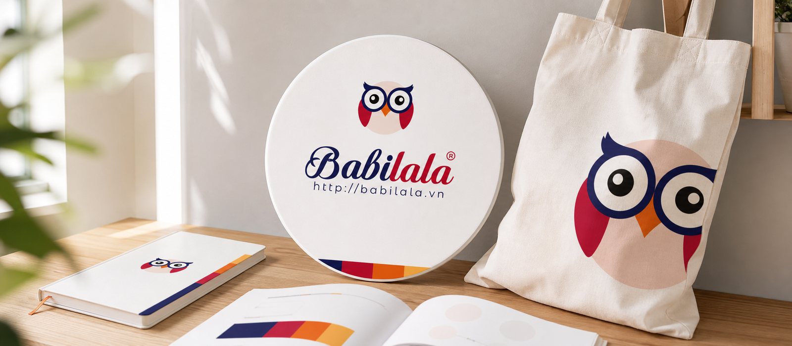
Sinh Vũ brought the owl Babi to every corner of Babilala, from the English learning screen to objects children aged 3 to 8 can hold, trustworthy enough to put parents at ease.
An English app for ages 3 to 8 with Babi the owl as a companion, along with guidelines, applications, packaging and a sales kit.
The principles behind it
A clear personality, easy to redraw in many poses, and easy to animate. The character also needs a set of rules for how it speaks, so every new feature still sounds right.
A shared set of interface components: colors, type, buttons, cards, screen transitions. The product team builds new features from that set, so the app does not drift in style with each version.
There is no universal formula, but the first sessions usually deserve the most care: small goals, just enough reward and pleasant reminders. Sinh Vũ designs the experience and the brand; retention also depends on the product as a whole.
Follow the character's or the brand's voice: short, warm and never scolding. Each reminder should give the learner one small thing they can do right now.
It should have a landing page so people who have not downloaded the app can find it, read it and share it. The page should say what learners achieve, with real screenshots.
A few lines about the product, your users and what is holding you back is enough. Sinh Vũ reads it and replies within one working day.