
Edupia Class, a warm embrace for the online classroom
At Edupia Class, every child is a color of their own, and this online English classroom needed exactly that kind of warmth. Sinh Vũ built a multicolored identity system so the class could feel both joyful and trustworthy.

The problem
Learning alone through an app is one thing, learning together with a whole class is another. Edupia Class is where children learn English in a live online classroom with teachers and classmates, so what it sells is not just lessons, but a sense of belonging, a feeling of learning together. The brand for that could not be cold and technical, it had to be warm.
But warm still had to be credible: parents needed to see a classroom of real quality, with real method, worth entrusting their child to. The brief for Sinh Vũ: build a face that was playful, approachable, as colorful as a lively classroom, yet polished enough to put parents' minds at ease.
The approach
Before any design work, we examined where Edupia Class stood and what it was really selling. Through an audit and working sessions with the team, both sides agreed: Edupia Class does not sell software, it sells a classroom, where children are guided by teachers and learn alongside classmates. That ground is human, it is togetherness.
From there, we shaped a voice: approachable and encouraging with children, attentive and clear with parents. That warm voice stayed consistent whether read in a message or watched in a video, so people would see a classroom with heart, not a machine.

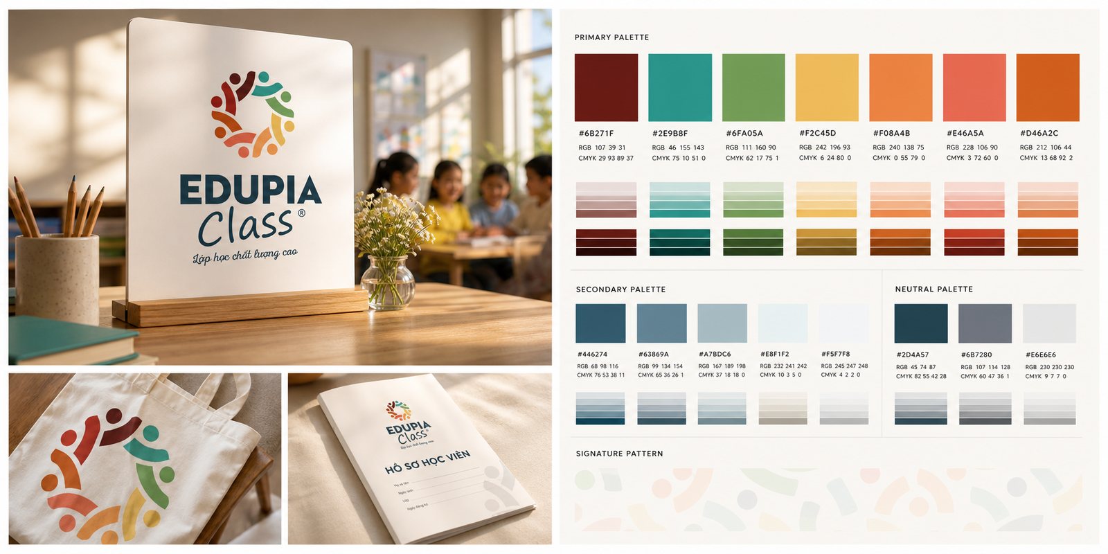
The Edupia Class symbol is a circle formed by colorful children holding hands, each one a different color, together making up a class. It says at once what the brand stands for: every child is different, and all of them belong to a classroom that is fun. The warm, varied colors make the whole identity ring with the joy of learning together.
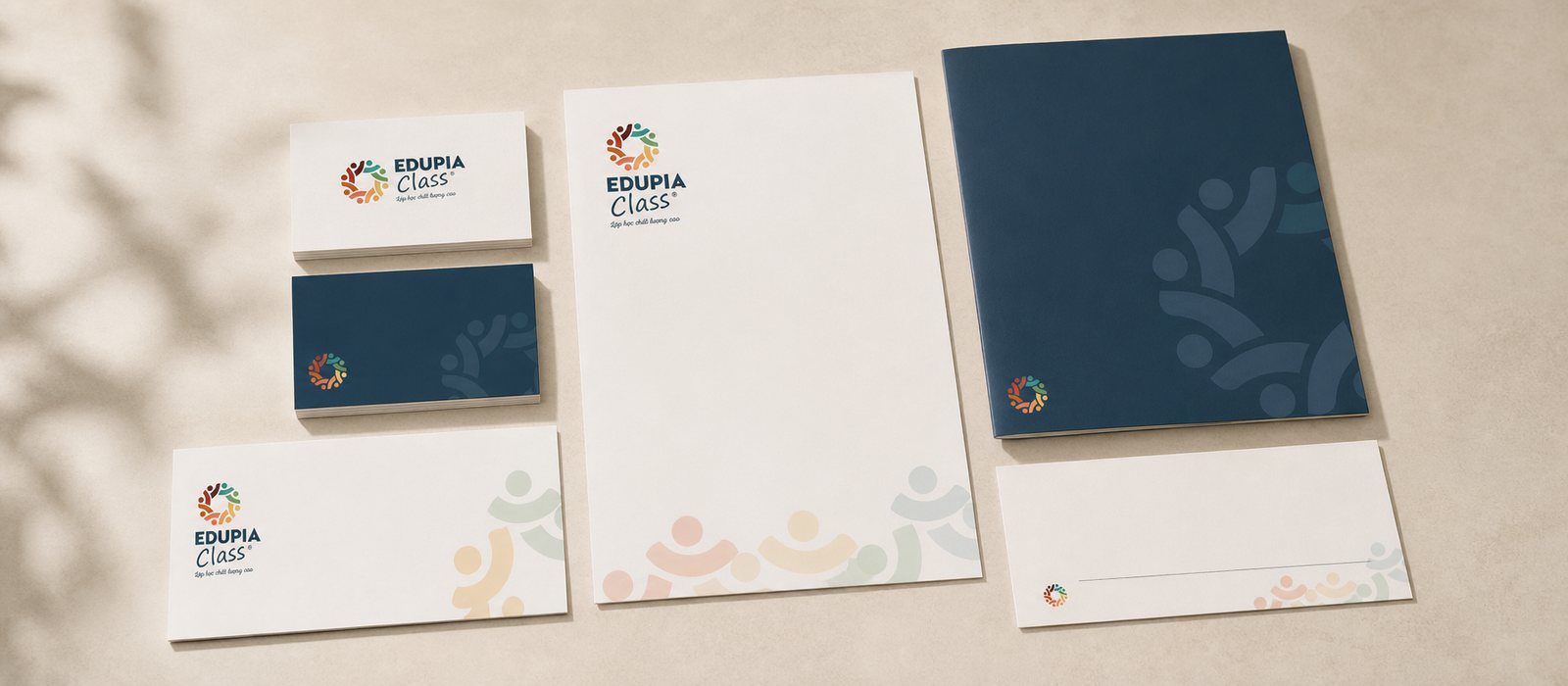
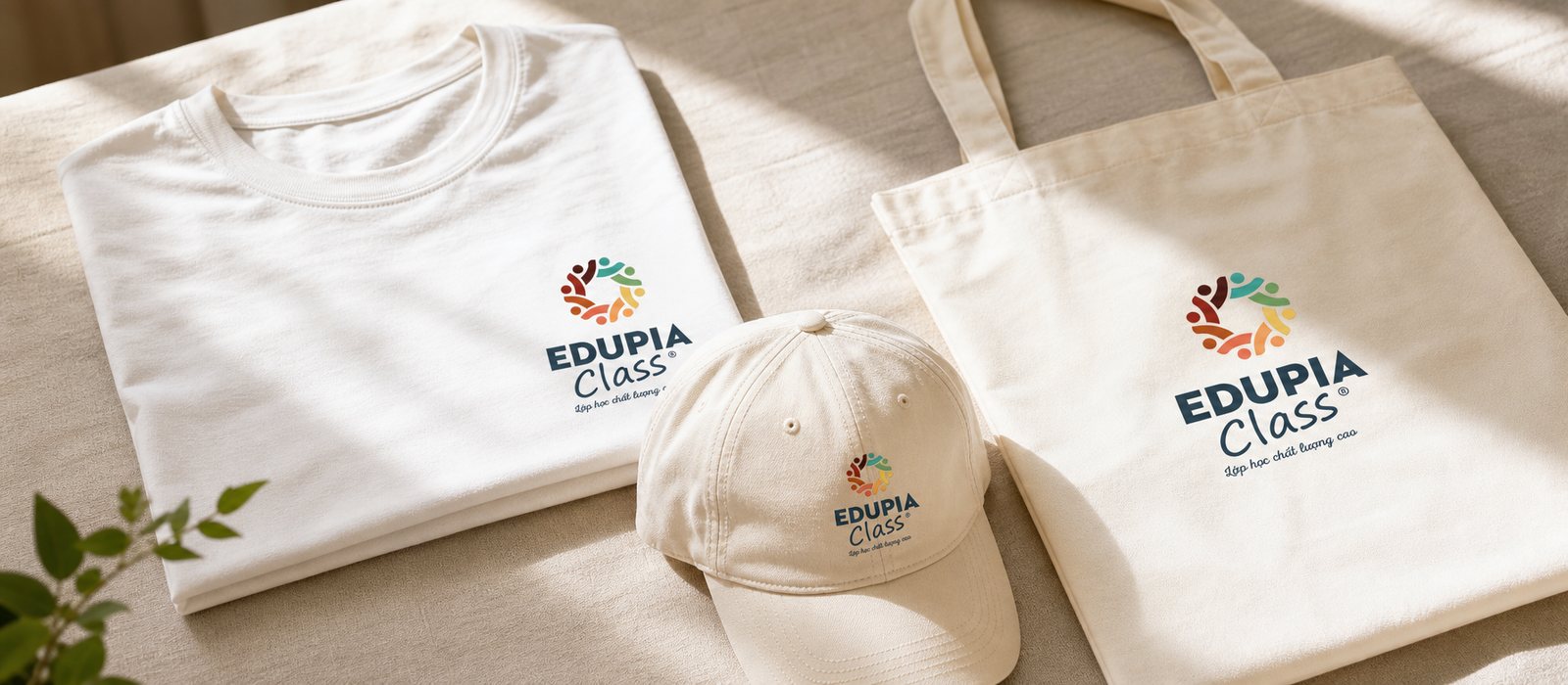
Around the symbol, we built out the full identity system with clear typography, usage and variations. So whether on a name card or a signboard, Edupia Class stayed a warm and joyful face. That is where an identity system differs from a logo: it keeps that warmth consistent at every touchpoint.

A brand this colorful can easily turn chaotic without rules. We wrote the brand guideline: how the circle of figures is used, how the colors are paired, where type sits, how much breathing room is needed. Because of it, materials and posts made by two different people still read as the same Edupia Class.
The guideline keeps the playfulness from becoming clutter, keeps many colors working as one system. That is how a lively, crowded classroom still stays tidy and credible.
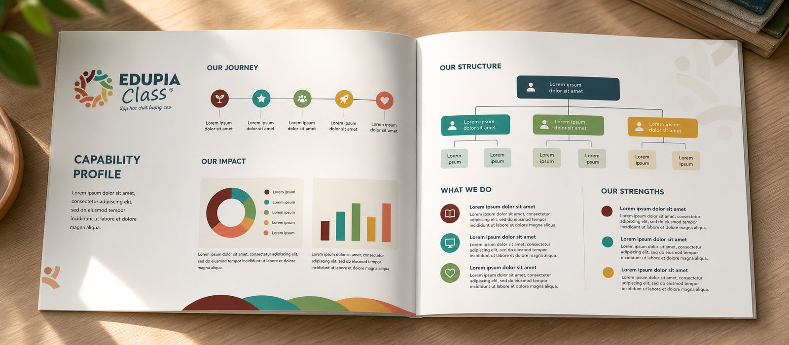
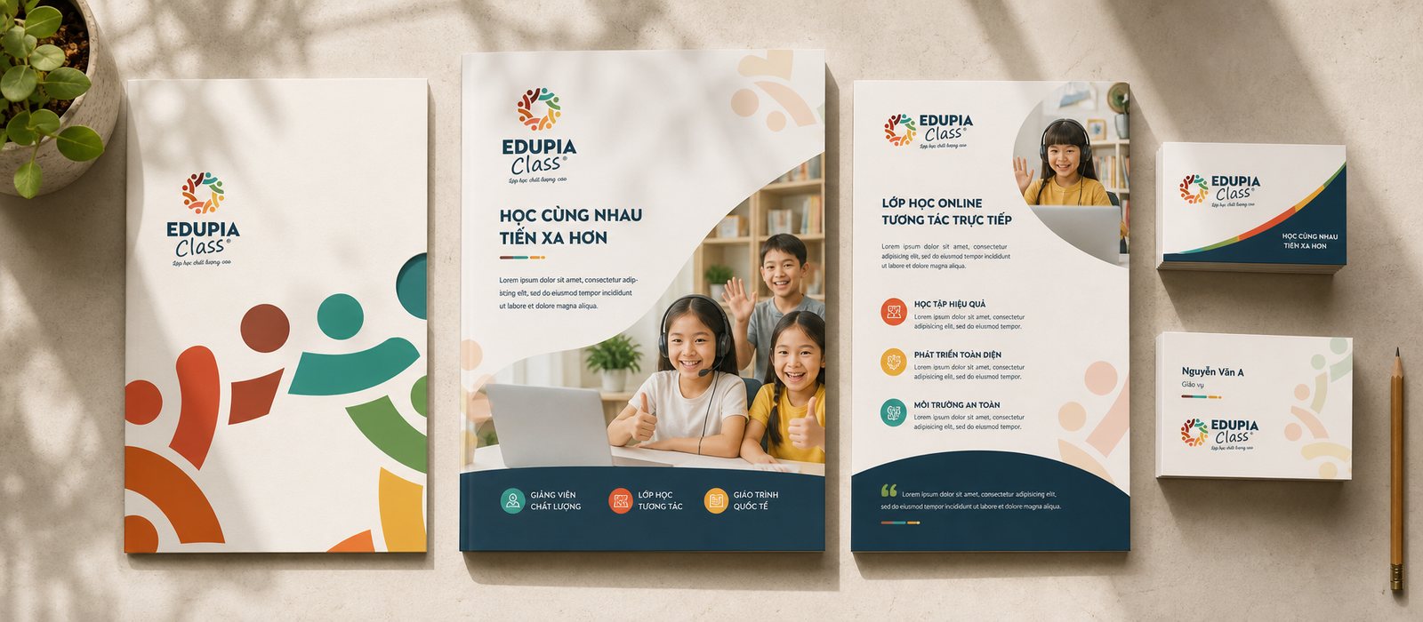
The one who decides where a child studies is the parent, so Edupia Class needed tools to speak to them. We built the corporate documents and sales toolkit: the company profile, the flyer, the consultation materials, so that every time the team sat down with a parent, they had something polished to carry trust.
For a classroom, polish in the documents is itself a promise of polish in the classroom. A beautiful, clear toolkit helps parents see that behind the joyful faces is a serious program.

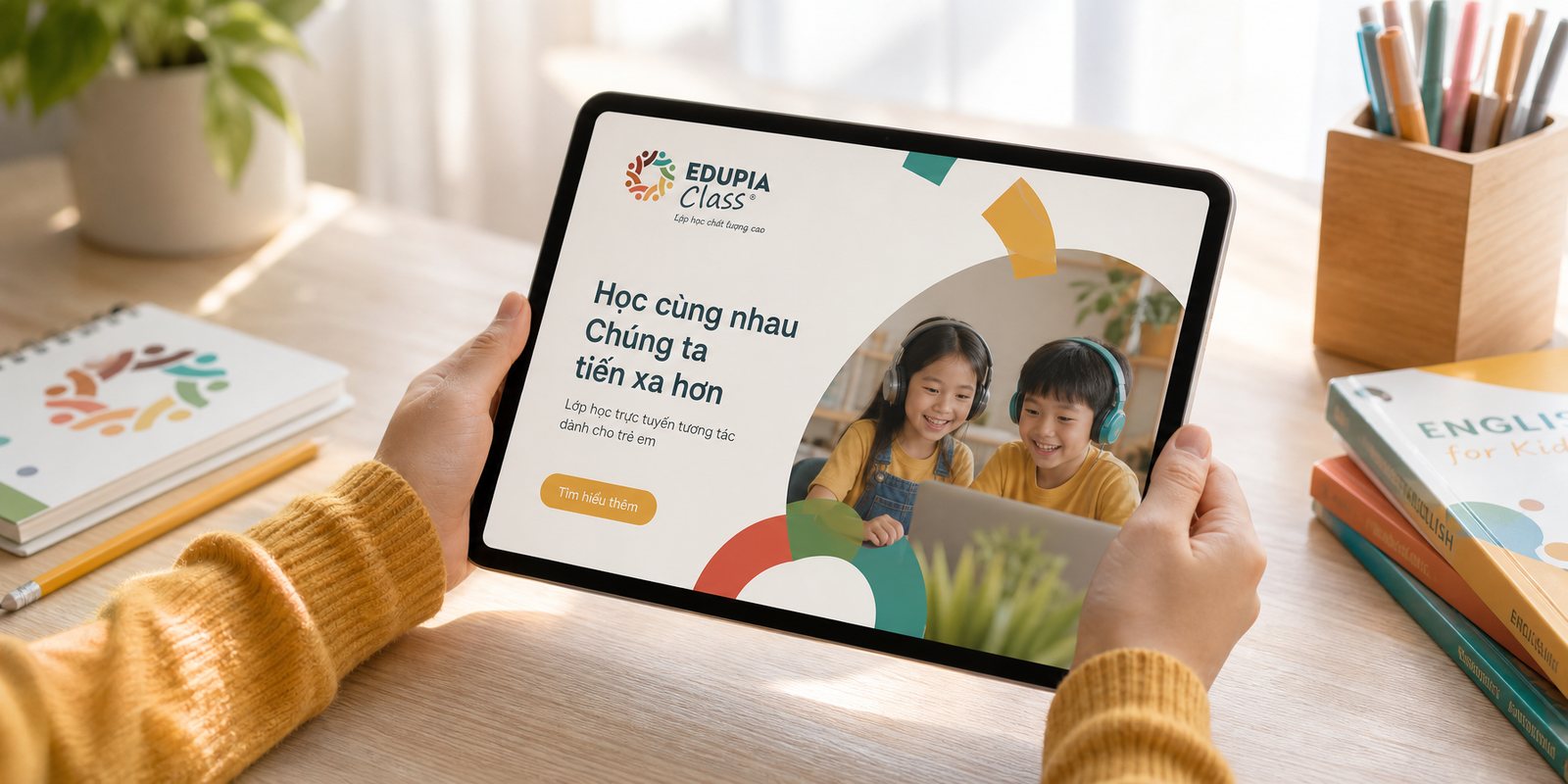
Education for children lives on images of joy. We built a photography and video set with its own character: bright, warm, full of the laughter of children learning. So that every frame of Edupia Class looks like a classroom worth dreaming of, one that makes parents trust it and children want to join.
From a photo of the whole class laughing together to a short film of a lesson, it all says one thing: learning together is fun. That is when a brand stops being a logo and becomes an atmosphere.
An online classroom still needs to meet its customers in person. We built the POSM set and event spaces: booths, backdrops, signage for experience days, parent seminars and English learning festivals.
So from screen to a bustling event hall, Edupia Class stayed a familiar, warm and joyful face. Wherever a parent meets the brand in person is also where trust is reinforced.

The process
Listening and positioning
Working with Edupia Class to define its ground: a classroom of people, of learning together.
Building a warm face
From the multicolored circle of figures to the palette and the guideline, building out the full identity system.
Imagery and voice
A photography, video and document set carrying the same warm, trustworthy atmosphere.
Handing over a living system
Closing with a guideline so the team can keep the brand true as the classroom grows.
The result
What Edupia Class gained was not a logo, but a warm, consistent face running through name cards, documents, imagery and event spaces alike. Whether a parent meets it on a flyer, a child sees it in a video, or the whole family meets it at a festival, it is still one Edupia Class, joyful and trustworthy.
For a classroom brand, that consistent warmth is what makes the name feel close and worth trusting a child to. That multicolored embrace, held steady at every touchpoint, is where every child finds where they belong.
A warm classroom at every touchpoint
From print, documents and video to events, one warm identity system runs consistently through every touchpoint.
Office stationery
Corporate documents
Video and animation

Event collateral
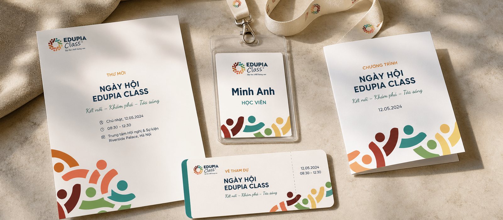
Apparel and applications
Print sales toolkit
Is your challenge like Edupia Class?
Tell Sinh Vũ what is on your mind about your brand. Sinh Vũ will point you to the right direction right away.