
Babilala, where English has a friend named Babi
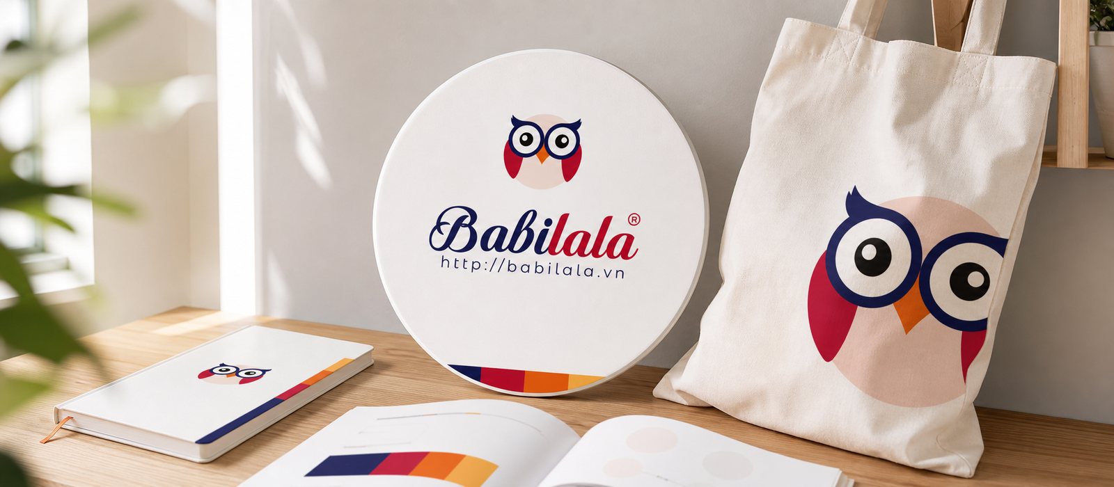
Sinh Vũ brought the owl Babi to every corner of Babilala, from the English learning screen to objects children aged 3 to 8 can hold, trustworthy enough to put parents at ease.
The problem
Babilala carries a gentle ambition: teaching English to children who cannot yet read. For a three year old, English is not a school subject, words carry no meaning yet, grades hold no power. The only thing a small child trusts is feeling, what is lovable draws them close, what is fun keeps them there.
But the person who taps download is a parent, someone who needs to see a method, Cambridge standards and a serious roadmap. Babilala therefore has to convince two opposite people in the same instant, the child following feeling and the parent following reason. The task set for Sinh Vũ was to build a brand that is both a friend to the child and a support to the parent, and to hold both as the app grows to reach hundreds of thousands of families.
The approach
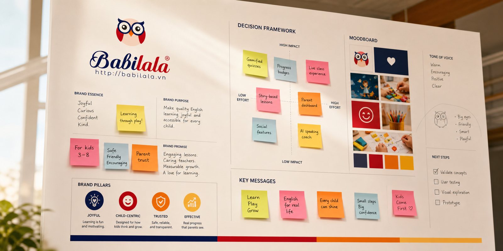
Before drawing anything, we worked with the Babilala team to clarify one point: for children aged three to eight, what sells is not lesson content, but a character for the child to love. The child will not remember which lesson number, but will remember the face that learned alongside them every day. Through our working sessions, both sides settled on one positioning: a friend who knows English, serious about results but always reaching the child through joy.
From that positioning, we shaped the brand's voice in two directions: cheerful and encouraging when speaking to the child, calm and clear when speaking to the parent. One Babilala, two ways of speaking, so each side hears exactly what it needs to believe.
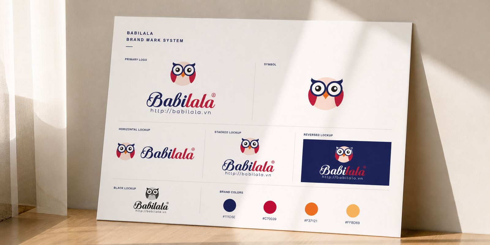
That character is Babi, an owl. The owl is the animal of knowledge, enough for parents to sense wisdom, but we drew it with big round eyes behind a pair of glasses and a playful sitting pose, so children would see a friend rather than a teacher. Set neatly inside a circle, Babi looks charming on a tiny app icon and stays solid when blown up large on a sign.
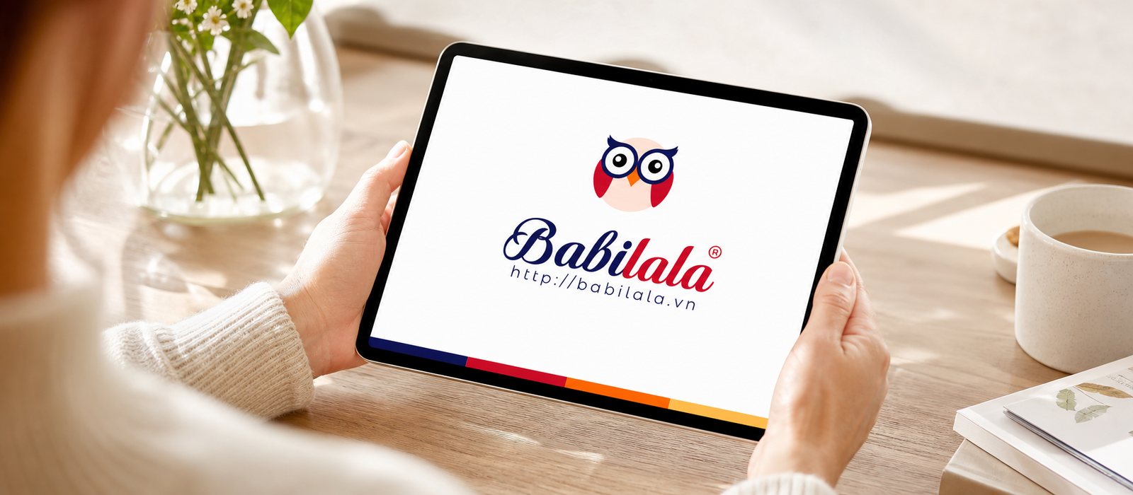
Around Babi, we built out the full identity system: the soft lettering of the name, variations for light and dark backgrounds, how the owl appears at large and small sizes. A child who cannot yet read the word Babilala can still point and call the owl's name, and that is exactly where the icon does what the name cannot yet do: get recognised, and get loved.
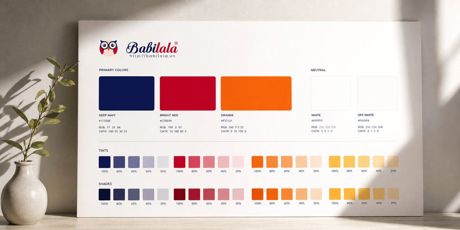
Colour is where Babilala balances two kinds of trust. We chose a deep navy as the colour of reliability and knowledge, the shade that puts parents at ease, then placed beside it a bright red along with warm orange and yellow for the child's laughter. A native palette, composed enough for parents and lively enough for children.
To keep a growing system from drifting, we wrote a brand guideline: how the owl is used, which colour code applies where, how type is set, how much breathing room is allowed. Because of it, a screen built by the product team and a flyer built by the marketing team remain the same Babilala. The guideline is exactly what keeps that friend's face unchanged as hundreds more hands touch it.
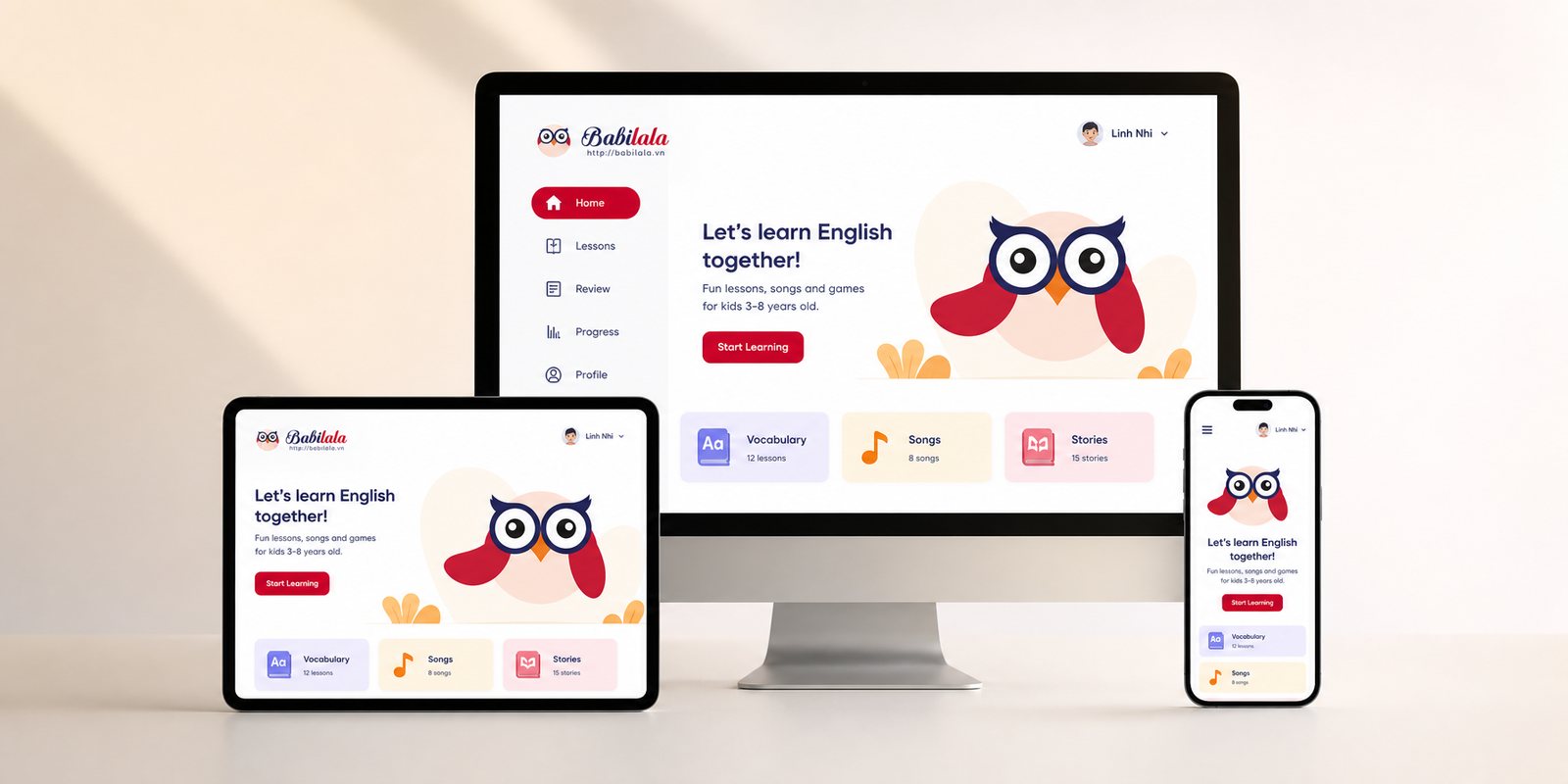
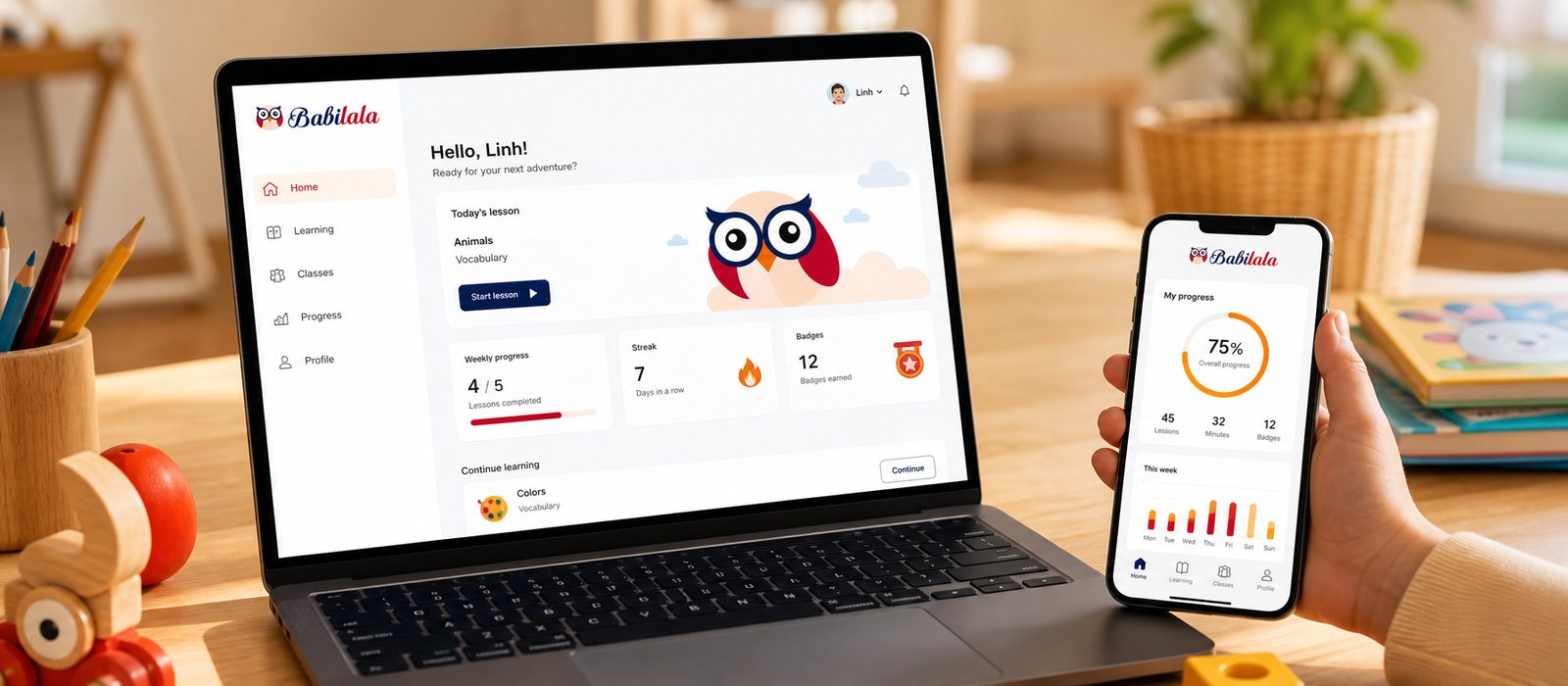
Babilala's core product is software, so the identity has to live on screen, and live in the hands of a very particular user: children who cannot yet read. We designed the app interface around images and sound rather than text, large buttons, clear icons, one tap and play, so a three year old can navigate alone without a parent reading for them.
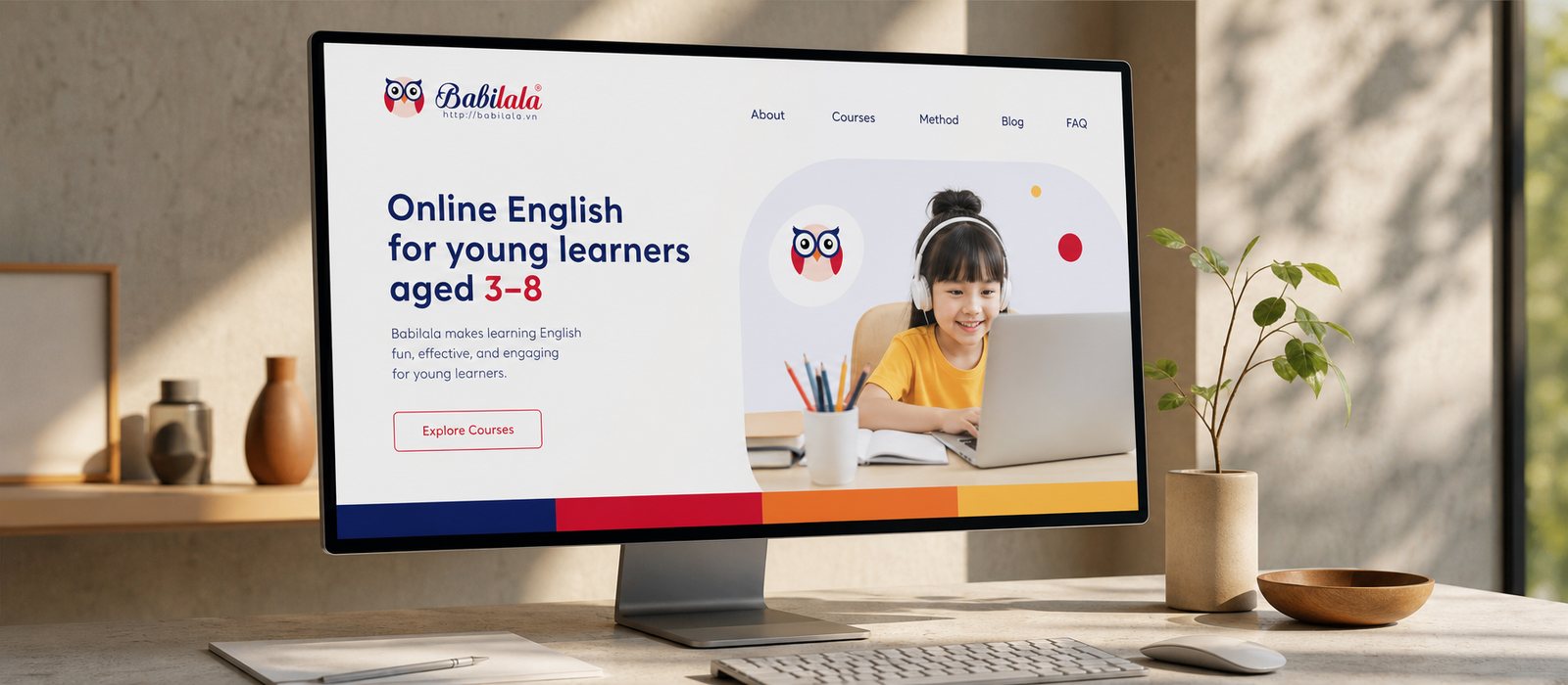
Beneath that playful surface sits a disciplined digital design system, reusable components, so that each time Babilala adds a lesson or a game, the new screen appears consistent and familiar rather than being drawn from scratch. The website for parents follows the same thread, a place where adults find method and reassurance. One side for children to play, the other for parents to trust, one system.
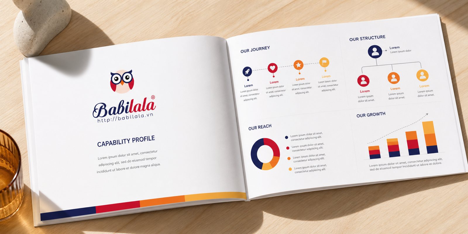
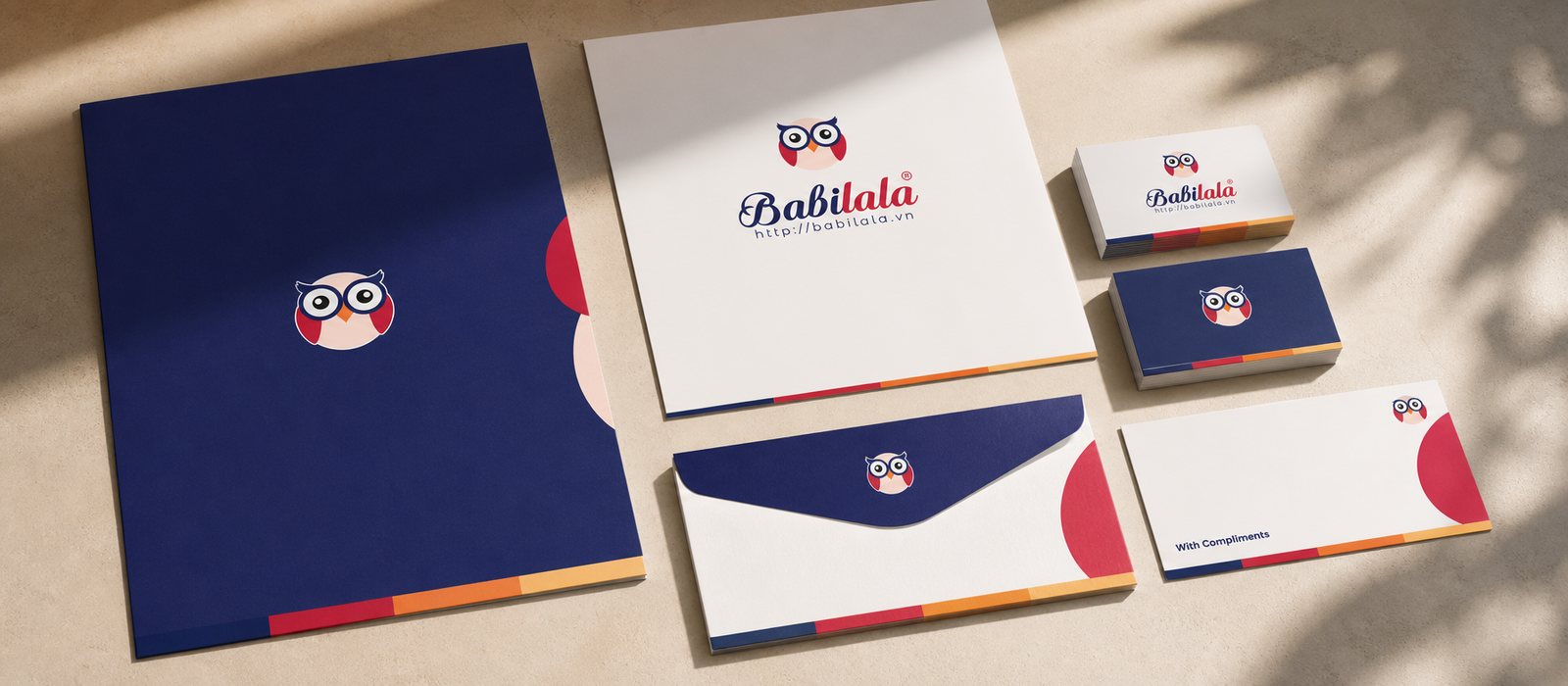
The app still needs to reach people offline. We built a corporate document set for Babilala to use with schools, partners and investors, a polished profile showing that behind the lovable owl stands a company with method and vision.
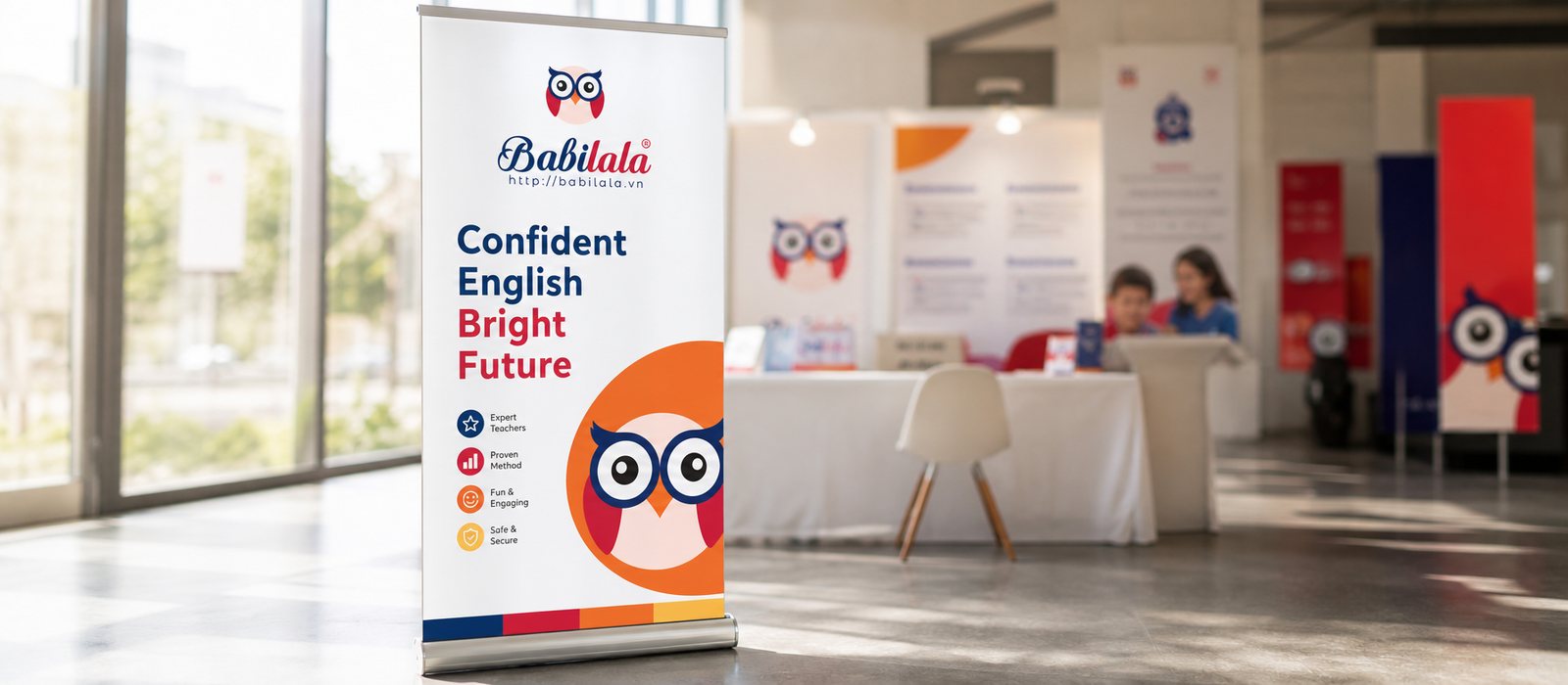
Alongside it came a sales and marketing toolkit, flyers, standees, publications and social media content templates, so the team has exactly what it needs when persuading an undecided parent. From the icon on a phone to the brochure on a table, Babilala keeps telling the same story, in the same voice.
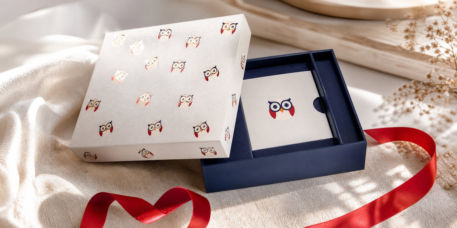
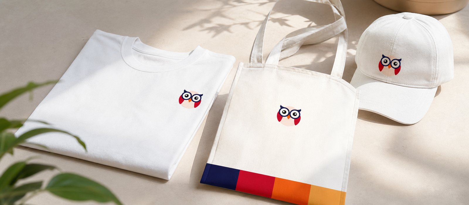
For a young child, what can be held feels more real than what stays on a screen. We designed packaging for Babilala's gift sets and learning kits, open the box and meet Babi, so the owl that lives inside the app steps out into an object a child can hug and show off.
The box wears a familiar face, the notebook is printed with the owl, the shirt carries Babi, all continuing the same identity system. For the child, that is the moment the friend from the phone becomes a friend in real life, and for the parent, that is a brand thorough down to the smallest item.
The process
Listening and positioning
Working with Babilala to clarify the dual audience of child and parent, and settle on one positioning: a friend who knows English.
Building the owl Babi
From the owl character to the colour palette and guideline, building the brand's full face.
Bringing it to screen
Designing the app and website through a digital design system, an interface suited to children who cannot yet read and reusable throughout.
Handing over a living system
Closing with the guideline, corporate documents, sales toolkit and packaging, standardised across every touchpoint.
The result
What Babilala received was not a logo, but a real friend in its users' hearts. The owl Babi runs through everything, from the app icon, the learning interface, the website, to publications, the sales toolkit and the gift box. Whether a child meets Babi on a phone or hugs Babi in real life, or a parent meets it on a printed profile, it remains one Babilala, both lovable and trustworthy.
For an app that grew from zero to hundreds of thousands of families and expanded across Southeast Asia, a clear and warm face is what keeps trust from thinning as it grows fast. That is the foundation for a large educational ambition to be loved by children from first sight, and trusted by parents from first touch.
One Babi across every touchpoint
From the app and website to publications, gifts and the sales toolkit, a single owl runs consistently through every place children and parents meet Babilala.
App interface
Website for parents
Publications and gifts
Brand photography
Sales toolkit
Office stationery
Is your challenge like Babilala's?
Tell Sinh Vũ what's on your mind about your brand. Sinh Vũ will point you to the right direction right away.