Travel and accommodation

Brand and interface design for travel platforms

Guests use a travel platform when it feels fast, clear and someone looks after them when things go wrong.

The rivals of a domestic booking or tour platform are international names guests already know by heart. Sinh Vũ gives your platform an identity, a UI design system and a voice that stay consistent across app, web and notifications, so guests remember the name and trust it when they pay in advance.

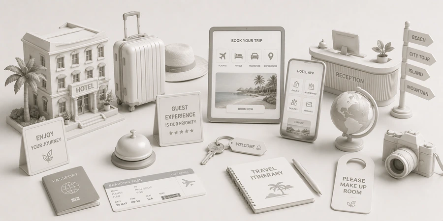
A sample interface set for a travel app: search results page, hotel card, booking confirmation screen and notification message
Quick answer01

What brand does a travel platform need for guests to choose it?

Three things: a clear position so guests know why to use this platform, a consistent interface system across app and web, and a voice that reassures when things go wrong. A platform never touches the room or the trip, so trust comes from how it appears and how it replies.

  1. A clear position

    One reason for guests to choose you, for example understanding Vietnamese travelers better, being clearer, or offering Vietnamese-language support.

  2. A consistent interface system

    The same color, type, buttons and cards across app, web and email, so adding a new feature doesn't add clutter.

  3. A voice that reassures

    Confirmations, delay notices and rescheduling messages written clearly and calmly, with something for the guest to do next.

Business types02

Three kinds of platform, three problems

All of them connect guests with travel services, but the users and what worries them differ.

Booking platform

Their customersGuests comparing many places to stay, and property owners who want more bookings.

Brand challengeShow both sides a platform that is clear, easy to compare and fair.

Tour booking app

Their customersGuests searching for tours by destination, date and group, who want to read honest reviews.

Brand challengeMake choosing among many hard-to-compare tours easy, on a phone.

Travel service marketplace

Their customersMany sellers (vehicles, attraction tickets, guides, experiences) and guests buying each item separately.

Brand challengeKeep one shared face across many suppliers, so guests trust it even when each partner looks different.

Pain points03

Four pain points specific to travel platforms

These are the places where platforms tend to lose guests even when the features are complete.

03

Messages and notifications in a machine voice

Confirmation emails, rescheduling notices and refund messages written dry and hard to follow, leaving guests uneasy.

Write a set of notification templates in one voice: say plainly what happened, what has been done and what the guest needs to do next.

Start from this problem
Customer journey04

At which stage do travel platforms lose the most guests?

At the Book stage. Guests like the platform, but when it comes to entering details and paying they hesitate, because they don't trust it enough yet or the payment screen is confusing.

Where customers are most often lostBook
Do this now
  1. Shorten the booking steps and show guests which step they are on.
  2. State plainly at the payment screen what guests are guaranteed and how to reach support.
  3. Send a confirmation right after booking, written clearly and with the details of the person who will help.
Touchpoints05

Five touchpoints to do first

Touchpoints are the places where guests see, touch or hear about the platform. You don't need to do everything at once. These five touchpoints decide most of the trust.

  1. App icon and launch screen

    What guests see every time they open the app, and the smallest size at which the mark has to stay legible.

  2. Search results page

    Where guests compare and decide whether to go on.

  3. Confirmation and payment screens

    The moment guests decide to pay, so every word has to be clear.

  4. Notifications and email

    Guests read them when anxious: rescheduling, refunds, trip reminders.

  5. Partner documents

    Partners are the supply, and they read these to decide whether to stay.

Roadmap06

Where Sinh Vũ suggests starting

Listed in the order to do them. A new platform stops at step two or three; a platform with several teams goes all the way.

  1. Logo and Brand Identity Design

    Name, mark, color and type: the base for app, web and every document.

  2. Designing a digital design system

    A shared UI design system so every team builds screens from the same root.

  3. Brand website design

    An introductory website and landing pages for guests and partners, in the same voice as the app.

  4. Building brand voice

    A set of notification templates, confirmation emails and guidance copy in one voice.

  5. Sales and marketing collateral design

    A document set for inviting partners and a sign-up guide.

Projects07

Projects closest to travel platforms

Sinh Vũ has not published a travel platform project. The two below are closest in the problem: a platform running in parallel on app and web, and a platform with many production teams building together.

Further reading08

More on travel platforms

Free toolTouchpoint map for this business modelSee the five stages customers pass through, where they drop off most, then rate the five touchpoints to fix first.Open the tool Free toolCrop images for every placementFrom one image, get the right format for Facebook, Zalo, TikTok, Shopee and YouTube, with the important part kept in frame and light compression for fast loading.Open the tool
FAQ09

Frequently asked questions

An app logo lives mostly at very small sizes on a phone screen. Sinh Vũ tests the mark at app icon size first, then scales up to larger sizes.

Yes, once two or more teams build screens together, or when there is both an app and a website. A design system lets every screen share color, type, buttons and rules, so you don't start over each time you add a feature.

Don't compete on every front. Choose a specific position such as understanding Vietnamese travelers, Vietnamese-language support, or strength in one region, then let the identity and the interface say that.

Yes, and they are what guests read most closely when anxious. A set of notification templates in one voice helps guests feel there are real people behind the platform.

Build a shared display template for service cards, photos and descriptions, then give partners clear guidance documents. Guests see one platform, not a pile of stalls.

Tell Sinh Vũ about your platform

A few lines about the product, your users and what is holding you back is enough. Sinh Vũ will read it and reply within one business day.