
Homedy, one platform, three screens
Homedy is a real-estate marketplace running in parallel on app and web. Sinh Vũ built the strategy, identity and a shared digital design system, so both could grow fast without drifting apart.
The problem
Homedy began from a simple belief: everyone deserves to find a happy home with ease, without wading through a cold sea of listings. Guided by the spirit of "Be your better home", the portal grew very fast on both phone and desktop. But that speed left a quiet crack that every digital platform meets as it matures: the app went one way, the web another, and the brand spoke in many voices depending on where you met it.
The crack was not a missing handsome logo, but a missing shared root for everything to grow from. Each team built screens its own way, each piece of print carried a slightly different red, each notification a different tone. For a product that serves one of the biggest decisions in many people's lives, that drift is not merely a matter of taste: it wears down the very thing Homedy needs most at first contact, trust. We brought everything into one system, so the platform could keep growing without rethinking the brand every time it added a screen.
How we did it
Before drawing a single line, we asked Homedy the question that comes before all others: where do you want to stand in the mind of a home buyer. This is the step most often skipped and also the most important, because buying a home is a large, anxious decision: the fear of choosing wrong, of being led astray, of placing a lifetime of savings in the wrong hands. A platform speaking to someone who is worried cannot speak in the voice of a classifieds board.
We chose for Homedy a warm place to stand: somewhere that helps people find a happy home, simple and trustworthy, not a cold marketplace of listings. Strategy is not a slogan on the wall, it is a measuring stick. Later, each time we hesitated between two designs, two ways to word a notification, two shades of colour, we came back and asked: which one serves that warm position more.
Getting the position right makes the whole project less costly. Once the root is clear, every decision anchors to it instead of trying things and turning back. That is where strategy returns its greatest value: it cuts away a whole series of expensive trial-and-error loops before they can even happen.
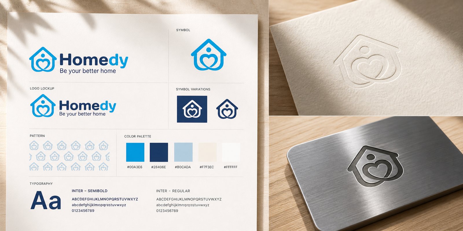
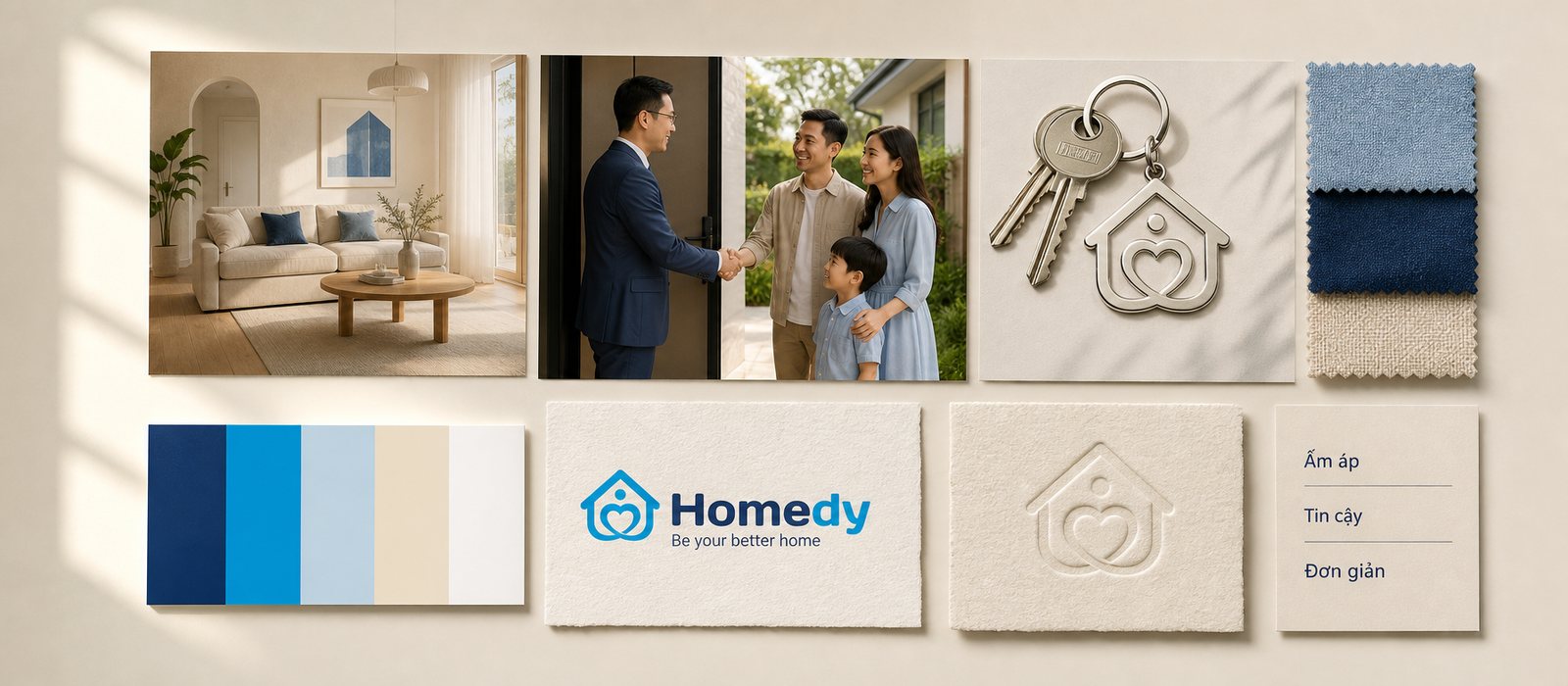
The first point of contact with a worried person must do one thing before anything else: reassure. So when building the identity system, we did not look for a strange shape to draw attention, but a familiar one to earn confidence. Homedy was distilled into two shapes anyone reads at once, a house and a heart, nested into a single mark. The house speaks of place, the heart speaks of happiness, and together they hold Homedy's promise in a single form.
An identity system is not a logo, it is a system of signals that lets a brand be recognised even when the logo is absent. Around that mark we built a full system: a warm leading red that suggests warmth, a typeface that reads well at every screen size, rules for breathing room, proportion and how the logo sits on light and dark backgrounds. We tested it at the smallest size, shrunk to an icon on a phone, to be sure it stays recognisable without clutter, because on a digital platform a logo spends most of its life very small.
The value of such a face shows in real life, not on a presentation slide. When someone opens Homedy for the first time, before reading a word about the company, the warm mark and the careful palette have already spoken quietly on its behalf: this is a decent place, worth your trust. That is the real work of identity, bringing trust in earlier than the introduction itself.
A warm brand that speaks in a cold voice is one thing in image and another in words, and people feel the mismatch even when they cannot name it. So after Homedy had a face, we shaped a voice for it. This is the most invisible part and the most easily neglected, because language is often written in haste by many hands, each in its own key, until the brand sounds like a room of ten people talking at once.
We set one root principle: always put the person and the happy home at the centre, rather than dry real-estate jargon. A prompt in the app is not written like a clause of terms, but like a thoughtful friend standing beside you. From there we built a set of language rules: words to use and to avoid, how to address people, how to report an error without making the user feel clumsy, how to name a feature so that someone new to real estate still understands. Brand voice is not the style of one writer, it is the body of rules that keeps a hundred writers sounding like one person speaking.
Because of that, even as the Homedy team changes, even when today's writer is not next year's, the Homedy voice stays consistent. Users meet the same kindness on the welcome screen, in the confirmation email, in the reminder about a viewing. It is the steady repetition of that kind voice, not one clever slogan, that builds a sense of familiarity over time.
This was the most important decision of the whole project, and it lay not in one prettier screen, but in our refusal to build the app and web as two different products. The familiar approach is one team per platform, each building an interface its own way, until three versions of the same Homedy drift further apart by the day. We chose the opposite road: a shared digital design system, a body of rules and a store of components so that iOS, Android and web all grow from the same root.
A design system is not a collection of pretty screens, it is a body of rules so that every screen grows from the same root. We defined reusable components, from buttons, input fields and listing cards to search filters, each with clear rules for colour, spacing, states and behaviour. We named the platform tokens such as colour, type size and spacing, so that when the brand adjusts a single red at the root, all three screens change together, instead of fixing each place by hand. For a platform showing thousands of listings alike, this consistency at the component level keeps the experience clean at large scale.
The value of this decision shows most clearly in the daily life of the product team. Each time Homedy adds a feature, they build it once from existing components, and it appears consistently in all three places at once. What used to be three builds, three drifts, three rounds of fixing to match, is now folded into one. A shared design system is how a digital product buys back its own time for every future expansion.
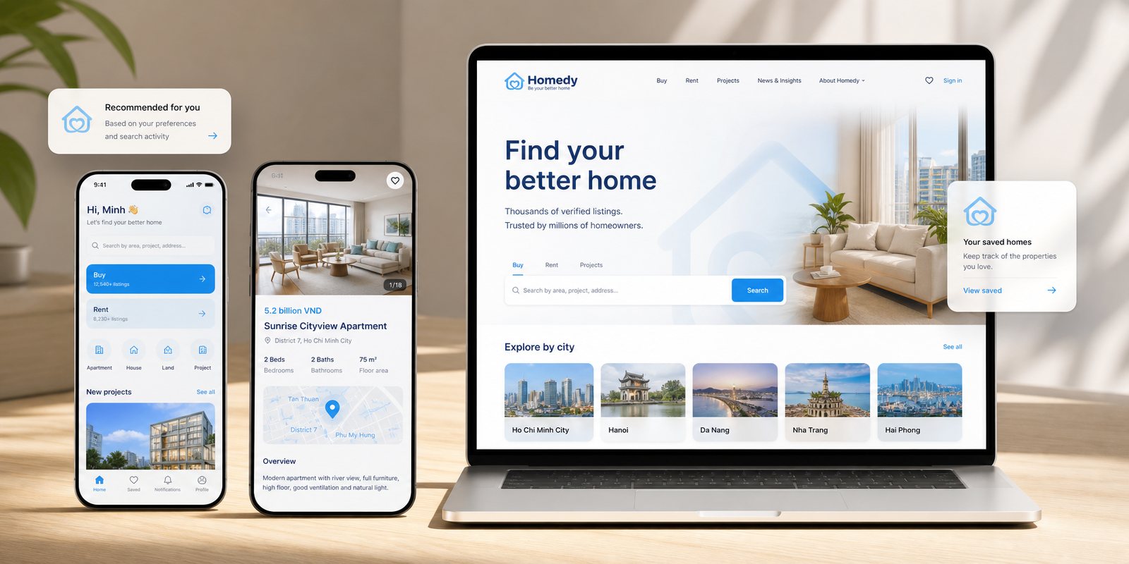
Real estate has a group of users that many digital platforms forget: first-time home buyers, often older, wary of technology, and for them a confusing interface is not a small inconvenience but reason enough to leave. Homedy could not serve only young people fluent with apps. So when building the website, we took the most hesitant user as our measure, because a product that is easy for the most demanding person is naturally easy for everyone else.
The Homedy website was designed so that someone who has never used any property platform can still search, filter and reach an agent without anyone guiding them. We kept the text large enough to read in comfort, the paths short enough that no one gets lost, and placed the most important actions, such as viewing a home's detail or making contact, exactly where the hand looks for them. As the online face where many meet Homedy first, the website carries the same identity and voice built in the earlier chapters, so the promise of kindness does not stop at the logo but runs straight into every action.
An easy experience, in a product like this, is not a convenience but a form of kindness. When an older person finds an affordable home and calls the agent themselves, without a child or grandchild doing it for them, the design has done its real job: it returns to the user a sense of self-reliance at the very moment they most need to be respected.
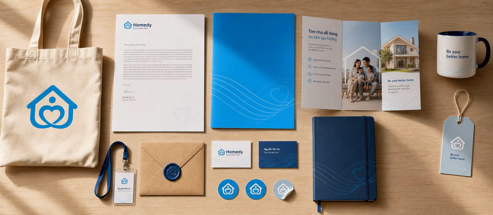
A brand is only trustworthy when it does not change voice from place to place. People might meet Homedy first on an outdoor advertisement, next in the app, then holding an agent's business card, and all three times they must see the same Homedy. This is the final test of any identity system: whether it can live beyond the design screen, on real objects made by real people in different places.
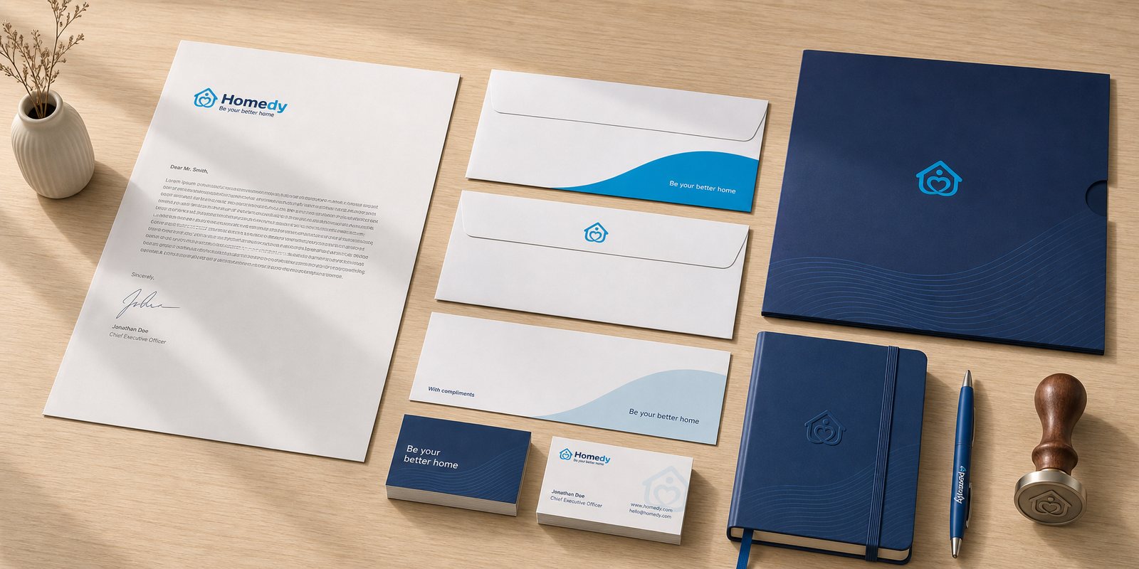
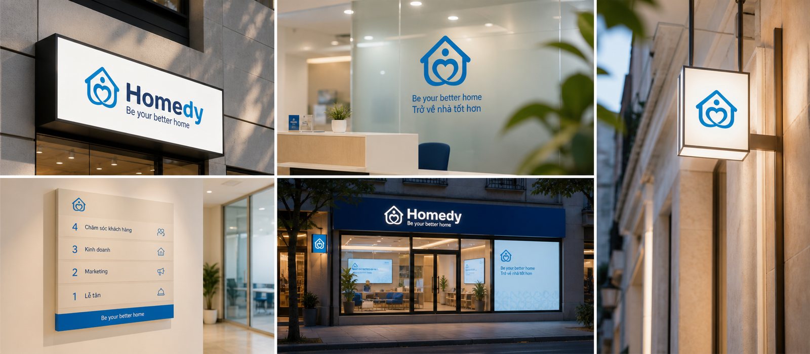
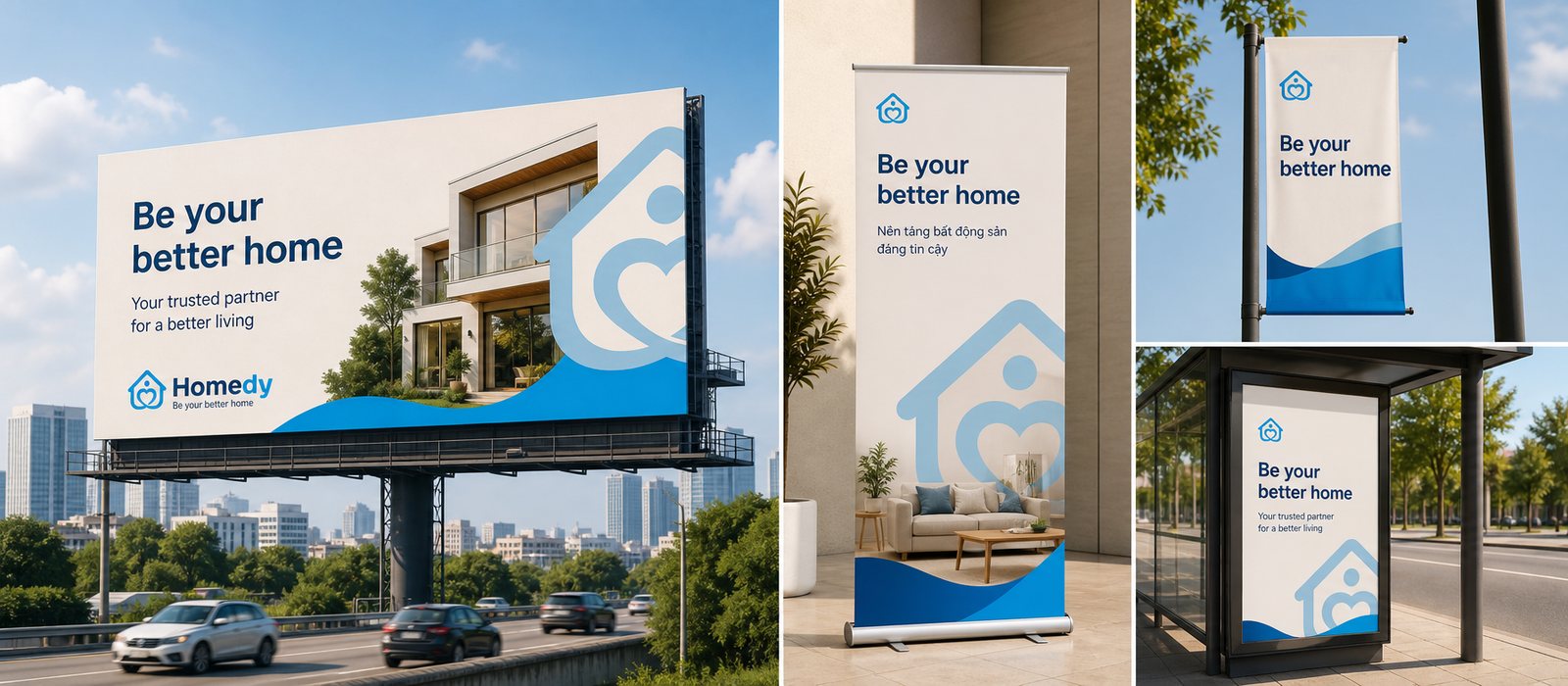
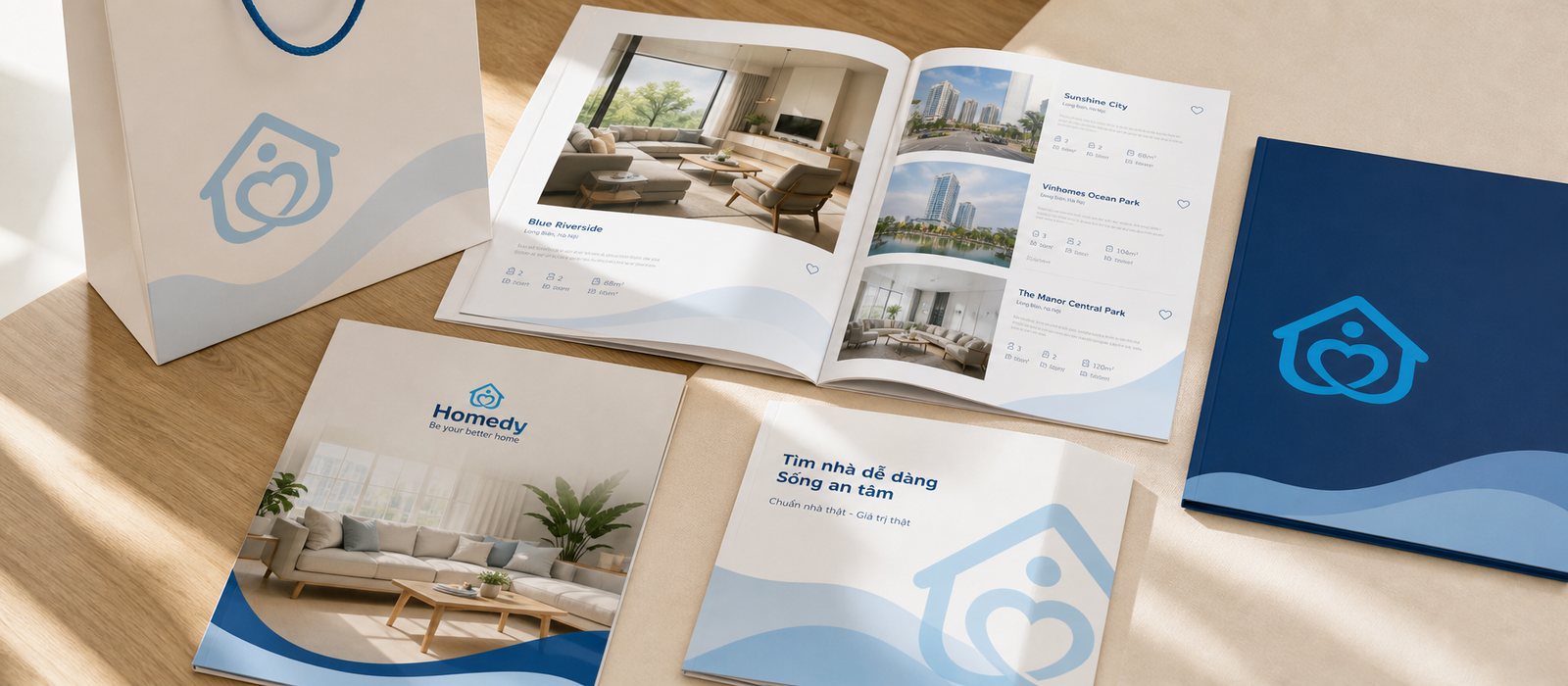
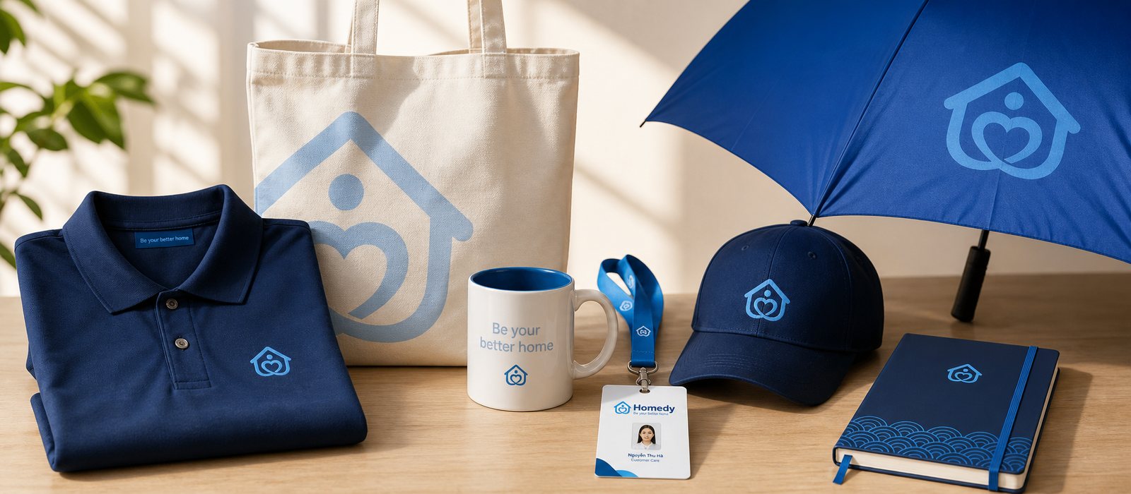
We ran the identity across every touchpoint outside the digital product: signage, outdoor advertising, brochures, uniforms, merchandise and social media. In each place, the same warm red, the same mark of a house holding a heart, the same voice. So that consistency keeps itself without us always standing beside it, we handed over clear rules for using the logo, colour and type, turning the identity into something the Homedy team runs to standard on its own as it keeps growing.
Because of that, the gap between a first meeting and a later one does not dilute the brand but concentrates it. Meeting Homedy on a phone and then holding an agent's business card, people still see the very same brand, and each match adds a little more to their trust. Consistency, kept long enough across enough touchpoints, becomes an asset in itself.
The process
Positioning and spirit
Together with Homedy we settled on a warm, trustworthy place to stand as the measure for every decision, laying the strategic ground before touching a single line.
Face and voice
From that position, the mark of a house holding a heart was born, alongside a full identity system and a kind brand voice, so Homedy would be both recognised and heard as one.
One foundation for three screens
We built a shared digital design system for iOS, Android and web, turning the app, the website and the interface components into branches growing from the same root, rather than three separate products.
Consistent at every touchpoint
The identity was applied across app, web and print, with a set of rules so the Homedy team keeps to standard and grows on without having to ask again.
The result
What Homedy received was not a logo or a set of pretty screens, but a shared root. From three platforms drifting further apart, now the app, web and print all grow from one system: a place to stand, a face, a voice, a shared store of components. Users meet Homedy anywhere, on a phone at midnight or on an agent's business card, and meet the very same brand, each match adding a little more trust.
But the deepest value lies in something you cannot see: the peace of mind to grow. Homedy entered its fastest growth phase with a brand it did not have to rethink each time it added a feature or a screen. What once had to be done three times and drifted three times is now done once and right in all three places. The system was built solid enough not to be shown off, but so the business can forget it and simply run ahead.
One identity, every application
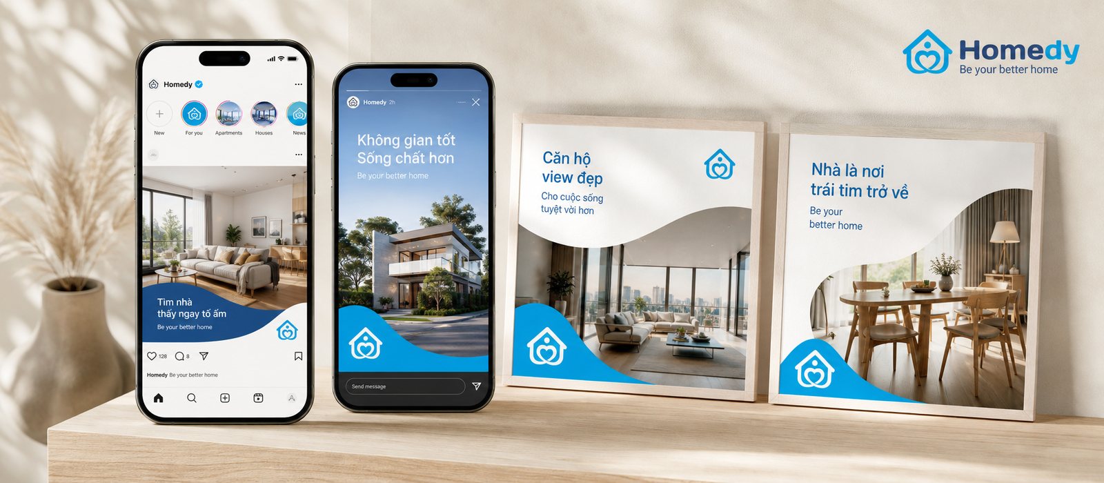
An identity system does not stop at the logo. This is the system of signals Homedy lives by across every touchpoint, from signage and outdoor advertising to print, uniforms and social media.
Signage
Outdoor advertising
Brochures
Uniforms and merchandise
Social media
Visual direction
Does your challenge look like Homedy?
Tell Sinh Vũ what is on your mind about your brand. Sinh Vũ will point you to the right direction straight away.