
Metacity, standards before the city
Metacity builds a 3D city where residents buy land, raise buildings and earn a living from the work of building. Sinh Vũ built the brand foundation and the standards behind it, so four production teams could draw that world every day and still arrive at the same place.
The problem
Metacity set out to do something hard to believe: build a 3D city where people buy land, raise buildings and earn a living from the work of building. That city had no bricks yet, no streets yet. Web3 at the time was full of projects that evaporated within months, so the hardest task was not drawing something prettier, it was giving outsiders a reason to believe.
That belief had to carry unusual weight. Four production teams ran in parallel, from 3D modeling and design to engineering and community, and each of them pushed a fragment of the world outward every day. A few fragments out of step and the whole place looks improvised, giving viewers one more reason to walk away.
The approach
We settled the word before we settled the line. Metacity does not stand where play to earn projects stand, all promising returns and all looking alike. Metacity stands as a city: zoning, infrastructure, citizens, land law. That word set a harsher standard for the team itself, because a city has to be livable, not merely playable.
From that position the world was divided into three cores so everything afterwards had somewhere to belong: an artificial iconicity core for people, an energy core for technology, an environment core for nature. An architect raising a tower, a writer naming a district, a designer ordering a menu, each of them checks against those three cores before deciding.
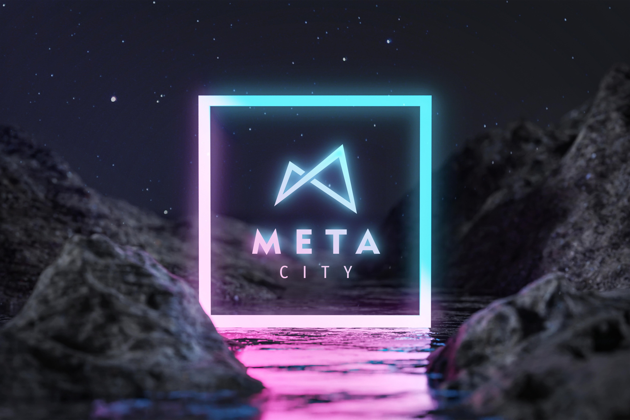
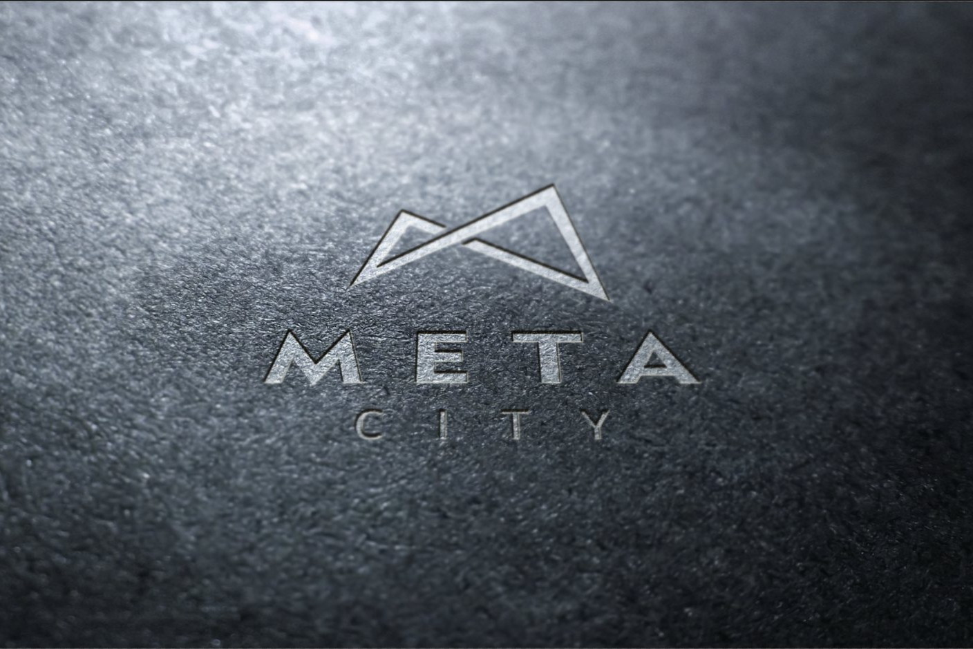
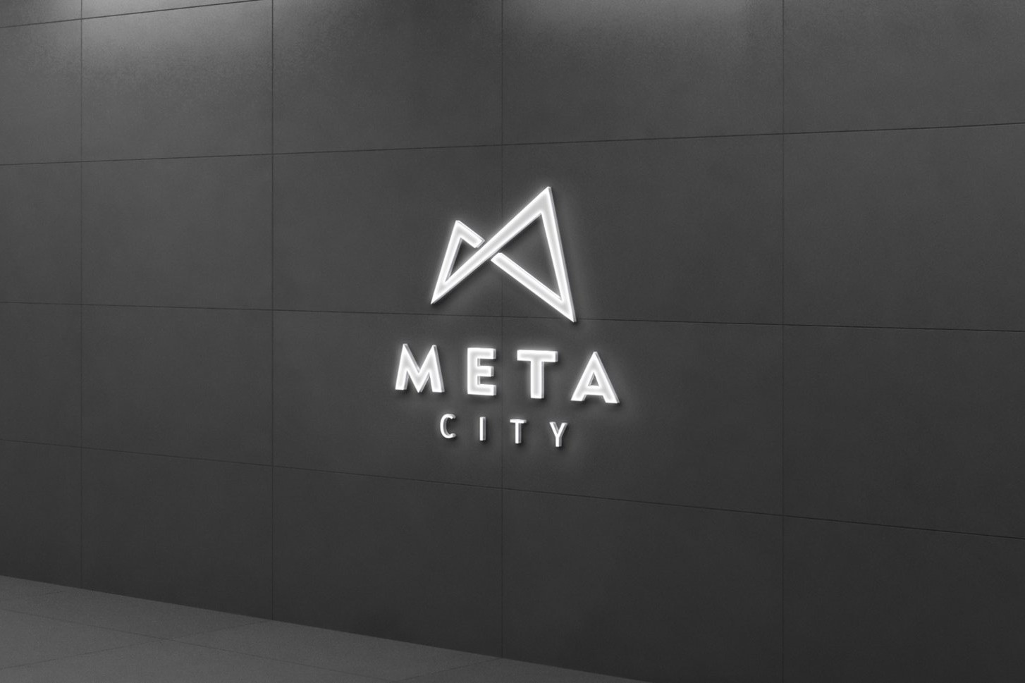
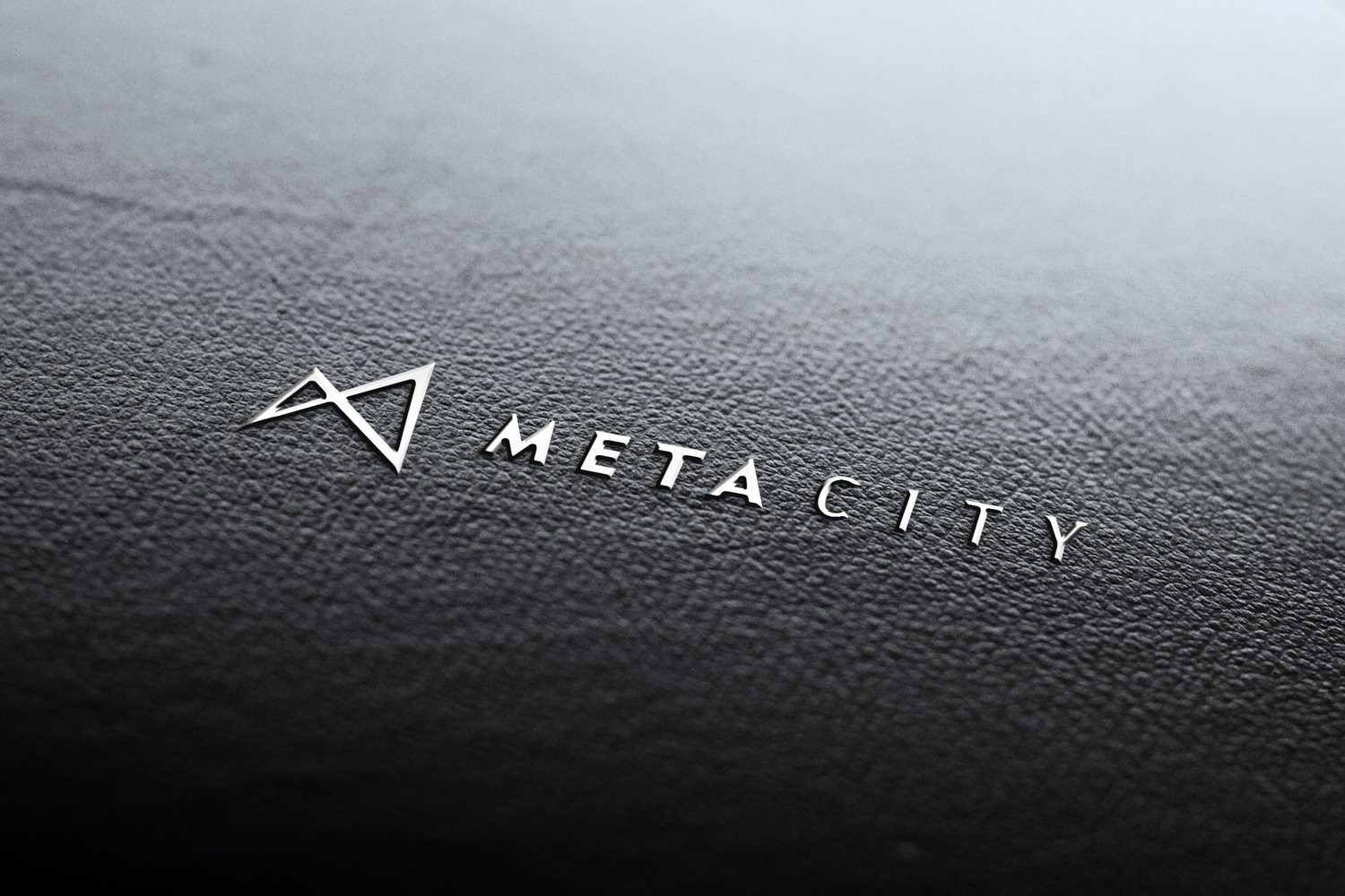
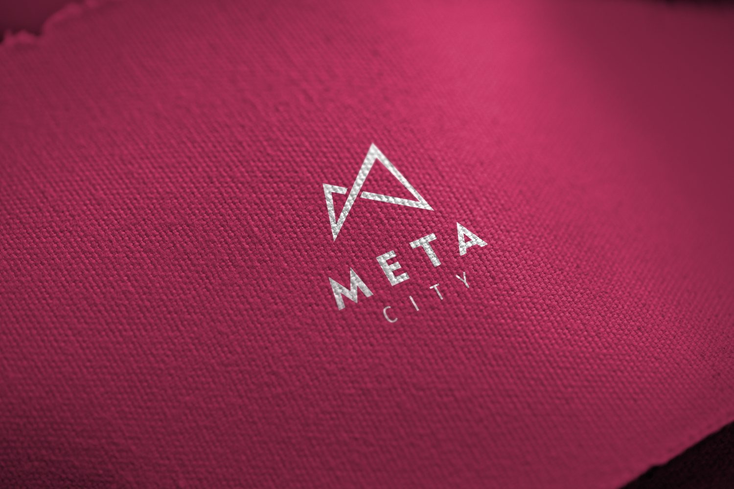
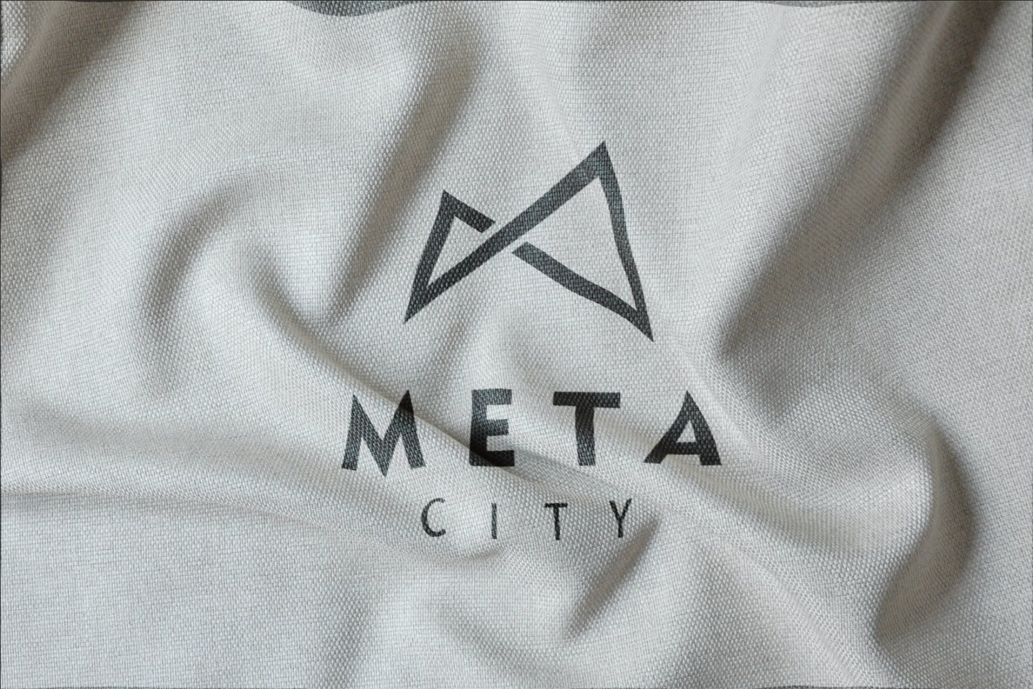
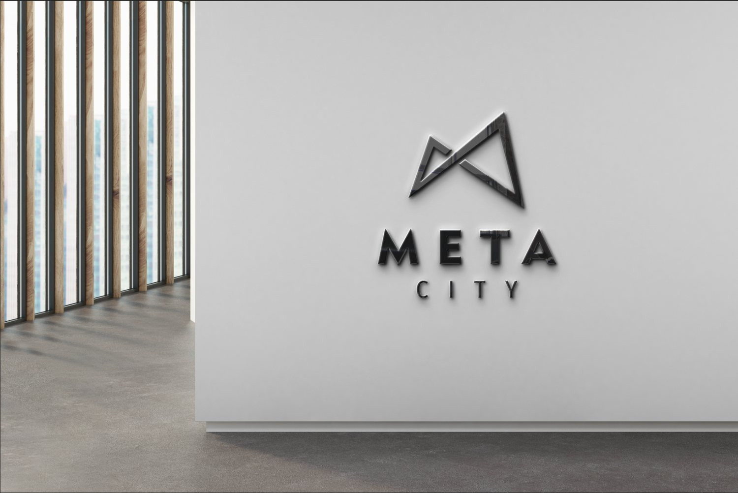
The Metacity mark is an M built from two thin triangles crossing at the center. Look long enough and it reads as a mountain range, and also as a gateway. That was the intent: an entrance into a territory. Because it is pure line and pure geometry, the mark holds its recognition at sixteen pixels in a browser tab and on a three meter sign in a lobby.
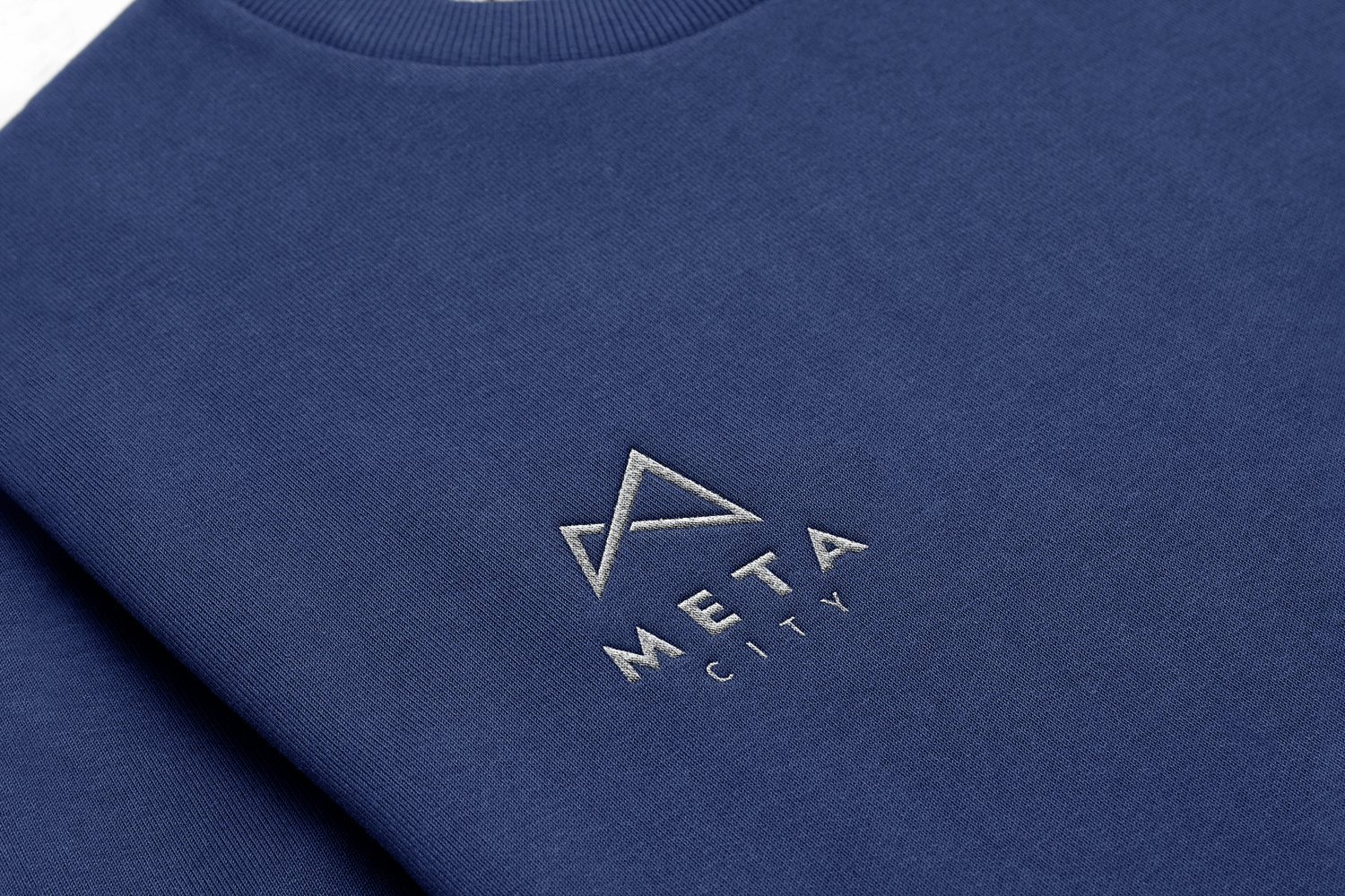
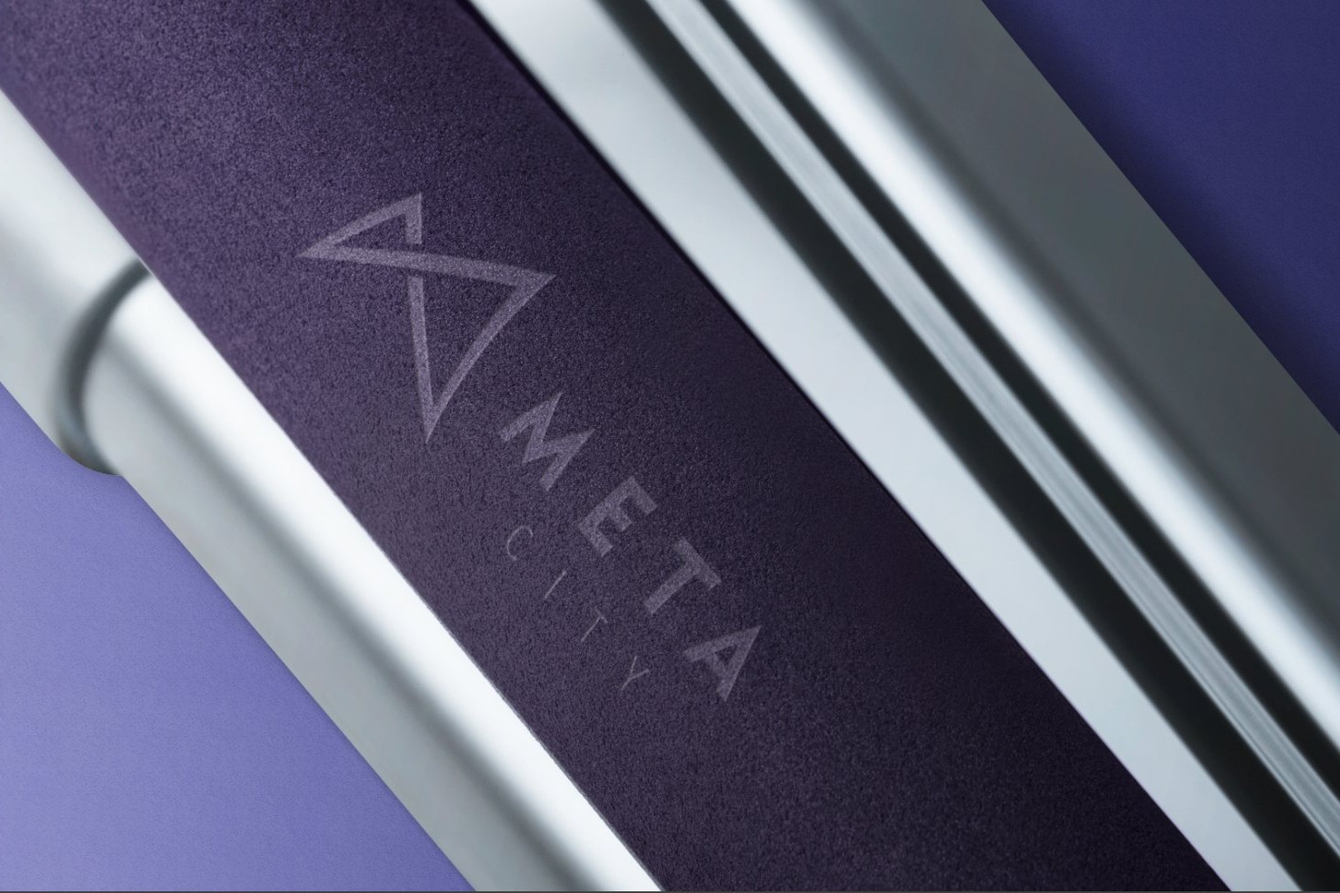
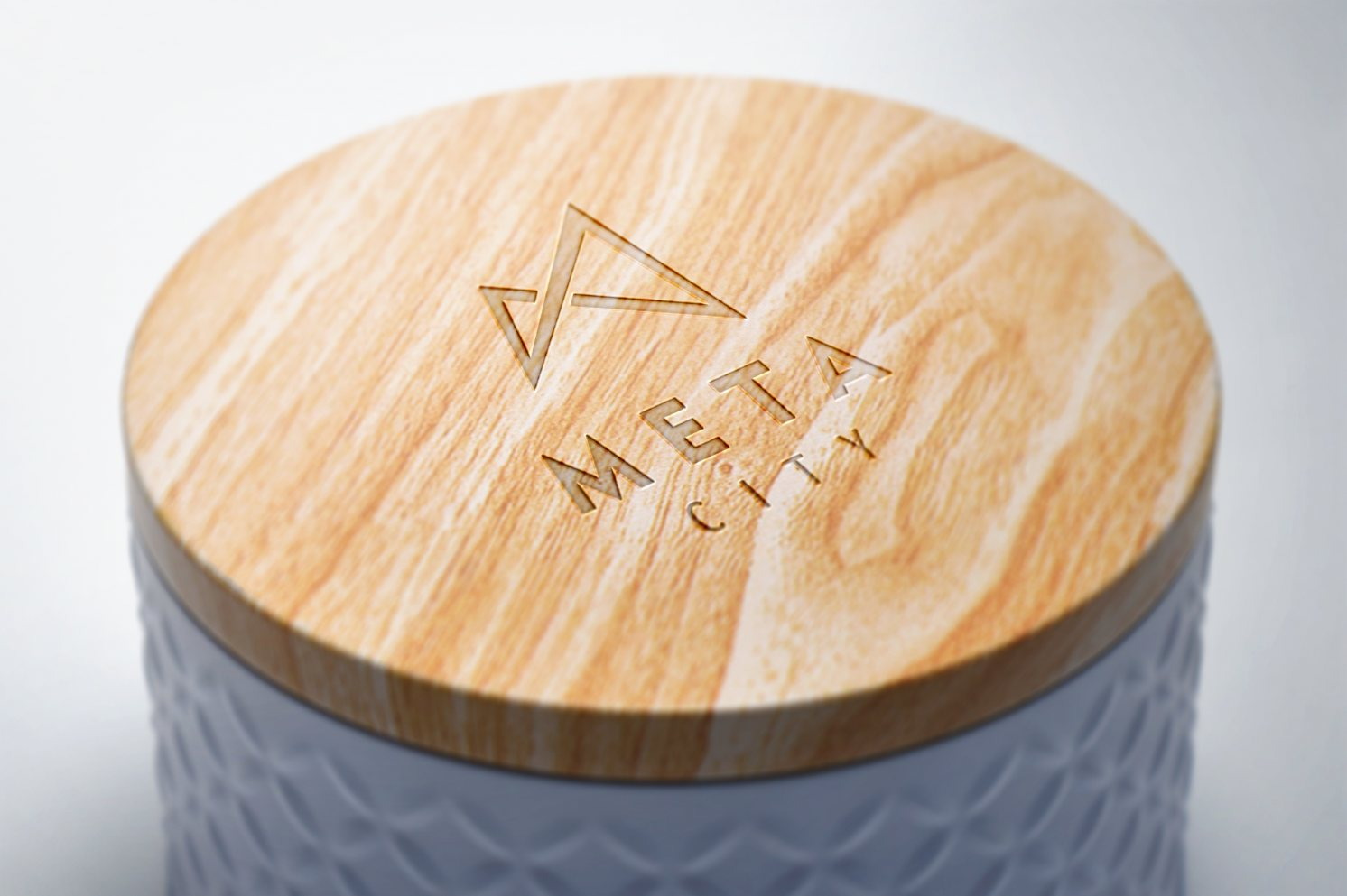
We tested it in the least forgiving places first. Engraved into black stone, embossed on cotton paper, stitched into fabric, glowing on a dark wall, foiled onto the barrel of a pen. The rougher the material, the more a flaw shows, so surviving that round meant the mark would be hard to ruin later, in anyone's hands.
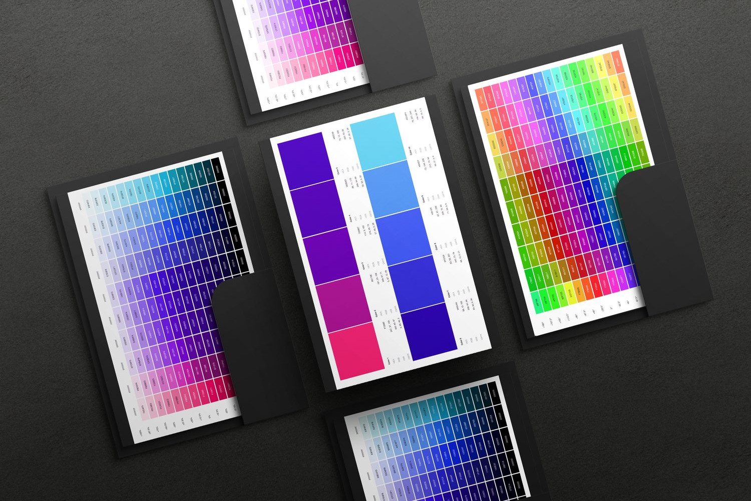
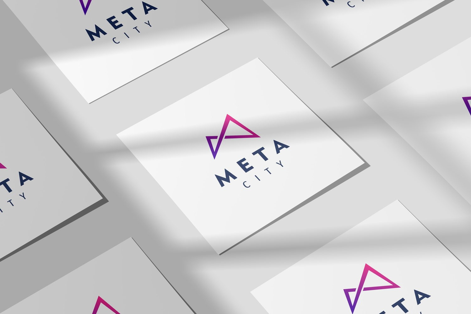
Vietnamese technology brands habitually wear corporate blue. Metacity went the other way: a gradient running from lotus pink into indigo, a light that exists only on screens and in neon, never in nature. The color states what the place actually is, a city born of artificial light, and it lifts Metacity out of a long line of technology brands sharing one frame.
For color to become an asset rather than a passing mood, the system was built along three axes, shade, temperature and hue, each carrying a full range of steps. A designer who needs a paler violet for a table background looks it up instead of mixing by hand. That is the moment a palette stops being taste and starts being infrastructure.
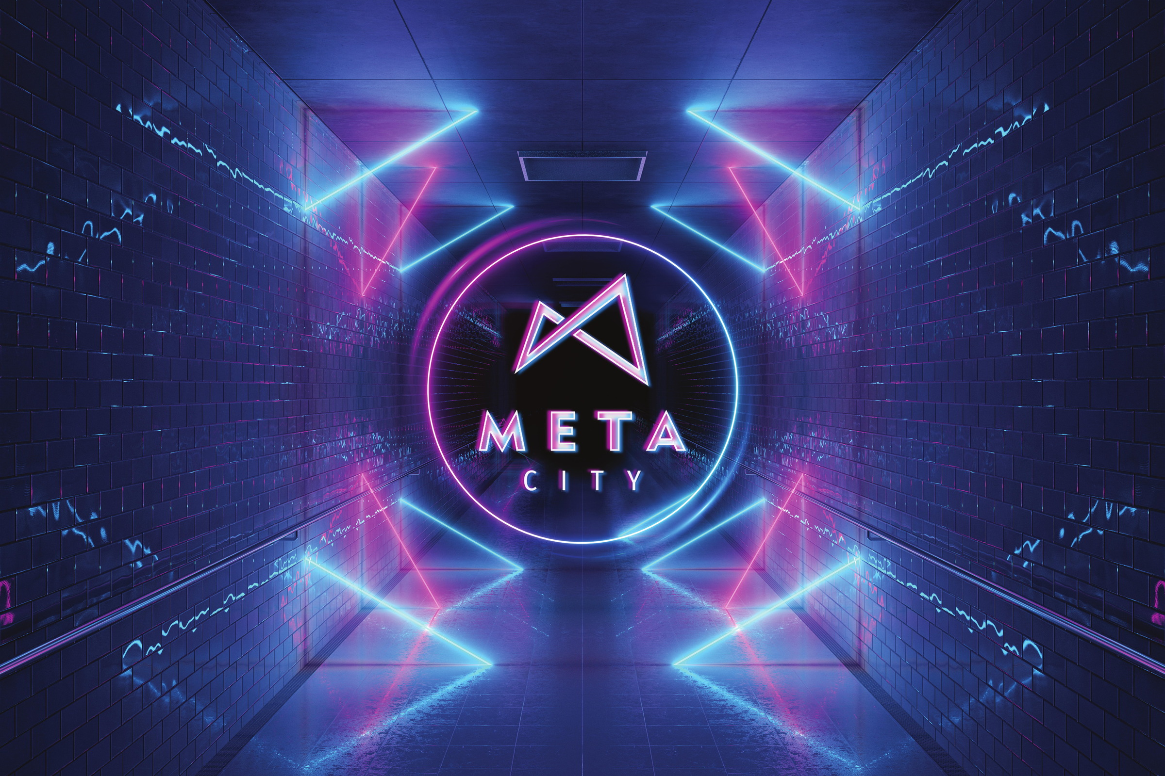
Nobody buys land in a place they cannot picture. So Metacity's visual language was built as slices of somewhere real: a neon corridor leading into the city core, a gate of light standing between rock faces, a person in a headset reaching into an interface unfolding in front of them.
That imagery carries its own rules so many hands can use it: light always spills outward from inside the mark, backgrounds stay dark so artificial light can rise, and the mark is always a light source rather than a sticker laid on top. Because of those three rules, a community cover made in a hurry still belongs to the same world as a carefully rendered frame.
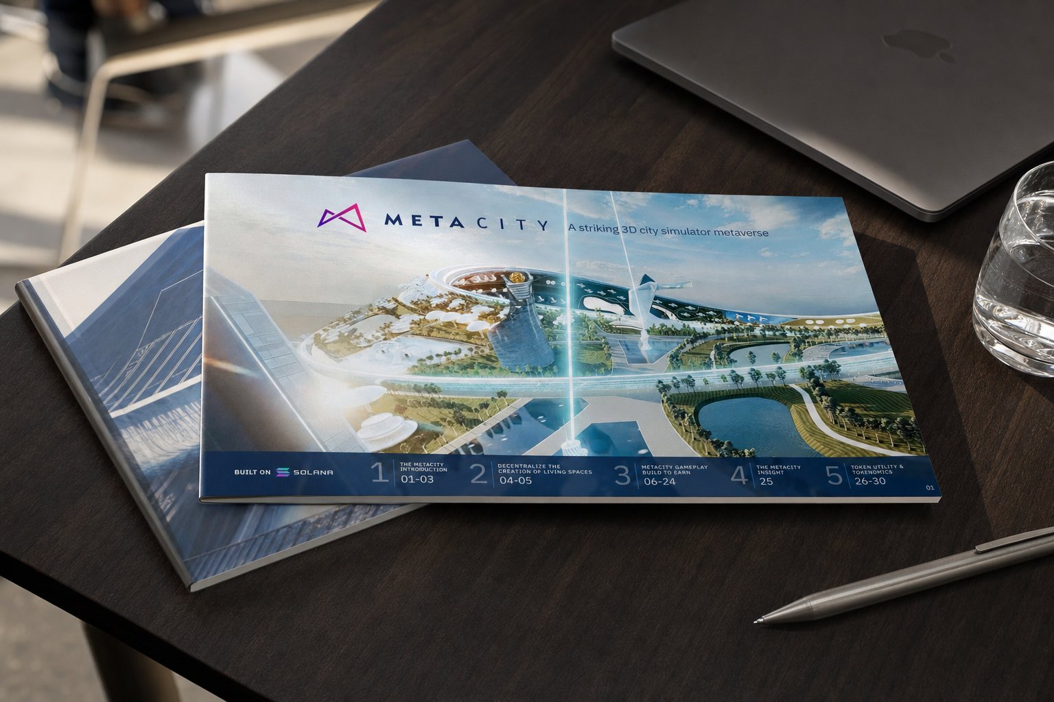
A project without land sells through its documents. We built a thirty page investor deck covering how the city runs as an autonomous organization, how architects bring their real craft inside through the modeling tools they already use, and how assets decay when an owner neglects them. Every page answers a question the person holding the money will certainly ask.
Alongside it ran a Vietnamese set for the home market, where the metaverse was still assumed to be social media with extra steps. There we dropped the jargon, drew illustrations, spoke plainly and asked the question before answering it. The investor deck and the explainer differ in voice, yet they stand on one mark, one palette, one way of setting a page.
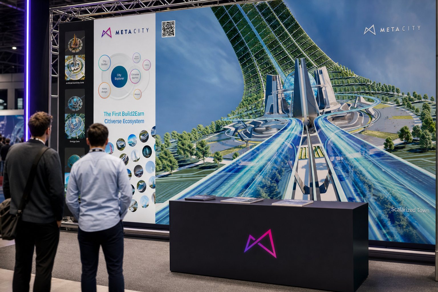
A virtual city still has to appear in the physical one, at technology fairs, investor days, recruitment events. We built the event presence on the same standards: a wide backdrop telling the ecosystem, a reception stand carrying a code that scans straight into the city, a banner for the voting round of an architecture internship.
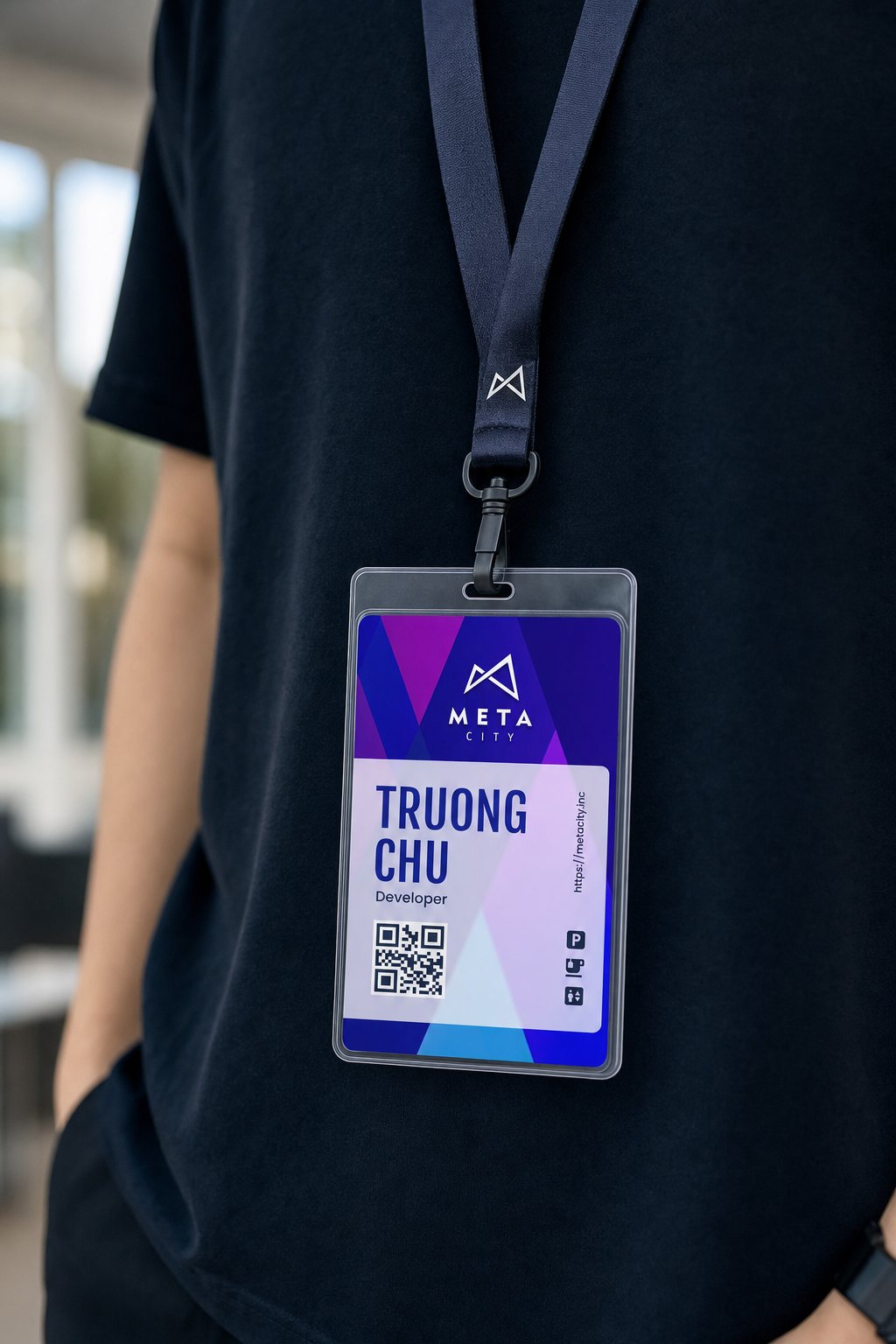
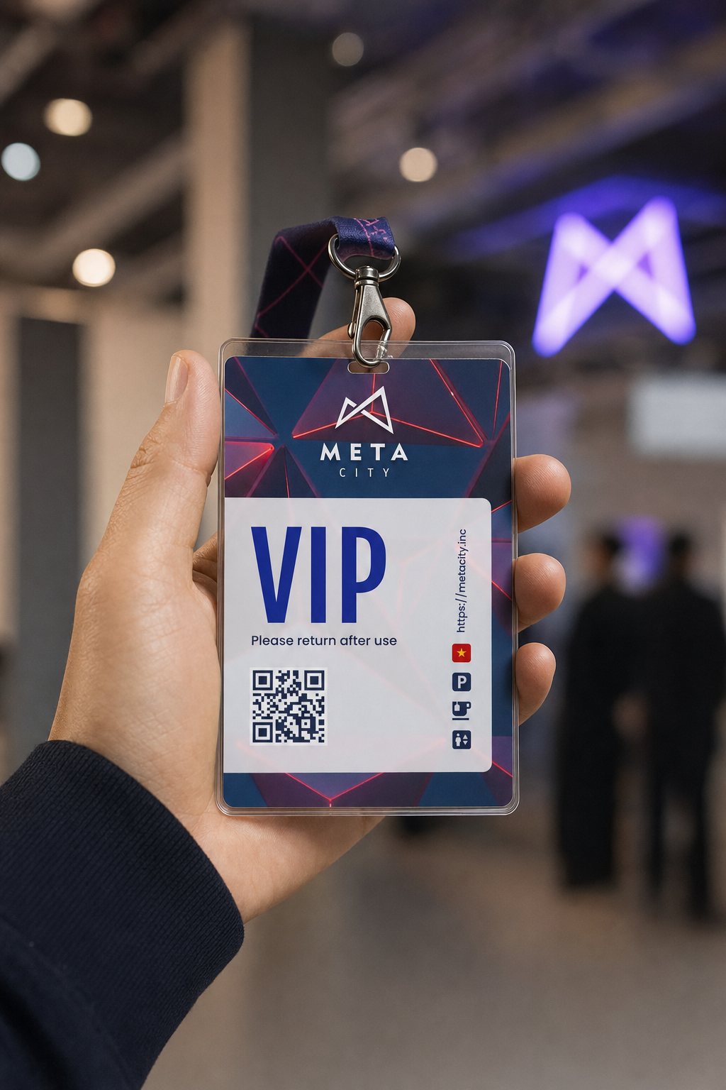
Inside the company the identity moved onto staff cards and guest passes, two small things that face outsiders every single day. The cards keep the gradient, and the reverse carries a code leading back to the main site. When someone from Metacity walks into a meeting wearing one, the brand has introduced itself before a word is spoken.
The process
Settle the position
Place Metacity as a city rather than a game, and split the world into three cores as a reference frame.
Mark and color system
Draw the two stroke mark, test it on unforgiving materials, and lay the palette across three usable axes.
Visual language and documents
Set the rules of light for the imagery, then build the investor deck and the Vietnamese explainer set.
Presence and handover
Carry the identity into fairs, events and staff cards, then hand the standards to the teams to run on their own.
The outcome
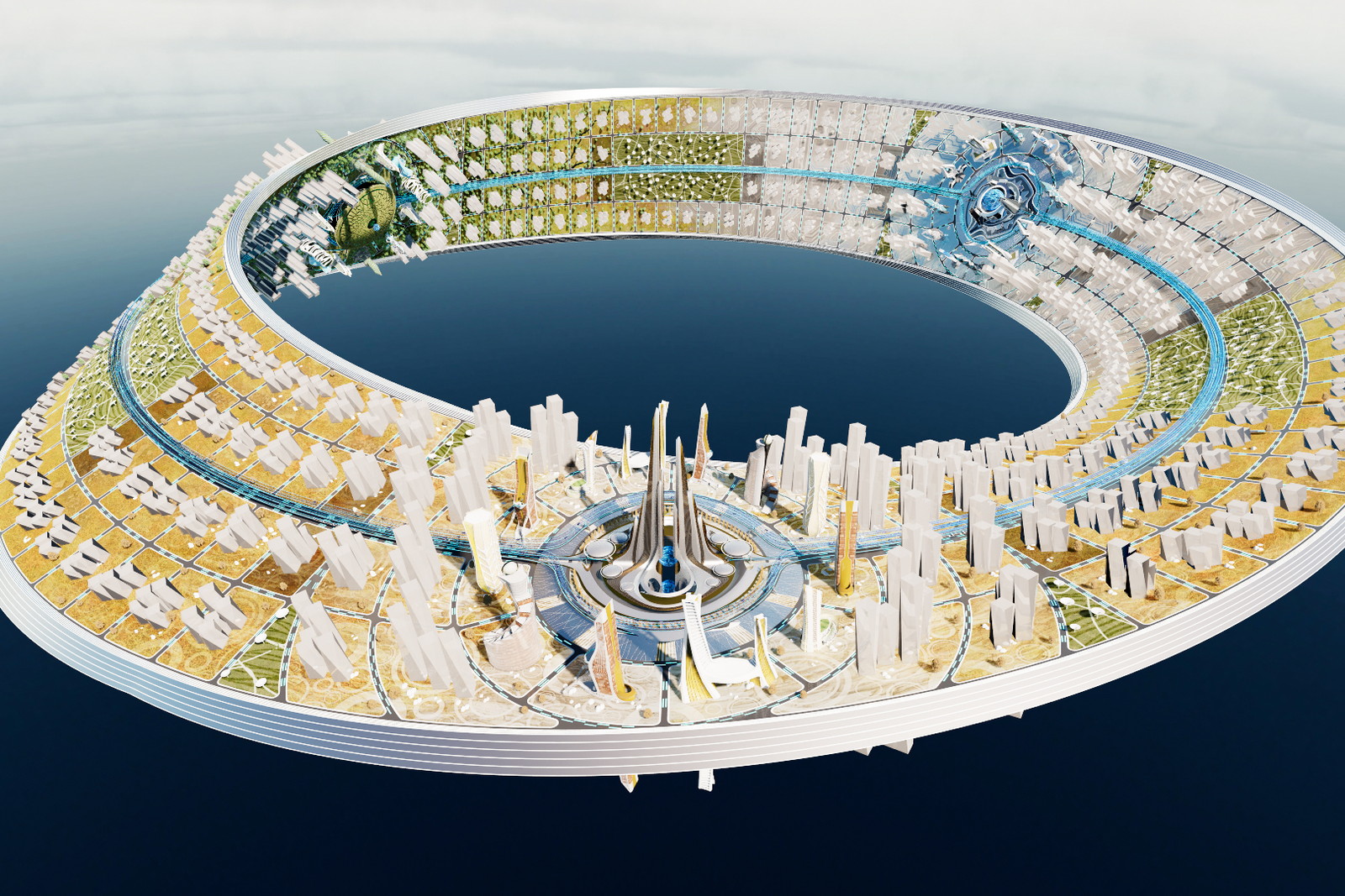
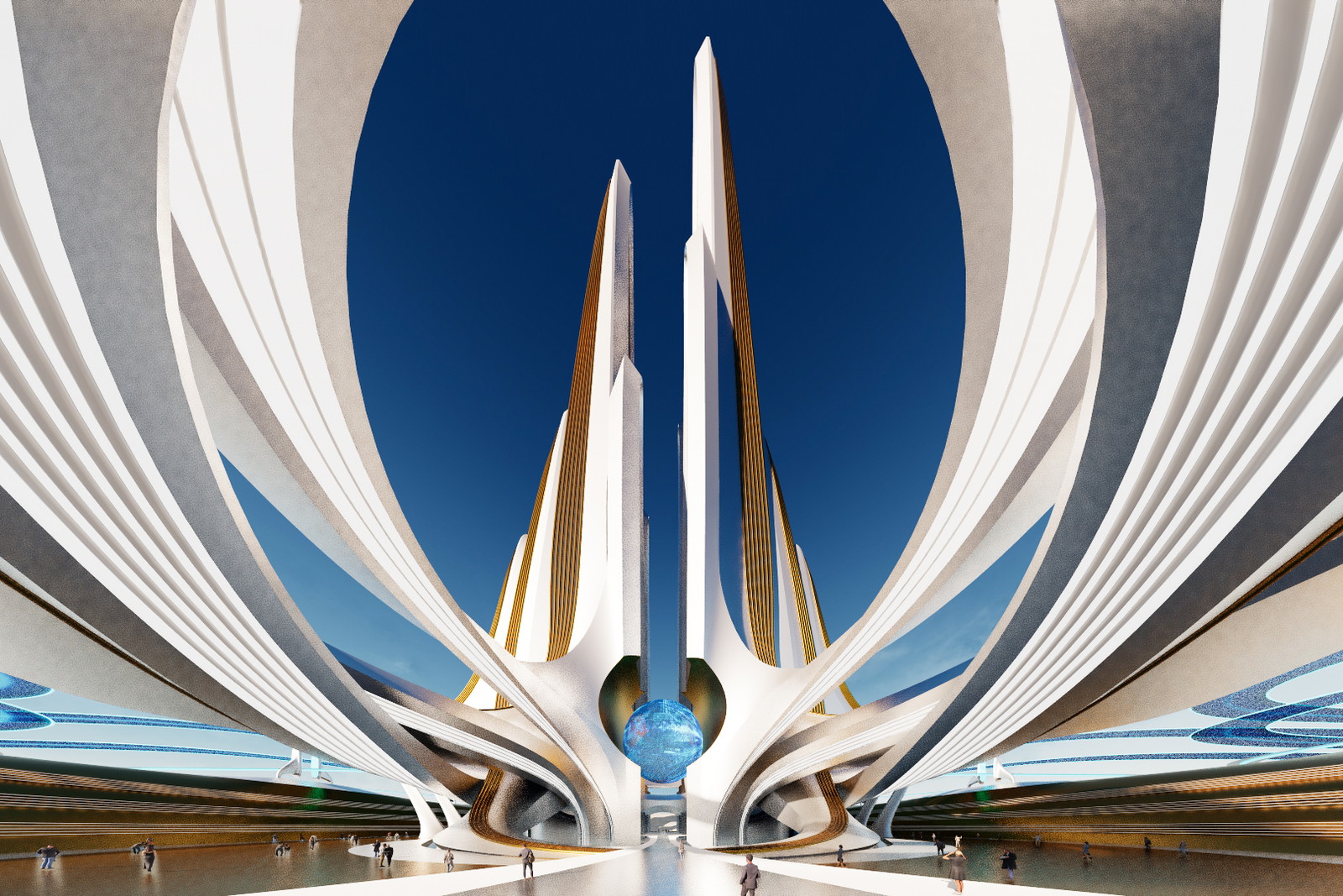
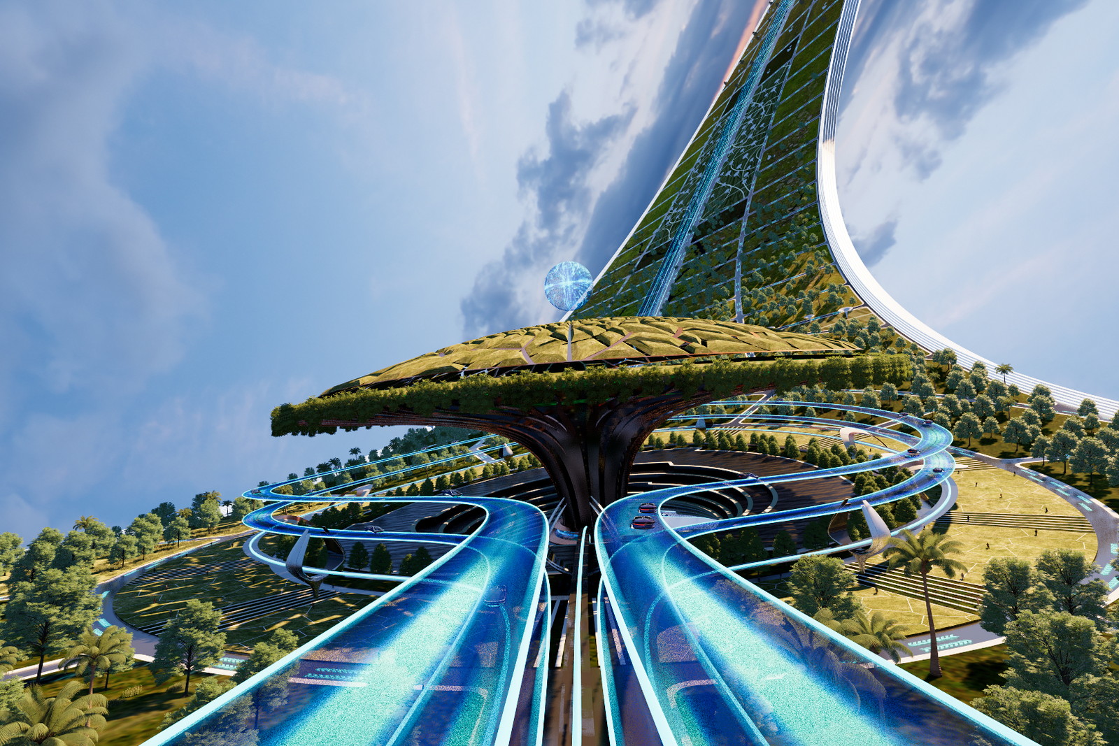
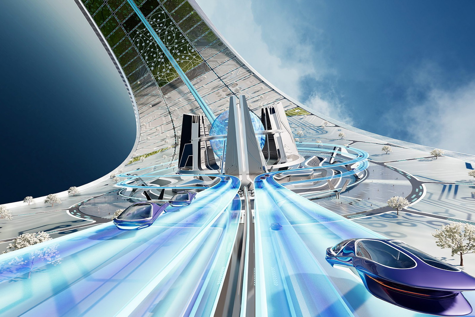
Metacity's first city, Scalarized, shaped as a Mobius strip and rising two and a half kilometers, held up as a piece of urban design worth discussing among architects at home. What matters more is that the renders, the document pages, the fair backdrop and the card hanging from a staff member's neck all belong to one place, though they were made at different desks.
What Metacity gained was not an identity set, it was a measure the team could run by. One more tower, one more document page, one more fair season, and a newcomer still has somewhere to check what correct looks like. For something that has never existed, the standard has to come first, because it is the earliest evidence that the place is being built seriously.
One place, one measure, from master plan to name card

Does your problem look like Metacity?
Tell Sinh Vũ what you are building and why outsiders do not believe it yet. You will get a direction, right away.