
AION, the shared voyage of the whole Hàn River cruise fleet
A refined identity system for the parent company of the Hàn River cruise fleet in Đà Nẵng, with Poseidon leading as the five-star flagship, so guests believe before they even step onto the pier.
The problem
A cruise does not sell a boat ride, it sells an evening. Guests remember the lights of Dragon Bridge on the surface of the Hàn River, a glass of wine on deck, soft music, not a ticket code. But that five-star feeling is fragile: one menu with a mismatched font, a faded flyer, or an untidy pier, and the whole promise of luxury falls apart.
AION is harder than a single cruise ship. It is the parent company of an entire fleet on the Hàn River, with Poseidon as the leading five-star vessel. The challenge: a parent name broad enough to hold the whole fleet, yet modest enough to let Poseidon shine, all speaking in one voice, so guests trust it before they even set foot on the pier.
The approach
Before drawing anything, we examined where AION stood in guests' eyes and among the cruise ships on the Hàn River. An evening on the river can be a cheap sightseeing ride, or a memorable five-star experience. Through a brand assessment and a workshop with the AION team, both sides agreed AION belonged to the latter.
From there, the brand architecture challenge emerged: AION is the parent company, Poseidon is the leading five-star vessel, with other ships behind it. We positioned AION as the endorsing name for the whole fleet, with Poseidon pushed forward as the star. A strong parent brand does not compete with its offspring for space, it stands behind so the offspring can shine.
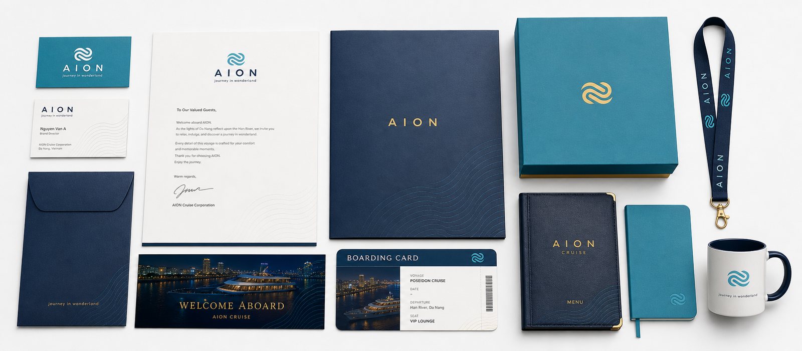
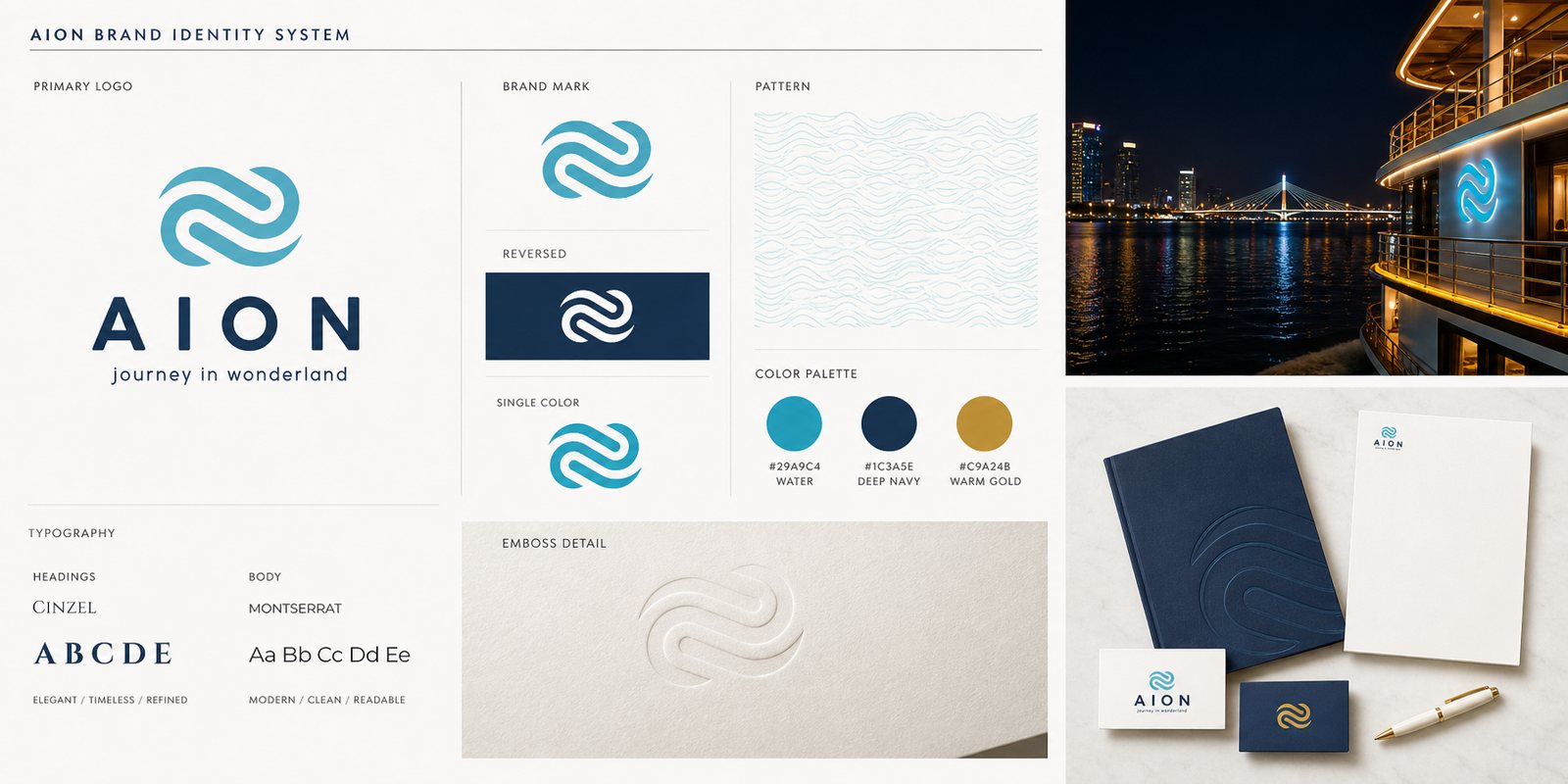
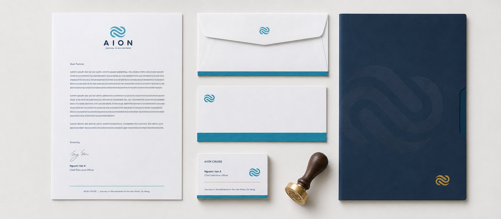
The AION mark is two waves interlocking, evoking the flow of the Hàn River and a journey without a break, end joined to beginning. The colors come from the setting itself: the blue of daytime water, the navy of the river at night, touches of gold from city lights reflected on the water's surface. The identity system was built to feel refined without being showy, matching the rhythm of a premium experience.
Beauty alone was not enough to keep the whole fleet aligned. We wrote the guideline system: how the logo sits on the hull, on the menu, on uniforms, how colors print, how much breathing room to leave. Because of it, a boarding pass and a sign at the pier remain the same AION, even made by two different people at two different times. That is where an identity system differs from a logo: it is the set of rules that keeps the whole current flowing as one.
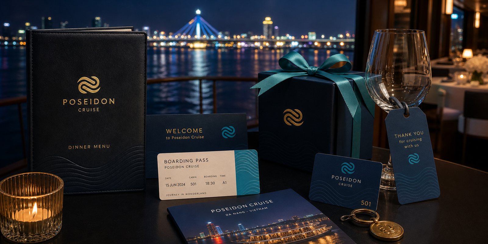
On a cruise ship, the brand lives in the things guests hold: the menu, the wine glass, the gift box to take home, the boarding pass. We designed the packaging and product print system so every item carries the AION mark, and every touch confirms another piece of the five-star promise.
The story continues at the pier and on deck: event backdrops, standees, directional signage, along with a campaign image library for advertising and social media. Everything speaks in the same refined voice, so the thread from the photo a guest sees on their phone to the moment they step onto the pier never breaks. For an experience-led business, identity is not decoration, it is a promise seen before it is proven.
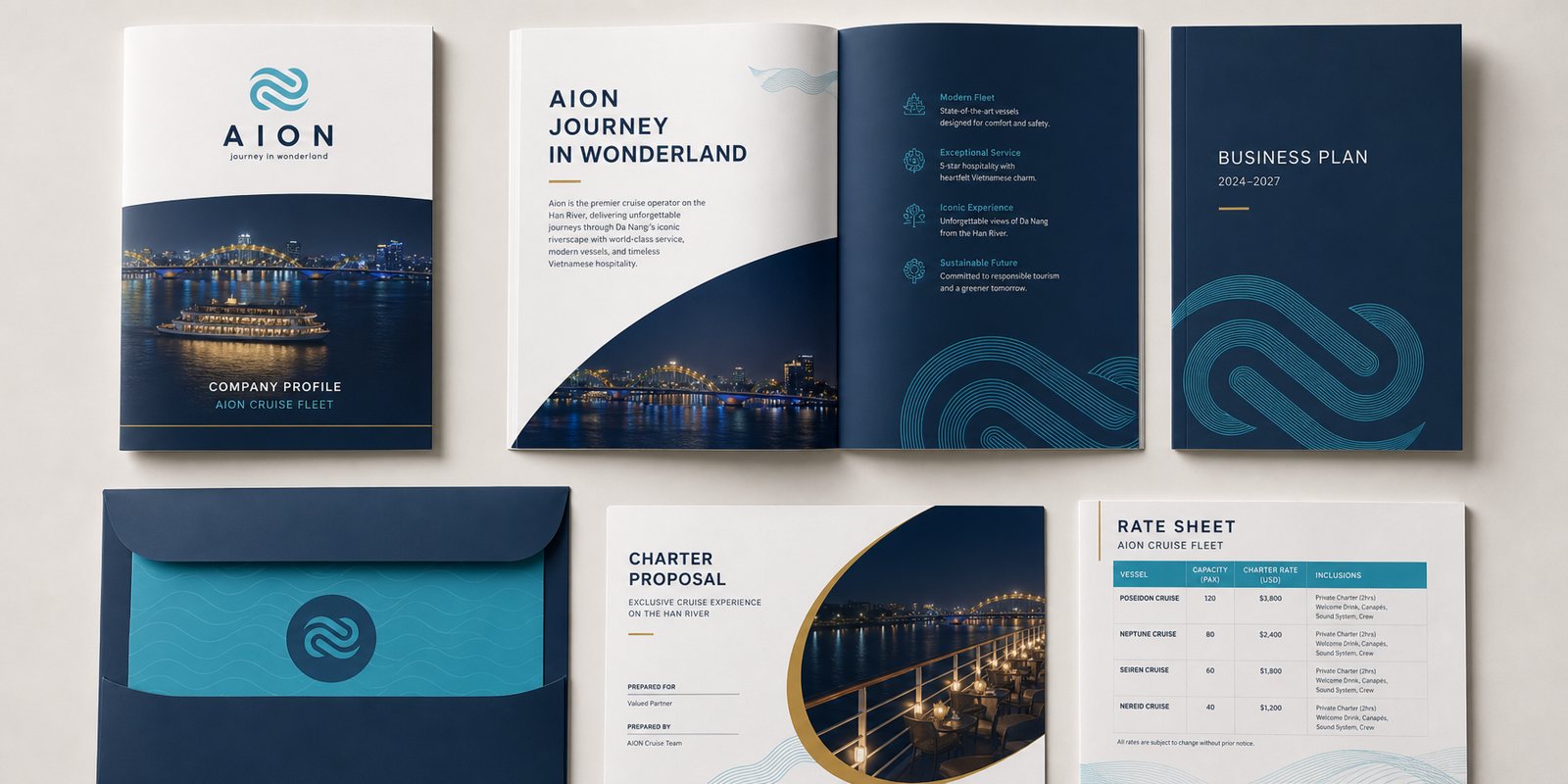
A five-star cruise does not just sell individual tickets. It sells full-ship charters to businesses, works with travel agents, and hosts weddings and corporate events. We built a capability profile and corporate documents so that every time AION sits across from a partner, they see a brand that is polished, methodical, worthy of a five-star price.
Alongside it came a sales and marketing kit: price sheets, ship introduction profiles, charter proposal documents, giving the sales team tools to persuade instead of just talking. For a journey guests have never experienced, polish in how it is presented is the first evidence of polish on board.
The result
What AION gained was not a logo stuck on the hull, but a current of identity running through the whole journey, from the moment a guest sees the advertisement, books a ticket, steps onto the pier, to the gift they carry home. Poseidon stands at the peak as the five-star flagship, the other ships follow behind, all sharing one AION face.
For an experience brand, that consistency is exactly the sense of assurance guests pay for. Keeping the current unbroken, from the surface of the river to the boarding pass, is what makes an evening on the Hàn River worth its five-star price, and what makes guests tell the story afterward.
One current reaching every touchpoint
Print materials and touchpoints on board
Does your challenge look like AION?
Tell Sinh Vũ what is on your mind about your brand. Sinh Vũ will point you to the right direction right away.