
GNTN, a trusted face from village to donor's table
GNTN, a poverty-reduction project in the Central Highlands, needed a face formal enough and warm enough for community and donors alike to trust. Sinh Vũ built the strategy, identity and packaging behind that trust.
The problem
A poverty-reduction programme is not like a commercial brand. It runs through many villages, many levels of officials, many donors, each understanding it in its own way, presenting it in its own way, sometimes calling it something different. Without one unified face, it is hard for local people to recognise and hard for donors to trust enough to commit resources.
GNTN needed a face carrying two qualities that seem to pull in opposite directions: formal enough to stand beside government documents, warm and unpretentious enough to feel close to the people of the Central Highlands. Reconciling the two, in one system anyone in the programme could use, was the hardest problem of the project.
The approach
Before drawing anything, we sat with the programme's team to answer one root question: where does GNTN stand in the hearts of the people it serves. Sustainable poverty reduction is not charity handed down, it is walking alongside, and that spirit had to live in the strategy before it lived in any image.
Both sides settled on one position: GNTN stands with the people, not above them, in service of long-term development rather than a short campaign. That position governs every choice that follows, from colour to tone of voice, so that whoever holds the pen, GNTN still speaks in one voice.
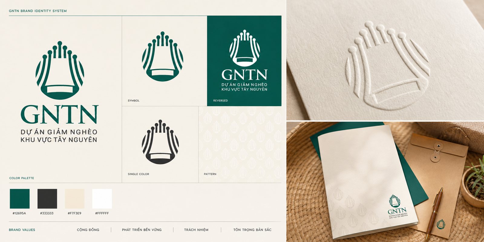
We distilled a symbol suggesting a Central Highlands gong and a gùi, the region's woven back-basket, lines rising like a sprouting shoot, like a gong calling in the season, carrying the spirit of the land while speaking to what the programme pursues: sowing and lifting up. The colour chosen is a mountain-forest green, dark enough to be formal on official documents, warm enough to feel at home in the villages.
A beautiful symbol is not enough. What keeps a large programme from fracturing in appearance is a set of brand guidelines: how the logo is used, what the colours are, where the type sits, how much breathing room it needs. Because of it, a sign in a remote village and a document sent to a donor remain the same GNTN, even made by two different people at two different times. That is where an identity system differs from a logo: it is the rulebook that lets the whole programme hold its consistency.
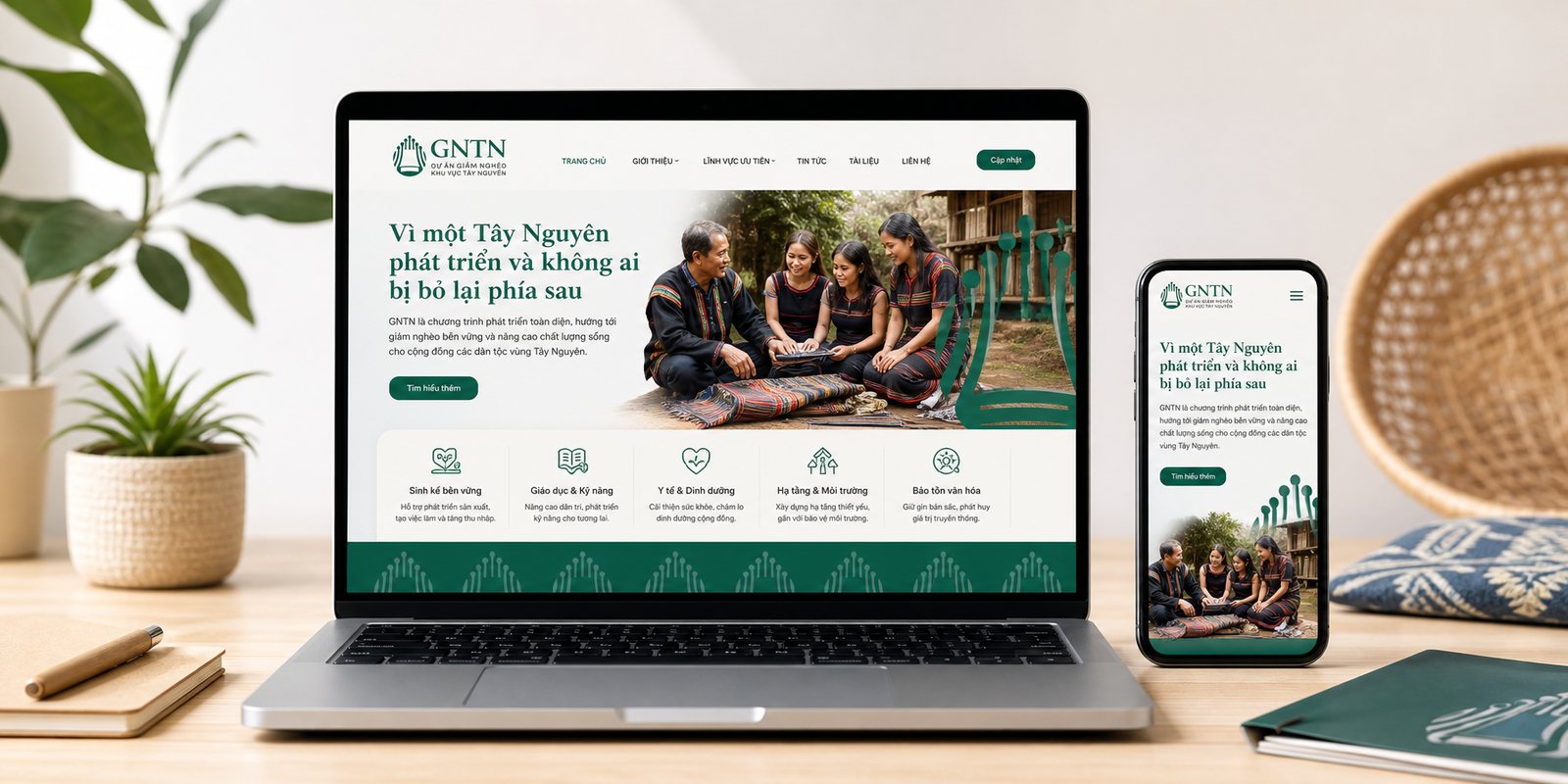
A programme only creates change when information reaches the right people. We built a website with a bright, clear, readable interface, so that local people, officials and anyone interested could find what they needed in a few taps, with type large enough and paths simple enough for people not yet comfortable with technology.
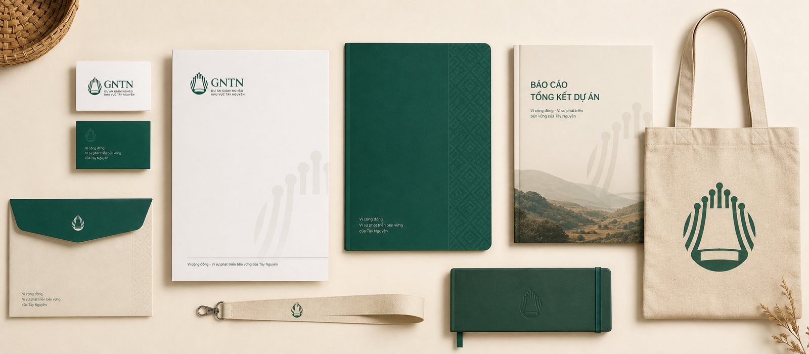
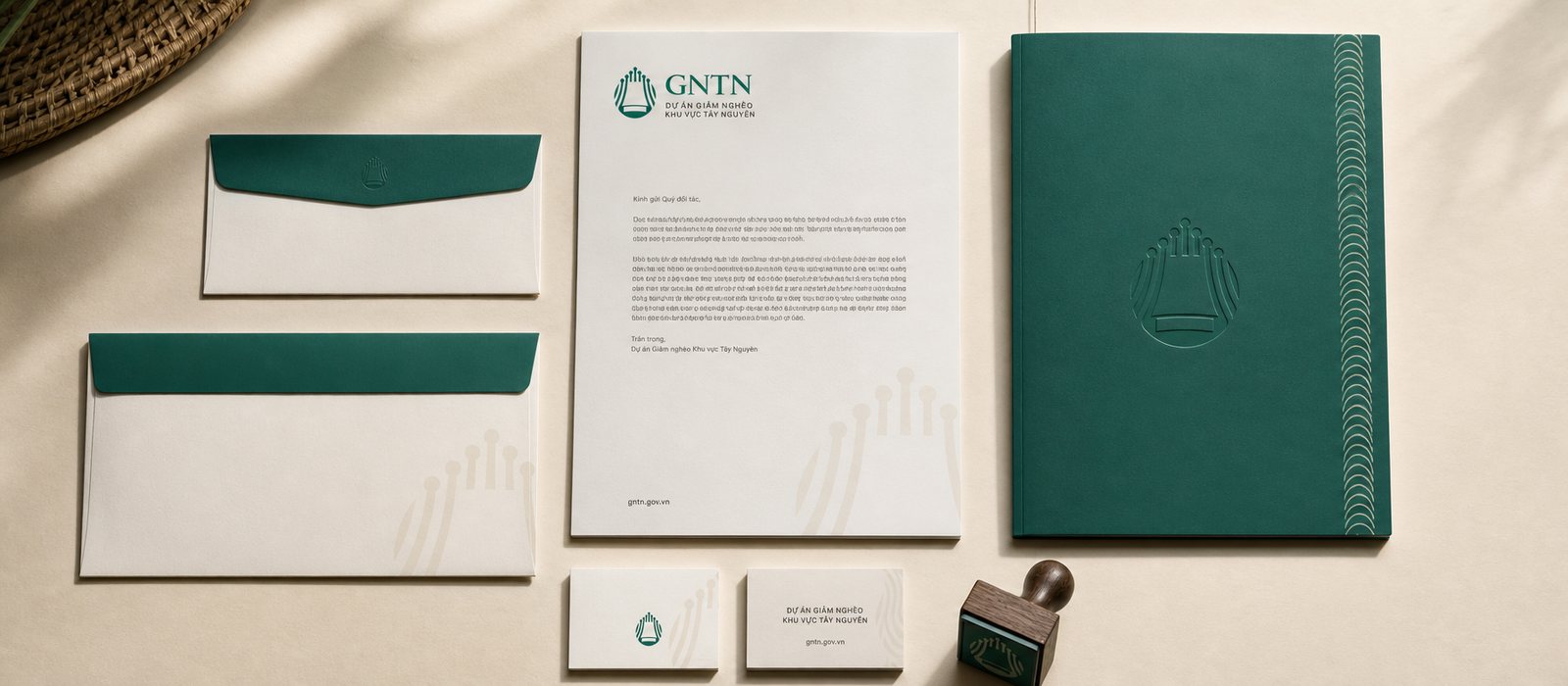
Alongside it came a set of communication and working materials, so that whenever partners or donors meet GNTN, they see a programme that is clear, transparent and methodical. For a community project, care in how things are presented is itself a form of trustworthiness: it gives people a reason to put their resources in the right place.
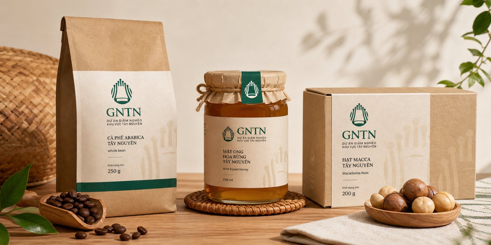
Sustainable poverty reduction, in the end, is helping people sell their produce at a price it deserves. Central Highlands coffee, honey and macadamia nuts are in no way inferior, yet they often sit in the lower tier of the market simply for lack of a face trustworthy enough to earn a place on the shelf. We designed packaging bearing the GNTN mark as a guarantee of origin and of the care behind it.
Packaging here is not only about looking good, it is about opening a door. When a bag of village coffee is polished enough to stand beside major brands, it earns the chance to be chosen, and every time it is chosen, one household earns a little more income. Design, in this project, connects straight through to livelihood.
The result
What GNTN gained was not a logo, but a unified face running from strategy through to product. Whether local people meet it on a sign in the village, officials hold it in a document, or a shopper sees it on a bag of coffee on a city shelf, it remains one programme, one voice, one trustworthy presence.
For a community project, that consistency is not a matter of aesthetics. It helps the programme be recognised so it can spread further, be trusted so it can draw in more resources, and helps the people's produce be seen with more respect. A trustworthy face, placed in the right spot, can do the work of a great many words.
Consistent down to every piece
Office stationery
Is your problem similar to GNTN?
Tell Sinh Vũ what's on your mind about your brand. Sinh Vũ will point you to the right direction right away.