Pharmaceuticals and health

Interface design for digital health and booking apps

Users leave their health data only where they see care being taken.

A digital health app has to be as easy to use as an everyday app and as steady as a medical facility. Sinh Vũ helps the brand, interface and messages do both, and say plainly how users' data is treated.

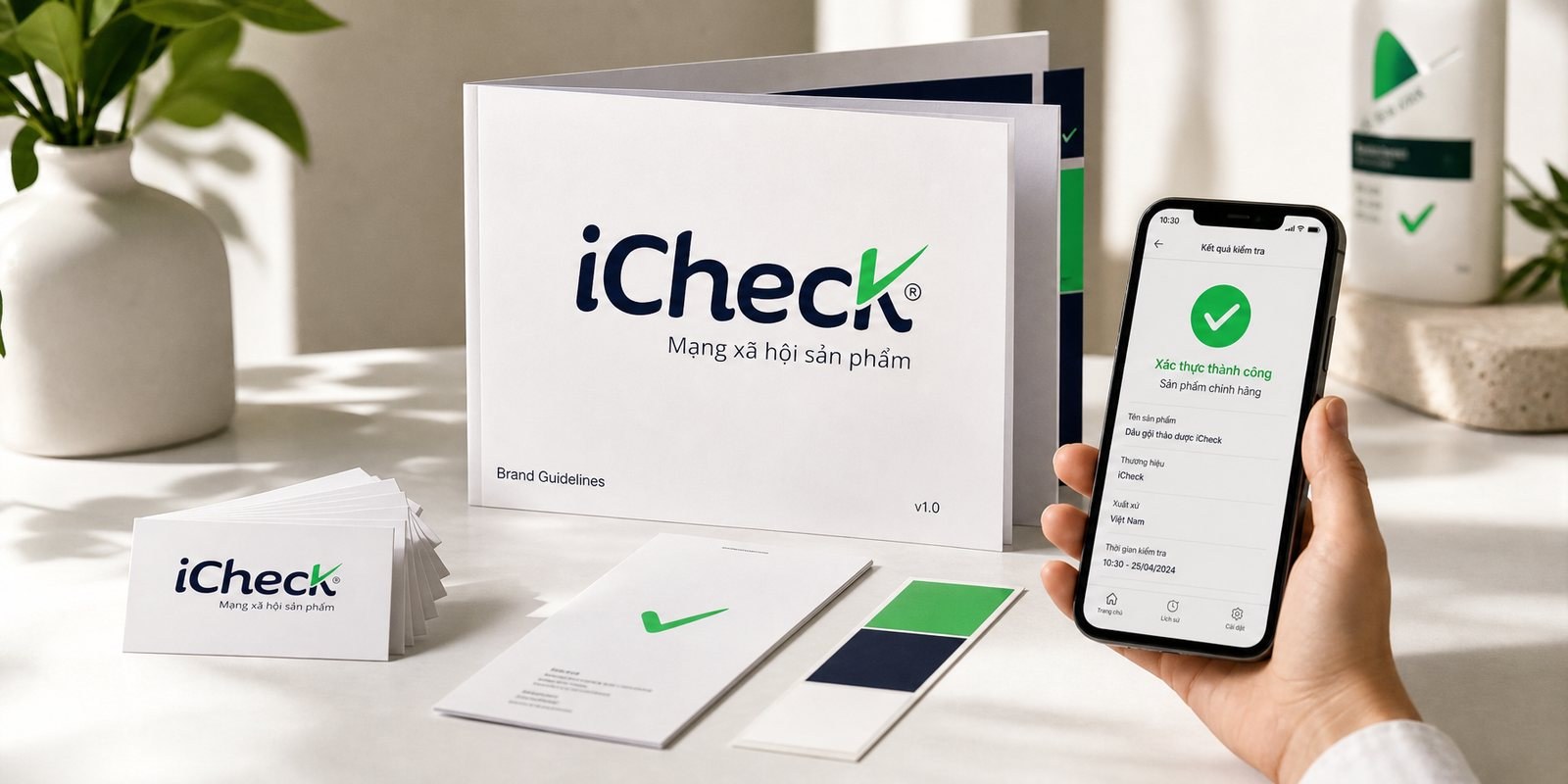
A sample print set for a digital health platform: a booking app screen, an appointment reminder message, a landing page and partner materials
Quick answer01

What does a digital health app brand need?

Three things: an interface clear enough for people wary of technology to still use it, an easy-to-understand way of talking about personal data, and a brand steady enough that medical facilities dare to partner. Those three decide whether users sign up and come back.

  1. An easy-to-use interface

    Type large enough, few steps, the main button clearly prominent, usable even by older adults.

  2. A way of talking about data

    Say plainly which data is asked for, why, and who can see it, right where it is asked.

  3. A steady appearance

    Not looking like an entertainment app, so partner medical facilities and users alike feel at ease.

Business types02

Three kinds of platform, three problems

All are digital health, but users come at different moments and worry about different things, so the interface has to say different things.

Appointment booking apps

Their customersPeople who want to choose a doctor, a time and a place without calling or queuing.

Brand challengeBook in a few steps, clearly see that the facility is real and what its license is, and know what to prepare.

Remote consultations

Their customersPeople who are far away, busy or in need of a quick question, talking to a doctor through a screen.

Brand challengeLet users trust that the person on the other side of the screen is a real doctor and that the conversation is kept private.

Health tracking apps

Their customersPeople tracking a chronic condition or caring for family, logging readings and medicine reminders every day.

Brand challengeBe usable every day without being a nuisance, and talk about health numbers without causing alarm.

Pain points03

Four pain points specific to digital health

These are the places where a health app loses users and features can't save it.

Customer journey04

At which stage do health apps lose the most users?

At the booking stage, on the very first open. Users have to register and leave a phone number and personal information. If they see no reason to trust, they leave.

Where customers are most often lostBooking
Do this now
  1. Let users preview the facility and the doctor before asking them to create an account.
  2. Ask only for the information the current step needs, and ask for the rest later.
  3. Put one short line about how data is kept private right beside the phone number field.
Touchpoints05

Five touchpoints to do first

Touchpoints are the places where users see, touch or read about the platform. You don't need to do everything at once. These five decide whether users get through registration.

  1. Opening and sign-up screens

    Where the most users are lost, and also where the brand gets to speak first.

  2. Booking screen

    Where users decide, and the doctor, facility, time and preparation need to be clear.

  3. Notifications and messages

    The part that appears most in users' daily lives, and where information is most easily exposed.

  4. Landing page

    New users and medical partners alike come here to check whether the platform can be trusted.

  5. Materials for medical partners

    Decide whether a medical facility agrees to attach its name and put its appointment schedule on the platform.

Roadmap06

Where Sinh Vũ suggests starting

Listed in the order to do them. A new product can stop at step two or three to launch a first version; a platform that already has users goes all the way.

  1. Logo and Brand Identity Design

    Name, mark, color and type: the foundation for the app, the website and the documents.

  2. Building brand voice

    How to talk to users about data, notifications and reminders.

  3. Designing a digital design system

    A set of shared interface components for the app and the website, which the engineering team can build on.

  4. Brand website design

    A landing page for new users and medical partners.

  5. Corporate capability profile design

    A platform profile for partner clinics, hospitals and pharmacies.

Projects07

Projects closest to digital health

Sinh Vũ has not published a digital health app project. The two projects below solve the two nearest problems: an app interface for a product users must trust right away, and a full digital system for a medical group.

Further reading08

More on digital health

Free toolTouchpoint map for this business modelSee the five stages customers pass through, where they drop off most, then rate the five touchpoints to fix first.Open the tool Free toolWebsite checkEnter a page address to measure mobile speed, read the title, description, images and search data, and see whether AI search engines can read the page.Open the tool
FAQ09

Frequently asked questions

Calmer: soft color, large clear type, few effects, a voice that is warm but doesn't joke. Users are worried about their health, so the interface needs to help them finish the task, not add pressure.

Say it plainly where you ask: which data, what for, who can see it. Ask for each item when it is needed instead of all at once at the start. Design only helps users understand; actually protecting the data is up to the platform's engineering and legal teams.

At a minimum: registration, choosing a doctor, booking a time, the call room, and receiving results or instructions back. Sinh Vũ arranges each screen by what the user is doing, not by the system's features.

Enough to recall the time and place, with no detail of the condition because the message may show on the lock screen. A caring voice, with a simple button to reschedule.

The logo and colors are the foundation. A design system also includes interface components, rules for type and spacing, and how errors are reported, so the engineering team can build new screens that still sound right. A version with medical partners usually needs this system.

Tell Sinh Vũ about your platform

A few lines about the platform, its users and what is holding you back is enough. Sinh Vũ will read it and reply within one working day.