
iCheck, trust you can scan
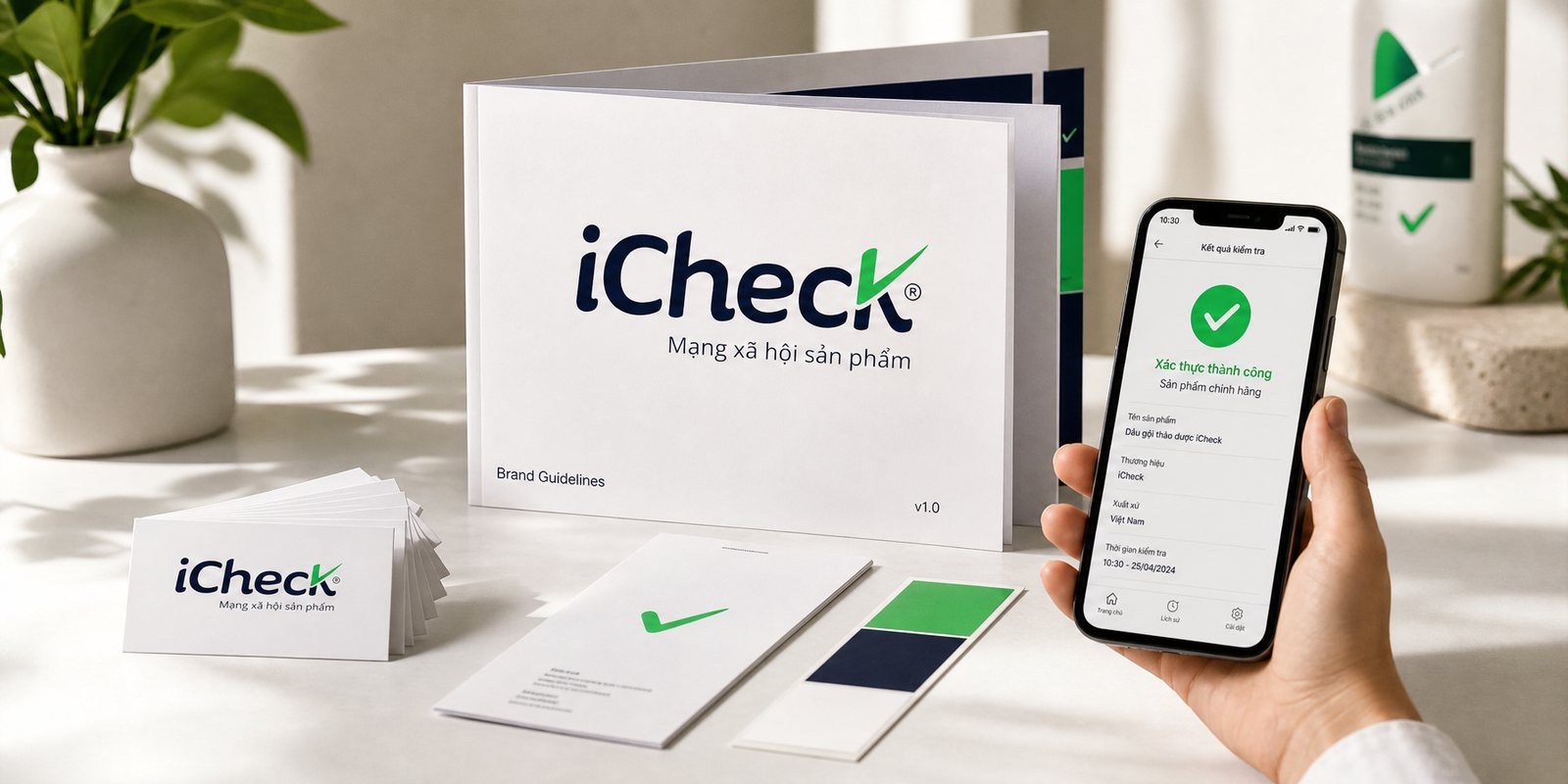
The first identity for iCheck, the barcode-scanning app that opened product origin tracing in Vietnam, turning a cold scan into a nod of consumer trust.
The problem
A shopper picks up a product and wonders: is it real, where is it from, is it safe. The question is as old as shopping itself, but it had no quick answer. iCheck launched in 2015 to answer in a few seconds, scan the barcode and you know the origin, and it was the first app in Vietnam to solve that problem.
But scanning is a machine's act, while what iCheck sells is trust, the softest and most human thing of all. Strings of digits and barcode lines are cold on their own, hard to love. iCheck's leadership set Sinh Vũ a challenge: make a technology app feel both modern and friendly, so shoppers trust it on sight, before they even try it.
The approach
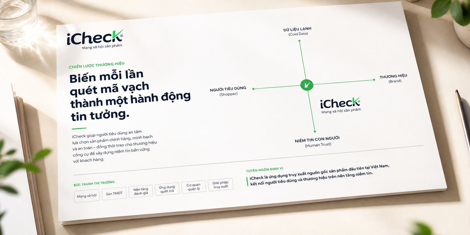
Before drawing anything, Sinh Vũ looked at where iCheck stood. The app market then was full of technology showing off features, faster, more data. iCheck chose the opposite, putting the shopper and trust first, with technology as the way to keep that promise.
That stance shaped everything after it. iCheck framed itself not as a scanning tool but as a shopper's trusted companion, later growing into a product social network where users verify things together. That positioning became the thread through the whole identity: every detail had to radiate trust, not complexity.
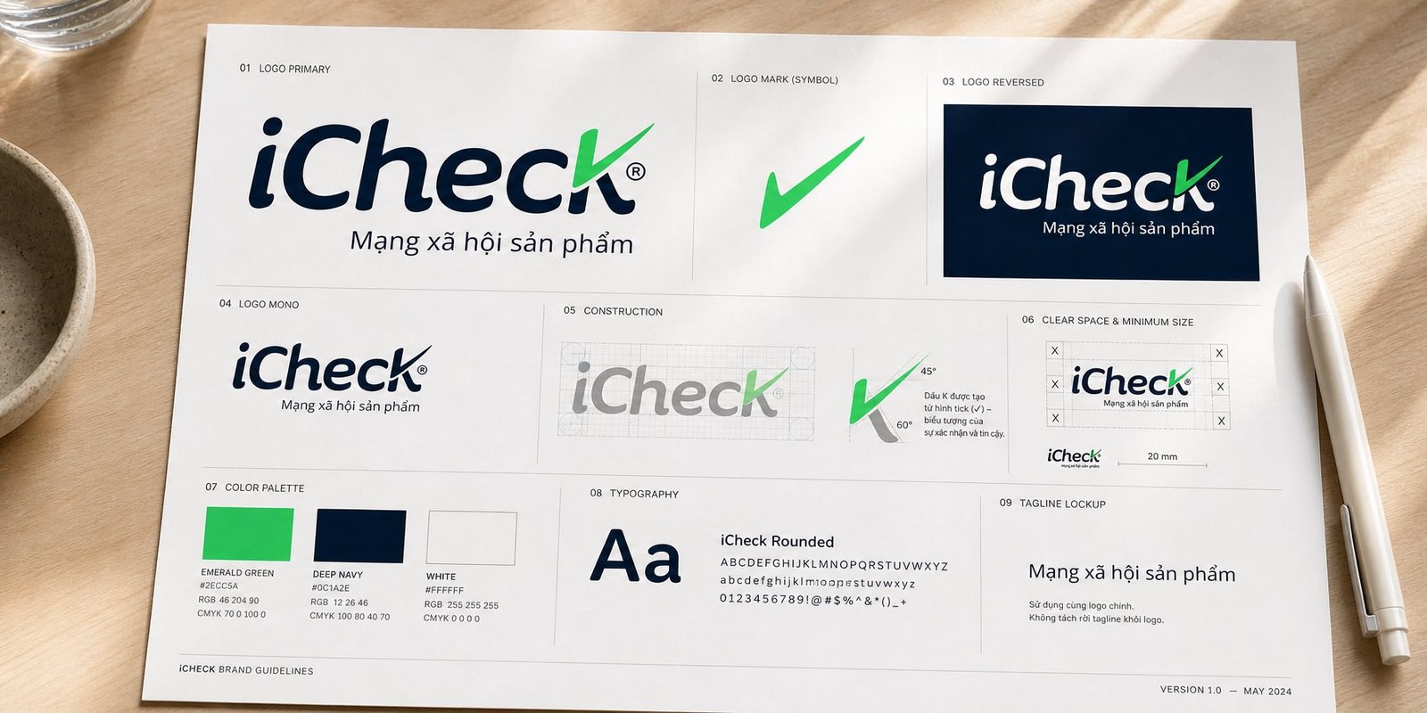
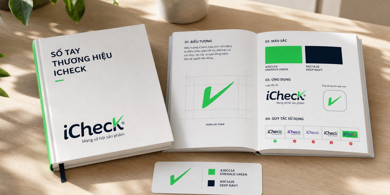
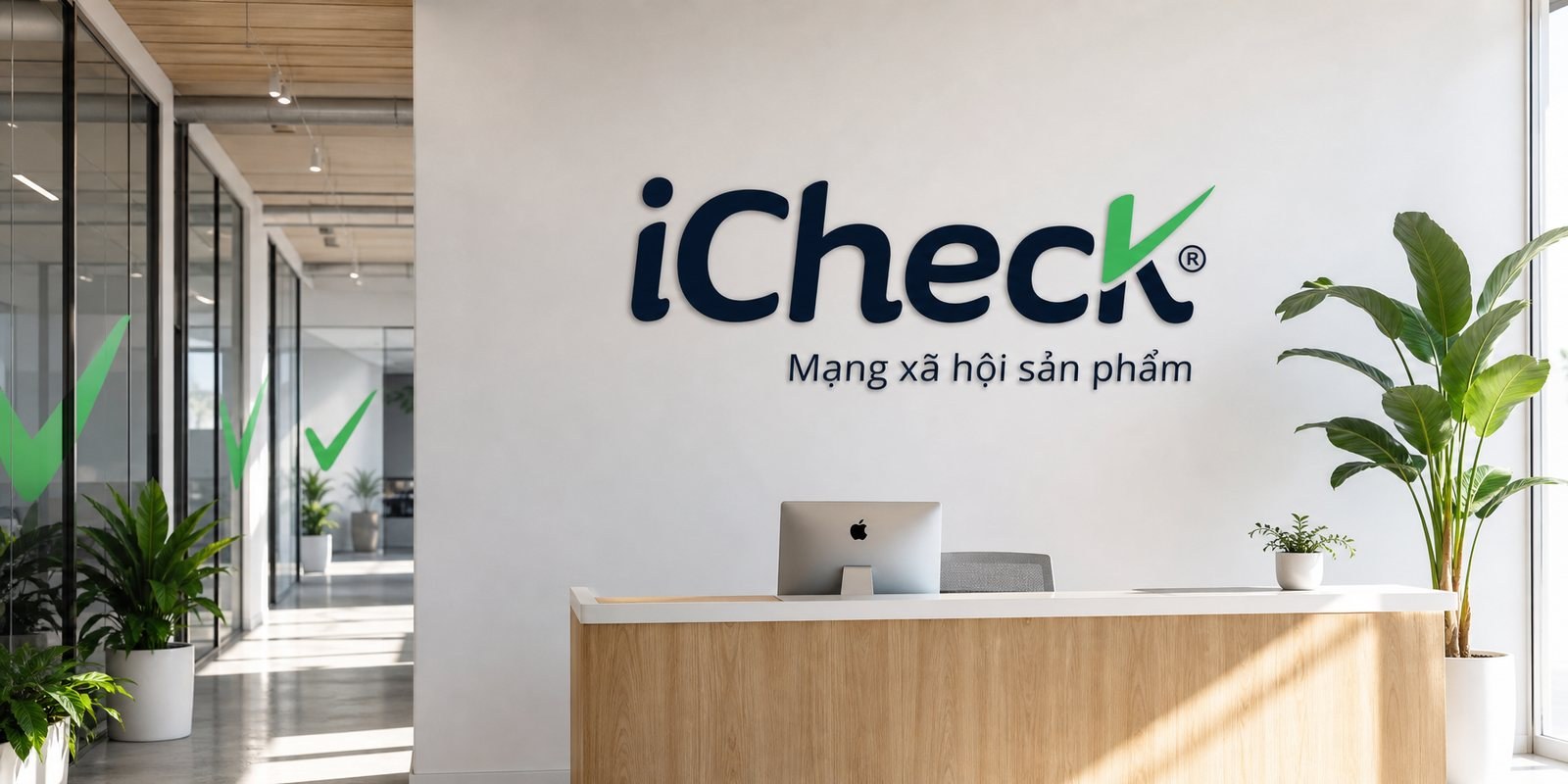
The core idea fit inside a single letter. The final K in iCheck was bent into a check mark, its stroke rising in emerald green, exactly the gesture of a nod of approval: verified, at ease. Check is at once the name, the action and the promise. The very first design carrying that K won over iCheck's leadership immediately.
The colors were deliberate. Emerald green is the color of safety, of fresh produce and of a traffic light saying go, set against a near-black navy so the technology still feels solid and dependable. The rounded iChec letters are soft and friendly, easing the machine feel of a tech product. The green check alone still reads as iCheck, a signal that names the brand without spelling it out.
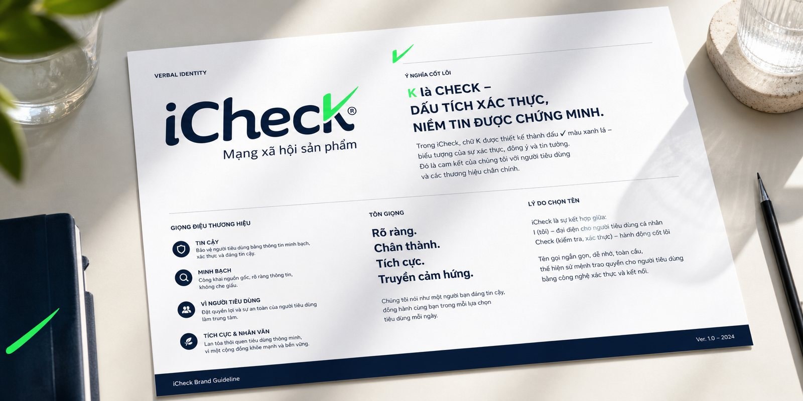
Identity is not only shape, it is also words. iCheck joins the i of the individual user with check, and you understand the app the moment you hear it. Sinh Vũ standardized how it is written, how it is read, and the descriptor Product Social Network, so every time the brand speaks its role is clear.
That voice runs through every line in the app and in print: close, plain-spoken, on the buyer's side. For a brand that lives on trust, saying it right matters as much as looking right, because people trust a consistent voice more than a clever slogan.
Beauty alone cannot keep a brand from drifting once it starts to grow. Sinh Vũ built the iCheck brand handbook: how the check sits, how colors print, how much breathing room to leave, the angle the K must never be bent to. From a basic identity system, every new hire and every partner has one shared standard to follow.
That is where corporate documents differ from a dry set of instructions: they are how a fast-growing tech company keeps one consistent face, whether today it is a flyer, tomorrow a trade-fair booth, next a new app version. Identity, because of them, does not fade with the speed of growth.
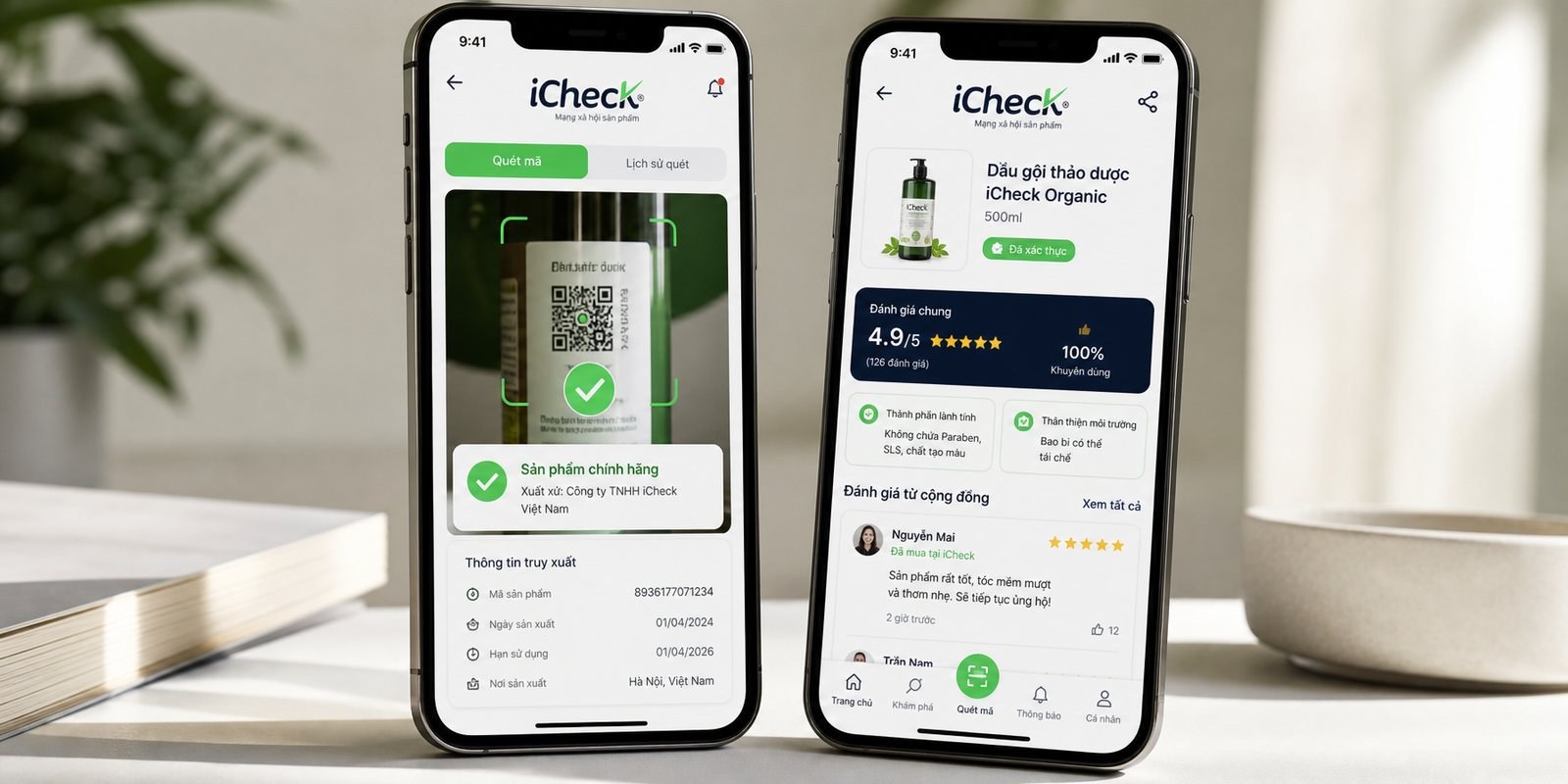
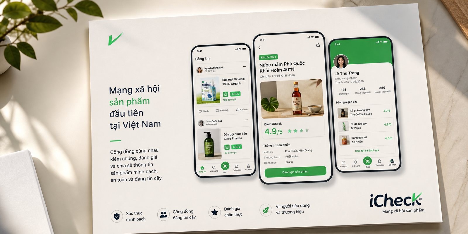
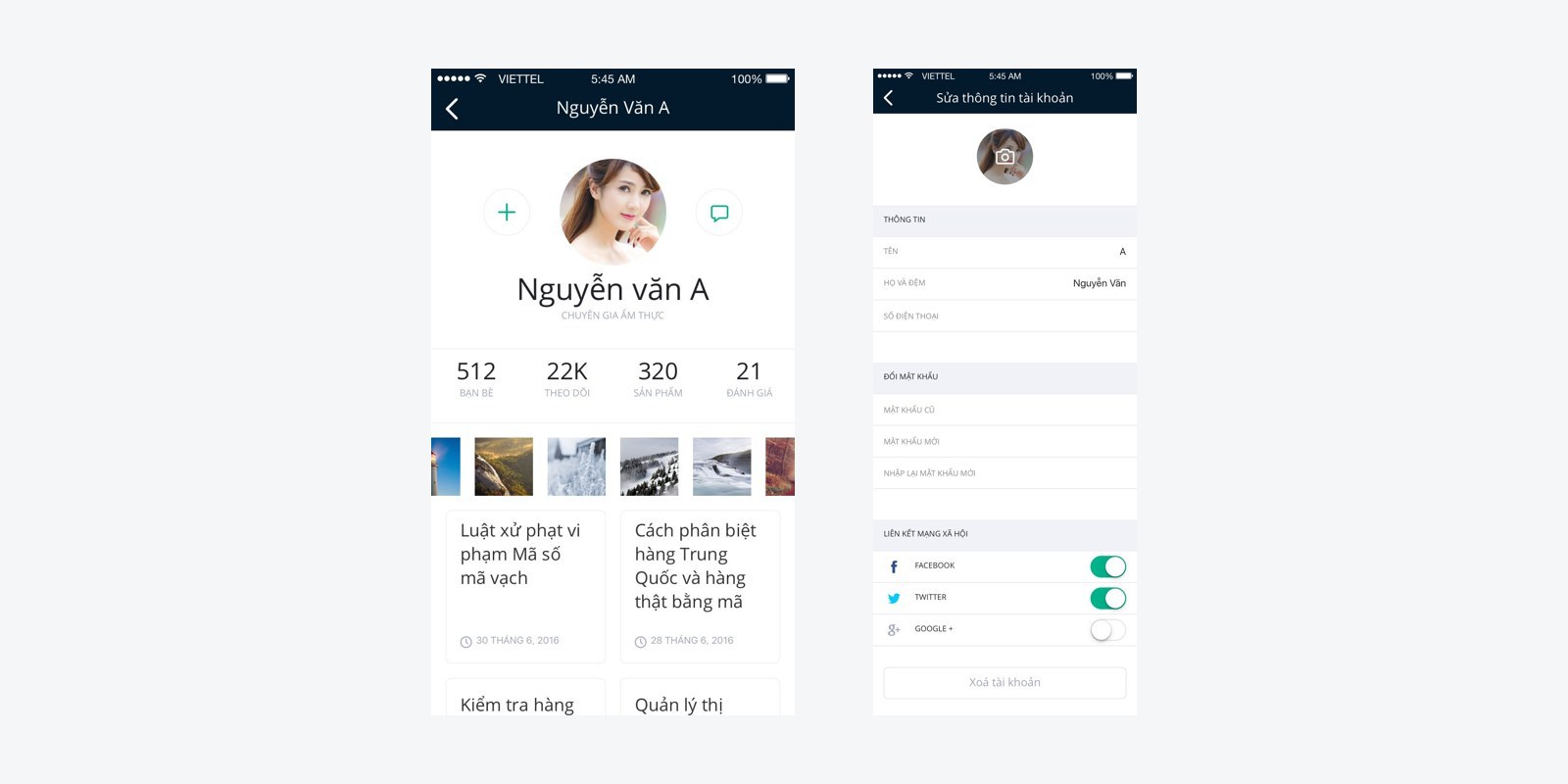
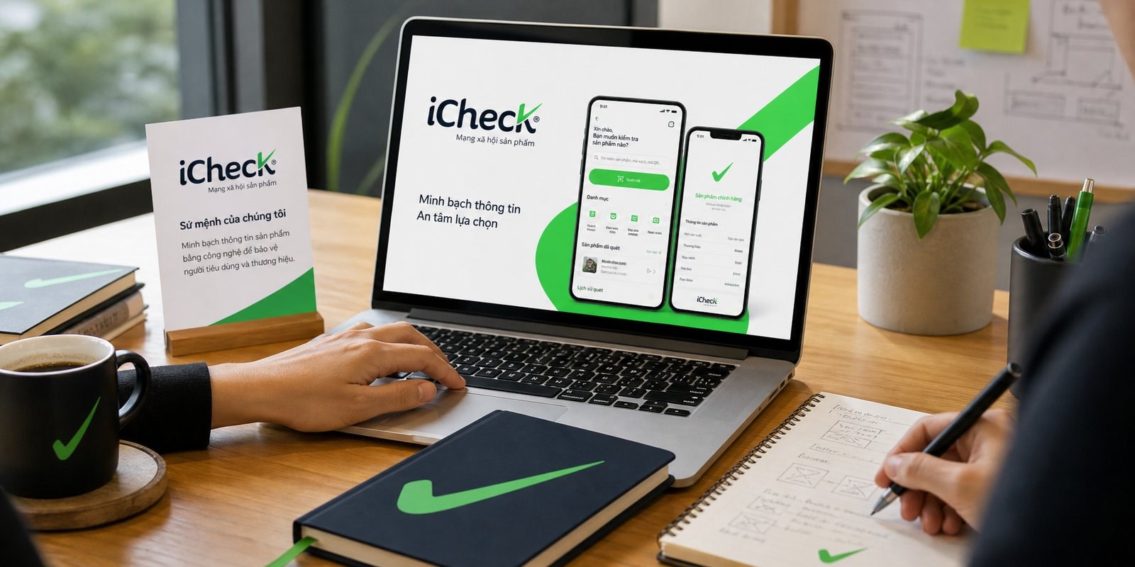
iCheck lives in users' hands, on the phone screen. Sinh Vũ carried the identity into the app interface, the scan button, product information cards, the profile page, the community ratings, all speaking the same green-and-navy language. The green check lights up whenever a product is verified, turning a technical moment into a nod you can see.
The interface was drawn to make scanning, normally a dry act, feel light and dependable: fewer steps, readable type, color leading the eye to what matters most, the verification result. For an app that many scans pass through every day, that clarity is not decoration, it is the reason people come back.
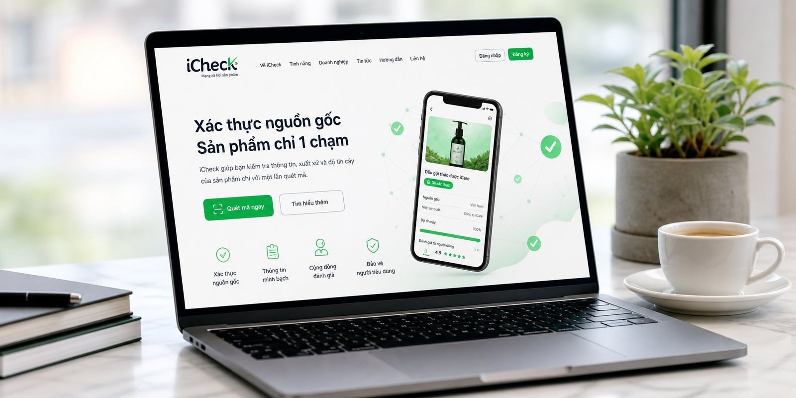
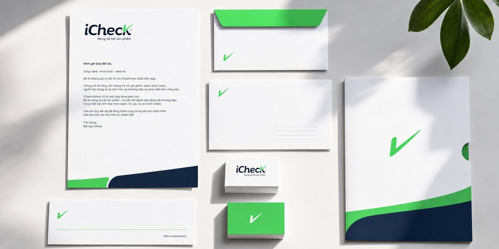
Beyond the app screen, the brand also meets people on the website, on the business card, envelope, letterhead, at the trade-fair booth. Sinh Vũ carried the same identity onto the marketing website and the office stationery set, so wherever you meet iCheck, you see the same one brand.
The website opens a door for both sides: shoppers understand why to scan, businesses understand why to digitize their products with iCheck. That consistency from app to web to paper is what makes a tech startup already look like a platform, before it truly becomes one.
The process
Assessment and positioning
Reviewing where iCheck stood in the app market and settling on putting shopper trust ahead of technology.
Identity and language
Turning the K into a green check, standardizing the name, the voice and the product-social-network descriptor.
Handbook and standards
Writing the brand handbook and basic identity system so the brand would not drift as it grew fast.
Digital application and handover
Carrying the identity into the app interface, website and stationery, then handing over the whole system for iCheck to run itself.
The result
What iCheck gained was not a pretty logo, but a face that makes technology feel trustworthy. The nodding K, the green of safety, the voice on the buyer's side, together they became the reason a shopper taps scan the first time, and scans again.
From that identity foundation, iCheck grew into Vietnam's product social network, partnering with tens of thousands of brands and becoming a partner of the national barcode center GS1 Vietnam. How far a brand travels is the story of a long journey, but the first step, the face that earns trust, was placed right from the starting line.
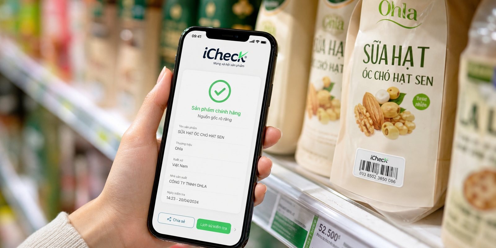
Trust reaching every touchpoint
From the scan screen on the shelf to the business card to the community page, one green check says: verified.

Does your challenge look like iCheck?
Tell Sinh Vũ what is on your mind about your brand. Sinh Vũ will point you to the right direction right away.