
Metfone, the standard that outlived the colour
Metfone is Viettel's mobile network in Cambodia, selling through a chain that runs from the boulevards of Phnom Penh to provincial markets. Sinh Vu standardised the network's existing mark and carried it across every touchpoint, so that wherever a customer meets the brand it speaks in the same voice, whoever built it and wherever it was built.

The problem
Metfone came to Sinh Vu already holding a mark and already holding a name. The brief was therefore not about drawing something new. It was about making that identity live in another country: sign workshops in the provinces could not read Vietnamese documents, every line of copy on a shopfront needed a Khmer version, and each point of sale hired whichever printer was nearest.
When a brand grows fast, everyone improvises. The sign maker picks the closest green in the workshop's swatch book. The person laying out a certificate stretches the logo to fill the gap. The person emailing a partner retypes the company name in whatever typeface the machine already has. Nobody does anything specifically wrong, yet added together the brand blurs at precisely the moment it is growing fastest.
The work
The first step was not opening design software but going out to see where the identity was being used wrongly, then asking why. The answer was almost always the same: people were not careless, they simply had nowhere to look things up. Each department held a logo file received by email, nobody knew which file was the correct one, so everyone used the one they had.
From there, Sinh Vu sat with the Metfone team to settle the rules before settling any lines: which parts of the mark are fixed, which may flex with placement, which may never be touched. The people in the room were the ones who would use it daily, from administration and sales to engineering and communications. The standard was written for them, not for designers to admire.
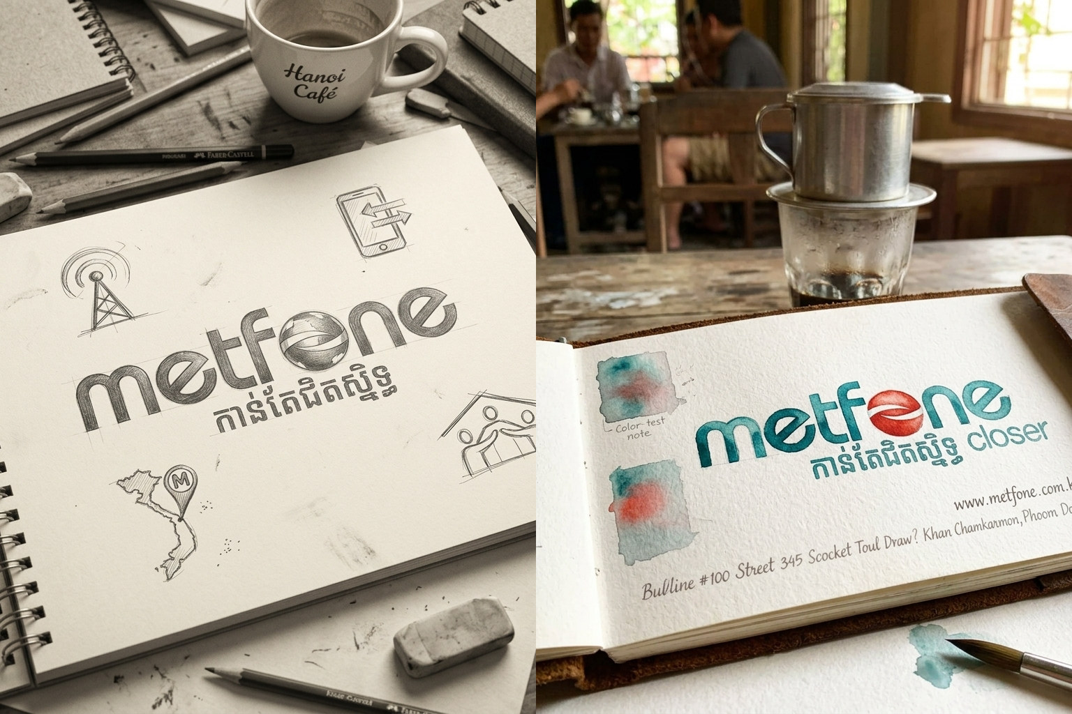
The Metfone mark stayed as it was. Standardising meant tightening it: the proportion between the Latin wordmark, the Khmer line and the word closer, the minimum clear space around the group, placement over colour and over photography, and the variant for the smallest sizes.
The most fragile part was the Khmer line. While it was not locked into the group, each person retyped it in whatever font their machine carried, producing five different weights and five different widths, and nobody noticed because everyone only ever saw their own version. Locking the whole cluster into a single artwork ended that: from then on the mark could only be used whole, never retyped.
Cambodia reads two scripts, so Metfone's type system had to travel in pairs. On the Latin side: Open Sans for advertising, headlines and the company name in print; Roboto for web, mobile apps and anything on screen; Times New Roman for administrative documents. On the Khmer side: Battambang for advertising and printed matter, Nokora for web and apps.
Faces were assigned not by which looked better but by where the text would live. Paper and screen read differently, and Khmer and Latin catch light differently. Because the split was decided in advance, someone drafting a memo in the administration office opens their machine and already has the right face, without asking anyone, and without an excuse to use another.
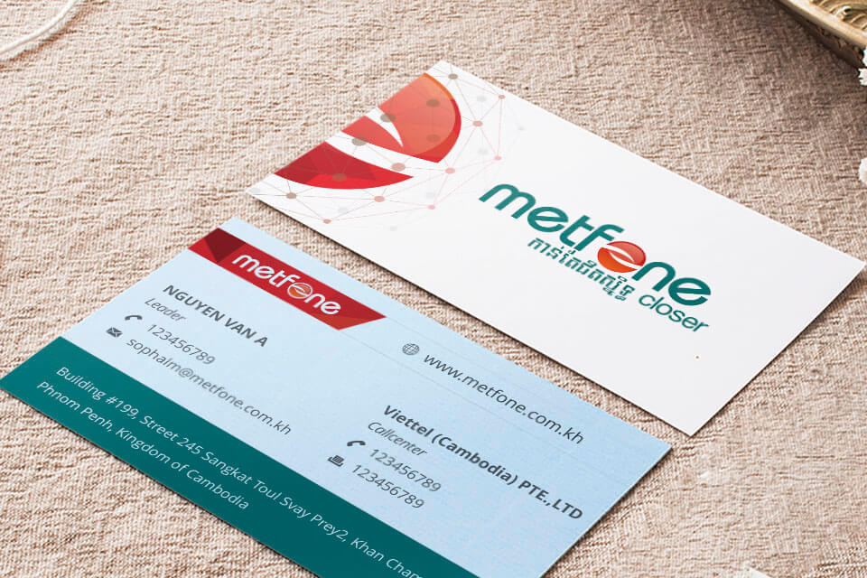
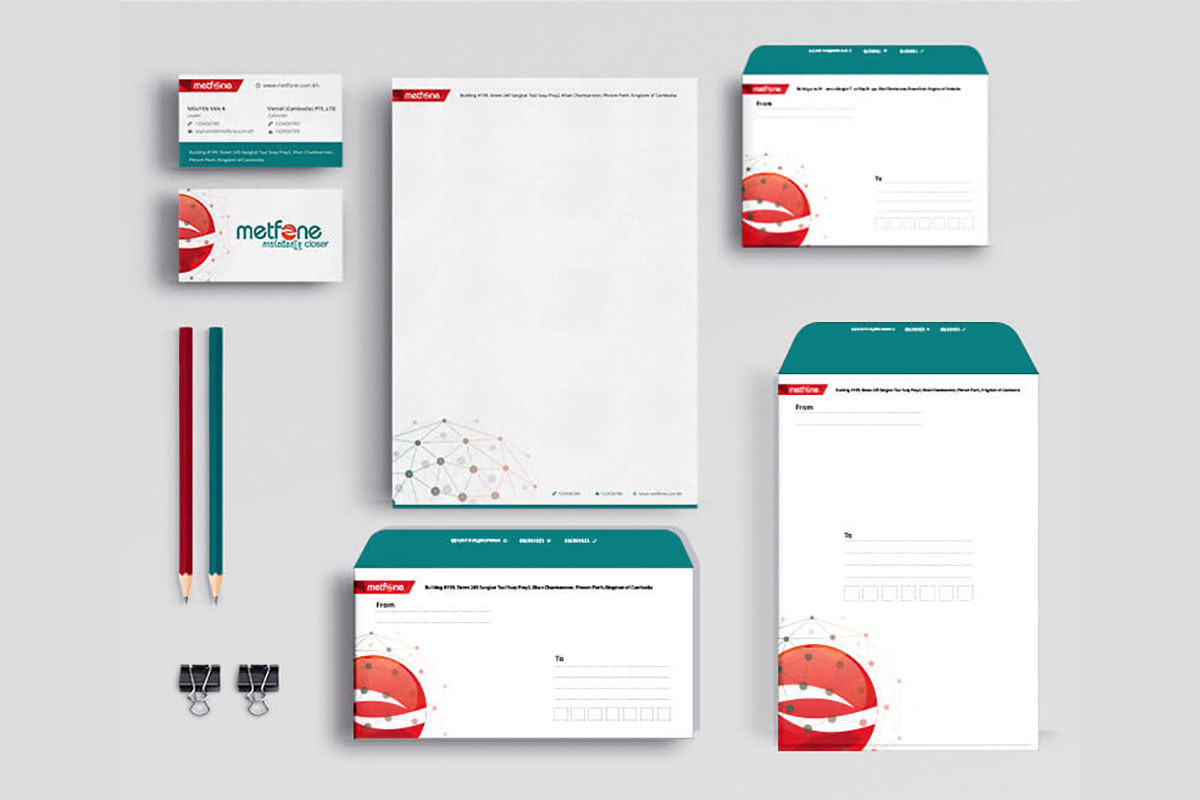
The standard was bound into a 55-page manual, chaptered by where the identity appears: chapter A for office identity, chapter C for signage, chapter E for office applications and uniforms, chapter G for outdoor print. Every item carries its own code, A102 for the letterhead, C104 for a department sign, so anyone looking something up can name it exactly instead of describing it over the phone.
Each page answers three questions: where it is used, what it is made of, what size it is. Certificates print on 180 to 120 gsm coated stock, 260 by 340 mm outside, 218 by 294 mm inside. VIP cards are PVC, 55 by 90 mm, four-colour offset plus a spot colour, HiCo magnetic stripe, signature panel coated in silver, numbers embossed from a metal die to resist forgery. Read the page and a workshop can quote from it without a single follow-up question. Leaf through the full manual.
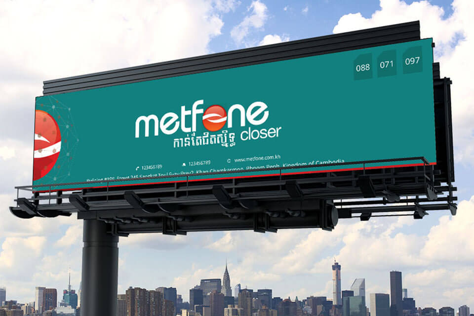
Outside the office the identity passes into the hands of dozens of different workshops, so this section is written for trades, not for designers. Department signs in stainless steel, 150 by 300 mm. Notice boards in acrylic with cut vinyl lettering, 1200 by 2200 mm. Vertical banners on square hollow steel frames, rust-proofed or galvanised. Sales vehicles are 16-seaters, white and green bodies, logo on both door panels and the front. Winter jackets are two-layer, logo 60 mm on the chest, 220 mm across the back with the hotline.
Every page carries the mixing formula at its foot: green C85 M30 Y50 K10, red C0 M100 Y100 K8. A workshop in a distant province can therefore cut and mix straight from the drawing, without calling Phnom Penh to ask which green is the right one. A sign built anywhere comes out the same colour, and that is the whole purpose of standardising.
The digital section covers the small things that appear most often: an email signature block with name, title, direct line and head office address already in place; desktop wallpapers for office machines; web and app interfaces running the assigned Roboto and Nokora pairing.
The email signature shows most clearly what standardising is worth. Metfone staff send thousands of emails out every day, and each one is the brand introducing itself. Before, every person signed off differently; after, everyone used the same block. Nobody had to try harder. They were simply handed the correct thing, ready to paste.
Process
Audit what is actually in use
Collect the identity as it is really being used across touchpoints, find every inconsistency and the reason behind each one.
Lock the mark and the type system
Tighten proportions, lock the Khmer line into the mark, assign five typefaces across print and screen.
Roll out the applications
Build office identity, signage, vehicles, uniforms, outdoor print and the on-screen application set.
Bind the manual and hand over
Bind 55 coded pages complete with material specifications, then hand the system to the Metfone team to run.
The result
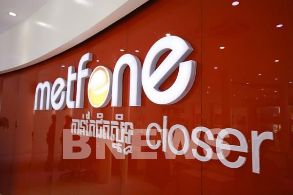
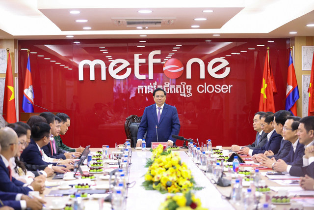
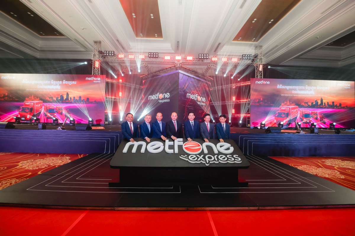
Walk into a Metfone shop today and the same cluster is still on the wall: the Latin wordmark, the Khmer line, the word closer, held in the proportions that were settled then. It stands behind state-level meetings flanked by two national flags, on the campaign marking sixteen years of the network in Cambodia, and it carried straight over to the Metfone Express sub-brand when the company moved into logistics.
Somewhere in that span Metfone changed its coat: the teal ground gave way to red, following the group's wider direction. The standard could not hold the colour, but it held something heavier, which is structure. The lockup, the Khmer line, the position of the word closer, all of it passed through the change of colour without being rebuilt. What Metfone got was not a handsome identity, but a measure tight enough to outlive the paint on top of it.
More than ten years on, that cluster is still there
The images below were published by Metfone and by the Cambodian press, not staged by us. They show the agreed lockup holding its structure across more than a decade, and across a change of the brand's primary colour.

Does your problem look like Metfone?
Tell Sinh Vu where your brand is drifting and who is building it. We will point you to the right route.