
MetaWork, steady inside the churn
An identity that lets MetaWork, a Web3 platform, hold a trustworthy shape through every product launch and campaign, inside a blockchain market that never stops moving.
The problem
Web3, the generation of decentralised platforms built on blockchain, moves fast and loud. Every week brings a new project, a new funding round, a new campaign flaring up and burning out. Inside that churn, the scarcest thing is not attention, it is trust: people grow wary of anything that looks rushed, short-lived, built to vanish after a single season.
MetaWork is not a token. It is a platform connecting projects, communities and investors, alongside a Ventures arm that backs projects built for the long run. A role like that needs to read as infrastructure, steady and here to stay, not as a short game. The hardest problem was holding that one face steady through a constant stream of events, campaigns and products, when every occasion pulls a brand toward noise and novelty.
The approach
Before any drawing began, we sat with the MetaWork team to answer the root question: inside a market full of projects that flicker on and off, what does MetaWork want to be remembered as. The answer was not about looking more technical than the rest, it was about looking more trustworthy.
Both sides settled on one position: MetaWork is where connection and building happen together, standing with the projects that choose the long road. That position set every choice that followed, so that whether it is an asset for a community reward drop or a deck sent to investors, MetaWork speaks in the same steady voice.
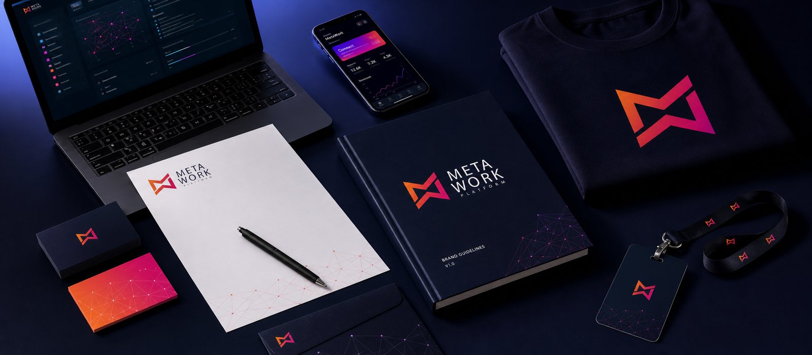
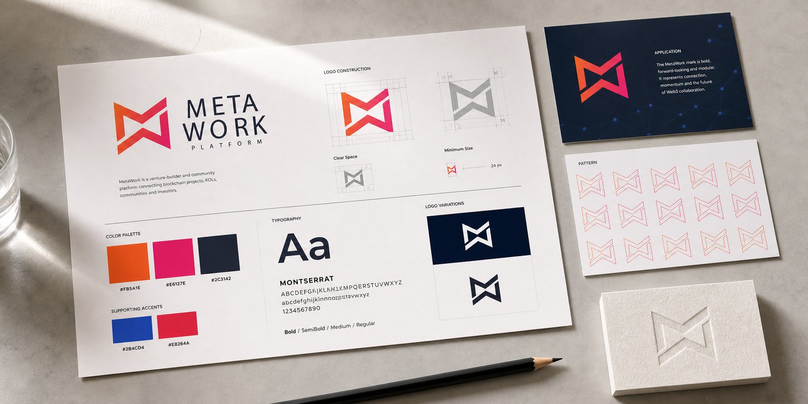
The symbol was reduced to a monogram of M and W, folded into one continuous ribbon, two letters in a single stroke. It carries exactly what MetaWork does: joining separate pieces into one network. A gradient from orange to pink carries the energy of a young tech community; a deep navy ground holds the steady part, so the new does not thin into the shallow.
A mark alone is not enough. What keeps it from losing shape through a packed release schedule is a full guideline: how the logo sits, how the colour shifts, how much breathing room it needs, how far it goes on dark and light grounds. Because of it, whoever is building an asset at midnight and whoever is laying out a deck overseas both produce the same MetaWork.
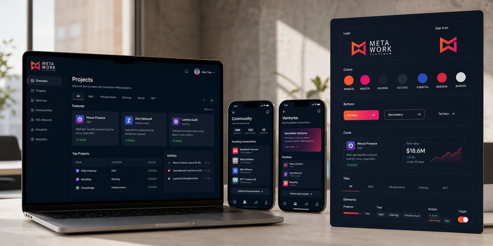
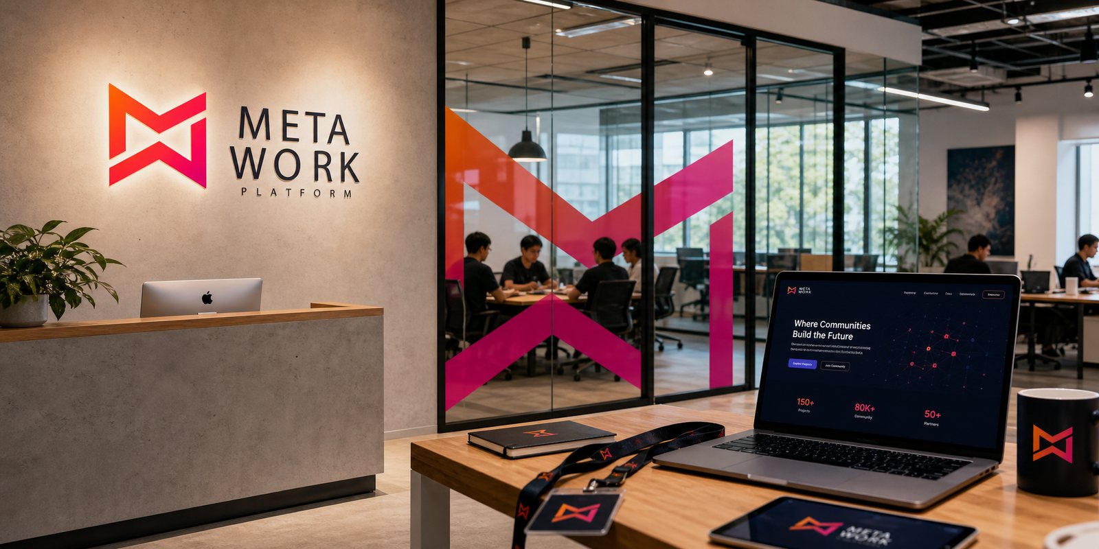
MetaWork lives on screen, and a platform keeps growing new products, new channels, new features. We built a digital design system so that everything newly born still belongs to the same home: the same grid, the same colour rhythm, the same way a button or an info card appears.
Out of that foundation, every new MetaWork screen, from the project dashboard to the community page to the Ventures section, reads immediately as family instead of being rebuilt from scratch. Build once, use everywhere: that is what sets a design system apart from a loose set of images.
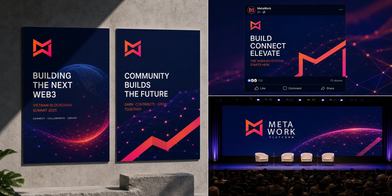
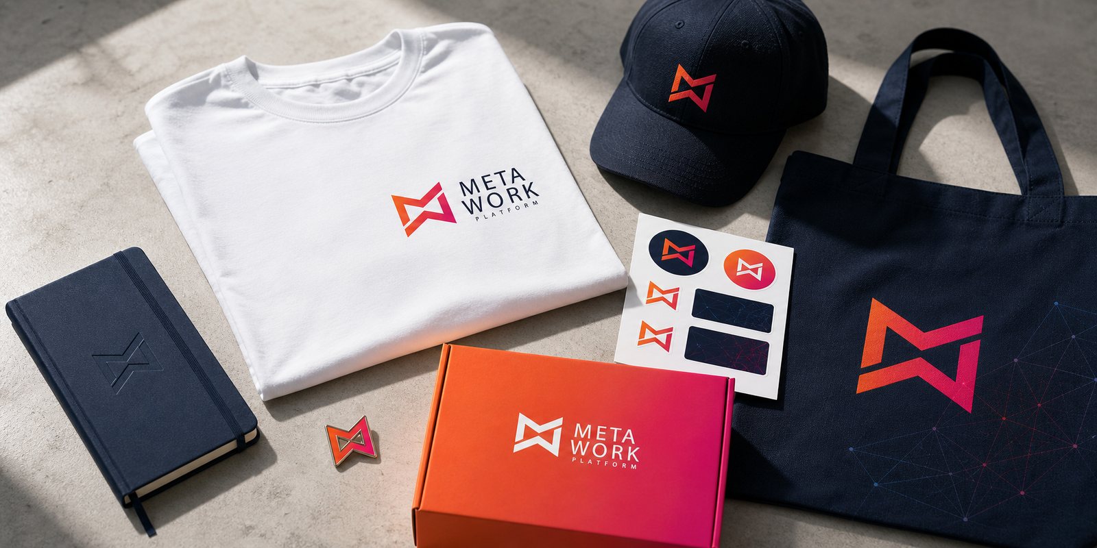
The loudest part of a Web3 project is its run of campaigns and events: conferences, community reward drops, referral programmes, seasonal moments. Each occasion tempts a brand to look different for the sake of new. We built a campaign visual system and event assets so that every occasion still reads as one MetaWork, only the content changes, never the face.
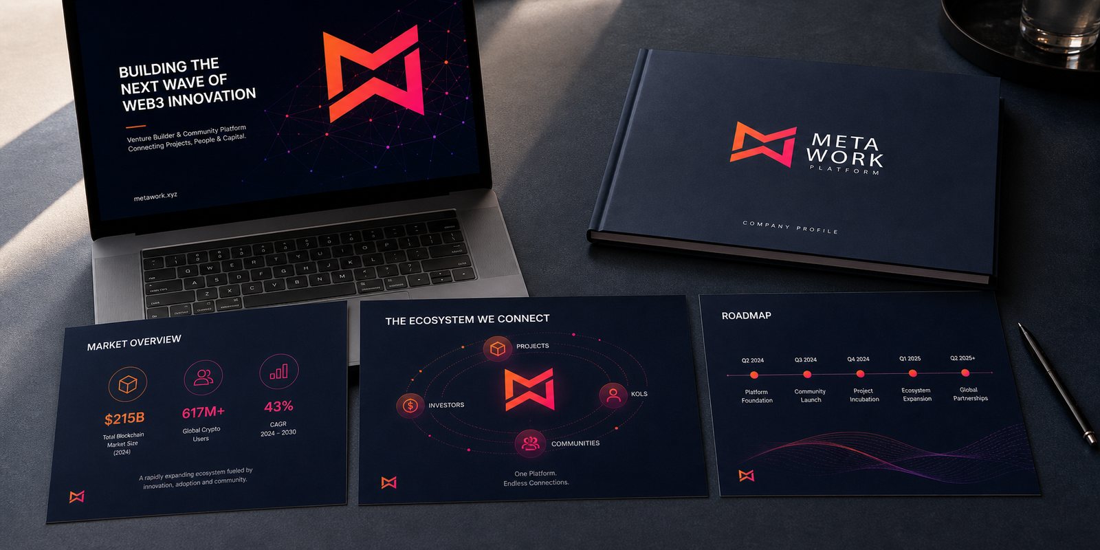
Alongside it sits a venture deck so MetaWork can sit at the table with investors: pages on the market, the vision and the ecosystem, as polished as the promise of seriousness itself. For a venture, how it presents is not decoration on the surface, it is the first proof that a method stands behind it.
The result
What MetaWork gained is not a logo, it is a face that holds its shape. On a conference stage, on a reward-drop asset, on a new product screen or on a community t-shirt, it is still the same MetaWork, one voice, one standard of polish.
In a market that rewards noise, that consistency is a quiet advantage: it makes a young platform look like it will still be here next year. And a brand that looks like it will stay is exactly what lets projects, communities and investors step closer with confidence. Steady, here, does not mean slow, it means holding your own shape while everything else moves fast.
One MetaWork across every touchpoint
Is your problem like MetaWork's?
Tell Sinh Vũ what is on your mind about your brand. Sinh Vũ will point you to the right direction right away.