
Chigasoco, made simple
Chigasoco, a sourcing company, needed a face as clean, clear and trustworthy as the invisible trade it runs; Sinh Vũ built its visual identity and corporate stationery.

The problem
Sourcing is an invisible trade. Clients never see the factory floor, the chain of negotiations, or the late nights spent checking goods. They only see the result: shipments arriving on time, at the right quality, at the right price. A whole tangle of complexity gets folded into a single word: done. The paradox of the trade is that the more value it creates, the less of it shows, and a service no one can see struggles to earn trust from the first meeting.
Chigasoco staked its whole brand on four words: we make it simple. But a promise of simplicity only holds up if the face speaking it looks just as clean, clear and solid. Standing between buyers and hundreds of suppliers, the company needed a mark people could recognise and trust, across sales emails, contracts, shipment crates, trade fair booths. The task was to give an invisible trade a visible face, and a difficult promise a shape people could believe.
The approach
Before drawing anything, we reviewed Chigasoco's existing brand together with its team and sat through several working sessions to settle one question: among countless sourcing contacts, what did Chigasoco want to be remembered as. The answer had nothing to do with looking more international or listing more product categories, and everything to do with looking more trustworthy and more at ease, the exact feeling a client gets the moment a messy job is finally off their hands.
The position landed cleanly: Chigasoco carries the hard part so the client keeps the simple one. The line we make sourcing simple stopped being a tagline under the logo and became the measure for every decision after it. From the seal on an envelope to the shirt the team wears on a factory audit, everything had to answer one question: does this make the brand look simpler and more trustworthy.
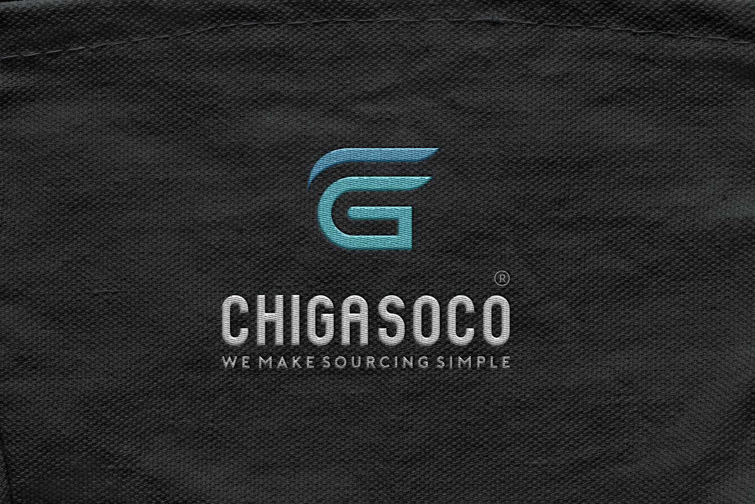
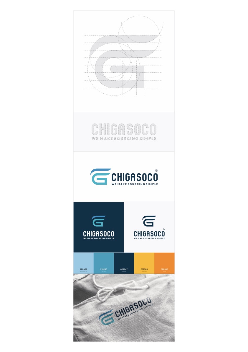
The mark distills to a single letter G, opened into the shape of a wing. A wing, because what Chigasoco sells is relief: lifting the heavy part of sourcing off the client's shoulders so goods move fast and clean. The upward curve suggests motion and the reliability of a flight landing on time; the square body of the G holds the weight in place, so the lightness never slides into flimsiness.
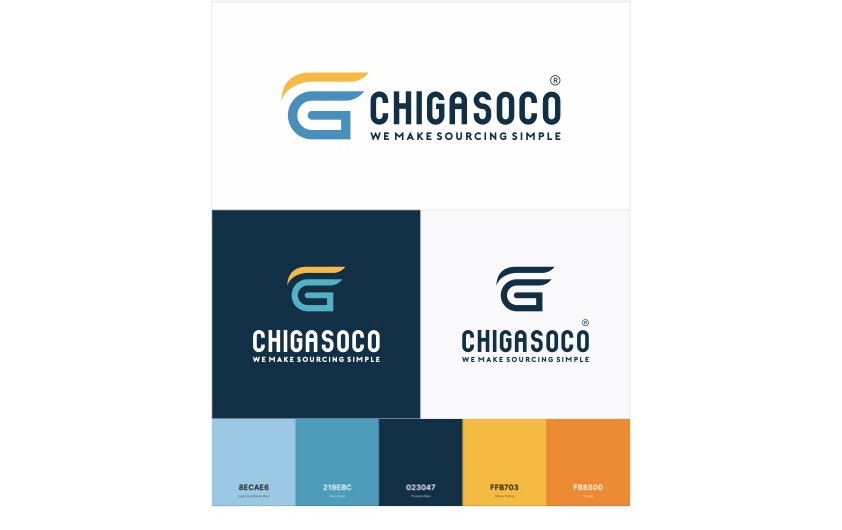
Colour carries the story forward. A deep navy grounds the brand in trust and experience, the first thing a trade partner needs to see. A gradient from sea blue to sky blue brings the air of freight and cross-border shipping lanes. A touch of warm orange keeps the human warmth in place, so a sourcing company never drifts into cold and mechanical. Together, these three layers of colour give Chigasoco just enough weight and just enough openness.
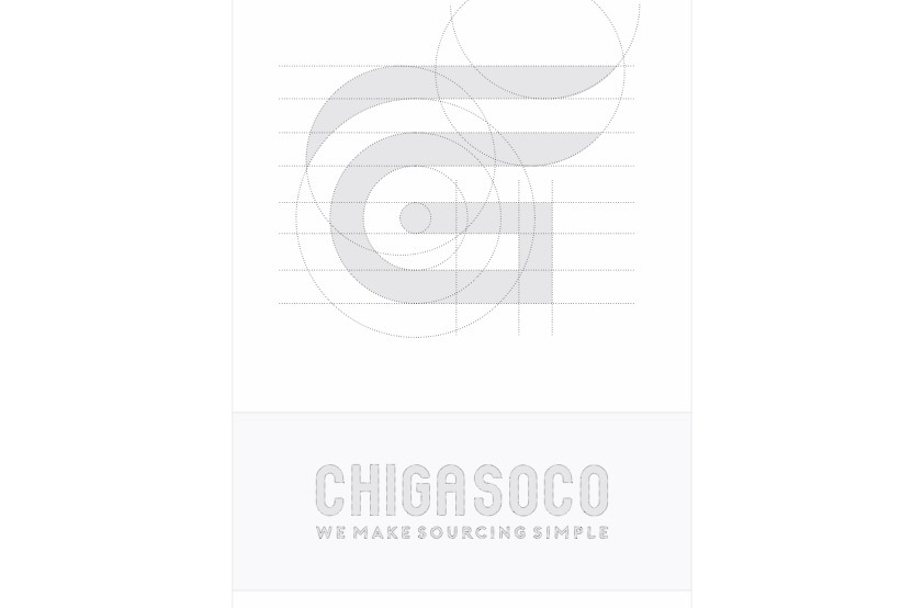
A beautiful mark alone is not enough. A sourcing company touches clients through many hands and many places: a staff member sending a quote, a printer producing shipment crates, a workshop embroidering logos onto uniforms. If each place reads the logo differently, the face fractures into pieces. We built a set of guidelines to lock in the correct version: the construction grid, minimum clear space, use on dark and light backgrounds, approved variations and the uses that are ruled out.
Guidelines are how a brand protects itself when no one is there to watch over it. Because of them, someone laying out a document at midnight and a printer in another province still produce the same Chigasoco. For a company whose greatest asset is its credibility, that consistency is not a matter of aesthetics, it is a matter of keeping a promise.
The brand of a trading company lives in very ordinary things: a letterhead tucked inside a contract, an envelope sealed with a stamp, a business card handed over at a trade fair. We carried the identity down into a set of corporate stationery, where every small detail speaks to the level of care behind it. The wax seal on the envelope is not decoration, it is the first handshake, a hint that someone on the other side works with genuine care.
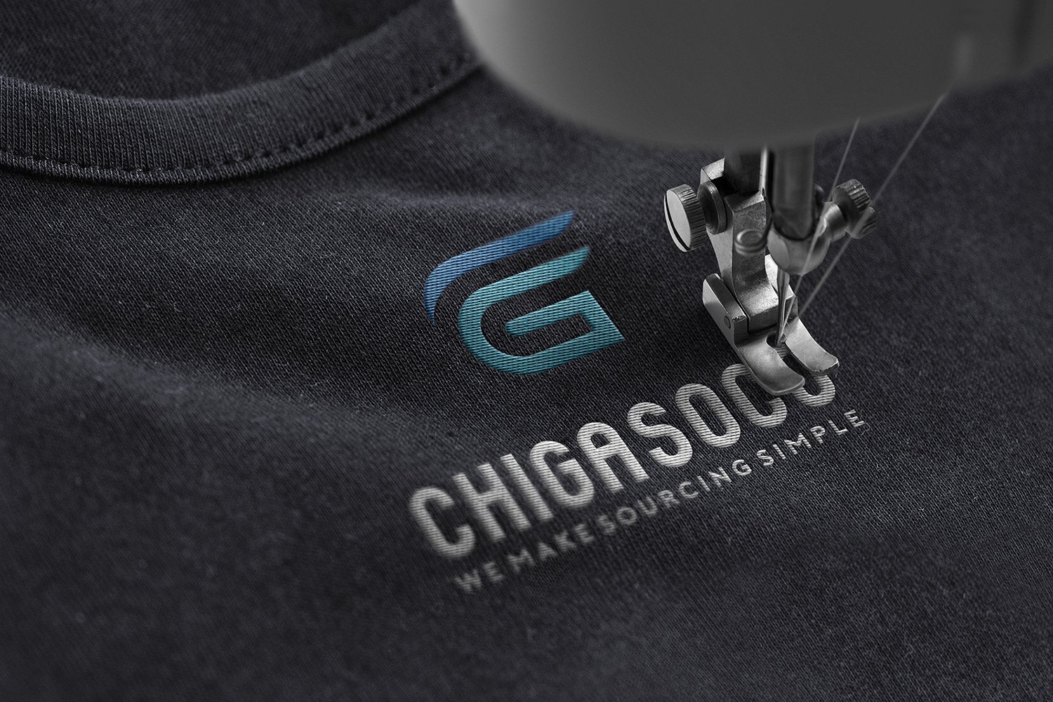
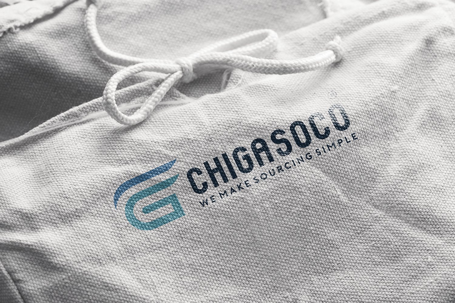
Off the desk, the brand moves onto people. Shirts and bags carrying the Chigasoco mark give the team a shared face on factory audits, at ports, and on trade fair booths. A logo embroidered onto dark fabric turns a group of people into a team, and turns an invisible service into something a client can see, touch and remember.
The result
What Chigasoco gained was not a logo, but a face that keeps its promise. On an envelope, on a contract, on a team shirt or on a crate about to ship out, it is still one Chigasoco: clean, clear, solid. An invisible trade now has a shape, and that shape already says simple before anyone on the team says a word.
For a company standing between clients and a complex supply chain, looking clear and trustworthy is the advantage that opens every conversation. It makes a hard-to-explain service easy to believe on first sight. Chigasoco makes sourcing simple; our part was to make Chigasoco itself look exactly like that.
One Chigasoco across every material
Is your challenge similar to Chigasoco's?
Tell Sinh Vũ what's on your mind about your brand. Sinh Vũ will point you to the right direction right away.