Finance and fintech

Brand design for e-wallets and payment apps

Users hand money to something they can recognize in a second.

E-wallets, payment gateways and money transfer apps live on the habit of opening the app every day. Sinh Vũ helps the product get a mark that is recognized at once and an interface that stays consistent no matter how many features you add.

A set of sample items for an e-wallet: an app icon, a counter QR plate, a payment screen and a transaction notification template
Quick answer01

What does an e-wallet brand need?

Three things first: an app icon that is recognizable at small sizes, a template for the QR plate at the point of sale, and a fixed template for transaction notifications. Those three are where users meet the wallet most, and also where it is easiest to fake.

  1. App icon

    Able to stand alone among dozens of other icons on a phone screen, at a size no bigger than a fingertip.

  2. QR plate at the point of sale

    A branded frame and a consistent placement, so sellers and buyers know at a glance which code is the real one.

  3. Transaction notification template

    Amount, sender and time always appear in the same order, so users understand at a glance.

Business types02

Three kinds of payment product, three problems

They all move money, but the users and the meeting points differ for each kind of product.

E-wallets

Their customersMass-market users open the app many times a day to pay, top up and transfer money.

Brand challengeKeep the app light and recognizable even as features keep growing.

Payment gateways

Their customersBusinesses and shops integrate to receive money; buyers only see the payment page for a few seconds.

Brand challengeA payment page that carries the seller's own face while still showing the buyer which processor is behind it.

Money transfer and QR payments

Their customersUsers scan a code at a cafe, a market or a shop; sellers need a plate that is easy to see and easy to scan.

Brand challengeMake the plate and the payment-accepted sign clear enough to scan correctly the first time, and distinctive enough to be hard to fake.

Pain points03

Four pain points specific to e-wallets

These are the places where wallets and payment apps tend to lose trust just when users are ready to pay.

02

An icon lost among the screen

Many financial apps share one or two familiar color tones, which are hard to tell apart at small sizes.

Choose a mark and a lead color that rarely overlap, and test at real icon size on many generations of phones before locking.

Start from this problem
Customer journey04

At which stage do e-wallets lose the most users?

At First bank linking. Users have downloaded and registered but do not yet dare to top up or link an account, because it is unclear where the money goes and who is behind it.

Where customers are most often lostFirst bank linking
Do this now
  1. Say in one sentence what this step does, right on the linking screen.
  2. Show the bank or partner involved and the remaining steps before the user taps on.
  3. End with a clear confirmation screen: what was done, the amount, and how to ask if something goes wrong.
Touchpoints05

Five touchpoints to do first

Touchpoints are the places where users see, touch or hear the wallet. You do not need to do everything at once. These five decide most of the trust.

  1. Icon and launch screen

    The first thing seen every time the app opens.

  2. Payment interface

    The place where users are holding money in their hands, so every word must be clear.

  3. QR plate at the point of sale

    It is the wallet's face on the street, and also the easiest thing to fake.

  4. Transaction notifications

    Users glance at them many times a day, so consistency is vital.

  5. Confirmation screen and receipt

    Users screenshot it and send it to each other as proof, so this screen carries the wallet's name the furthest.

Roadmap06

Where Sinh Vũ suggests you start

Listed in the order to do them. A newly launched product can stop at step two; a wallet that has grown goes all the way.

  1. Logo and Brand Identity Design

    Name, mark and color: the base for the app icon and everything after.

  2. Designing a digital design system

    A digital design system for the payment interface and the notification template.

  3. POSM and event booth design

    QR plates, payment-accepted signs and materials at the point of sale.

  4. Brand video and animation production

    Motion for the launch and confirmation screens, so actions feel fast and stay clear.

Projects07

The projects closest to e-wallets

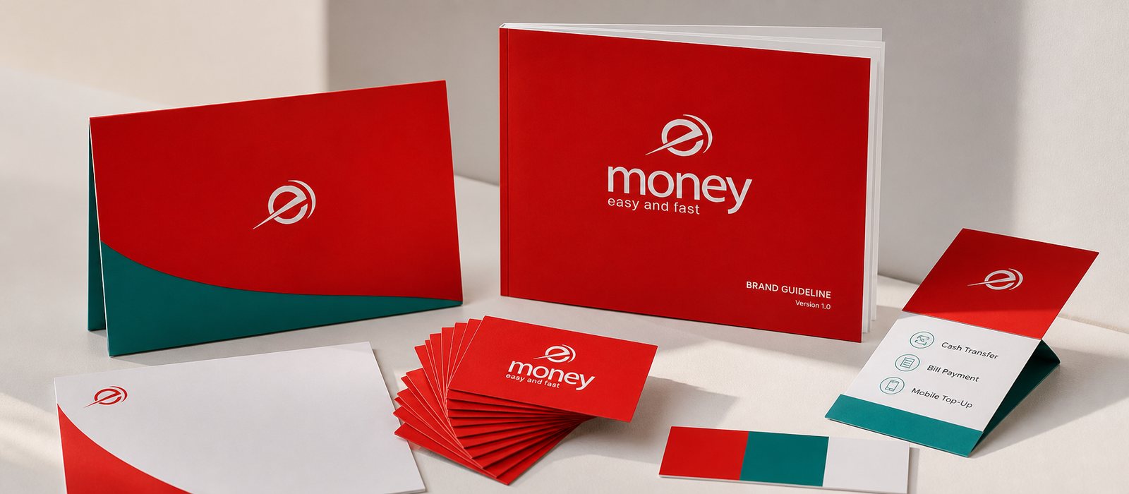
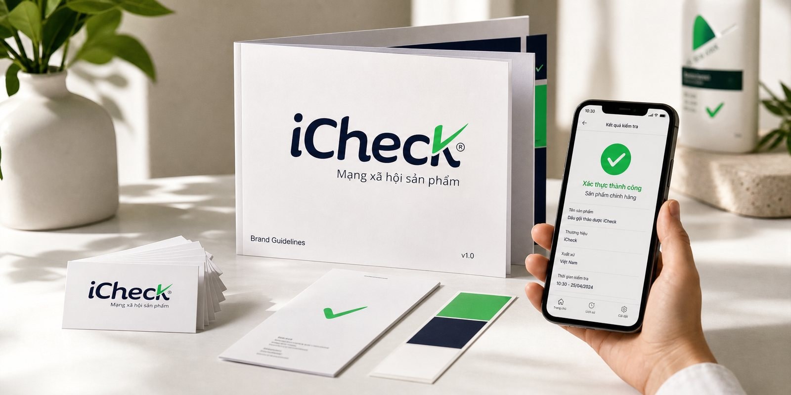
Sinh Vũ has built the brand for eMoney, a money transfer wallet in the Cambodian market, and has not published an e-wallet project for the Vietnamese market. iCheck is a near neighbor: an app that needs users to trust it before they tap.

Further reading08

More on e-wallets and payments

Free toolTouchpoint map for this business modelSee the five stages customers pass through, where they drop off most, then rate the five touchpoints to fix first.Open the tool Free toolPalette checkEnter color codes or drop a logo and see whether text is readable, whether print goes dull, and what people with color vision deficiency see.Open the tool
FAQ09

Frequently asked questions

Avoid padlocks, shields and coins, because every wallet uses them. Sinh Vũ looks for something distinctive about the product, such as how the money moves or who it serves, then tests it at app icon size before locking.

Nothing is impossible to fake, but you can make the real one easy to recognize: a consistent branded frame, the receiving entity's name printed clearly, a fixed way of mounting it. Formal verification still needs the technical side and the banks involved.

Rules for where a new feature goes, its priority on the home screen and how it is named. With a digital design system, whichever team adds a feature, it comes out with the same feel.

The same order for every type of transaction, short words, nothing alarming. Key information such as the amount and the parties comes first, and how to ask for help comes after.

Not yet. The minimum is a name, a mark, colors, an app icon and a notification template. The full design system comes when the product team grows.

Tell Sinh Vũ about your payment product

A few lines about your users, your points of sale and what is stuck is enough. Sinh Vũ reads it and replies within one working day.