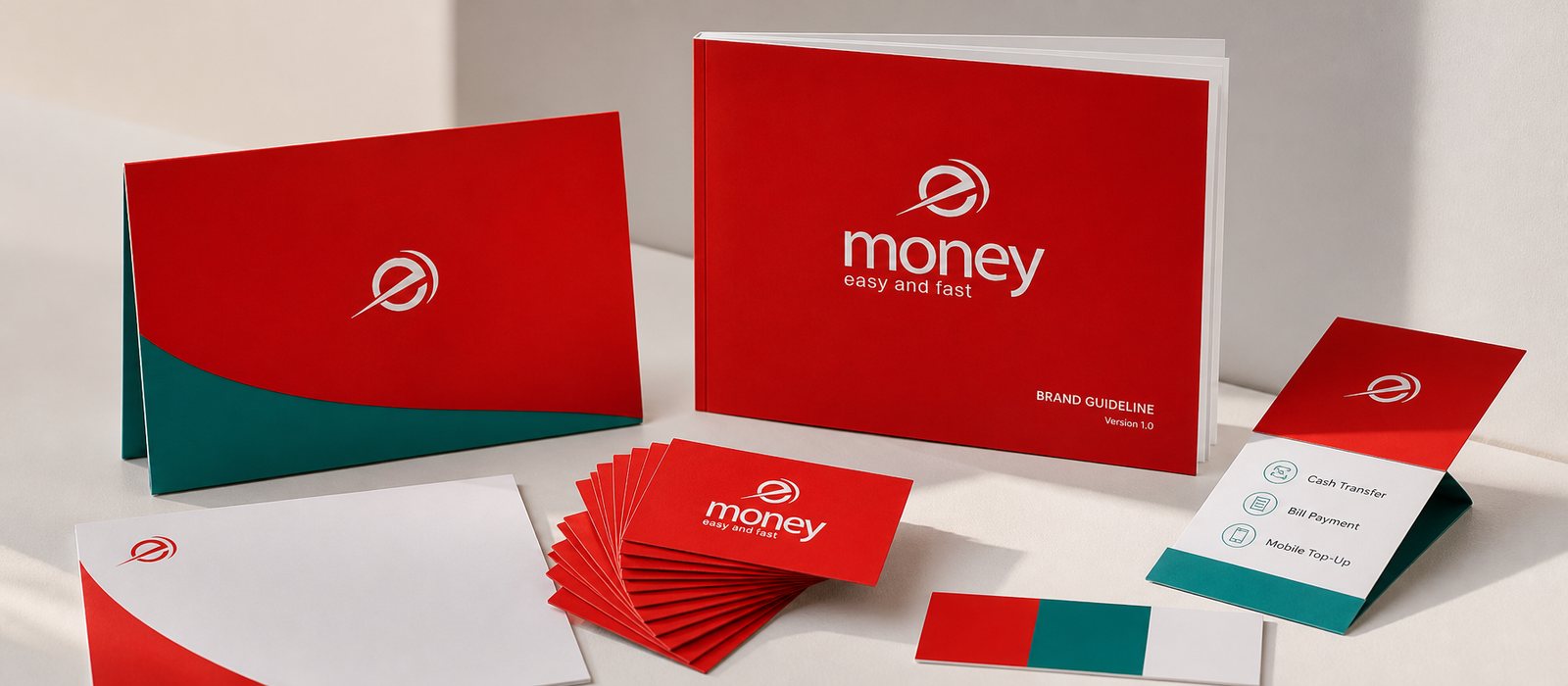
The counter and the app feel like two banks
Colors, type and voice at the branch differ sharply from the app; customers used to one side find the other strange.
One shared standard for both the branch and the screen, written for everyday users and not only for designers.
Start from this problem