
eMoney, money transferred fast, and a mind at ease
For millions of people in Cambodia, the Metfone SIM in their pocket is also where they keep their money. eMoney, the money transfer wallet of Metfone and MB Bank, had to say two things at once: money moves fast, and the sender can relax. Sinh Vũ built the strategy, the mark and the entire identity system so that promise could be read from a street sign to a business card on a meeting table.
The problem
eMoney was built for a very particular market. In Cambodia, most people have never held a bank account, yet almost everyone carries a Metfone SIM. eMoney turns that SIM into a wallet: sending money, paying bills, topping up phone credit, all in a few taps. Behind it stand two large names, Metfone of Viettel and MB Bank, vouching for the money that moves through it.
But transferring money is a matter of trust. People need to believe this wallet is fast enough to be convenient, and solid enough to be handed their hard-earned money. A financial service entering a new market, with Vietnamese roots, had to say that promise in a visual language Cambodians could read at a glance, with nothing to translate. What eMoney lacked was not a good-looking logo, but a face that made strangers trust it from the first encounter.
The approach
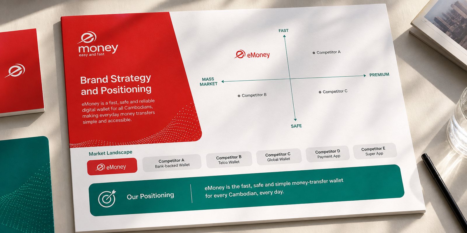
Before the first stroke was drawn, Sinh Vũ sat down with the root question: what is eMoney actually selling to people in Cambodia. If it were merely another wallet among many, it would be measured on promotions and fees, a race everyone loses. We chose a different ground, sitting between the two things users need most and few name outright: speed and peace of mind. Speed is money that moves instantly; peace of mind is knowing Metfone and MB Bank stand behind it.
That position shaped everything that followed. It told the design which colour should lead, which type should stand tallest, which tone should carry: a mass-market, approachable service reaching from the city to the countryside, not a distant financial product. Positioning is not a slogan pinned to the front of a document, it is the hinge the whole identity system turns on, around one promise.
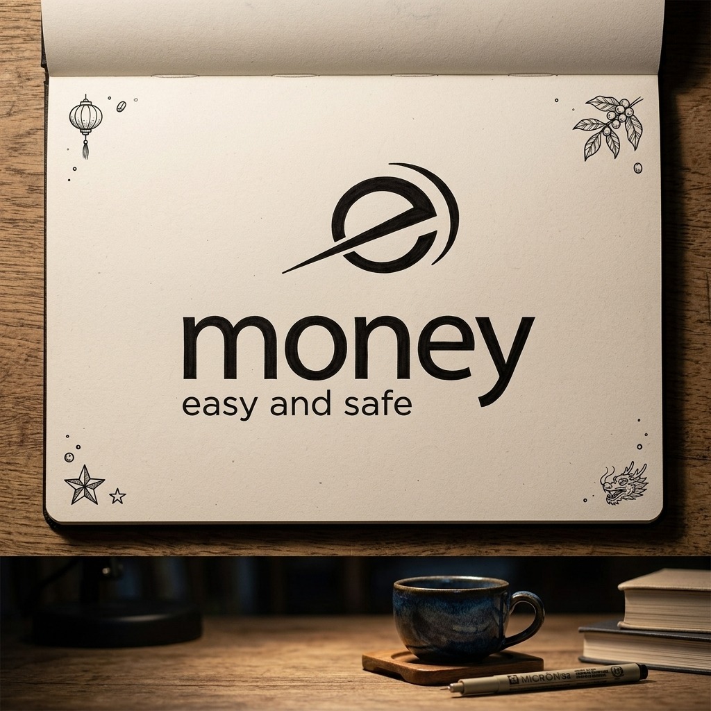
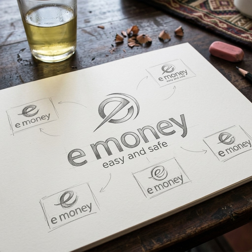
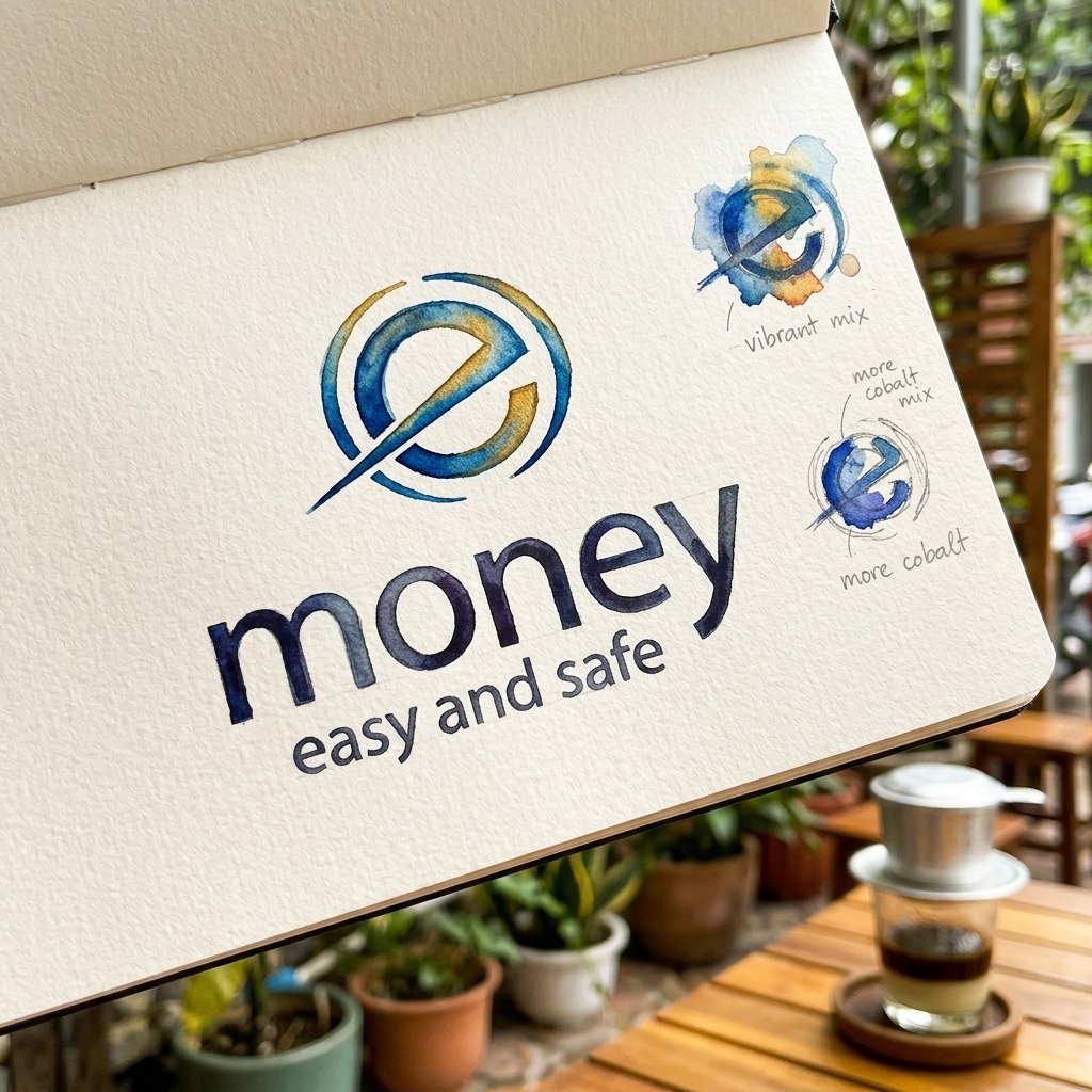
The whole positioning was compressed into one mark. The 'e' of eMoney is not a plain lowercase letter: it is an open circle cut by a swoosh, a sweeping stroke like the streak of a coin flying past, a trajectory with no stopping point. Seen at a glance, it already reads as motion, as the 'fast' the tagline names. Beside it sits the word 'money' in a rounded, sturdy type, legible at any size, from a phone screen to a building facade.
Colour carries the rest of the promise. Crimson red is energy, the familiar colour of Metfone and Viettel, strong enough to stand out on the streets of Phnom Penh. Teal, a blue-green, sits alongside as a calmer, trustworthy note, nodding to the bank's side, so that 'fast' always has 'at ease' next to it. White keeps everything bright and clean. Legible from a hundred metres and legible in the hand, that is the visual problem Sinh Vũ solved.
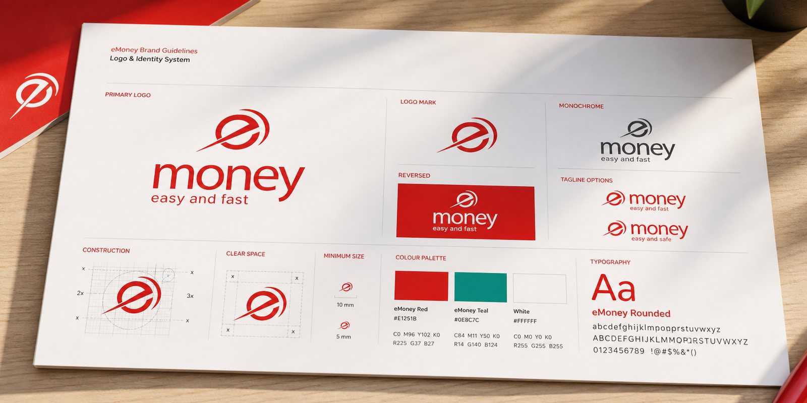
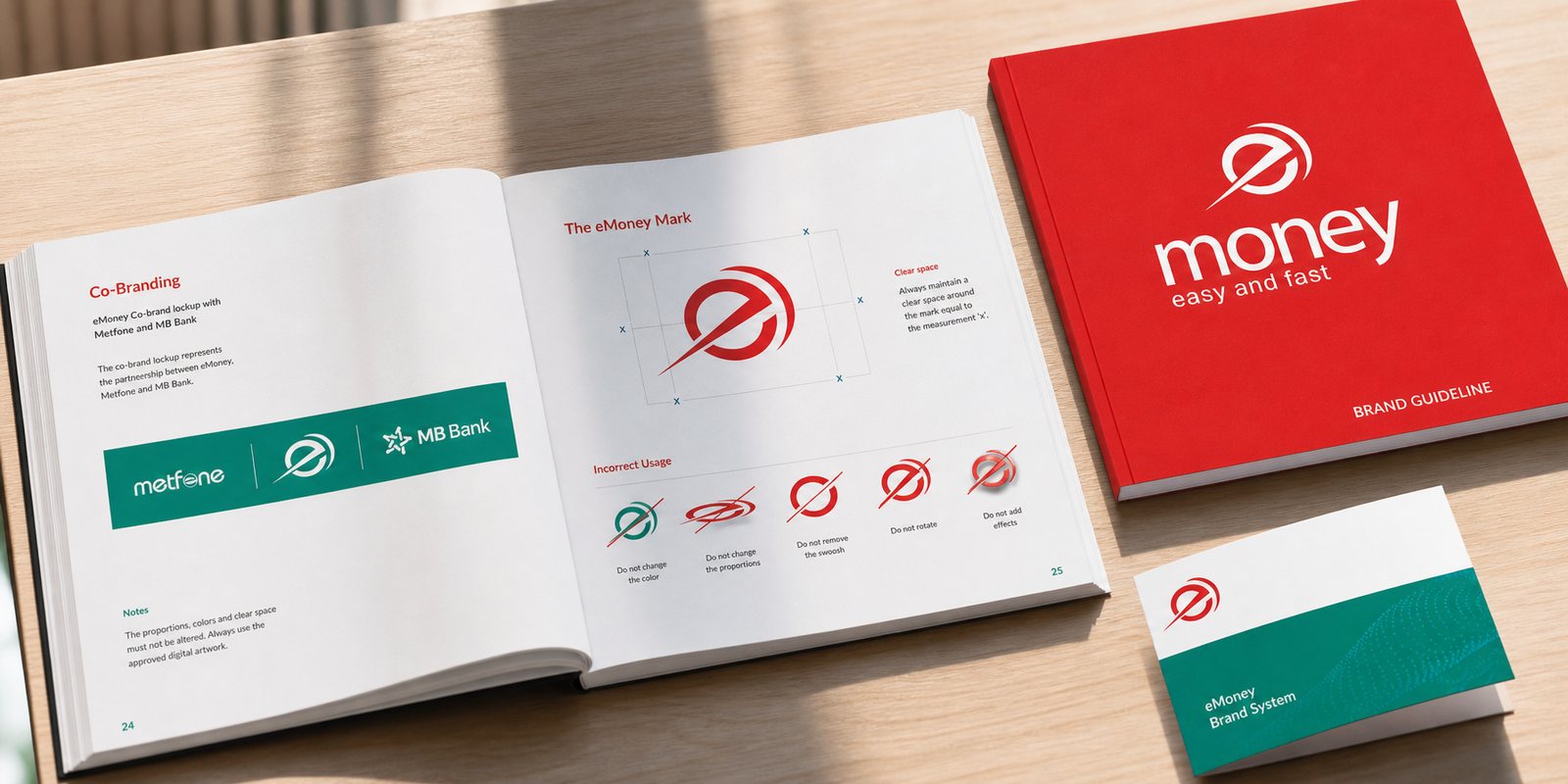
A financial brand lives at thousands of touchpoints: a small agent counter at the market, a street sign, a business card, an app, printed materials. If each one drew itself its own way, trust would crack. Sinh Vũ built identity guidelines so that every hand that touched eMoney produced the same eMoney: the mark's clear space, the smallest size that stays legible, how red and teal are used, what may and may not be done with the swoosh stroke.
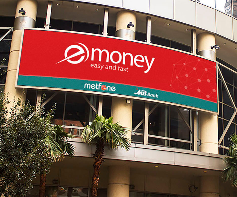
The hardest part was co-branding. eMoney never stands alone, it always appears alongside Metfone and MB Bank. The guidelines set out exactly how the three names sit together on a teal band, which comes first, how much space between them, so the partnership reads as orderly rather than a crowd of competing logos. Because of this, a small agent in a distant province and a large sign in the capital remain unmistakably the same brand.
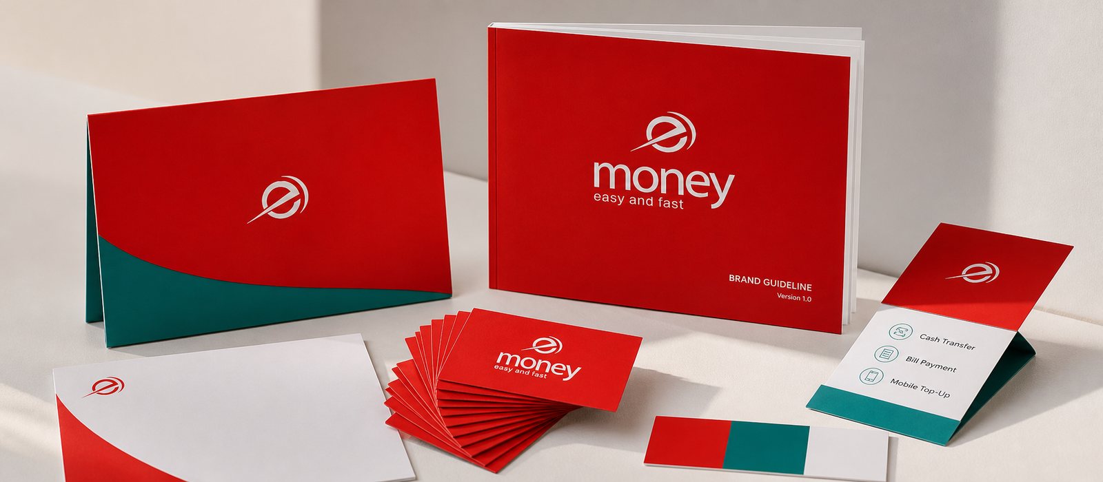
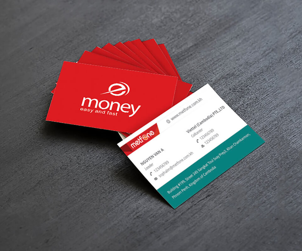
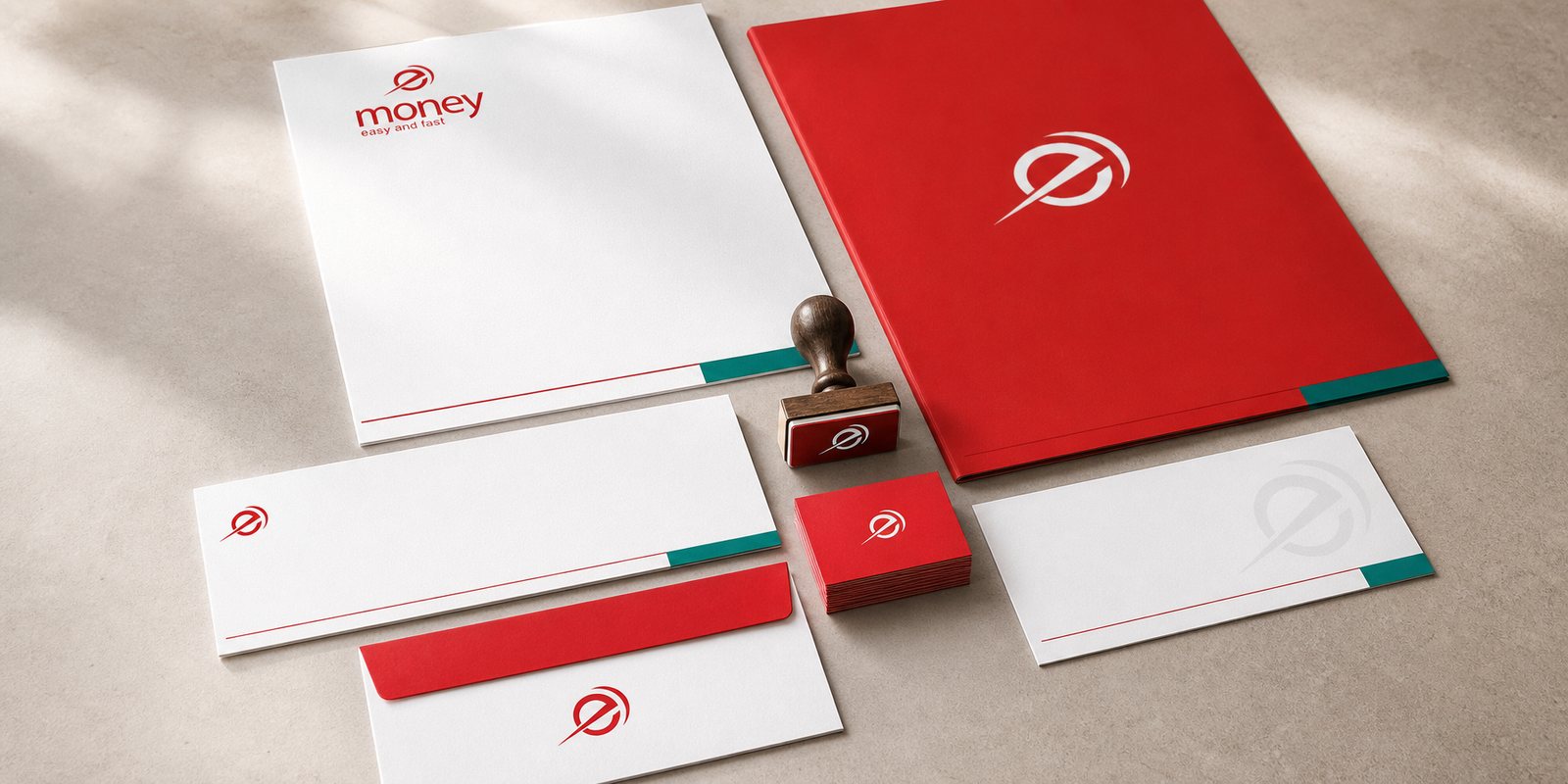
There is a layer of a brand few notice but that decides a great deal: its corporate face. eMoney operates under the Viettel Cambodia legal entity, so its business cards, letterheads and envelopes are what walk into meetings with partners, banks and regulators. Sinh Vũ designed this entire document set so every time one changed hands, the brand introduced itself with the same care.
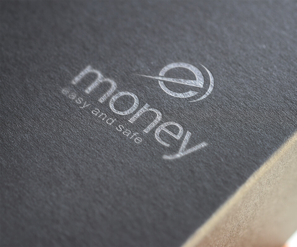
At this layer, detail is the language. A red business card with the mark in silver foil stamping, that is, a metallic embossed finish, says a seriousness that a large street sign cannot; on the back, contact details and the Phnom Penh address sit neatly on a teal band, formal enough for a financial entity. Same brand, but here it speaks in a lower voice instead of shouting, and that very care is what trust looks like in print.
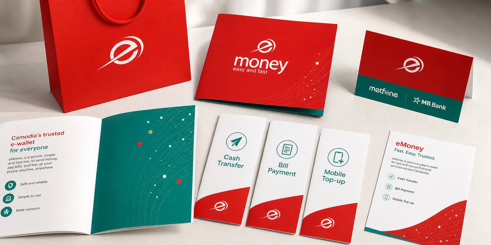
A mass-market e-wallet wins or loses on its agent network. People top up, withdraw, and ask questions at small counters across the city, and every counter is another chance for eMoney to explain itself. Sinh Vũ built a sales and marketing toolkit so that story could travel further than any single team: service leaflets, counter cards, introductory materials, all in one voice.
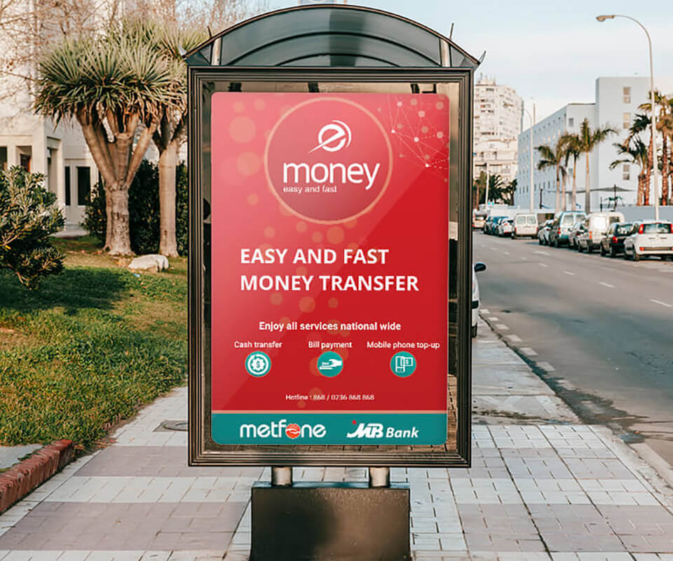
The trick was turning an abstract service into something understood on sight. The three core actions, transferring money, paying bills, topping up credit, are told through three clean teal-line icons, repeated consistently across every piece, so a vendor in the provinces and a flyer in the city say the same thing the same way. That toolkit let the network grow fast without the brand thinning out.
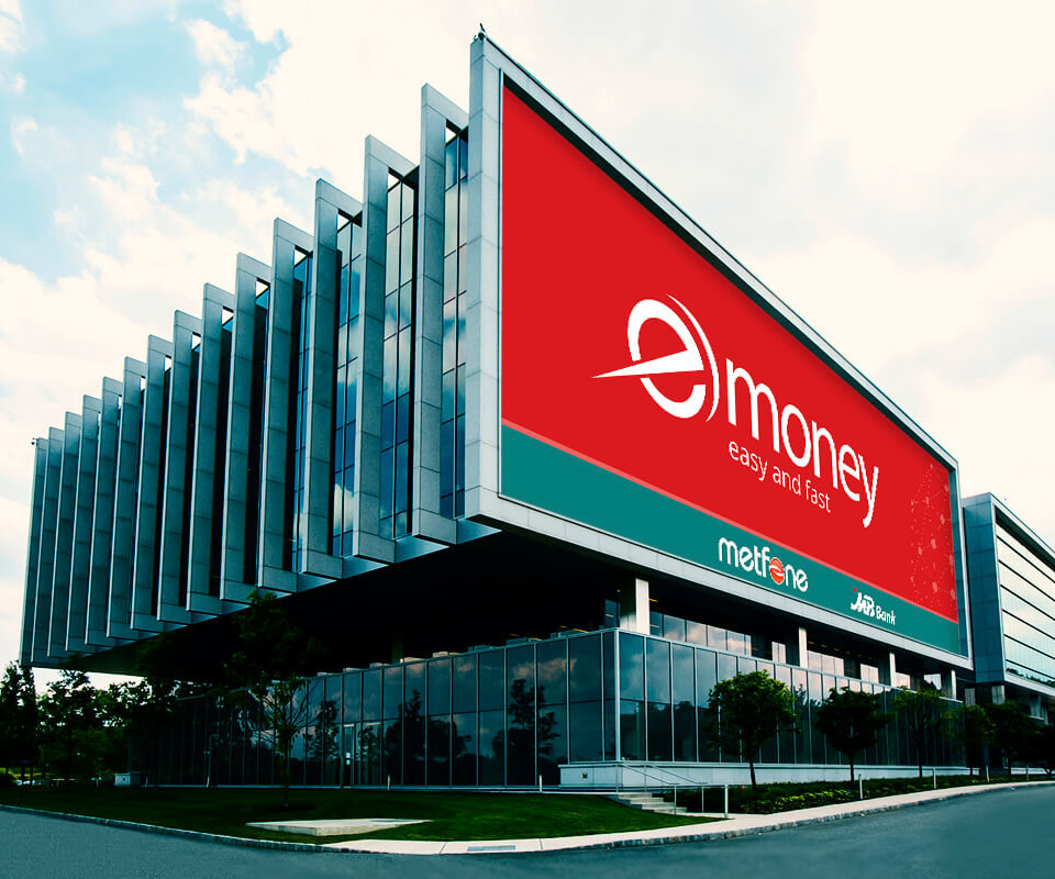
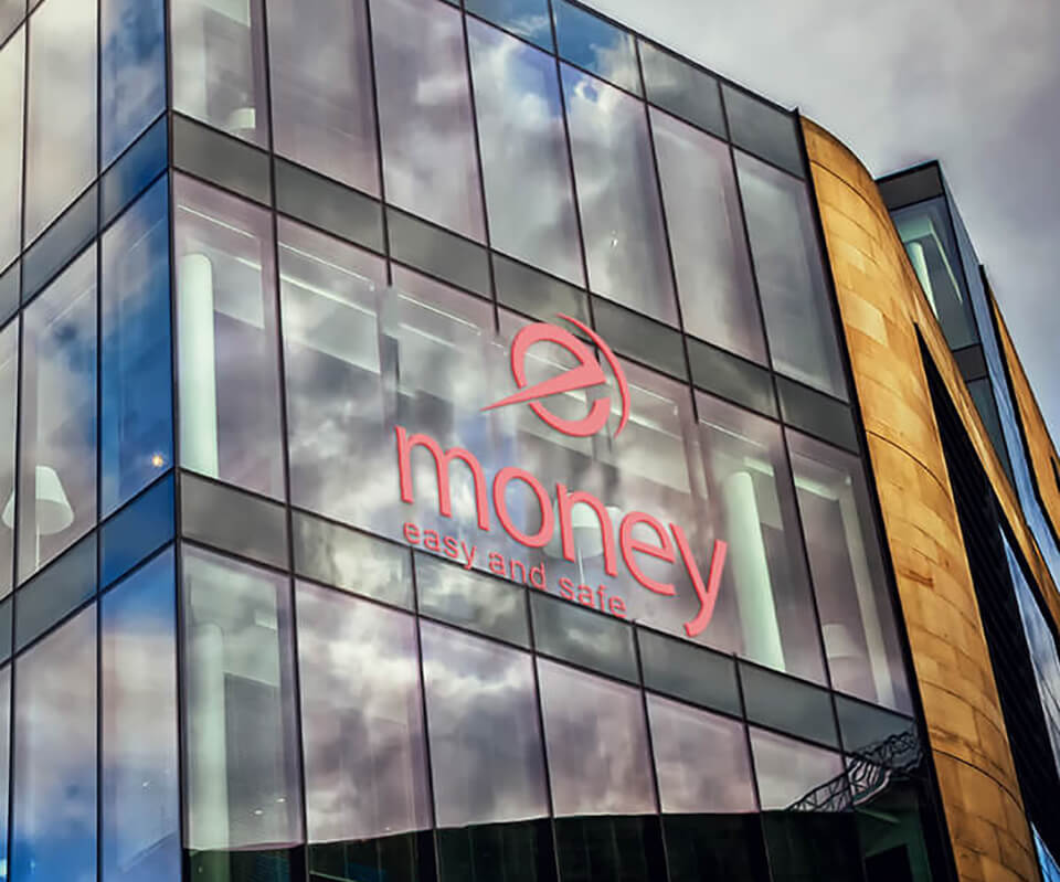
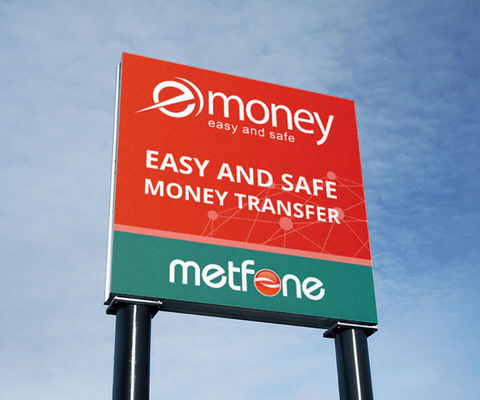
In the end, a brand has to go outdoors. eMoney appears on glass building facades, bus shelters, and pylon signs standing along Phnom Penh's main roads, at a scale no one can miss. Sinh Vũ designed the POSM system, that is, point-of-sale materials, together with outdoor advertising so the mark reads clearly at driving speed: red filling the ground, a large white logo, a message about fast, safe transfers told in a few words.
The power lies in disciplined repetition. Every sign, whether large across a glass facade or standing alone by the road, carries the same mark, the same red and teal, the same Metfone and MB Bank co-branding band. Repeated often enough, in enough places, the name eMoney stops being a logo and becomes a reflex: when people need to send money fast and feel at ease, they think of it.
Process
Positioning and strategy
Set the speed and peace-of-mind ground for a mass-market wallet in Cambodia, the hinge the whole identity system turns on.
Mark and colour system
Built the circular 'e' mark with its swoosh stroke, the crimson and teal palette, and two tagline variants, easy and fast, and easy and safe.
Guidelines and documents
Wrote the identity guidelines, co-branding rules with Metfone and MB Bank, and the full set of corporate documents.
Sales toolkit and POSM
Brought the identity to the agent network and the street: service leaflets, counter cards, outdoor signage and pylon signs.
Result
What eMoney gained went beyond a logo, it was a face ready to cover an entire country. From the mark to the colour, to the guidelines, to every printed piece, the brand said the same promise everywhere it appeared: fast, and at ease. The same eMoney on an agent counter at a Phnom Penh market and on a foil-stamped business card at a meeting table, differing only in volume, never in substance.
eMoney went on to become one of the more widely used e-wallets in Cambodia. Most of that journey belongs to the operations and technology teams; what the identity work contributed was a solid foundation to grow on: a mark that is easy to remember, a colour system strong enough to hold its own on the street, and guidelines so thousands of touchpoints would not drift apart. For a financial brand, that consistency is not decoration, it is trust made visible.
From mark to the street
The eMoney identity set stretches from a foil-stamped business card to a building-sized billboard, from the earliest sketches to a lightbox sign on the street. Tap to see every application in full.
Is your challenge like eMoney's?
Tell Sinh Vũ what's hard to put into words about your brand or the market you're about to enter. Sinh Vũ will point you to the right direction right away.