
ZINZA, beyond expectation with a Z cutting across the horizon
ZINZA, a Vietnamese software company serving the Japanese market, had Sinh Vũ build an identity system that keeps its promise, Beyond the expected, at every touchpoint.
The problem
ZINZA is a software company built by people who once served Japan's demanding market, carrying the Kaizen spirit, continuous improvement, care for every small detail down to every line of code. The company chose an ambitious promise as its second name: Beyond the expected, always going further than what the client waits for.
But a young software company, standing among countless providers in the same field with near identical technology blue logos, all promising quality, how could a promise to go beyond expectation become something visible, not just a slogan? ZINZA needed a face that was precise, trustworthy, and quietly ambitious, one that could say we cross the line where others stop, without needing to raise its voice.
The approach
Before drawing anything, we sat with the ZINZA team to clarify the promise. Together we reviewed the touchpoints already in place and the competitive landscape, then settled on a positioning line: what sets ZINZA apart is not a claim of being good, but an attitude of going further than expected, true to the Kaizen spirit the company carries into work with Japanese clients.
That stance gave both sides a clear measure: everything bearing the ZINZA name, from a single card to a full set of documents, had to carry precision and care, a quiet proof of the promise to go beyond expectation.
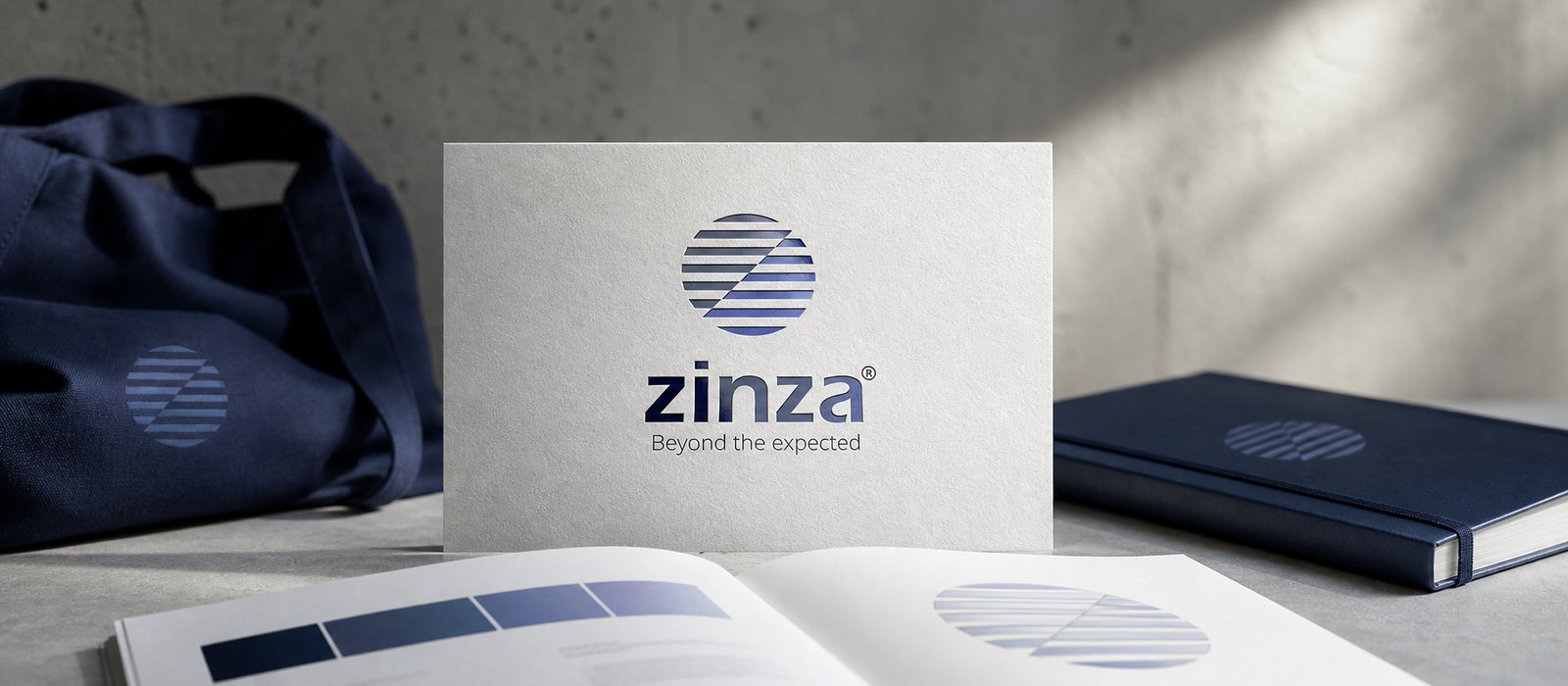
From the positioning line, we built the symbol. A circle filled with evenly spaced horizontal lines, suggesting a horizon, the familiar level of expectation everyone recognises. Then a diagonal Z cuts across it, through those horizontal lines, as ZINZA rising above the usual threshold. The mark reads as the brand's promise made visible.
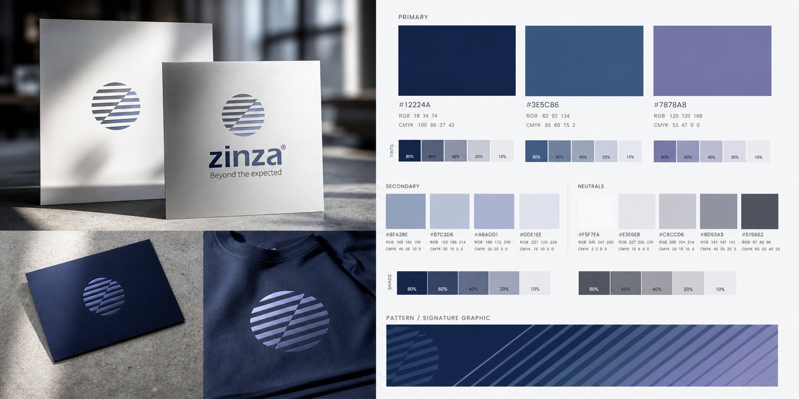
A gradient from deep navy to steel blue to silver brings the depth of technology and a sense of trust. Around the symbol, we built the full identity system with a modern rounded typeface and a flexible set of applications. That is where an identity system differs from a logo: it is a set of signals that lets people recognise ZINZA at once, whether on a website or in a document sent to a partner.

ZINZA's colour is a cool blue range: deep navy, steel blue and periwinkle silver. We chose cool tones because they speak to three things a software company needs: precision, technological depth, and a calm, unshowy confidence. A modern rounded typeface keeps the overall feel approachable rather than cold.
The colour palette and typeface were defined for consistent use on screen and on paper. These are the first building blocks of an identity system, the ones that decide how consistent ZINZA looks at every touchpoint.
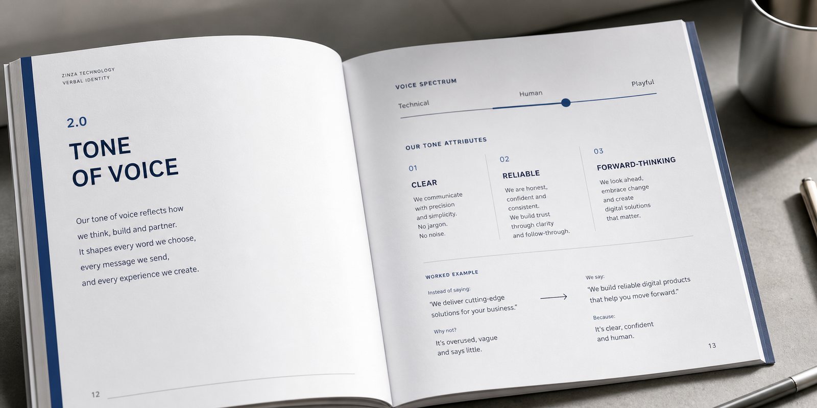
A technology brand speaks not only through image, but through words. We built ZINZA's tone of voice: precise, confident but never boastful, true to a team that lets quality speak for itself. The tone of voice guide sets out how to write on the about page, job postings, and documents sent to clients.
For a company serving the Japanese market, consistency in every sentence matters as much as in every line. A defined voice lets everyone in the company speak with one tone, and that tone carries trust.
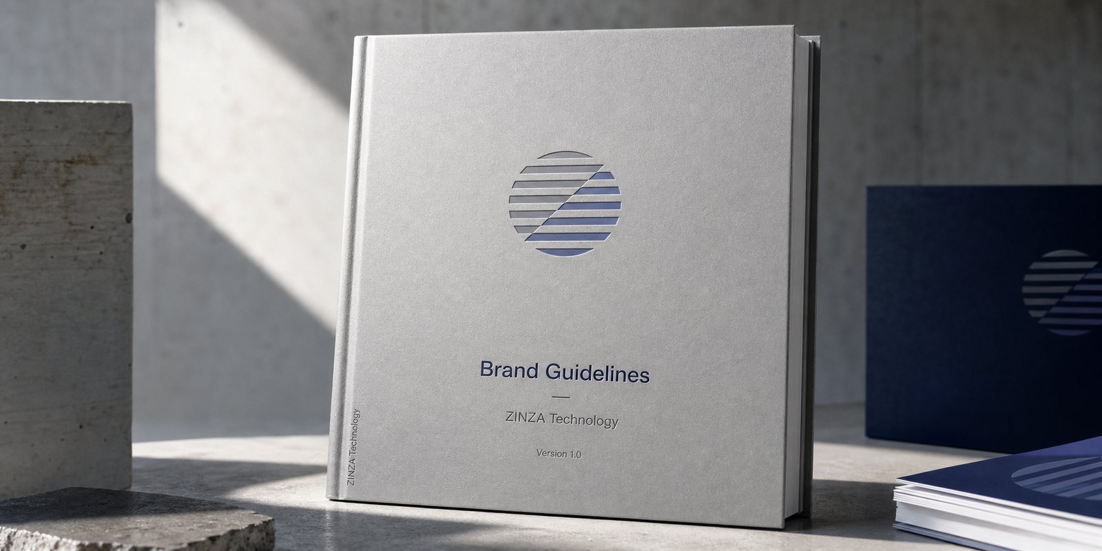
A software company touches many places: website, capability profile, office, job postings, documents sent to partners. To keep the horizon symbol and the Z standing correctly everywhere, we wrote the brand guidelines: how the logo is placed, how far the blue extends, how type and space breathe.
The guidelines keep consistency from depending on any one person's memory. Whoever is on the design team, whether printed on an office sign or a document page, ZINZA remains one face. That is the condition for a fast growing technology brand to keep its care intact.
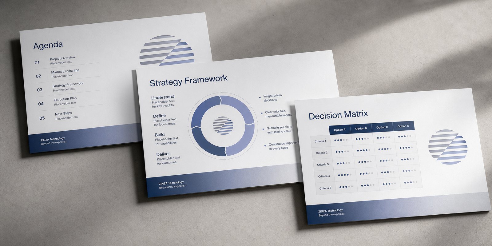
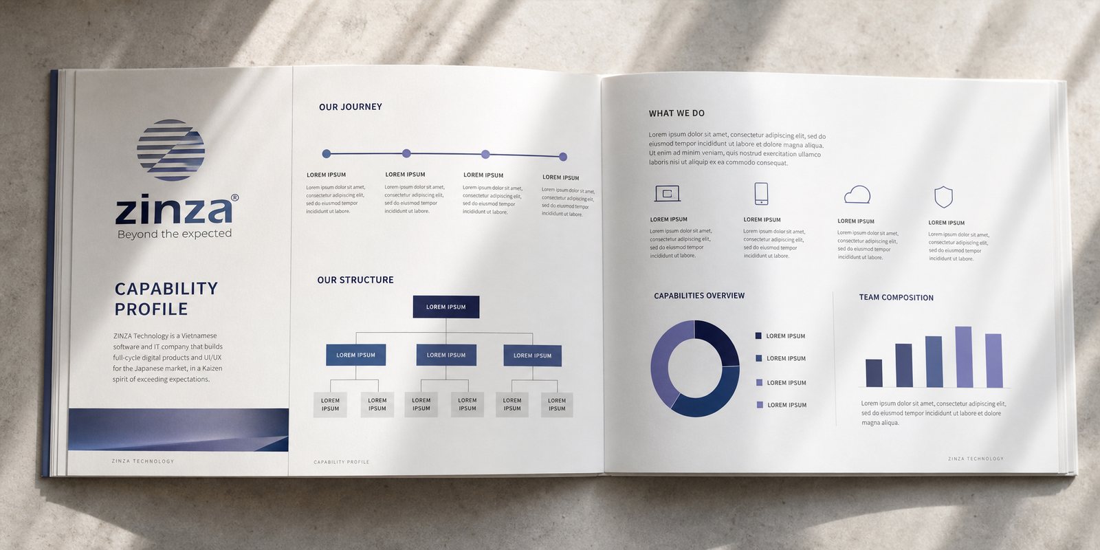
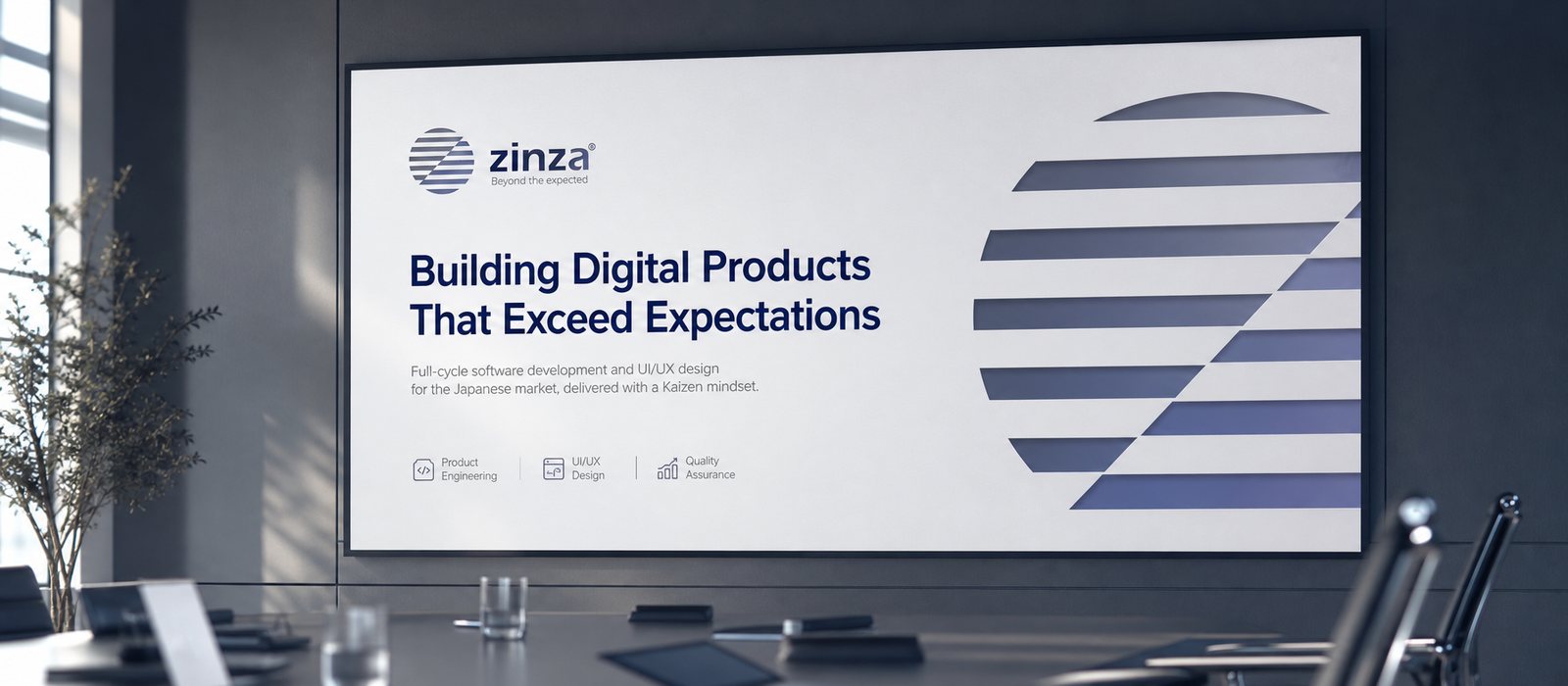
ZINZA sells its capability to demanding clients, so its corporate document is a key touchpoint. We built the corporate document, a carefully composed capability profile for ZINZA to present its team, process and value to partners at home and abroad.
For a technology company, the care put into this document is the first proof of the quality behind it. A handsome, coherent profile lets the promise to go beyond expectation be believed from the very first meeting.
The process
Positioning the promise
Working with ZINZA to clarify Beyond the expected, settling on the going beyond expectation line in the spirit of Kaizen.
Building the symbol
A horizontal-line horizon and a Z rising above it, a precise, trustworthy steel blue range.
Setting the system and voice
Colour palette, typeface, tone of voice and brand guidelines.
Documents and office rollout
Corporate documents, stationery, signage, an application library for every touchpoint.
Result
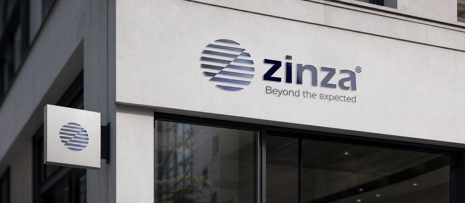
What ZINZA gained was not a logo, but a face that lives everywhere: on the website, in the document sent to partners, on the sign at the office. The horizon symbol and the Z, in a steel blue range, hold precision and trust consistent throughout, true to the spirit of a software company that cares for every detail.
For a brand built on the promise Beyond the expected, a careful, quietly ambitious identity system is the first proof of that promise. A Z rising above the horizon turns a slogan into a mark people see and believe.
A precise face everywhere
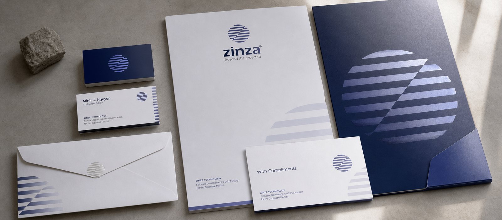
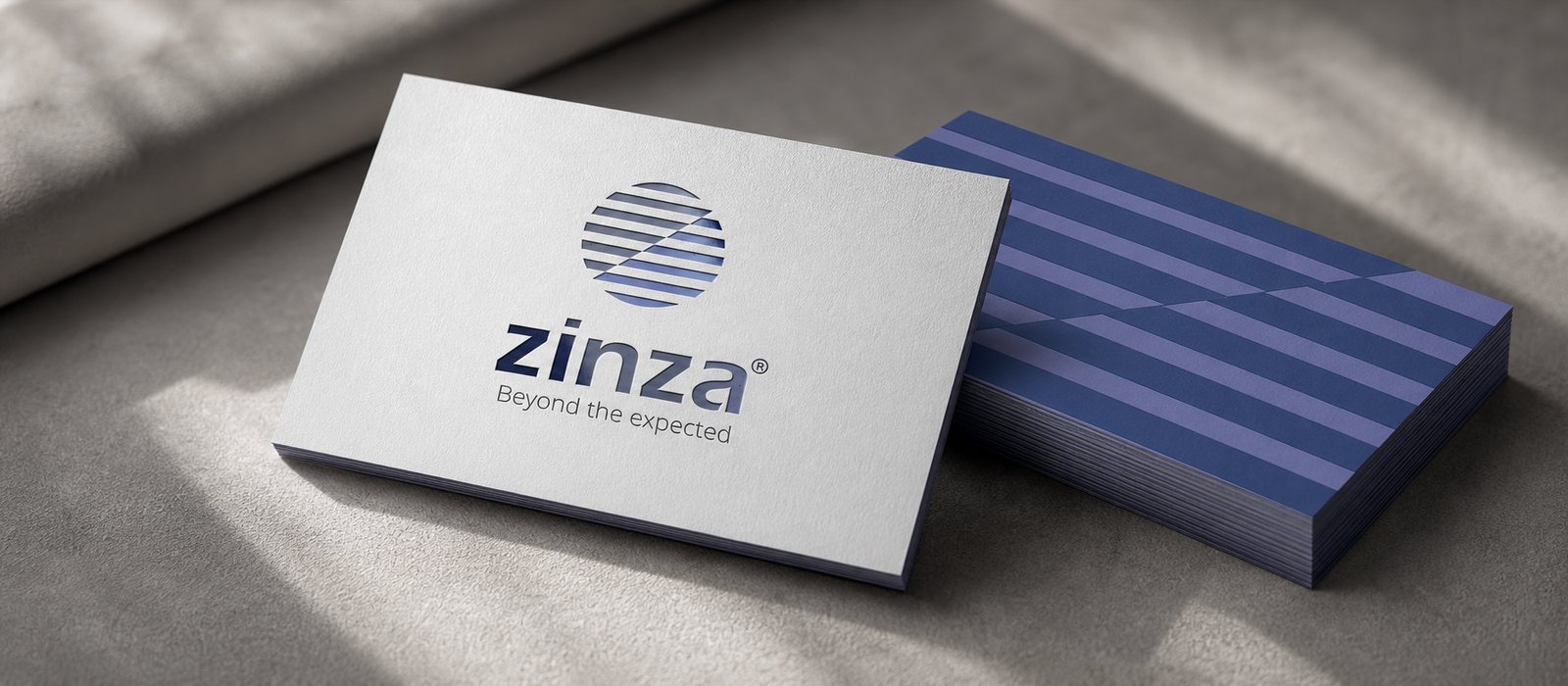
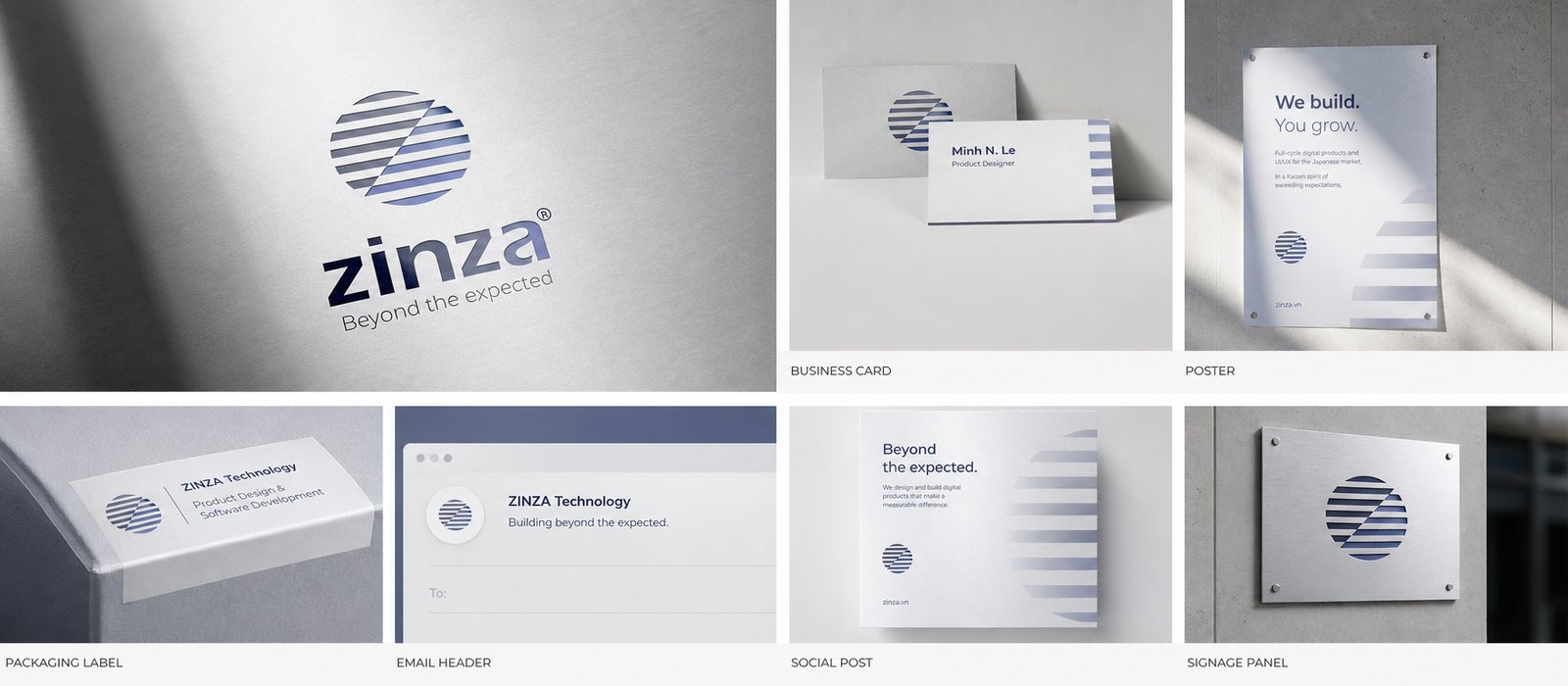
From stationery, name cards, office signage to the application library and capability profile, one consistent symbol stands correctly across every touchpoint.
Office stationery
Name card
Office signage
Application library
Capability profile
Is your challenge like ZINZA?
Tell Sinh Vũ what is on your mind about your brand. Sinh Vũ will point you to the right direction right away.