
MOG, three circles, meeting in one shared mark
MOG operates across many mobile internet sectors and needed a corporate-scale identity foundation. Sinh Vũ built a shared mark wide enough for its member companies to still build brands of their own.
The problem
In August 2015, after four years of operation, mWork renamed itself MOG to expand its reach and influence. The new brand repositioned the company from a digital content unit into an internet company delivering products and services to mobile users, spanning five main areas: online advertising, payments and e-wallets, mobile utilities, entertainment and retail connectivity.
Leadership set a hard problem. The MOG logo had to carry three messages at once: connection, formality, professionalism. And more than that, it could not just be a logo. It had to be a corporate-scale identity foundation, wide enough and systematic enough for member companies to grow brands of their own while still belonging to one house.
How it was done
Faced with a large brief, we did not start drawing. Sinh Vũ mobilised three design teams and spent two months studying the identity models of large technology corporations worldwide, places where a parent brand has to cover many different business lines while staying consistent.
From there, we built the full picture: not a single logo, but a corporate-scale identity system. This foundation was calculated to be wide enough for MOG's member companies to later grow their own brands while staying within one shared language.
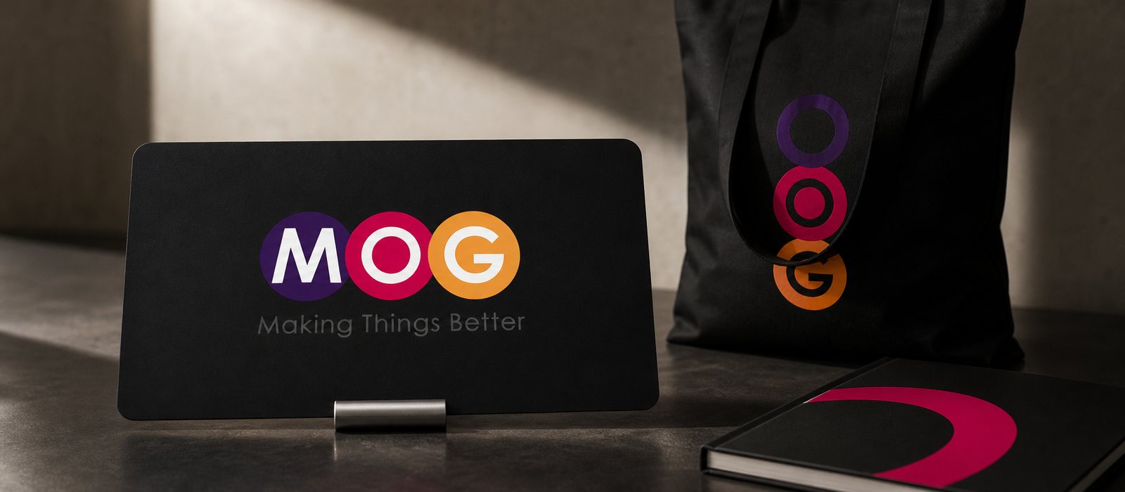
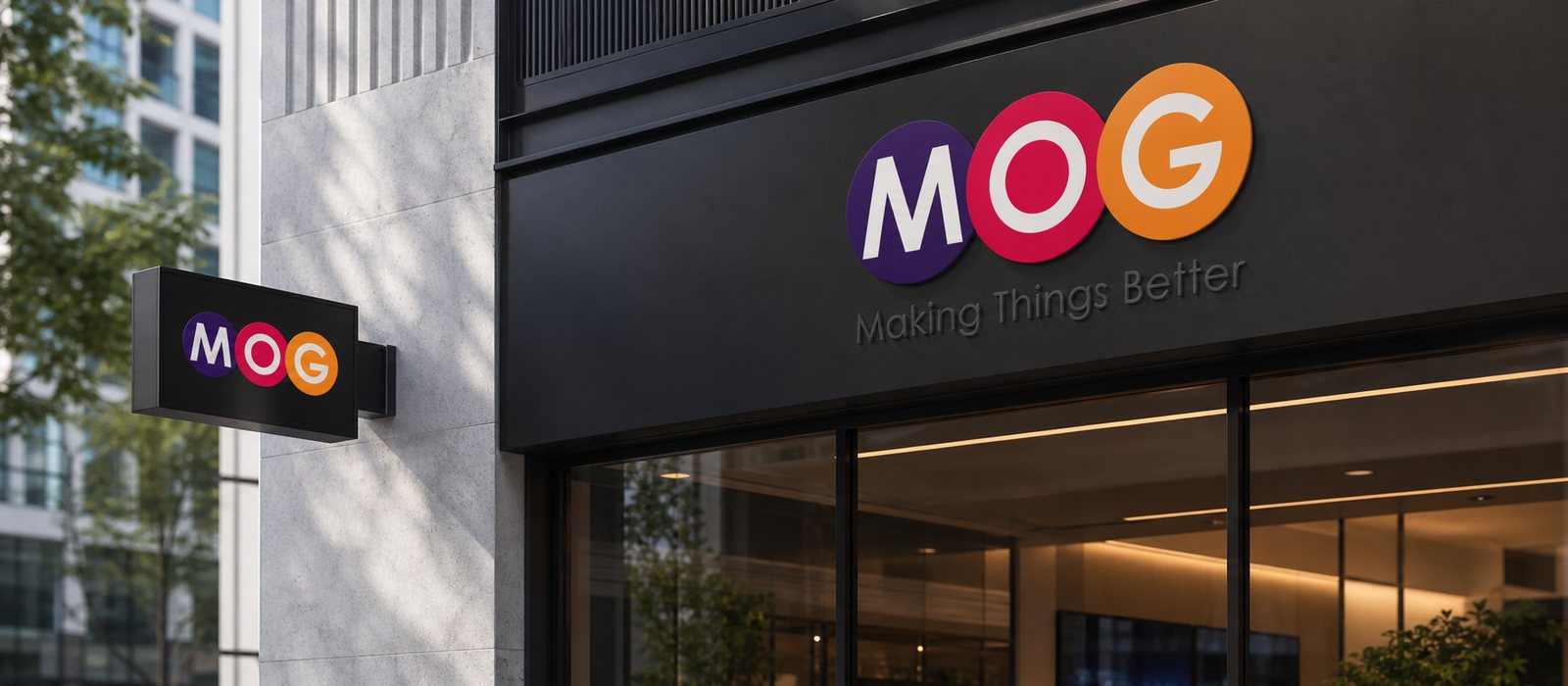
The three messages, connection, formality, professionalism, meet in a single mark. The three letters M, O, G each sit inside their own coloured circle: M in deep purple, O in pink red, G in warm orange. The three circles sit close together, each a different colour, suggesting many different sectors belonging to one house.
The firm letterforms speak to formality and professionalism, while the three coloured circles speak to diversity and connection: each business line its own colour, all coming together in one complete mark. Around the symbol, we built the full identity system with a colour palette and flexible usage rules, so the spirit of connection repeats at every touchpoint.
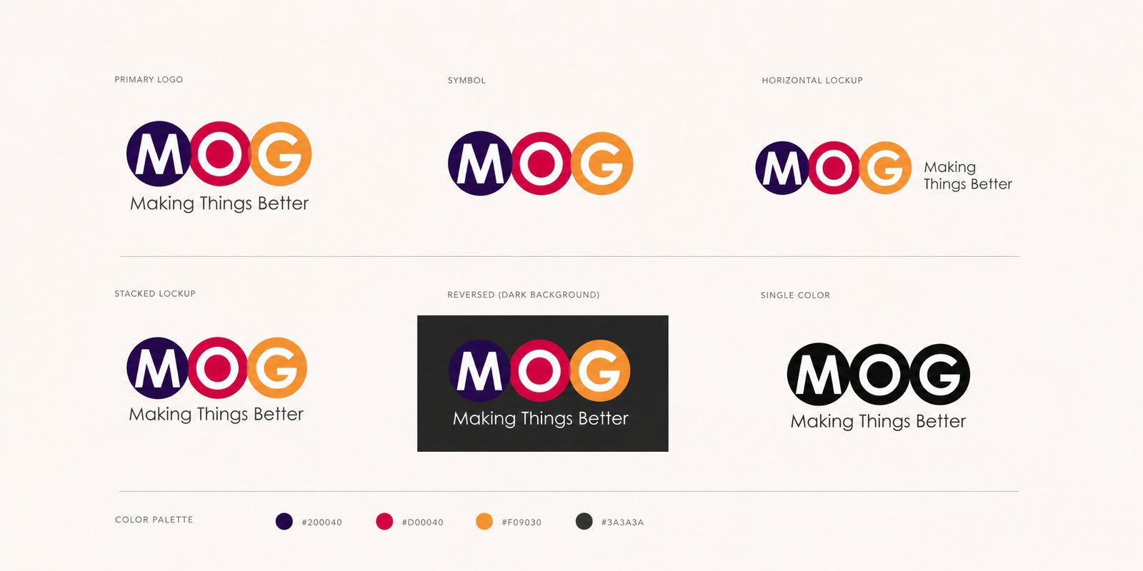
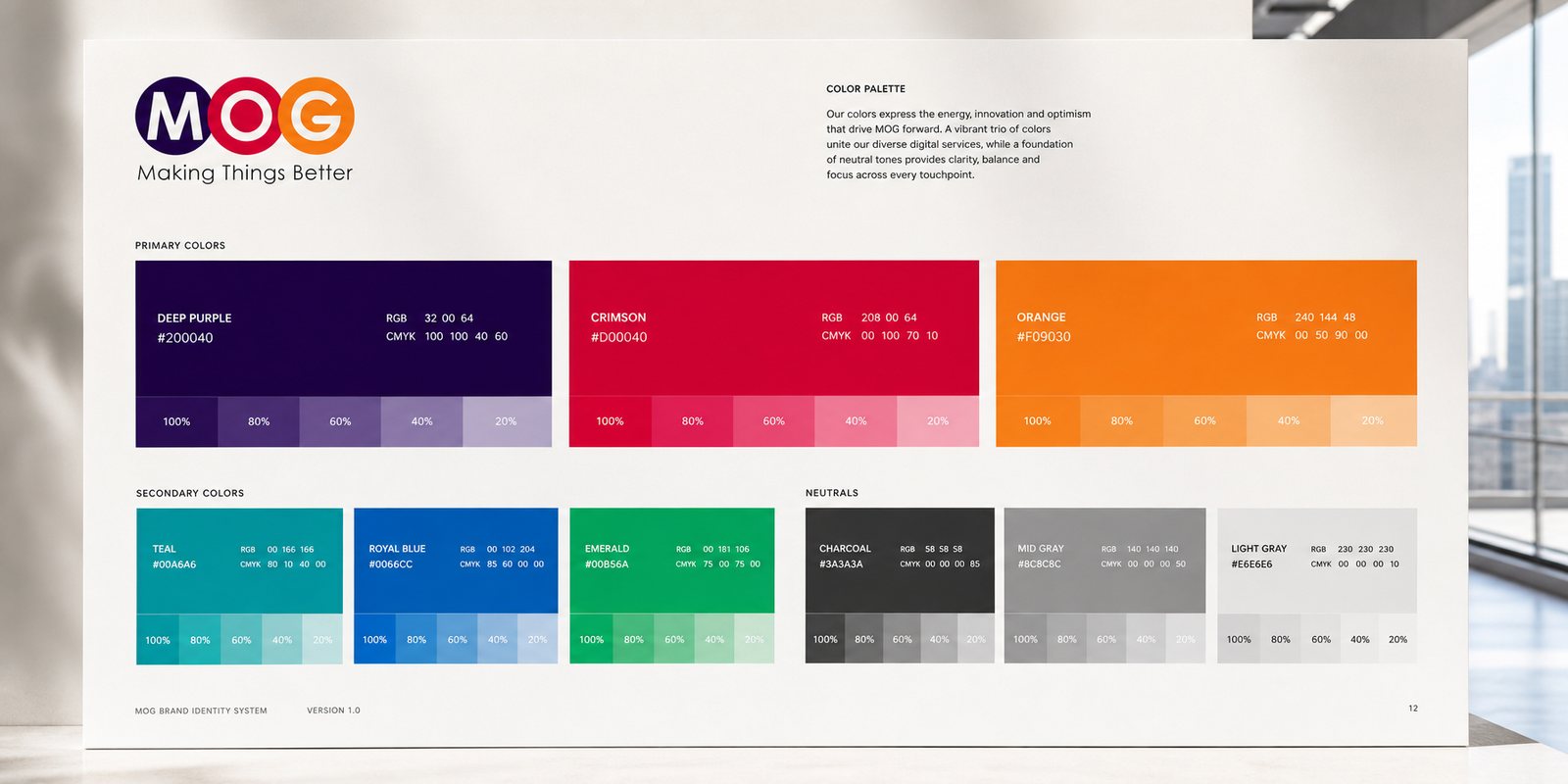
For a parent brand to cover many member companies, the identity system has to be wide without being diluted. We set a multicoloured palette, a typeface and rules for using the circles, all as a toolkit that different business lines could each draw on while staying of one piece.
This is where a system differs from a logo: it is a foundation to build on, not a fixed image. So when MOG opens a new sector or a new member company, the new brand already has a language to inherit.
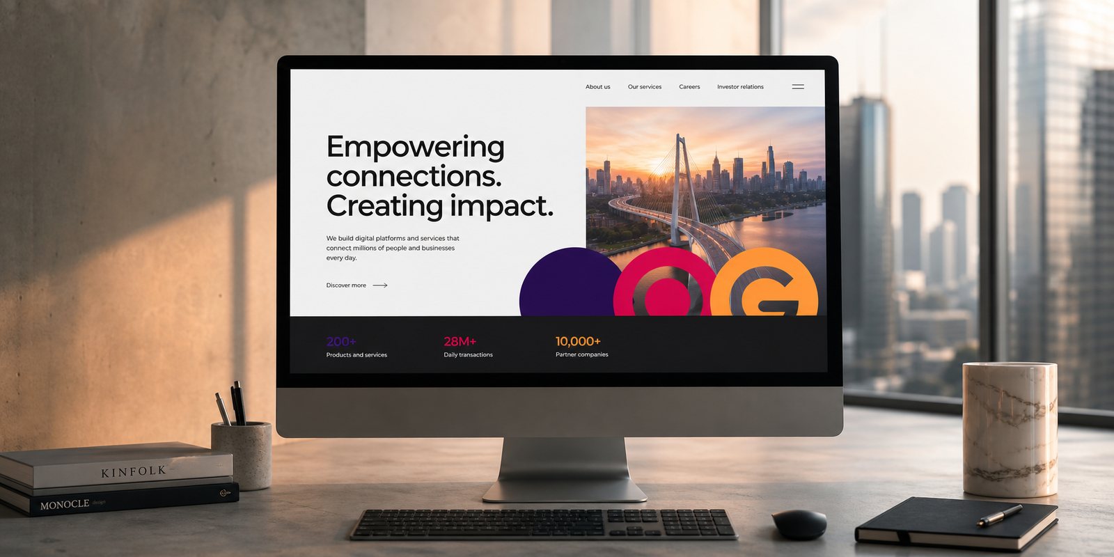
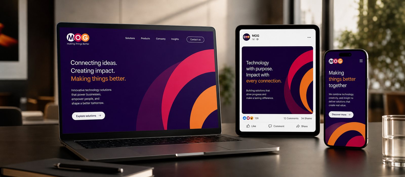
As a mobile internet company, MOG lives mostly on screens. We brought the identity system onto the website, so the corporation's homepage could present the whole multi-sector picture in a way that is orderly and professional, true to the spirit of a technology company.
A digital interface consistent with the identity helps MOG show up polished at the first touchpoint clients and partners encounter. The three coloured circles look as good on screen as they do on paper.
A multi-sector brand needs to speak to many different audiences. We built a campaign imagery system, a set of image and layout frameworks so MOG could communicate for each business line while keeping one shared face, never fragmented.
With a foundation system in place, each campaign only needs to draw from it, not build from scratch. That is the value of investing in a wide identity foundation from the start: everything afterwards runs fast while staying consistent.

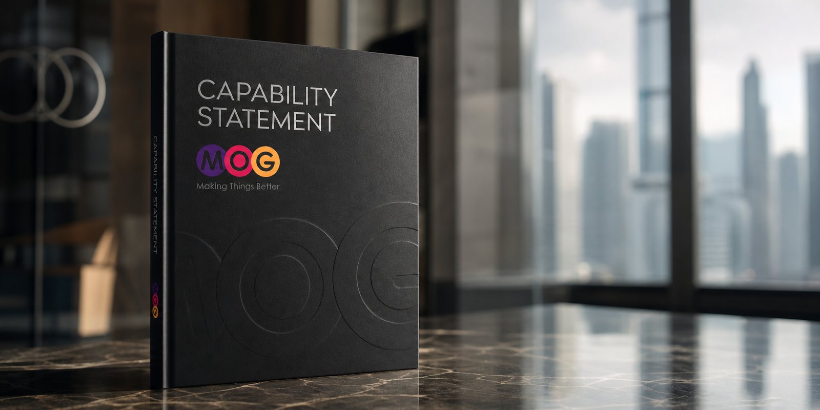
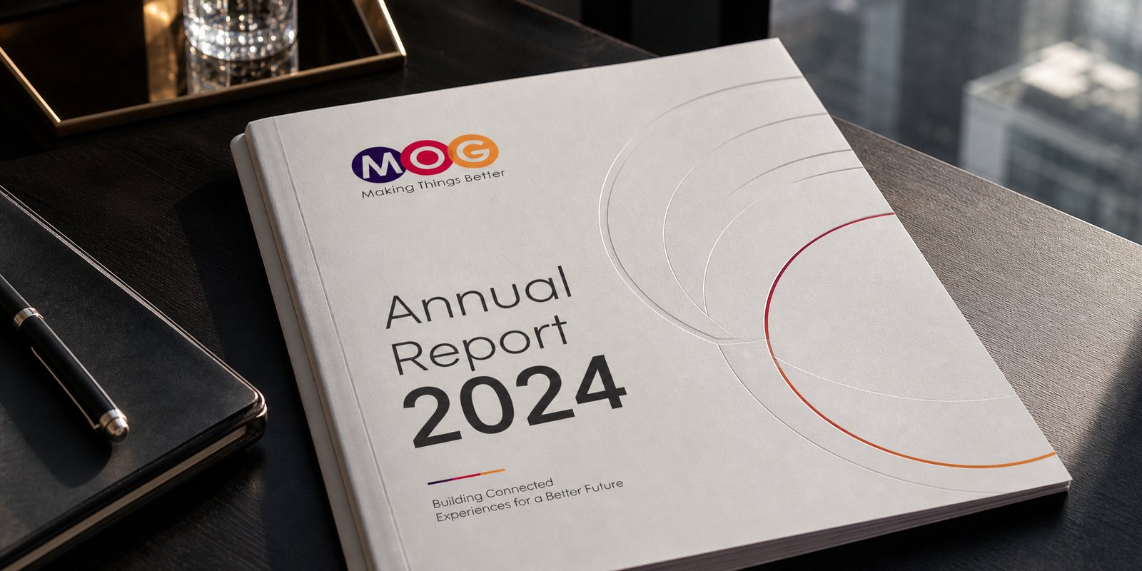
As a corporation, MOG has to present itself to many large partners. We built its corporate document set, a polished capability profile so MOG could tell the story of its whole multi-sector ecosystem coherently and with weight.
For an ambitious technology company, the polish of the document set is the first proof of the formality and professionalism behind it. A well-made profile helps a large model earn trust from the very first meeting.
Process
Research and positioning
Three design teams, two months studying the models of large technology corporations, settling on three messages: connection, formality, professionalism.
Building the mark and system
Three multicoloured circles for M, O, G and a diverse colour palette, forming a foundation wide enough to build on.
Going digital and into campaigns
Website, campaign imagery system and corporate documents at corporation scale.
Covering every touchpoint
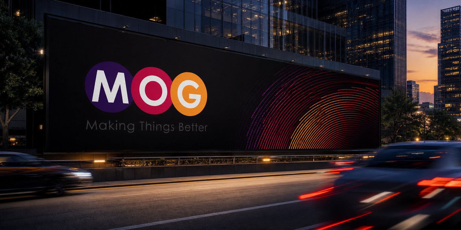
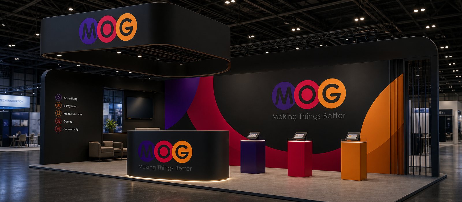
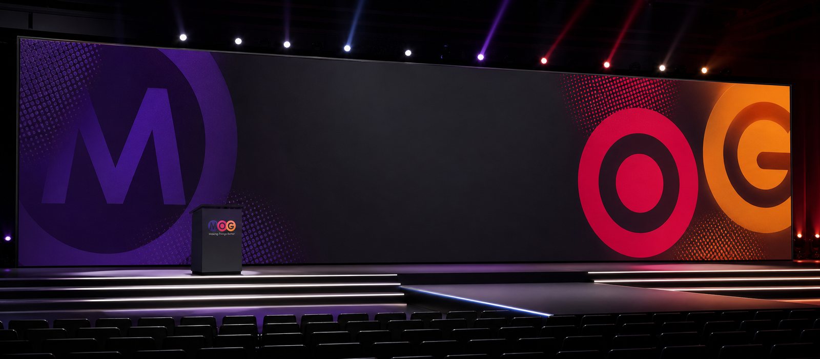
Publications, the annual report, outdoor signage, exhibition booths and event stages carried MOG everywhere.
The result
What MOG received was not a logo, but a corporate-scale identity foundation: three multicoloured circles and a system of language wide enough for its whole multi-sector ecosystem to belong to one house. From the website to the launch stage, MOG kept one face: formal, professional, connected.
For an ambitious company covering many sectors, an identity foundation calculated from the start is what lets a brand grow fast without becoming diluted. Three multicoloured circles, placed just right, turn diversity into connection.
One face, connected everywhere
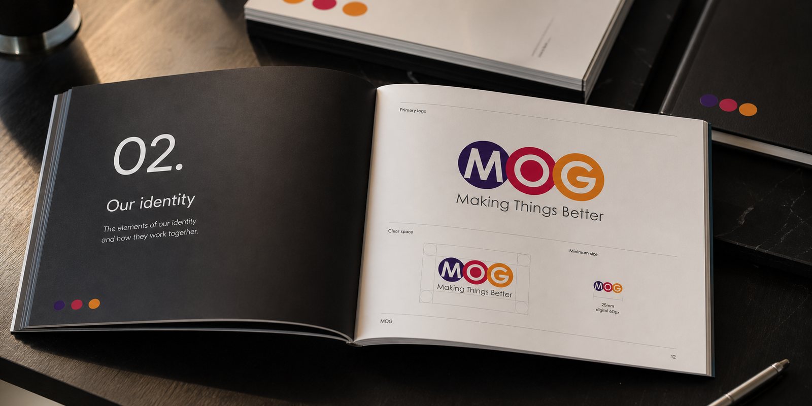
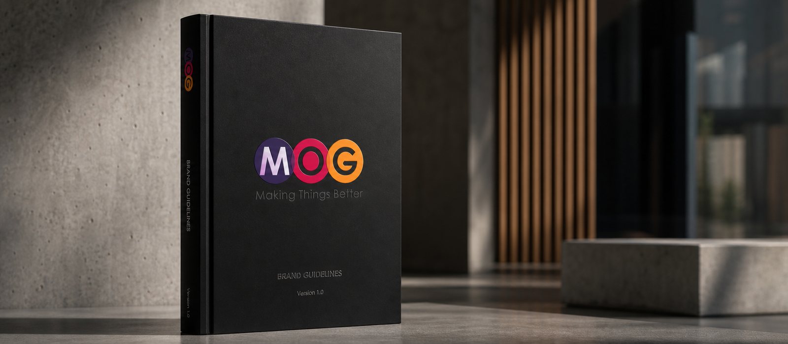
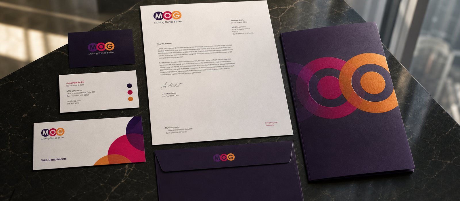
From the brand guideline book, publications and the annual report, to the digital system, outdoor signage, exhibition booths and event stages, a wide identity foundation covers every touchpoint evenly.
Brand guideline book
Office stationery
Annual report
Multi-screen digital system
Outdoor billboard
Exhibition booth
Event stage
Headquarters signage
Is your problem similar to MOG's?
Tell Sinh Vũ what's on your mind about your brand. Sinh Vũ will point you to the right direction right away.