estilo, a mark that lives on fabric
The founder of estilo left a large corporation to open a premium menswear brand, and needed a mark that held its shape whether printed, embroidered or stamped onto material.
Leaving something stable to open a name
The founder of estilo left an enviable position at a large corporation to open a premium menswear brand. A choice like that says something before the first product even exists: this is someone willing to put their own taste on the shelf, in front of buyers who have never heard of them.
In fashion, people trust the name before they try on the shirt. A new brand has no history to lean on, only a mark to be recognised by. Sinh Vũ's task was to give estilo a mark that already looked assured on opening day, so that new would not read as unready.
Holding on to one word
estilo, in the foreign language it comes from, means style. We did not treat that as a name that happened to sound nice, but as the brand's whole promise, and we held on to that exact word as the root. A narrow, true word is always easier to remember than a broad, generic pitch, because a buyer only ever holds on to one thing about a name.
That positioning became the ruler for every decision after. Every stroke, every shape, every colour choice had to answer one question: does it make the word style clearer and more believable. Anything that was only there to look good, without serving that, was cut.
A frame that holds the word
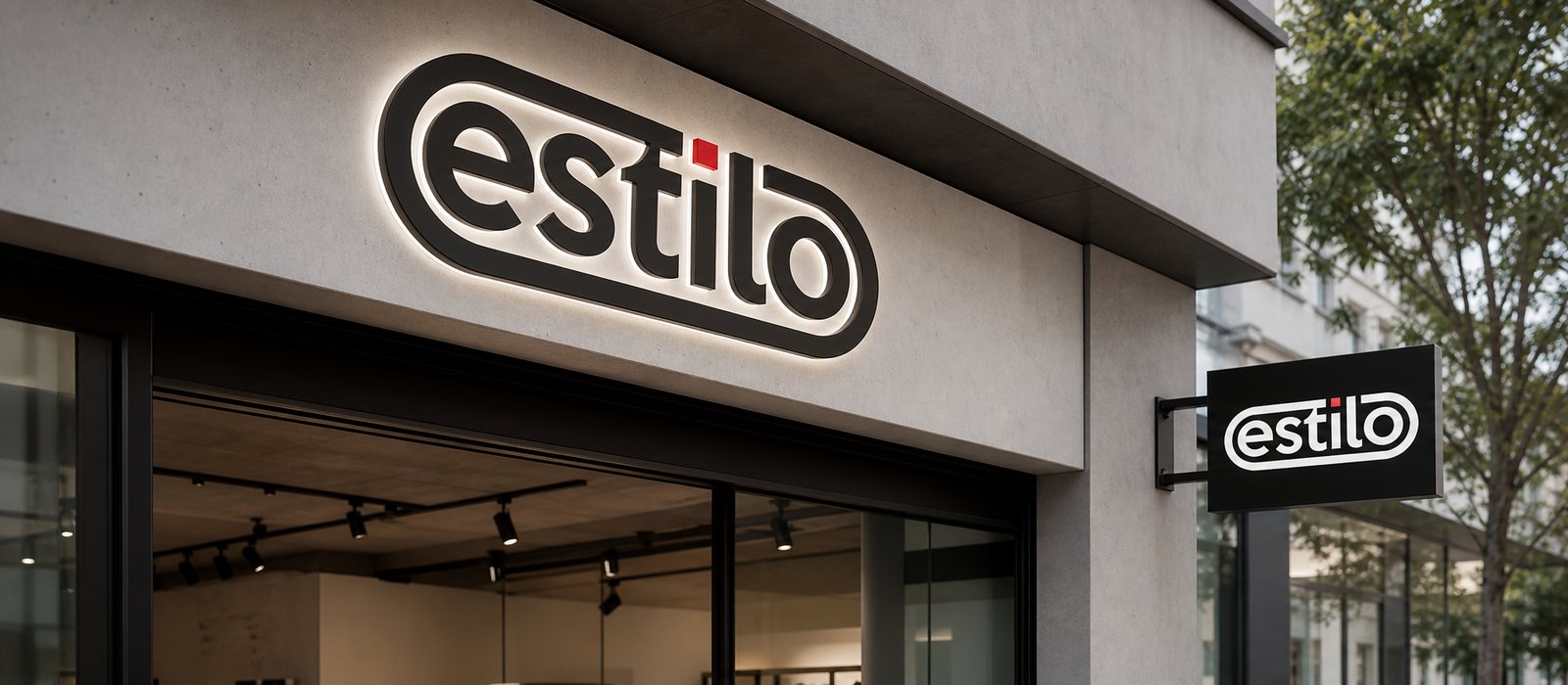
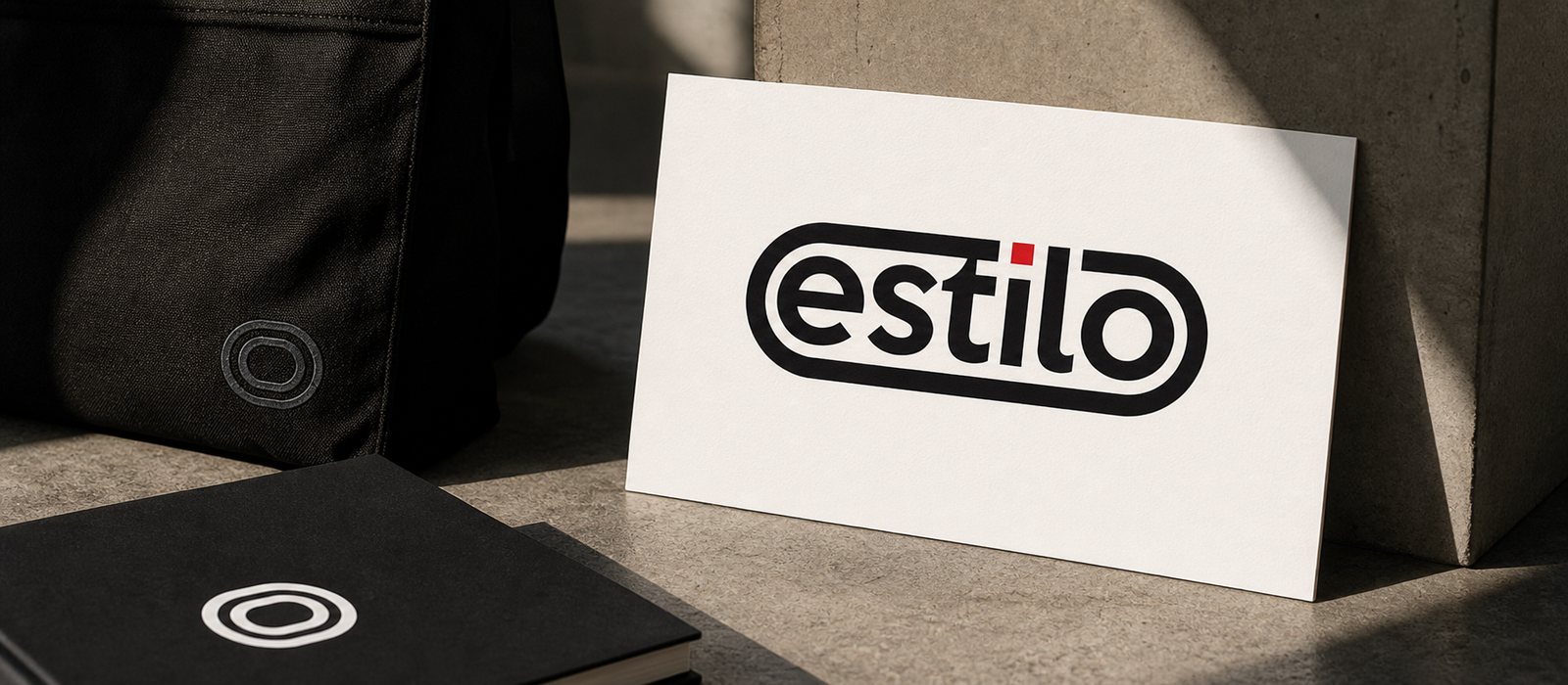
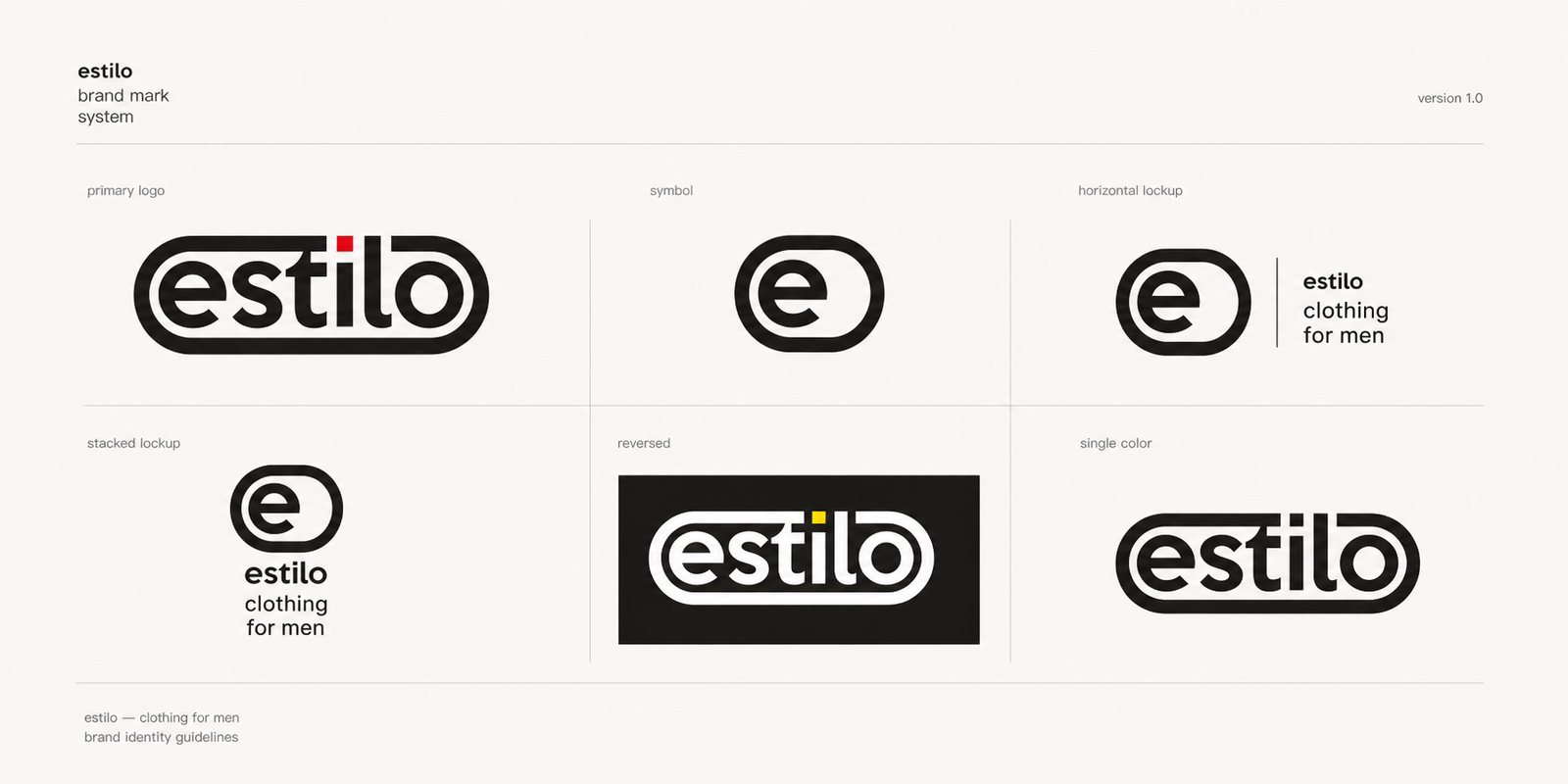
The estilo mark distills down to one simple form: the lowercase word estilo sitting inside a capsule frame rounded at both ends, closed off by a double outline. That frame does two things at once, it holds the name into a solid shape the eye catches immediately, and it gives the mark a clear edge that holds up wherever it is placed.
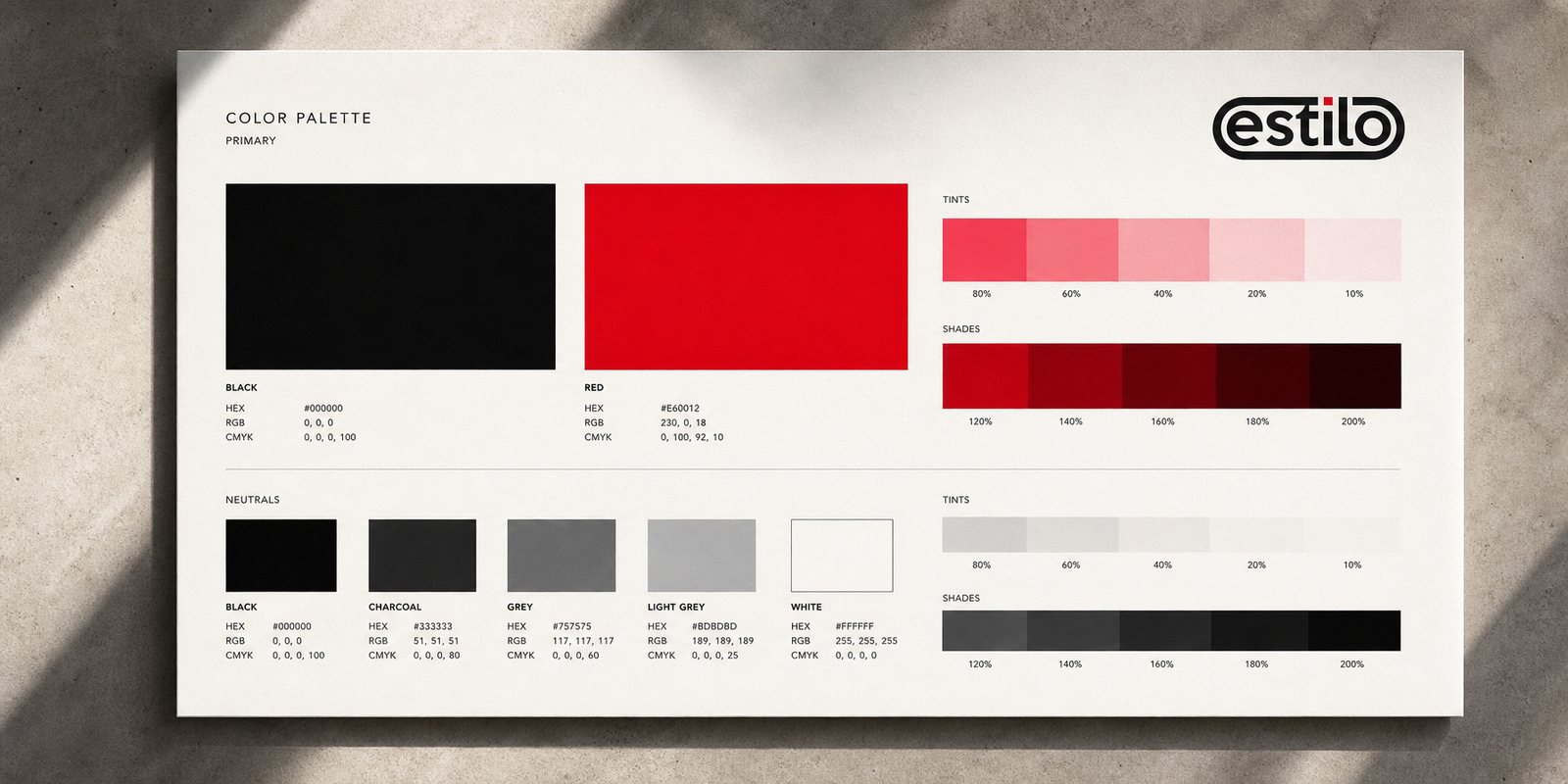
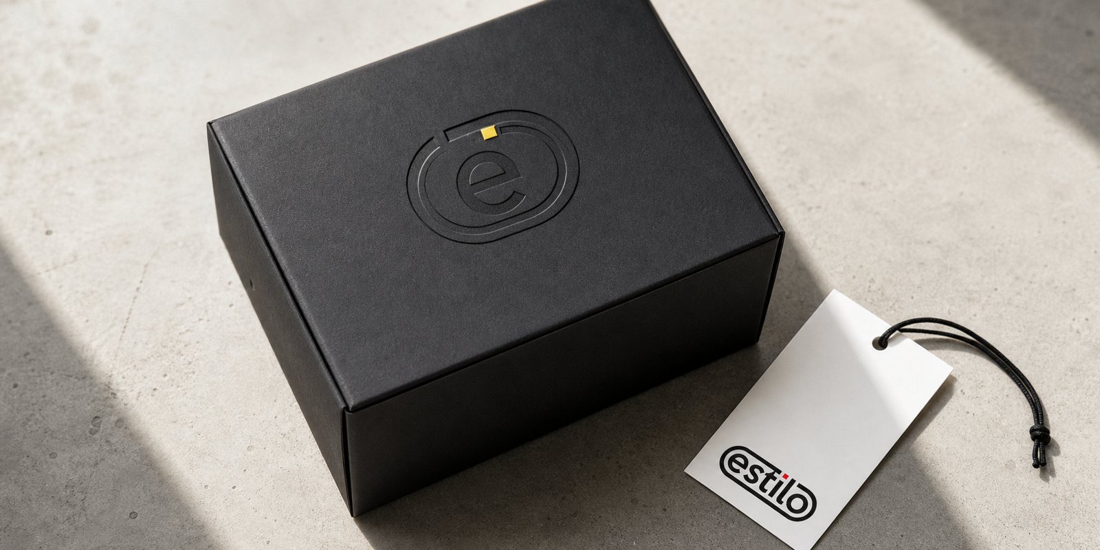
The typeface chosen is sans serif, with even strokes from start to end, so the name reads calm rather than showy, in keeping with the temperament of a mature menswear brand. The one accent is the dot on the i, a small square, marking where the eye starts and stops while letting a touch of character into an otherwise disciplined form. On light backgrounds that square is red, on dark ones it turns yellow, the same mark shifting mood.
Material is the real test
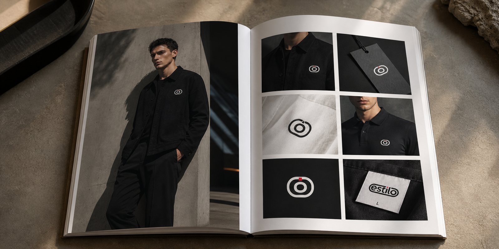
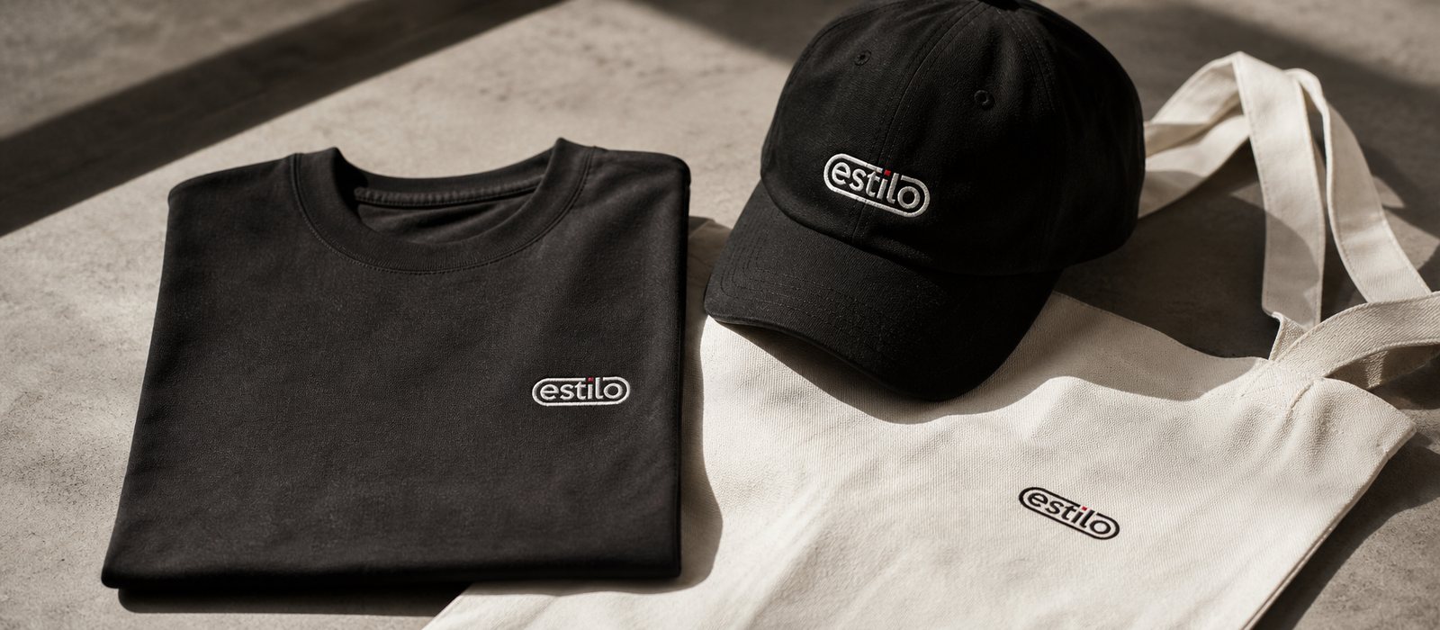
A fashion logo does not live on a screen, it lives on fabric. From the start, we designed the mark to pass the hardest test in the garment trade: the same shape has to read identically whether embroidered in thread, printed on a tag, stamped into plastic or woven into a collar label. The strokes are thick and even enough that embroidery stitches do not swallow the detail, the frame is closed so a stamping die keeps the whole outline, and the black and white contrast is strong enough that even the smallest tag stays legible.
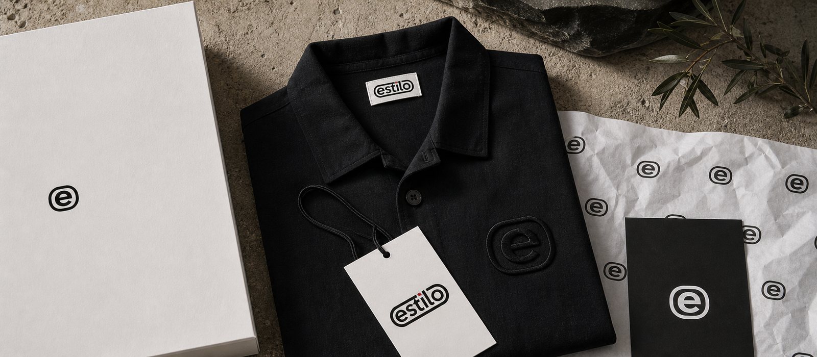
Because we planned for that, estilo never has to redraw the mark each time the material changes. The woven collar label, the embroidered mark on the chest, the paper hang tag on the sleeve and the print on the shopping bag are all one mark, only the production method changes. That is the difference between a logo made to be looked at and a mark made to be worn.
Working together, handing over an open system
We settled the positioning first, then built the form, reviewing every move together with the founder in shared working sessions so the name matched the person standing behind it. That approach kept the brand from chasing a passing trend, and instead held to a clear point of view that could last, which a premium brand cannot do without.
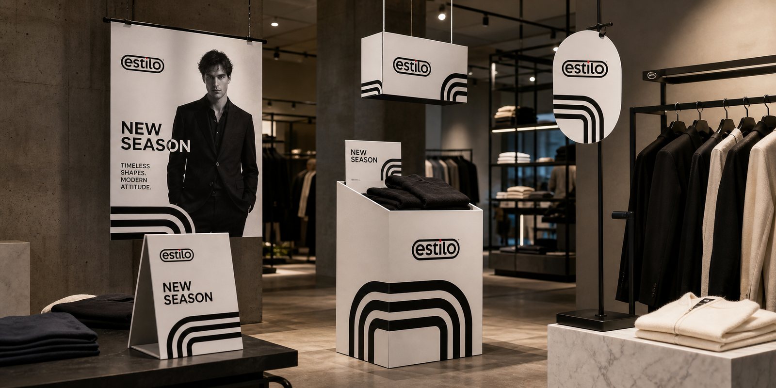
What was handed over at the end was not a few pretty images to admire, but an open system built to last: the mark and its variants, colour standards and placement across each material, a photography direction and an in-store display approach, so estilo could launch new product lines on its own without rebuilding the brand from scratch.
Value
What estilo received was not a logo file, but a mark that holds up where it has to live, on the garment and in a buyer's memory. In an industry where every name tries hard to look young and loud, estilo has a form that stays calm and solid, wearable across every material and every season. With each new collection, the brand does not start over, it simply places a mark people already recognise. That is the difference between hiring a design job and owning a brand asset that lasts for years.
One mark, many touchpoints
A mark only earns trust when it stays itself across everything the brand touches: from woven labels and hang tags to lookbooks, storefronts and printed materials.