
Phú Quý wraps a thousand years of flavor around a pack of instant noodles
Food Hanoi's Phú Quý noodle line was repositioned by Sinh Vũ around its Thăng Long roots, then built into a packaging system able to hold its ground on the shelf.
The problem
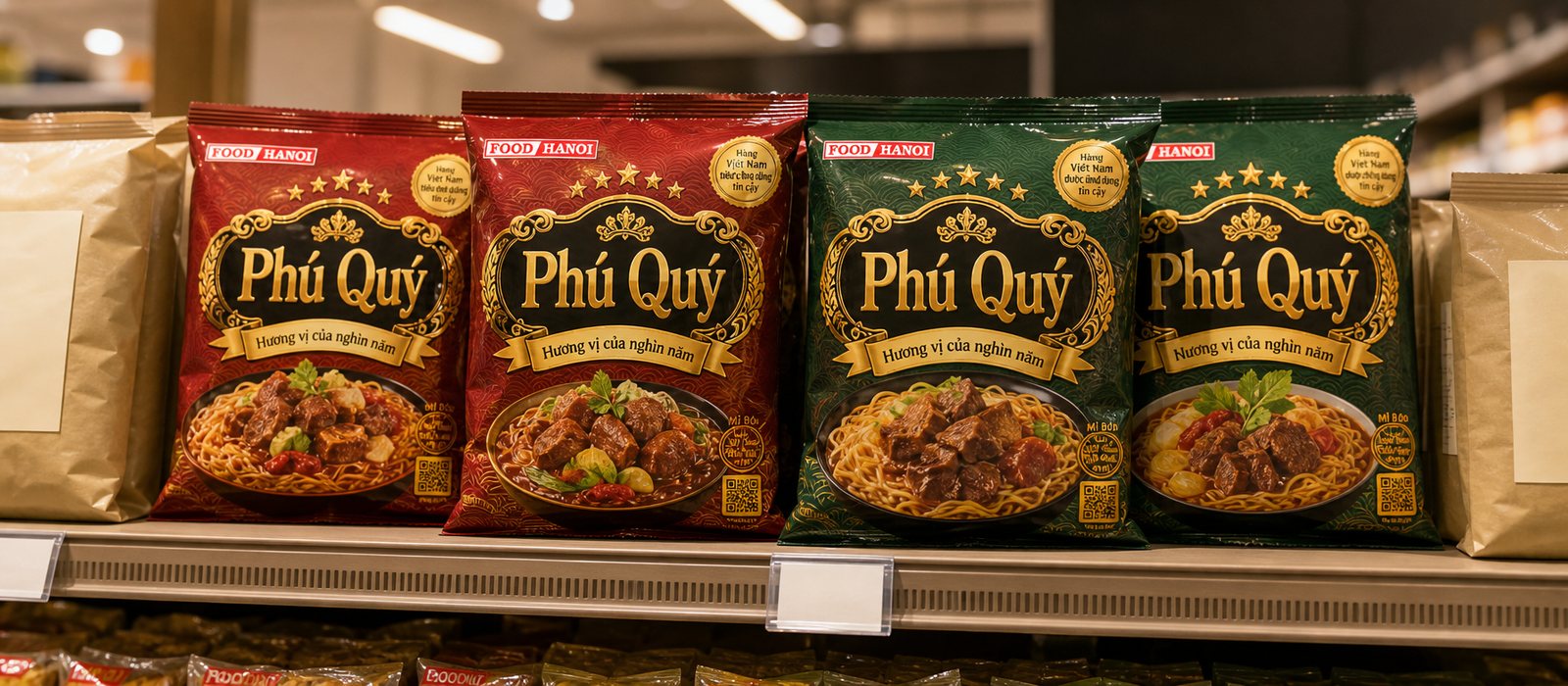
Instant noodles are the most crowded, unforgiving aisle in the supermarket. Dozens of brands compete on the same meter of shelf, at nearly the same price, and a shopper's eyes rest for less than three seconds. A noodle pack from a state-owned enterprise, however genuine its quality, is easily read as ordinary if its outer coat says nothing distinct.
Food Hanoi, part of the Vietnam Northern Food Corporation, holds something most competitors do not: depth of history. The task, then, was not to make a prettier noodle pack, but to find the whole product line a place to stand that people would trust on sight, and to translate that place into a coat that could actually sell.
The approach
Before drawing anything, we went looking for the story only Food Hanoi could tell honestly. Not cheaper, not spicier, but origin: a food enterprise tied to Hanoi, to the culinary thread of Thăng Long. That place to stand was folded into a name and a line: Phú Quý, the flavor of a thousand years.
A positioning line only earns its keep when it commands every choice that follows. A thousand years means the packaging has to be refined yet old, formal rather than loud, meaning gold-and-lacquer tones and imperial-court motifs in place of the usual budget-noodle design language. From here, every decision on color, line and type had a reference point to answer to.
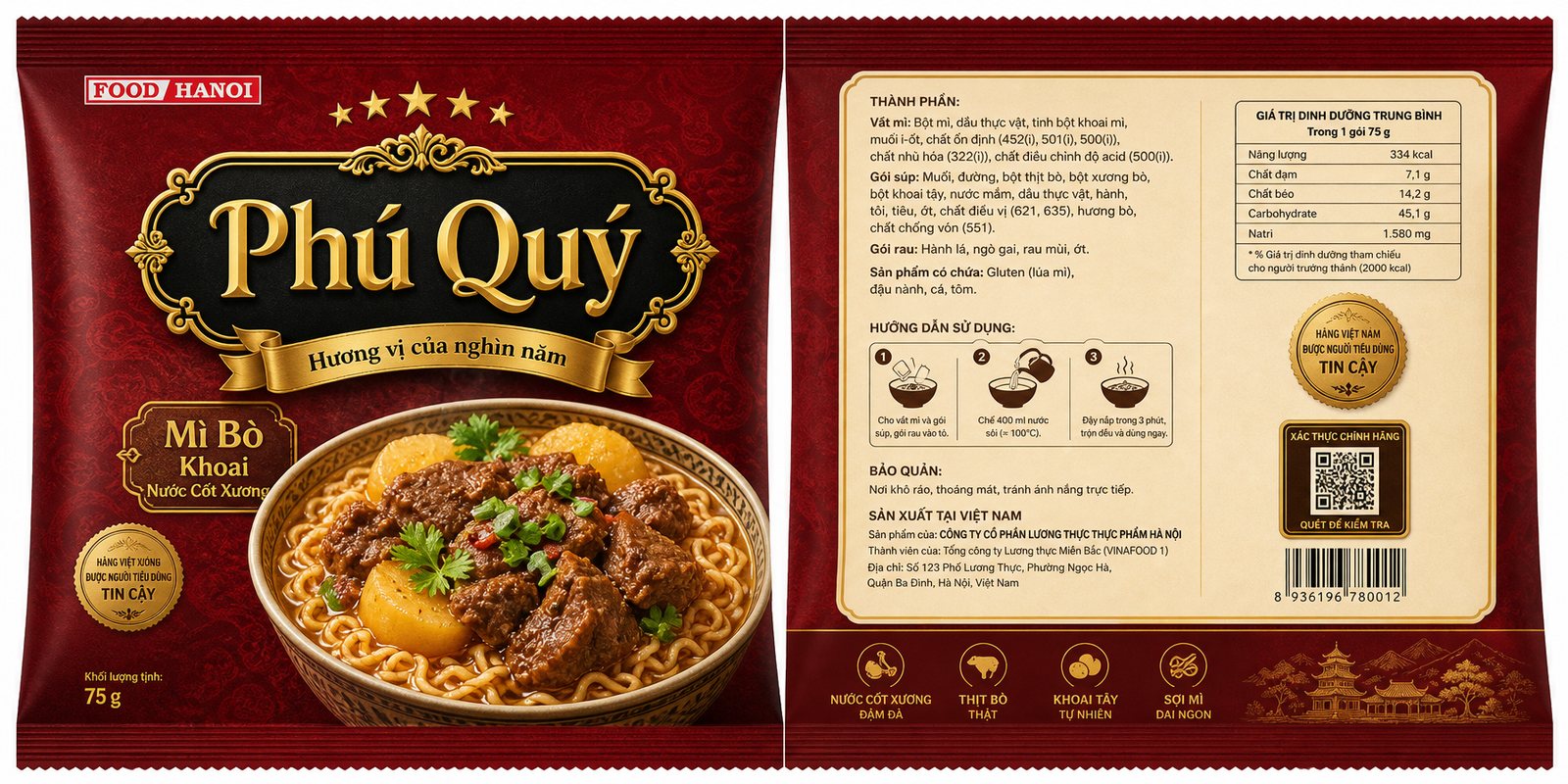
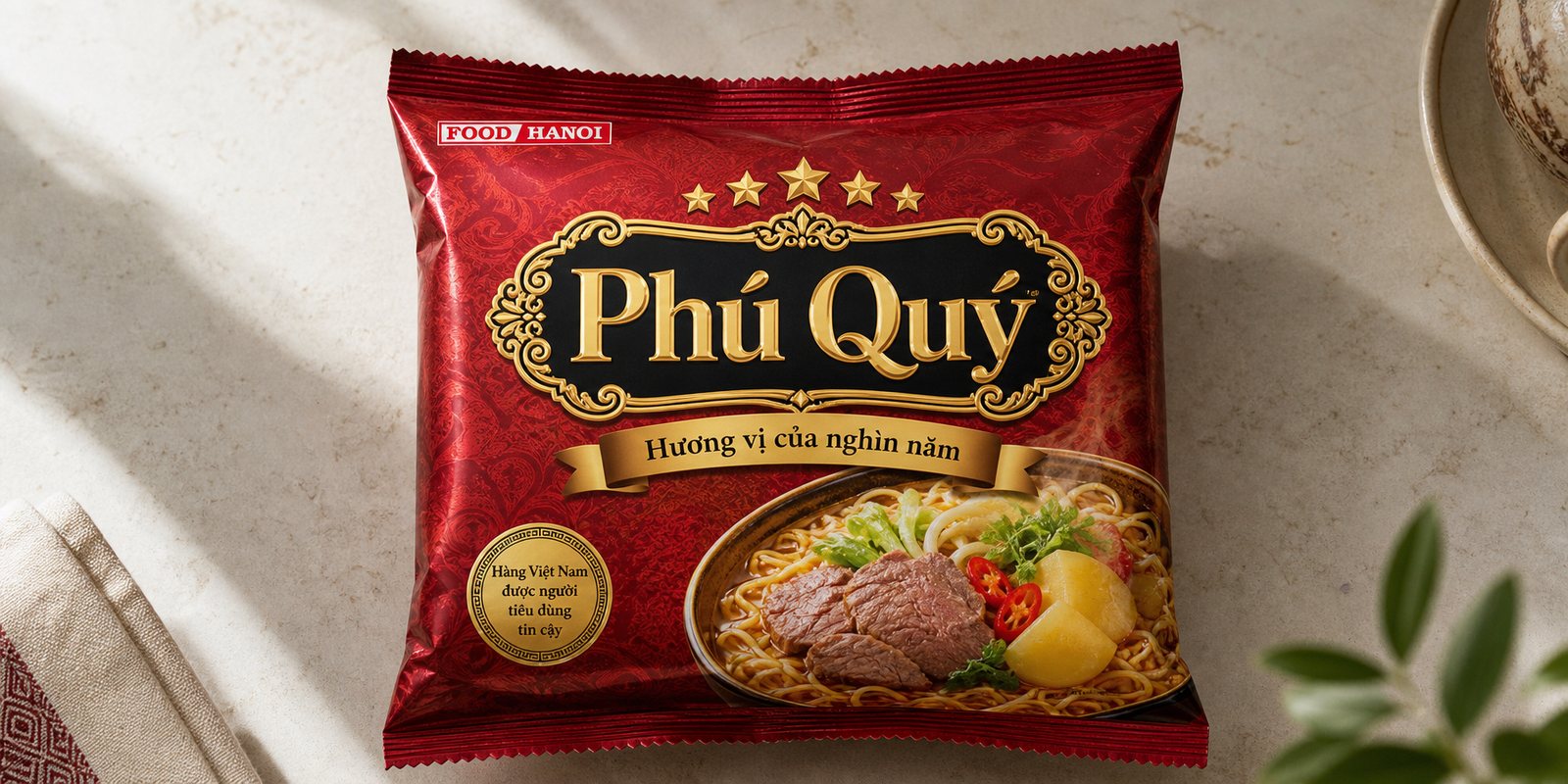
We built the face of Phú Quý around a central block: the brand name gilded in gold, set inside a lacquer-red frame with a metallic sheen, edged with motifs recalling temple and palace carving. The background splits into two zones, one in a rich, dignified tone, the other giving way to the food photography, so the shopper's eye travels the right path: status first, then appetite.
Refined does not mean hard to read. Product name, flavor and weight are ranked into a clear hierarchy for instant recognition. The trusted-Vietnamese-goods seal is kept in place as a quiet pledge. The coat had to look good held close in the hand, and still hold its own seen from three meters down the aisle.
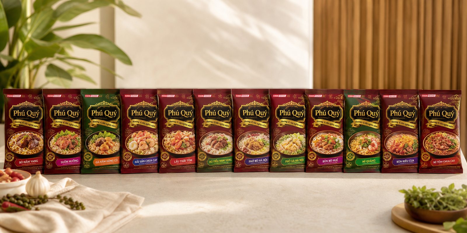
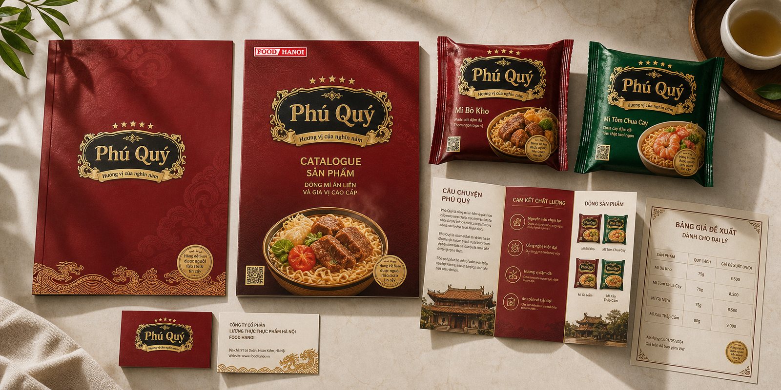
A food brand is rarely a single product. Phú Quý spans several noodle flavors, then extends into seasoning and soup powders. If each item designed itself, the whole shelf presence would splinter into disconnected pieces. We set a fixed template instead: the gold-and-lacquer name block stays constant, only the background color and food imagery change by flavor, so the whole line reads as one family.
The approach pays off twice over. On the shelf, many packs sharing one face merge into a larger, harder-to-ignore brand mass than any single pack alone. For the manufacturer, every new product is just a variation within an existing system, shipped quickly and consistently, with no need to redesign from scratch each time a flavor is added.
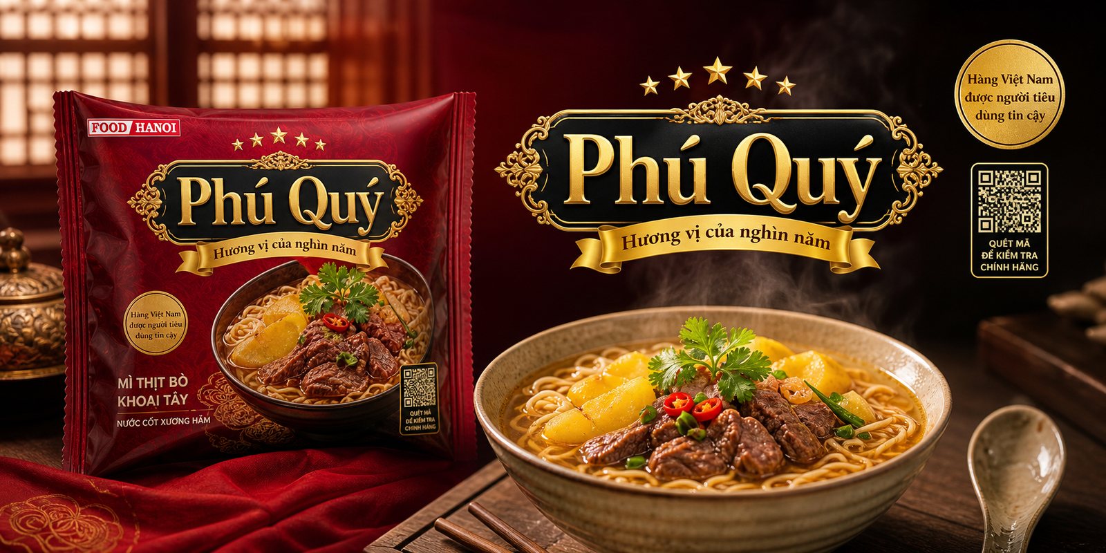
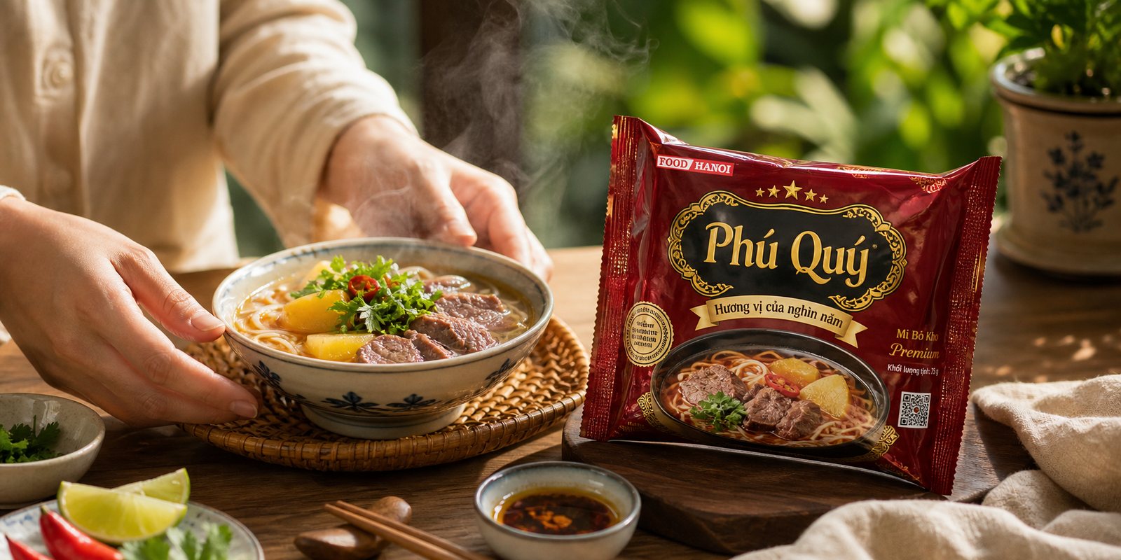
With food, the photograph is the greeting. We directed the imagery so the noodles, meat and herbs looked exactly as they do the moment boiling water hits them: steaming, fresh, genuine, appetizing. The photography does not stay on the packaging alone, it became a shared image bank used across shelf displays, flyers and signage, all in the same register.
Consistency from pack to point of sale is what gives a product line its weight. When a shopper meets the same face again on the shelf, on a standee, on a promotional flyer, they no longer see a single noodle pack, they see a brand showing up properly.
The result
What Food Hanoi got was not one attractive package design, but a product line with its own face and a place to stand on. From the thousand-year story to the gold-and-lacquer name block, to the whole packaging family and food photography set, everything says the same thing: this is honest Vietnamese goods, with roots, worthy of a place on a beautiful shelf.
For a product worth a few thousand đồng, a few seconds of being chosen on the shelf is everything. A coat carrying the bearing of heritage, set onto a familiar dish, helps that pack of noodles get picked up instead of scrolled past. Design, in this project, did not make the product more expensive, it made it more worth choosing.
From design file to shelf
Phú Quý noodle pack
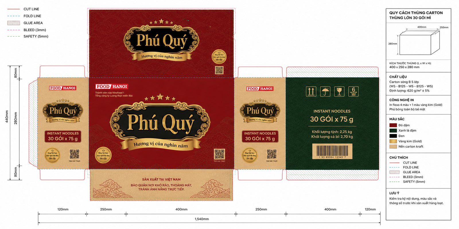
Print files and dieline
A moment of enjoying the meal
Sales collateral set
Does your challenge look like Phú Quý?
Tell Sinh Vũ what is on your mind about your product. Sinh Vũ will point you to the right direction right away.