
Shopy: online shopping, tidy and trustworthy
Shopy is Viettel's shopping network, launched when Vietnamese buyers were still wary of shopping online. Sinh Vũ designed the logo, pattern, website and print so Shopy looks tidy, clear and trustworthy enough for people to press order.
Buyers were still wary
When Shopy launched, buying online was still unfamiliar to many. People worried the goods would not match the photos, delivery would be slow, money would be lost. A shopping site had to get past that worry before talking about low prices or deals.
Shopy had the advantage of belonging to Viettel, a name Vietnamese people already knew. But it also needed a face of its own: cheerful enough to invite people in, orderly enough to make them comfortable paying. The line Mua sắm tiện lợi, convenient shopping, states that promise.
Dots that build an S
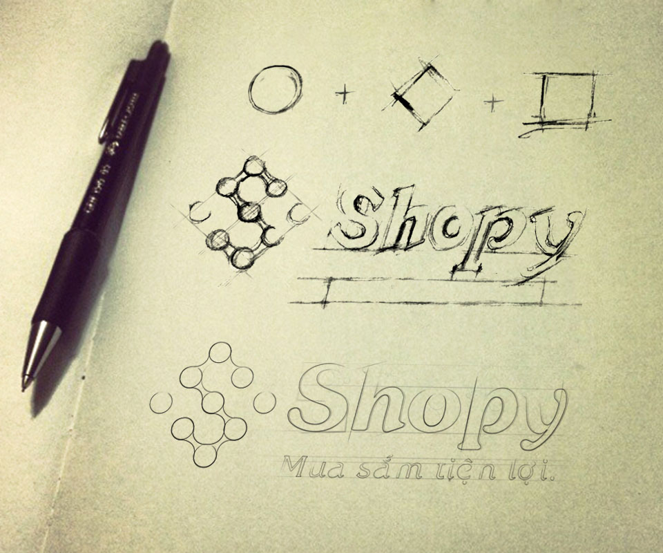
Sinh Vũ sketched from three basic shapes, circle, diamond and square, then arranged small dots into the letter S. Each dot is like an item, lined up into an orderly store. One orange dot at the head of the S is the accent, like the item a buyer has just picked.
The word Shopy is slanted with soft strokes, the y extended a little for warmth. This holds two ideas at once: the fun of shopping and the order of a business that can be trusted.
A pattern that works everywhere
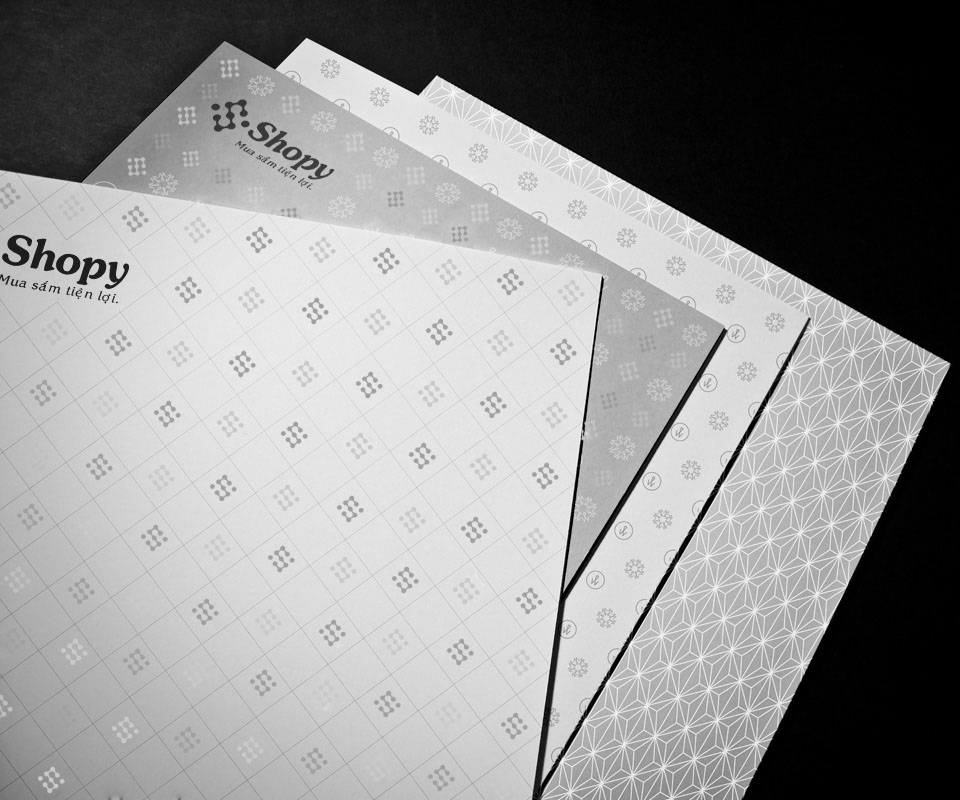
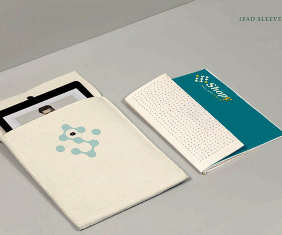
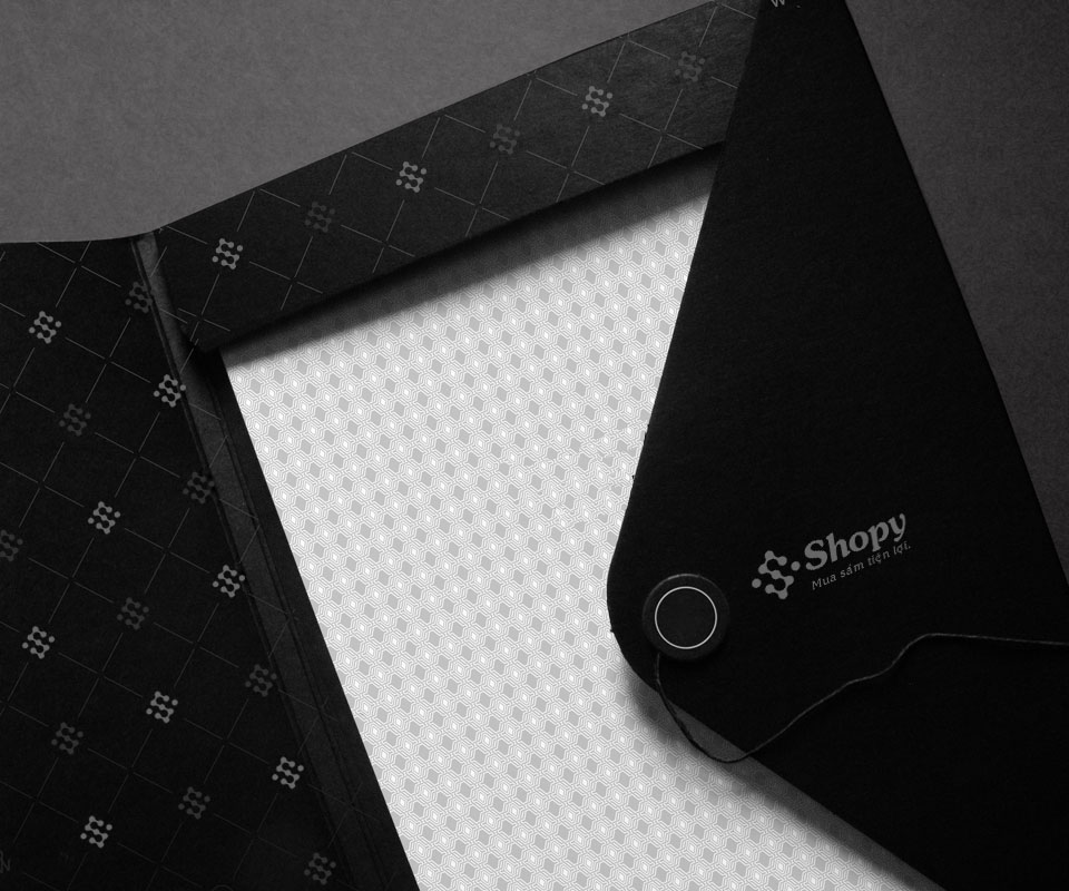
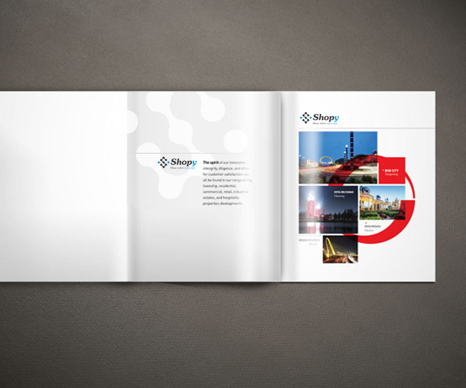
From the dots that form the S, Sinh Vũ built a fine dot-grid pattern. It is printed faintly on letterhead, folders, tablet sleeves and inside envelopes. Where the logo cannot go, the pattern alone is enough to recognise Shopy.
The palette is deep teal, charcoal and white with touches of orange and yellow. Teal feels modern and reliable, unlike the loud red of discount sites at the time, and makes Shopy look more composed.
A website laid out like a mall
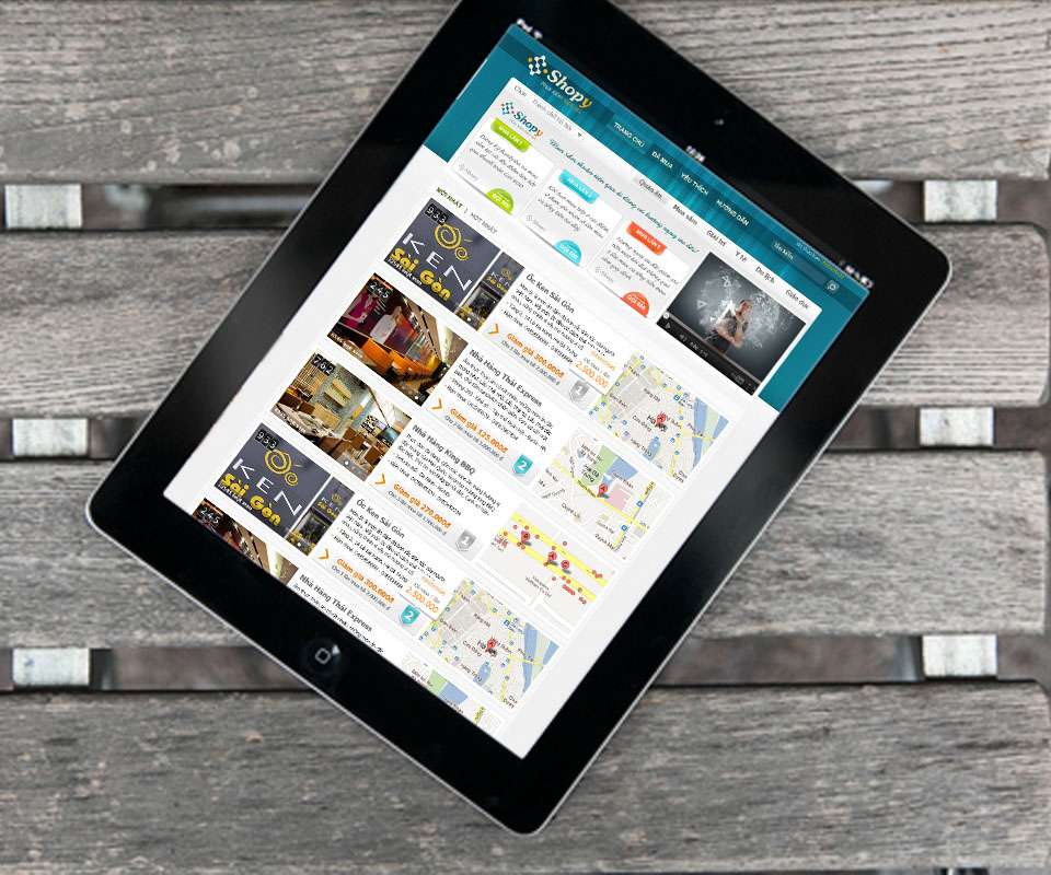
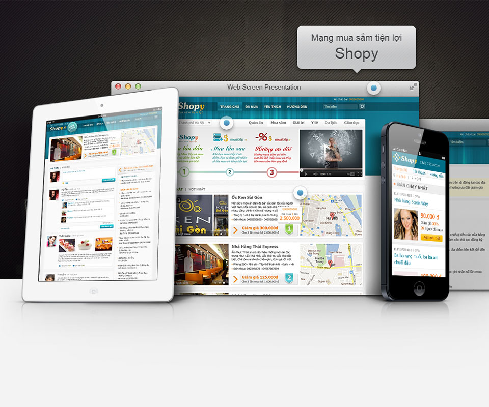
The Shopy website divides goods into clear zones: food, entertainment, travel, shopping. Each item has a large photo, a clear price and a buy button where it is easy to find. A small map showing the shop's location reassures buyers that there is a real place behind the deal.
The interface was made for desktop, tablet and phone with the same colours and the same zones. Someone who knows the site on a computer still knows where things are on a phone.
The value
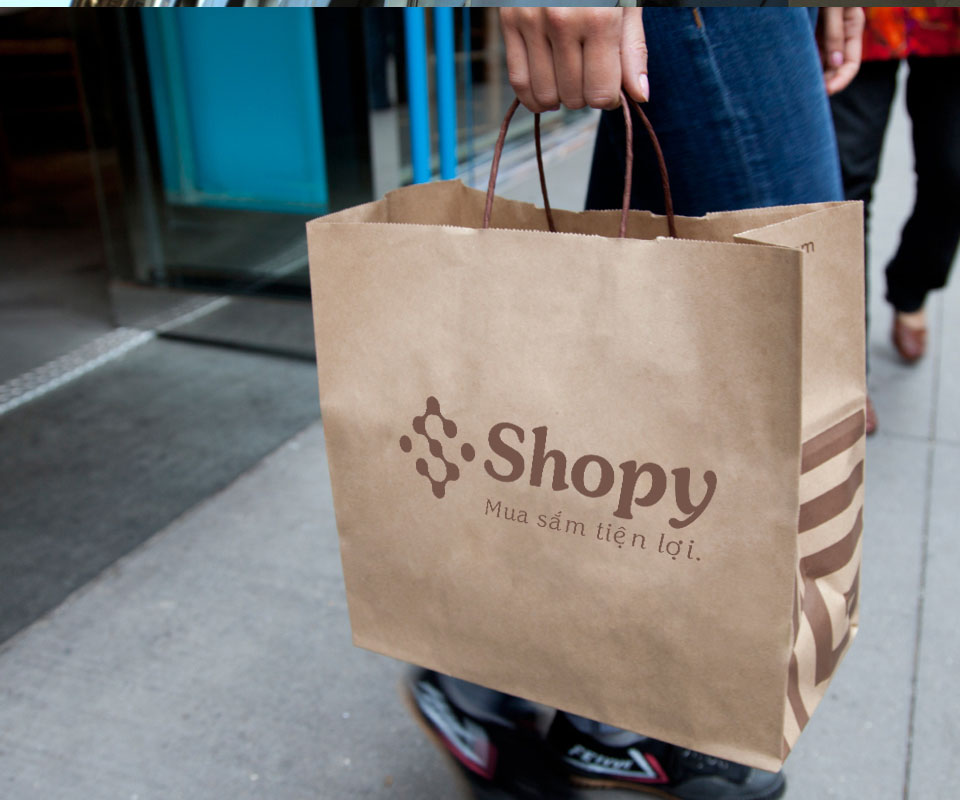
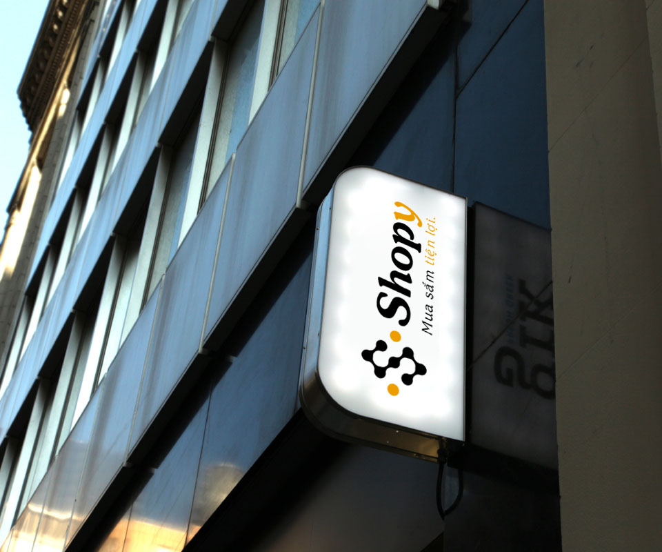
Shopy gained an image that is both cheerful and orderly, exactly what buyers needed on their first online purchase. From a lightbox sign on the street and a paper bag in hand to the site on a phone, it is the same dotted S and the same teal.
For an e-commerce site, trust comes from consistency: if it looks the same everywhere, buyers believe it is a serious business. Sinh Vũ built Shopy as that kind of system from the start.
The dotted S from street to screen
In their own words
Sinh Vũ is a reliable and attentive partner. The work was carefully researched and consistent from the logo and pattern to the website and shopping bags, making Shopy look tidy and trustworthy to first-time online shoppers.