
KOVA, a thousand touchpoints in one voice
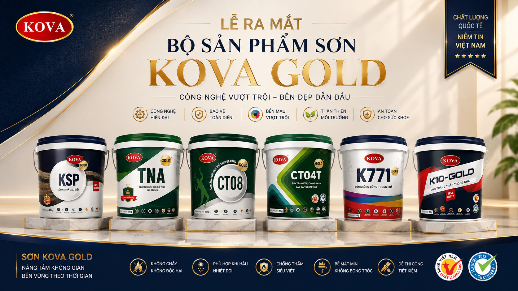
KOVA is a Vietnamese paint brand that leads on technology, sold through a network of over a thousand authorised dealers across sixty three provinces, with a range of seventeen paint lines. Sinh Vũ delivered five bodies of work so all of it comes out as one brand: audit and positioning, logo standardisation, a design system, a brand guideline, and the packaging.
The problem
KOVA sells paint for buildings that have to stand for decades. Lasting beauty over time is not an advertising line, it is the thing customers are paying for.
The brand image, though, was not lasting the same way. Over a thousand authorised dealers across sixty three provinces, each with its own local signmaker. Seventeen paint lines, each born at a different moment. The larger it grew, the more the brand thinned at the edges, furthest from head office and exactly where customers meet it most.
Five bodies of work
The first move was not to open the design software. Sinh Vũ went through every touchpoint in service: pails on dealer shelves, signs out on the street, sales collateral, signage inside the plant. The audit answered three questions: what the market remembers about KOVA, where that memory thins out, and which part must not be touched.
From there the positioning was rewritten tighter, and the brand language settled on lasting beauty over time. That line is not wall decoration, it became a measure: everything built afterwards had to survive time, including a dealer in a far province remaking their sign five years on.
With seventeen paint lines, the easiest mistake is to start with the best seller and work it out from there. Do that and the second line has to dodge the first, the third dodges both, and by the tenth there is nowhere left to dodge. So the move straight after the positioning was settled was not to open the software but to write the rules that hold for all of them.
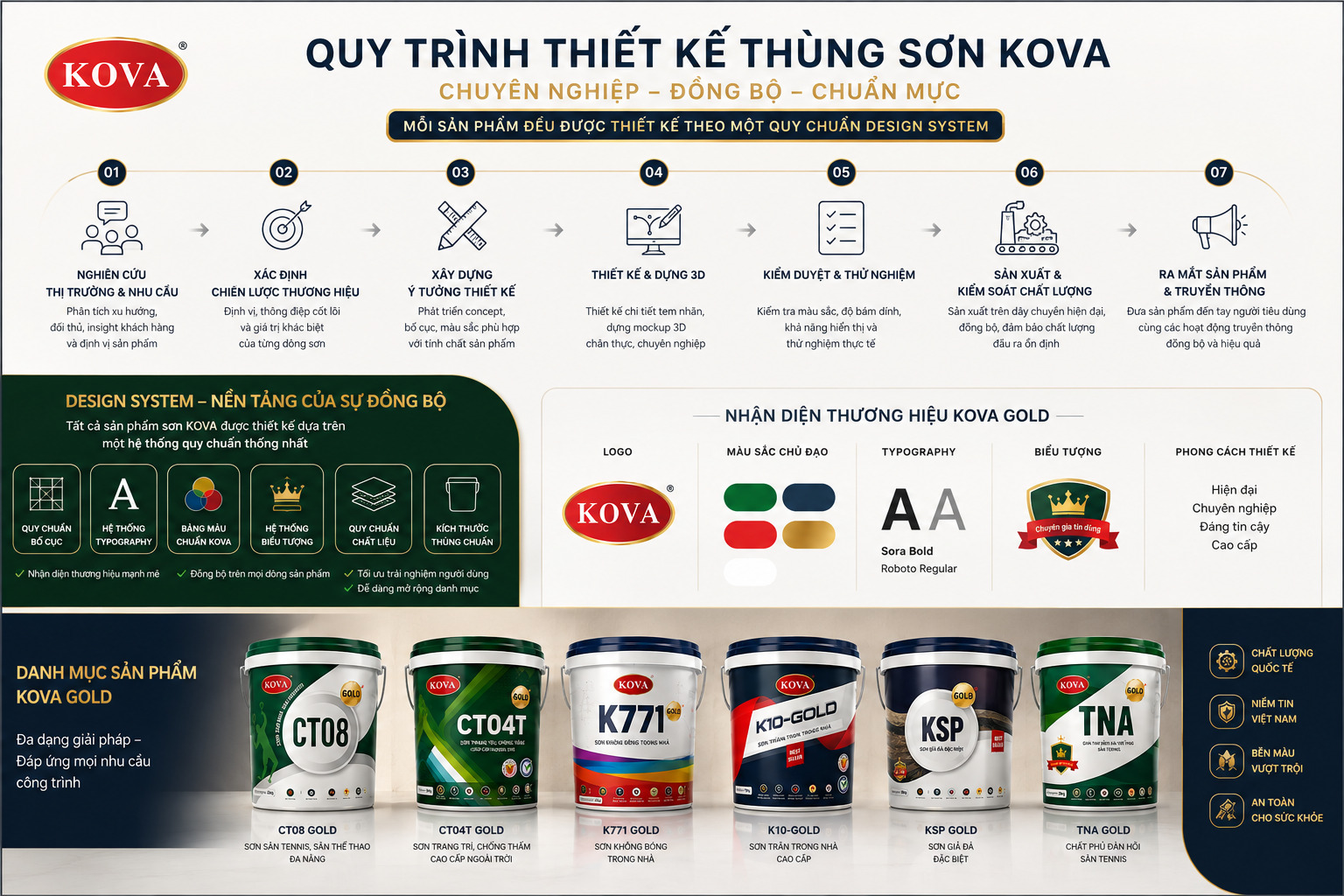
The design system stands on six pillars: layout standards, the type system, the core palette, the icon system, material standards and standard pail sizes. Alongside runs a seven step process, from market research to launch. With that ground in place, designing a line stops being an act of invention: fill in the system, build the 3D, approve the sample.
Those rules live in the studio while the label is born in a print shop, a different one in every province, darker here, lighter there, stretched flat elsewhere to fit the die. The red oval with its gold rule has sat in the market's memory for decades, and redrawing the curves clean is only half the job.
So the standardisation was written into a printing guideline covering every KOVA product. Four sections go straight to work: the label system for each paint line, the core palette, and printing standards that fix the CMYK colour space and a minimum resolution of 300 dpi. Whoever runs the press opens this and knows what to do rather than guessing. That is why the red on a pail printed in Hà Nội does not drift against one printed in Bình Dương.

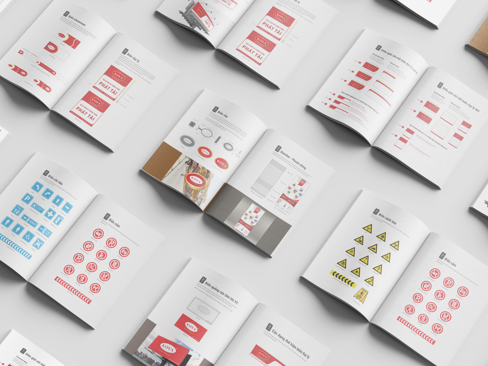
The second guideline reaches where the system breaks most easily, out on the street. It does not stop at the logo and the palette but goes down to horizontal and vertical dealer signs sized for each shopfront, light boxes, standees, interior signage, then wayfinding, prohibition and warning signs for the plant.
This is the line between a handsome identity and a system that works. When a dealer opens in a province with no presence yet, nobody needs to call and ask how wide the sign should be, what size the type is, where the dealer name goes. The guideline has already answered.
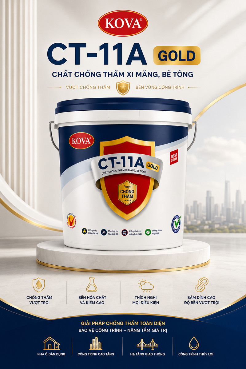
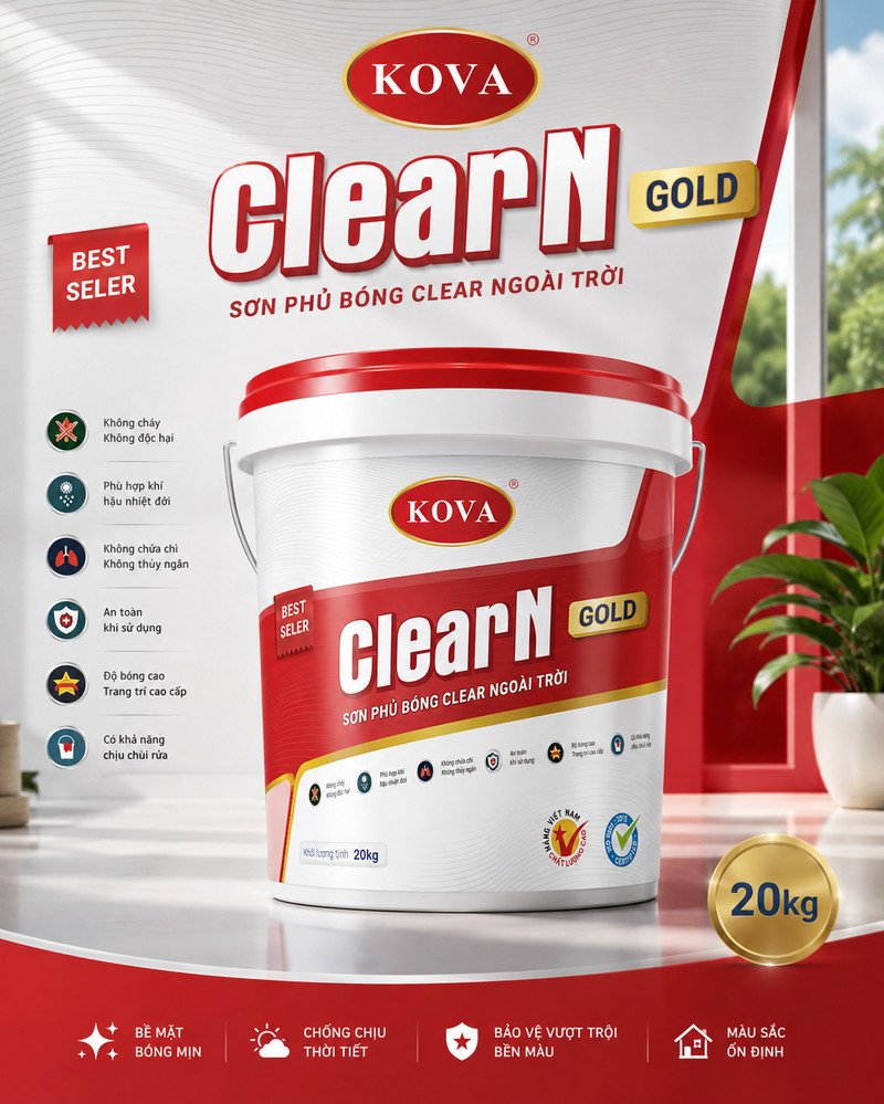
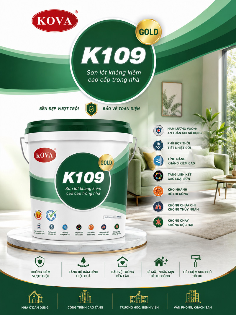
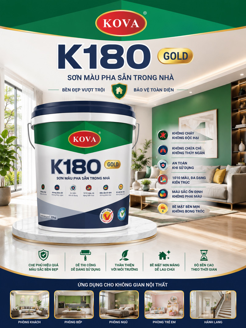
Packaging is the last touchpoint and the most crowded. Seventeen paint lines, each with a genuinely different job. Sinh Vũ fixed the reading order for every pail and every sheet: the logo at the top, the line name large beneath it, the function line immediately after, the feature icons alongside, the applications closing the foot.
Colour does the heaviest work. Red and navy for exterior and waterproofing, blue for alkali resistance primers, green for the interior range. From three metres away, before a word is legible, the colour has answered the first question: inside or outside, primer or topcoat. The words only confirm what the eye guessed.

What was handed over
Most of the work lives in documents rather than in a handsome photograph. These are what KOVA kept once the project closed: the standards, the guideline, and a signage system detailed enough to reproduce in any province and still come out as the same brand.


The process
Market and demand research
Trends, competitors, customer insight and where each product sits.
Set the brand strategy
Positioning, core message and the distinct value of each paint line.
Build the design idea
Concept, layout and colour developed to suit the nature of the product.
Design and 3D build
Detailed label design and realistic 3D mockups for approval.
Review and testing
Colour, adhesion and legibility checked, then tested in real conditions.
Production and quality control
Production runs kept consistent, with stable output quality.
Launch and communications
The product reaches buyers alongside a coordinated communications push.
The outcome
What KOVA gained is not a handsome identity. It is the ability to grow without rethinking. An eighteenth paint line, a dealer in a province with no presence yet, a stand for a trade fair: each already has its rule, already answered inside the guideline.
On the street, a KOVA sign in Cần Thơ and one in Hà Nội read as family. At the shelf, the painter picks up the right pail first time. That is the moment lasting beauty over time stops being an advertising line and becomes how the brand runs.
Seventeen lines, one frame
Twenty three sheets covering the range. Pick a line to see its sheet, tap the image to open it large.
This is where the design system shows most plainly: grounds change and settings change, yet the reading order and the rhythm of the marks hold across every sheet.
Exterior and waterproofing
Alkali resistance primers
Interior
Specialist







Is your range as tangled as KOVA once was?
Tell Sinh Vũ what is troubling you about your packaging and your product range, and we will point to the right direction straight away.