
GrowSteak, the signature of growth
GrowSteak is the first agency in Vietnam to reach HubSpot Platinum Partner status, selling B2B companies the hardest thing there is: sustainable growth. A company that sells growth needs its own signature to look like it is growing too. Sinh Vũ built the logo and identity system so that promise would land on first sight.
The problem
A growth agency sells something you cannot see. GrowSteak's value sits inside its Inbound methodology, inside marketing and sales automation flows, inside a client's momentum building over months. None of that can be held in your hand. Which means the brand is the only tangible evidence of an otherwise invisible promise, and it has to be convincing before a client ever hears the explanation.
The client's brief was clear and, at the same time, hard: the logo had to speak to the specifics of Marketing and Sales Automation, while carrying two messages that appear to pull against each other. Inherent stability, a core steady enough for the business to grow without breaking. And outsized development, a lift outward, beyond baseline value. Reconciling steady and lifting inside a single mark was the problem this project had to solve.
Approach
Before any drawing began, we settled one foundational point: GrowSteak does not sell software, it sells an upward trajectory. Inbound means pulling in the right people, nurturing them, then letting automation carry the repetitive work, so a business grows evenly and lasts. What needed shape, then, was not a static tool but the motion of growing itself. That positioning decided the mark had to read as a system expanding, not a symbol standing still.
Once the position was clear, the form came fast. The idea for outsized development arrived in a single sleepless night, and by the next morning a finished concept was in the partner's hands and approved that same morning. That near-instant approval was not luck. It was a sign the form had struck exactly the note the client meant to say, close enough that they recognised themselves in it on first look.
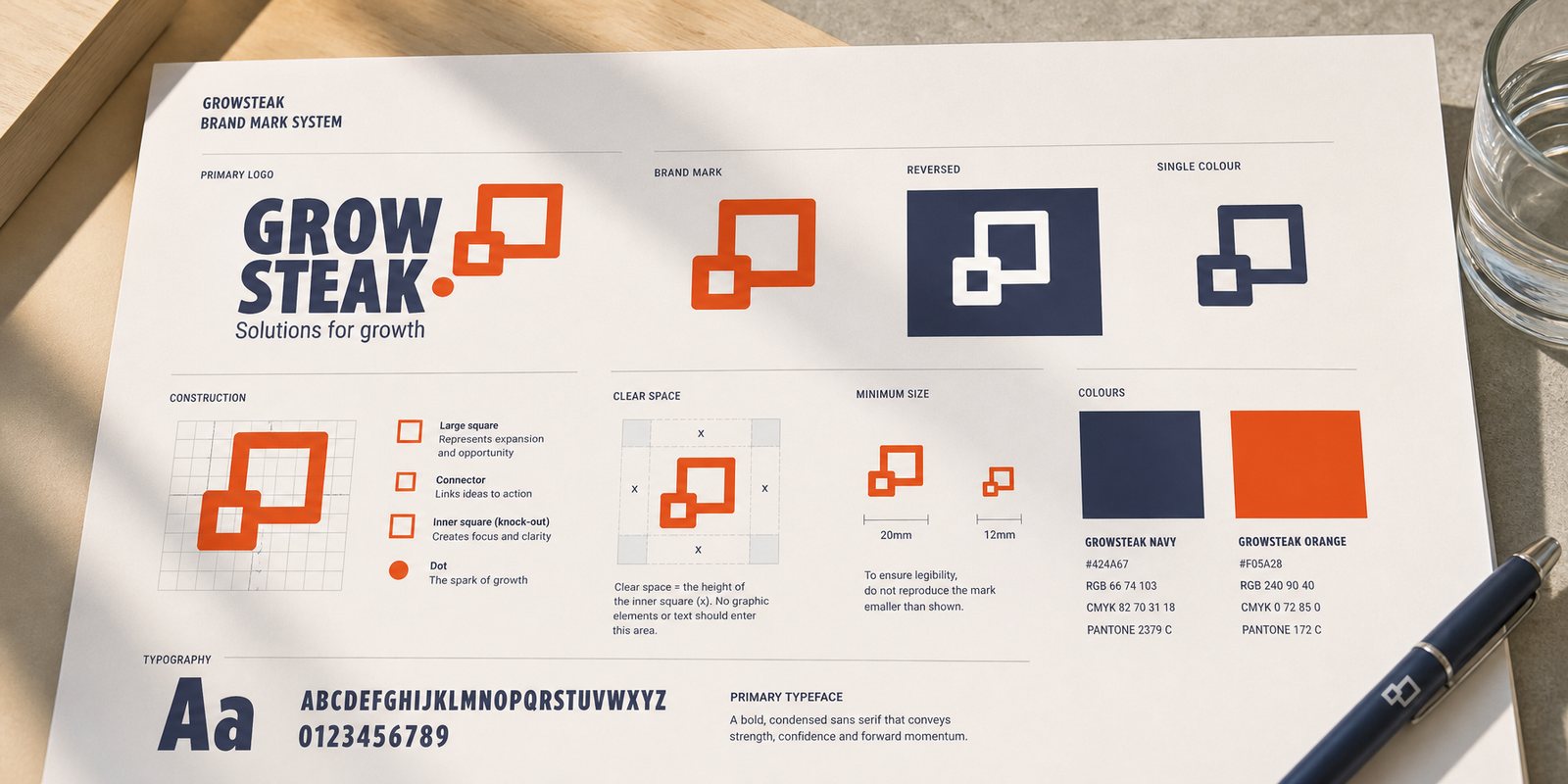
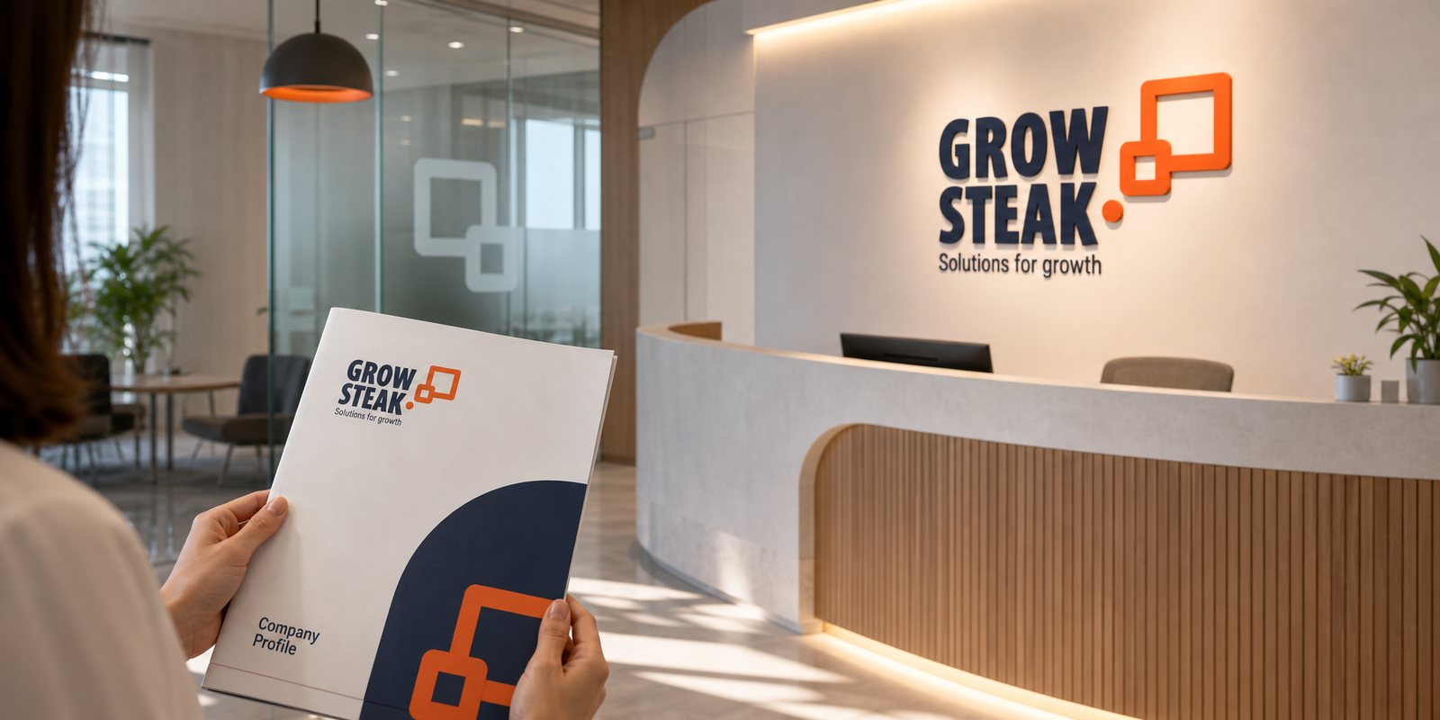
The mark is two orange squares joined by a rounded connecting stroke: a small, solid square below standing for the core already steady, a stroke rising into a larger square left open for the outsized growth still unfilled, and a single orange dot marking the starting point. The motion from small square to large square is the growth trajectory itself, while the bold, compact GROW STEAK wordmark stands beneath it like a foundation. Navy holds the trust and composure, orange holds the energy and momentum. Both messages from the brief sit inside one form: steady at the core, lifting at the edge.
A beautiful symbol alone is not enough for a company to stay consistent as it grows. We built the identity system as the set of rules around that mark: variants, reversed colour on dark backgrounds, minimum clear space, a fixed colour pairing and typeface. Because of it, everything from an email signature to the sign outside the office is still the same GrowSteak, whoever makes it and whenever it is made. That is where an identity system differs from a logo: it gives the whole company one consistent visual voice, so nothing dilutes as growth accelerates.
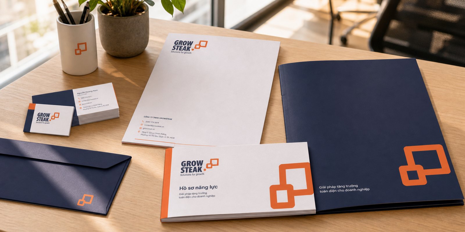
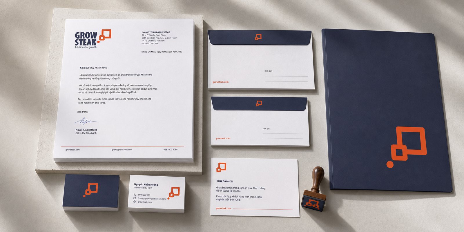
A consultancy sells on credibility, and credibility starts in very small things. A corporate client's first point of contact is often a name card handed over, a letterhead on a proposal, an envelope holding the paperwork. We designed the stationery set so that every piece of paper GrowSteak hands out already says: here is a partner disciplined enough to be trusted with something big.
Consistency here is not a matter of taste, it is the shape credibility takes. The name card keeps the same proportion, the same colour, the same mark every time, so whoever on the team hands it over, the client meets the same GrowSteak. For an agency, this discipline in every printed detail is the earliest evidence for its promise of method and rigour.
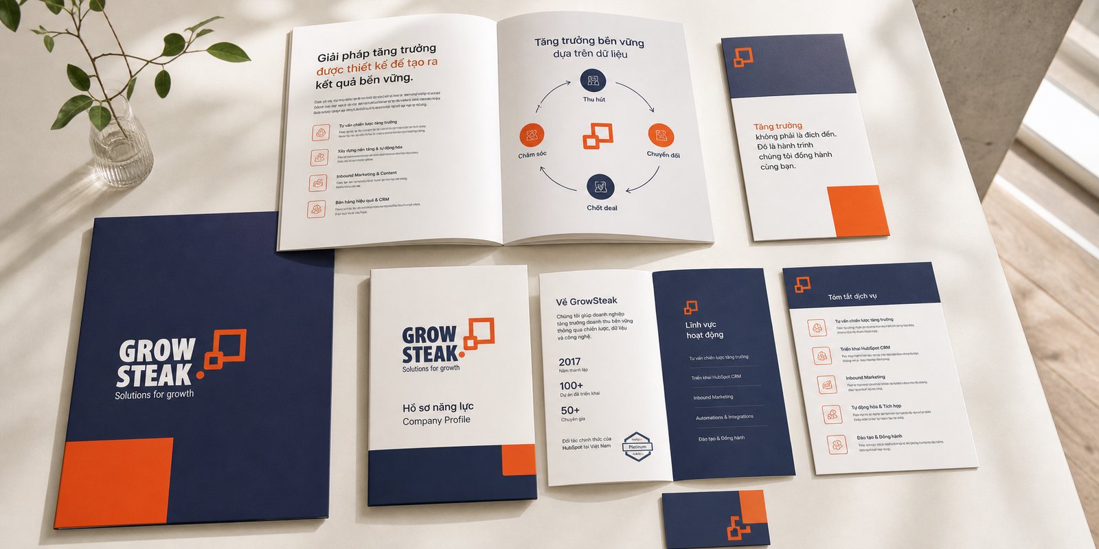
After the identity system, Sinh Vũ turned to building GrowSteak's sales and marketing applications: a company profile, a services catalogue, and a set of sales and marketing materials. This is where the growth story runs longer than a logo can carry it: what GrowSteak does, for whom, and how it helps a business grow, all laid out inside the same visual system.
This toolkit is what the team carries into the room to make its case. Open the profile and you see the Inbound methodology, the roadmap, the coherence. For an agency, sales documents are not just paperwork, they are a sample of the product itself: a client reads how GrowSteak presents itself to infer how this company will present their business. Discipline here is a silent pitch of its own.
Result
What GrowSteak received was not a logo, it was a signature already carrying its own promise. Look at it and you see upward motion, a core that is steady and a form still left open. From the email signature and the name card to the company profile and the sign outside the office, everything speaks to the one thing this company actually sells: sustainable growth.
For an agency that sells growth to others, its own brand is the first piece of evidence. When the mark, the colours and the documents all speak with the same steady, lifting voice, GrowSteak does not need to say much about its capability, clients already believe it on first sight. And a logo approved in a single night is, in the end, its own signal: when the position is clear enough, its form arrives almost as a matter of course.
The brand placed in space
Signage and office space
Is your problem like GrowSteak's?
Tell Sinh Vũ what is on your mind about your brand. Sinh Vũ will point you to the right direction right away.