Tuyết Shan Cổ Thụ Trà: traditional tea, a new design language
Tuyết Shan Cổ Thụ Trà sells tea picked from ancient tea trees in the mountains of Suối Giàng, Yên Bái. Sinh Vũ designed the brand identity system (the shared rules for logo, colour, type and pattern) and applied it across 250 items, from labels and gift boxes to the catalogue (a book presenting the products).
Traditional tea needs a modern image
Tuyết Shan tea is picked from ancient tea trees whose roots run deep, and the young buds gather the morning dew high in the mountains. The client needed Sinh Vũ to design a brand identity system and then carry it into office stationery, signage, packaging, labels, sales materials and online channels.
The difficulty is that ancient-tree tea is a traditional product, yet the client wanted the brand to look modern. Sinh Vũ needed a new design language, meaning one consistent way of using image, colour and type. It had to be simple enough to sit on gift boxes, labels and signs, while people still recognise at once that this is tea.
A teacup logo and a leaf pattern
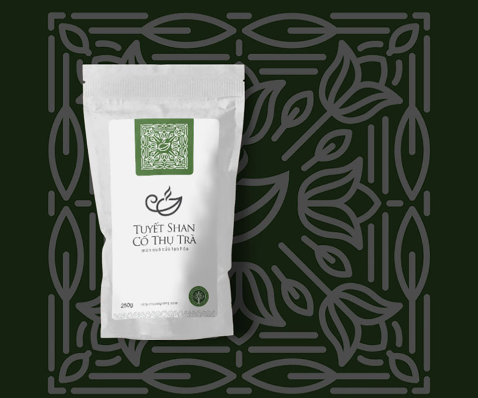
The brand's symbol is a teacup with a leaf inside and a curl of steam rising, set beside the name Tuyết Shan Cổ Thụ Trà on two lines. The lines are thin and even, and one glance says this is tea.
From that symbol, Sinh Vũ drew a pattern (a decorative image that repeats) of leaves arranged in square frames. The pattern is printed on the 250g tea bag label and reused as a faint background across the catalogue pages. Because the same pattern appears in many places, people easily see that the pieces belong to one brand.
Round labels: same frame, different colours
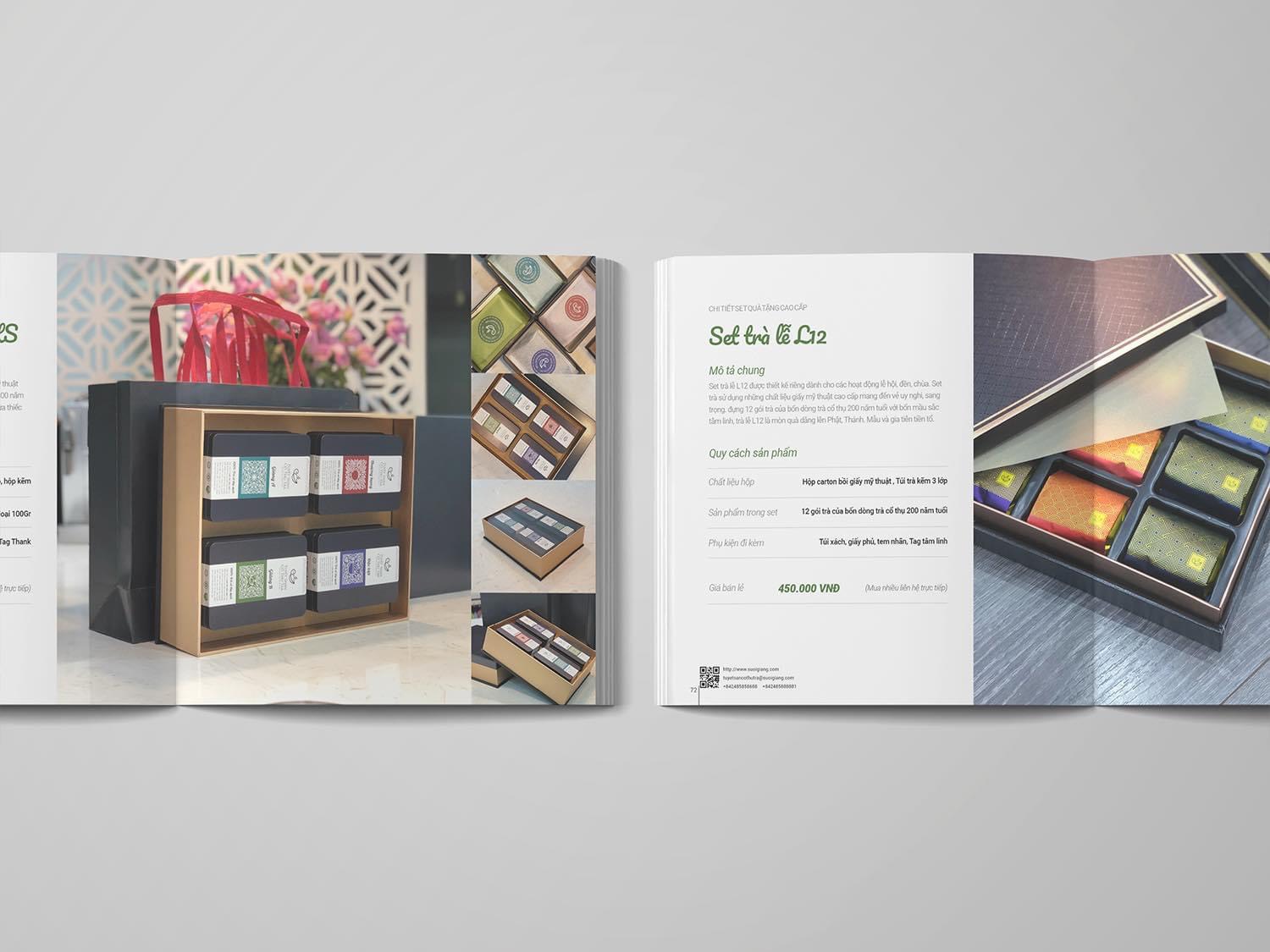
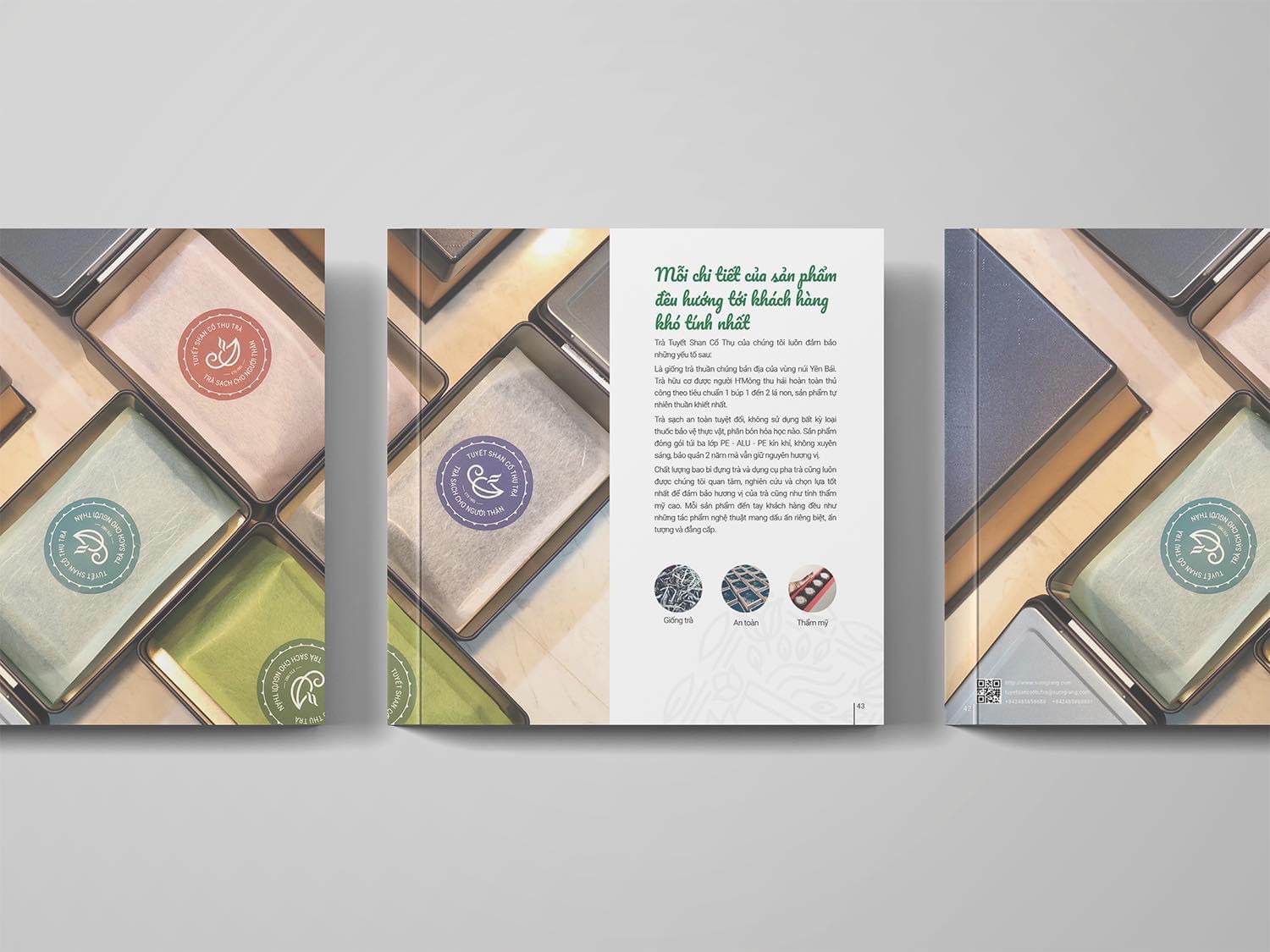
Inside each tin, the tea is wrapped in thin paper and sealed with a round label. The labels come in four colours: orange-red, jade green, purple and green. They share one round frame and the same brand name, and only the colour and the leaf in the middle change.
So when several packs sit side by side, buyers can tell them apart by label colour and still see one brand. The colours are all soft, and suit the colour of the tins.
A catalogue that tells the origin first, then the gift sets
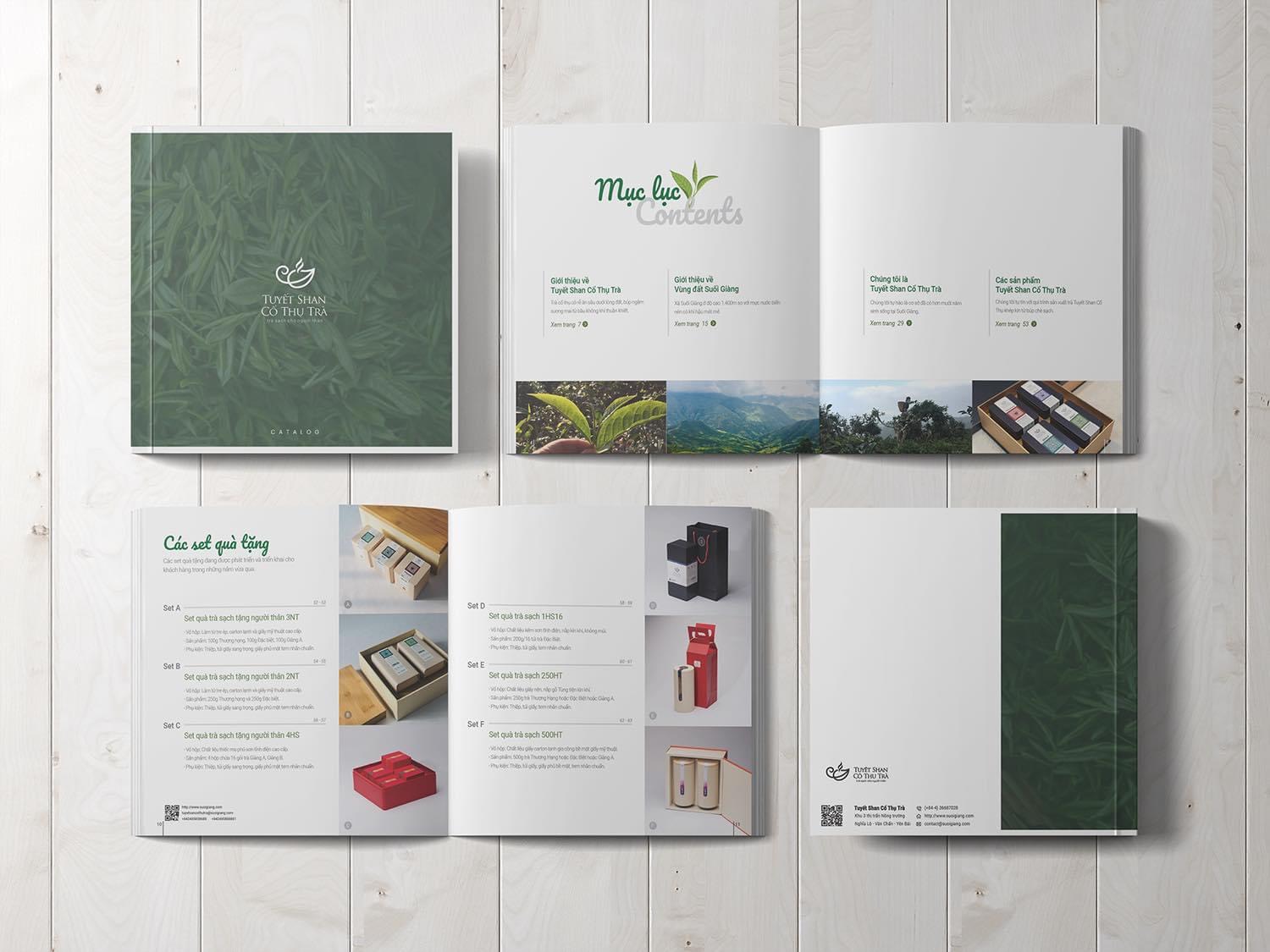
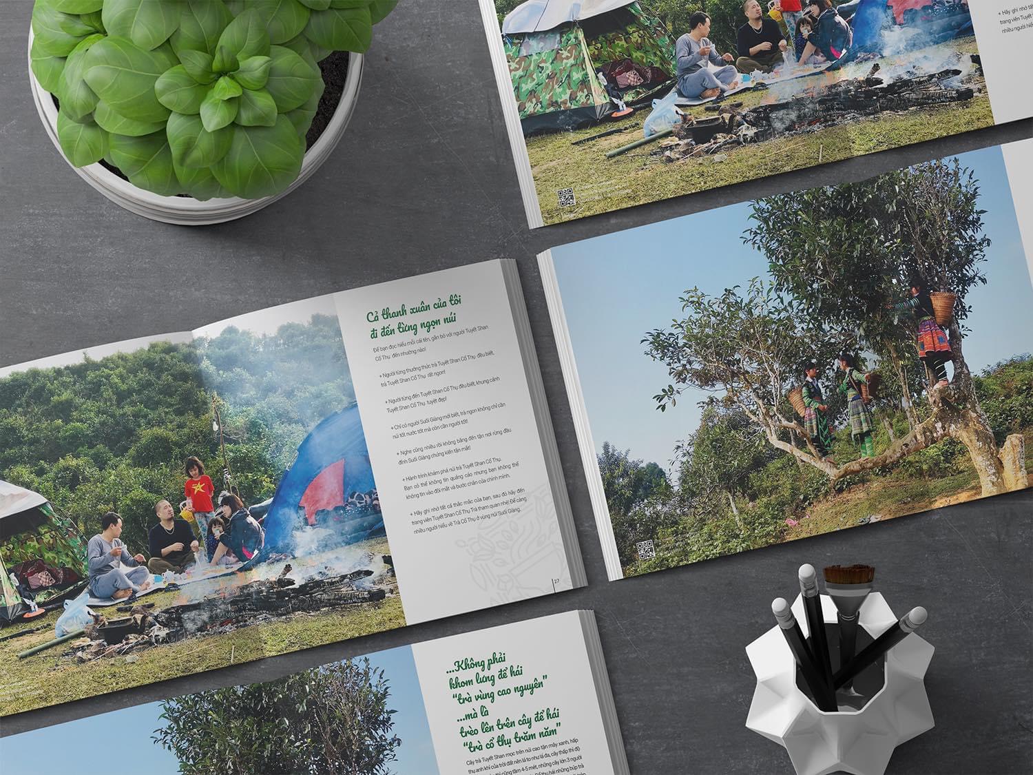
The catalogue is square with a deep green cover. The opening section introduces ancient-tree tea and the land of Suối Giàng, and only then the gift sets. Photos of tea pickers climbing the ancient trees and of trips into the mountains sit beside the text pages. This order tells readers where the tea comes from before they look at each gift set and its price.
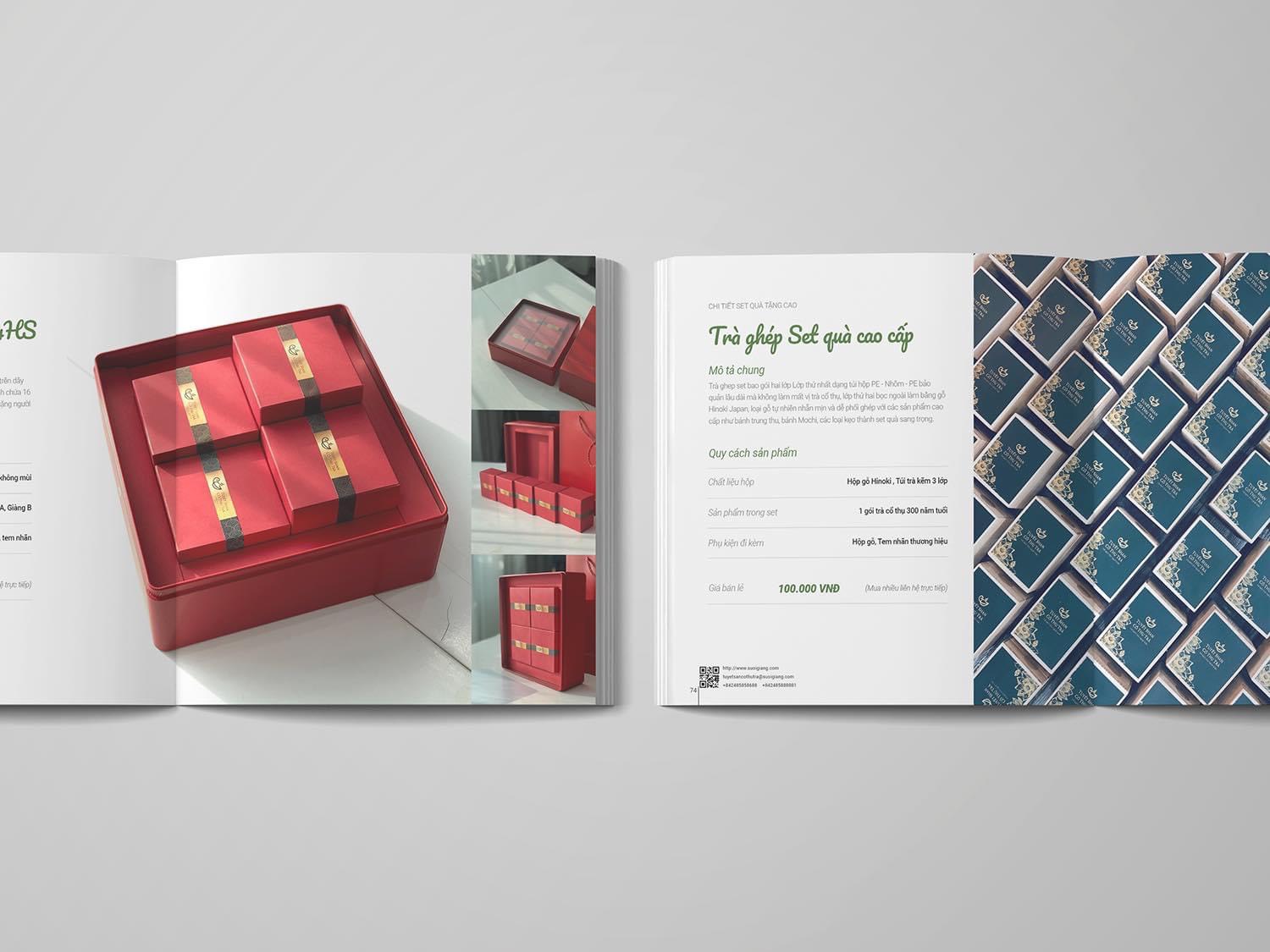
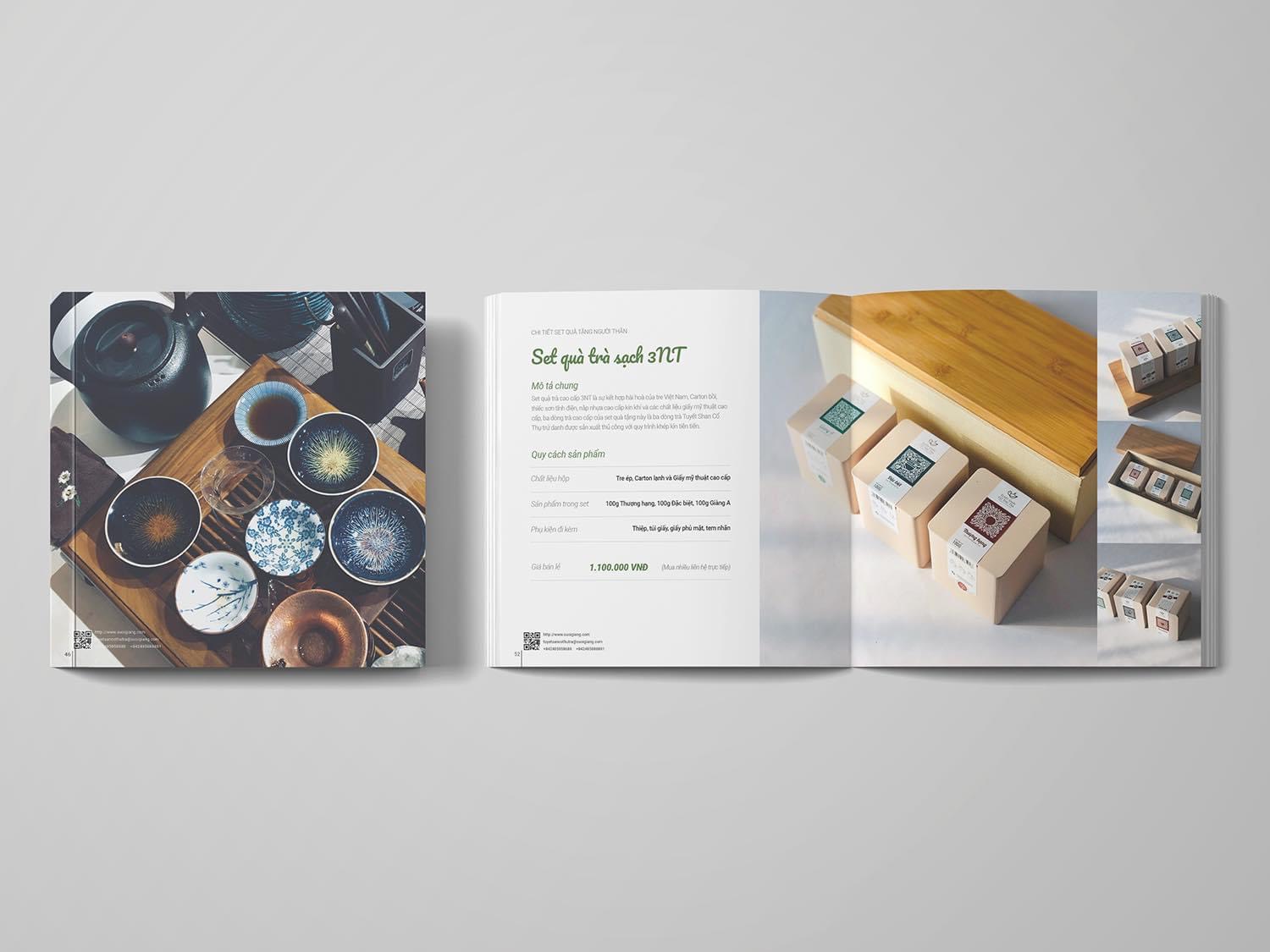
Every gift set page follows one layout: the name of the set, a general description, then a specification table covering the box material, the products inside and the accessories included. Buyers can compare the sets easily.
The value
Tuyết Shan Cổ Thụ Trà has one identity system used consistently across 250 design items, from labels and packaging to gift boxes and the catalogue. The product is still traditional tea, but the presentation has a modern touch.
Sinh Vũ delivered the catalogue and a video. For a business with many kinds of packaging, a tight identity system makes each new gift set faster to produce. The reason is that the logo, pattern, label colours and layout are already there to reuse, with no need to design again from scratch.
Gift sets from presents for relatives to offerings at temples and pagodas