Style Stone: logo, website and stationery for an engineered quartz stone maker
Style Stone is a company making premium engineered quartz stone slabs using Italian technology. Sinh Vũ designed the logo, built the website and prepared the print files (getting the files technically right so a printer can print them) for the company. All three share one logo and one blue, so customers meeting the company on the website or on paper recognise it at once.
Three jobs for a stone company
Style Stone makes engineered quartz stone slabs. This is stone pressed from quartz powder mixed with resin, commonly used for kitchen worktops, counters and wall cladding.
Sinh Vũ took on three jobs: designing the logo, building the website and preparing print files for the stationery. The logo is the foundation, because the website and the paperwork both take their blue from it.
Sketching the logo in pencil
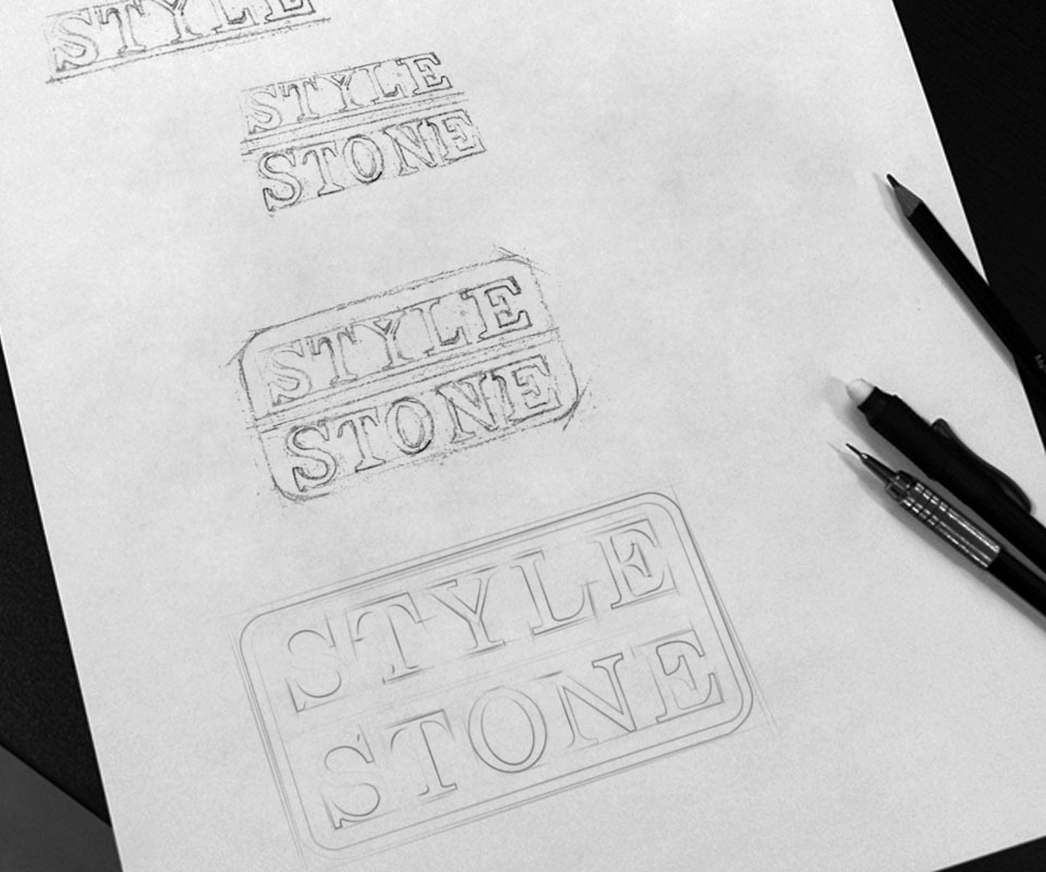
The sketches show the logo going through many drafts. The words Style and Stone sit on two tiers, set in a serif typeface (letters with small strokes at the ends of each stroke). This kind of lettering is common on gravestones and carved signs, so it suits a company that works with stone.
From a single line of text, the drawings add a dividing line between the two tiers, then a rounded rectangle around both words. The final logo keeps this rounded frame: the upper tier in blue, the lower in charcoal grey, like a small name plate.
A website for products and certificates
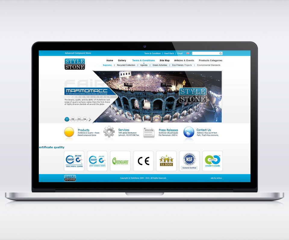
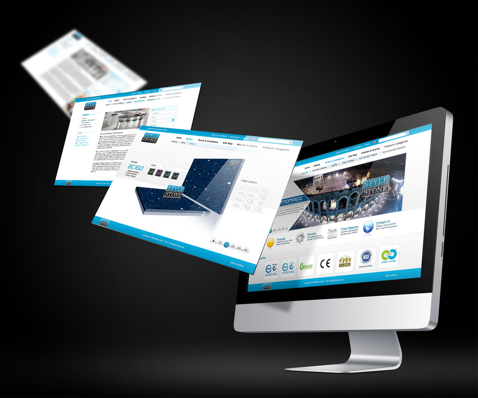
The website is in English. At the top is a pale blue bar with the logo on the left and the main sections on the right, such as Home, Gallery and Product Catalogue. Below is a large image announcing the company's presence at Marmomacc, the international stone fair in Verona, Italy. Next come four quick routes in: products, services, press news and contact.
At the foot of the home page is a row of certificate icons, such as ISO 9001 (a quality management standard) and CE (the mark showing a product meets requirements for sale in Europe), so visitors see at once which standards the company meets. The product page shows a three-dimensional slab with a colour selector and a choice of edge finishes, helping buyers picture the real slab.
From screen to paper
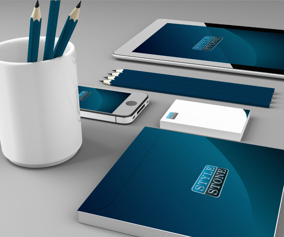
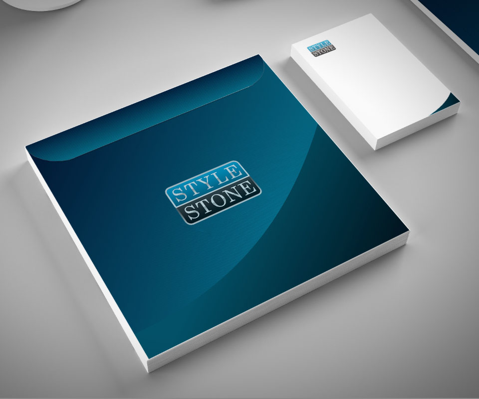
The stationery uses a deep blue gradient (a colour fading from one corner to the other) with a bright curve running diagonally across the surface. The logo sits in the middle of the folder cover, and also appears on the phone and tablet screens.
The note pad does the opposite: a white ground, a small logo in the top corner, and just one curved patch of blue at the bottom corner. The white ground keeps handwriting easy to read, and the small blue patch is enough for whoever holds it to recognise the company.
The value
Style Stone has an easily recognised two-tier logo, a website that presents its products, certificates and fair news in full, and a stationery set sharing the logo's blue.
For a company selling materials to building projects, tidy, consistent paperwork helps customers trust that it works carefully. That is why Sinh Vũ used few colours and placed the logo the same way on every item.
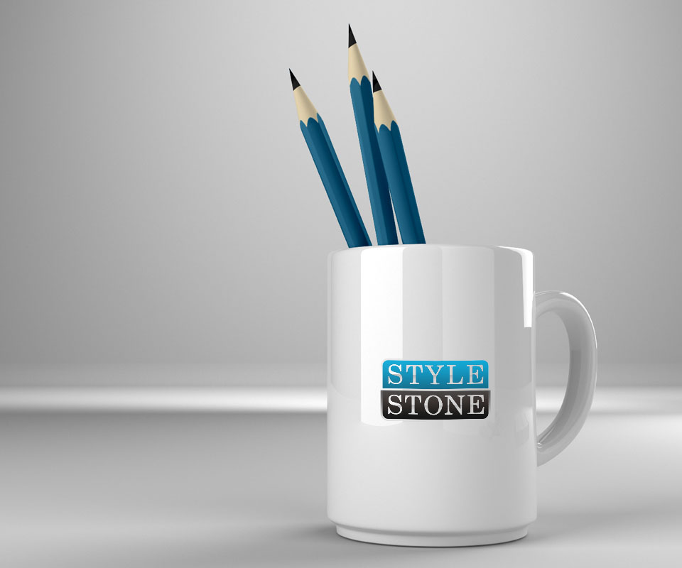
The Style Stone logo on the web, a mug and paperwork