
SOOBOO, where two poles meet
SOOBOO, a young technology brand, had its face built by Sinh Vũ around the infinity form as its core: human passion fused with technological intelligence, the future beginning.
The problem
Technology is a promise about tomorrow, but tomorrow is abstract and hard to touch. Every young technology brand faces the same hard question: how to look advanced enough to be trusted with vision, without looking so cold that people feel distant. Too technical and it turns unfeeling; too soft and it loses its edge. SOOBOO needed a face that could hold both.
SOOBOO believes in something simple and large: value is created where people and technology meet. On one side, passion, emotion, the drive to create; on the other, precision, intelligence and the power of machines. The task was not to choose one over the other, but to find a form that could say both at once, and say that this meeting has no end point.
The approach
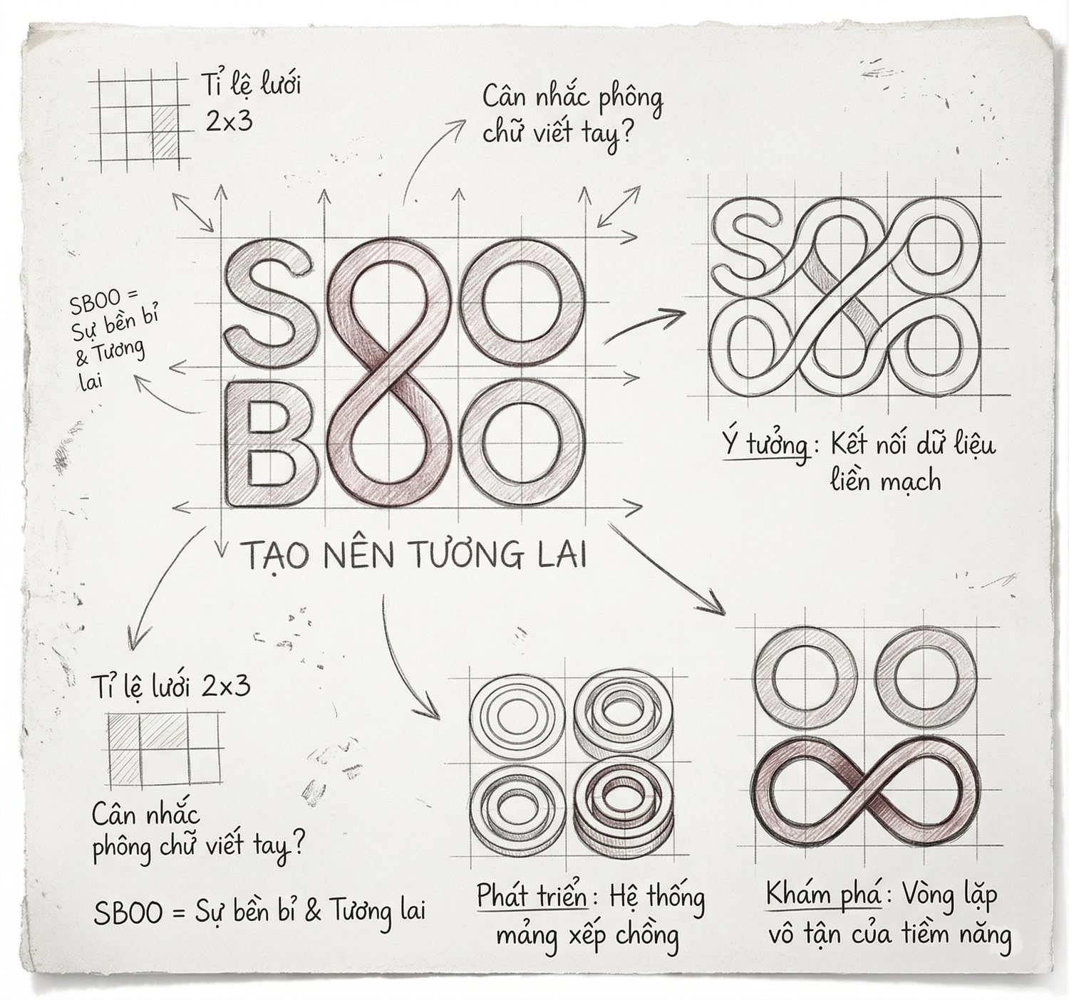
Before drawing anything, we went looking for what SOOBOO truly wanted to say. The answer was already in the name: the double O, which reads as continuation the moment you say it aloud. From there came the form, the infinity curve, a figure eight lying on its side, where the loop closes and opens again, never running out. It held exactly SOOBOO's belief, that the potential of a meeting between people and technology is limitless.
That stance was set down in one short line: Make to future. Not chasing the future, but building it. This statement decided every choice that followed, so that whether on a business card or a page of print collateral, SOOBOO would keep saying the same thing, that this is where tomorrow begins, today.
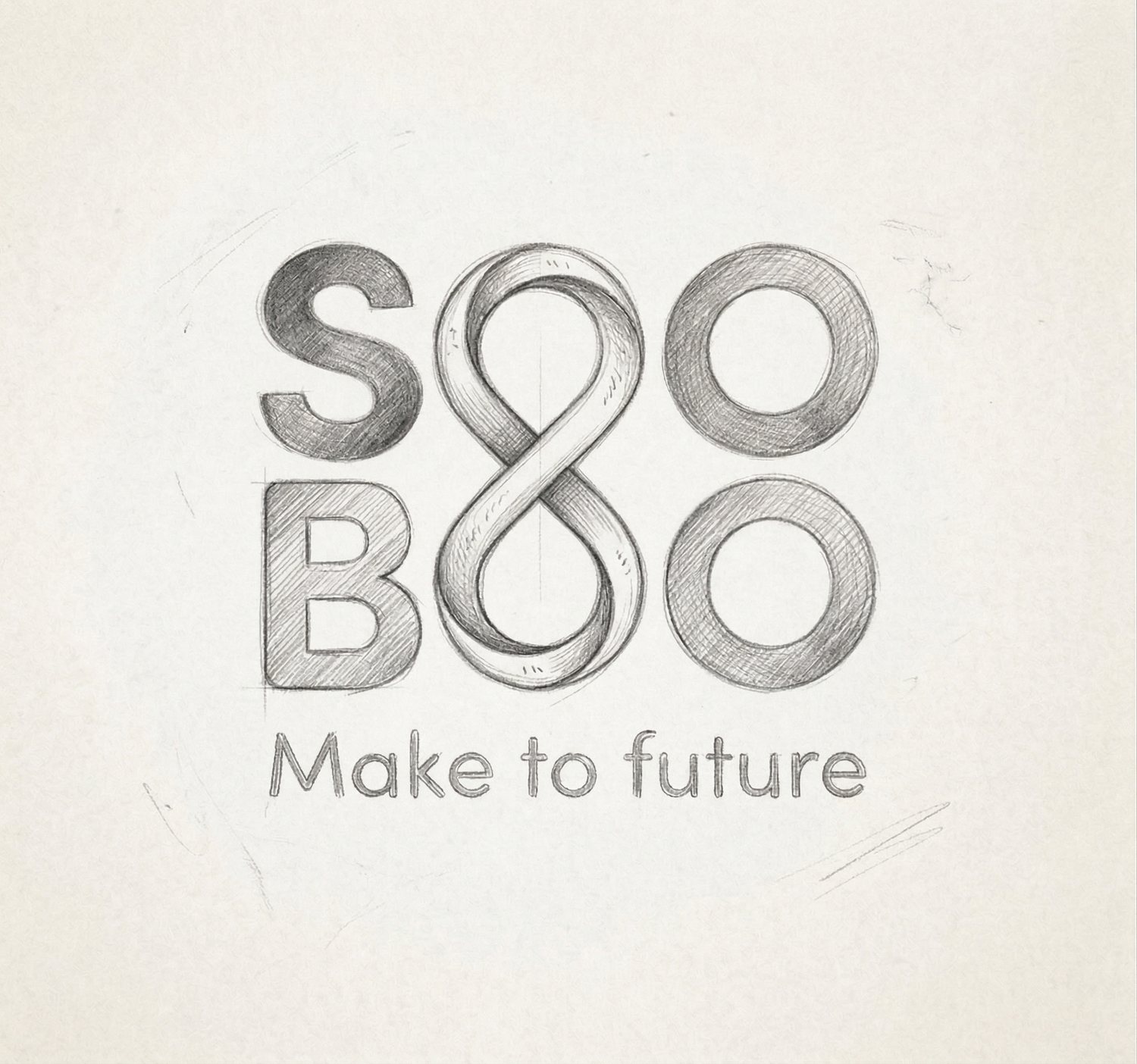
The mark was reduced to the exact heart of the idea: the pair of Os at the center curling into an infinity line. That stroke tells two stories at once, unbroken endurance and the ceaseless loop of potential. The letterforms sit on a strict geometric grid, rounded just enough that a technology brand still carries a human breath, without hardening into a machine.
The refinement of the mark lies in the two-color infinity line. Half red, half blue, twisting together at the exact point where they meet. Red is the human half: passion, emotion, drive. Blue is the technology half: precision, clarity, strength. They do not simply sit side by side, they meet and merge, so that at the very center of the logo sits an image of the thing SOOBOO does, the place where two worlds cross.
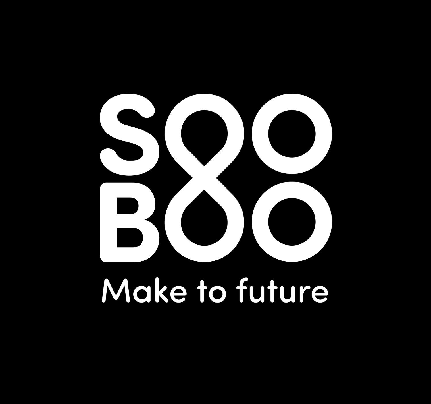
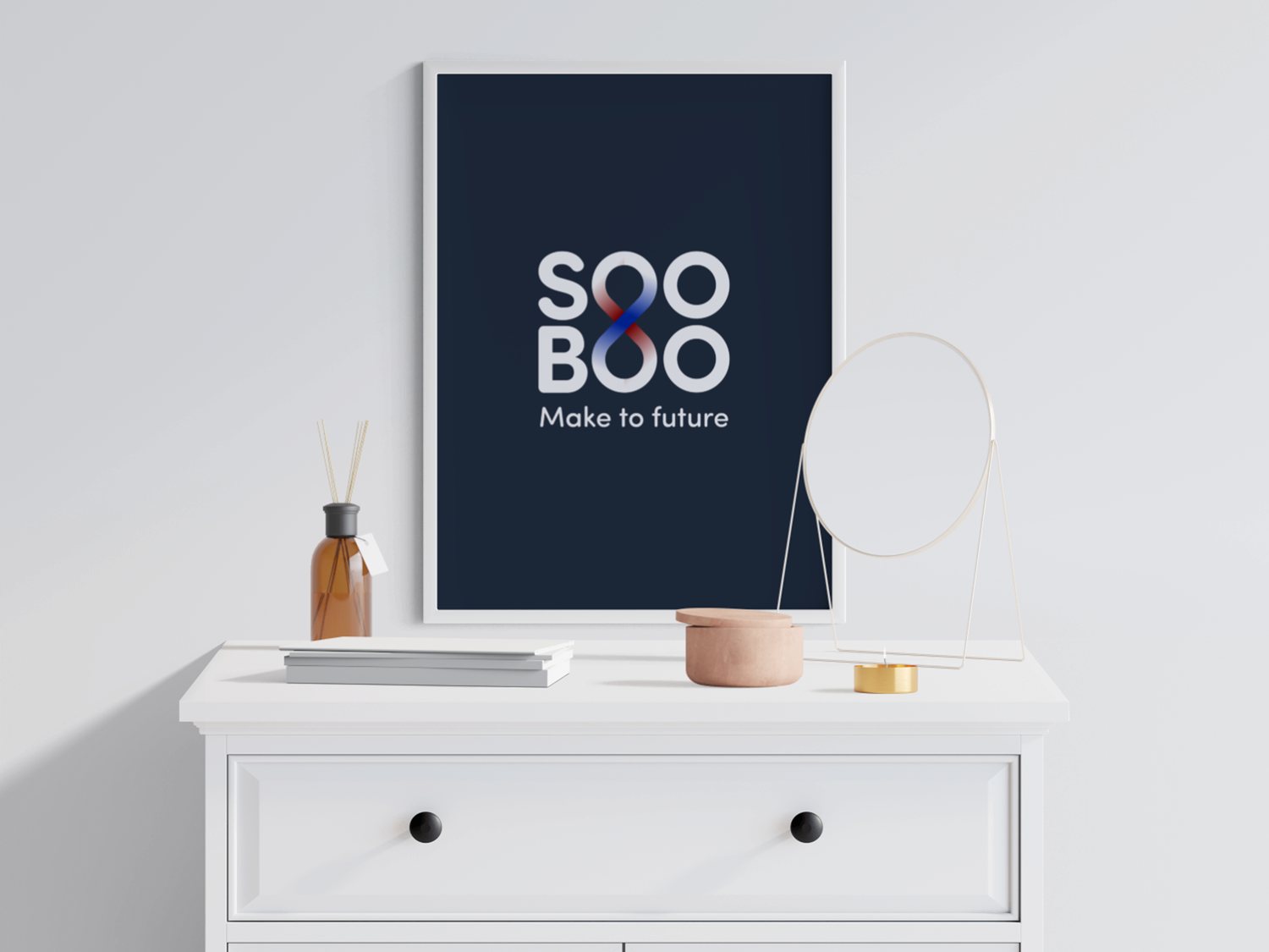
A two-color mark only holds up if those two colors are kept exact everywhere. We built a guideline system around the red and blue pairing: exact tones, how they meet at the crossing point, the ratio between them, and the approved backgrounds, deep dark grounds where the two colors flare up, white grounds where they read clean and sharp. Alongside this, a construction grid, minimum clear space, and variants for each context.
For a technology brand that appears across many screens and many pieces of print, the guideline system is what keeps SOOBOO from breaking apart. Because of it, a designer laying out a page at midnight and a printer working far away both produce the same SOOBOO, with the same red-blue crossing point in the same place. Consistency, here, is exactly how a promise about the future gets kept.
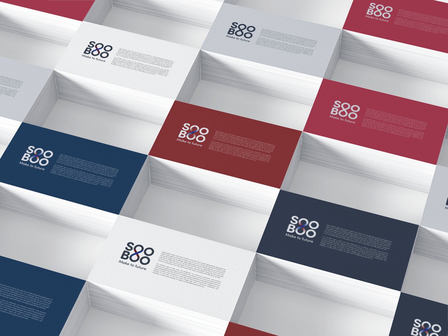
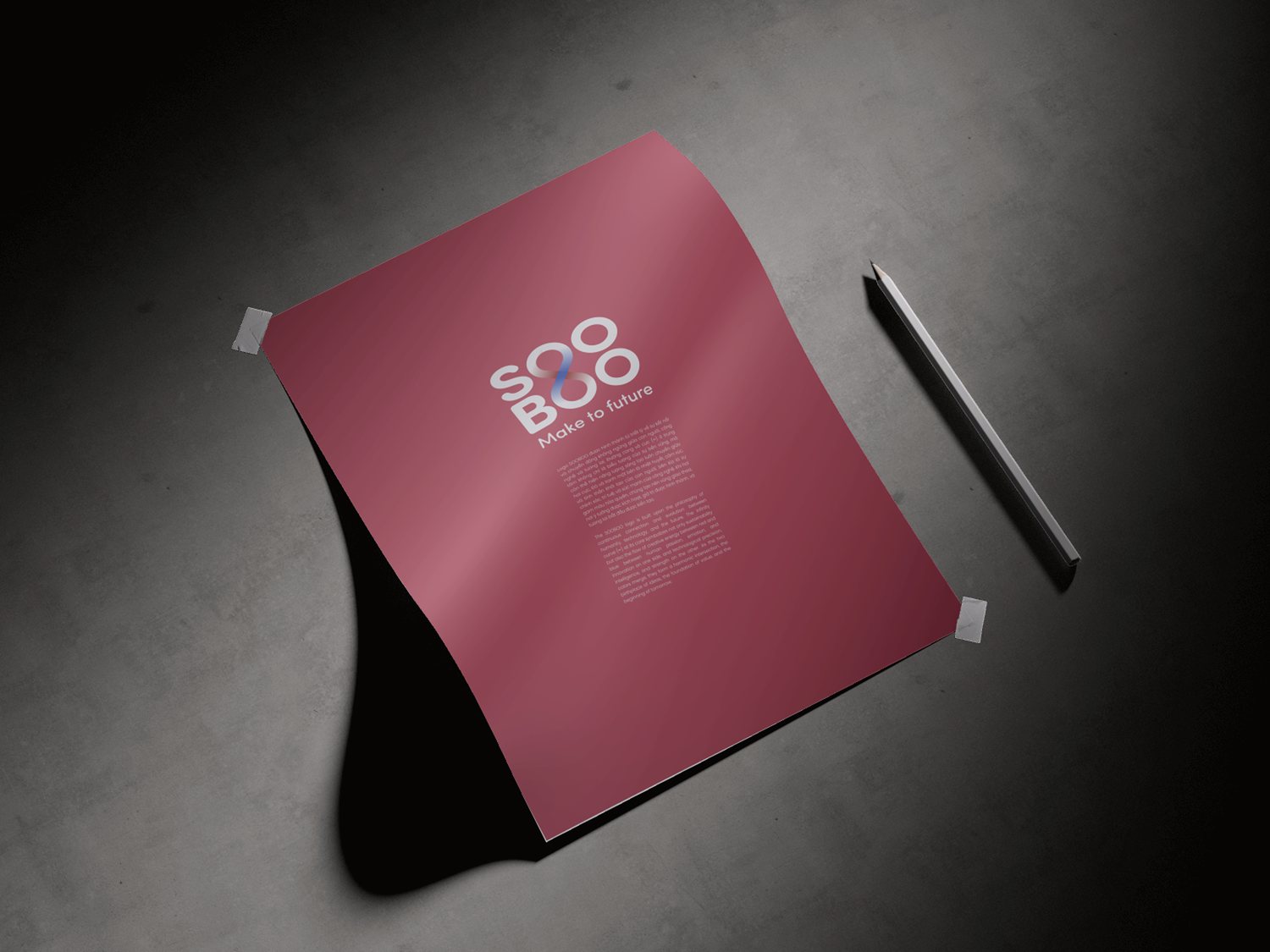
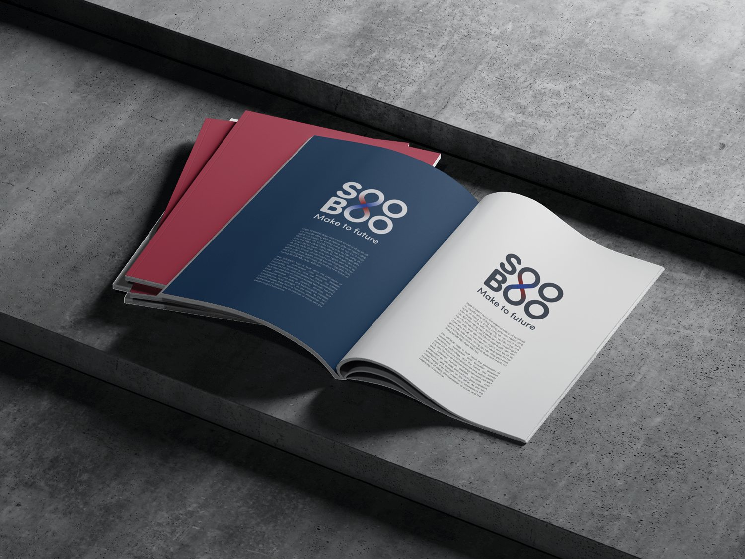
A philosophy only lives once it can be touched. We carried SOOBOO down into everyday objects: business cards exchanged in a handshake, event lanyard cards, folders, envelopes, introductory print collateral. On each object, the red and blue color system was redivided by role, sometimes a deep navy ground for the serious moments, sometimes a warm red for the inviting ones, so that the same brand could still carry more than one voice.
Placed side by side, the whole collateral set reads instantly as belonging together: the same infinity mark, the same color pair, the same spirit of being compact and confident. A poster mounted on concrete and a business card tucked in a stack of paper still tell the same story. At this point, the brand stops being an idea and becomes something people can hold, wear and remember.
The result
What SOOBOO gained was not a beautiful logo, but a short way of saying something hard to say. From a single two-color infinity mark alone, the whole vision reads through: people and technology, meeting, with no end point. On the business card, on the print collateral, on the lanyard card or on the poster, it is still one SOOBOO, one crossing point, one promise.
For a still-young technology brand, a face that is both advanced and warm is an advantage that opens every conversation. It makes a promise about the future trustworthy from the very first glance. SOOBOO wants to build the future; our part was to give that ambition a form people could believe, starting today.
One SOOBOO across every touchpoint
Is your problem similar to SOOBOO?
Tell Sinh Vũ what is on your mind about your brand. Sinh Vũ will point you to the right direction right away.