
Quà vùng cao, the mountains wrapped into a gift
More than a dozen Tây Bắc specialties once stood scattered across the highland market. Sinh Vũ built the positioning, name and packaging for Quà vùng cao, bringing them under one rustic, presentable face fit for a gift basket.
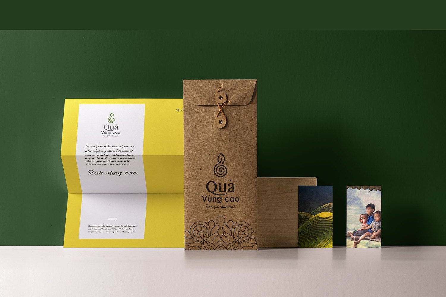
The problem
Tây Bắc is not short of specialties. Smoked buffalo meat, Séng Cù rice, bamboo shoots, forest shiitake, star anise flowers, every hamlet and every region has its own good thing. But most of it sits in unlabeled plastic bags, tied with string and sold at the highland market, rarely able to leave the mountains as a gift someone from the lowlands would dare carry along.
The difficulty for Quà vùng cao was never about prettifying a label. It was finding one face common enough for more than a dozen different specialties to stand under the same roof, rustic enough to keep the character of the forest, and presentable enough to enter a gift basket without reading as market goods.
The approach
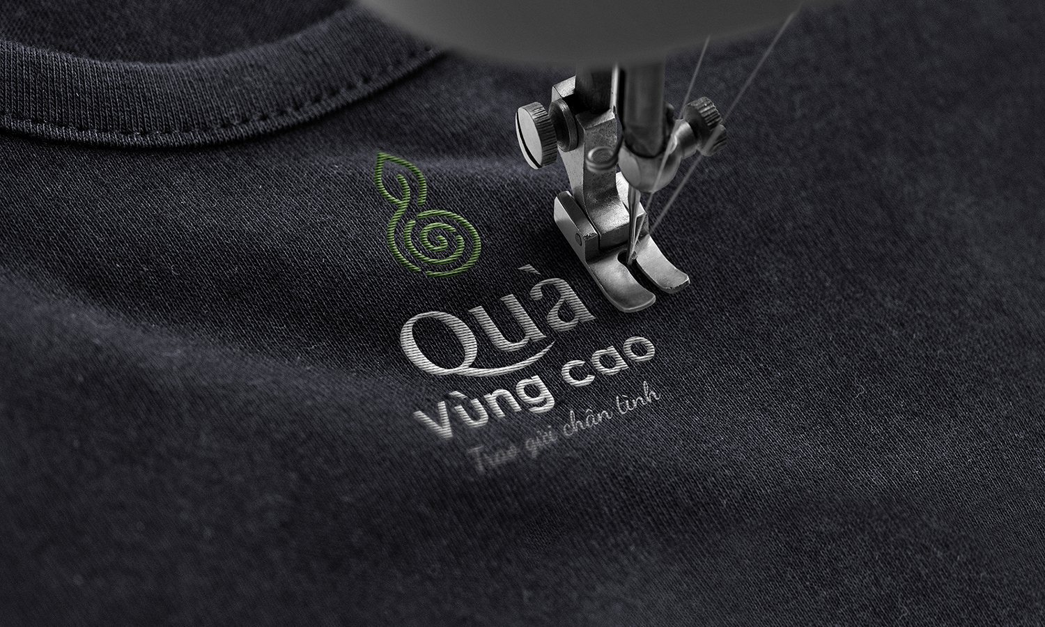
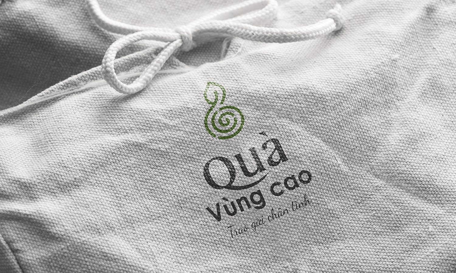
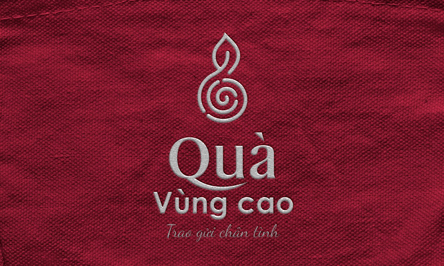
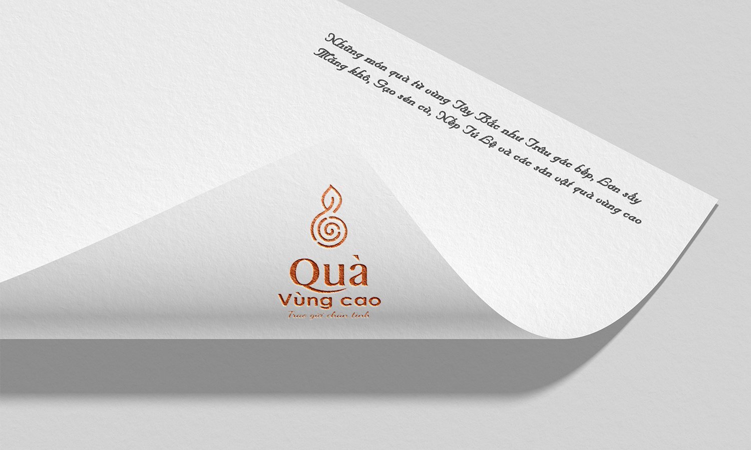
Before drawing anything, we settled the standpoint. This brand does not sell generic clean food, it carries a feeling: a gift from the highland people to the lowland people. The name Quà vùng cao says this plainly, and the line Trao gửi chân tình sits underneath like a greeting before the customer even picks the product up.
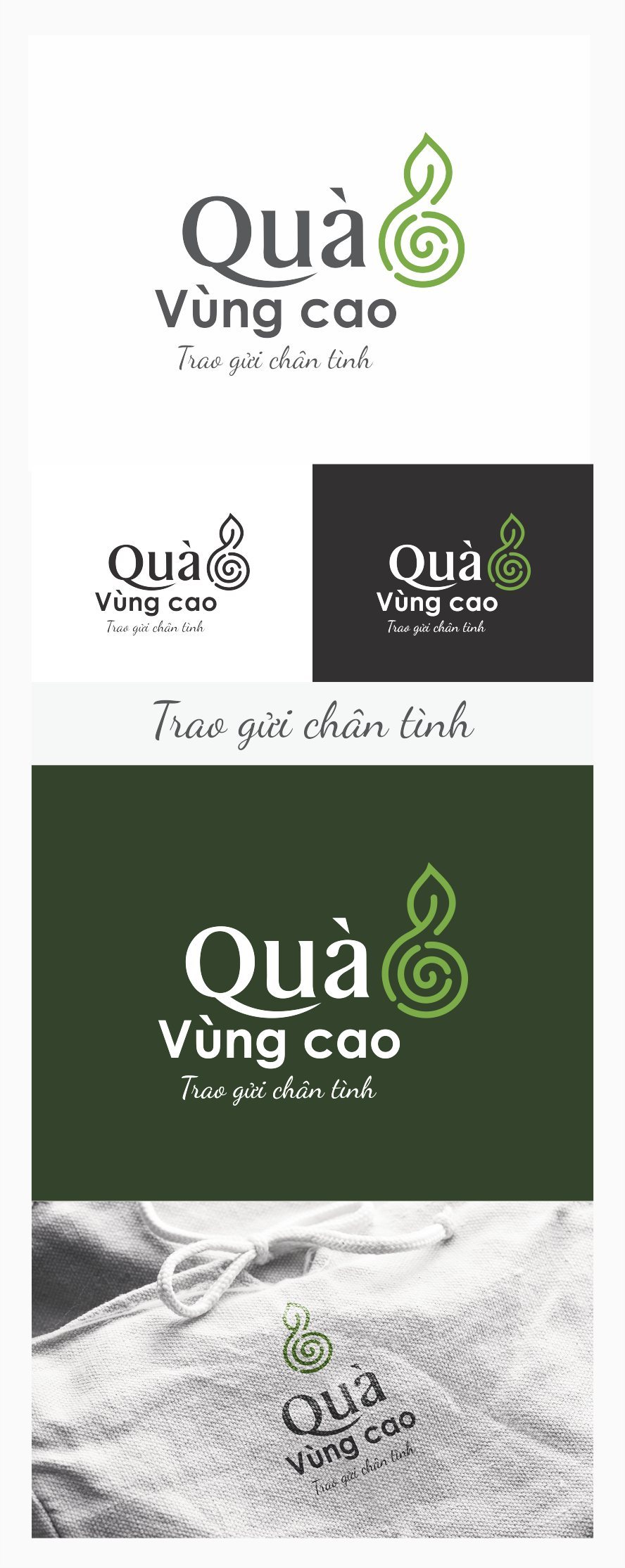
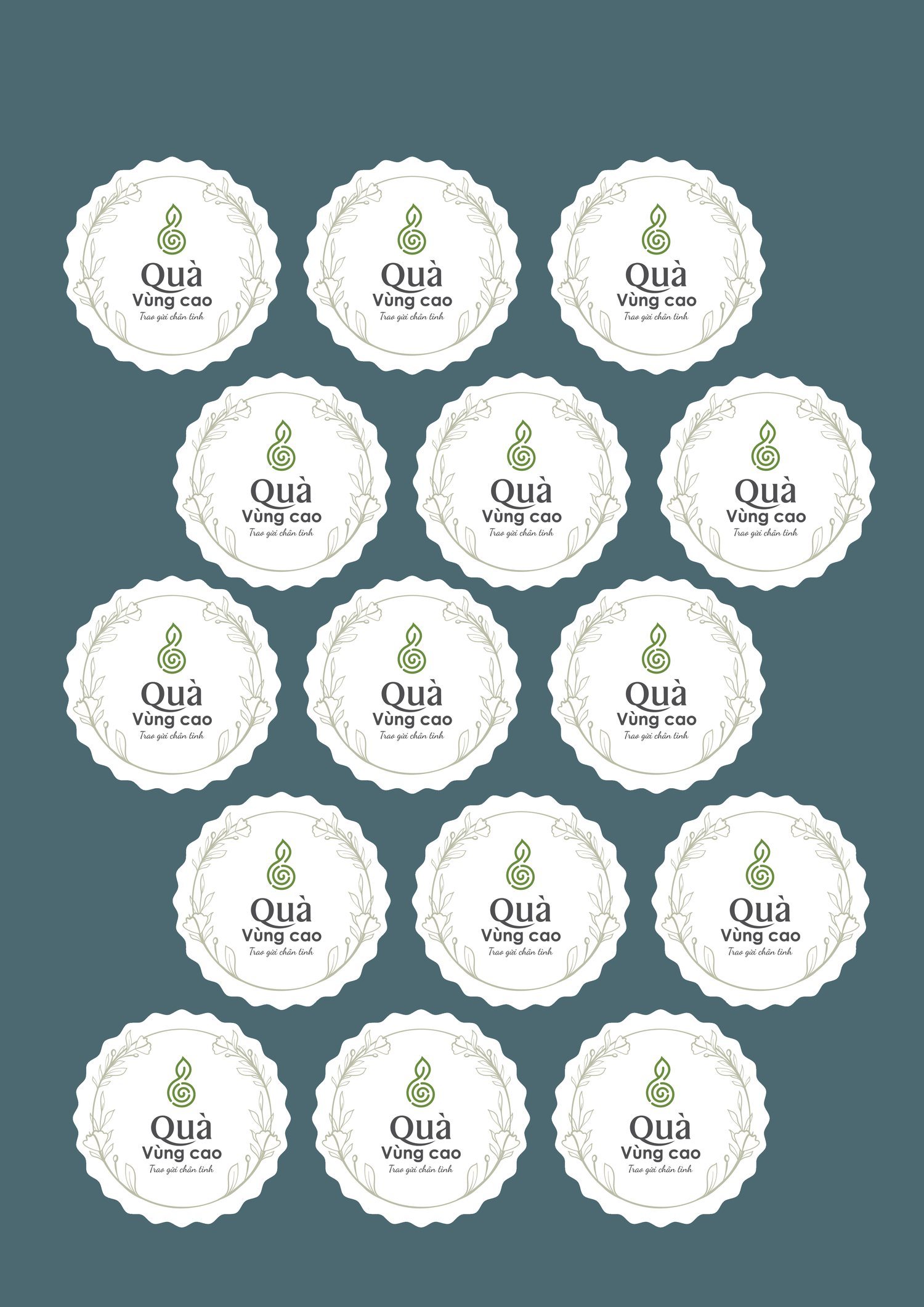
From that standpoint, the symbol narrowed down to a single curling green sprout, shaped like a young shoot just emerging after the forest sheds its leaves. It carries the freshness, the wholesomeness and the untouched quality of the mountains all at once, so that before anyone reads a word, they already see the green of a land not yet disturbed.
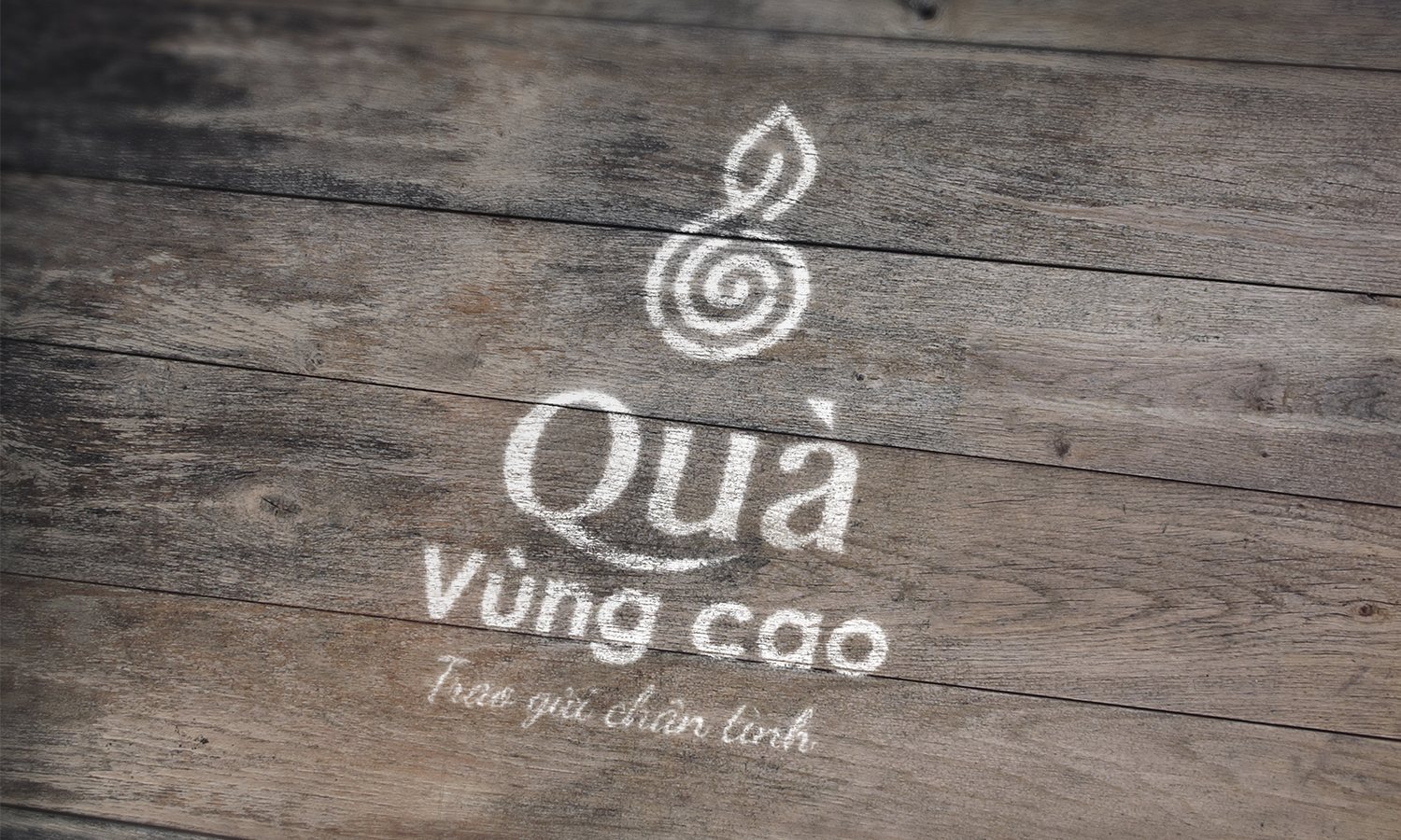
The sprout needed a ground to stand out from. We built a color system on a deep forest green base, with dó paper cream as breathing space, plus rust brown and turmeric yellow for each product group. That warm, grounded palette let many kinds of specialties sit side by side without clashing.
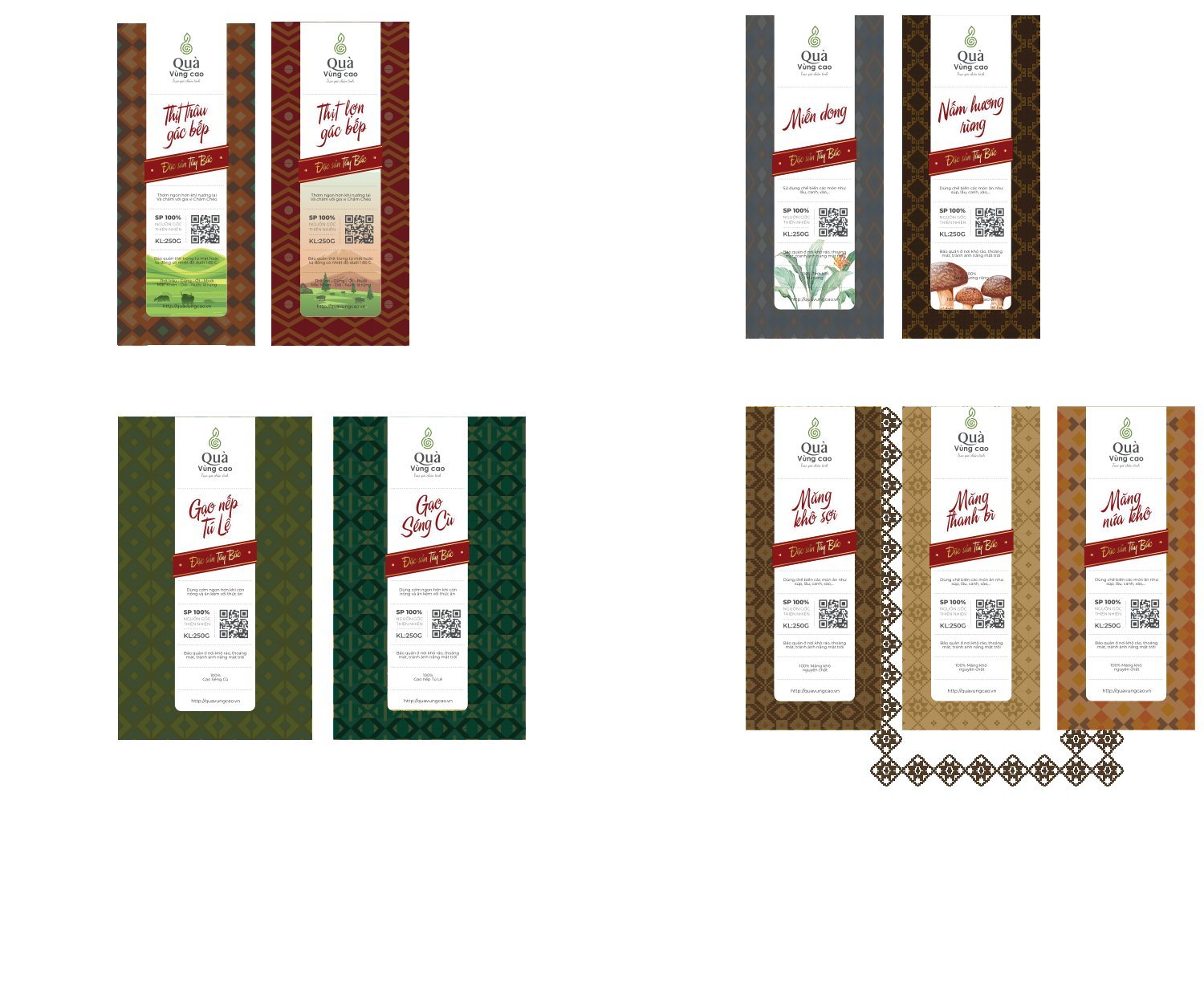
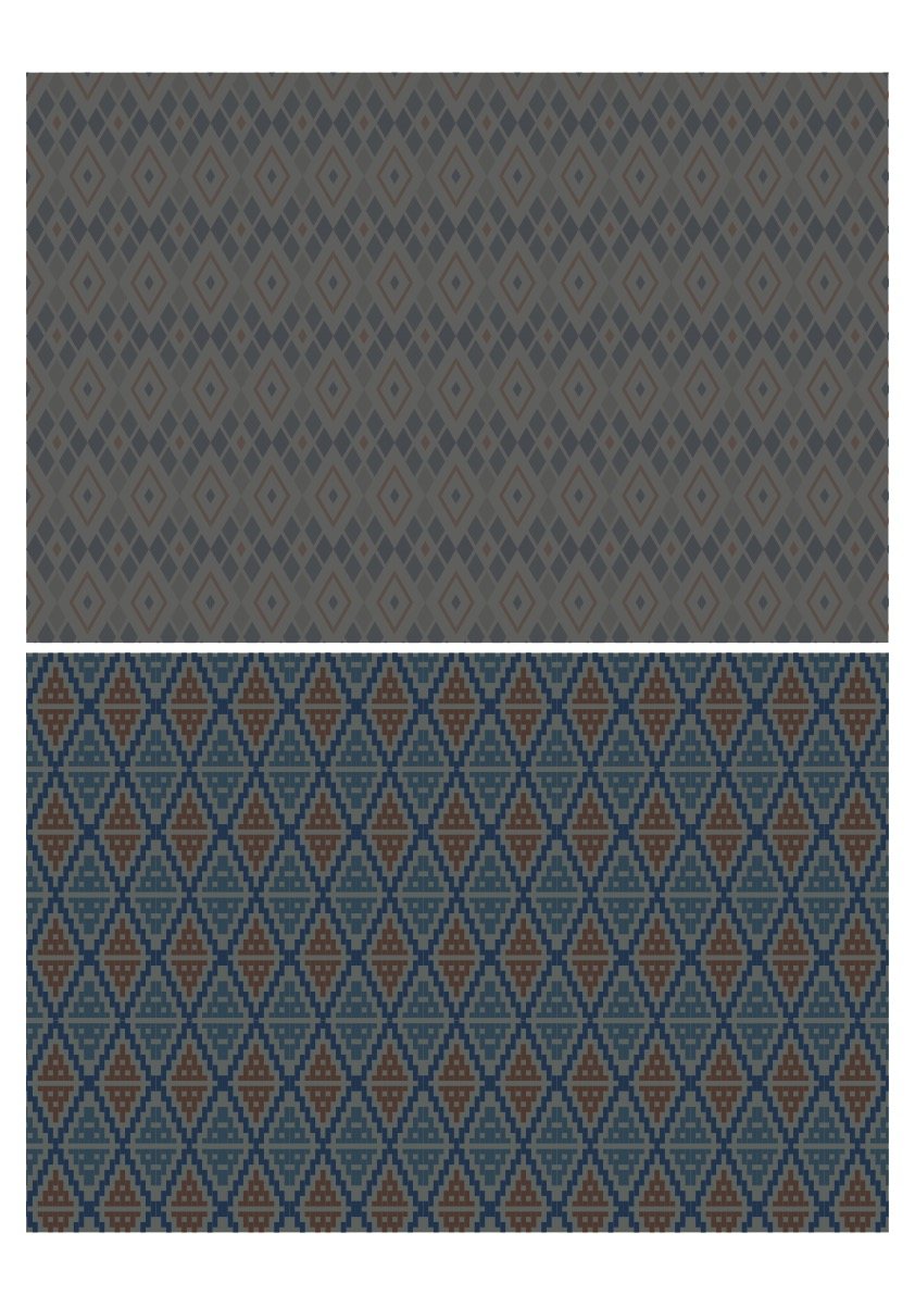
The soul of it lives in the pattern. We borrowed the brocade of the highlands, geometric bands running along the edge of each label, with each product group carrying its own brocade tone. That layer of pattern turns a flat label into a miniature piece of brocade cloth, so that a single touch reveals the hand of the highland people behind the product.
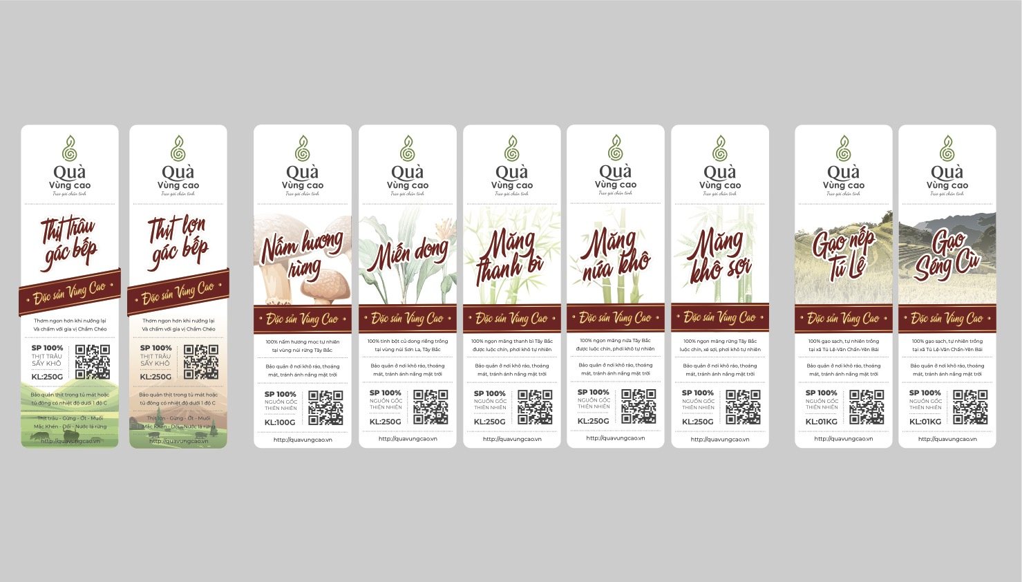
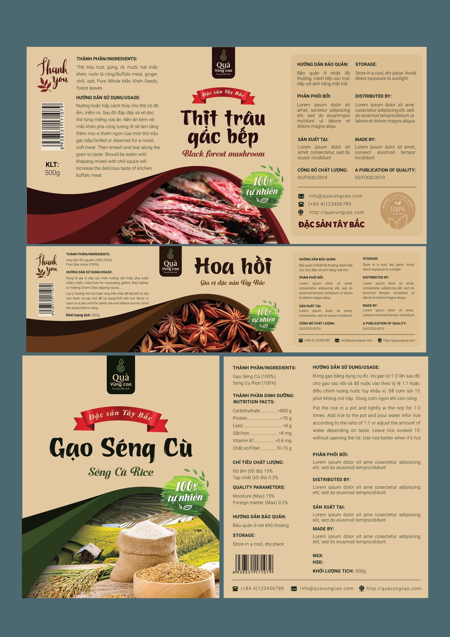
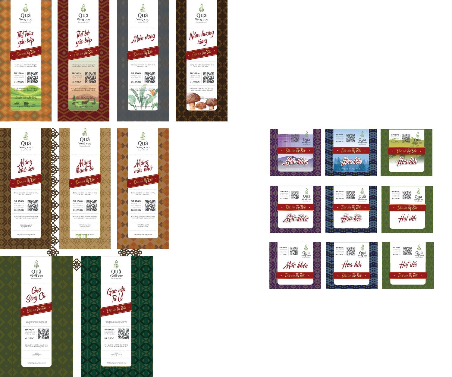
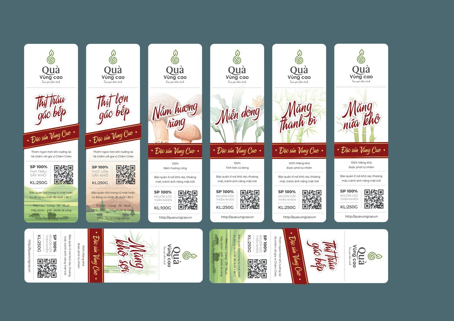
The whole product line was brought into one template: smoked buffalo meat, smoked pork, forest shiitake, glass noodles, dried bamboo shoots, thanh bì bamboo shoots, Tú Lệ sticky rice, Séng Cù rice, star anise flowers. Each product has its own label, but all of them share one rhythm: the sprout on top, the product name in the middle, a brocade band running along the border, and a terraced rice field corner as the ground.
So a buyer can tell the category at a glance, we split the colors by group: deep red for the meat group, green for the rice group, brown yellow for the bamboo shoot and mushroom group. When a new product line comes along, the team only needs to take the right template and the right color band and fill it in. What used to be printed a different way each time now has one rule to follow.
Highland specialties are still unfamiliar to many lowland people, so the back of every package was built into a storytelling page: ingredients, how to use, how to store, a one hundred percent natural seal, written bilingually in Vietnamese and English so the gift could travel beyond the border.
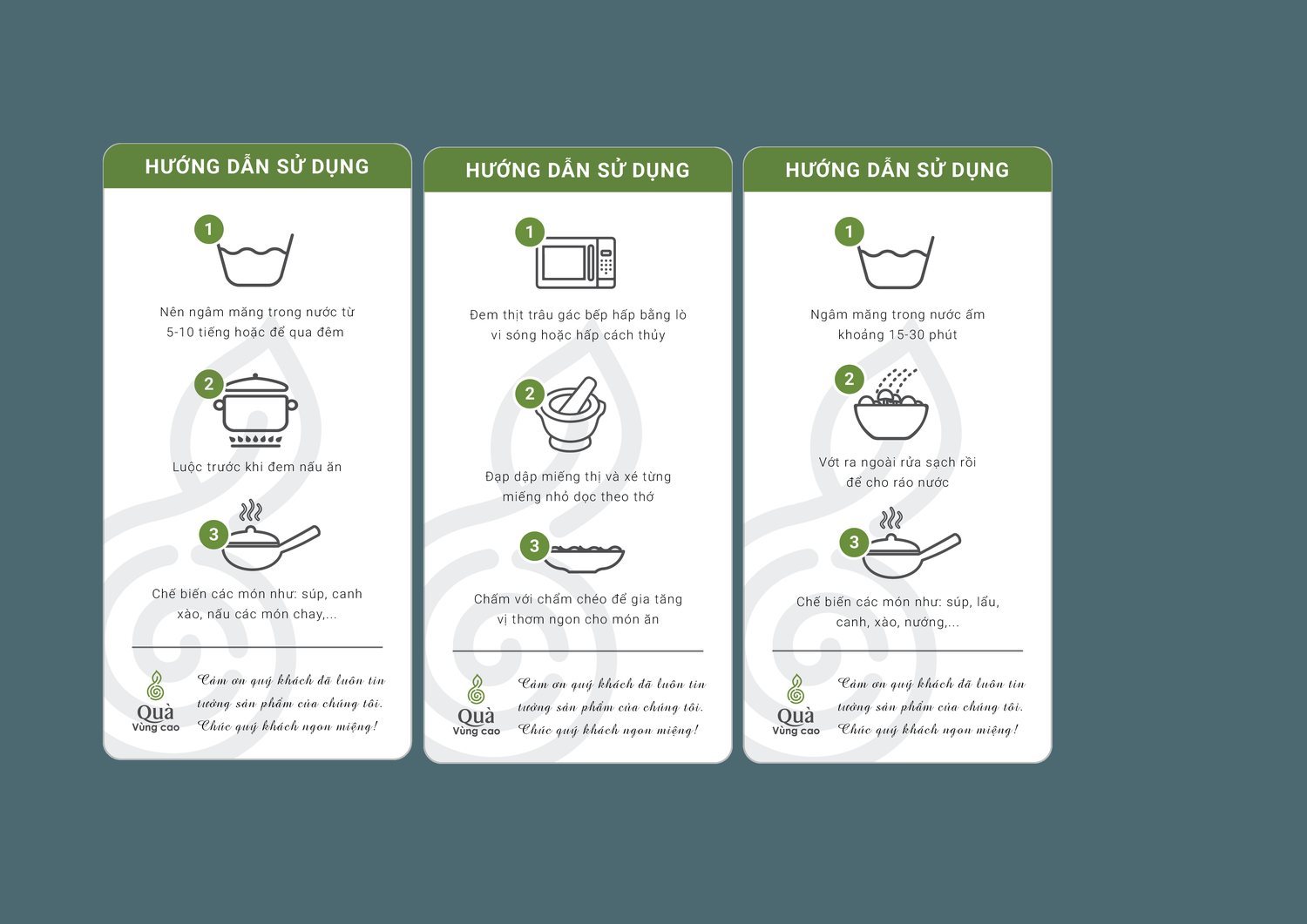
Alongside it comes a set of picture-based instruction cards, so that someone who has never cooked dried bamboo shoots or smoked meat before can still get it right the first time. That care is the brand's way of saying what is inside is not just goods, but a product wrapped with thoughtfulness.
The result
What Quà vùng cao gained was not a logo, but a way of gathering the mountains into one place. More than a dozen specialties that once stood apart now share one sprout, one brocade band, one label template, tight enough to be recognized, open enough to add a new product without rethinking everything from the start.
For a brand that lives on trust and warmth the way a gift does, a face that is both rustic and presentable is the first greeting. It speaks on behalf of the giver that this gift was chosen with care, and on behalf of the highlands that behind every package stands a real land.
The full specialty line, one packaging system
Does your challenge look like Quà vùng cao?
Tell Sinh Vũ what is on your mind about your brand right now. Sinh Vũ will point you to the right direction straight away.