Moore, the arrow inside the name itself
In 2007 Moore Corp built Vietnam's first online ad network, which meant its mark had to live on other people's pages. Sinh Vũ built the identity system and the guidelines that let it hold its ground on any background.

The business of selling space on someone else's page
Moore Corp began in 2007, when Vietnam's digital advertising market had almost nothing to trade. The company built VietAd, the country's first ad network, linking over a thousand publisher sites across 51 channels, and took the hardest position of all: between the people with advertising money and the people with space to fill.
That position set an unusual identity problem. Moore's mark had no shop of its own, no wall colour and no lighting to control. It lived on other people's pages, wedged between other people's content, usually in a box the size of a thumb. Nobody arrives there waiting to look at you.
The last letter refuses to close
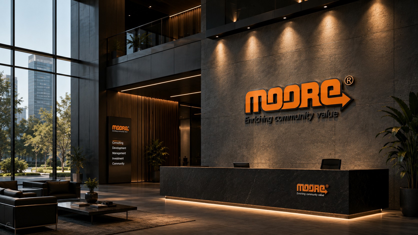
The wordmark is set in lowercase, drawn from thick rounded blocks with an even black outline running around every stroke. At the last character the system opens itself up: the stroke of the e does not close its loop but carries on to the right and resolves into an arrowhead. The sense of forward motion therefore sits inside the name rather than being pinned beside it.
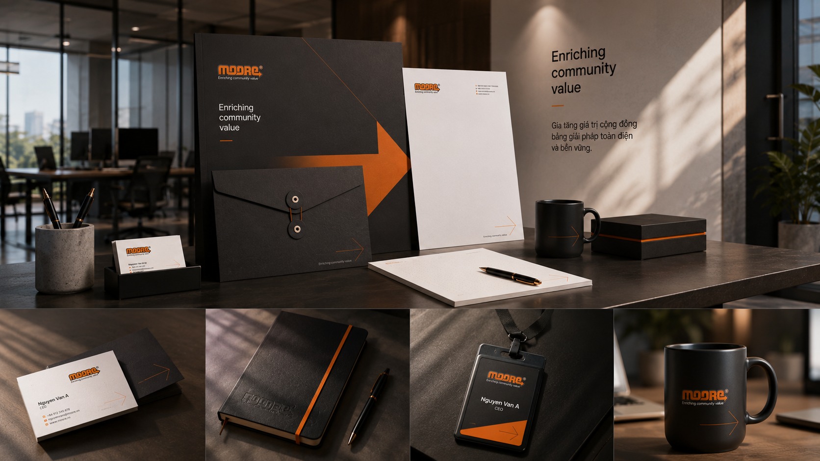
That construction handed Sinh Vũ the most valuable thing a system can have: a signal that detaches. Lift the arrow out of the wordmark and you have a mark of your own, small enough for the spine of a notebook, bold enough to be enlarged into a pattern running along a welcome desk. The full logo then only needs to appear once or twice, and the arrow carries everything else.
Orange in a forest of blue
Vietnamese technology in those years defaulted to blue, the colour of being trusted, and the whole sector looked alike because of it. Moore went the other way: a burning orange, R231 G120 B23, set against a near absolute black, R31 G26 B23, with no third colour allowed in.
Orange is the colour of the trade itself, what you reach for when you need an eye to stop. The black holds it down, gives the lettering weight and keeps it from drifting into discount-sale territory. Two colours at high contrast, still legible when a print job is down to two inks: this is what someone chooses when they know the mark will end up in rough places.
Five ways not to disappear into anyone's background
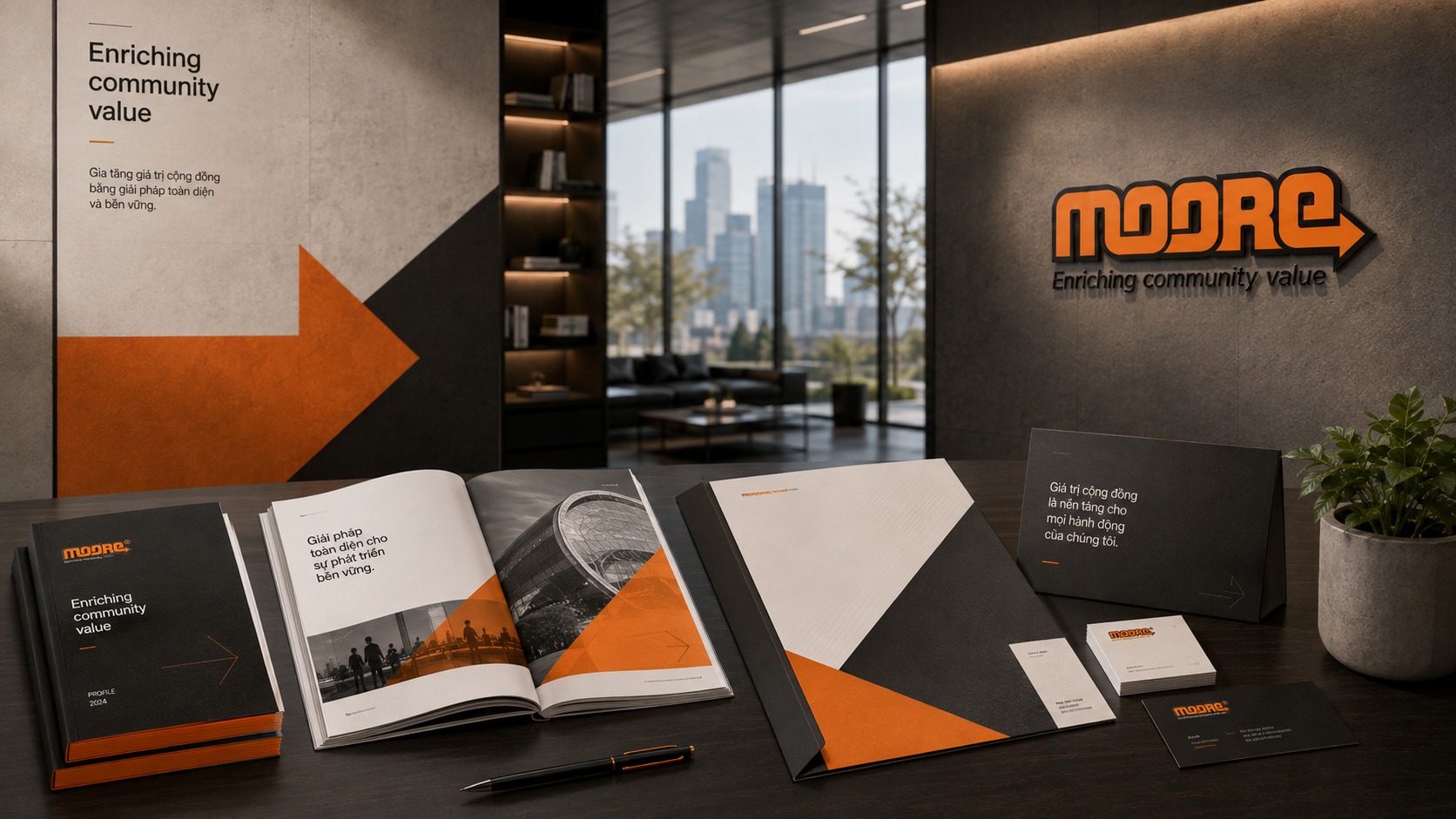
The guidelines do not stop at the master artwork. The correct-use page sets out five ways the same mark can stand: orange on white, a red version for print runs on other inks, an outlined black version for single-colour work, a reversed version in white on black, and a Vietnamese version carrying the line Gia tăng giá trị cộng đồng in place of Enriching community value.
This is where a system repays the people who use it. Every publisher has its own background, every printer its own limits, and the person placing the logo is usually not a designer. Give them the right version for each situation and nobody has to improvise, so the mark comes back the same shape everywhere it appears. Colour values recorded for both print and screen keep the paper and the web from drifting apart.
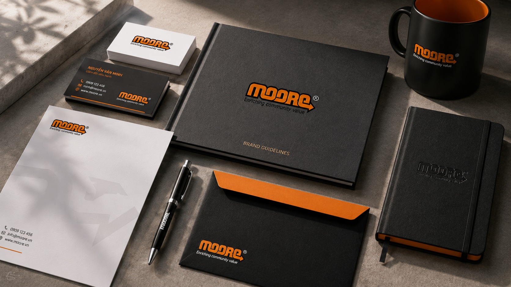
A storefront for the party in the middle
Moore had nothing to put on a shelf. What it sold was placement, data and a smarter way to spend an advertising budget, so its storefront was the credentials document, the website, the sales kit, and the seminar stage where it published its research on how Vietnamese users behave online.
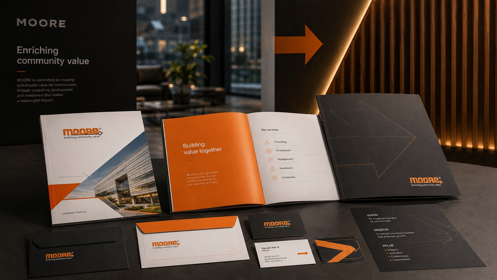
The system runs across all of those on one principle: arrow first, name second. On a report cover the arrow is blown up into a rising diagonal across the black field. Inside, it shrinks to a bullet, then becomes the connector between the stages of a buying journey. One shape, three sizes, three jobs.
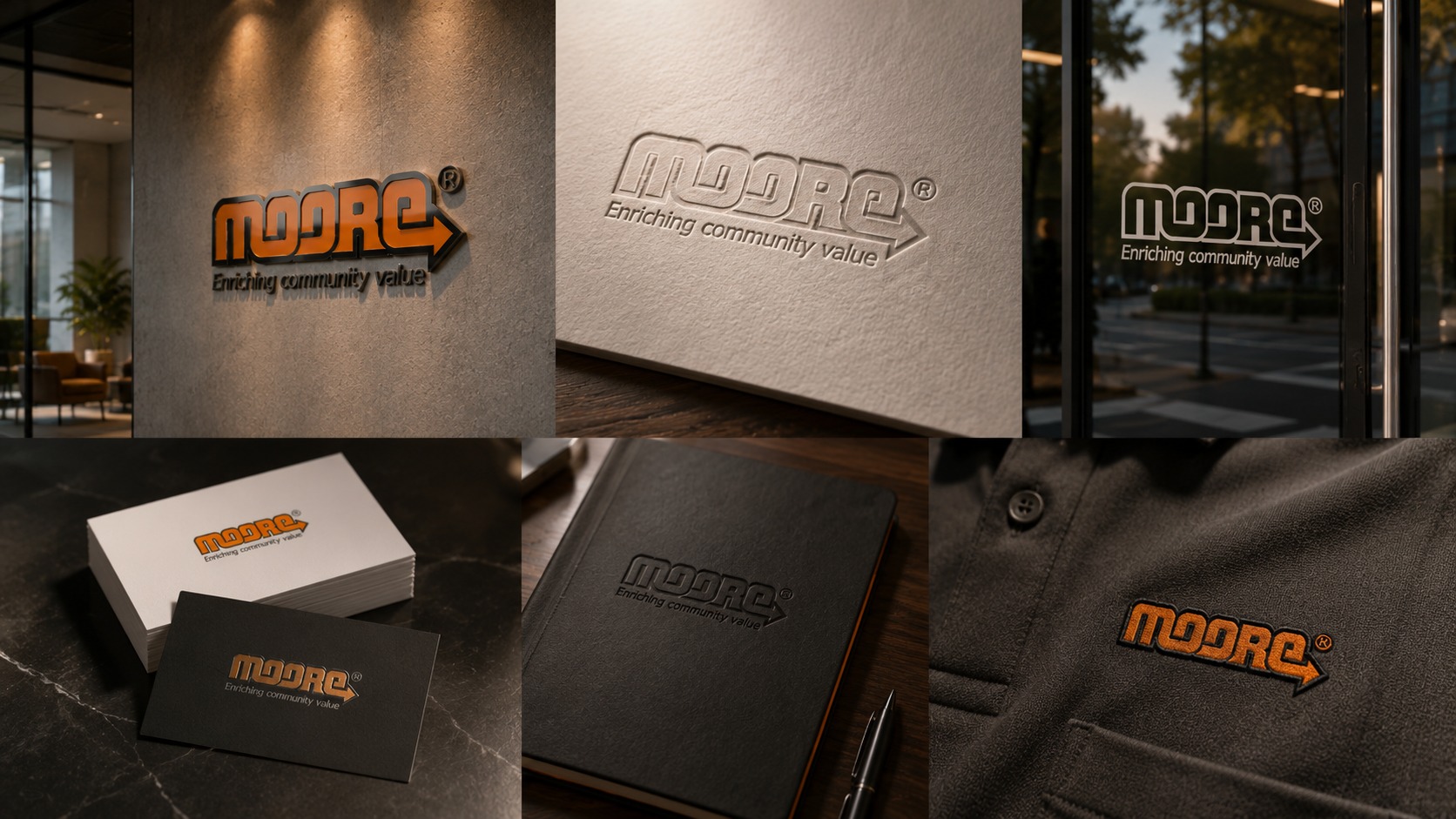
What is still legible after the lights go out
Moore took investment from IDG Ventures in 2008, won a Sao Khuê award in 2009, launched three performance advertising platforms in 2012, and became part of Irep of Japan in October 2014. The digital advertising market then changed hands very quickly, and the company stopped. This industry waits for nobody.
What matters to anyone in this trade is the part that remains: the mark still reads perfectly today, with nobody left to explain it. It never borrowed the effects of the era that produced it, so the era passed and the drawing still stands. That is the honest test of building a system properly, and the reason a sound one holds its value even after the business closes its doors.
Where a mark stands on its own
An identity only earns trust once it leaves the page: on a screen, in a lecture hall, on the wall people walk past every morning.