
mcdi, eight branches joined into one
mcdi builds roads, plants and apartment towers across northern Vietnam, yet every branch presented itself its own way. Sinh Vũ built the handshake mark and the guidelines behind it, so all eight speak with one voice.
The problem
A construction contractor sells something it cannot carry into the room. When mcdi bids for work, the client cannot hold the bridge or the water plant it has built, only the document set. People passing a site cannot read the craft inside the concrete either, they only see the hoarding along the fence. In the end, all the proof of a contractor's capability rests on paper and on painted steel.
mcdi runs eight branches spread across the country, and each one arranged its own signage, printed its own tender documents, hired local sign-writers to letter its own site boards. One company, yet every province produced a different red, a different typeface, a different way of writing the name. Nobody could assemble those fragments into a single firm, so a project completed in Nghệ An added no weight to the next bid in Hà Nội.
The approach
mcdi was used to introducing itself as a contractor, yet the company also acts as the investor behind clean water plants, hydropower and high-rise housing. Those two roles speak in different voices: a contractor talks about execution, an investor talks about the long view. Before drawing a single line, we went looking for a position wide enough to hold both.
That position settled on one word: alongside. To a client, mcdi is the party sharing the schedule and the risk. To a locality, mcdi is the party that puts the infrastructure in and then stays to run it. The handshake was never decoration chosen because it looked warm, it was the most accurate description of how this company works, which is why it could carry every decision that followed.
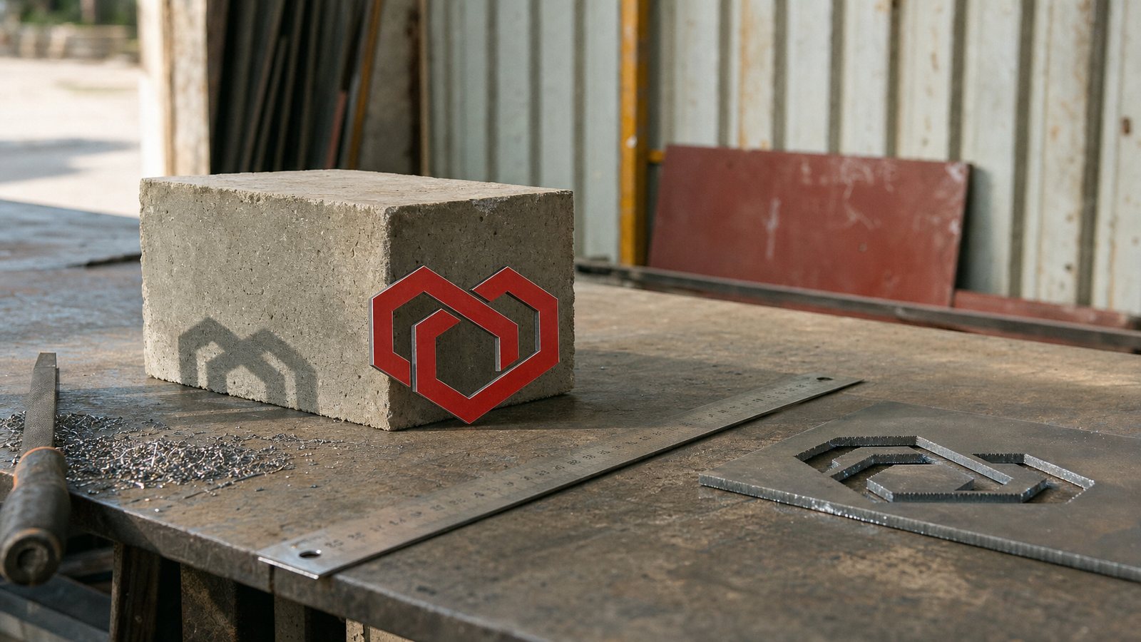
The mark is built from hexagons through six geometric steps: one cell splits into a honeycomb, the honeycomb interlocks, the two forms rotate into symmetry, then close into a shape that reads at once as a handshake and as a heart. Not a line of it was drawn on instinct; it was all set out with rule and centre point, because that is the language people in construction trust.
Choosing the hexagon meant standing inside the rules of the trade: modules, structure, load-bearing form. But the trade usually stops there, at sturdiness, and forgets the human part. mcdi took one step further and let two engineered forms hold each other into something warm. The red was pitched strong enough not to disappear into the grey of concrete, steel and dust, the ground this mark would live against for the rest of its life.
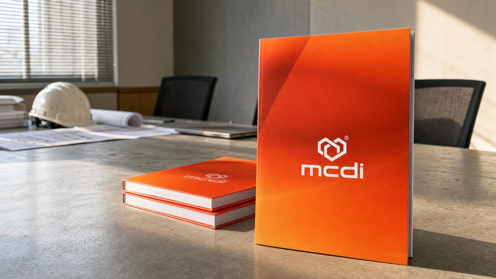
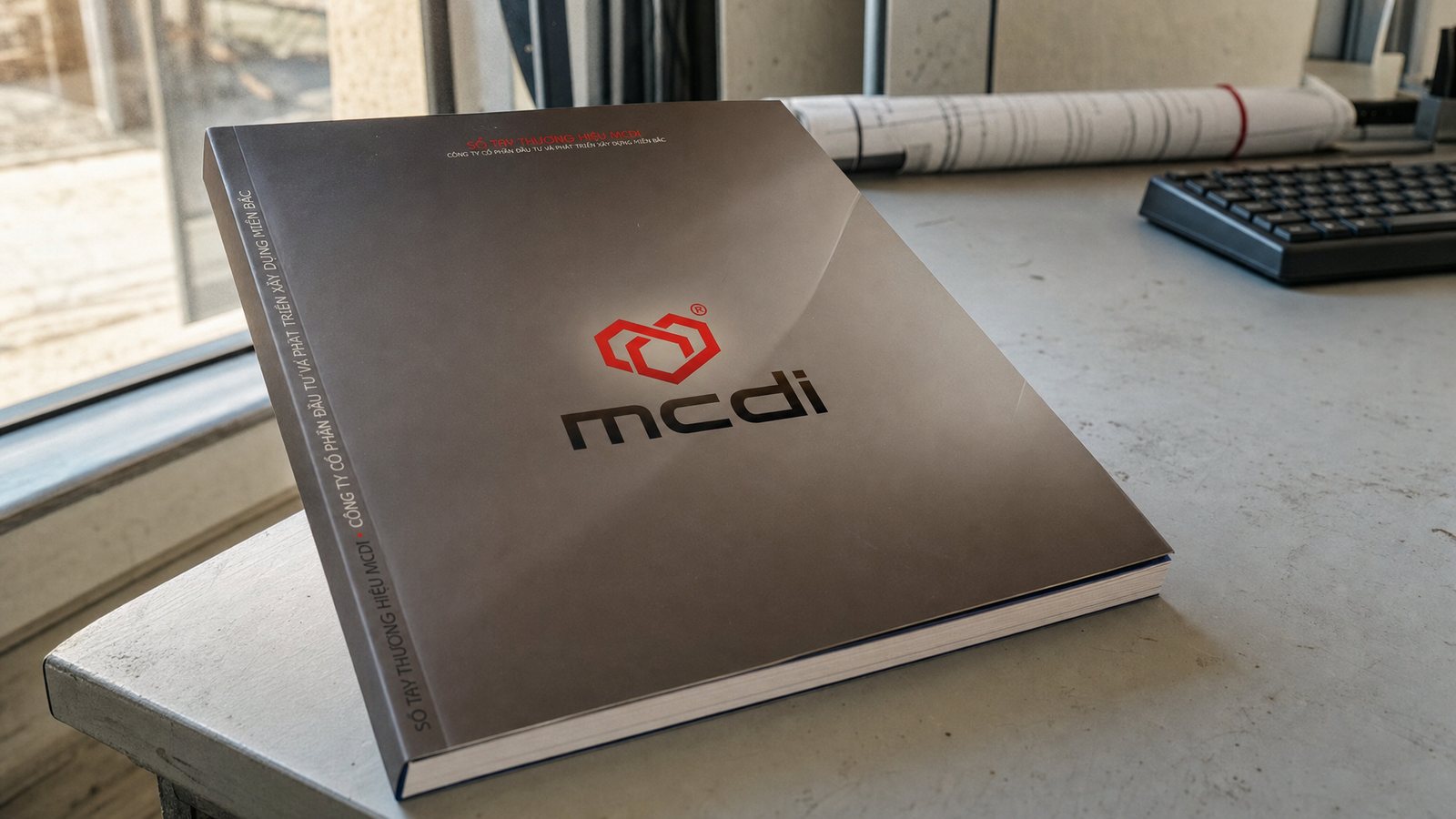
A tender committee gives a capability profile a few minutes, usually with nobody there to present it. We built the book to speak for itself: completed projects printed large in black and white, wide margins, heavy stock, type set loose. A tower standing alone on the page lets a reader feel the scale before reading a single figure, while the composure of the layout says, on the company's behalf, that this is an organised firm.
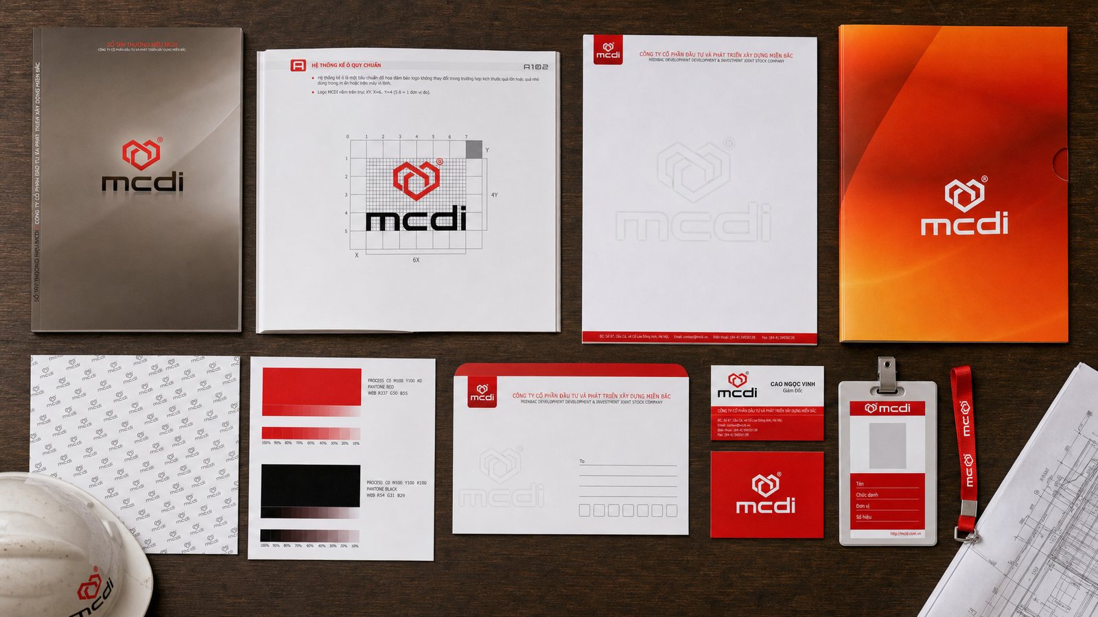
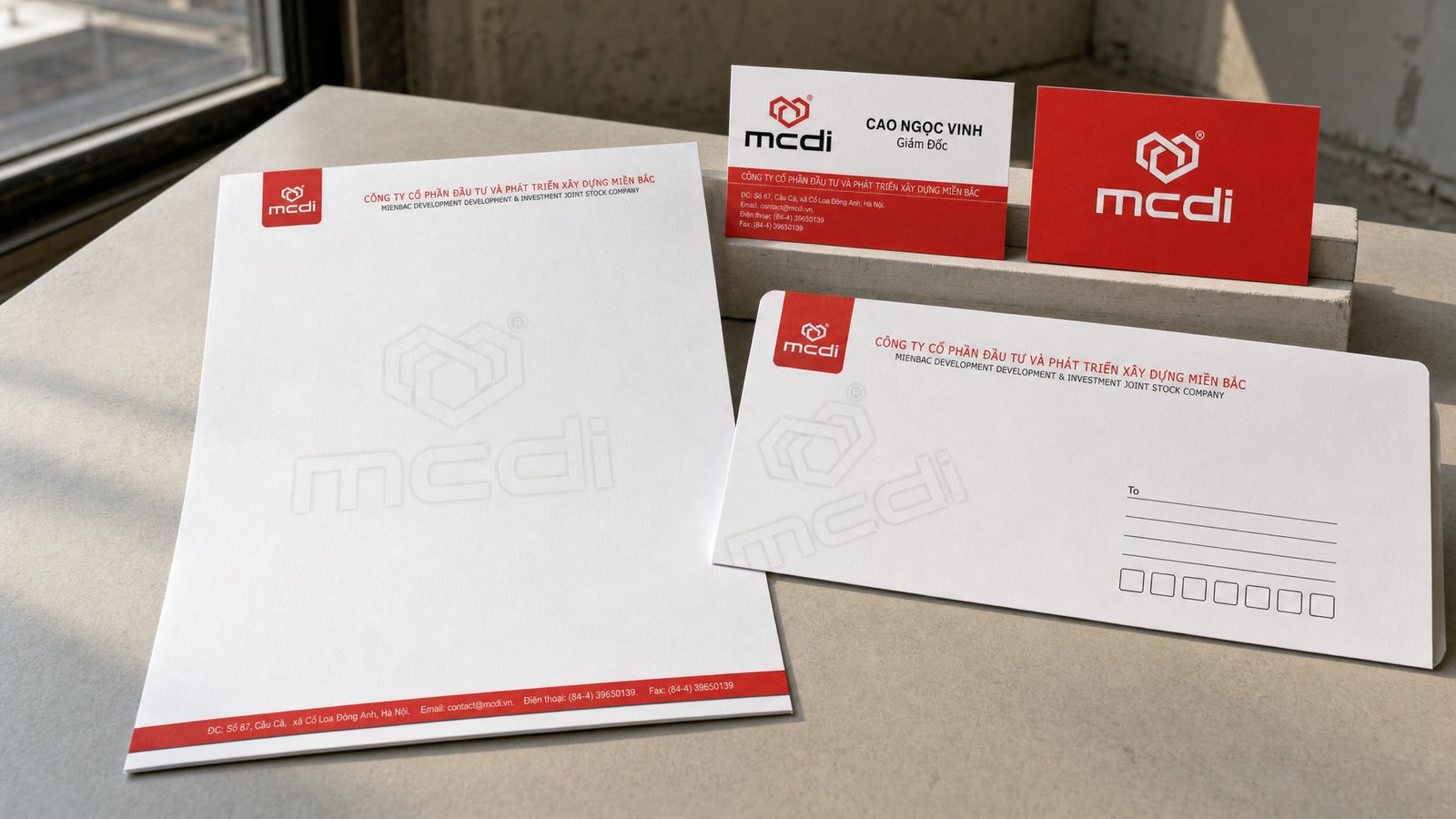
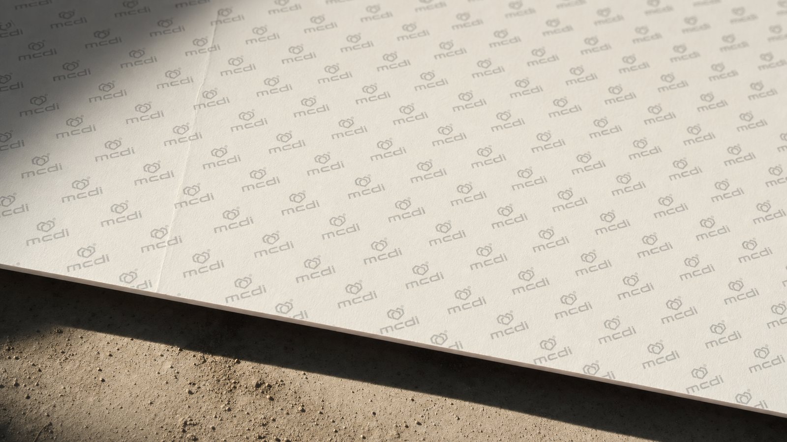
The office stationery follows the same line: letterhead, envelope, business card and folder, each carrying the hexagon pattern blind-embossed under the surface, visible only when the light falls across it. In meetings where mcdi has not yet had a chance to prove itself with a finished building, the paper passed across the table is the first piece of workmanship a partner holds.
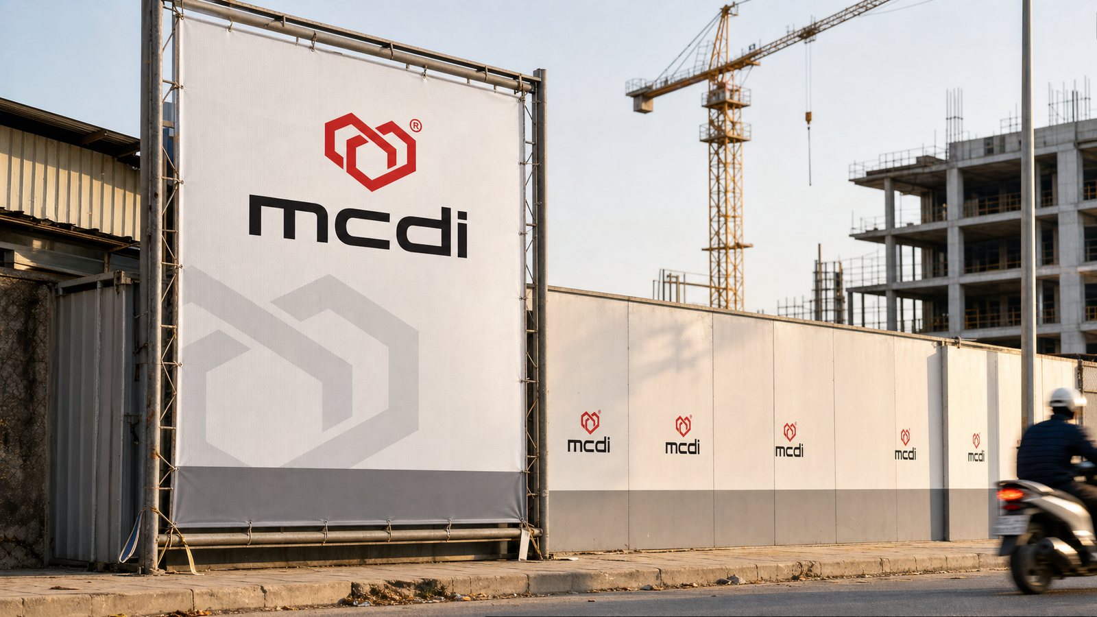
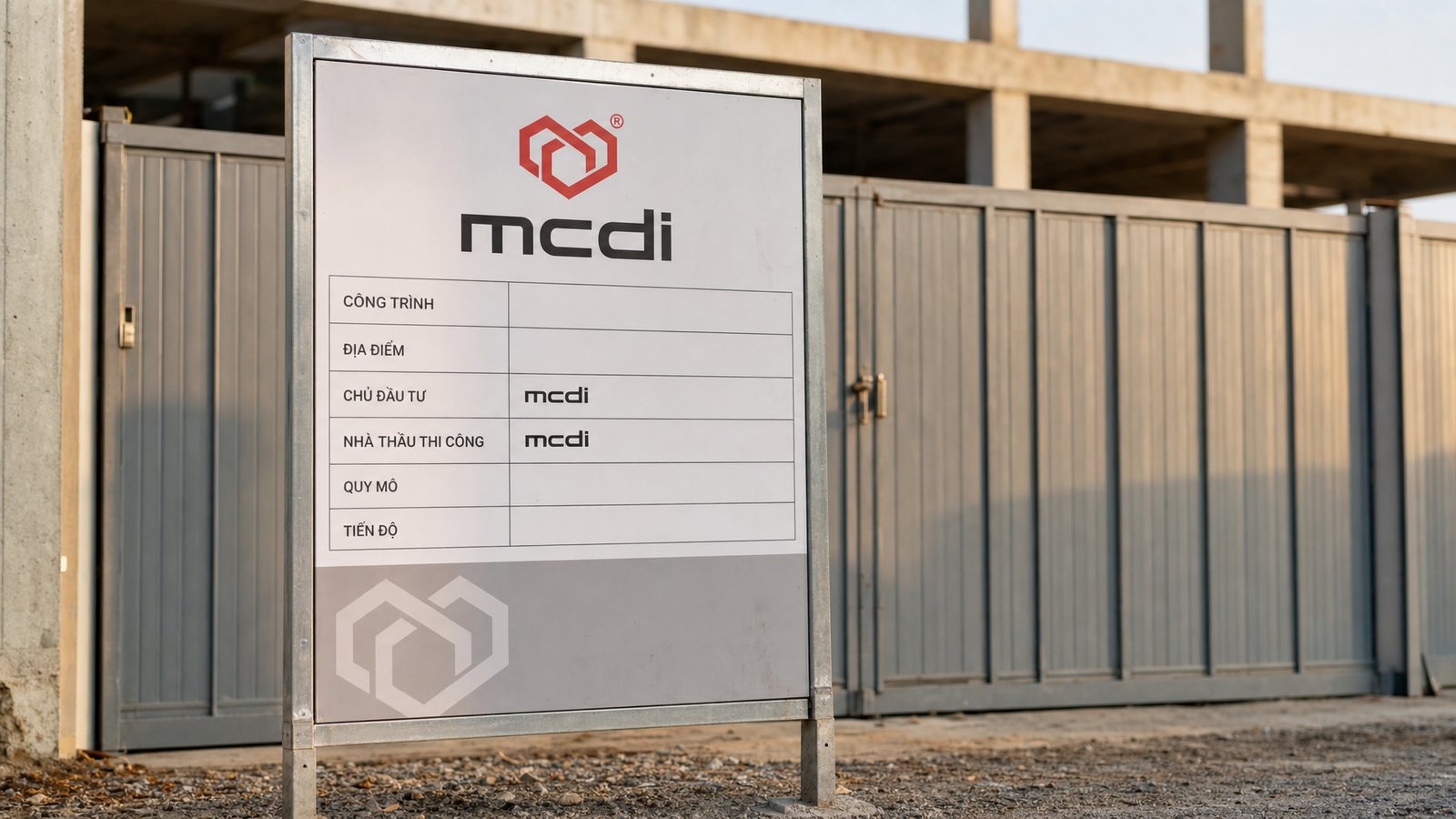
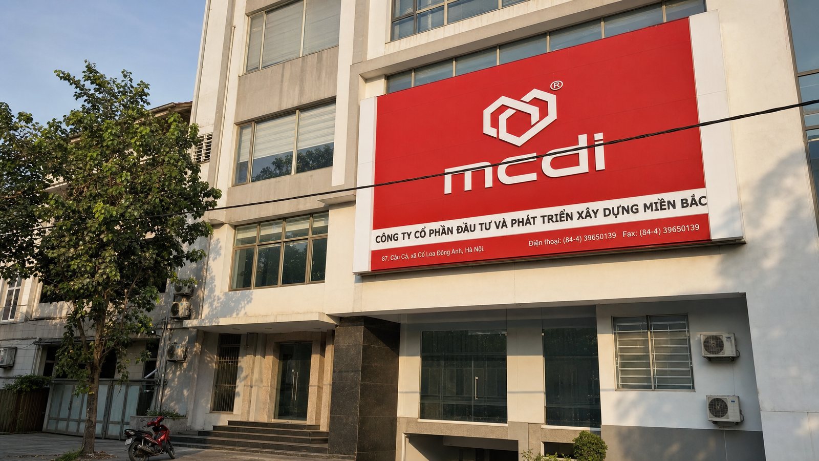
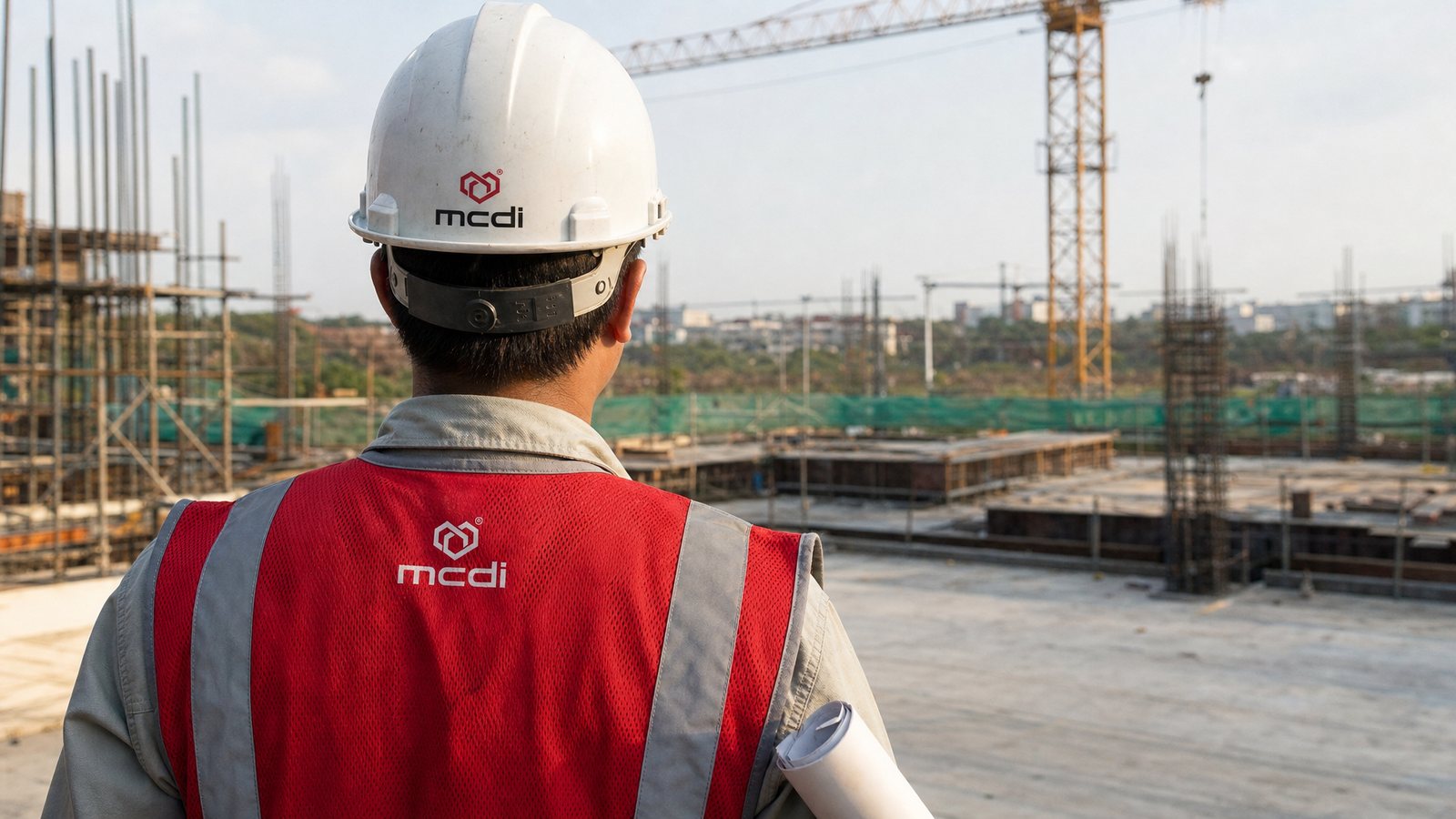
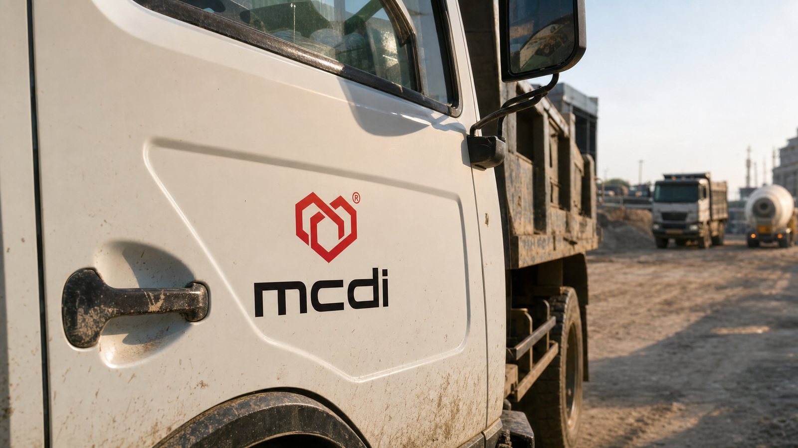
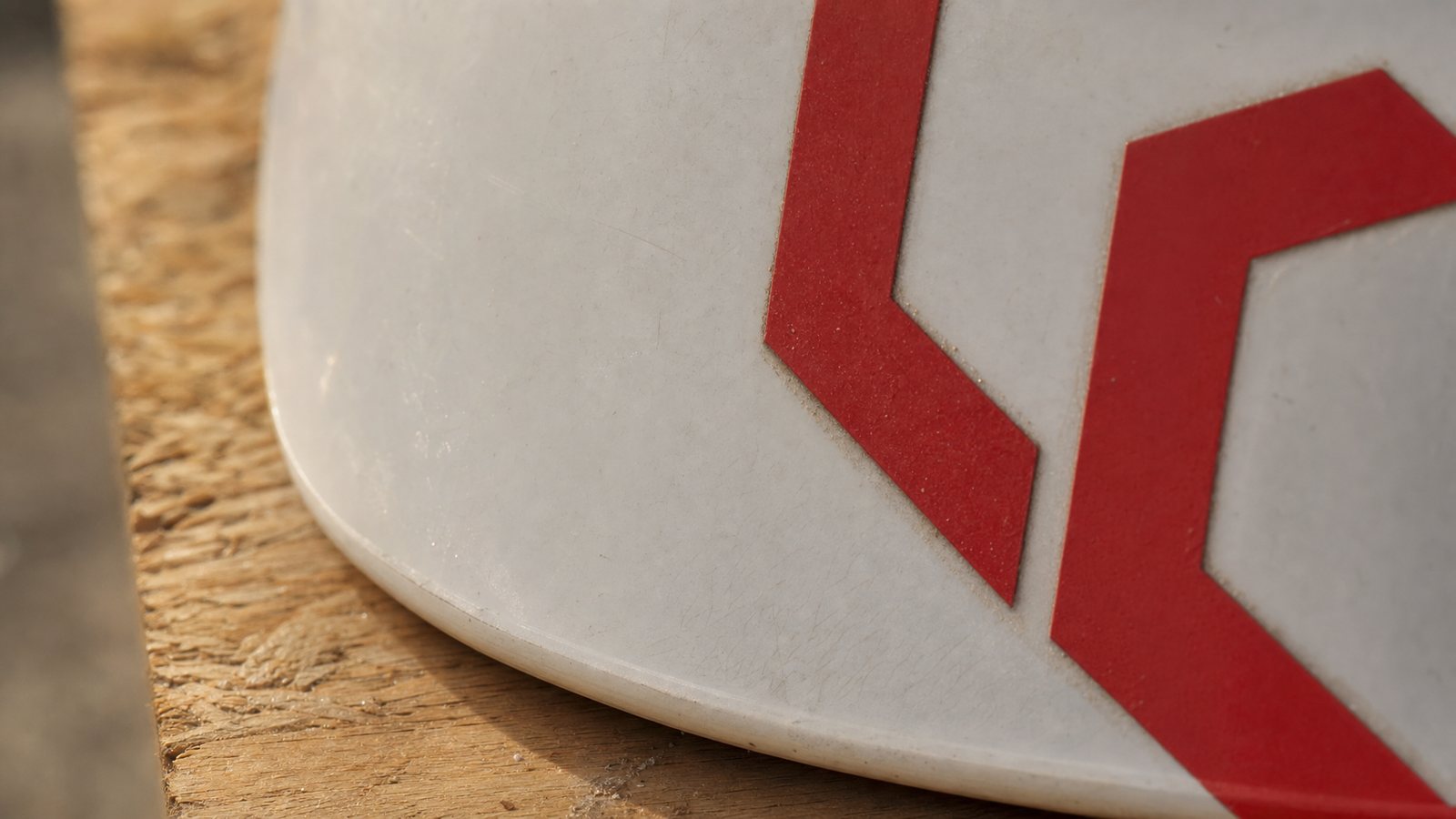
A contractor's identity lives out in the weather far more than in a meeting room: site hoardings, project boards, branch signage, safety helmets, hi-vis vests, truck doors. All of it is made by local trades from printed tarpaulin, cut vinyl and hand-painted lettering, under different conditions in every province. A drawing that looks fine on screen but ignores those conditions will simply be remade the cheapest way the nearest workshop can manage.
So the guidelines were written to be worked from, not admired: minimum clear space around the mark, the smallest size still legible from the roadside, what to do when only one colour can be printed, how a branch name sits beneath the group name. Templates for each item come with it. A branch can get it right without calling head office, and whoever keeps the standard at head office has something concrete to check against.
The result
What mcdi gained was not a logo, but the right to stop rethinking. A branch putting up signage in a distant province, an administrator printing a tender set at head office, a workshop making helmets for a new project: three jobs, three places, three moments, and still one mcdi comes out.
For a contractor, that consistency is a silent capability statement. Every project leaves behind a mark identical to the one before it, and those scattered encounters accumulate into familiarity in a client's mind. By the next tender round, the name mcdi already carries a measure of trust that a rival still has to argue for from scratch.
An identity that lives outdoors
Eight places where the mcdi identity actually goes to work, from the board at the site gate and the vinyl on a helmet shell to the paper passed across a meeting table and the pattern that only appears when light rakes across it.
In their own words
Excellent design work. We have unified the group's brand identity system across 8 branches, and the trade promotion materials are performing very well.
Is your problem similar to mcdi?
Tell Sinh Vũ what's on your mind about your brand. Sinh Vũ will point you to the right direction right away.